Fashion Week is in full swing in Milan, long a capital of both haute couture and high design. The two worlds intersect in the eclectic and variegated interiors of the labels’ flagship stores — architecture may not be subject to the biannual cycles of fashion, but it certainly goes a long way toward complementing the aesthetic of a brand. Here is a collection of stunning showrooms that express the cosmopolitan spirit of the city: Fashion and design addicts alike should take note of this short guide around the fashion district for your next trip to Milan.


Photo credit: Jacopo Spilimbergo
Dame Zaha left her imprint in Via Sant’Andrea, 10/A at the new Stuart Weitzman boutique, inaugurated last September. Modular display units showcase shoes and, at the same time, turn into seating. Hadid’s futuristic cave is organized into two separates spaces characterized by a monochromatic spotless atmosphere. According to Hadid:
“Our idea was to create a design that will be recognizable and, at the same time, able to adapt and establish its own relationship with each of the separate spaces in different cities around the world. We have divided the design into invariant and adaptive elements. This enables each new store to be different from the other, yet also maintain a common architectural language that will be recognized as a Stuart Weitzman space.”

© Agomstino Osio

© Agomstino Osio

© Agomstino Osio
Photo courtesy Prada
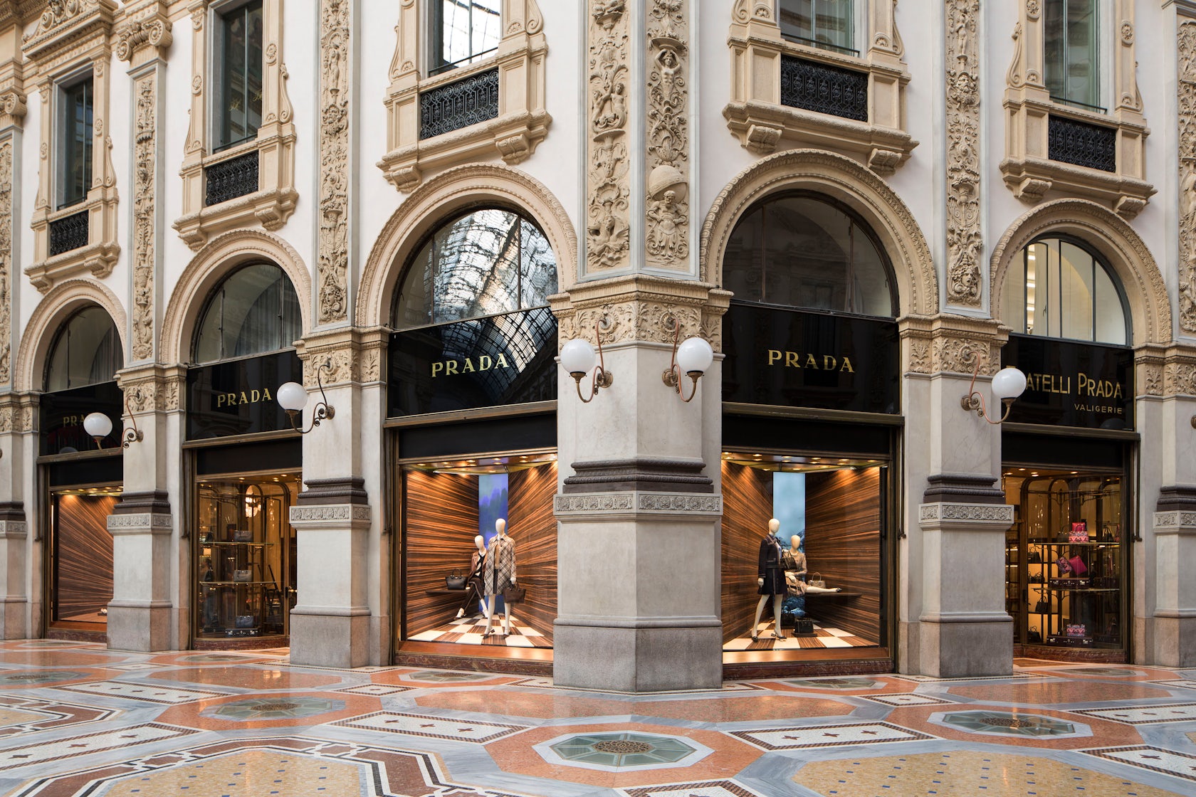
You now have one more reason to walk around the stunning Galleria Vittorio Emanuele: The Prada windows design by London-based designer Martino Gamper. The forced perspective backdrop was inspired in the study of the corner, foreshortened and exaggerated through a composition of fragments and contrasts between natural materials. Each window plays with the same elements, but looking through different perspective and accessories to compose the frame.
“When one creates new ways of seeing and experiencing, sometime within existing parameters, in this case shop windows, generating new ways of looking means opening new perspectives and points of view,” explains the Italian designer. “So, in this collaboration, I tried to find a new way of looking at something that we already know; I tried to create a new focal point: in this case, the corner.”


© Alberto Moncada
Photos above and at top courtesy Prada
Prada is well known for prestigious collaboration with architects and designers. OMA/AMO has just unveiled the newest performance space for F/W 2015 collections, entitled the ‘Infinite Palace,’ a mix of blue and black marble and aluminum grating.


Photo credit: Andrea Martiradonna
Brioni, the iconic Italian men’s fashion brand, has chosen Park Associati to design its latest showroom at Via Gesú 4. Filippo Pagliani and Michele Rossi, founders of the studio, explore a peculiar characteristic of Milan: behind their polished façades, many buildings conceal elegant internal courtyards. Glassy cantilevered windows face the courtyard, effectively turning he façade inside out; interior spaces are constructed around the interaction with the courtyard and inflowing sunlight.
“Brioni is a brand that, while looking back over its own past and origins, is projected into the future and the global world,” said the architect Michele Rossi “For us, the design task was to combine Classic and Modern, generally considered to be contrasting adjectives, in one whole space. The modernity is, above all, a mental approach and classicism actually means compositional balance, harmonious forms and stylistic elegance. ”The redesign of the 700 sqm building keeps the luxury character of the brand focused on the craftsmanship of their manufacture.Lighting design is carefully tailored to the space, combining ceiling illumination with a set of lamps made of custom-designed ribbed glass, and wall lighting along the stairs.


Photo via Camper
In the heart of the fashion district at Via Montenapoleone 6, the interior of the Kengo Kuma-designed Camper showroom is clad in a minimalist 32×32 cm grid of wooden boards, added and subtracted to create a complex three-dimensional construction, executed with top-notch craftsmanship. The sand-colored poufs are custom made for the store and perfectly match the stone floor. “The duality which coexists between the simple and the basic, at first sight, and the complex and the sophisticated, is what fascinated Camper most about this design,” says the Japanese architect. “And it’s precisely this dual attitude that we have tried to reflect in our project for this store.”


Photo by Orsenigo Chemollo, via Designboom
You’ll find many similarities between the Duvetica showroom (Via Santo Spirito 22), designed by the master Tadao Ando, and the Teatrino di Palazzo Grassi in Venice. The sublime use of exposed concrete, typical of Ando architectures, transforms even a showroom in a masterpiece. Two inclined walls extend across the two levels of the shop to shape the interiors. A poetic sequence of spaces harmonizes with the clothing racks, arranged like art objects to present the colorful variations that represent the brand’s image.


