Architects: Want to have your project featured? Showcase your work by uploading projects to Architizer and sign up for our inspirational newsletters.
Effective graphics can transform how we understand space. As visual information that combines images, words and ideas, graphics are designed to produce specific effects and interpretations. Known as environmental graphics at the scale of architecture, this type of information can include wayfinding, branding or space shaping. The art of making environmental signs transcends history and locale, but modern techniques have evolved to encompass digital data displays, interactive content, virtual or augmented theme environments and integrated smart city interfaces.
Supergraphics are large environmental graphics that are usually applied over walls or floors to form a kind of altered space. This collection of buildings from the Architizer database explores how supergraphics are applied today. Located across four continents and multiple countries, the projects include homes, offices, retail centers and training facilities. As elements that define brand and perception, the graphics incorporate color, pattern and scale to transform spaces and façades. Collectively, they show how environmental graphics are used to build identity and create powerful statements.

© Austin Maynard Architects

© Austin Maynard Architects
Tattoo House by Austin Maynard Architects, Fitzroy North, Victoria, Australia
As a small extension to an existing three-bedroom home, Tattoo House was built to explore multiple functional and conceptual ideas. As a rectilinear volume, the project was formed with a tree supergraphic that plays with shadows as a continuation of the simple white box.

© Ministry of Design Pte Ltd

© Ministry of Design Pte Ltd
Leo Burnett Office by Ministry of Design Pte Ltd, Collyer Quay, Singapore
Featuring a graffiti style mural of Leo Burnett, this ad agency’s multi-surface supergraphic creates an iconic entrance space. Located on the second floor of a restored building, the design includes anamorphic art and gold-gilded wheel barrows filled with trophies.

© Shigeru Ban Architects, Dean Maltz Architect

© Shigeru Ban Architects, Dean Maltz Architect
Camper House of Shoes by Shigeru Ban Architects and Dean Maltz Architect, New York, N.Y., United States
Sited in a Landmark Historic area, this flagship store includes street-level retail and storage space below. Built from paper tubes, the project includes the Camper Brand logo and colors that form a supergraphic that can be read from multiple angles.

© Gayle Babcock - Architectural Imageworks

© Gayle Babcock - Architectural Imageworks

© Gayle Babcock - Architectural Imageworks
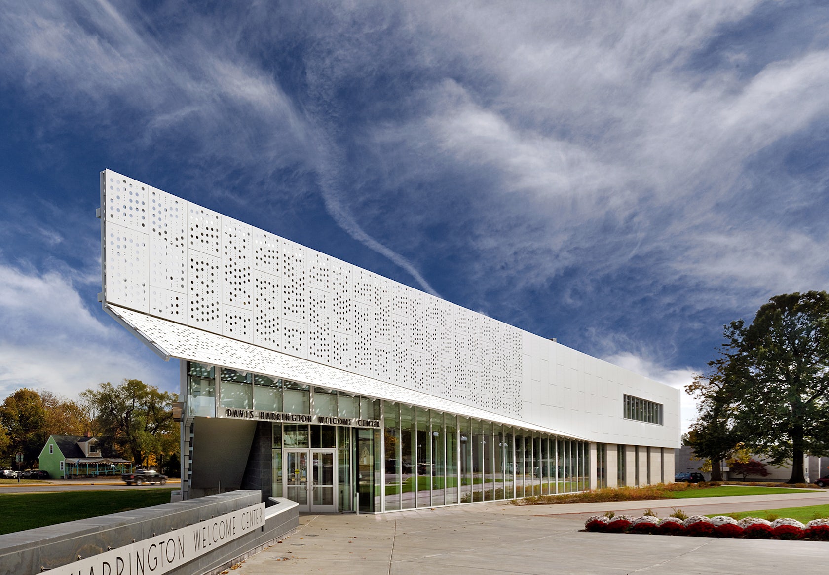
Davis-Harrington Welcome Center by Dake Wells Architecture, Springfield, Mo., United States
Serving as Missouri State University’s front door, this new welcome center builds on the institution’s history and brand image. The project includes a 20-foot maroon and white bear graphic suspended from the building’s structure.

© LOT-EK

© LOT-EK
ERASMUS EFFECT by LOT-EK, Rome, Italy
As an installation of shipping containers, ERASMUS EFFECT follows the museum gallery’s geometry. Using a rhythmic pattern, the project utilizes graphic signage on the floor and walls to tell the story of migrant architecture.

© Skidmore, Owings & Merrill (SOM)

© Bruce Damonte Photography Inc

© Bruce Damonte Photography Inc
The Strand, American Conservatory Theater by Skidmore, Owings & Merrill LLP (SOM), San Francisco, Calif., United States
SOM’s design for the Strand Theater renovation resurrects the 100-year-old movie theater on San Francisco’s Market Street to form an experimental performance space. Created for the American Conservatory Theater (A.C.T.), the former 725-seat cinema has a new theater, lobby, café and a black box performance area with multiple environmental graphics throughout.

© Pablo Orcajo Pena

© Pablo Orcajo Pena
Car Park Puerta de América Hotel by Teresa Sapey Studio, Madrid, Spain
This car park was designed with functional graphics that would “appeal to the emotional side.” An iconographic wall code leads guests through the space, while motifs and vivid colors delineate program and circulation.

© ACDF Architecture

© ACDF Architecture
Lightspeed Offices by ACDF* architecture | design urbain | intérieur, Montréal, Canada
Formed as a new global headquarters, Lightspeed’s office in Montréal was built around the idea of a tight-knit, nimble startup. Glass walls, colorful pavilions and graphic art by Arlin Cristiano and Jason Botkin create a synergy between the original structure and the new office space.

© LOT-EK

© LOT-EK
PUMA City by LOT-EK, Mobile, Ala., United States
Transforming 24 shipping containers into a transportable retail and event space, PUMA CITY is fully dismountable and can be moved by cargo ship. The project is branded with a Puma supergraphic logo stretched across multiple floors.

© RUFproject

© RUFproject
Football Training Centre by RUFproject, Soweto, South Africa
As a state-of-the-art football facility, this training center in Soweto is the first of its kind in Africa. Built with two full-sized pitches, junior pitches, a clubhouse and an education facility, the project features a large supergraphic along the building façade.
Architects: Want to have your project featured? Showcase your work by uploading projects to Architizer and sign up for our inspirational newsletters.


