Architects: Want to have your project featured? Showcase your work by uploading projects to Architizer and sign up for our inspirational newsletters.
The fear of the doctors (iatrophobia) and the fear of hospitals (nosocomephobia) are commonly held anxieties. Whether it be a mild unease or a crippling fear, medical establishments often bring up past traumas or bad experiences and as a result, are avoided until they can’t be anymore.
Since the primary goal of all medical establishments is to perform the required procedure and treatment, the spaces are often built pragmatically which produces sterile and uninviting environments. However, when the same attention to functionality is given to the overall atmosphere, the result is a warm and inviting medical center. When patient experience is prioritized, a less daunting space is produced. Listed below are 7 medical establishments, all of which demonstrate that focusing on patient experience does not compromise functionality, and rather, work together to create unparalleled and leading medical establishments.
 Waldkliniken Eisenberg by Matteo Thun & Partners, Germany
Popular Winner, 2021 A+Awards, Architecture + Health
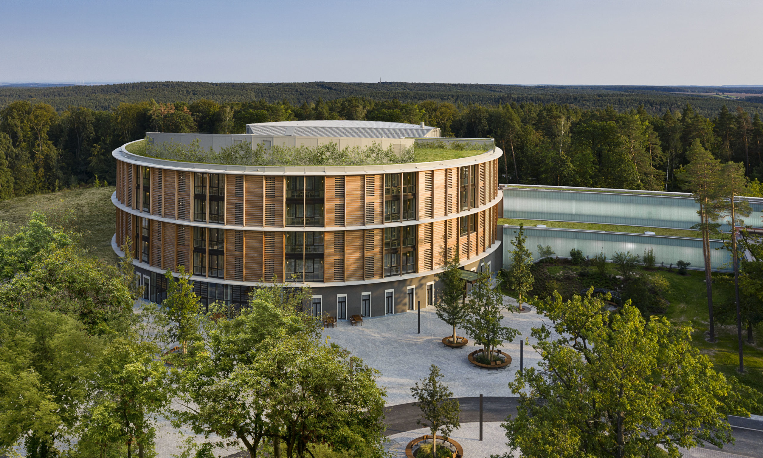
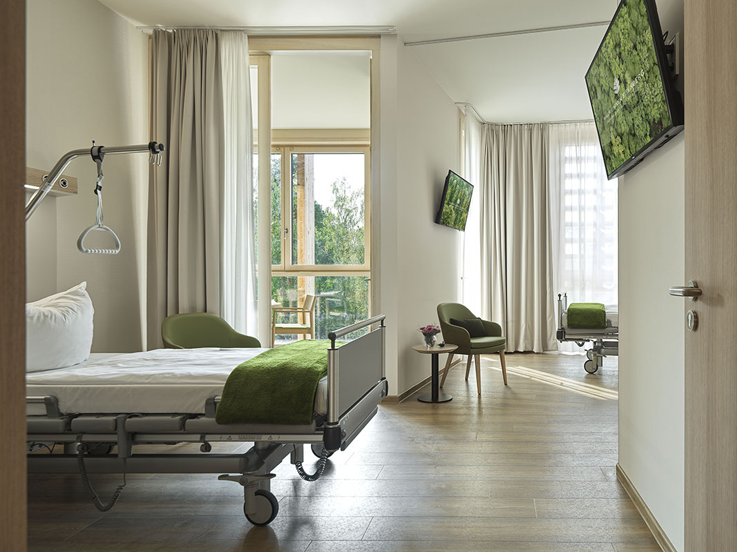
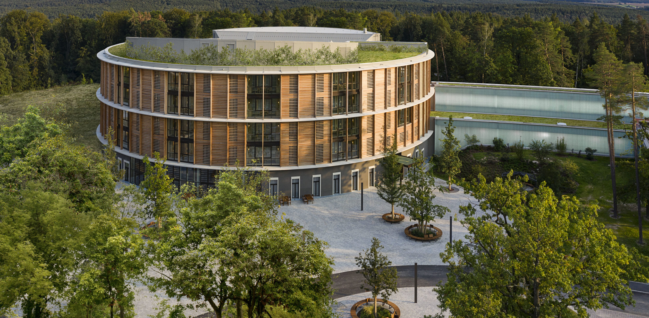
A recently-built German hospital is recognized for its hotel-grade amenities and unparalleled patient care. Designed by Matteo Thun & Partners, Waldkliniken Eisenberg is a municipal hospital that specializes in orthopedics. The hospital is comprised of a large circular volume with a wooden façade and is surrounded by rich vegetation, making the medical center feel less daunting and less sterile.
This facility has 128 rooms and can host up to 246 patients. The post-op rooms have been centrally positioned so that patients can be easily accessed and therefore well looked after by the staff. At Waldkliniken Eisenberg, patients are viewed as guests and in order to treat them as such, the hospital was designed with patient needs in mind. From light-filled rooms to functional layouts, Waldkliniken Eisenberg sets a new precedent for the patient hospital experience.
Photos by Hufton+Crow Photography
Maggie’s Leeds by Heatherwick Studio, Leeds, United Kingdom
Jury Winner & Popular Winner, 2021 A+Awards, Hospital & Healthcare Centers
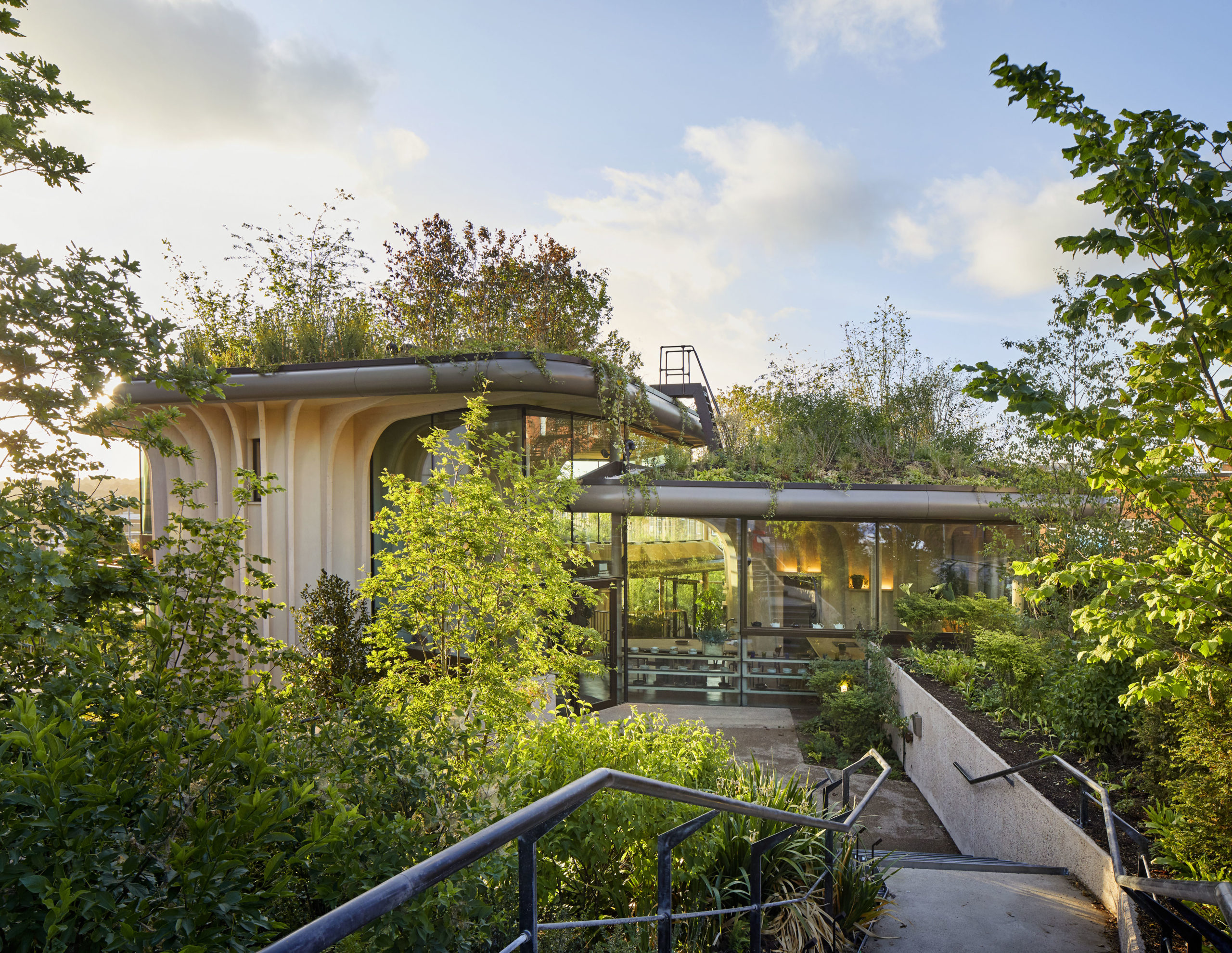
Maggie’s is a UK-based charity that provides free support to people with cancer, as well as to their families. Whether it be emotional or practical support, the ethos of Maggie’s is rooted in the belief that individuals should never “lose the joy of living in the fear of dying.” Founded by Maggie Keswick Jencks in 1995, Maggie’s centers continue to expand (designed by Gehry, Hadid, Heatherwick and more) throughout the United Kingdom, and in 2017, Heatherwick Studio was commissioned to design a new location in Leeds. Though it is sited next to St. James’s University Hospital, the center is run independently but works closely with the hospital’s patients.
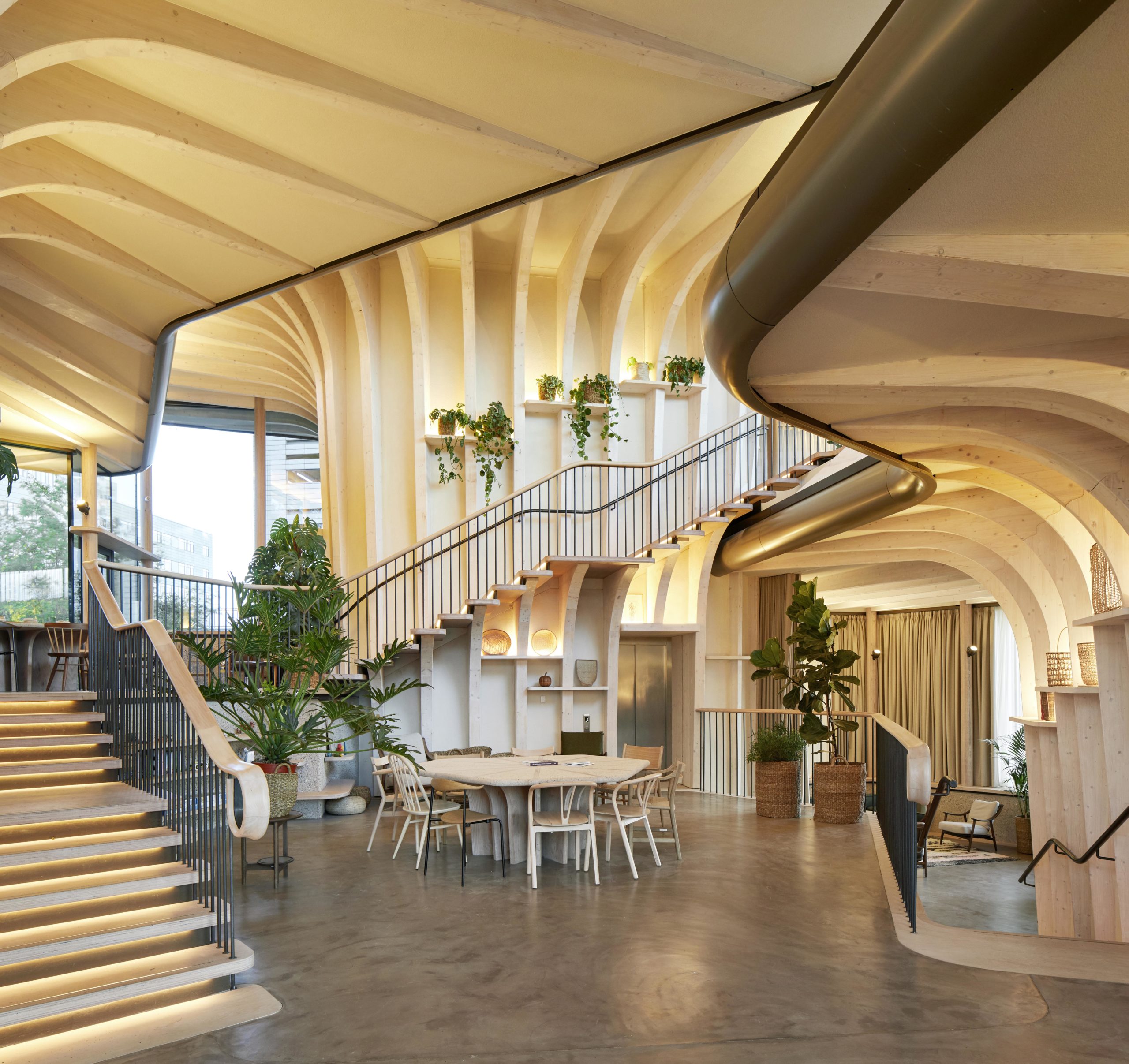
The center is located on a grassy hill and offers views of the surrounding Yorkshire Dales landscape. Each counseling room is connected to an external garden which removes the sterility commonly felt in most medical environments. The entrance and reception area equally break from traditional medical layouts. Visitors are not welcomed by a reception desk; rather, they are invited directly into the main space which features a communal table, couches, and a kitchen area where guests and staff can gather over a cup of tea. The entire space is made of spruce, which creates a warm atmosphere and offers its guests a much-needed break from the melancholy hospital spaces.
 Del Río Pharmacy by guëystudio, Olas Altas, Puerto Vallarta, Mexico
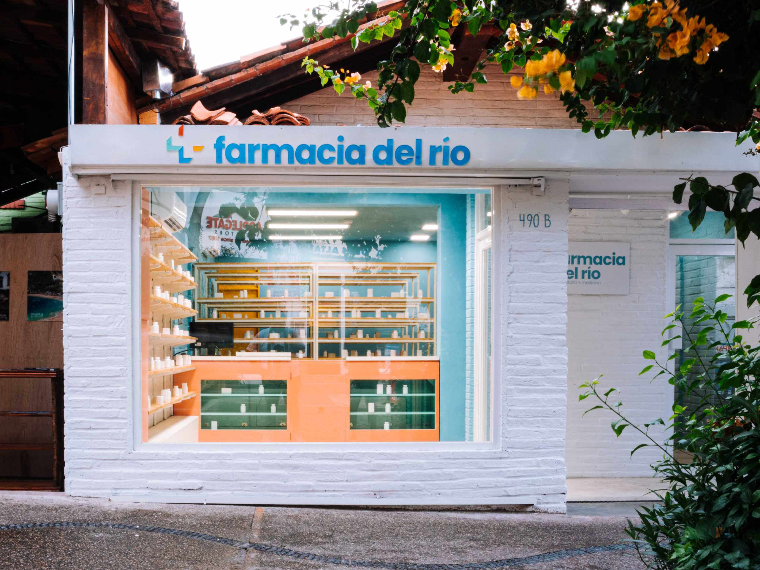
Del Río Pharmacy is located in the bustling square of Viejo Vallarta and offers a fresh and modern take on a pharmacy design. This design pushes the boundaries of what a medical establishment can be. Through a meaningful use of color, Del Río Pharmacy brings life and joy to a typically dull and sterile space.
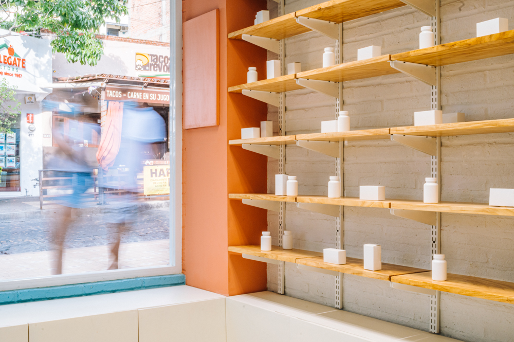
The pharmacy’s storefront reflects the surrounding urban image through its use of materials and colors. However, it equally stands out for its tonality is atypical of a pharmacy and creates an authentic aesthetic. The storefront boasts a large glass façade, allowing pedestrians to window shop from the street and see into this vibrant, almost pop-art-like interior. Inspired by natural botanic stores, the shelves are made of a natural wood grain, which produces a welcoming and comforting atmosphere. Moreover, each color was symbolically chosen: yellow for strength, pink for kindness, and blue for serenity.
Photos by Ketsiree Wongwan
EKH CHILDREN HOSPITAL by IF (Integrated Field co.,ltd), Thailand
Jury Winner, 2020 A+Awards, Health Care & Wellness
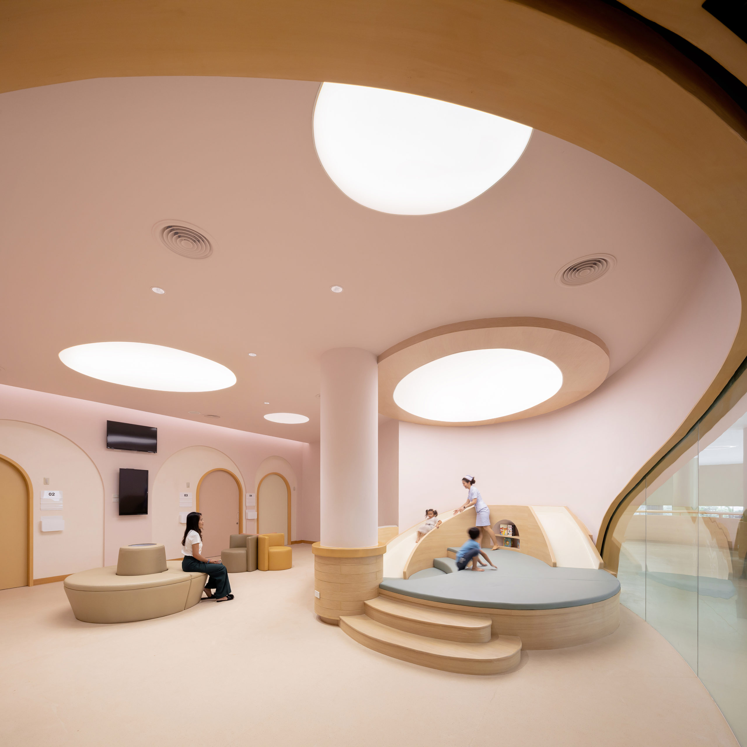
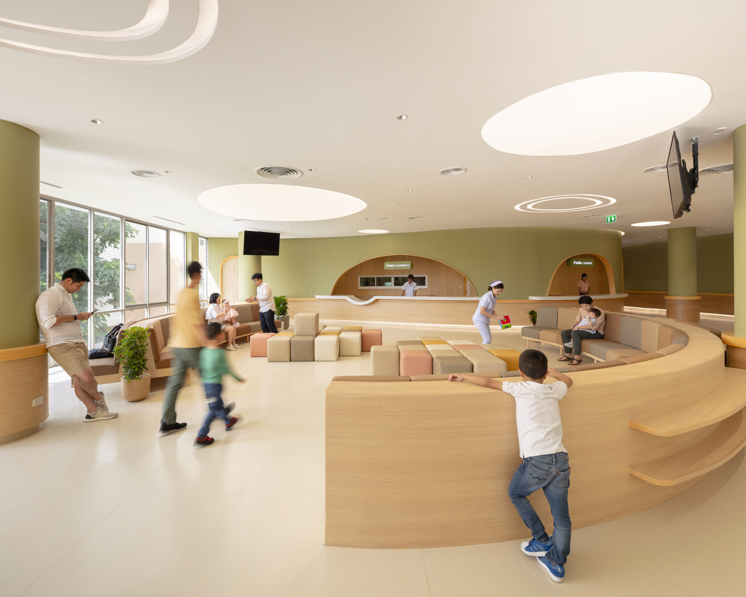
Thailand’s EKH CHILDREN HOSPITAL offers a playful and safe space for children and their families. The hospital’s main entrance welcomes its visitors into a large reception area filled with fun distractions for children, such as a large yellow slide. The entire hospital follows a unique aesthetic – curved shapes and pastel tones. IF (Integrated Field co., ltd) designed and decorated the hospital with curved lines. This was purposefully done to avoid the harsher lines and geometric forms often associated with medical facilities.
Moreover, many of the seating areas were measured so that they correspond with children’s body sizes. In addition, the patient rooms are named after animals — such as Whale, Turtle, and Rabbit — which produces a playful quality to a typically dispassionate environment. By producing such a child-friendly and youth-centered environment, it takes away from the cold and unapproachable hospital feel.
 Taverny Medical Center by MAAJ ARCHITECTES, Taverny, France
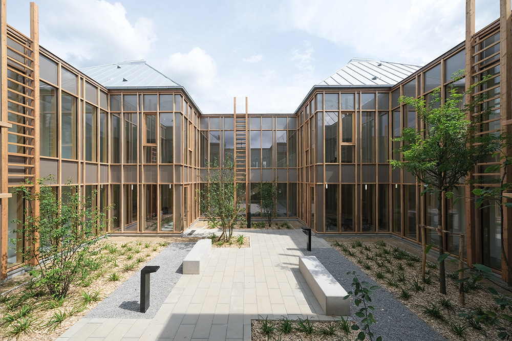
To address France’s health crisis — that is, the lack of medical doctors in rural areas — a plan was put together to construct a medical center where numerous specialists could all work under one roof. The Taverny Medical Center is located near a small town and is positioned near a highway.
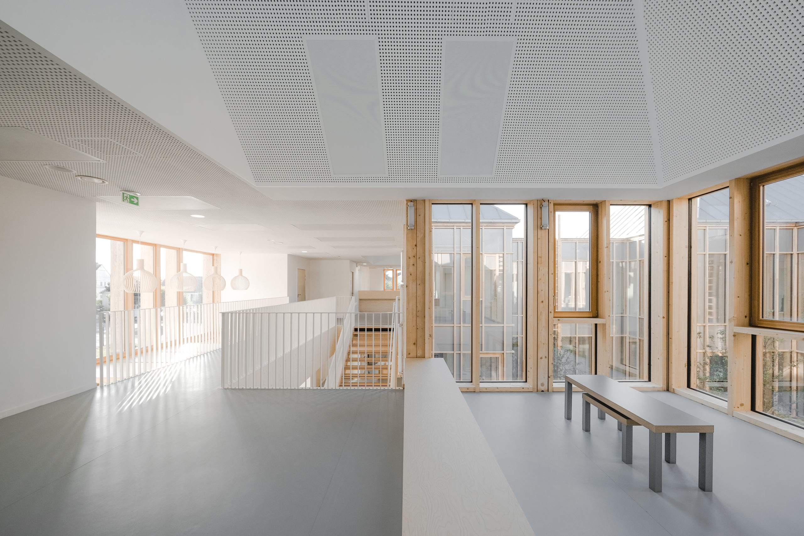
The facility is designed around a central patio, which fills the interior with natural light and allows access to a private outdoor space. The patio also doubles as a relaxing waiting area where guests are exposed to medicinal plants planted throughout the exterior. The goal was to create a space that blends well with the surrounding topography. In order to do so, the façade is made up of a mix of timber and large glass windows, which speak to the surrounding forested landscape and offers patients views of the outdoors.
 Dentist Clinic SG by Atelier Giavenale, Schio, Italy
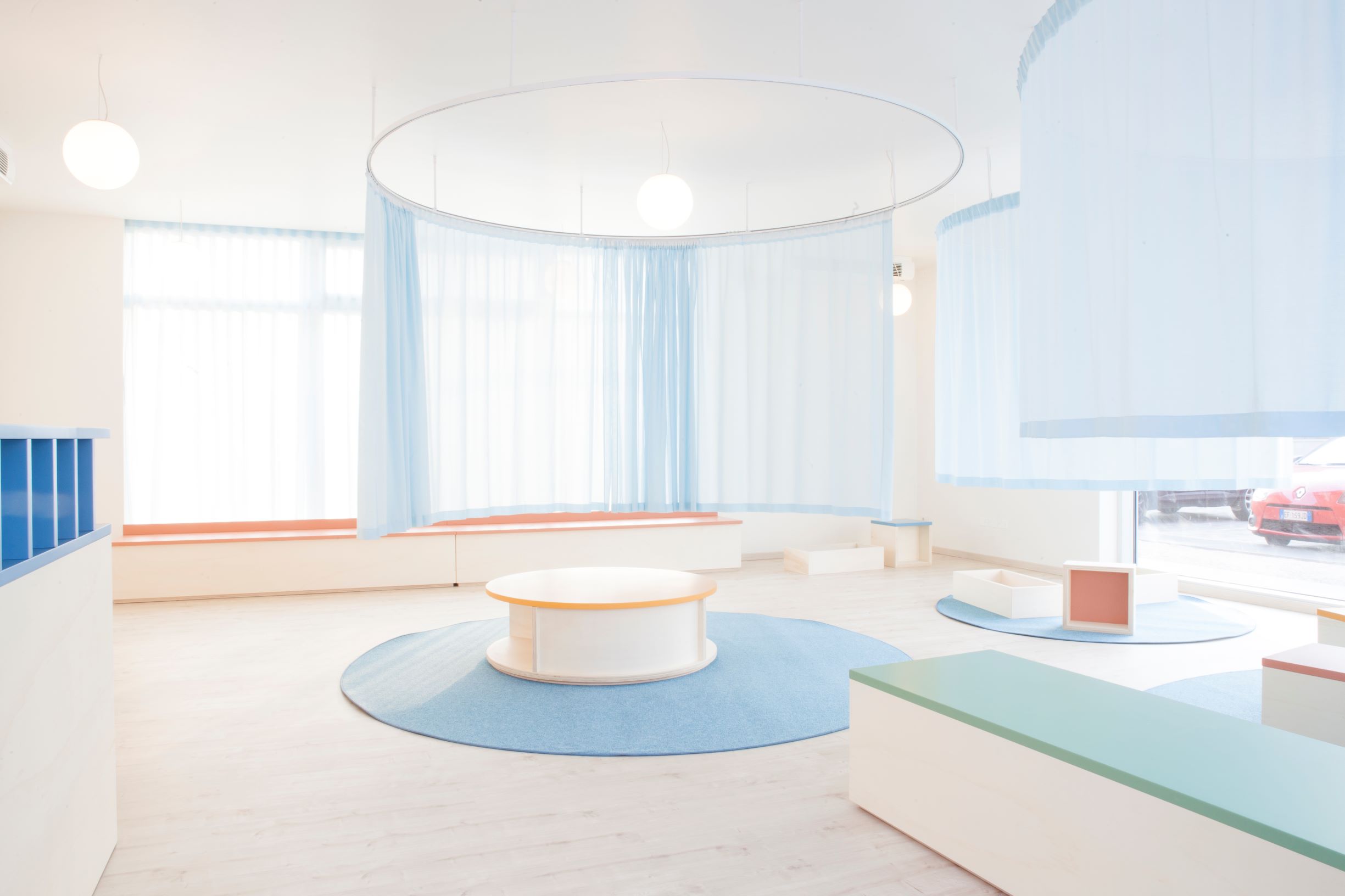
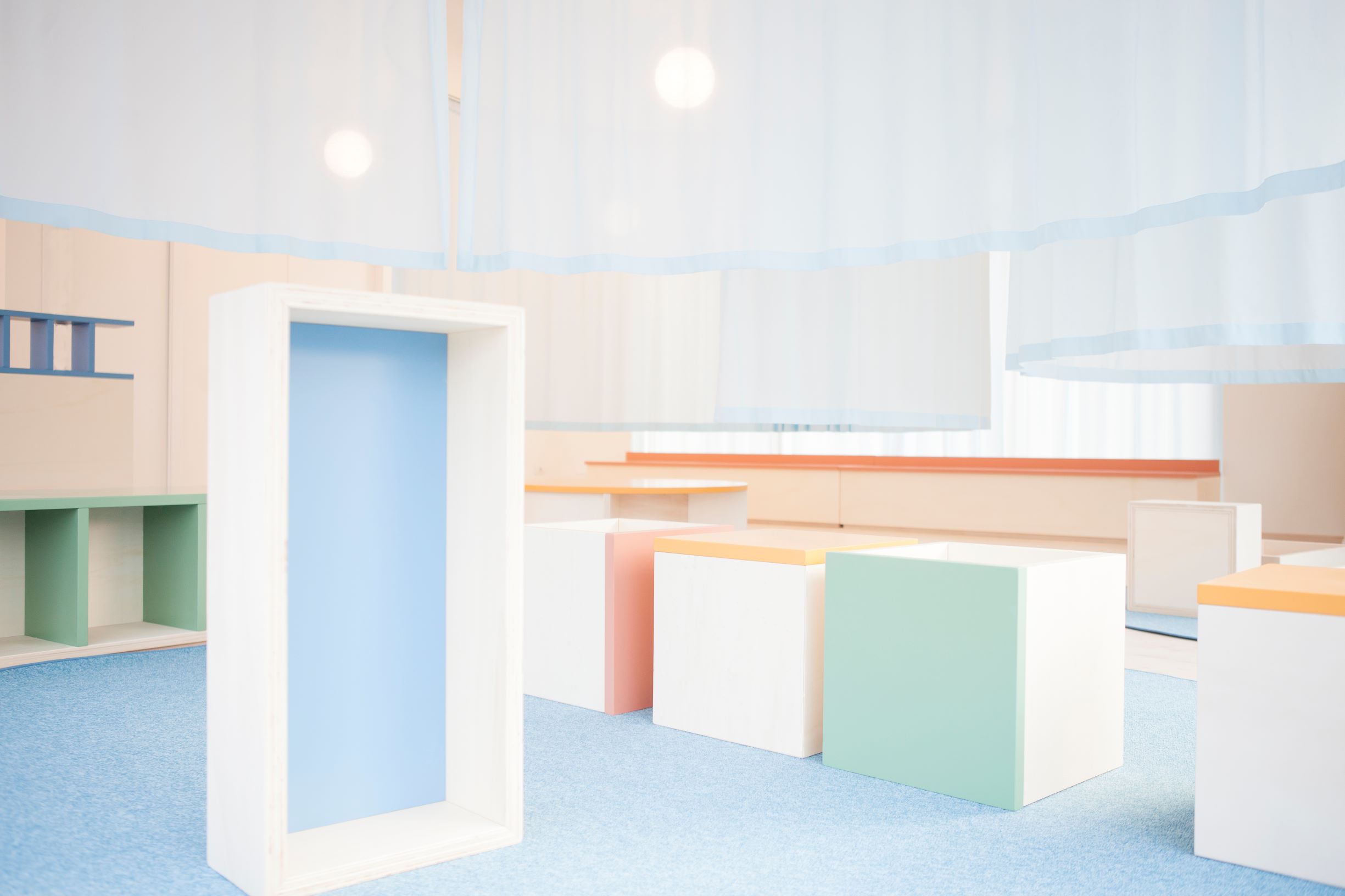
Atelier Giavenale’s playful office concept will surely take the fear out of visiting the dentist. This children’s dental office was designed with playfulness and transparency in mind. Dentist Clinic SG is a highly interactive, child-friendly space. From the furniture choices, wall paintings and overall layout, this office is equally functional as it is enjoyable for young patients.
The main reception room is configured into three separate spaces by way of hanging curtains. This allows children to play and explore the office, all the while remaining visible to their minding parents. The playful, pastel-colored space offers a calm atmosphere that distracts the young patients away from the stress and anxiety associated with a dental check-up.
Architects: Want to have your project featured? Showcase your work by uploading projects to Architizer and sign up for our inspirational newsletters.
 Dentist Clinic SG
  EKH CHILDREN HOSPITAL
  Maggie's Leeds
  Taverny Medical Centre