The judging process for Architizer's 14th A+Awards is now underway. Subscribe to our Awards Newsletter to receive updates about Public Voting, and stay tuned — winners will be announced later this spring.
Solid surfaces aren’t just for kitchens and bathrooms anymore. This synthetic, stone-like material, which first gained popularity in the sixties as a way to create seamless countertops and shapely sink basins, is finally making its way to façades around the world.
Solid surface cladding, like its interior counterpart, is created from a mixture of acrylics, pigments and resin. The result is a homogeneous material that can be sliced, scribed, sculpted and sanded without weakening its structure or its water-resistant finish. From originators like DuPont Corian, to newcomers like Krion and HI-MACS, several manufacturers have developed cladding products that have brought this remarkably versatile material to the surface.
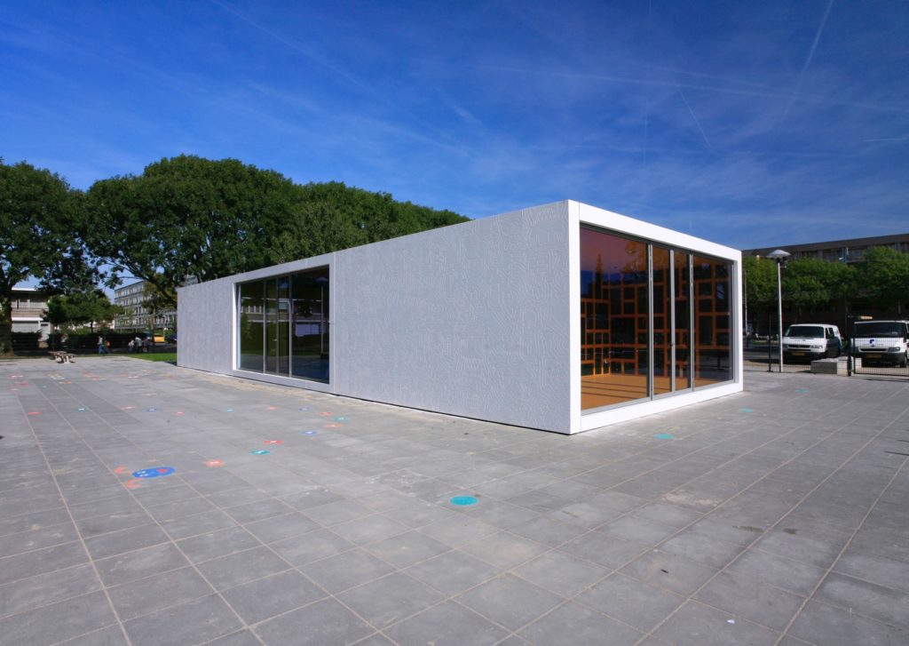
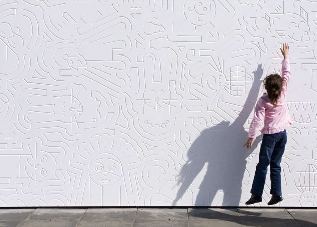 Anansi by Mulders vandenBerk Architecten, Utrecht, The Netherlands
Cladding by DuPont
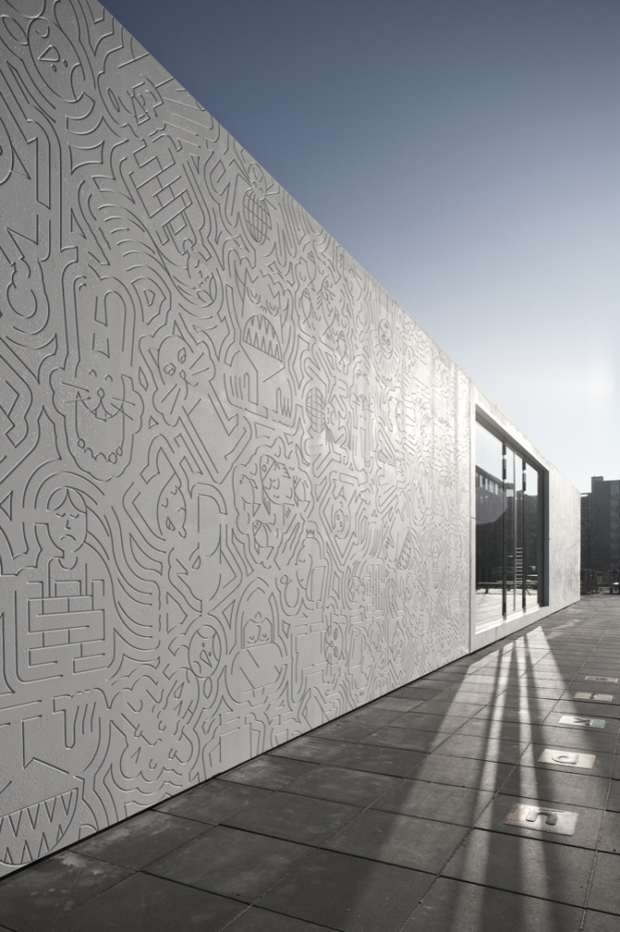
The Anansi playground pavilion sits at the heart of a busy park in Utrecht, providing the neighborhood children with three brightly colored, indoor play spaces. Its fantastical interior is belied by its minimalist façades of glass and white Corian panels. The starkness of the exterior is softened by cartoon-like drawings engraved in the solid surface cladding.
Design Arbeid, a graphic design studio, created the drawings in collaboration with local school children, transforming their descriptions of storybook characters into a lively mural. As the architects describe: “In the various panels… each drawing seems to flow into the next, creating a sort of puzzle-like pattern. As children get closer to the wall, they recognize favorite fairytales they had proposed.”
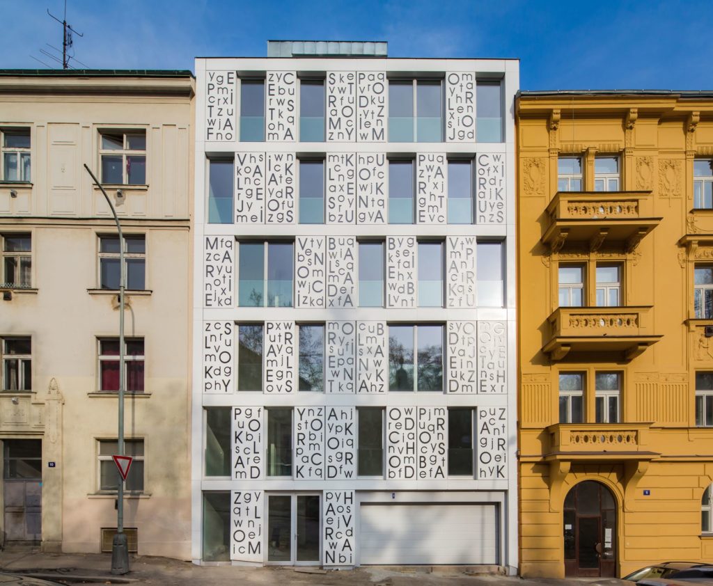
 Bieblova Apartments by P6PA+Architects, Prague, Czech Republic
Cladding by HI-MACS
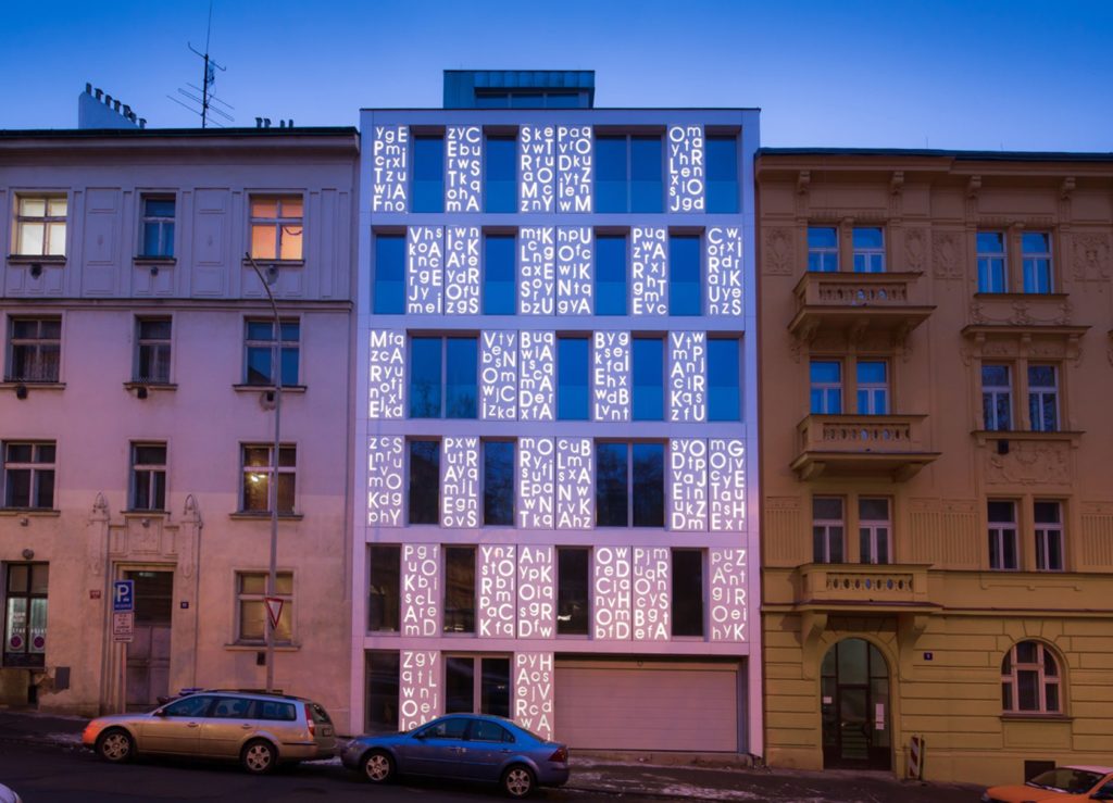
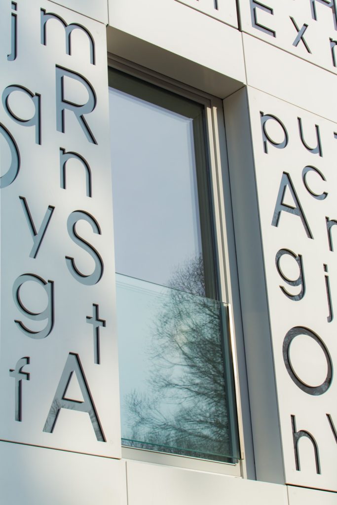
The Bieblova Apartment building, located in an old Prague neighborhood, features a contemporary façade that is cleverly rooted in the history of the city. Across the face of the building are hundreds of letters which, when read diagonally, spell out the titles of poems by Konstantin Biebl, the late Czech poet after whom the building and street are named.
This seemingly simple construction actually comprises three layers. The first is the solid surface cladding which has been carved by CNC-milling machines. Beneath the cladding is a layer of black glass which gives depth to the letters and supports the detached shapes within the typeface. Lastly, is a layer of clear glass which is backlit by LEDs, causing the words to glow as if written in light.
 Lens House by Alison Brooks Architects, London, United Kingdom
Cladding by DuPont
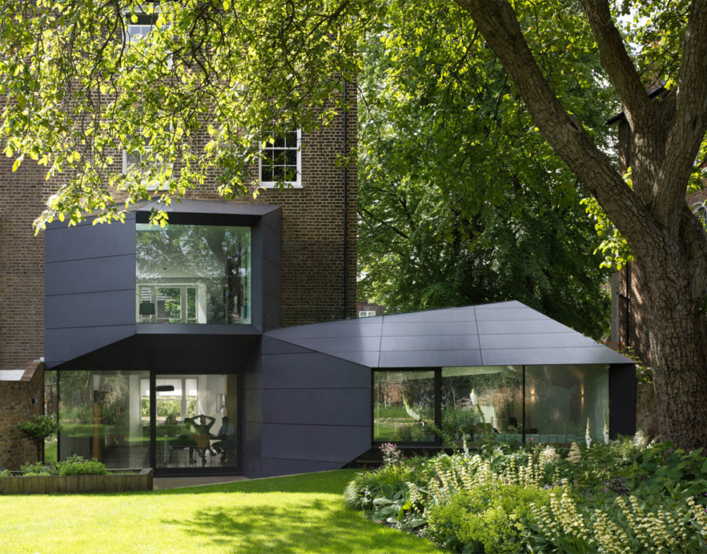
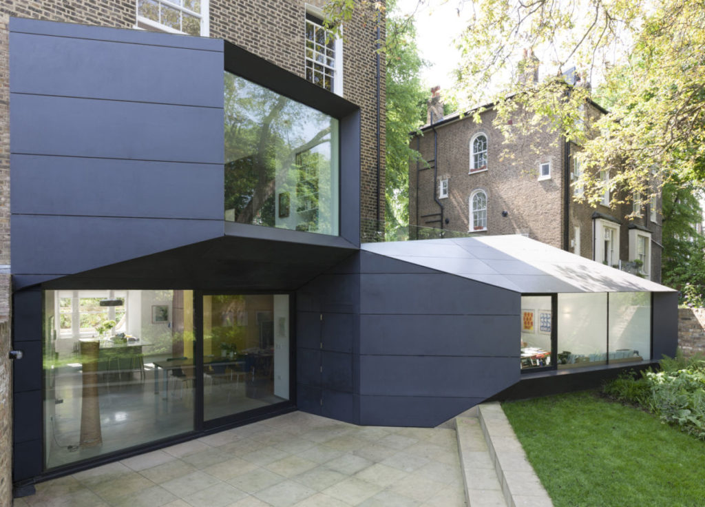
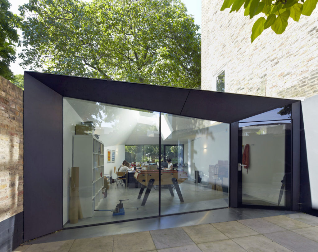
Lens House is a contemporary extension of a nineteenth century brick home. The two dark, angular volumes emerge from the original house like apertures, connecting the interior with the garden and framing views of a longstanding walnut tree. Their sloping, trapezoidal façades create, in the architect’s words, “an architecture without mass and weight… more like the folded surfaces of origami.”
The façades are clad in panels of Corian which have been cut into precise shapes and mitered together tightly. The downspouts and gutters are concealed beneath the panels, preserving the façade’s crisp angles. Beyond being durable and dimensionally stable, the angled solid surface cladding also catches the sunlight beautifully, changing from black to silvery gray throughout the day.
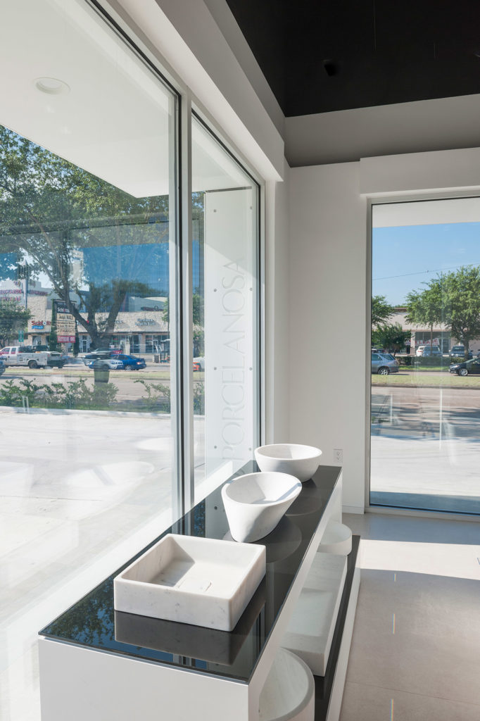 Houston Showroom by Ignacio Vidal Traver, Houston, Tex., United States
Cladding by Porcelanosa
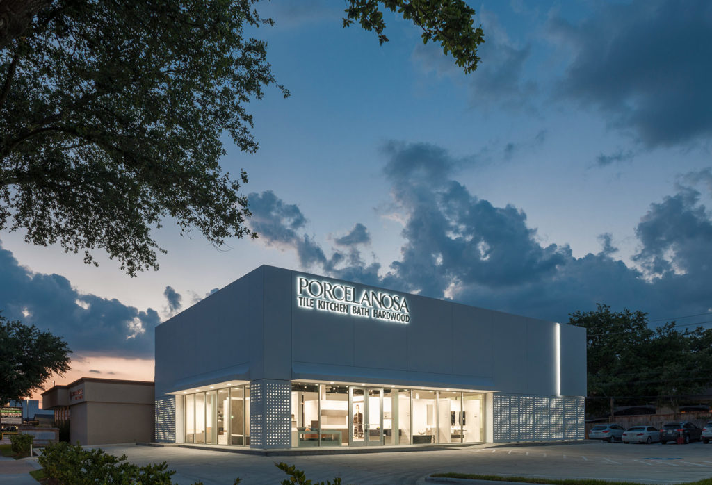
With their latest store, Porcelanosa, a manufacturer of kitchen countertops and bathroom fixtures, has taken the concept of a showroom to its extreme. In addition to displaying their products on the interior, the entire exterior is clad in Krion, their patented solid surface material.
The building was designed by in-house architect Ignacio Vidal Traver and marks the first time Krion has been specified as a façade covering. The upper portion of the façade is clad in enormous Krion panels, one of which is backlit, revealing its slim profile. Above the entrances, curved awnings of thermoformed Krion provide shade from the Houston sun while, below, perforated Krion louvers filter natural light into the showroom. For a more in-depth look at this project, check out Solid-Surface Façades: How One Company Puts Its Own Product to the Test.
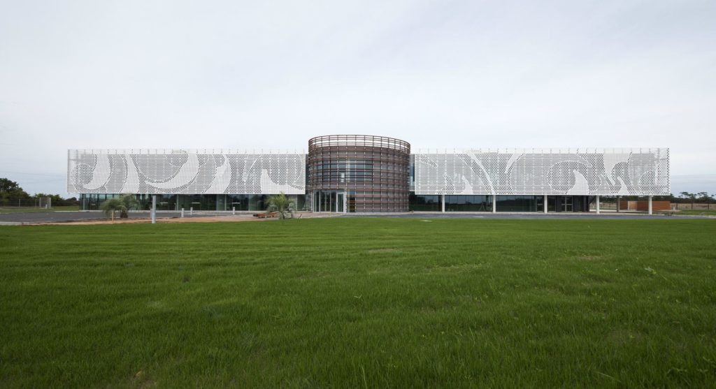
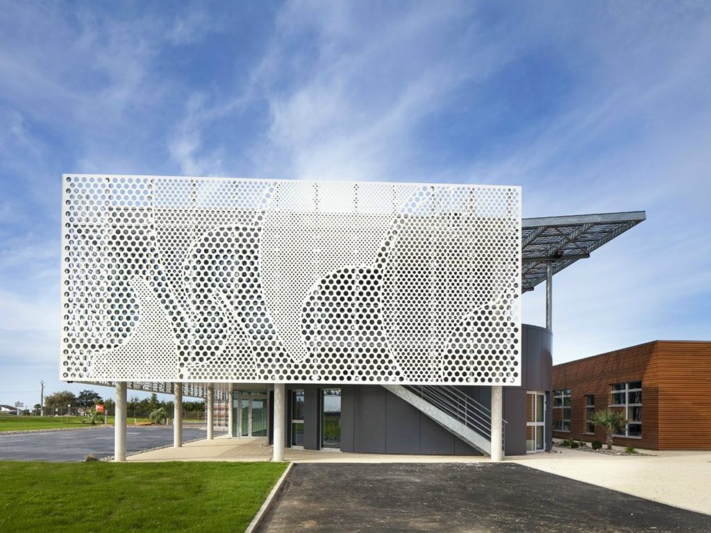
 Beneteau Headquarters by PAD, Givrand, France
Cladding by HI-MACS
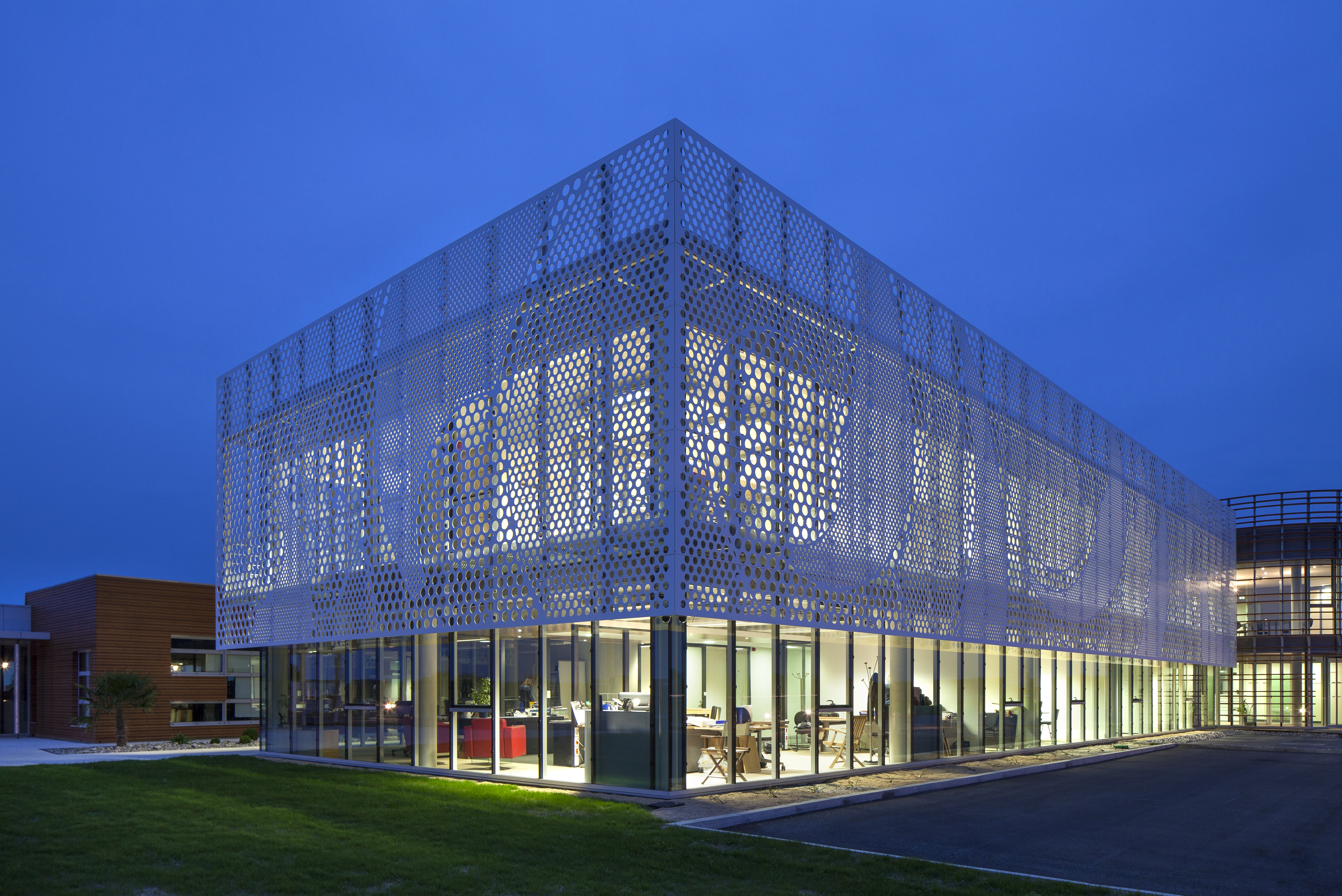
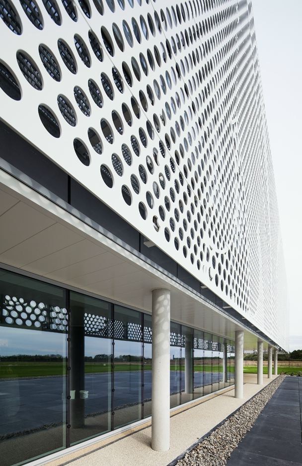
The new headquarters of Beneteau, a leading manufacturer of luxury sailboats and motor yachts, comprises two administrative buildings connected by a long, glass bridge. The glazing’s extensive southern exposure is mitigated by a large, perforated screen which shields the building from solar heat gain while allowing daylight to flood the offices.
The screen is constructed of HI-MACS, a product Beneteau has often used to create elegant and waterproof yacht bathrooms. The material’s strength allowed 50% of screen to be perforated without losing rigidity, and its workability allowed designers to vary the size of the perforations in an irregular pattern. From up close, this pattern resembles the company’s logo: the abstract silhouette of a seahorse. From a distance, it “gives the impression that the façade is moving, like a wave coming to cover and protect the building.”
The judging process for Architizer's 14th A+Awards is now underway. Subscribe to our Awards Newsletter to receive updates about Public Voting, and stay tuned — winners will be announced later this spring.
