Architects: Want to have your project featured? Showcase your work by uploading projects to Architizer and sign up for our inspirational newsletters.
Who says you can’t teach concrete new tricks? As the most widely used manmade material today, concrete transcends both climate and style. A material equally comfortable as flat foundations and parametric roofs, concrete takes shape through formwork, aggregates and reinforcement. The ubiquitous material can be as expressive and versatile as it is durable. Today, contemporary designs reimagine concrete’s accepted applications through texture, pattern and form, especially within the building envelope.
Creating solid concrete architecture that’s unexpected requires a rich understanding of the material’s construction methods. Showcasing distinct building techniques within the façade, the following projects create innovative concrete envelopes that are both rigorously detailed and unconventional. These solid façades question the boundaries between interior and exterior to break from tradition.
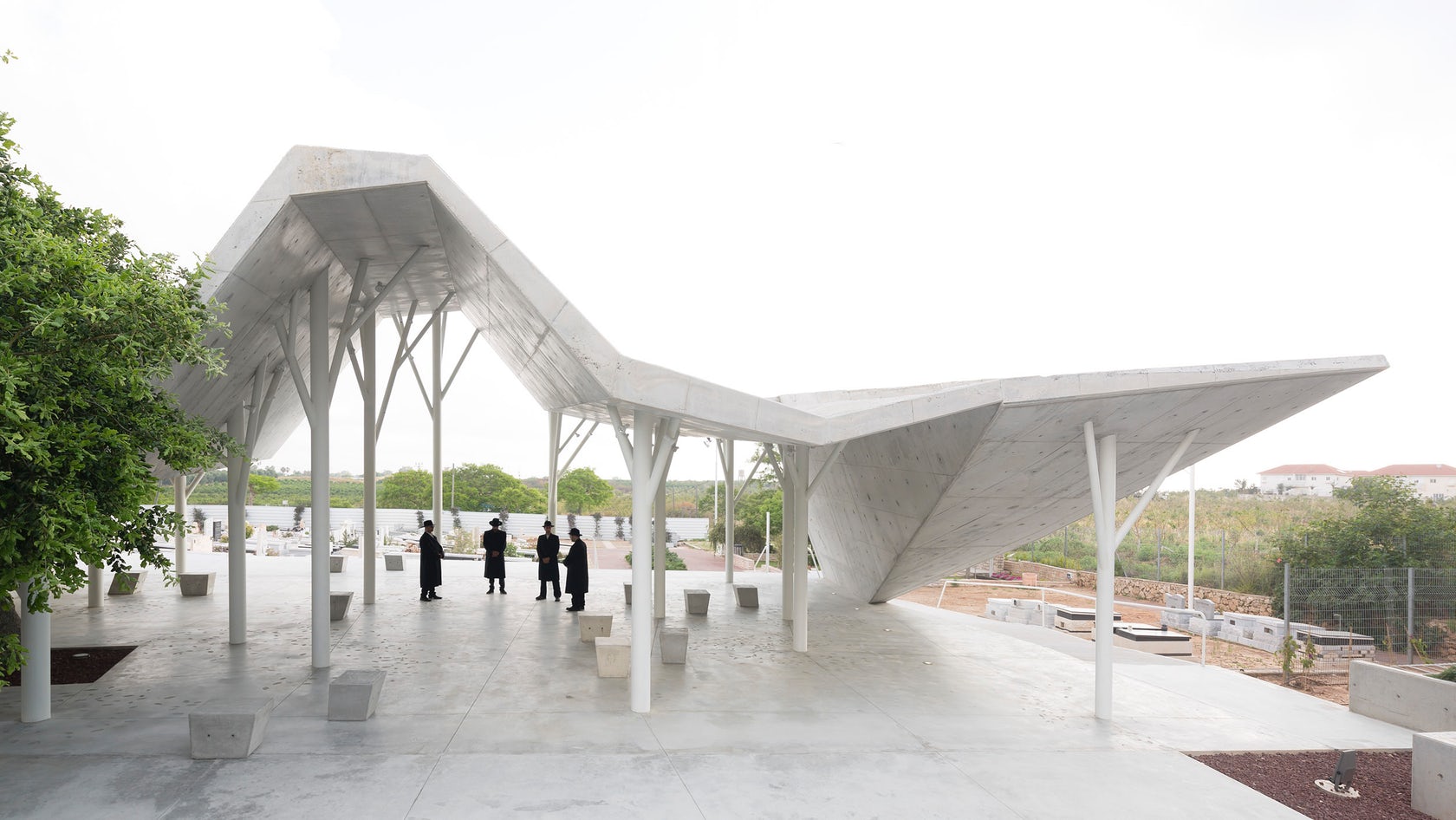
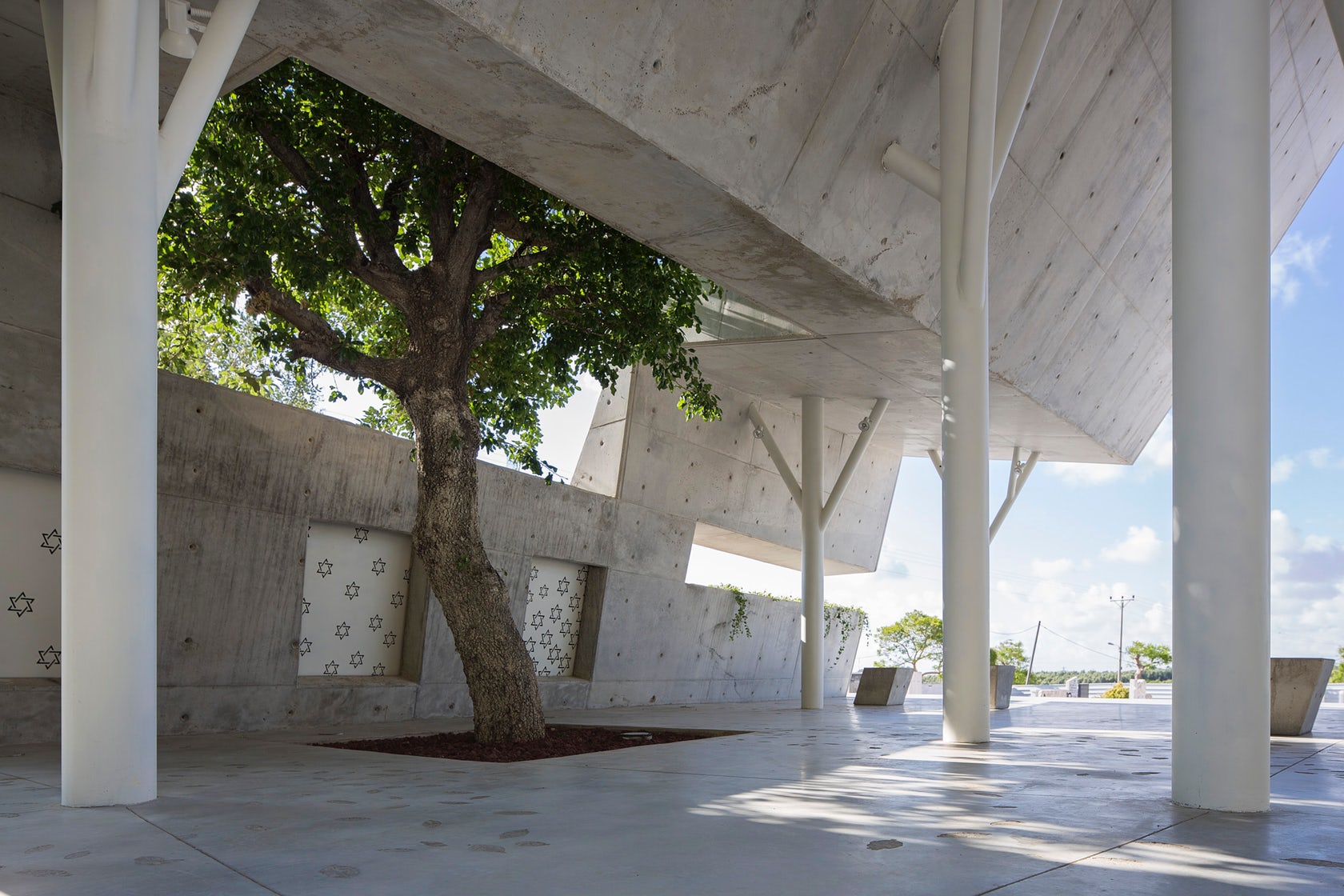 Open-Sided Shelter by Studio for Architecture & Design Ron Shenkin, Pardesiya, Israel
Designed as a structure that accommodates both mourners and eulogy readings, this delicate shelter is sited among a former orchard that was raised to make space for urban repurposing. Built with two entrances, the project allows easy access to the building. The design is positioned to allow mourners to remain at a distance while observing proceedings.
Made with an exposed concrete slab that symbolizes construction, the project is held up by pillars that recall the site’s history and the trees that were cut down. The continuous concrete structure has one solid wall to the west which serves to block any direct afternoon sunlight except what is allowed through via a long narrow window. On the northern side of the building there is a line of concrete, beginning in the ground on the west side and climbing up through the window. The concrete form ascends to the roof, ceilings and walls and making its final decent back to the ground.
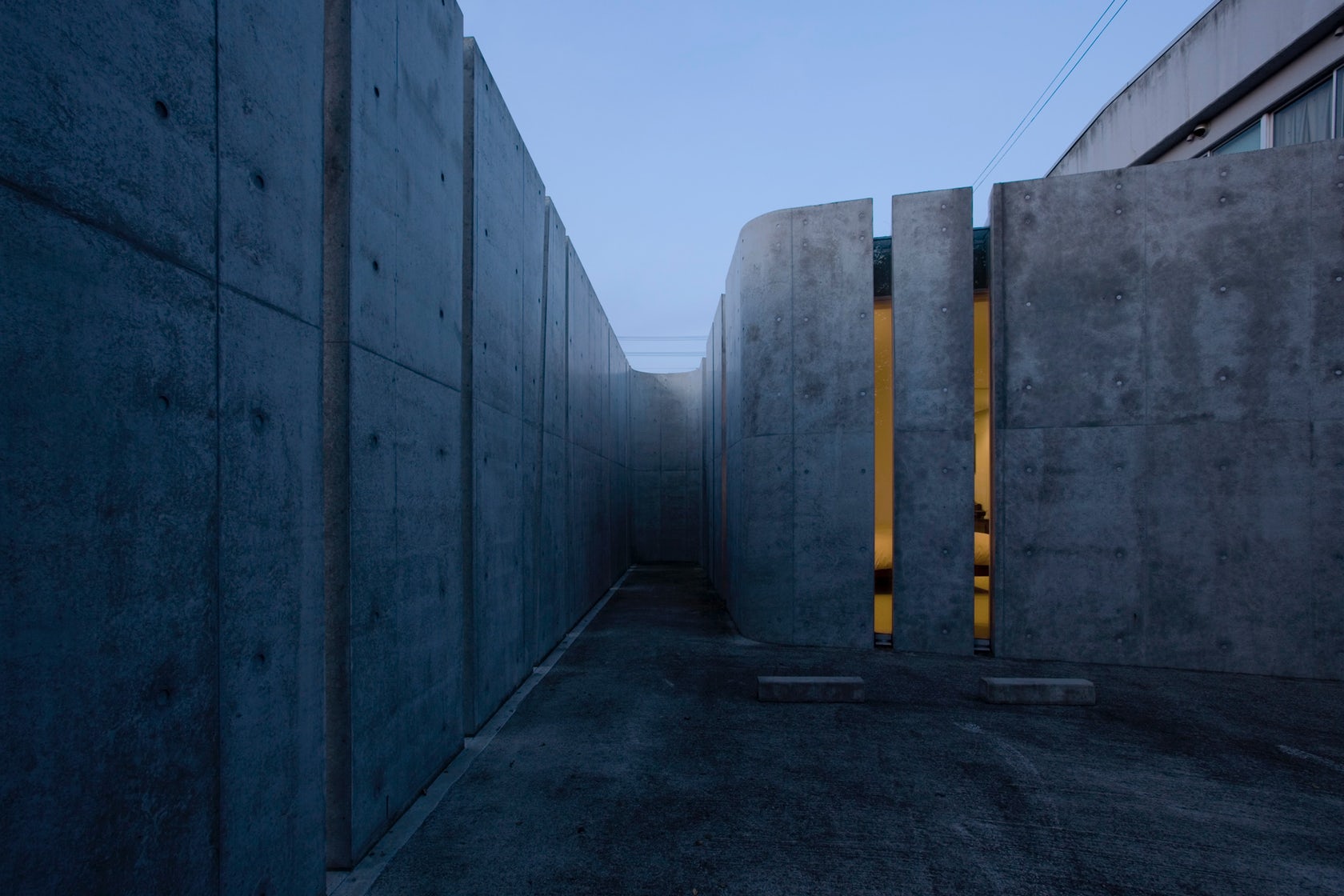
 Slit House by EASTERN Design Office, Shiga Prefecture, Japan
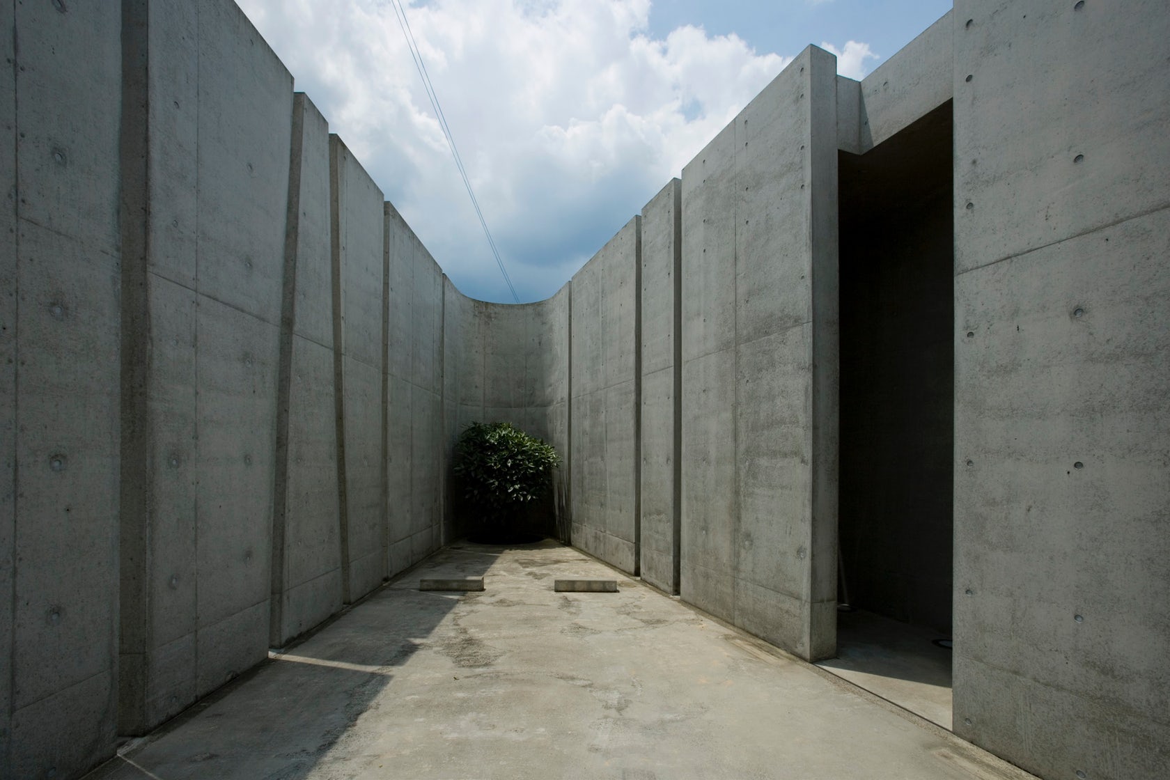
Slit house was designed as a challenge to the archetypical “window.” The entirety of the house and façade has no windows; instead, it has 60 thin slits along its length. Light is carefully controlled through the slits, heightening inhabitants’ sensitivity to light conditions and quality. The formal play between light and mass, solid and void was explored as a constructed method to compose architecture.
The solid concrete façade runs a length of 105 meters and achieves spatial quality through absence. The conceptual sculpturing of the concrete and each space proposes an alternative to contemporary glass designs. Views are controlled by the concrete, instead favoring light in the context of the old Japanese city. The effect is a sense of nostalgia in Japanese spatiality and a silent ambiance. The smooth concrete was achieved through a careful formwork design that left a series of imprinted control joints.
 Spring Street Salt Shed by Dattner Architects, New York, NY, United States
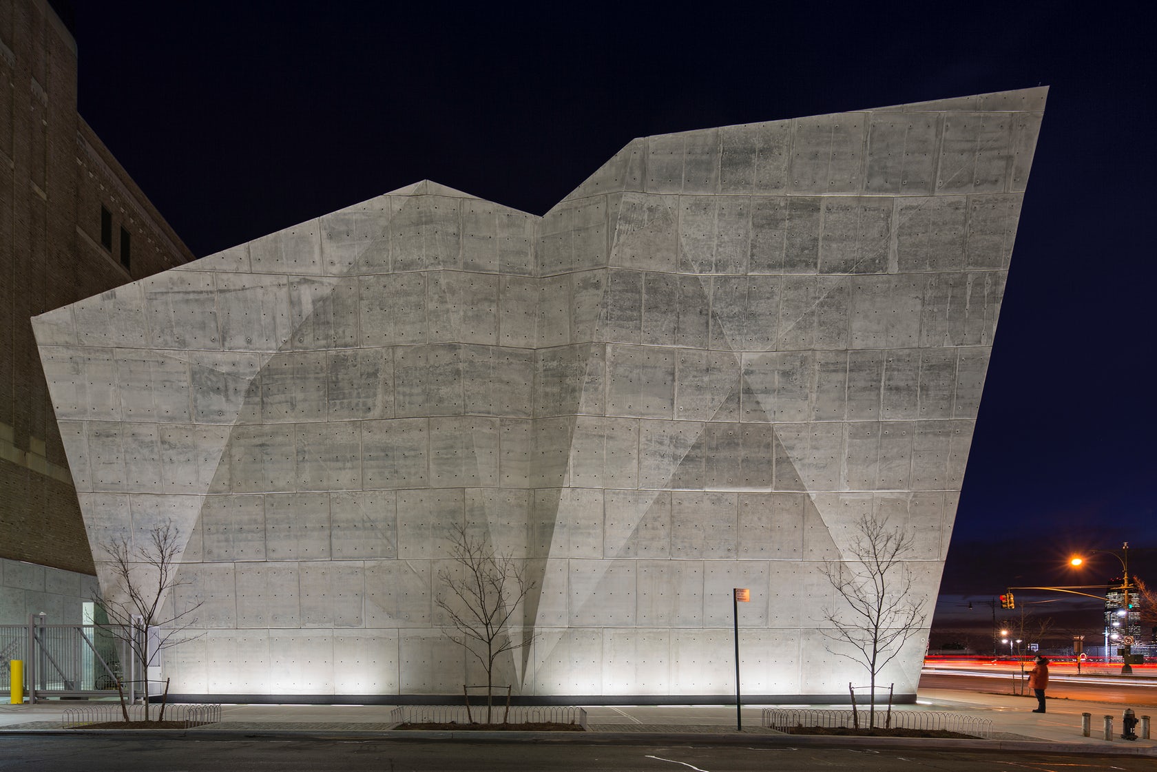
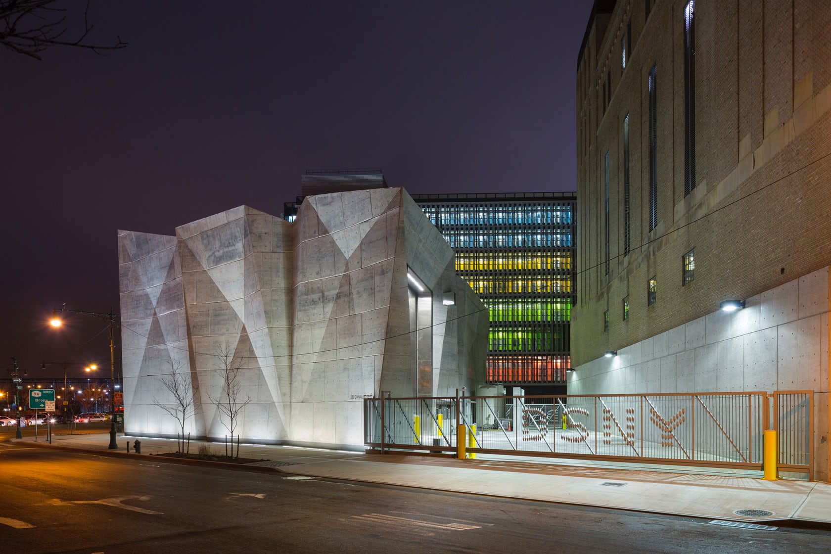
The Spring Street Salt Shed is a lesson in rethinking the everyday. Located at the terminus of Canal Street at the Hudson River, this crystalline, utilitarian structure was formed with faceted concrete planes to house 5,000 tons of salt. The result is a highly visible, elegant structure. Built for the New York Department of Sanitation, the shed is the first fully enclosed shed commissioned by the department.
The cast-in-place solid concrete structure tapers toward the bottom — creating more pedestrian space — and rises from a glazed moat that is illuminated at night. The walls of the shed rise to meet programmatic demands of salt storage; the structure accommodates salt’s resting angle of repose. The interior of the shed is shaped so that the salt can naturally assume a slanting position. With six foot thick walls, the concrete structure was also built with steel plating to prevent damage from trucks moving in and out. The concrete’s blueish hue comes from slag, and as the walls are exposed to sunlight the structure will eventually begin to resemble the color of salt.
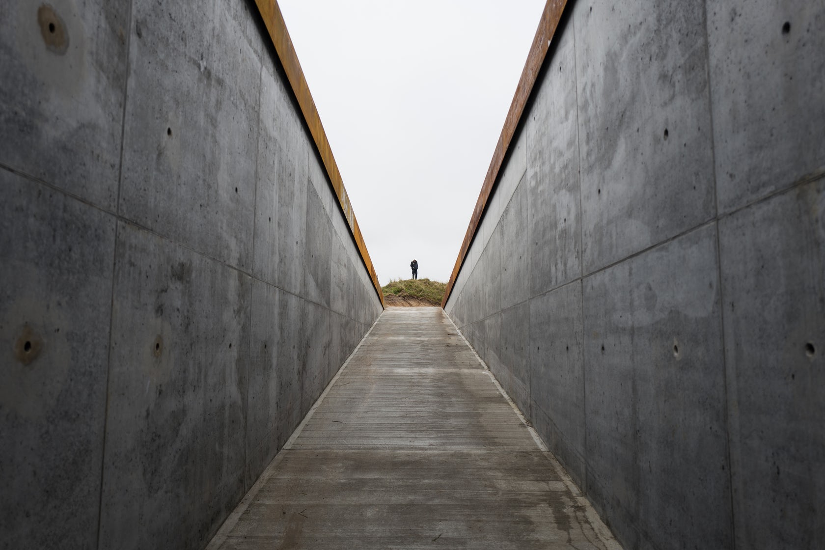 TIRPITZ by BIG – Bjarke Ingels Group, Blåvand, Denmark
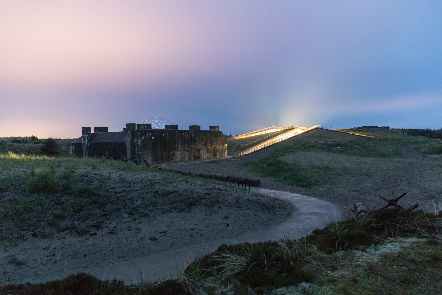
Designed to transform and expand a historic German WWII bunker into a groundbreaking cultural complex, TIRPITZ was designed by BIG as a single, seamless structure embedded in the landscape. Located among the protected shorelands of Blåvand in western Denmark, the project was created as an antithesis to the heavy volume of the WWII bunker. The museum rises as a series of cuts in the landscape, camouflaged within the land. The surrounding heath-lined pathways cut into the dunes from all sides, and the paths converge into a central clearing that allows daylight and air into the museum.
Solid concrete was used in the project to recall the bunker while reimagining its material associations. This combines with the other three main materials and elements which are also found in the existing structures and natural landscape of the area – steel, glass and wood. The walls of the exhibition rooms are made of concrete cast onsite, supporting the landscape and carrying the cantilevered roof decks. These concrete walls support the complex roof structure is engineered by Swiss Lüchinger+Meyer.
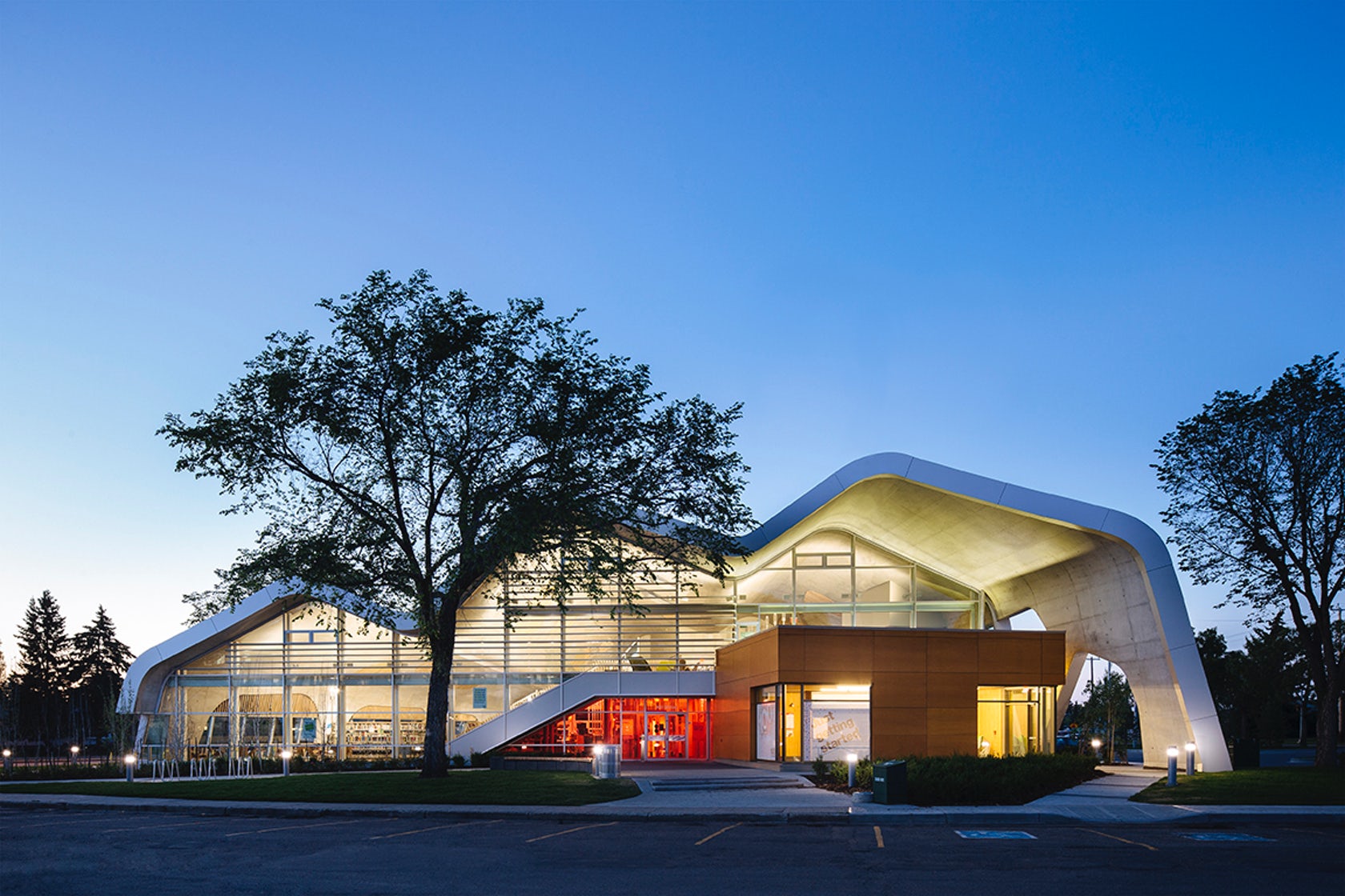
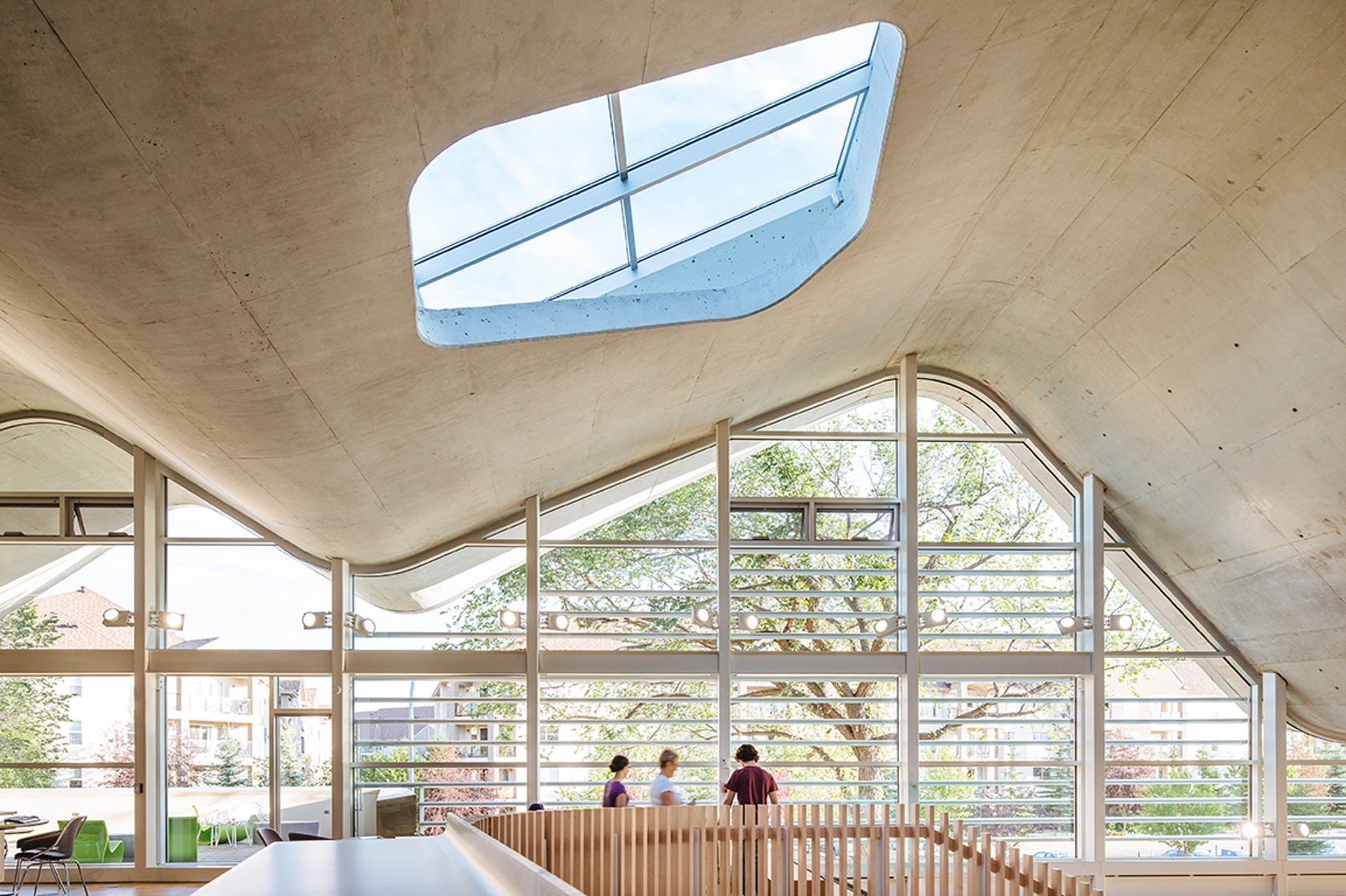 Jasper Place Branch Library by Dub Architects and HCMA Architecture + Design, Edmonton, Canada
Inspired by the idea of a library with no books, the Jasper Place Branch Library was formed as a new, flexible social hub within an older suburban neighborhood. Shifting the focus from housing book collections to maximizing gathering areas, the design is organized by a large social space sheltered by a column-free undulating roof form. The space includes a continuous raised floor that eliminated the need for mechanical/electrical services at roof level, as well as a folded ground plane that encompasses “back of house” functions.
The continuous, solid concrete roof form incorporates cast-in-place concrete on piles, with a large-scale folded-plate concrete roof that spans the space through curvilinear folds. The roof is punctuated by skylights and is designed to shed water though the peaks and troughs of the folded plate. The plane lowers down to the ground on the east and west sides to control excessive heat gain from low angle summer sun. The resulting form creates diverse spatial conditions around an inviting and memorable public space.
Architects: Want to have your project featured? Showcase your work by uploading projects to Architizer and sign up for our inspirational newsletters.
