The judging process for Architizer's 14th A+Awards is now underway. Subscribe to our Awards Newsletter to receive updates about Public Voting, and stay tuned — winners will be announced later this spring.
Herzog & de Meuron is a design powerhouse. Founded by Jacques Herzog and Pierre de Meuron in Basel, Switzerland, the practice values an “open, impartial approach to projects” that reconsiders context, history, materials, and more. Together, the duo was chosen to share the 2001 Pritzker Architecture Prize. As the prize jury chairman, J. Carter Brown, commented, “One is hard put to think of any architects in history that have addressed the integument of architecture with greater imagination and virtuosity.” Now, over 20 years later, their firm includes 600 individuals from 35 countries and continues creating some of the most iconic architecture in the world.
Today, Herzog & de Meuron have projects built and under construction across Europe, North and South America and Asia. These include designs that range from the small scale of a private home to the large scale of urban design. The following projects highlight renderings from Herzog & de Meuron‘s portfolio juxtaposed with the completed, built architecture. Comparing rendering and reality, they showcase how one of the world’s best architecture firms is bringing critical and elegant projects to life in a design tour de force.
VitraHaus
Weil am Rhein, Germany
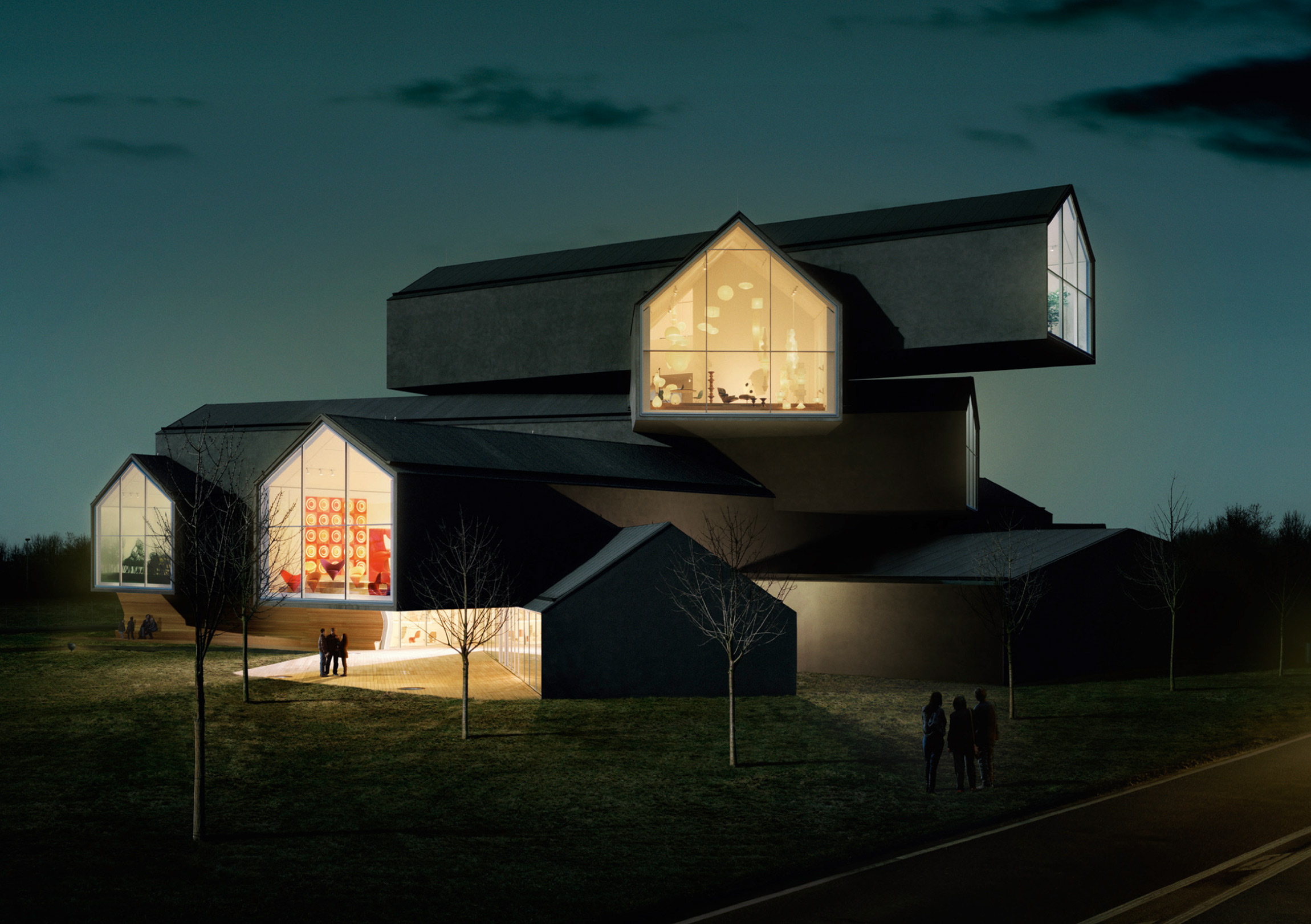
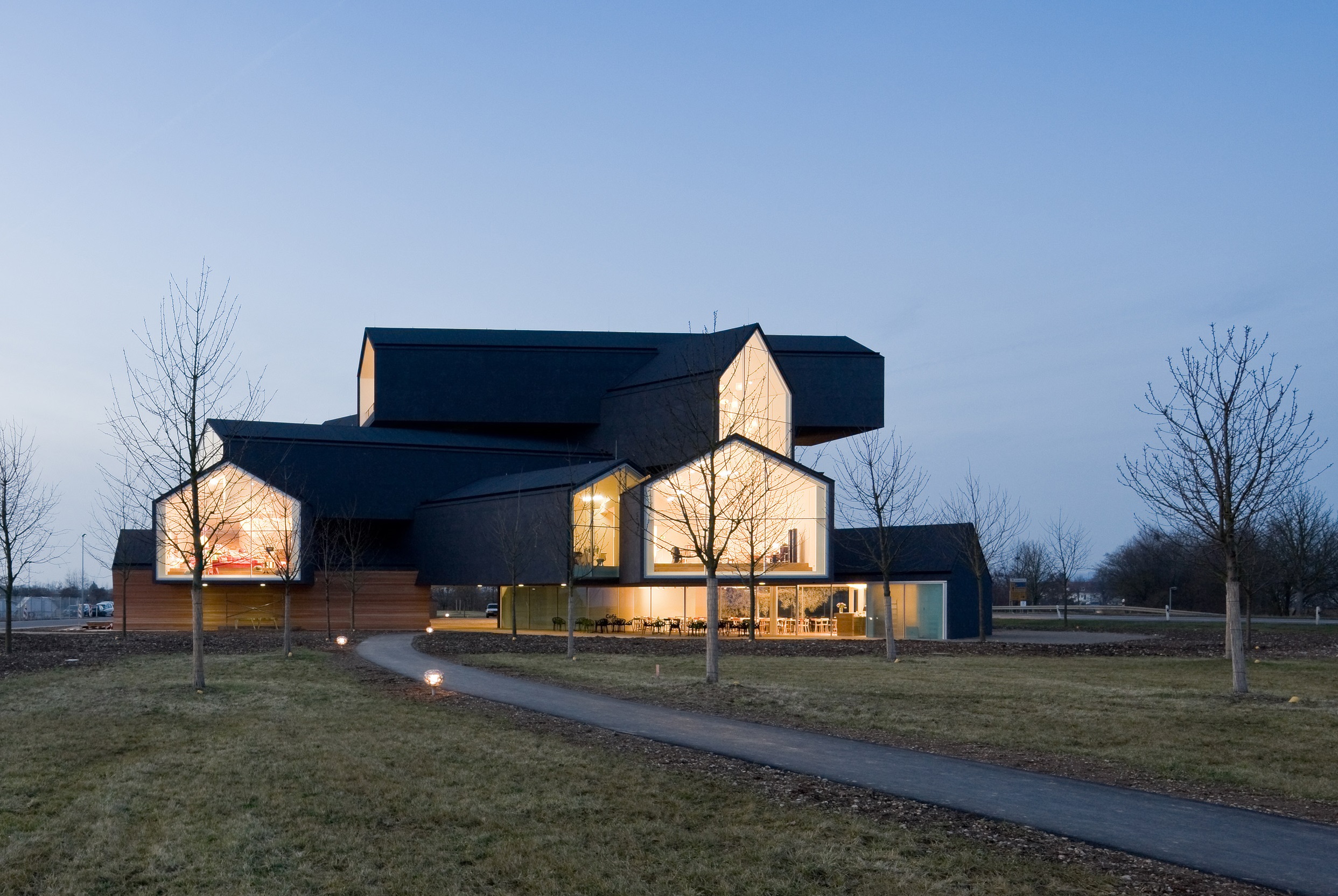 Vitra launched its Home Collection in 2004 with a new target group in mind: individual customers with an interest in design. Since no interior space was available for the presentation of the Home Collection on the Vitra Campus in Weil am Rhein, the company commissioned Basel-based architects Herzog & de Meuron in 2006 to design the VitraHaus. Thanks to its exposed location and striking appearance, it not only enhances the already outstanding ensemble of Vitra architecture, but assumes the important role of marking the Vitra Campus.
As the rendering and finished building show, the two mirror one another. The concept of the VitraHaus connects two themes that appear repeatedly in the oeuvre of Herzog & de Meuron: the theme of the archetypal house and the theme of stacked volumes. In Weil am Rhein, it was especially appropriate to return to the idea of the ur-house, since the primary purpose of the five-story building is to present furnishings and objects for the home.
Tate Modern Switch House
London, United Kingdom
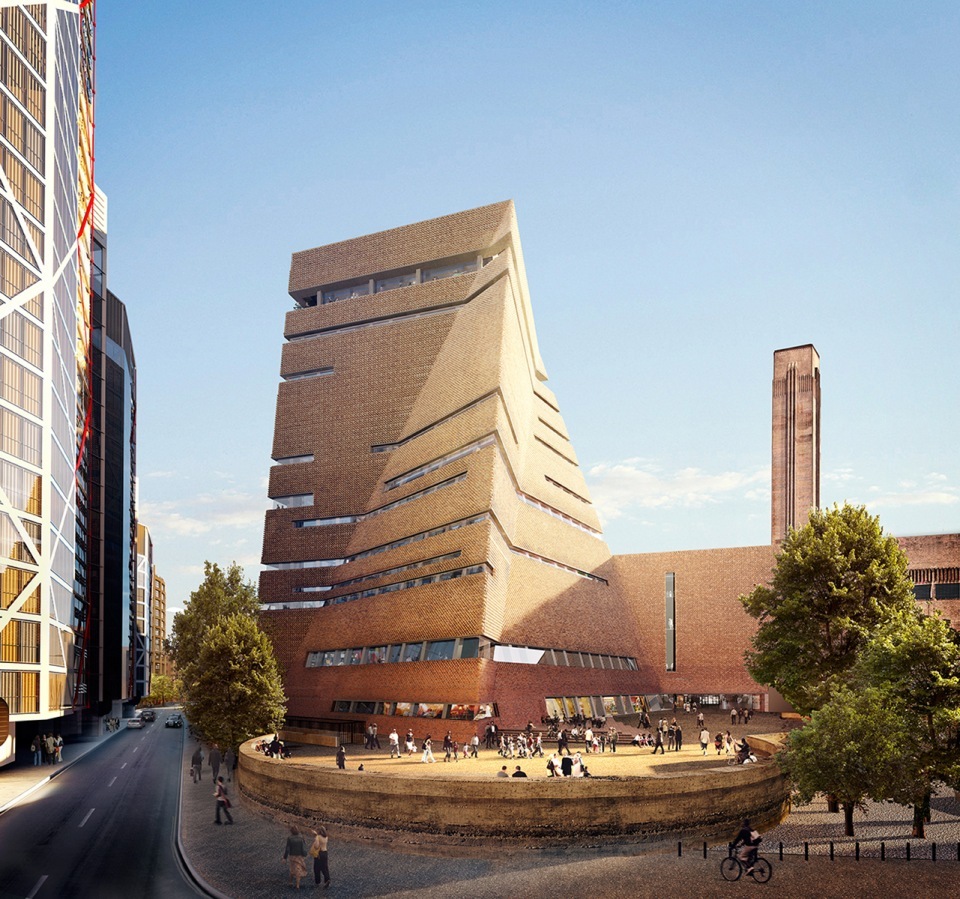
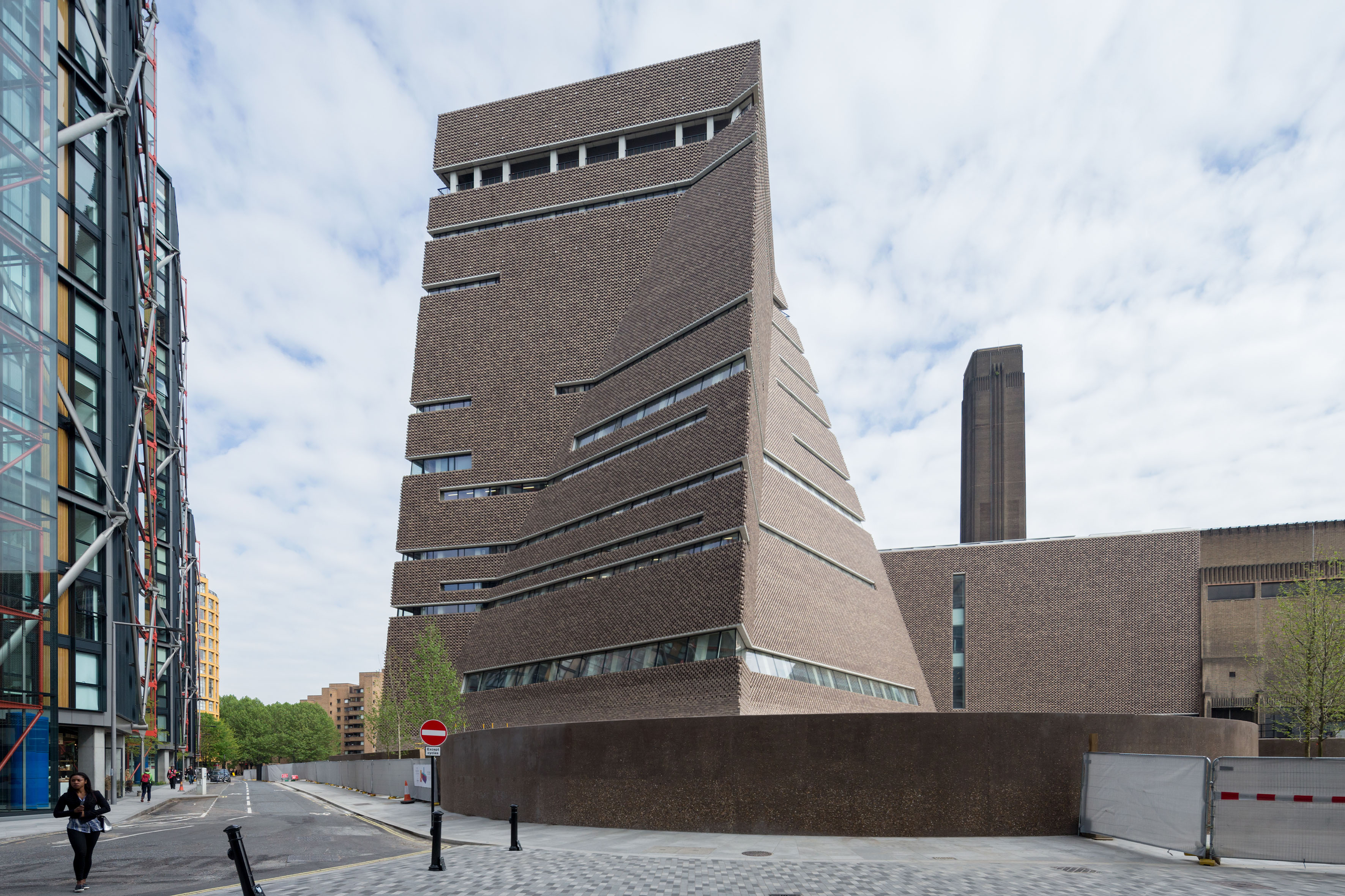 The new Tate Modern Switch House was designed to enhance the original structure and be a model for museums in the 21st century. The new building added 60% more space and opens up the museum to the area around it. Tate Modern changed London when it first opened in 2000. Herzog & de Meuron transformed the derelict Bankside Power Station into a home for the UK’s collection of international modern and contemporary art, sparking local regeneration and creating a new landmark on the Thames.
2016 marked the next phase in Tate Modern’s evolution, with the opening of a new 10-story building to the south of the Turbine Hall on the site of the power station’s former Switch House. The new Switch House building is rooted in the cylindrical underground Tanks, each measuring over 98 feet (30 meters) across and providing the world’s first museum spaces dedicated to live art, installation and film. They form the physical foundations of the Switch House and the conceptual starting point for it, offering new kinds of spaces for a new kind of museum.
56 Leonard Street
New York, NY, United States
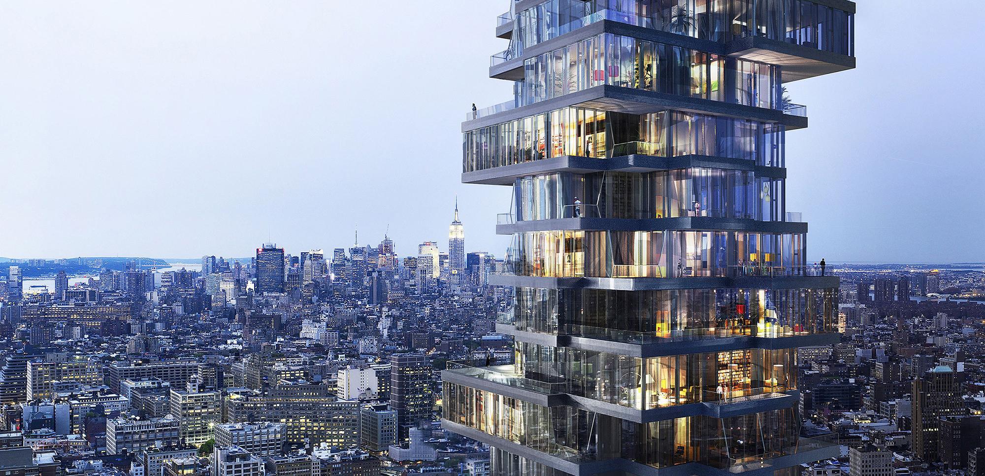
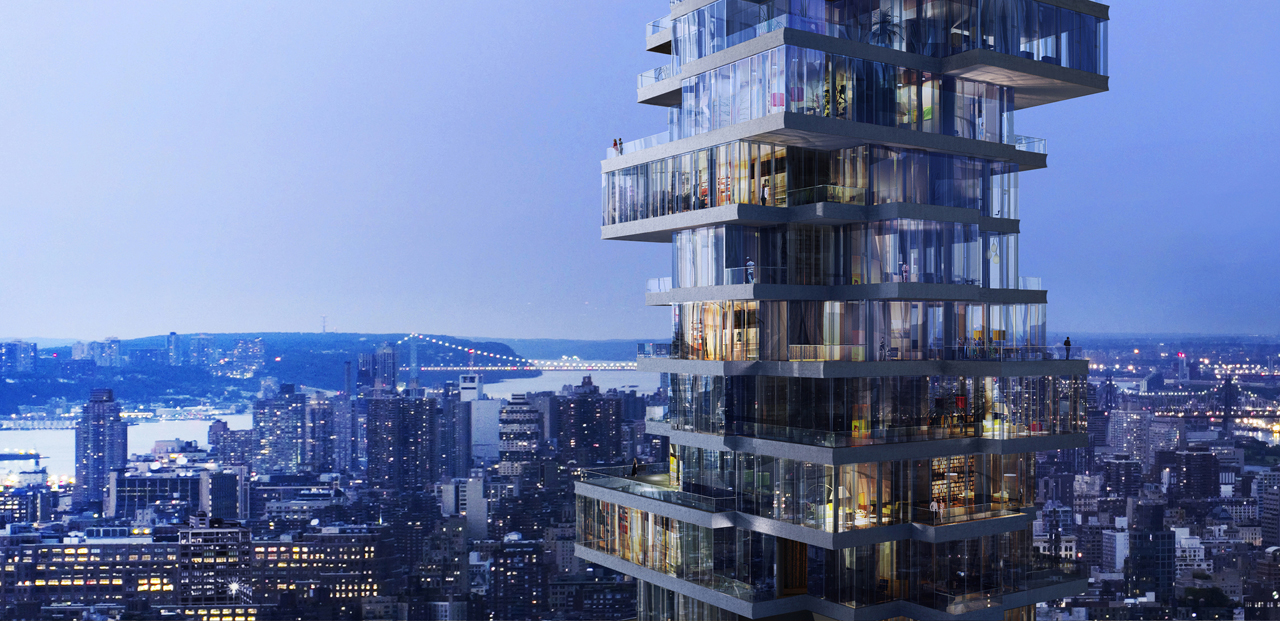
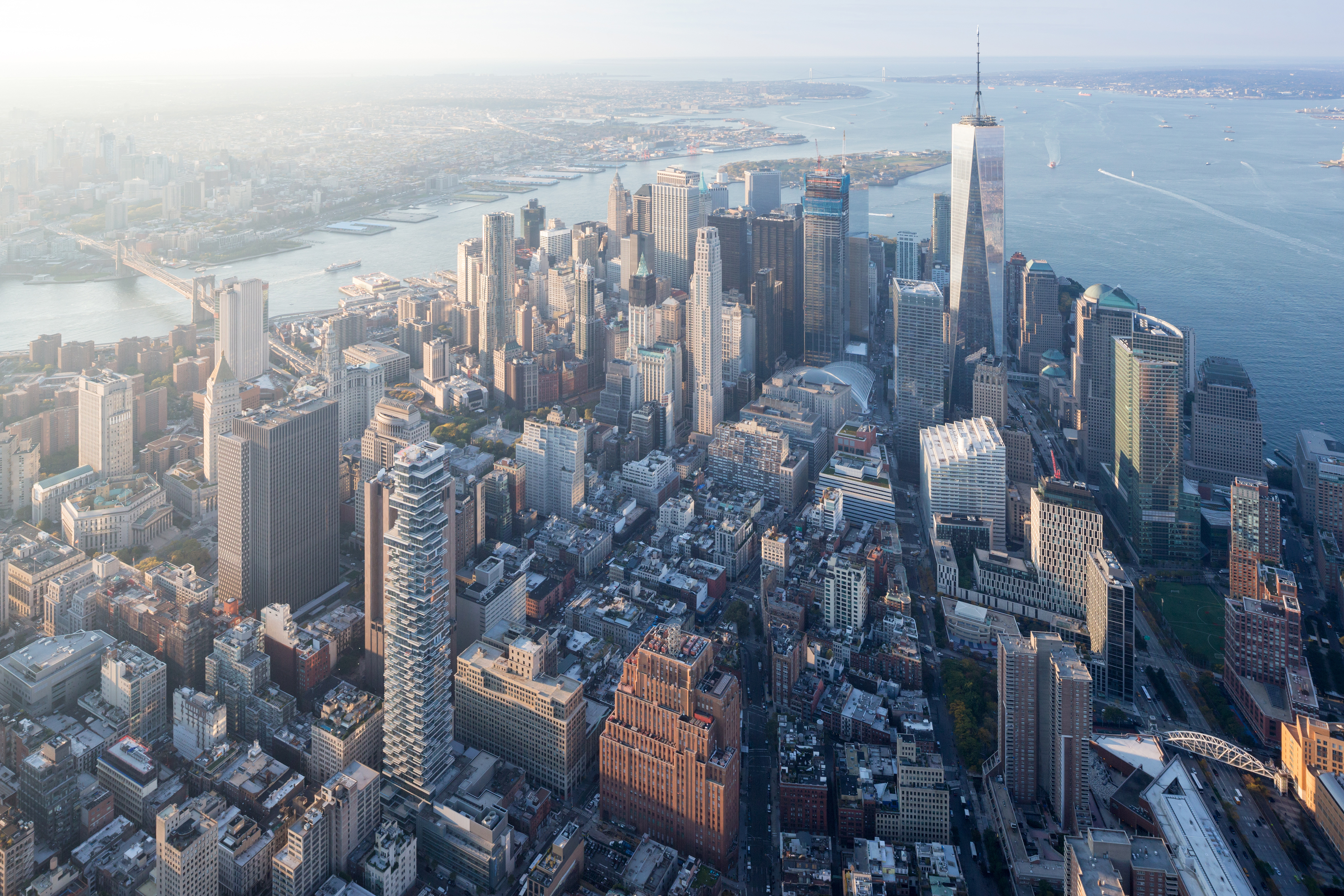 For 56 Leonard Street, the high-rise tower is conceived as a stack of individual houses, where each house is unique and identifiable within the overall stack. As the team noted, an investigation of local construction methods revealed the possibility of shifting and varying floor-slabs to create corners, cantilevers and balconies — all strategies for providing individual and different conditions in each apartment.
At the base of the tower, the stack reacts to the scale and specific local conditions on the street, while the top staggers and undulates to merge with the sky. In-between, the staggering and variation in the middle-levels is more controlled and subtle, like in a column shaft. To break-up the tendency towards repetition and anonymity in high-rise buildings, the project began with individual rooms, treating them as “pixels” grouped together on a floor-by-floor basis. These pixels come together to directly inform the volume and to shape the outside of the tower.
CaixaForum
Madrid, Spain
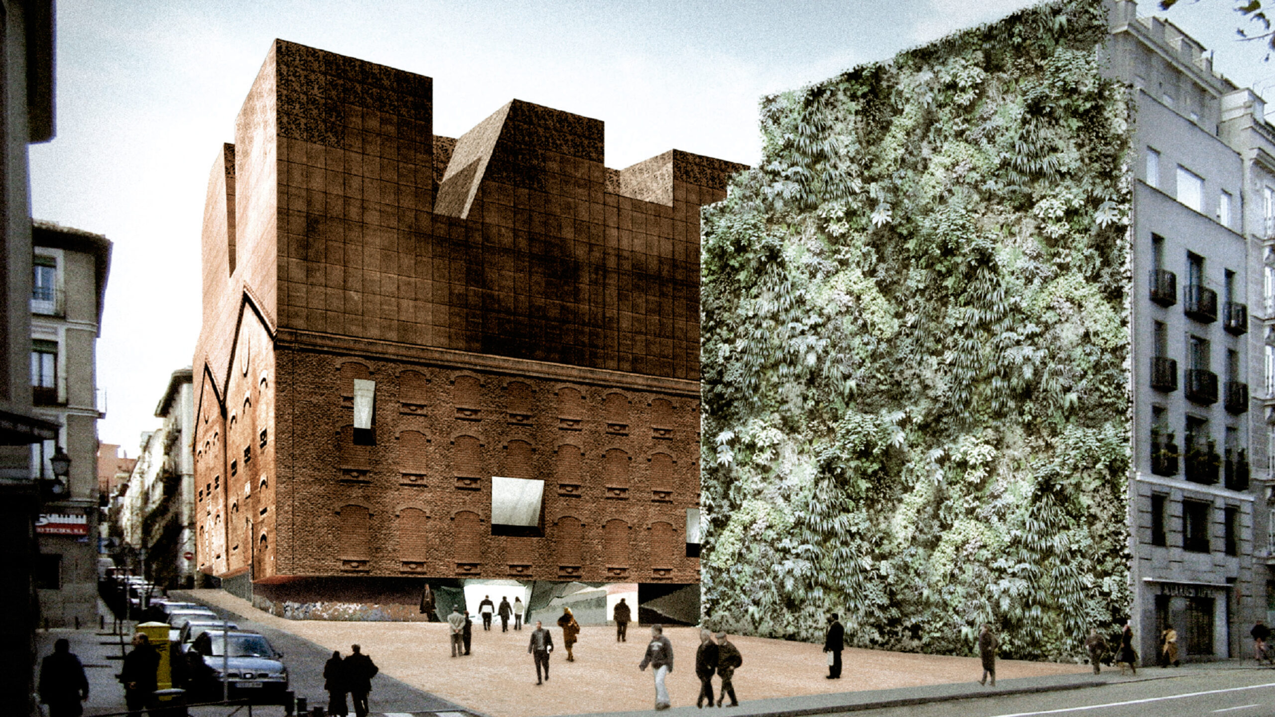
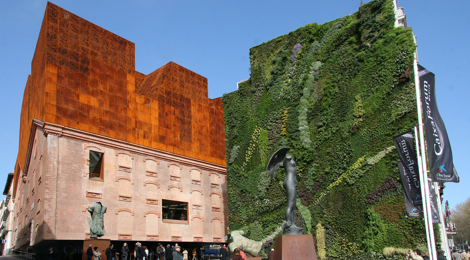 Designed to be an urban magnet, the CaixaForum was made to attract not only art-lovers, but all people of Madrid and from outside. It includes not only CaixaForum’s cultural program, but also the building itself, insofar that its heavy mass is detached from the ground in apparent defiance of the laws of gravity and, in a real sense, to draw visitors inside. The only material of the old power station that the team could use was the classified brick shell.
In order to conceive and insert the new architectural components of the CaixaForum, the team began with a surgical operation, separating and removing the base and the parts of the building no longer needed. This opened a completely novel perspective that simultaneously solved a number of problems posed by the site. The removal of the base of the building left a covered plaza under the brick shell, which now appears to float above the street level.
Bordeaux Stadium
Bordeaux, France
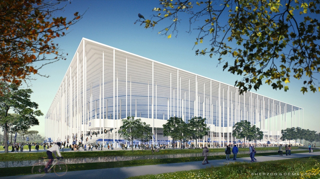
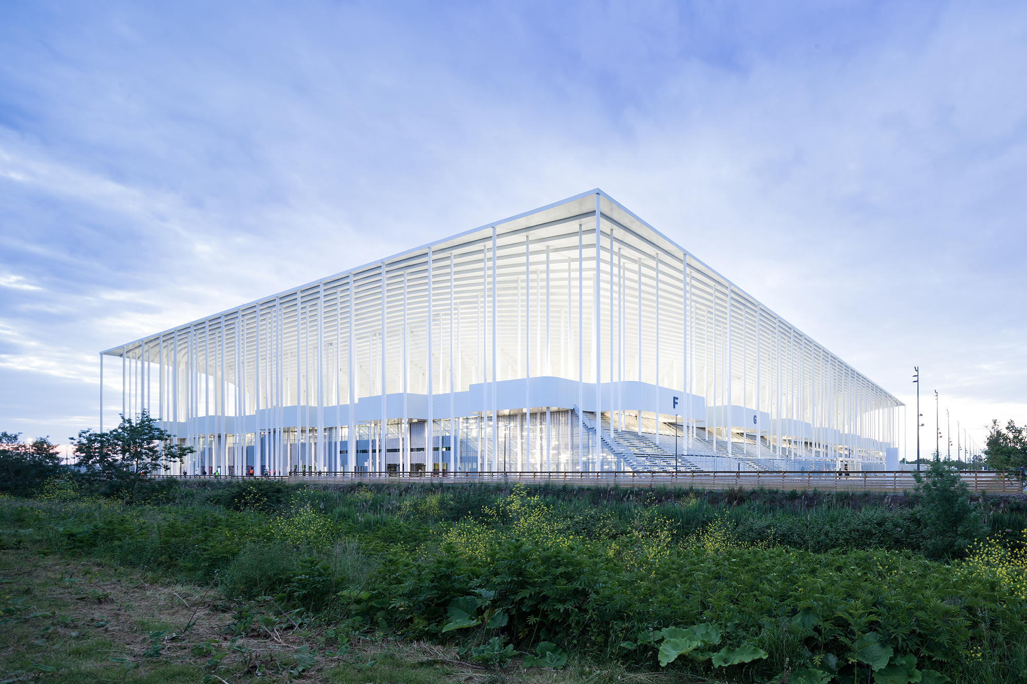 Herzog & de Meuron designed the new Bordeaux stadium to appear light and open. Its purity and geometrical clarity inspires a sense of monumentality and gracefulness, and the grand stairs of the stadium blur the boundaries between inside and outside. Countless columns standing on the stairs accompany the visitors on their way in and out of the stadium. The fusion of stairs and columns forms a gesture of openness and accessibility.
The design team paid careful attention to the integration of the structure into the grand landscape of Bordeaux. The meticulous geometrical arrangement of bowl structure and columns reflects the pattern created by trees and paths in the surrounding landscape. This stadium is made for this specific place – an open, flat landscape in immediate proximity to the Bordeaux Exhibition Centre stretching along the lakefront.
Beirut Terraces
Beirut, Lebanon
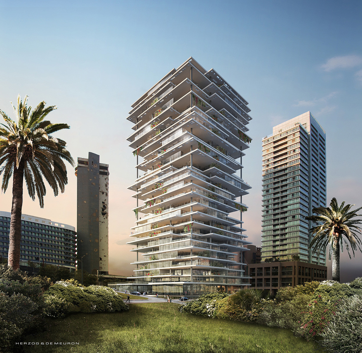
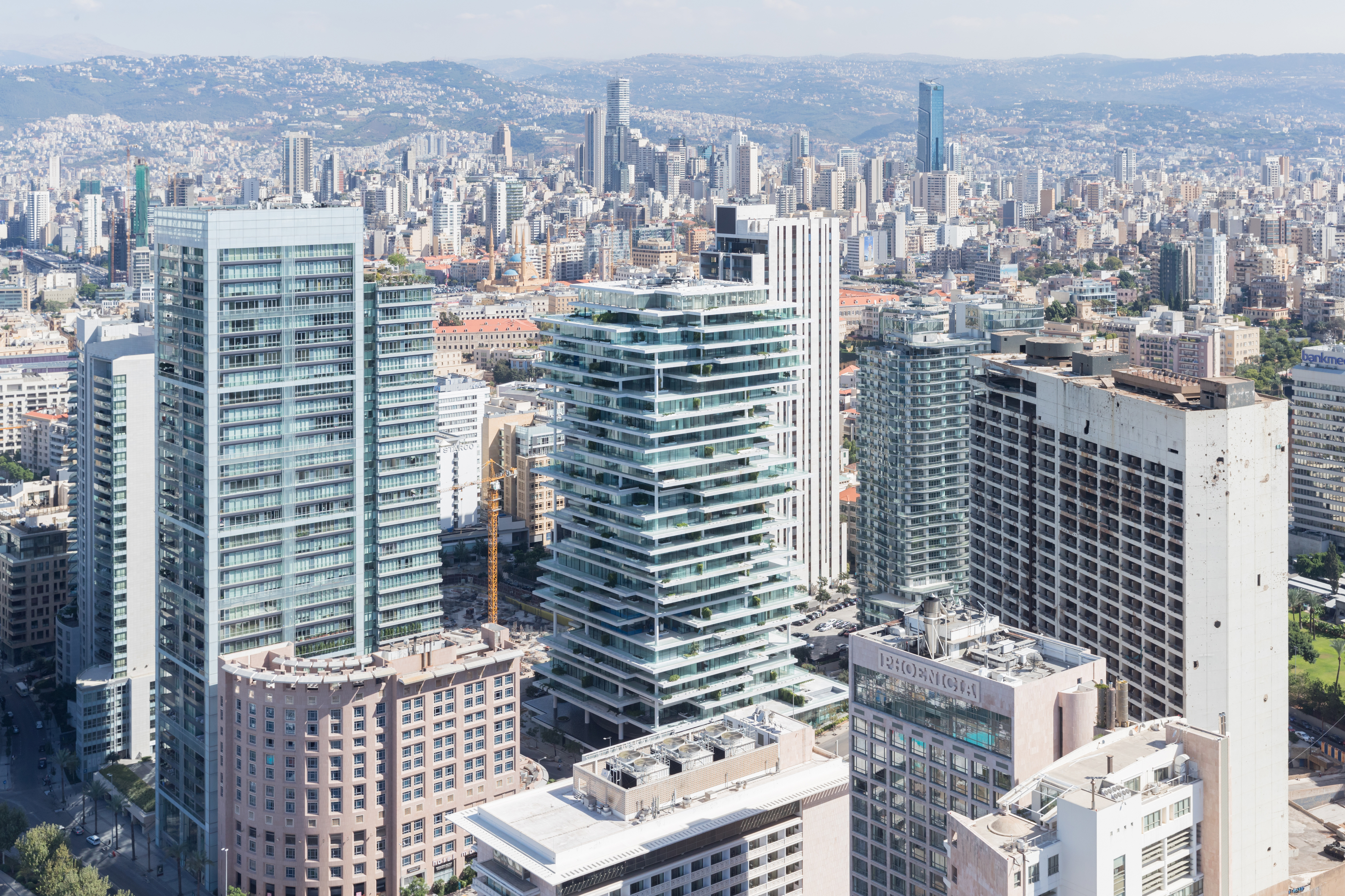 The structure and appearance of Beirut Terraces was informed with an awareness and respect for the city’s past and an optimism for the contemporary city. Five principles define the project: layers and terraces, inside and outside, vegetation, views and privacy, light and identity. The result is a vertically layered building: slabs of varying sizes allow for interplay between openness and privacy that fosters flexible living between inside and outside.
As the team noted, careful environmental engineering and specific use of vegetation further enhance sustainability and the quality of life within the building. The rendering and built reality show how vegetation is spread throughout the terraces and the simple, elegant columns that rise throughout the structure. As a multilayered 390-foot (119-meter) tall high-rise, the stratified structure is distinguished by projecting or set back living areas that generate overhangs, light and shadow, places of shelter and exposure.
The judging process for Architizer's 14th A+Awards is now underway. Subscribe to our Awards Newsletter to receive updates about Public Voting, and stay tuned — winners will be announced later this spring.
 Beirut Terraces
  Bordeaux Stadium
  CaixaForum
  Tate Modern's Switch House
  VitraHaus