Architects: Want to have your project featured? Showcase your work by uploading projects to Architizer and sign up for our inspirational newsletters.
The rules are simple — the overall height of a column capital should be half the diameter through the bottom of the column. Divide the height into 19 modules. Give three modules to the abacus, four to the scrolls of the volute, six to the echinus, and leave the remaining six at the bottom to the volute. The width and depth of the abacus should be the diameter at the top of the shaft of the column.

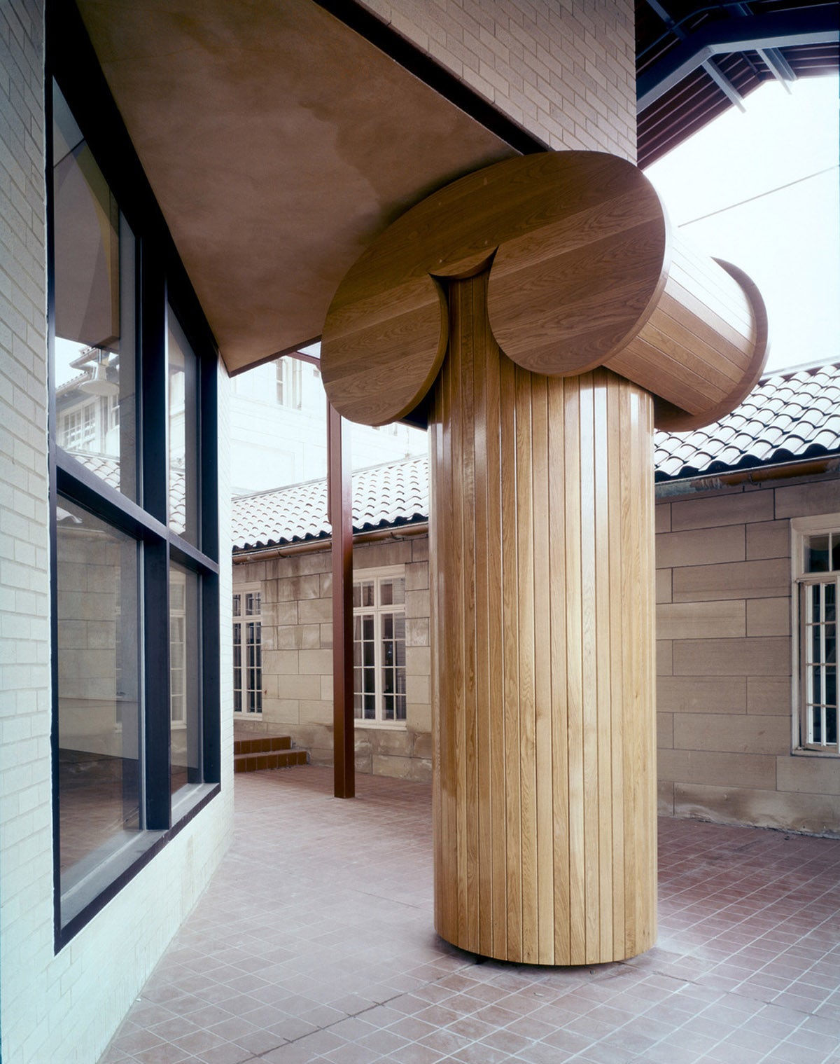
Ironic Column by Robert Venturi
In case Alberti’s approach to designing a column seems overly pedantic, you might prefer Venturi’s idea of what a column should look like. Cartoonishly oversized, his “Ironic” column at the 1977 addition to the Allen Memorial Art Museum has an exaggerated capital, no basis, and looks like a child’s interpretation of the classical support system. This, along with a few other examples of post-modernist architecture, marks the last time classical orders were directly referenced in built architecture.
Over the last century the column has undergone dramatic changes in both structural and aesthetic interpretation, emerging as an architectural element whose connection to the over four-thousand-year-old concept often seems barely detectable. Here are a few more examples of how architects have subverted Alberti’s conventional column throughout recent history.


Johnson Wax Headquarters by Frank Lloyd Wright, Racine, Wis., United States
The SC Johnson and Son Administration Building is famous for its dendriform columns. Frank Lloyd Wright’s tendency to introduce organic elements and metaphors into his designs has found its most distinctive incarnation in the tall slender columns of the administration building, also known as the Johnson Wax Building.

Chuey House by Richard Neutra, Los Angeles, Calif., United States
Neutra’s “spider legs” go beyond the footprint of his houses and grab onto the surrounding landscape. This system of extended beams and columns blurs the line between interior and exterior and has specific psychological significance.

Clos-Pegase Winery by Michael Graves, Calistoga, Calif., United States
Another post-modernist example — Michael Graves’ 1984 Clos Pegase winery combines classical and modernist architecture while giving it a Mediterranean twist. Dominating the entrance portico, two massive pillars support the structure and divide the building into two volumes.

M2 by Kengo Kuma, Tokyo, Japan
One would hardly believe that this bizarre building is the work of Kengo Kuma. Built in 1991 as Matsuda’s (Mazda) car showroom, the building now allegedly functions as a funeral hall. It can’t get more post-modernist than this.


Kanagawa Institute of Technology by Junya Ishigami, Kanagawa, Japan
The almost weightless Kanagawa Institute of Technology rests on no less than 305 white columns of various sizes placed seemingly randomly and supporting the stripped roof of skylights. Their etheric quality frees up the space and makes them almost disappear.

© Iwan Baan

© Iwan Baan
Serpentine Gallery Pavilion 2009 by SANAA, London, United Kingdom; photos by Iwan Baan
A similar treatment of columns is used by SANAA in the design of the 2009 Serpentine Gallery Pavilion. An aluminum structure rests on a system of columns that form different spaces meandering through the park.


Sendai Mediatheque by Toyo Ito, Sendai, Japan
Toyo Ito, on the other hand, merges thin columns into lattice systems that are used as supports, light shafts, storage spaces and vertical communication. Six steel-ribbed slabs are supported by 13 vertical steel lattice columns that look like trees.


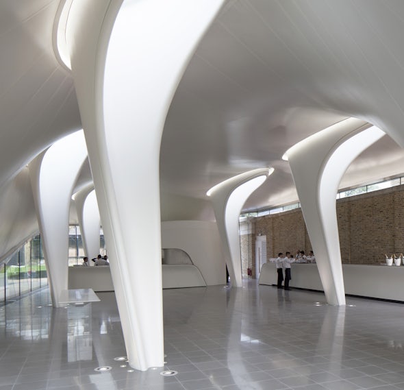
Serpentine Sackler Gallery by Zaha Hadid, London, United Kingdom; photos by Luke Hayes
The Sackler Gallery has columns that visually accentuate their primary role as supports. Appearing sliced out of the envelope, the five interior columns also function as light wells.


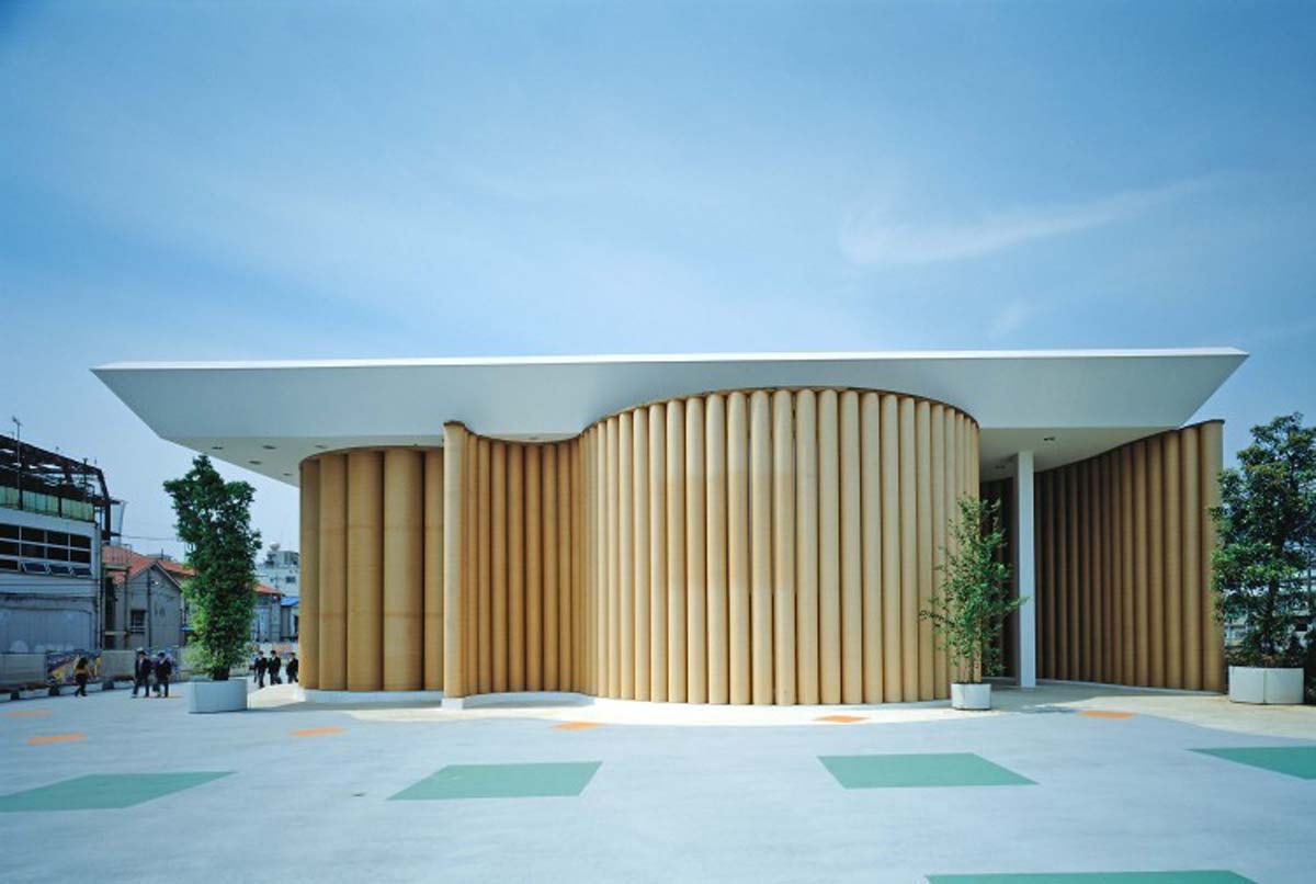
Paper House by Shigeru Ban, Lake Yamanaka, Japan
The Paper House is one of those projects that blur the line between the column as autonomous element and the continuity of an envelope. Freestanding paper tubes surround different spaces of the house and create spatial continuity.
Architects: Want to have your project featured? Showcase your work by uploading projects to Architizer and sign up for our inspirational newsletters.


