Architizer's diverse jury of global experts is currently reviewing submissions to the 14th A+Awards! Sign up to receive updates on Public Voting and spring winner announcements.
While reflective façades have become commonplace — and consequently, less meaningful — in an age of glass skyscrapers and curtain walls, reflective interiors still remain an area of experimentation, exploration and creative expression. When reflective walls are used in modern architecture, they often only exist in private spaces, like bathrooms or dressing rooms. Alternatively, they are used in intentionally disorienting spaces, like fun houses. These uses of mirrors emphasize the reflection of the spectator, with little concern for their architectural context.
This convention is precisely what makes the following projects experimental. Each structure contributes to a new language of reflections in addition to developing new ideas about architecture. The projects do not completely abandon tradition, however. They still use reflections in a personal way (the spectator plays an important part in creating the architectural experience, though they are not always the center of it) and in a disorienting way (an intentional disruption of order). Yet the projects ultimately go beyond these two qualities, using reflections to add new meanings, not just new functions, to the spaces they inhabit. Just as a mirror can reflect our sight, each design reflects the very essence of architecture, using mirrors to create and destroy space.
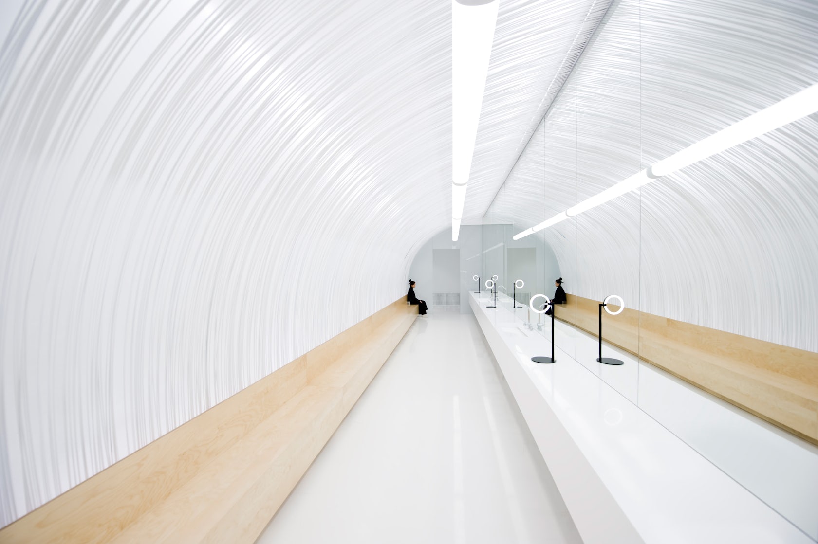

Selfie Room, Au Pont Rouge by Cheungvogl, Saint Petersburg, Russia
As part of a promotion for the Au Pont Rouge department store, Cheungvogl created a mirror-lined tunnel in the store’s historic building. The room is designed to encourage visitors to take self portrait photographs, so that participants will promote the store by sharing their photos over social media. The use of mirrors and reflections democratizes brand creation by literally making people a part of the architecture.
© Bundschuh Architekten

© Bundschuh Architekten

© Bundschuh Architekten
© Bundschuh Architekten
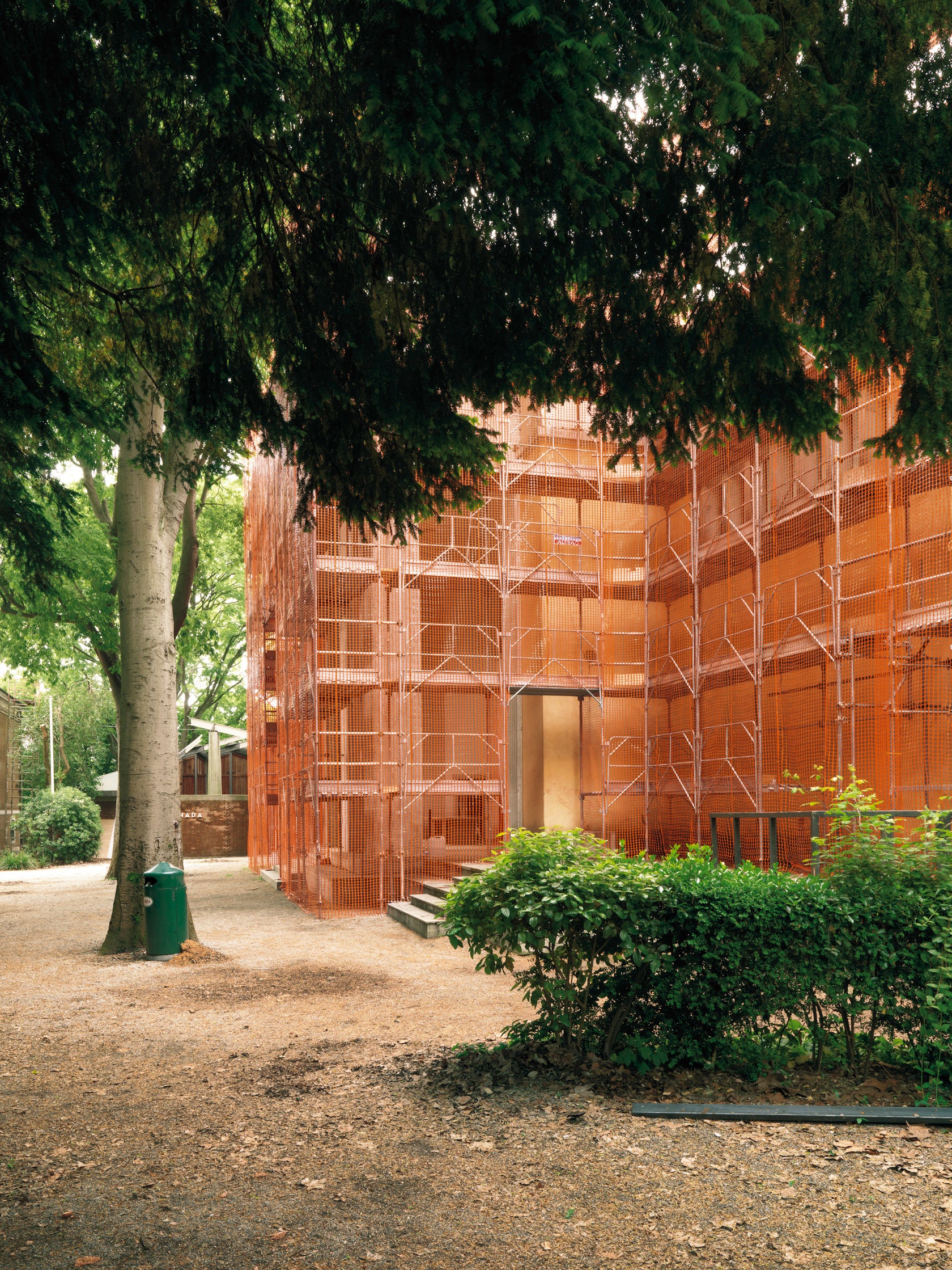
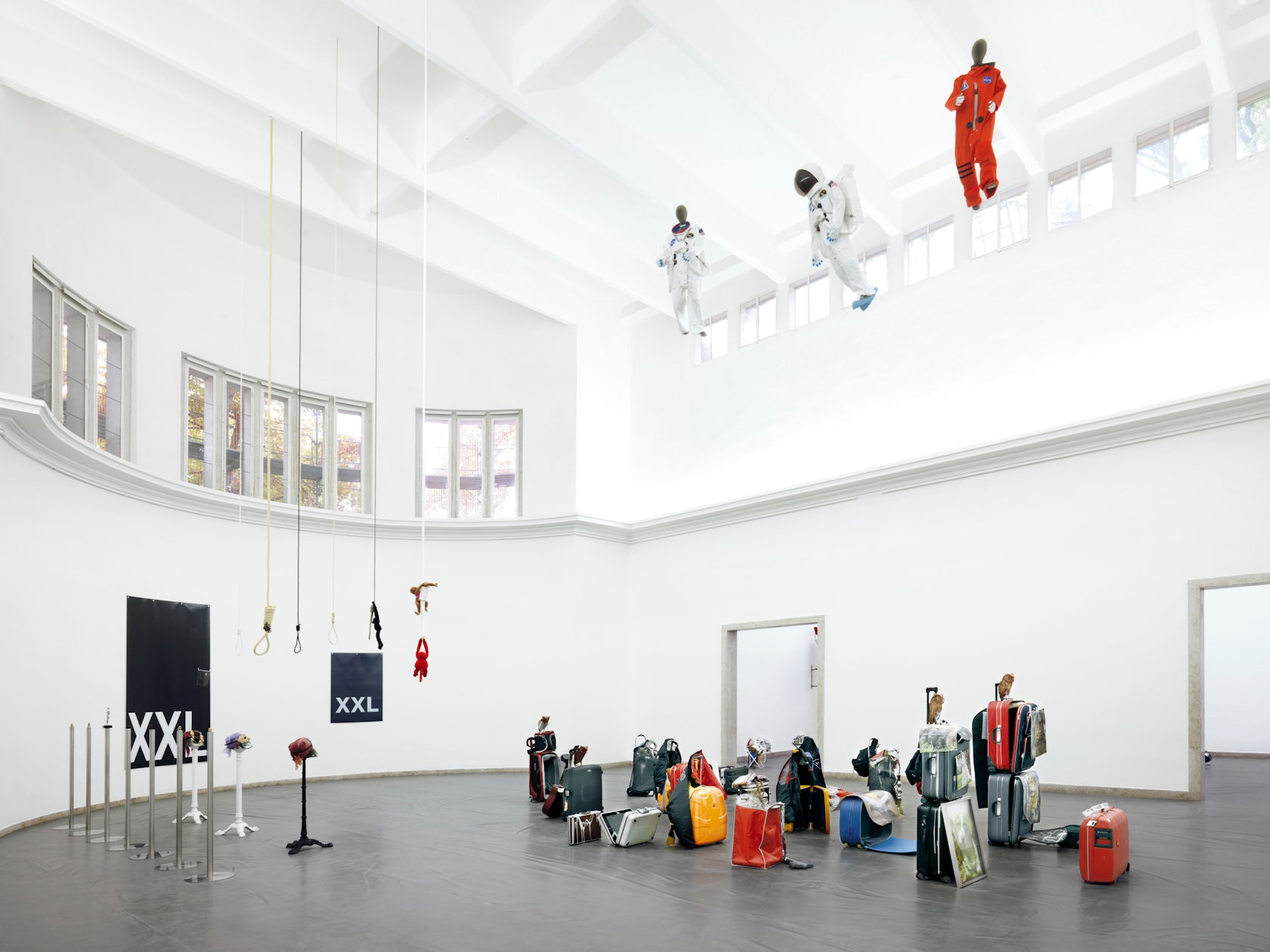
German Pavilion Biennale venice 2007 by Bundschuh Architekten, Venice, Italy
The German Pavilion for the 2007 Venice Biennale is an exhibition space for installations and works of art. But the structure does not make illusions about being a pure, neutral viewing space; instead, the architecture defines the viewing experience and creates entirely new meanings for the exhibits inside. The outside of the structure takes the appearance of the construction side, surrounded by scaffolding and orange netting, and provides a utilitarian and banal context for the otherworldly interior spaces. Rooms of reflective walls and ceilings reflect the visitors, architecture and works of art to create ever-changing juxtapositions of what is on display.

© Ateliers O-S Architectes

© Ateliers O-S Architectes
FAV08 by Ateliers O-S Architectes, Place Saint-Come, Montpellier, France
The temporary FAV08 pavilion also represents a study of contrasts. Composed of stacked cardboard boxes, the structure’s deceivingly simple exterior gives no suggestion of the reflective gold interior spaces. Unlike the German Pavilion in Venice, the structure does not exhibit works of art, but instead recontextualizes its surrounding environment, acting as an intervention into the space of an 18th-century hotel. Though the reflections draw spectators into the structure, they ultimately reverse their gaze to reexamine the place where their experience began.

© Milena Villalba
© Milena Villalba
© Milena Villalba
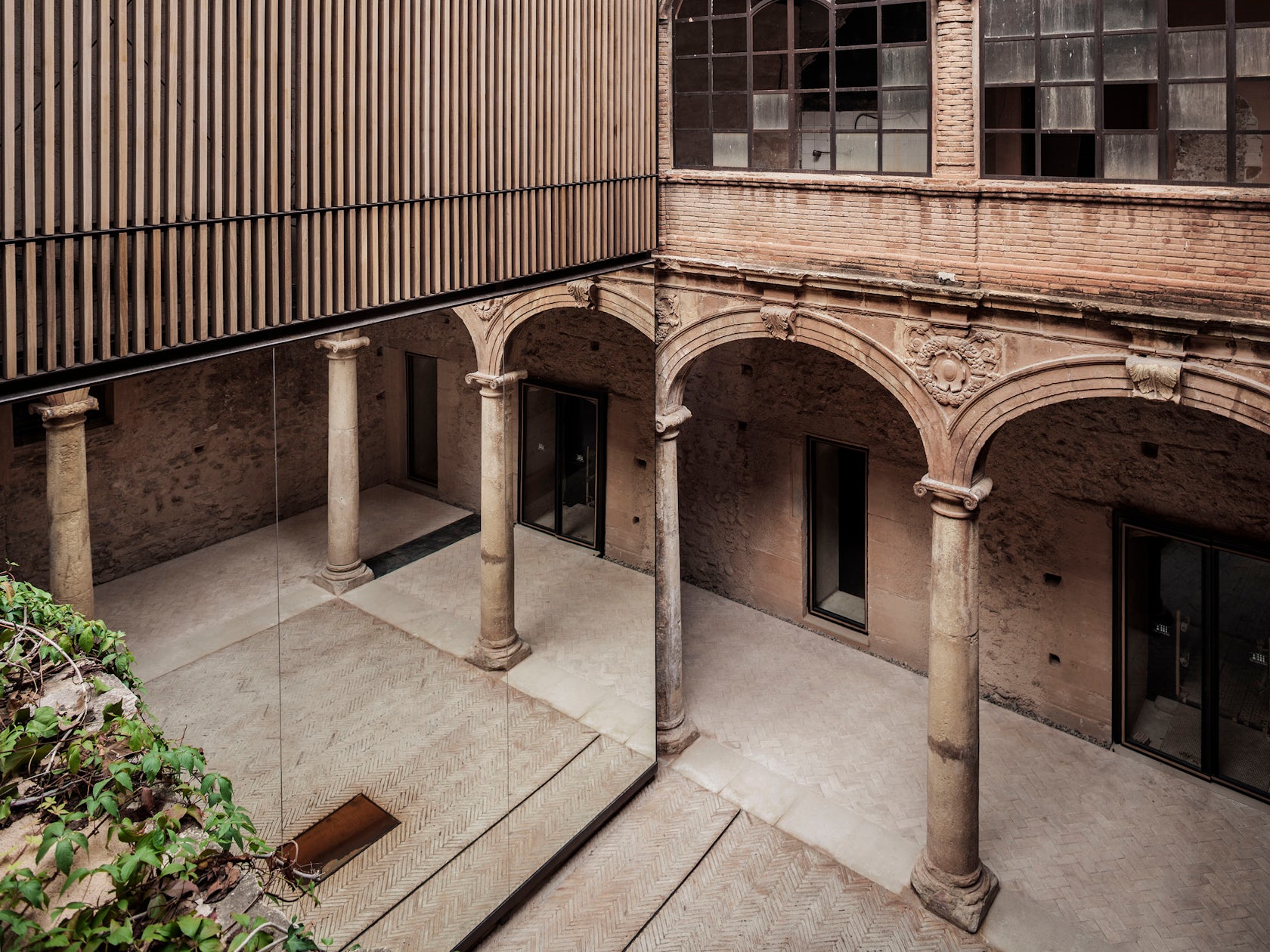
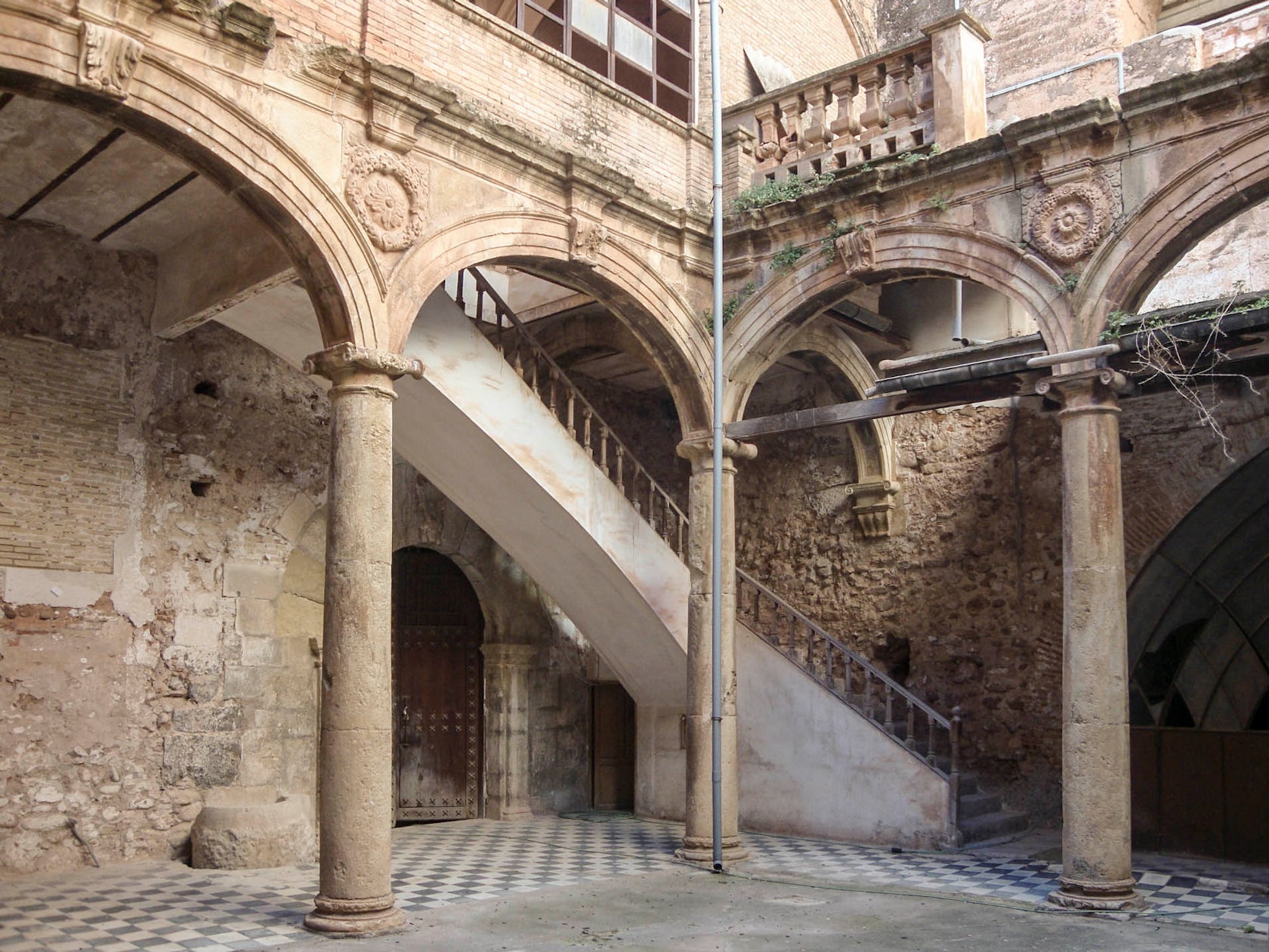
Renewal of the Palau-Castell Renaissance Cloisterby el fabricante de espheras, Betxí, Spain
El fabricante de espheras placed a giant mirror in the courtyard of a decaying Spanish cloister, using it as a nondestructive way to intervene and reinvigorate the space. The project demonstrates a mirror’s power to not only create a facsimile of the world around it, but to add new meaning to the forms it reflects. From certain vantage points, the mirror disappears completely, and creates an illusion of great depth, doubling the courtyard and restoring damaged elements without physically altering the architecture at all.

© Annabel Karim Kassar Architects

© Annabel Karim Kassar Architects
© Annabel Karim Kassar Architects
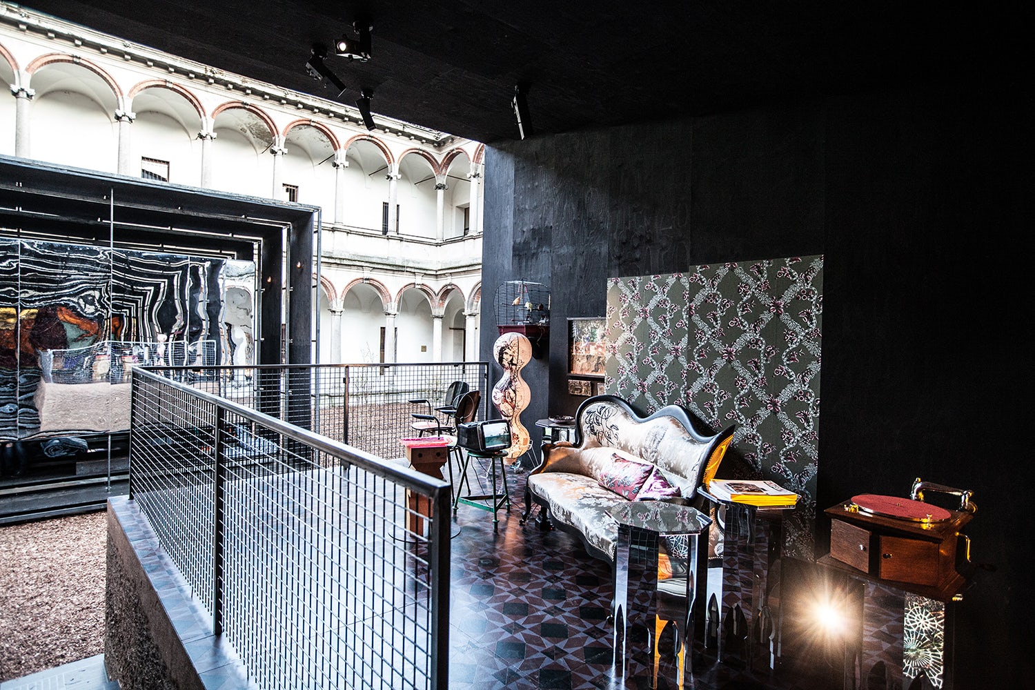
Camera Chiara by Annabel Karim Kassar Architects, Milan, Italy
The Camera Chiara pavilion refers as much to the history of photography as it does to architectural traditions. The project is comprised of two structures shaped like the bellows on a large format camera, each containing different, yet interrelated spaces. One of them, the so-called “Camera Obscura,” refers to the origins of photography, when architecture was used to capture images before portable cameras were invented. Containing a small cinema, the screen at the entrance of the room bears a mirrored back, which reflects the Lebanese-styled liwan in the opposite structure. The mirror not only alludes to the design of a single-reflex camera, but also draws parallels between the reflected domestic space and the projected images on the other side.
© shao feng architectural photography

© shao feng architectural photography
© shao feng architectural photography
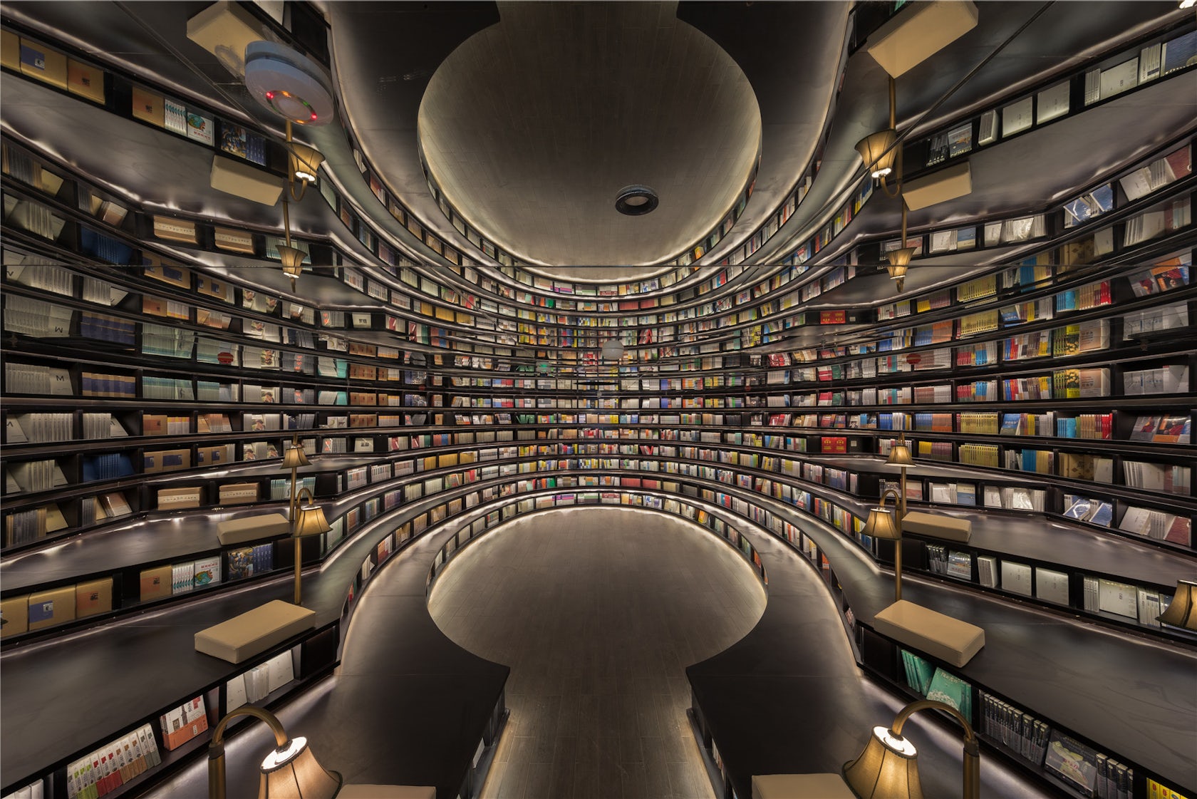
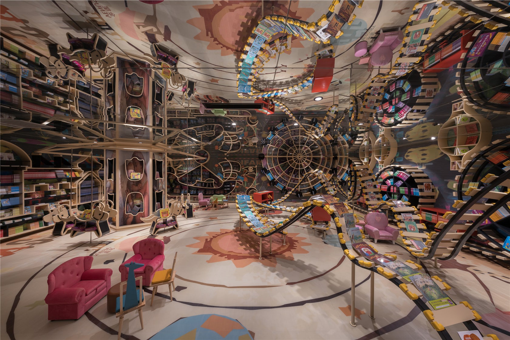
Hangzhou Zhongshuge by X+Living, Hangzhou, China
Bookstore Hangzhou Zhongshuge uses mirrors to disorienting and dramatic effect. In spaces already dominated by serial forms, reflective ceilings multiply the store’s wall-height bookshelves to create expansive and immersive reading spaces. In the children’s section, mirrors are used to create whimsical, topsy-turvy wonderlands, reminiscent of fantasy worlds in children’s literature.
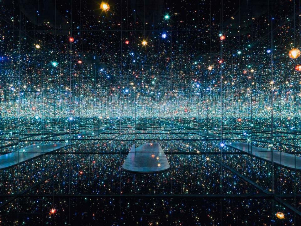

Infinity Mirrored Room, Yayoi Kusama; installation from The Broad Museum in Los Angeles
For over 50 years, artist Yayoi Kusama has developed a series of mirrored rooms designed to represent concepts of infinity. Each room is comprised of installations of repeated forms, which are surrounded by reflective walls to create exponentially greater repetitions. Rather than using mirrors to create or contextualize architecture, Kusama’s rooms obscure architecture to generate endless space, inserting spectators within the mirror and into a world where there is no distinction between reality and its reflection.
Architizer's diverse jury of global experts is currently reviewing submissions to the 14th A+Awards! Sign up to receive updates on Public Voting and spring winner announcements.


