Architects: Want to have your project featured? Showcase your work by uploading projects to Architizer and sign up for our inspirational newsletters.
Architizer’s journal is fueled by the creative energy of the thousands of architects from around the world who upload their stunning work throughout the year. From conceptual designs to projects under construction to completed buildings, we are proud to serve as a platform for showcasing global architectural talent and the brilliance of visualizers, engineers, manufacturers, and photographers who are crucial members of the industry. A stellar drawing, rendering or photo, as well as a detailed project description, can go a long way in making a project stand out, as does tagging the stellar contributors on a project.
Firms who upload to Architizer share their work with professionals and design enthusiasts through our Firm Directory and Projects database. They also gain exposure by having their projects shared on our Facebook, Instagram, and Twitter pages, as well as in our Journal feature articles. Indeed, through these various channels, hundreds of thousands of people in the global design community have come to rely on Architizer as their architectural reference and source of inspiration. As 2021 draws to a close, we’ve rounded up our database’s top 10 most-viewed, user-uploaded architecture projects:
1. Harbour Plaza Residences
architects–Alliance, Toronto, Canada
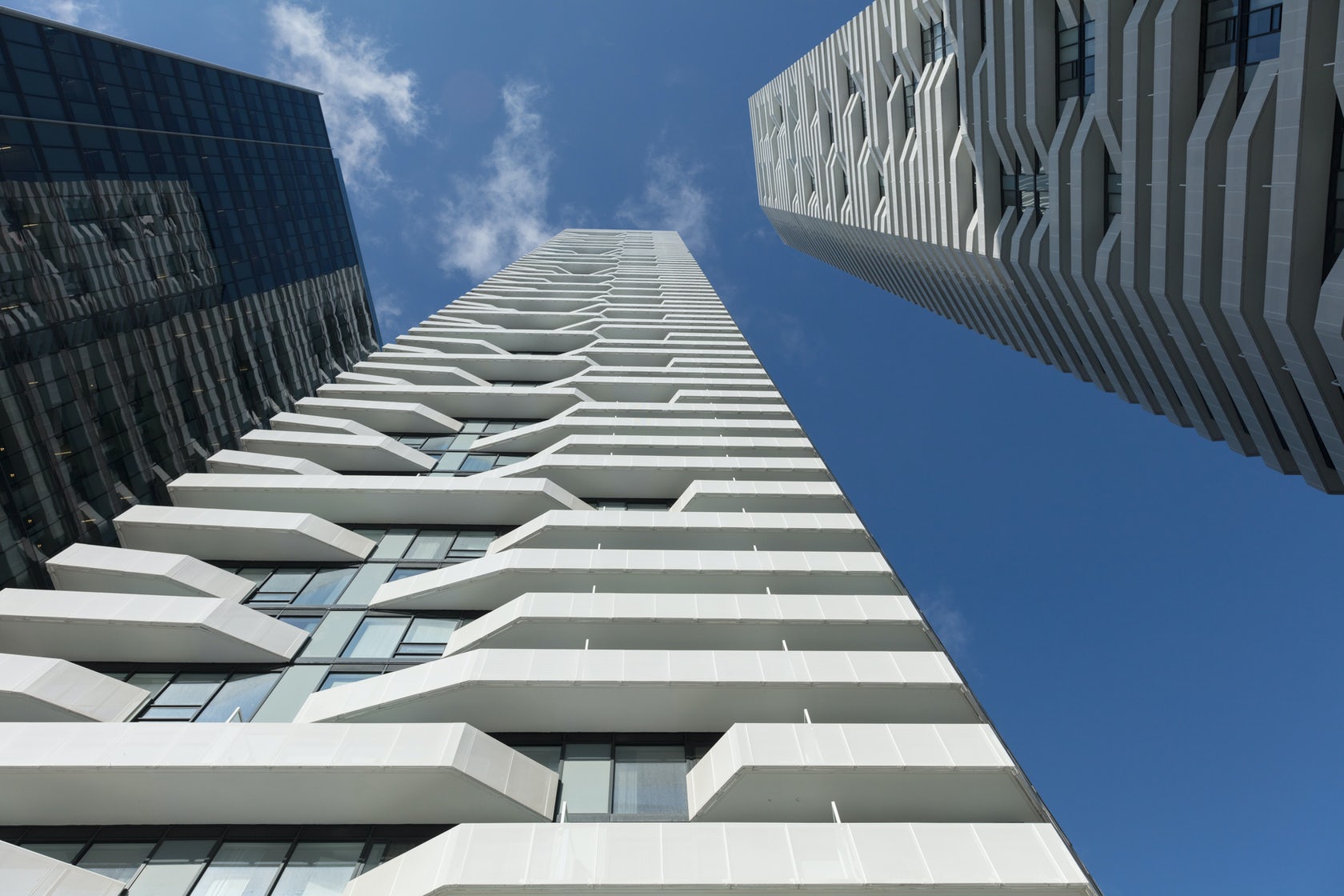
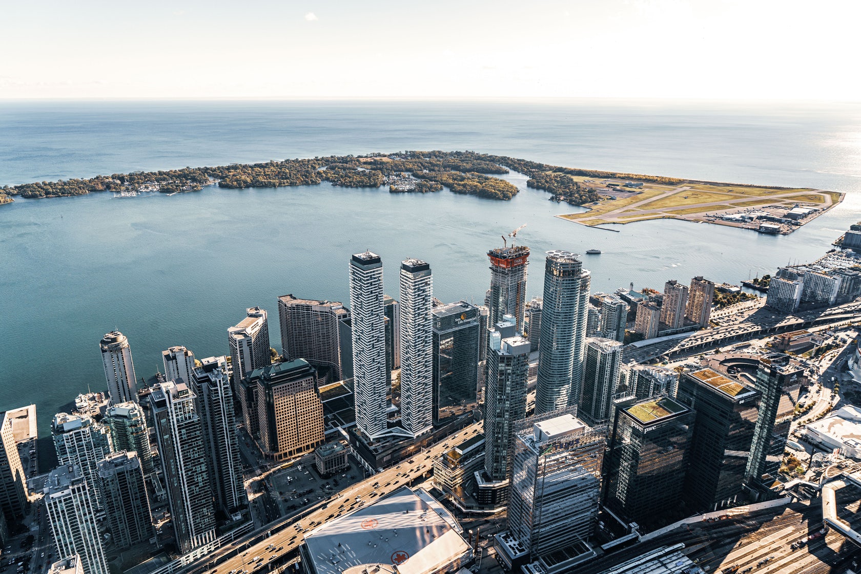 Harbour Plaza is a ‘vertical community’ aimed at transforming a former business district — a dead zone after dusk — into community for 9,000 residents, workers and visitors. A four-storey mixed use podium supports the elegant residential towers, whose bright white skin of pierced aluminum echos the rippling reflection of sunlight on the nearby Lake Ontario.
The façade’s woven texture can also be read symbolically, expressing the interrelationship between social, cultural, professional and recreational activity promoted by the development.
2. Beaver Lake Kiosks
perraultarchitecture (atelier urban face), Montreal, Canada

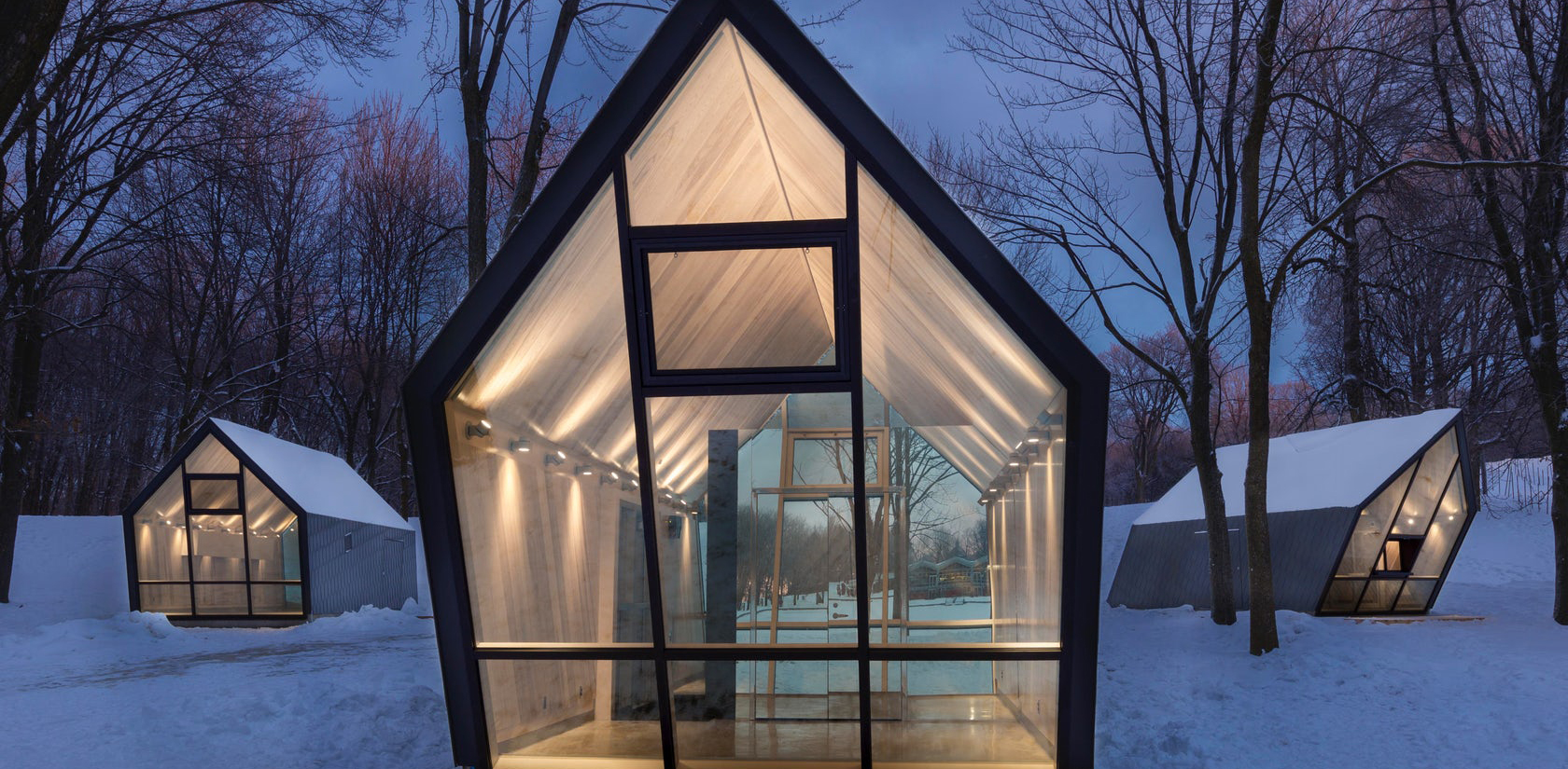
 Mount Royal Park is to Montreal what Central Park is to New York. What is more, both were designed by Frederick Olmsted in the late 19th century. Fast forward to today, and 3 new kiosks at the Beaver Lake are reinvigorating the beloved Canadian green space.
Nestled in a glade on the top of the urban mountain, the trio imbues the natural surroundings with a poetic air. Their expressively slanted forms seemingly respond the elements, as if gusts of wind were pushing their volumes. Glazing at their front and rear ends transform the structures into glowing beacons that guide late night skaters and tubers in the dark.
3. Nancy and Rich Kinder Museum Building – Museum of Fine Arts Houston
By Steven Holl Architects, L’Observatoire International, Kendall/Heaton Associates, Houston, TX
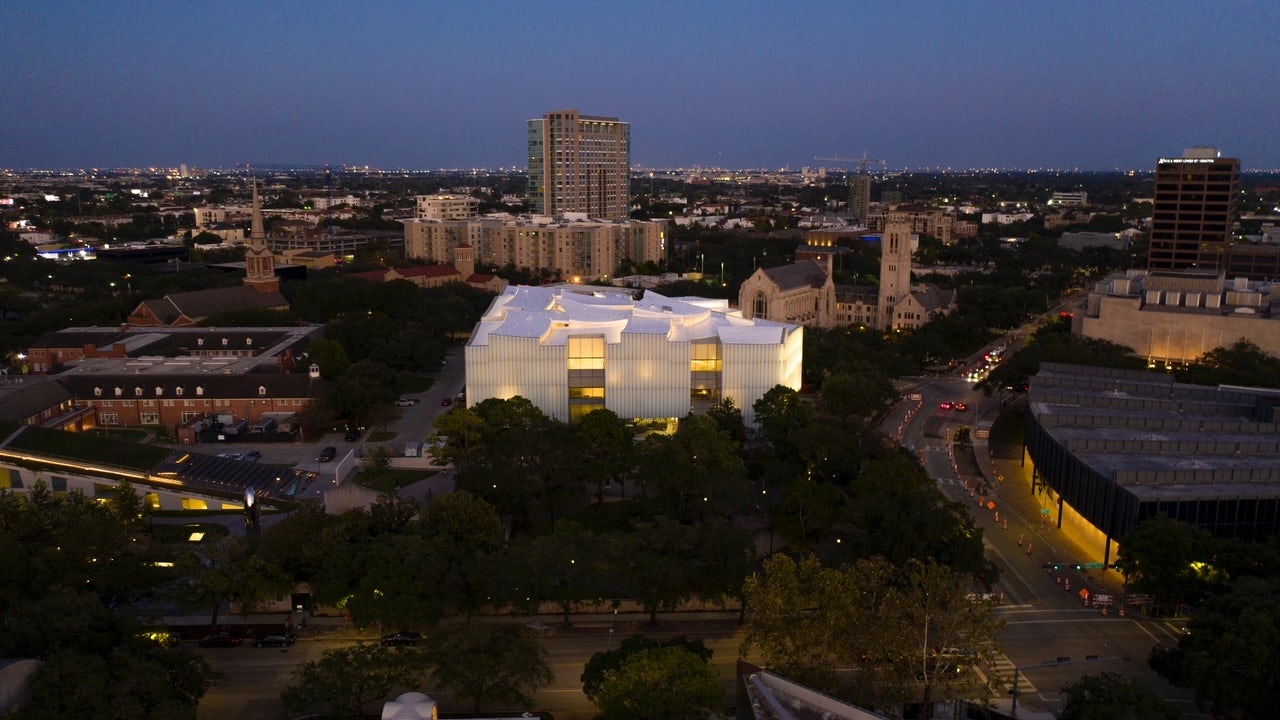
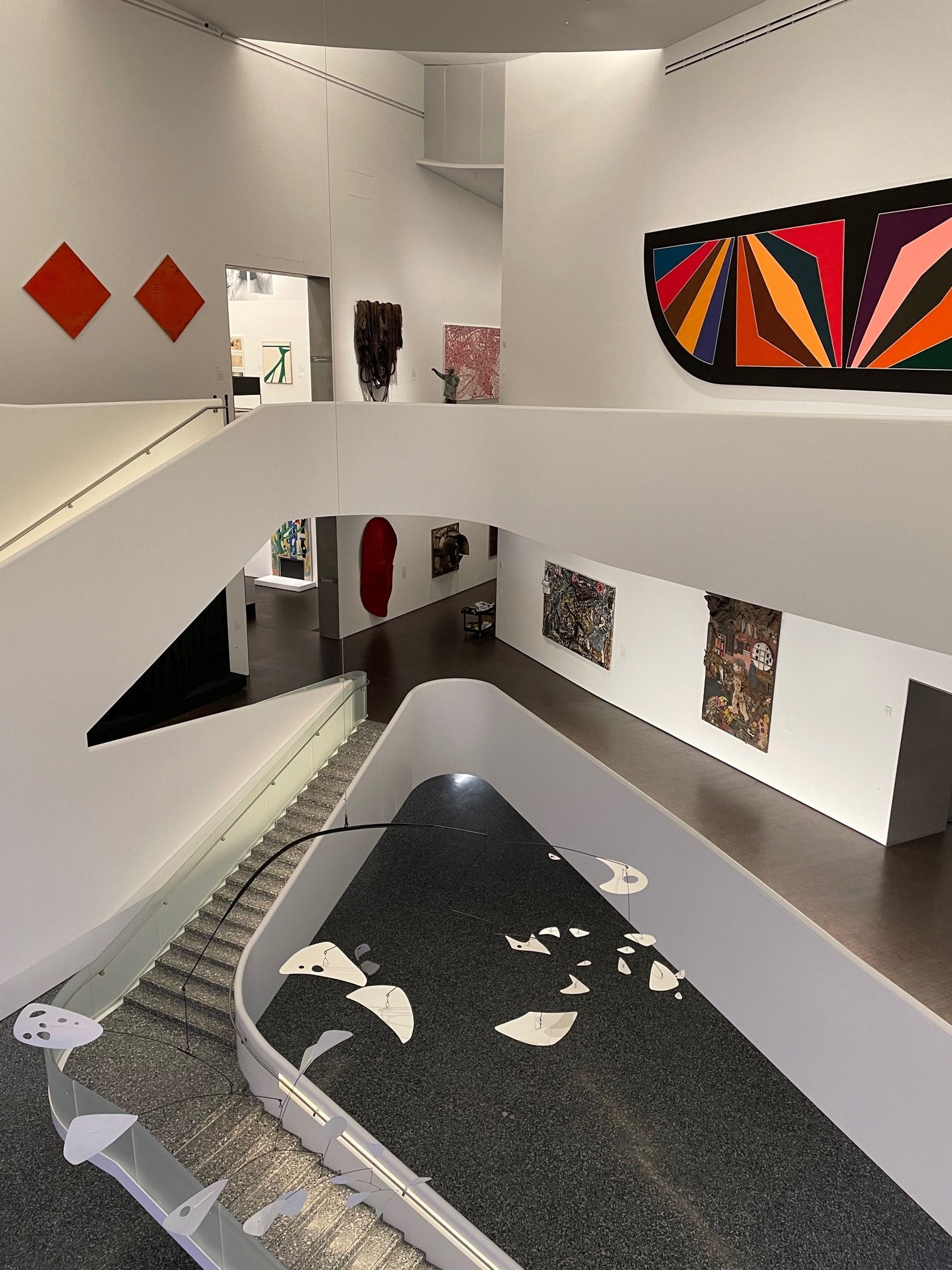
The new Nancy and Rich Kinder building stands as the central showpiece in the Museum of Fine Arts Houston campus redevelopment. The iconic structure is the final addition to the diverse portfolio of buildings on the Fayez S. Sarofim campus at the heart of Houston’s museum district.
The lighting concept for the new 164,000 square foot museum was carefully curated not to overpower this cultural district with its large scale. Its glass facade offers a muted backdrop for the lush green live oak trees of the museum grounds during the day, and softly glows as a lantern beacon at night.
4. Îlot Balmoral
Provencher_Roy, Montreal, Canada
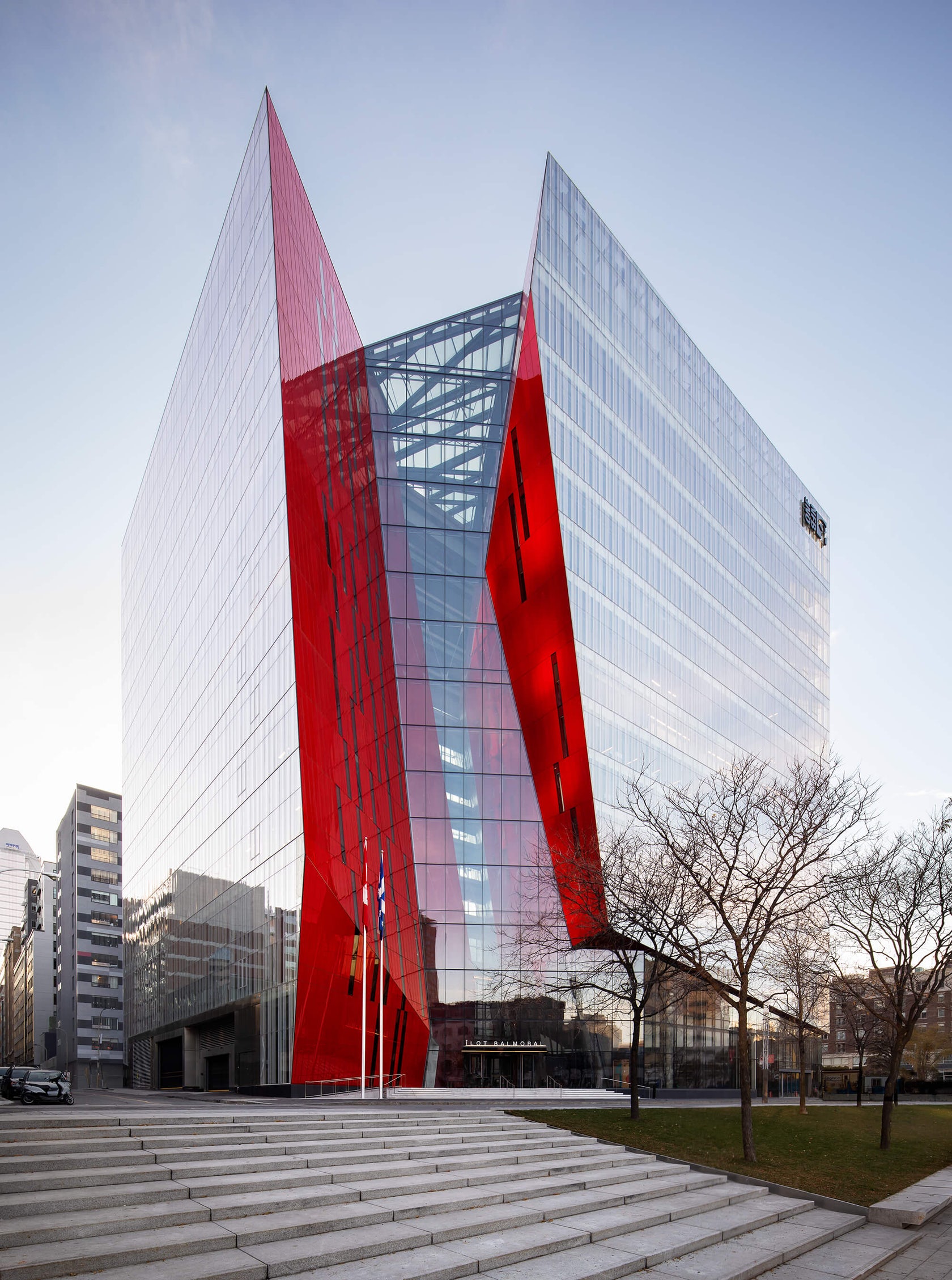
 This vibrant icon acts as a visual anchor for the pedestrians who wander through Montréal’s Quartier des spectacles — a favorite festival destination and the cultural heart of the vibrant northern city. The structure actually consists of two volumes, which are at once physically connected and visually separated by an emphatic, oblique fault line.
This divide is highlighted by large-scaled, bright red facets, which fold outwards and are oriented diagonally to the urban grid. This full-height atrium also invites light to deeply pierce into the building’s interior, revealing the zigzagging walkways that bridge the two volumes.
5. Phoenix Pavilion
Jiangzuo Studio of Huazhong University of Science and Technology, Gao Xin Da Dao, China
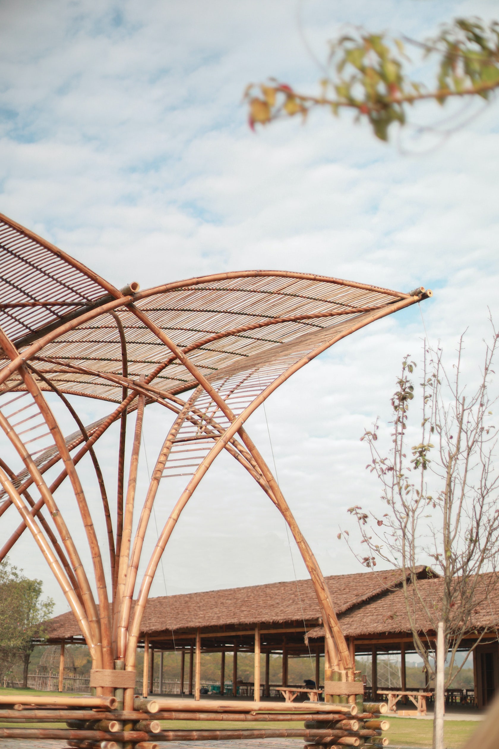
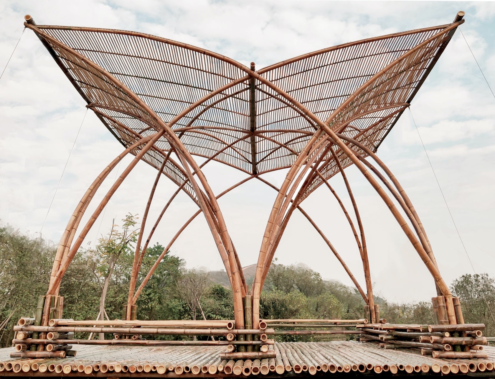 Sited on what was once a large refuse landfill, this pavilion marks the area’s transformation into an outdoor education place for students after its ecological restoration. Fittingly, the design of the Phoenix Pavilion articulates the intersection of three different lines of investigation: sustainable construction, heritage context and modern technology.
Bamboo grows abundantly in the area and it was thus used as the main built material. Exploring the possibilities of hot bending techniques, the large-span arch structure expresses the materials pliability and strength. Open and elegant, the pavilion takes the form of a phoenix spreading its wings in an allusion to traditional Chinese structures.
6. YAO Concept Restaurant
AAN Architests, Shenzhen, China
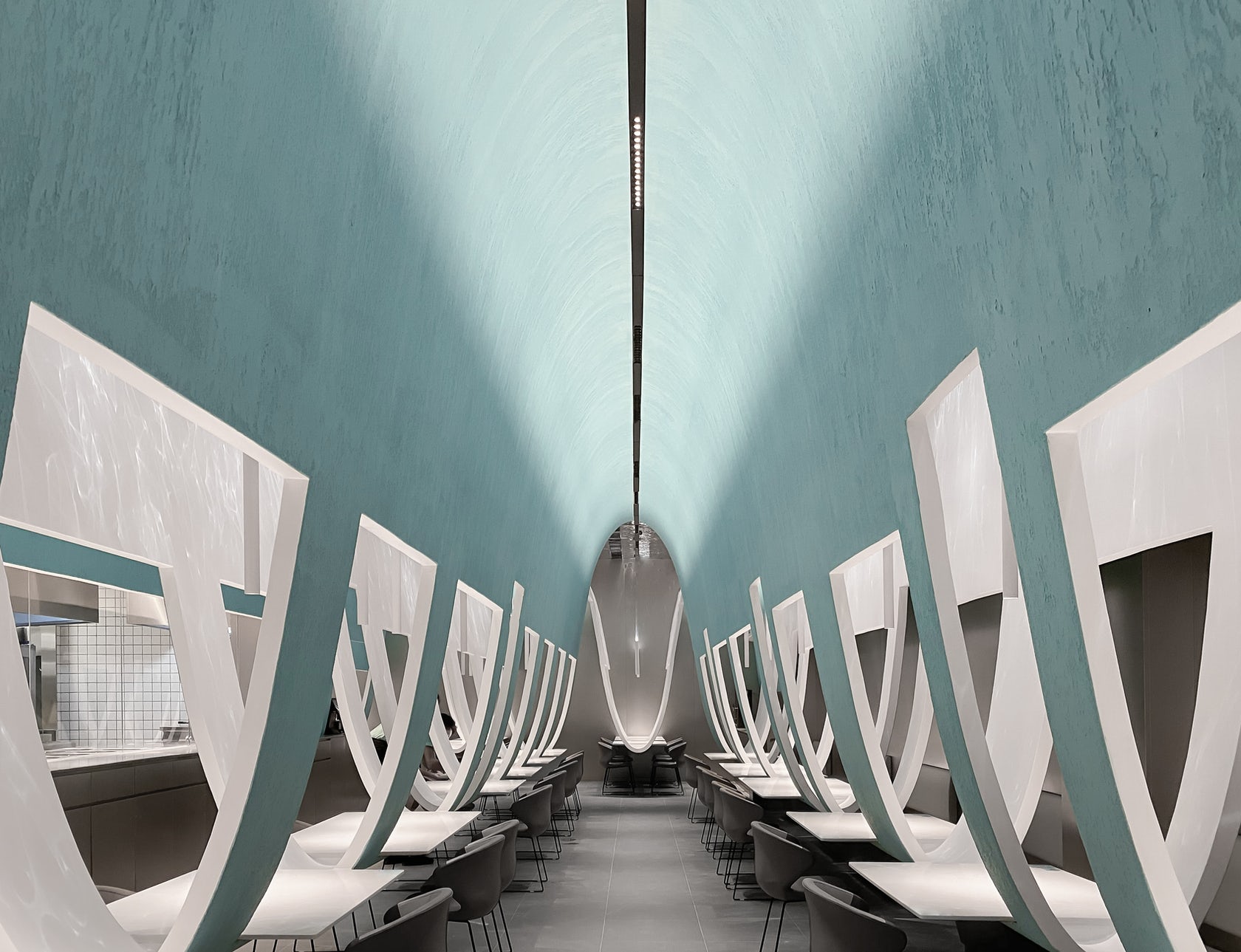
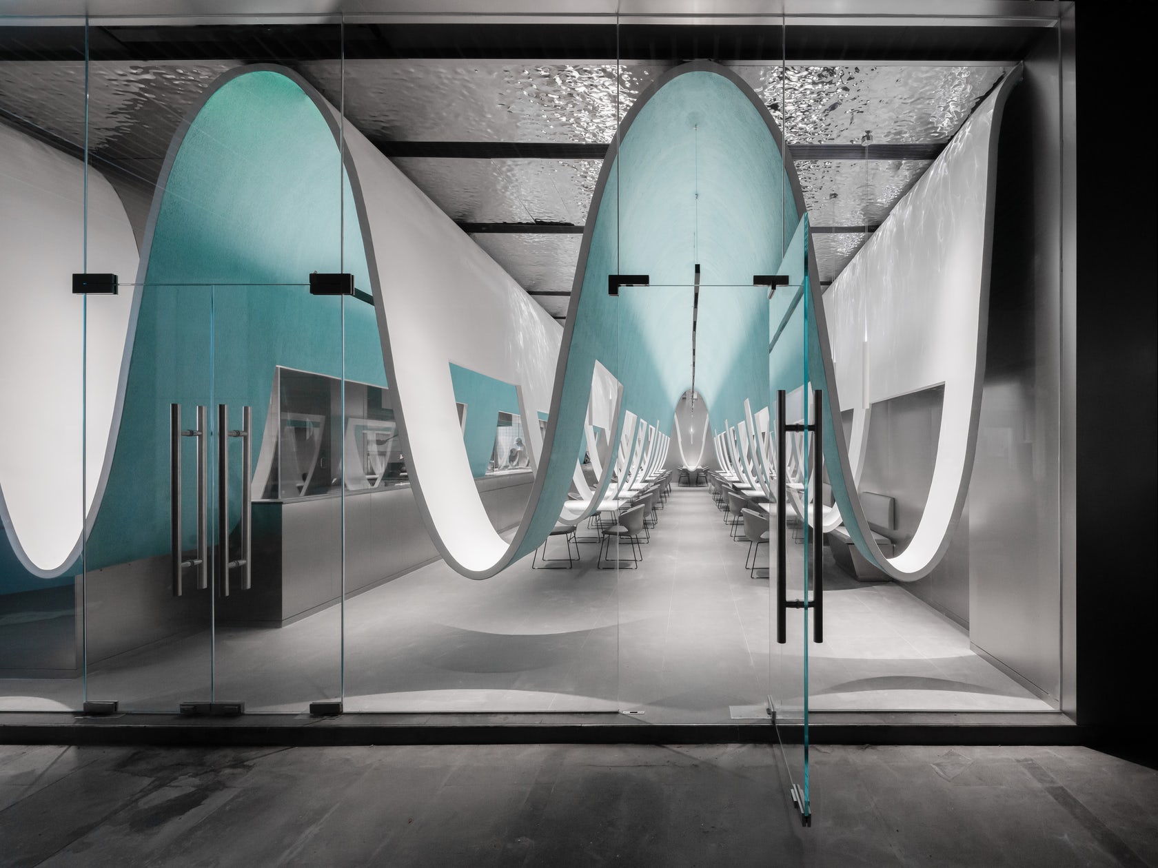
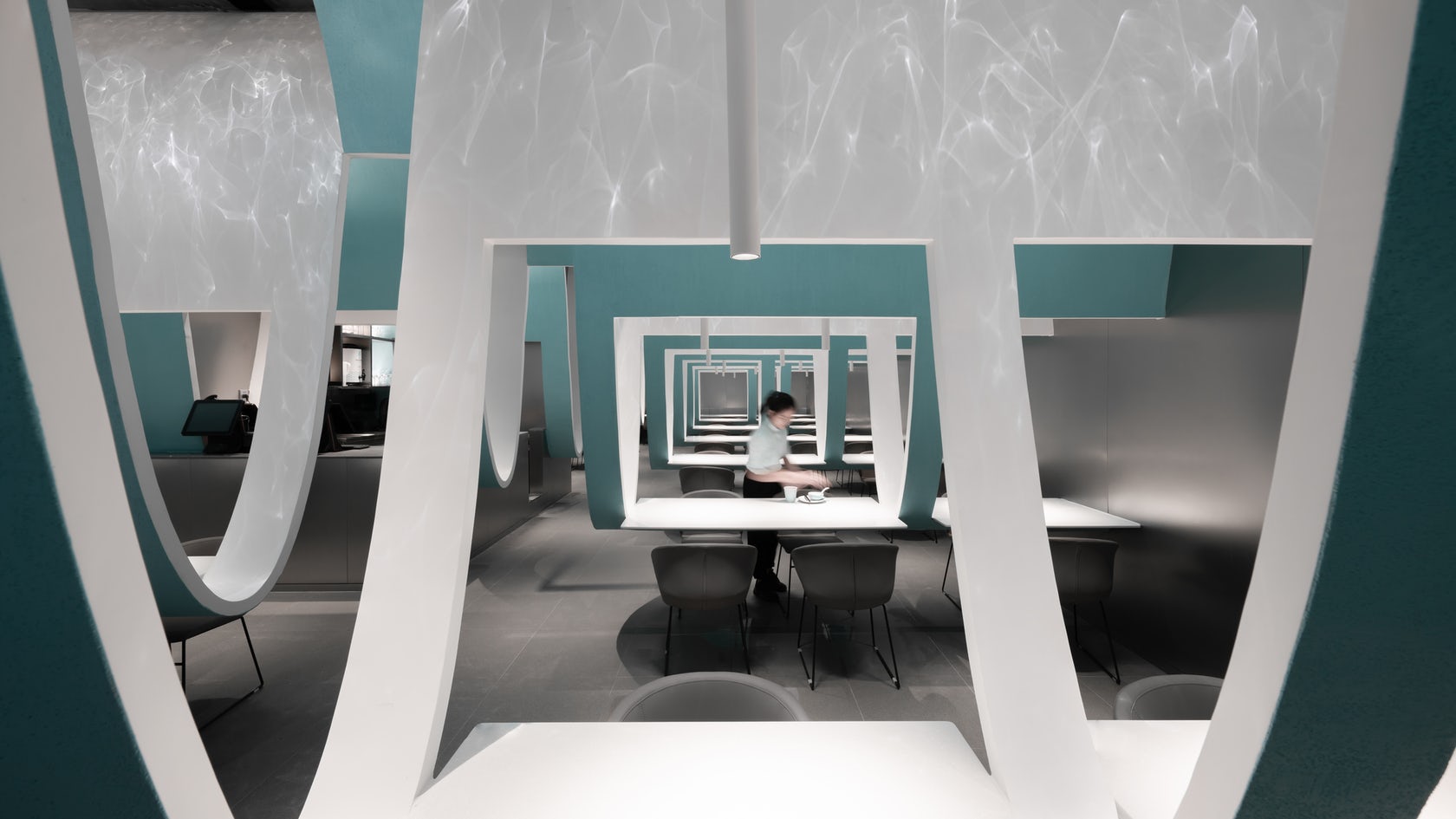 While interior architects are constantly advancing the spatial experience of hospitality interiors, tables and chairs are basic standards for most restaurants. This Chinese restaurant meditates on the expectation that diners eat at separately spaced tables. Curved partitions swoop down from the ceiling, simultaneously uniting and separating the various tables. The result is a net-like landscape which entangles hungry visitors and holding them together apart.
7. Cultural Center of Beicheng Central Park
Shenzhen HuaHui Design, Hefei, China
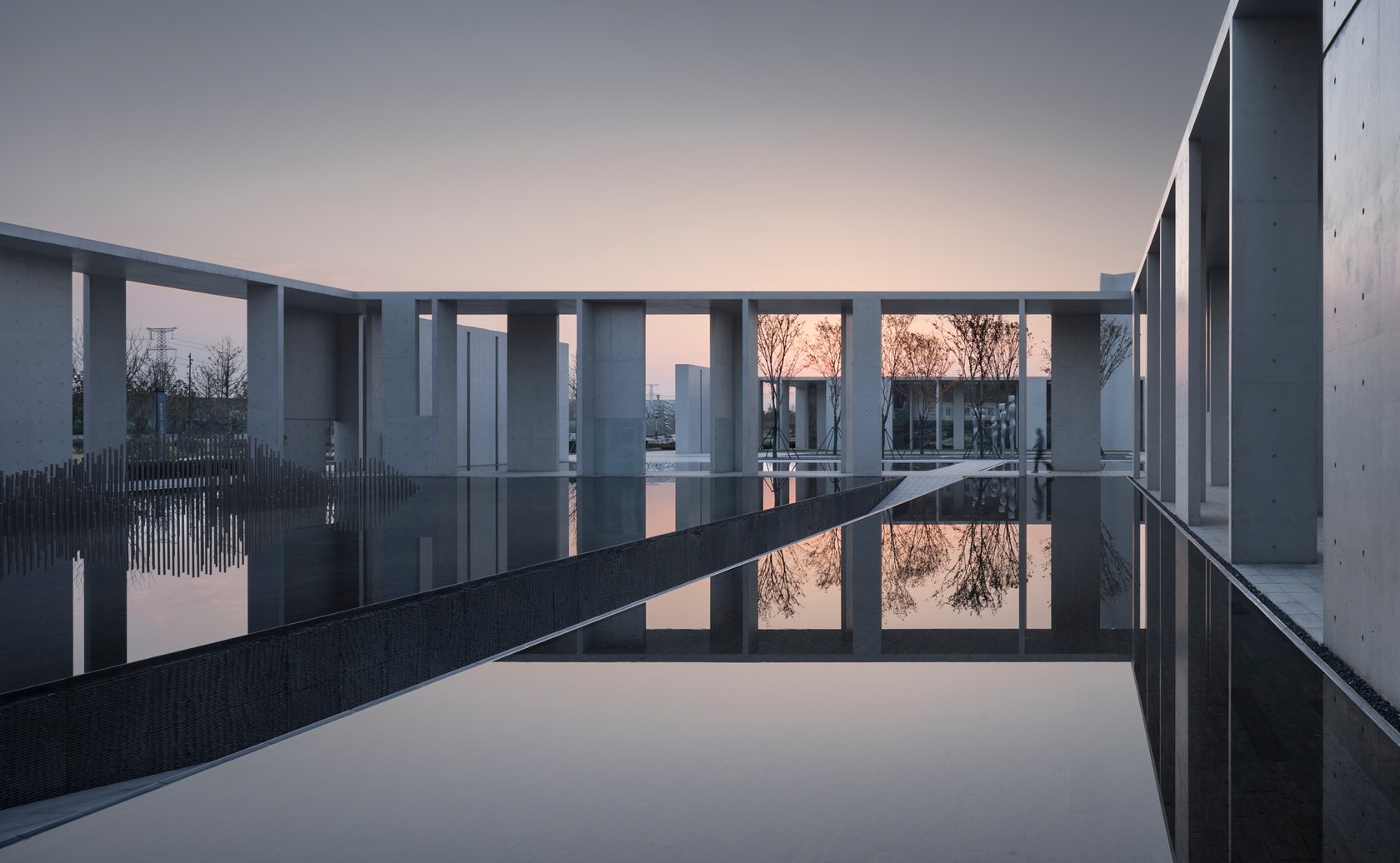
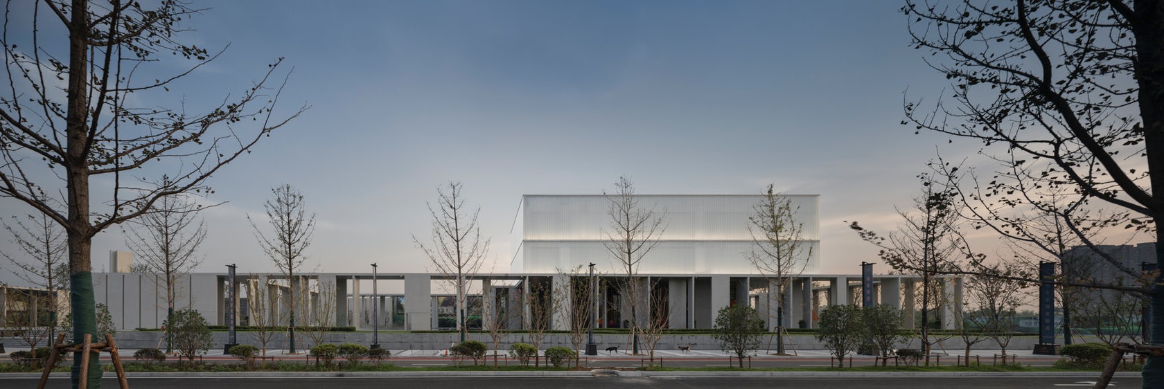 This cultural and educational facility reimagines the powerful tradition of the Chinese courtyard. Wall and corridor serves as interface for the courtyard, redefining the architectural space through a combination of different forms and modules that create rhythms of opened and closed space.
8. The Bicycle Garage
Tengbom, Uppsala, Sweden
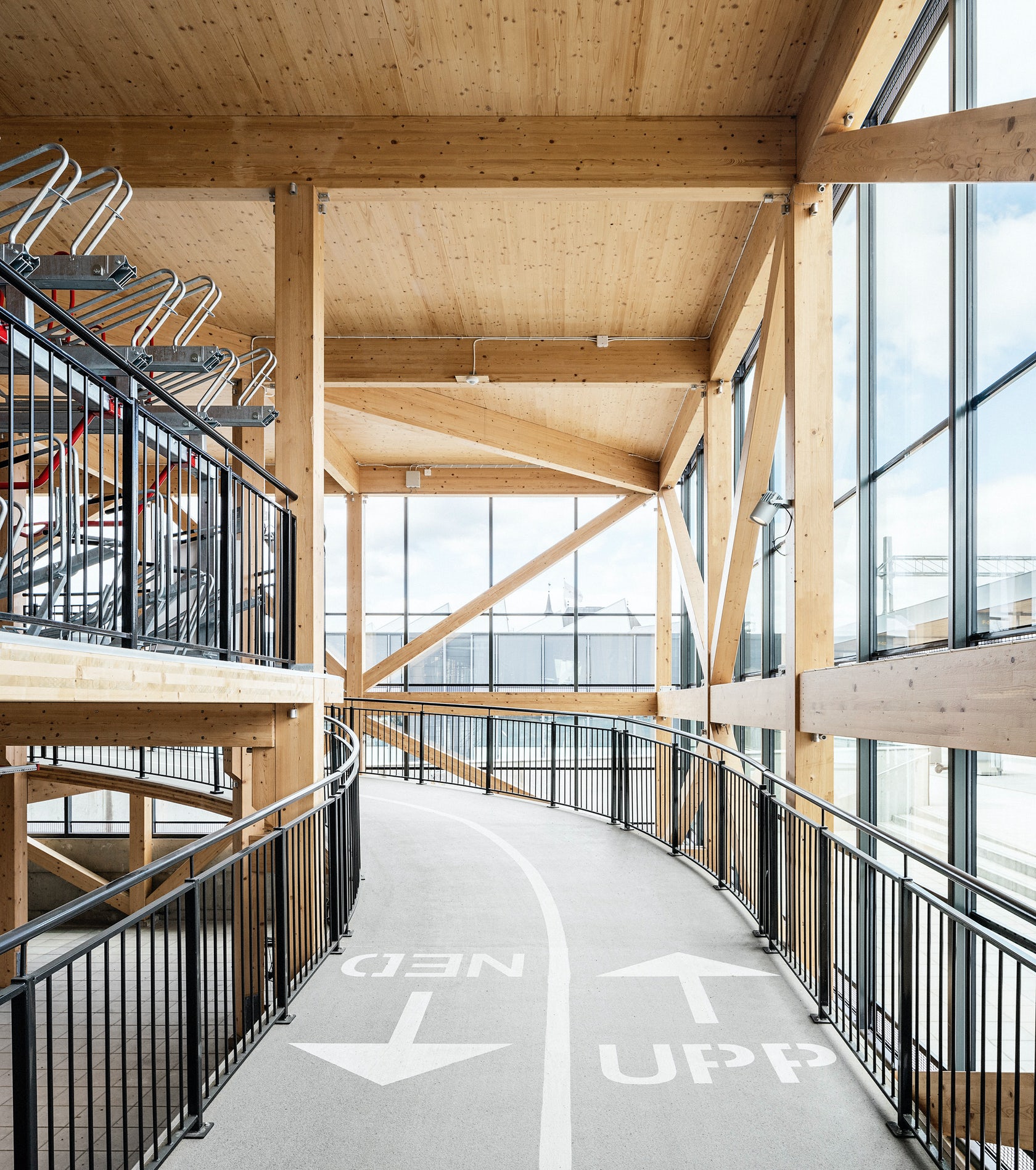
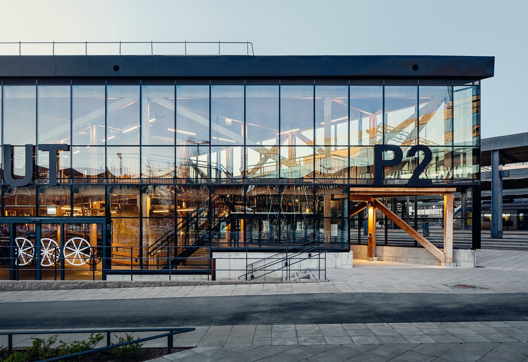
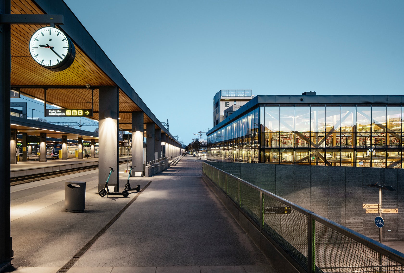
Located next to the platforms of Uppsala Central Station, this bicycle garage is both a symbol and an attestation of the city’s action-oriented sustainability ambitions. The building is a practical functionality piece of infrastructure, but at the same time, it powerfully represents a strong design concept. Two floors hold 1, 200 bicycles at once; they are connected by a wooden bike ramp which melds into the building’s exposed wood skeleton. Clad in glass façades with black steel moulding, the handsome building greets commuters at the platform of the city’s central railway station.
9. A Surfer’s House
Christiana Karagiorgi Architects, Peyia, Cyprus
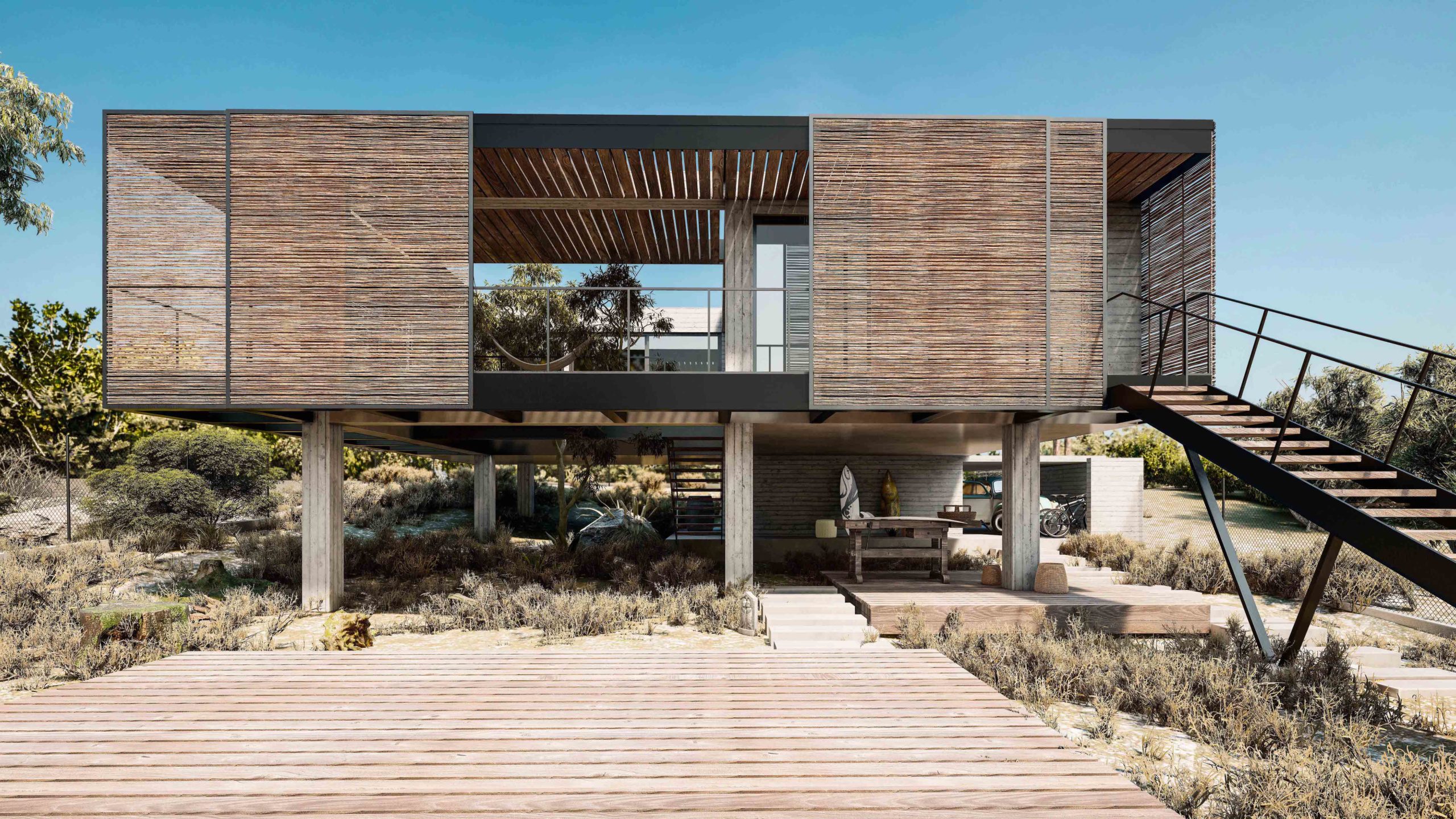
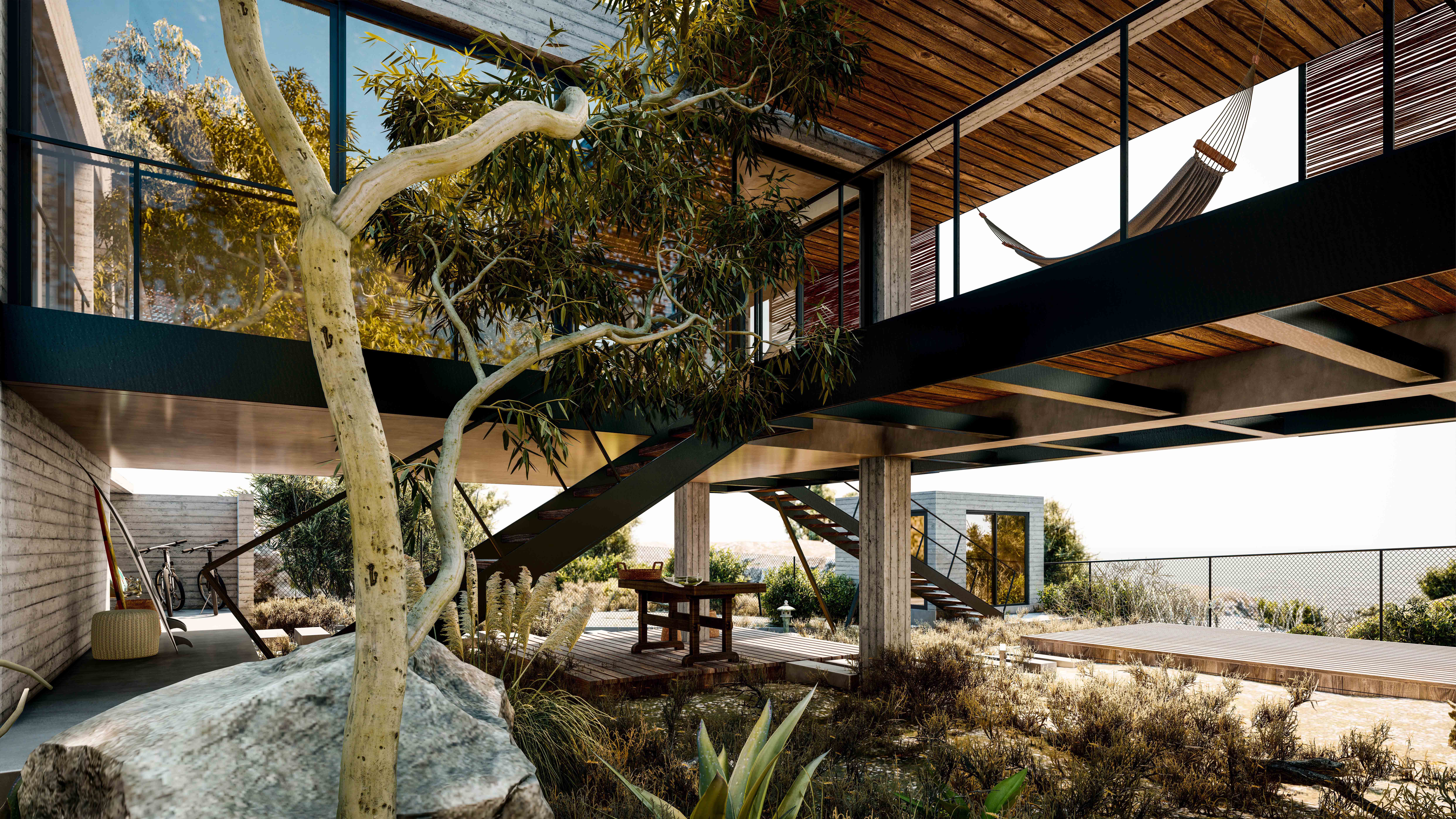
This design ingeniously moves beyond the binaries of inside/outside to explore what it means to live in between indoor and outdoor space. Natural materials and claddings — including movable screens made of reeds — enclose exterior spaces, transforming the structure into a light and almost transparent cubical volume that overlooks the sea.
The building’s ground imprint is minimized in order to preserve the local microclimate and natural flora, while the timber slats visually elide the distance between the natural and built environments. The Akamas Peninsula is carpeted with plants and rocky fields. The house embraces both, inviting them to rest amongst the living spaces.
10. The Wall House
Guedes Cruz Architects, Lisbon, Portugal
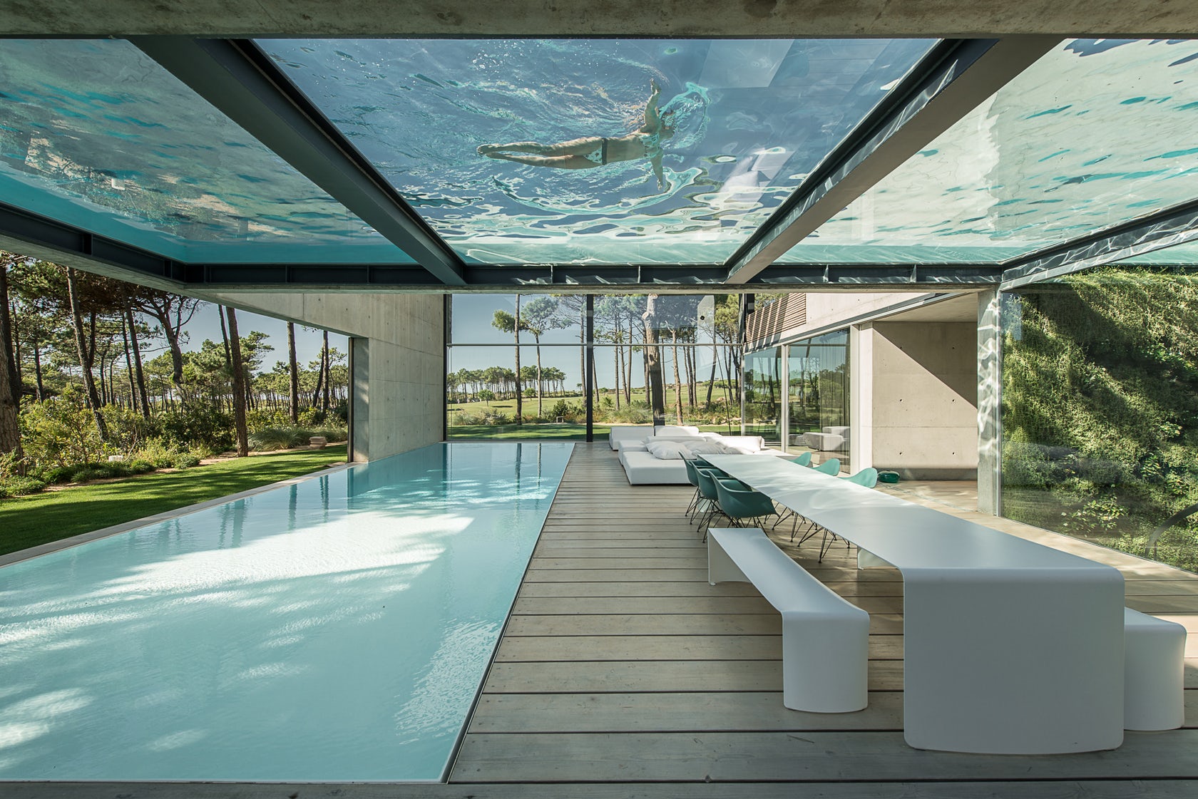
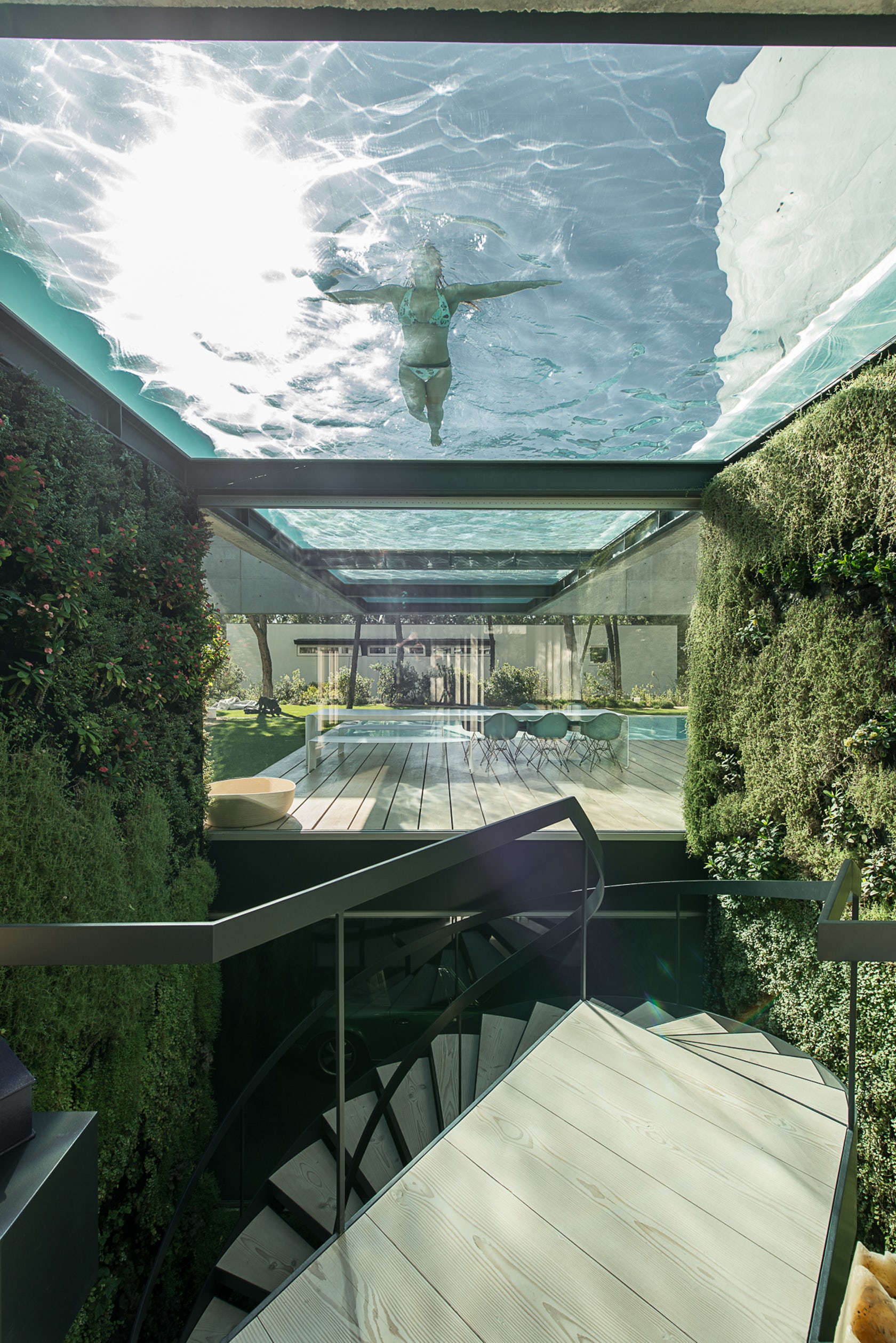
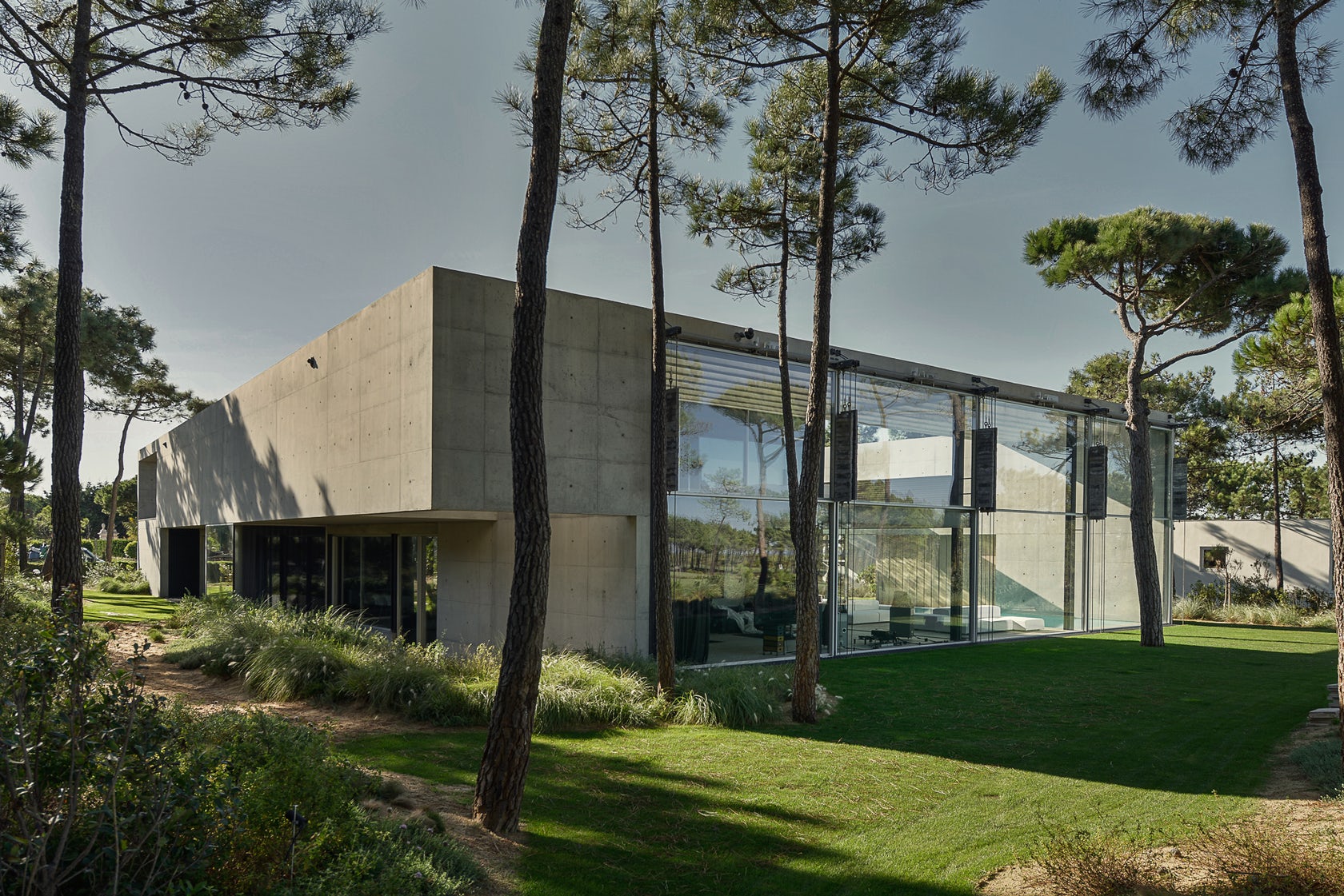 Concrete, glass and wood form a protective but open barrier that cocoons the patio of this remarkable home. Privacy was less of a concern than the harsh Atlantic winds. To this end, extensive glazing opens the house to scenic sea views, which are visible from both interior and exterior spaces. The tour de force are two stacked, exterior pools that crisscross over one another on the patio — one in the ground and the other floating in the air.
Bonus: Toyath Residence
Webber + Studio, Architects, Austin, TX
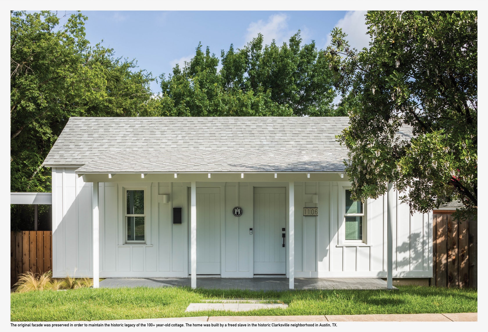
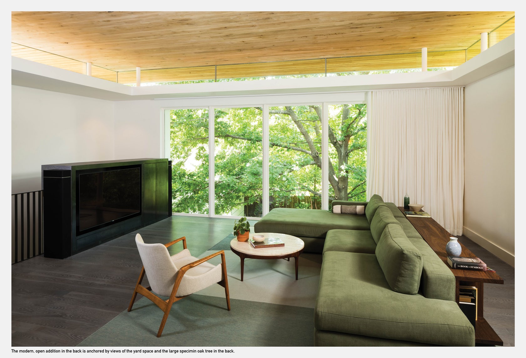
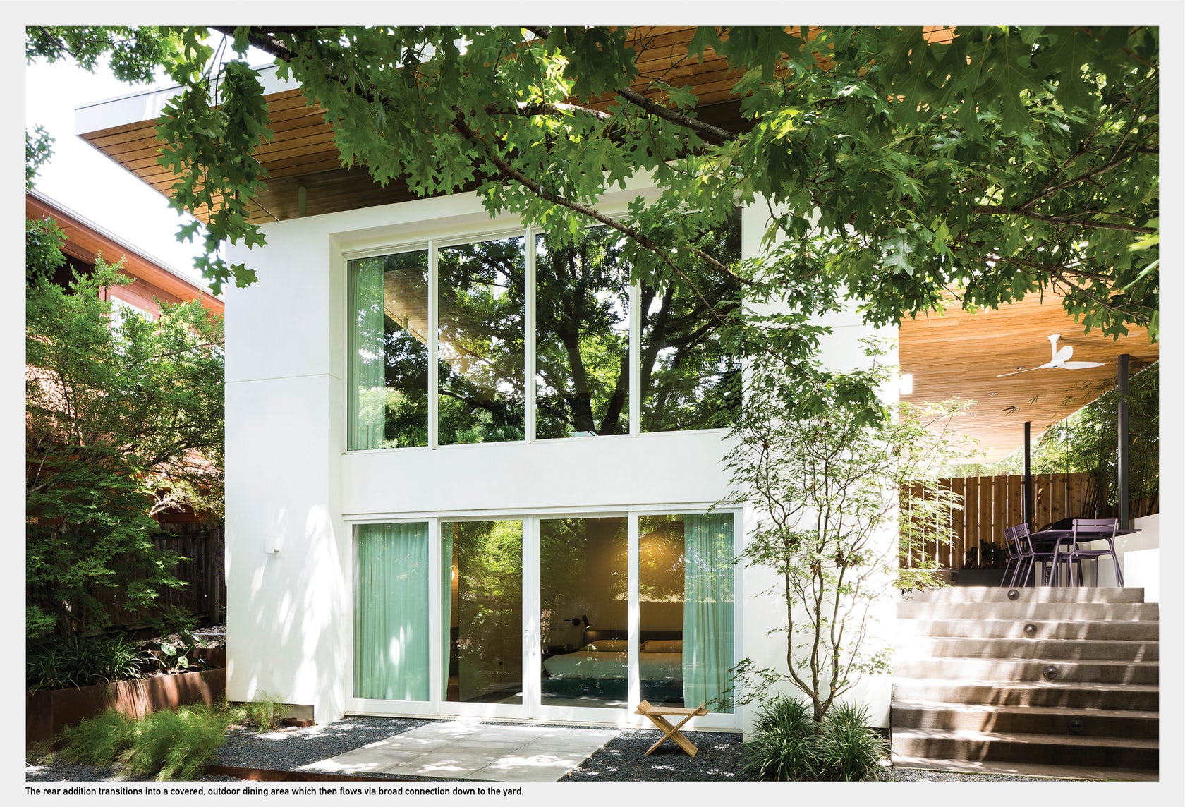 Infrastructural issues, size constraints and stylistic inconsistencies plagued this twice-renovated Freedman’s cottage in Austin’s historic Clarksville neighborhood. Although it may be a common challenge, preservation is an art form, and this intervention is a masterclass in balancing modern updates and expansion with sensitivity to historic value. This project responds by reimagining the home as a series of smooth and luminous interconnected spaces that culminate a spacious, modern addition at the rear.
Architects: Want to have your project featured? Showcase your work by uploading projects to Architizer and sign up for our inspirational newsletters.
 The Wall House