Parking structures are some of the most common buildings many people encounter on a daily basis, yet they remain largely ignored by the architectural profession. They populate roadways, cities, shopping centers and office buildings across the globe and have considerable spatial impact on the environment. Too often though these structures receive little consideration in the overall development scheme of a site. Parking garages are thought of as a utilitarian necessity to provide services for people to then enjoy other sites of interest. We have seen them avoid the aesthetic considerations to which we might hold other ubiquitous public buildings. However, these structures offer an opportunity for architects to display a thoughtful rethinking of the usual image of this universal typology and set new standards for what this enduring infrastructure can achieve.
Part of the reason for this aesthetic inattention may be due to the fact that the parking structure’s program has gone unchanged since its inception. It still must facilitate a certain number of vehicles across multiple levels, most often connected by a series of ramps, walkways and elevators. This building typology can then be a blank canvas of sorts for the architect, who can apply exterior ornament or cladding that veils the structure’s underlying functions. Architects have therefore focused on the parking structure’s skin to introduce textural, sculptural and material expression into this potentially drab infrastructure. The following projects exemplify this approach to parking structure design, in which the building’s skin becomes a manipulable surface that applies decoration, protection and filtration to the program from within and without.

© Behnisch Architekten

© Behnisch Architekten
City of Santa Monica Public Parking Structure #6by Behnisch Architekten, Santa Monica, Calif., United States
This urban parking structure in Santa Monica creates a dynamic interaction between the street life of pedestrians, cyclists and motorists, and the building’s functions. The circulation zone is located towards the exterior streetscape, which guides patrons towards the activities below, reducing confusion and increasing connectivity. The screen’s perforated metal panels draw light deep into the interior structure and act as a light reflecting mechanism.

© Urbana / Rob Ley

© Urbana / Rob Ley
May / September Hospital Parking Structure Facadeby Urban / Rob Ley, Indianapolis, Ind., United States
The angled metal panels of this hospital parking structure’s façade change with the movements of vehicles and pedestrians moving on the inside and outside of the building. The overall effect of this interactive skin is a colorful and dynamic façade that responds to both the city and the hospital’s patrons.

© Dennis De Smet Photographs

© Dennis De Smet Photographs
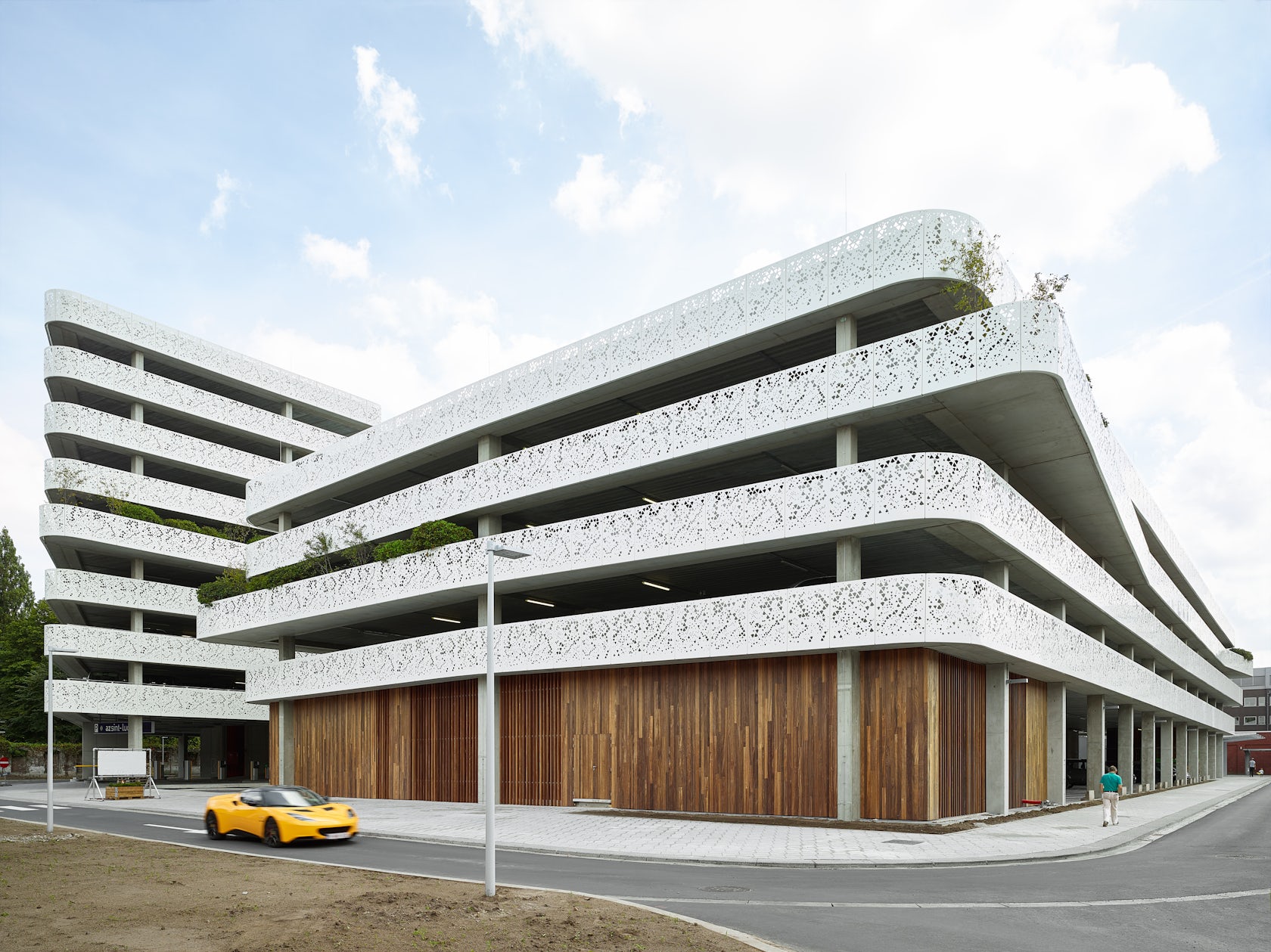
AZ Sint-Lucas Car Parkby Abscis Architecten, Ghent, Belgium
Another hospital parking structure, this Belgian parking lot at first resembles the typical multi-story parking structure in its stacked concrete floor plates supported by pillars. But this building distributes its parking capacity across two distinct structures of differing heights, creating a flowing avenue that leads to the hospital entrance. The textured panels are paired with strategically placed greenery to lighten up the building’s mass.

© Milan Mijalkovic

© Milan Mijalkovic
Baroque Parking Garage by Milan Mijalkovic, Scopje, Macedonia
Commissioned as part of a massive restructuring project by the city government, this winning competition entry responded to a brief to create a baroque or neoclassical look that would reflect the aspirations and independence of Macedonia (the former Yugoslavia). Rather than opting for a banal historicism, the architect re-envisioned the baroque style in light of its emphasis on illusionistic ornament. The pattern is drawn from a perspective photograph of historicist houses in Vienna, which has been distorted, layered and dissolved onto the two-dimensional plane of the façade.

© Jeroen musch

© Jeroen musch
Gnome Parking Garageby Mei Architects and Planners, Almere, Netherlands
The perforated metal screen façade of this 413-space structure features imagery and symbols drawn from the surrounding area such as windmills, birdhouses and garden gnomes. This whimsical ornamentation also draws light and ventilation into the structure.

© Gehry Partners

© Gehry Partners
New World Symphony Parking Garageby Gehry Partners, Miami Beach, Fla., United States
This parking structure serving a 700-seat concert hall uses GKD’s Helix 12 woven sheet metal façade, which keeps the interior open, ventilated, safe and secure, and is highly resistant to hurricanes and storms. The skin is lit by LED lights at the base of the screen, which can be programmed to the events taking place at the concert hall.

© NBJ architects

© NBJ architects
Urban Space and Parking in Carrosby NBJ Architects, Carros, France
Set on a sloping site, this two-story parking lot features a slatted-wood skin that blends seamlessly into the forested environment. The breezy application of the skin adds light and air to the partly open structure.

© Fitzsimmons Architects

© Fitzsimmons Architects
Guardian Parking by Fitzsimmons Architects, Oklahoma City, Okla., United States
Although this project differs from the others presented above because it is not a multi-story structure, this parking structure in downtown Oklahoma City features a cantilevered structural steel frame covered in standing seam metal roofing panels. This transparent skin adds enclosure and protection to the space, but allows visibility to the street from the inside.


