Architects: Want to have your project featured? Showcase your work by uploading projects to Architizer and sign up for our inspirational newsletters.
Tilting the volumes and the façades of buildings allows the architect to achieve new and unexpected formal effects. Even the slightest of modifications to conventional building geometries have the potential to create more dynamic dimensions to architecture. In many of these projects, the tilting of volumes conveys an abstract representation of a more natural landscape. Angled volumes that are not parallel to the horizon line can create an illusion of growth that begins below the earth, creating a striking harmony between architecture and nature.
Moreover, ‘off-balance’ architecture also serves a practical purpose in many sustainable projects. By tilting and rotating building forms, the architect has the ability to control the angle of light that strikes each elevation. A tilted façade could offer an optimal exposition for the integration of photovoltaic collectors allowing a maximum harvest of solar energy to create a green building. Check out these off-kilter designs, each of which appear to bend and break away from the horizon line:

© Moussafir Architectes

© Moussafir Architectes

© Moussafir Architectes
La Luciole by Moussafir Architectes, Alençon, France
This theater is composed of two cylinders whose intersection forms an elliptical arc between the audience and the stage. The minimalist forms emerging from the ground represent a geyser linking earth and sky.

© L J B

© L J B

© L J B
Flotane by L J B, Lærdal, Sogn og Fjordane, Norway
Nestled within a landscape of rocky and dramatic plateaus, this structure takes the form of a tilted cube. The tilt creates a covered entrance on one side and a perfectly angled solar panel integrated in the main window of the other side to maximize solar gain.

© Paal-André Schwital

© Snøhetta

© Snøhetta
ZEB Pilot House by Snøhetta, Narvik, Norway
This sustainable home creates enough energy on its own to power the house and an electric car. This is made possible by the characteristic tilt towards the southeast and a sloping roof surface clad with solar panels and collectors among many other green building features.

© ArchiWorkshop

© ArchiWorkshop

© ArchiWorkshop
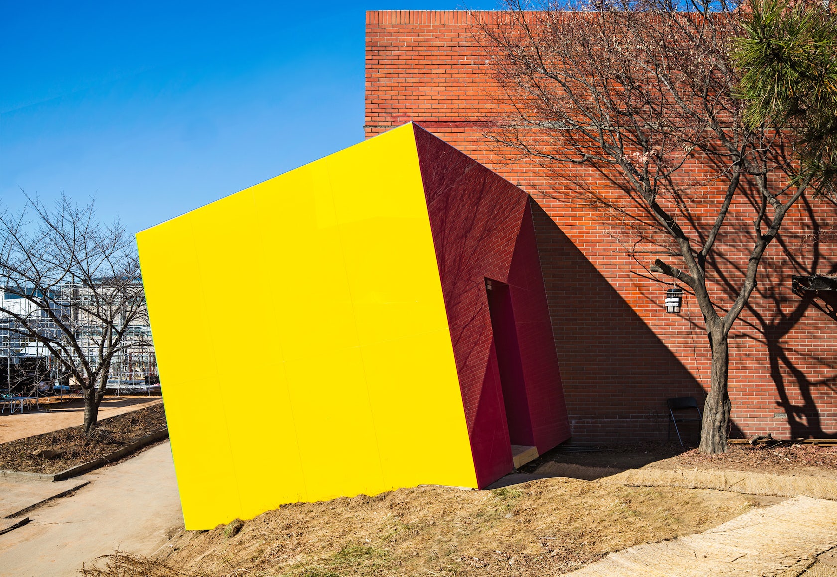
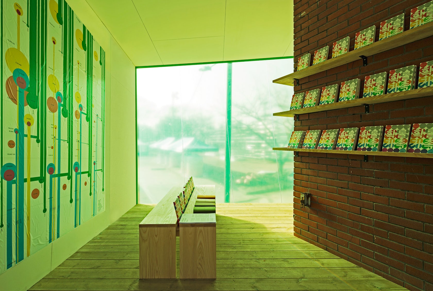
Mobile Library by SpaceTong, Seoul, South Korea
A “parasitic attachment” to the main library building, the tilted cube is an experimentation of creating more dynamic entryways into the older building in order to better engage users. The tilted cube and its bright yellow façade is eye catching, yet still chimes with the surrounding environment.

© Chyutin Architects

© Chyutin Architects

© Chyutin Architects
University Senate Center by Chyutin Architects, Israel
The main entrance to this educational complex is designed like a cleft carved into the rock of a canyon. Made up of disparate parts, the off-balance nature of the cylindrical structure and the partition wall creates a dramatic tension.

© Gerald Zugmann

© Gerald Zugmann

© Snøhetta
Bibliotheca Alexandria by Snøhetta, Alexandria, Egypt
Intended to recall the original library of the ancient city founded by Alexander the Great, the 11-story library in Alexandria aspires to serve as a new symbol of learning in the city. Its spiraling form is emblematic of the circuitous and timeless nature of knowledge.

© LOVE architecture and urbanism

© LOVE architecture and urbanism

© LOVE architecture and urbanism
villa 3s by LOVE Architecture, Schönbrunngasse, Graz, Austria
A folding of the ceiling begins at the seating platform over the outside walls, continues over the roof, and covers the building structure forming a saddle roof without taking on the appearance of a conventional saddle roof. This folded roof allows interior and exterior spaces to be differentiated to create a dynamic circulation in this home.
Architects: Want to have your project featured? Showcase your work by uploading projects to Architizer and sign up for our inspirational newsletters.


