Architects: Want to have your project featured? Showcase your work by uploading projects to Architizer and sign up for our inspirational newsletters.
Corporate modernism is a term that encompasses a specific kind of International Style building in the latter half of the 20th century. Large corporations, flush with cash as revenues and profits exploded in a post-war boom, wanted to showcase their forward-looking attitudes and futuristic products by virtue of cutting edge innovations in modern architecture. Employing the modernist vocabulary of ribbon windows, steel framework and simple geometric forms, companies modeled their offices and headquarters in light of the vibrant transformations happening in architecture. Iconic buildings such as SOM’s Lever House and Mies van der Rohe’s Seagram Building are direct outgrowths of this trend and many have hailed them as both the earliest examples and highest achievements of corporate modern architecture.
But if these buildings were the best executed of their kind according to the strict formal standards of modernism, countless others went on to mimic the style in endlessly monotonous imitations that were neither aesthetically inspired nor well-built. The ability to construct them cheaply and efficiently (much like the products they were meant to evoke) has caused a bastardized version of corporate modernism to proliferate across the globe, harming workers and the environment alike. Thankfully, a new generation of architects have reinterpreted the tenets of corporate modernism in ways that continue the tradition while tweaking their formal values. The following collection of corporate modern office buildings showcase a consistency with earlier models, but with an unexpected and playful edge.

© Wittfoht Architekten

© Wittfoht Architekten
World Trade Organization (WTO) headquarters in Geneva by Wittfoht Architekten, Geneva, Switzerland
This global headquarters for the WTO — the organization responsible for regulating the flow of corporate goods around the world — has much in common to the high-modern style of yesteryear. The new building is in an area with a group of existing buildings and continues both the height and section lines of the others, giving the elongated form an appropriate proportionality. An open mixed-use base serves as the flexible foundation from which sets of four columns extend upward into the office space.

© Meier Architects

© Meier Architects
City Green Courtby Richard Meier & Partners Architects, Prague, Czech Republic
This building is the third in a cluster of larger buildings all by Richard Meier. It plays off the history of Cubism in Czech culture, featuring a series of louvered fins on the façade that break up the singularity of the horizontal and vertical glass surfaces. Balconies to the south add expression to the geometric form, while the building is raised on pilotis and efficiently organized around a multi-story atrium.

© Olson Kundig

© Kyungsub Shin
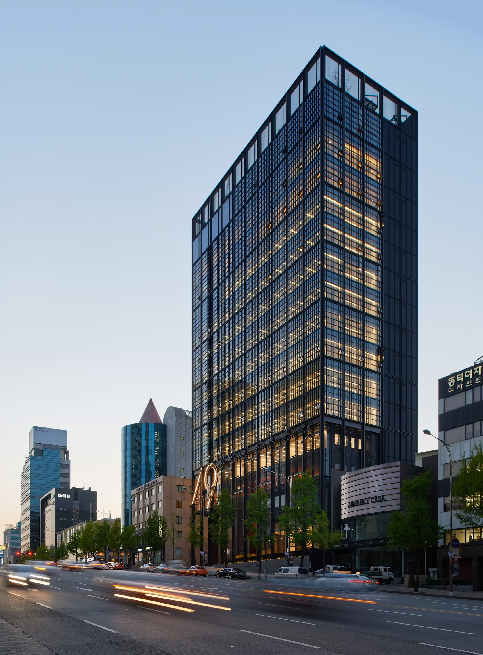
Shinsegae International by Olson Kundig Architects, Seoul, South Korea
This 15-story tower uniting workers at the company into a single building contains offices, meeting rooms, a rooftop garden and ground-level retail facing a public plaza. The building features Olson Kundig’s signature kinetic elements of movable panels connected to giant wheels. The crisp gridded façade of steel-framed casement windows recalls an industrial rather than corporate modern feel.

© Jens Kirchner

© Jens Kirchner
GRÜNENTHAL OFFICE 411by kadawittfeldarchitektur, Aachen, Germany
Extending from a 500-foot elevated platform, a staggered seven-story building with offset floor plates serves as the entry point to a corporate campus. The office spaces are arranged on either side of the building to allow light, while varied meeting spaces are found on the core as a result of the shifted plan and sections.

© Fletcher Priest Architects

© Fletcher Priest Architects
New Ludgateby Fletcher Priest Architects, London, United Kingdom
This office complex transforming an entire city block previously occupied by a large 1980’s office building does not overwhelm the historic district, but rather continues the height of the neighborhood and forms a lively public plaza with a decidedly non-corporate feel. The façades are of masonry, glass and white precast concrete.

© Dominique Perrault Architecte

© Dominique Perrault Architecte
Onix Office Building by Dominique Perrault Architecte, Lille, France
The triangular plot of this mid-rise office building in the vibrant commercial and transportation district of Euralille helps determine the efficient allocation of its form, which folds and facets. The glazing of the façade echoes this formal variation with four types of glass modules, going from smooth at its base to increasingly sloping and jagged at the top. A metallic netting covers mechanical systems on the roof, topping off the volume.

© pierer.net

© pierer.net
OEBB headquarters by Vechner & Vechner, Austria, Vienna
The dynamically curved form of this corporate headquarters for an Austrian railroad company departs from the formal constraints of typical corporate modernism, while evoking the speed and movement of its industry. Standing at 288 feet, it is a significant landmark for the area and connects the company’s employees to its physical product.
Architects: Want to have your project featured? Showcase your work by uploading projects to Architizer and sign up for our inspirational newsletters.


