Architects: Want to have your project featured? Showcase your work by uploading projects to Architizer and sign up for our inspirational newsletters.
Colorful backdrops and quirky aesthetics are accumulating millions of likes and saves on social media platforms like Instagram and Pinterest. Architects and architectural enthusiasts alike recognize the photographic appeal of these designs. For example, the hugely popular page, Accidentally Wes Anderson, has based its social media presence around the curation of spaces that embody the renowned filmmaker’s signature style — a pastel color palette with quirky objects, symmetrical lines and a dash of nostalgia. This playful design aesthetic has now moved from movie sets to the interiors of coffee shops, restaurants, coworking spaces and even more niche areas like Etsy and other smaller decor brands.
As it is warmly embraced by millennials, this aesthetic may seem to be having its moment; however, it the combination of colorful palettes with bold geometries is far from novel. From vibrant hues found in Cape Town to the soft-hued panorama of Havana or the whimsical air of Disneyland, such animated landscapes have long been magnets for visitors from around the world. Following these trends, more and more architects are playing with solid color blocks, bold patterns and strong geometry to create striking visual impacts.
Images by Patrick Coulie
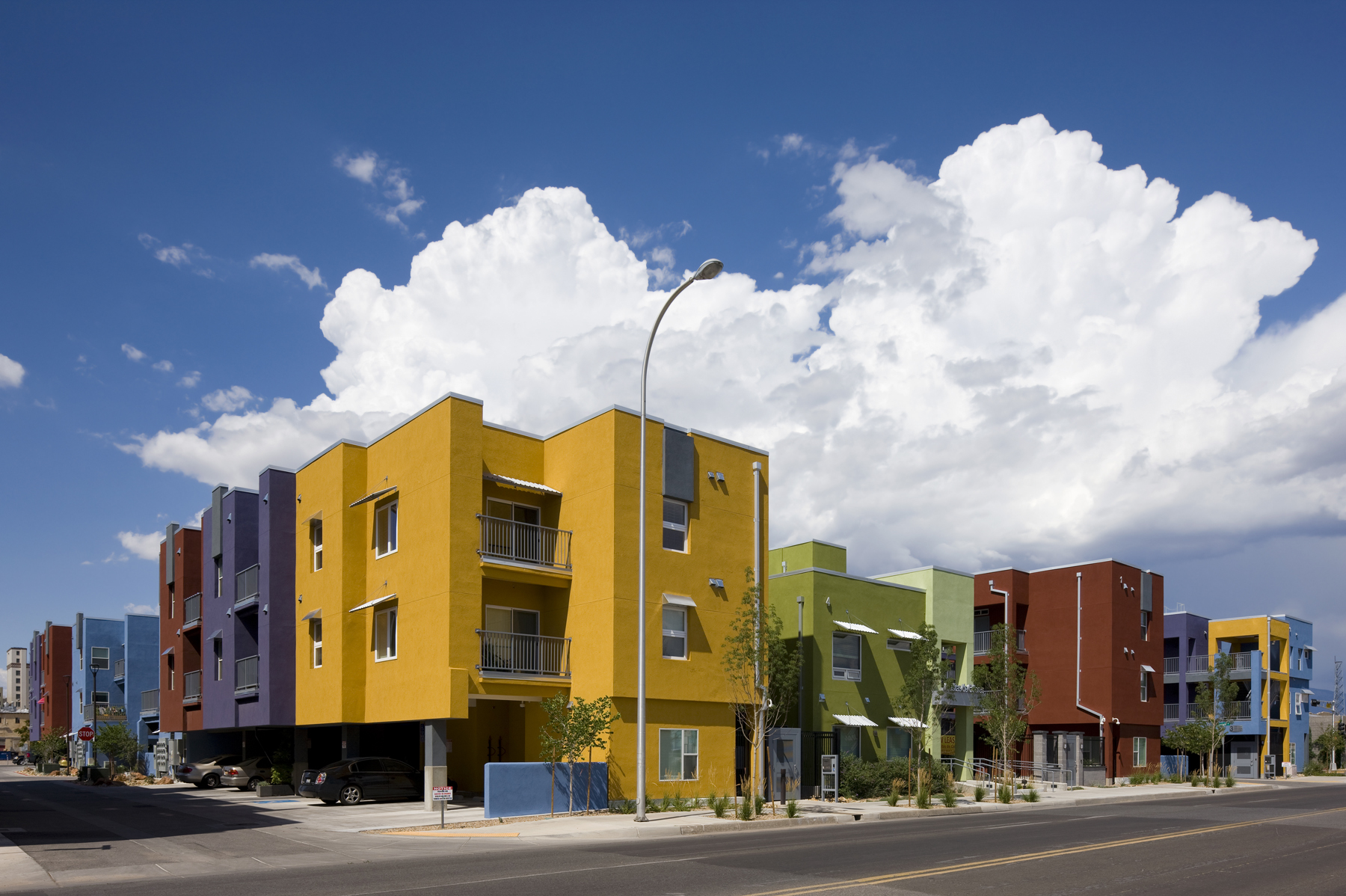
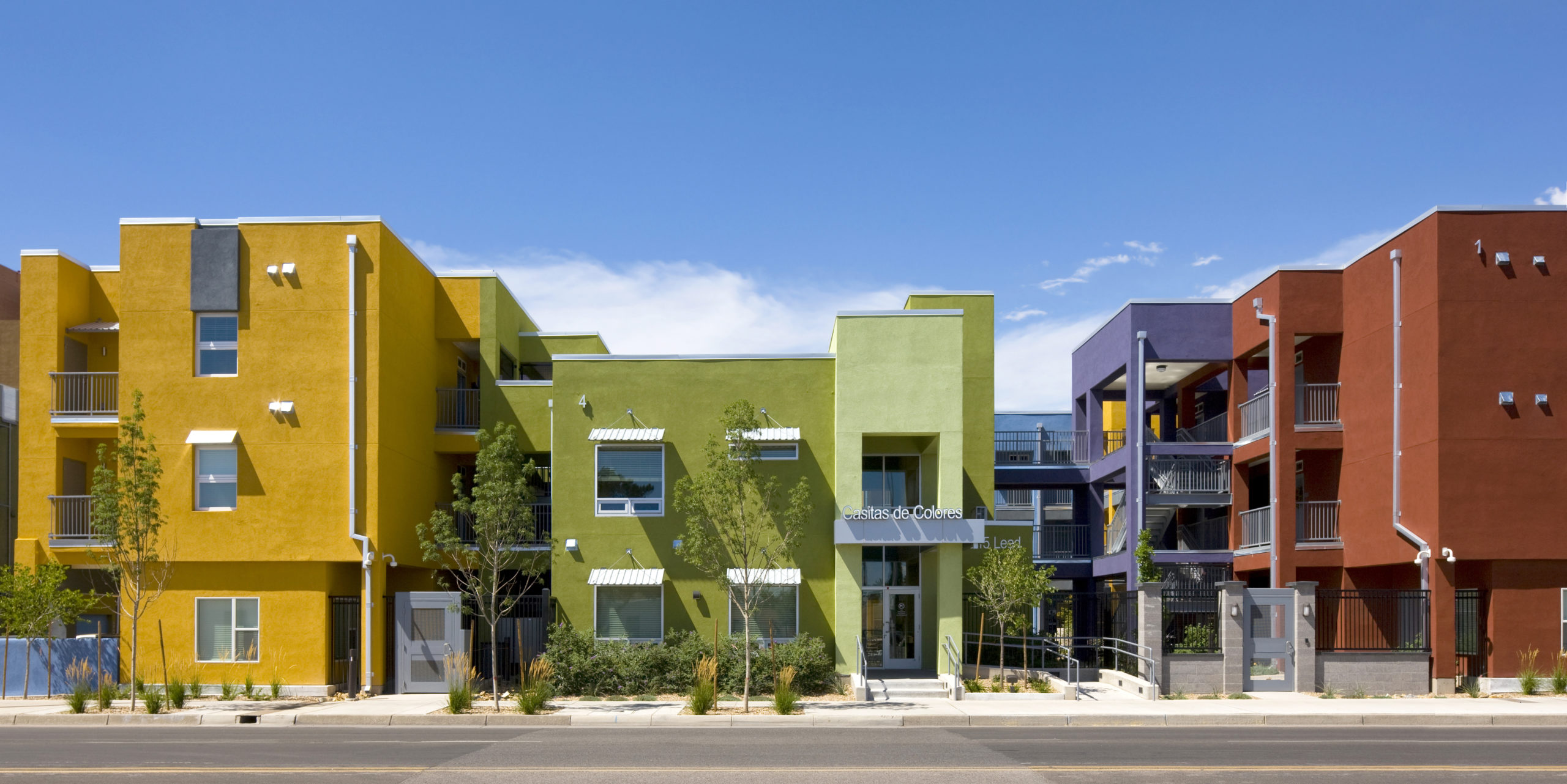
Casitas de Colores by Dekker/Perich/Sabatini, Albuquerque, New Mexico
The mixed-income housing complex is composed as a series of colorful apartment buildings that loop together, creating a courtyard at their center. Passersby can see solid blocks in vibrant hues like purple, yellow and green, interspersed with white-accented fenestrations and similarly crisp balconies.
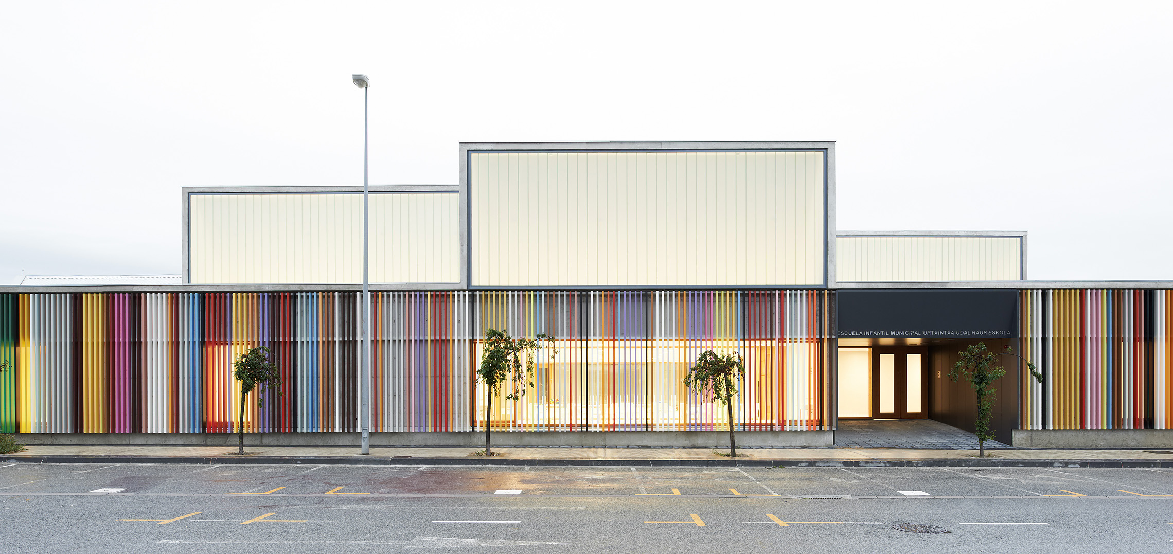
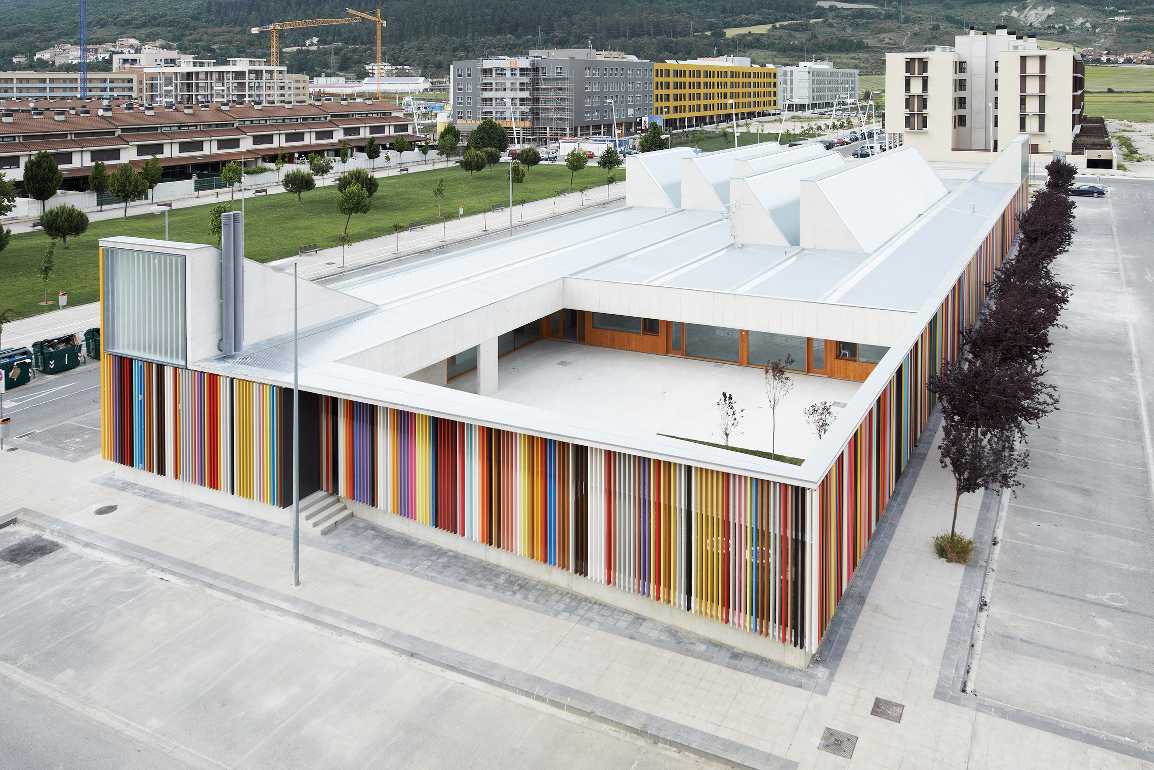 Nursery School in Berriozar by Javier Larraz Arquitectos and Iñigo Beguiristain, Berriozar, Spain
The school’s design balances the colorful panels on its exterior façade with white interiors. Warm-toned wooden accents break the monotony of the white and help differentiate the various programs within space.
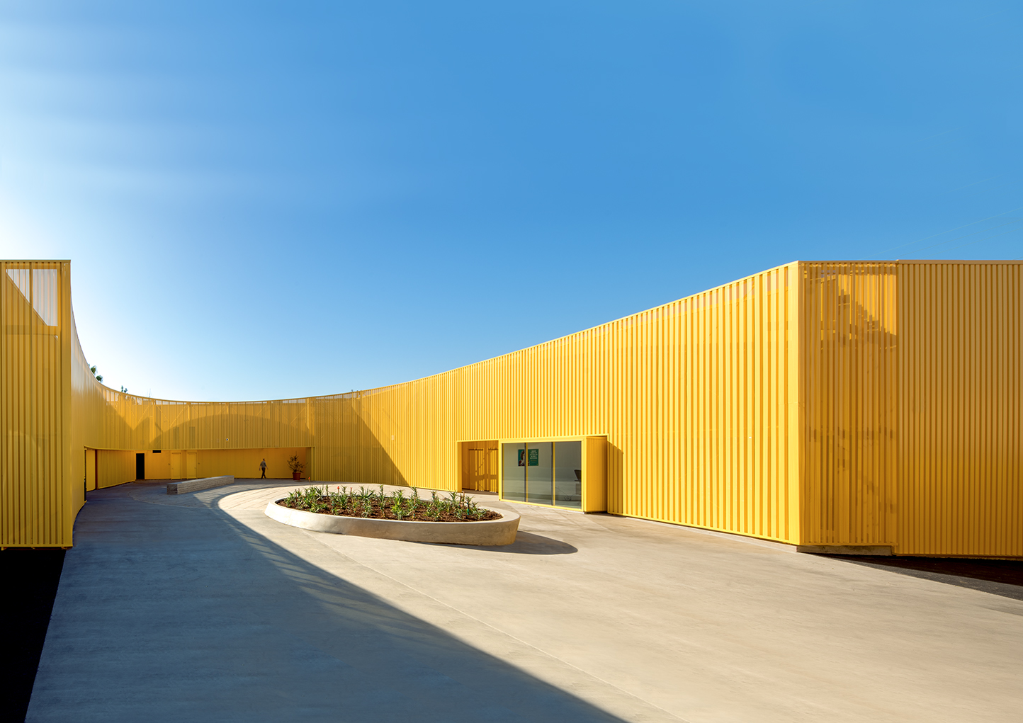
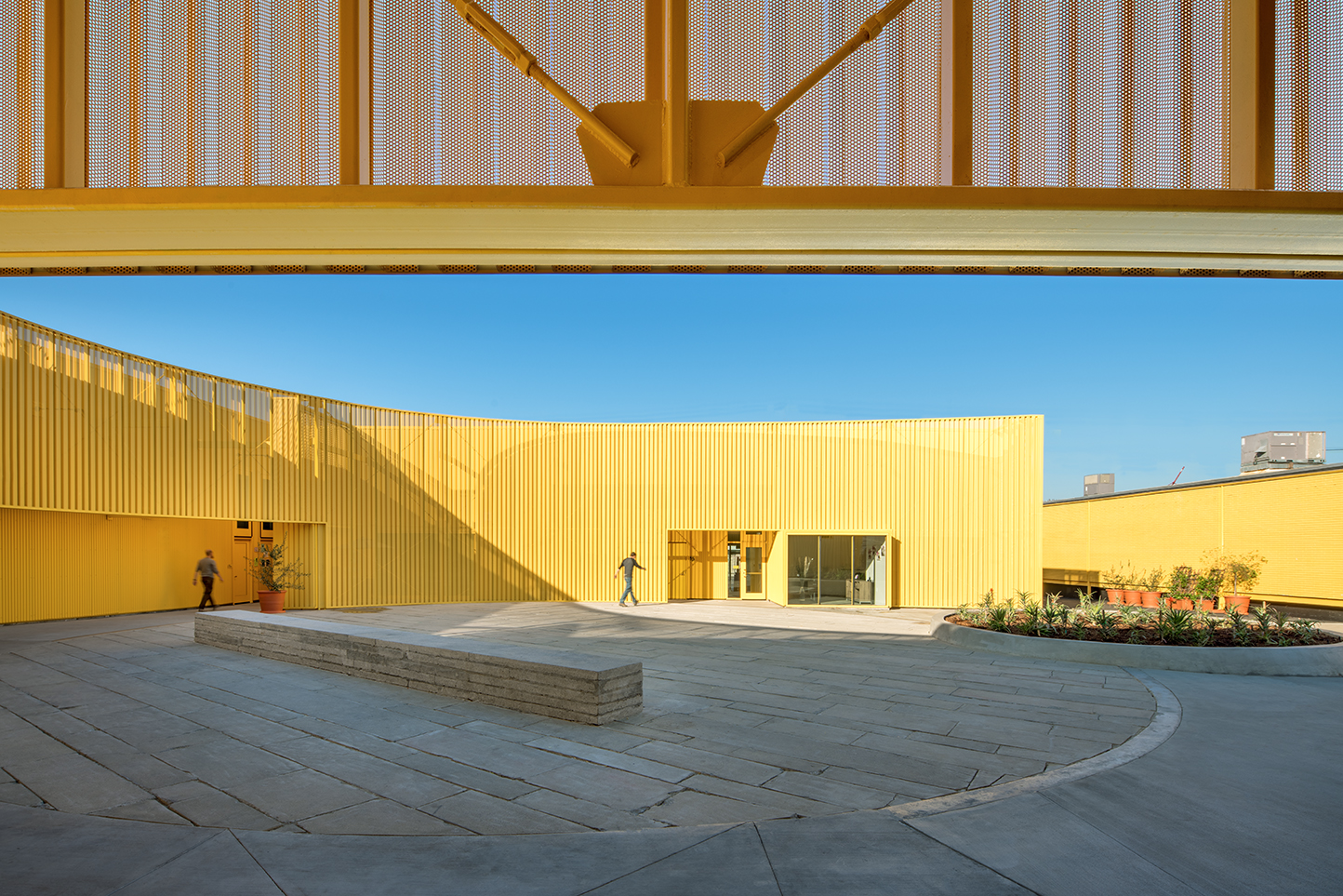 Animo South Los Angeles High School by Brooks + Scarpa Architects, Los Angeles, California
Epitomizing simplicity, the institution’s design makes one color — yellow — its focal point. The perforated external metal fencing, which becomes a part of the overall form, adding the required depth to an otherwise flat colored surface. This also allows light to filter in and out of the structure, creating ever-changing patterns along with the sun’s movement or as activities are carried out within.
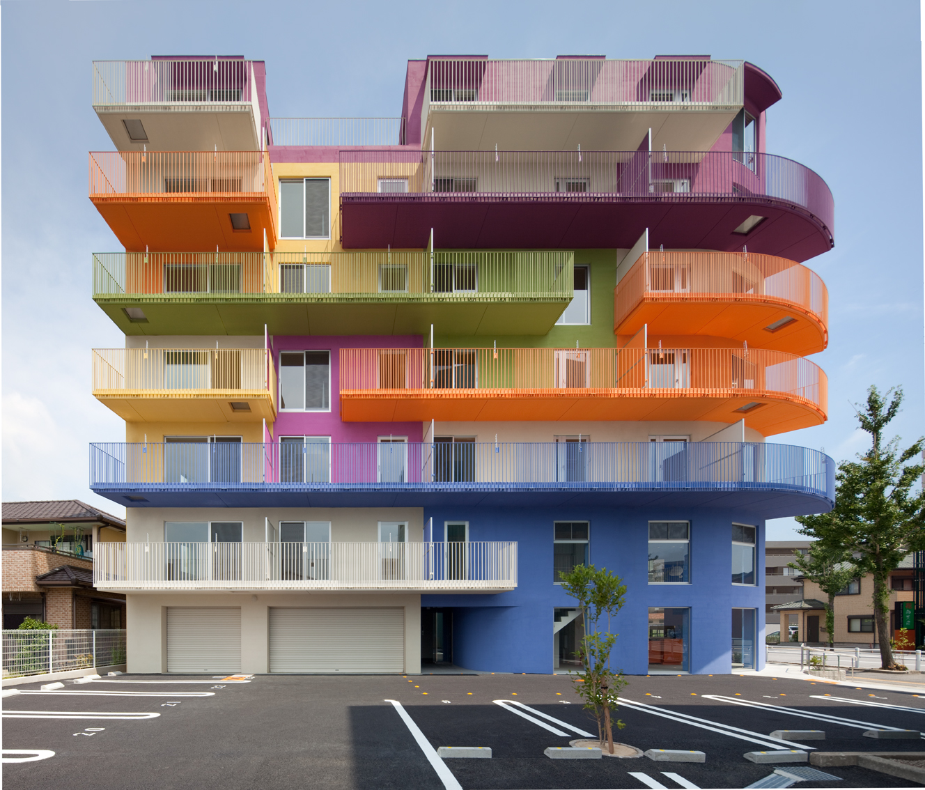
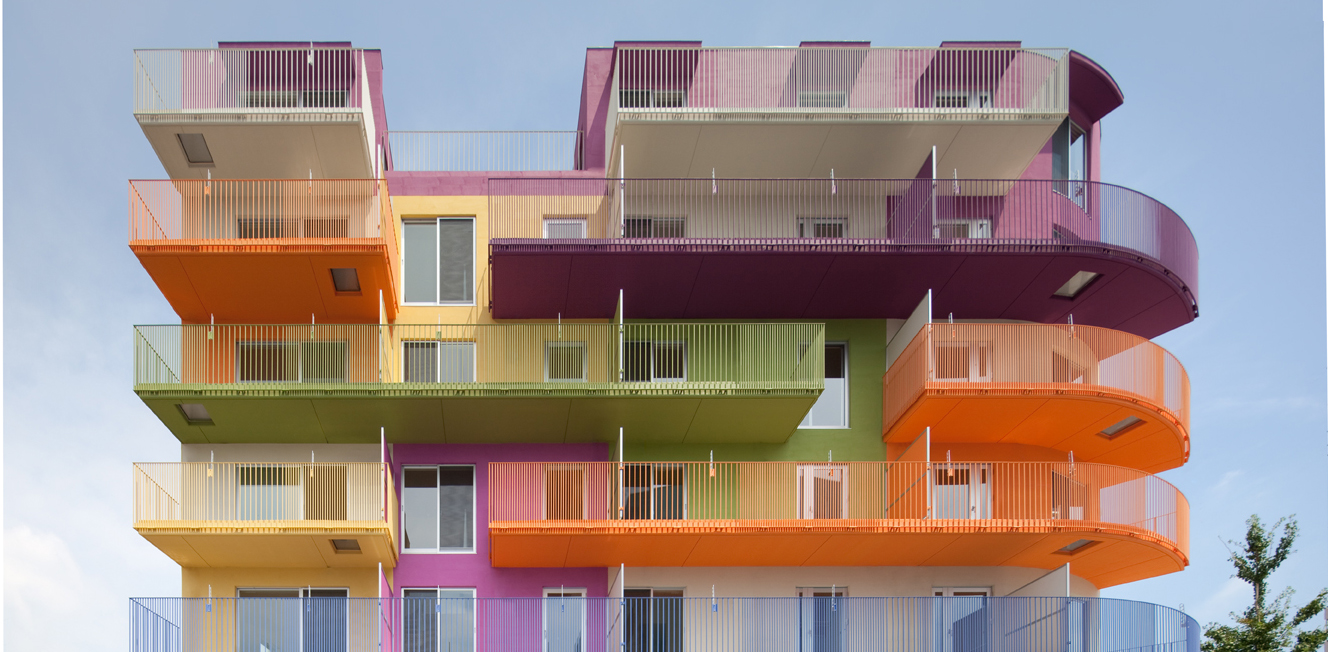
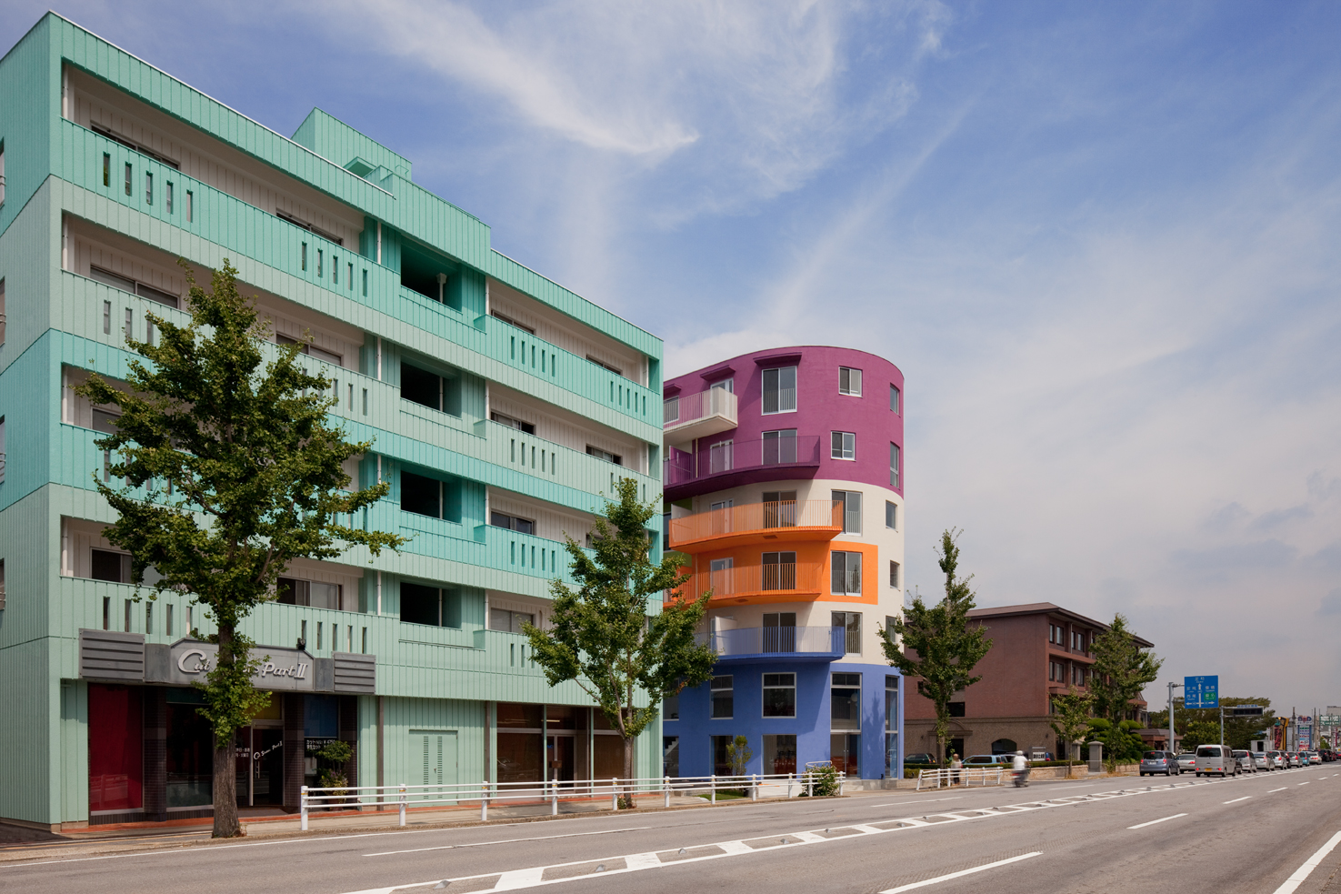 Nagoya Housing by Ciel Rouge Création, Nagoya, Japan
The dollhouse-like edifice revitalizes the bland palette of the area and creates a new urban identity. Each apartment is painted in a different color to help distinguish it easily from the outside. The building creates a strong statement about individuality and personality.
Images by Nacasa & Partners Inc.
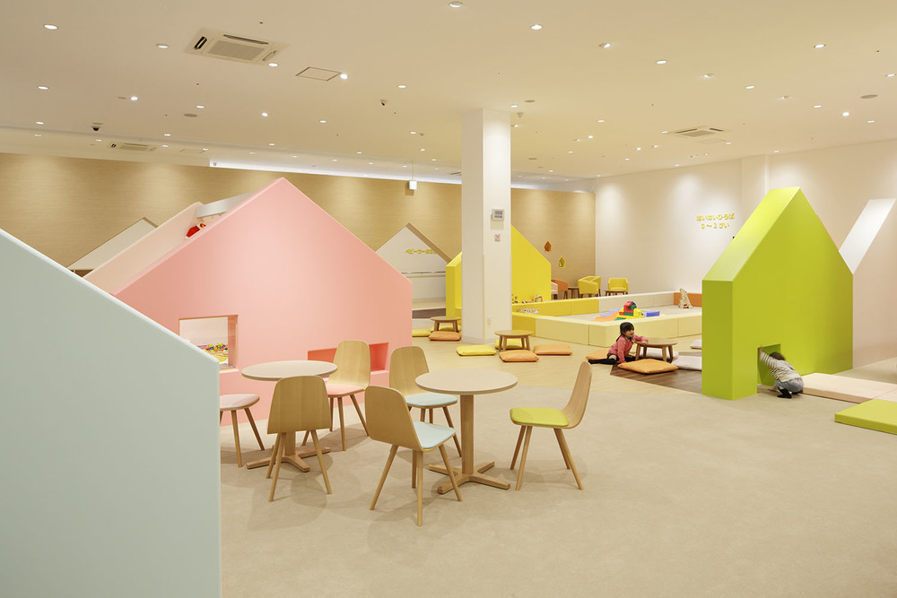
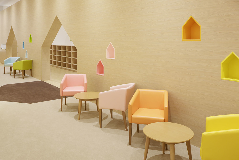
Mama Smile by emmanuelle moureaux architecture + design, Mito, Japan
Located within a shopping mall, this playing area was fashioned to create a sense of security and comfort. Tones of pink, yellow, orange, green and blue are used to create a whimsical neighborhood comprising house-shaped cutouts, back alleys and open spaces for children to explore and enjoy.
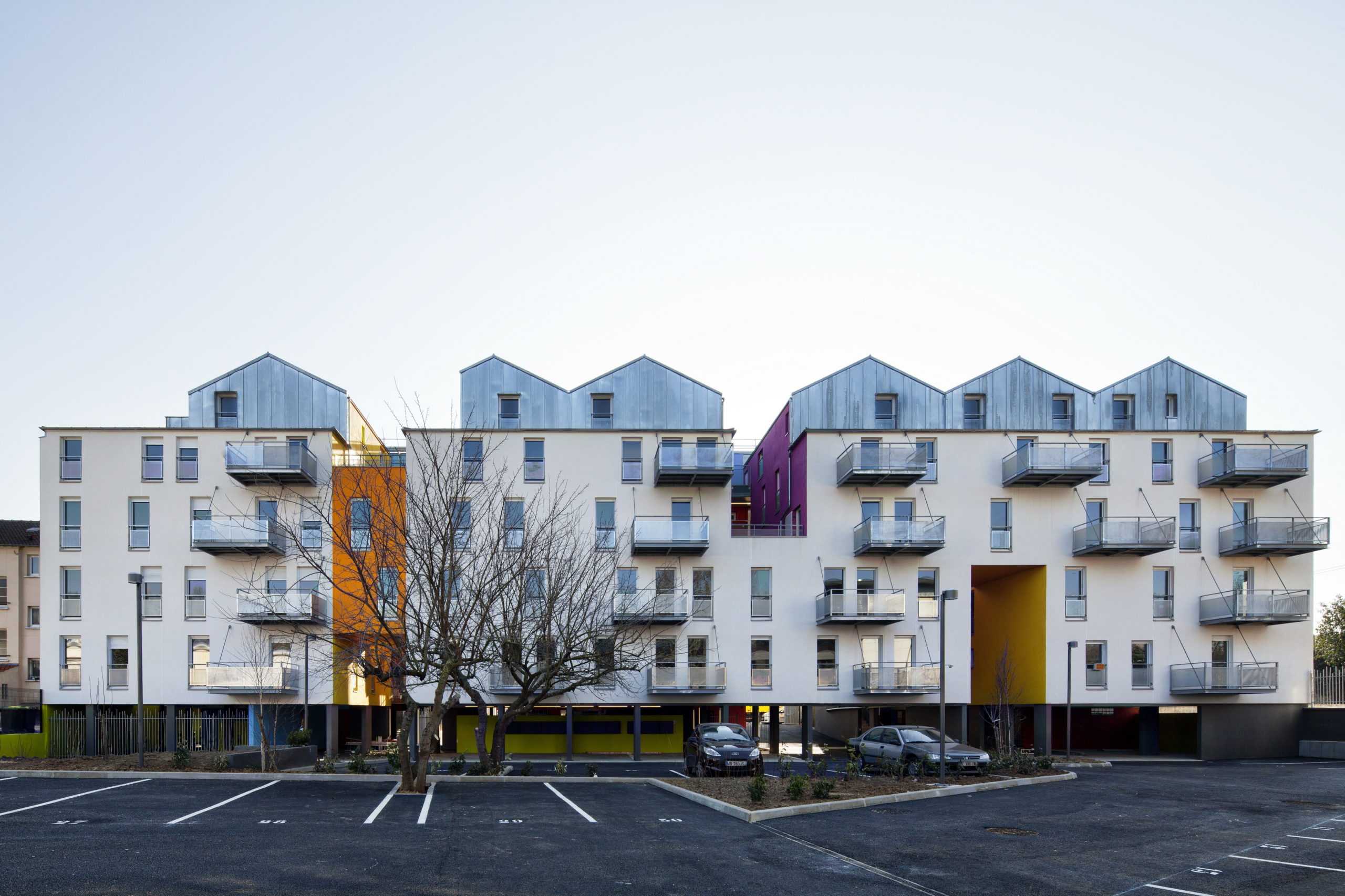
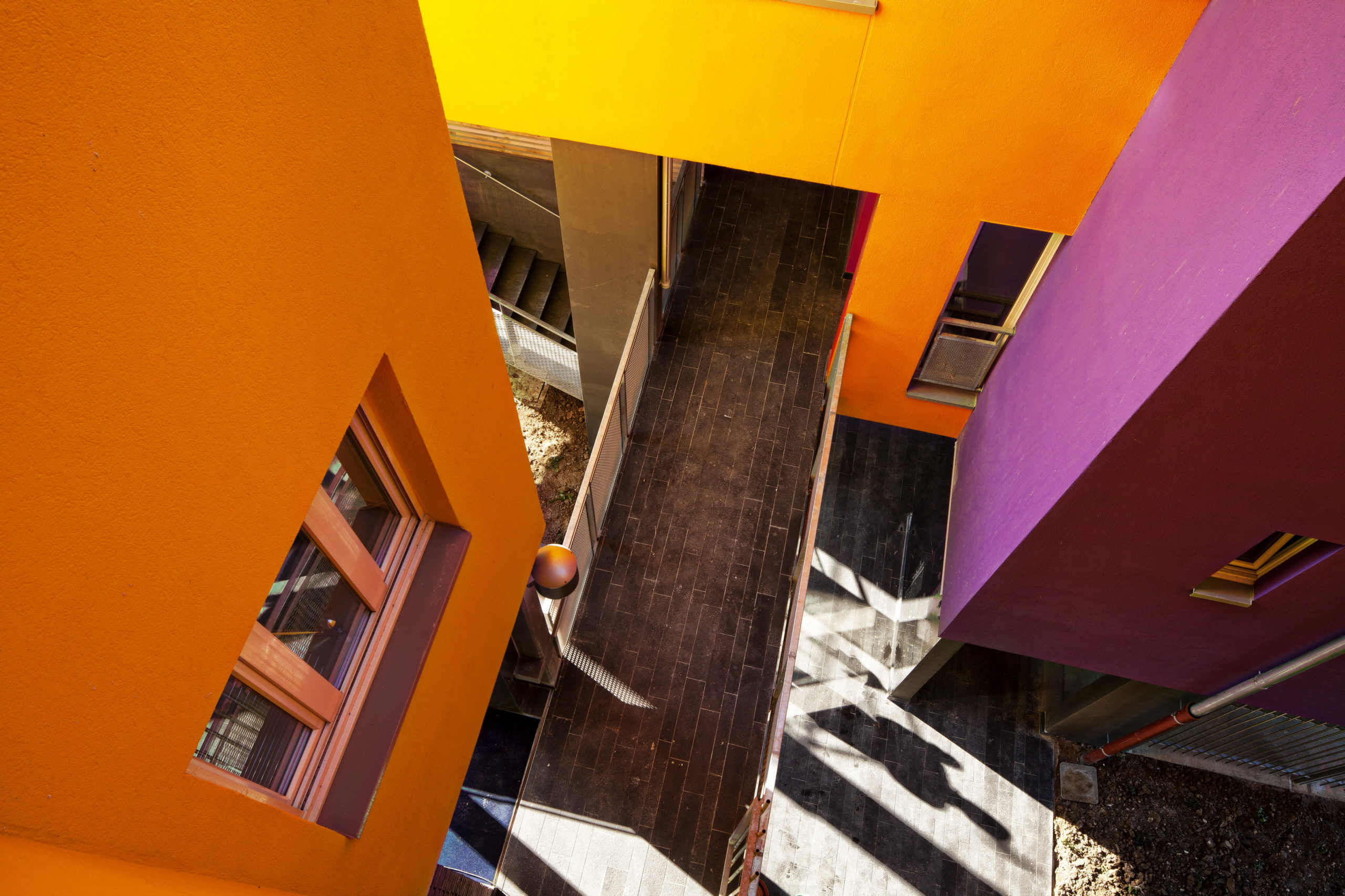 Social Housing in Athis-Mons (Immobilière 3F) by Atelier VongDC, Athis-Mons, France
The neutral exterior of the housing complex is energized by pops of color throughout the interior — visible through the openings carved into the massive forms of the apartment blocks. These bright pockets complement both the grey-toned façade on one side as well as the sepia palette on the other.
Images by Miguel de Guzmán
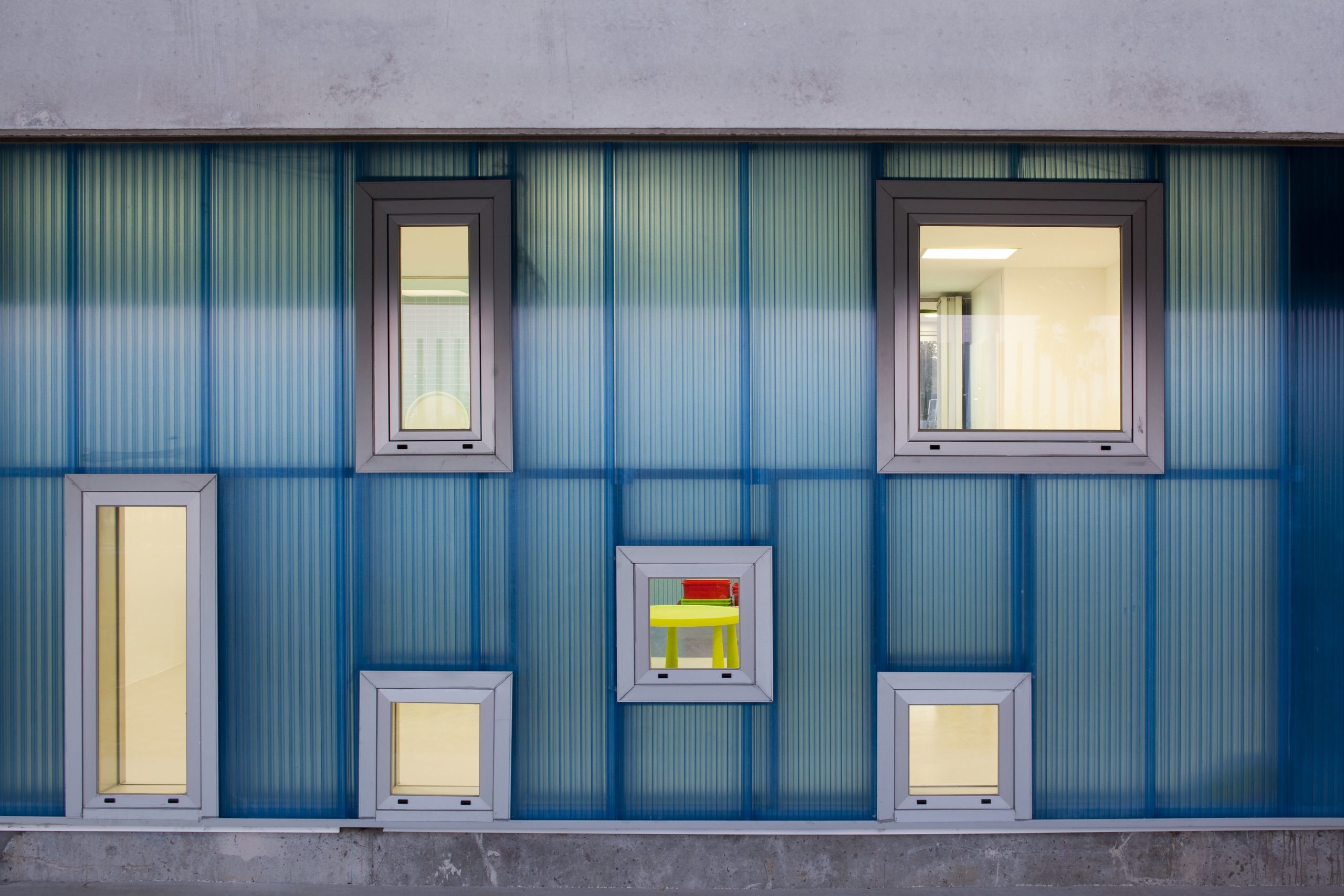
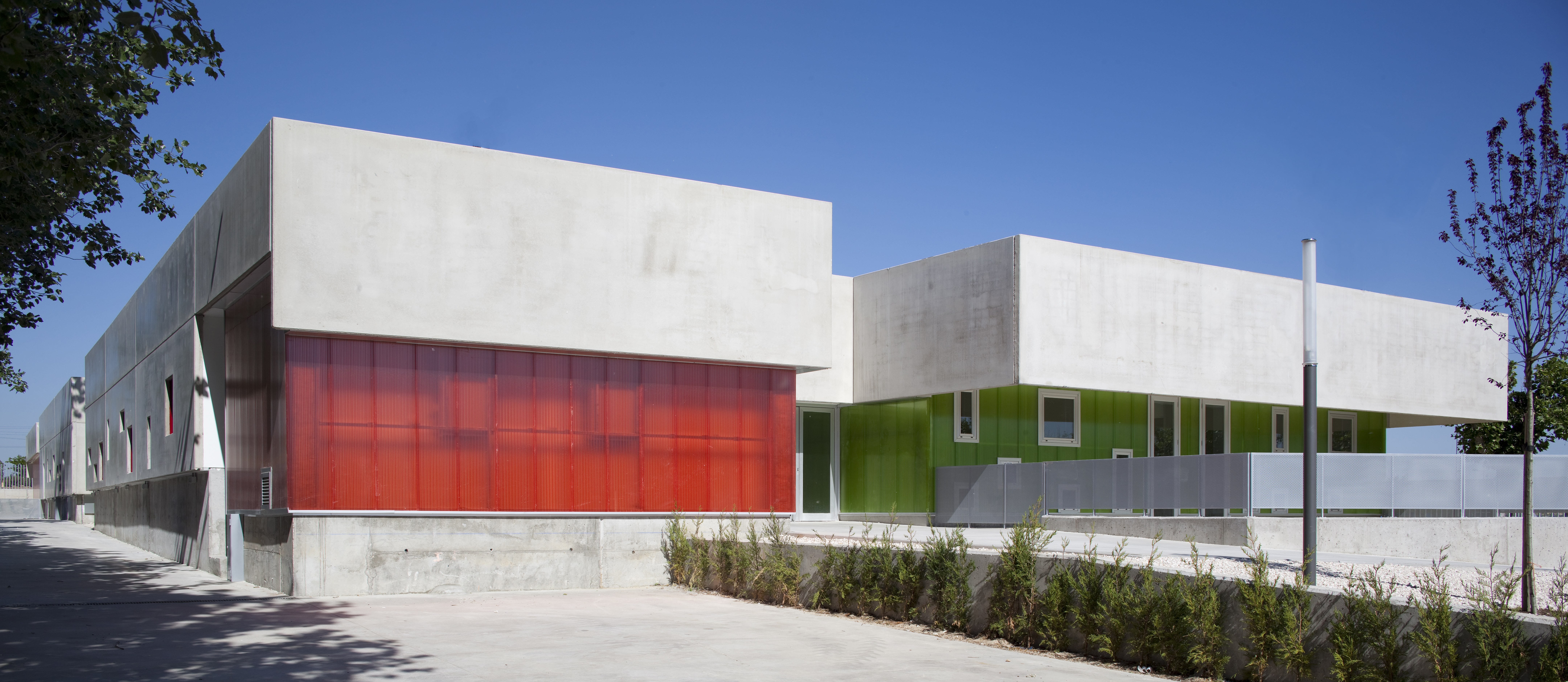
Pablo Neruda Nursery School by Rueda Pizarro Arquitectos, Alcorcón, Spain
Inspired by Alice in Wonderland, the school’s form plays with color, scale and texture to create a unique experience for children. Its roof also features tinted skylights that add to the playfulness of the structure. Several openings in different sizes are scattered along the walls to give a glimpse of the activities carried out within.
Images by César Béjar
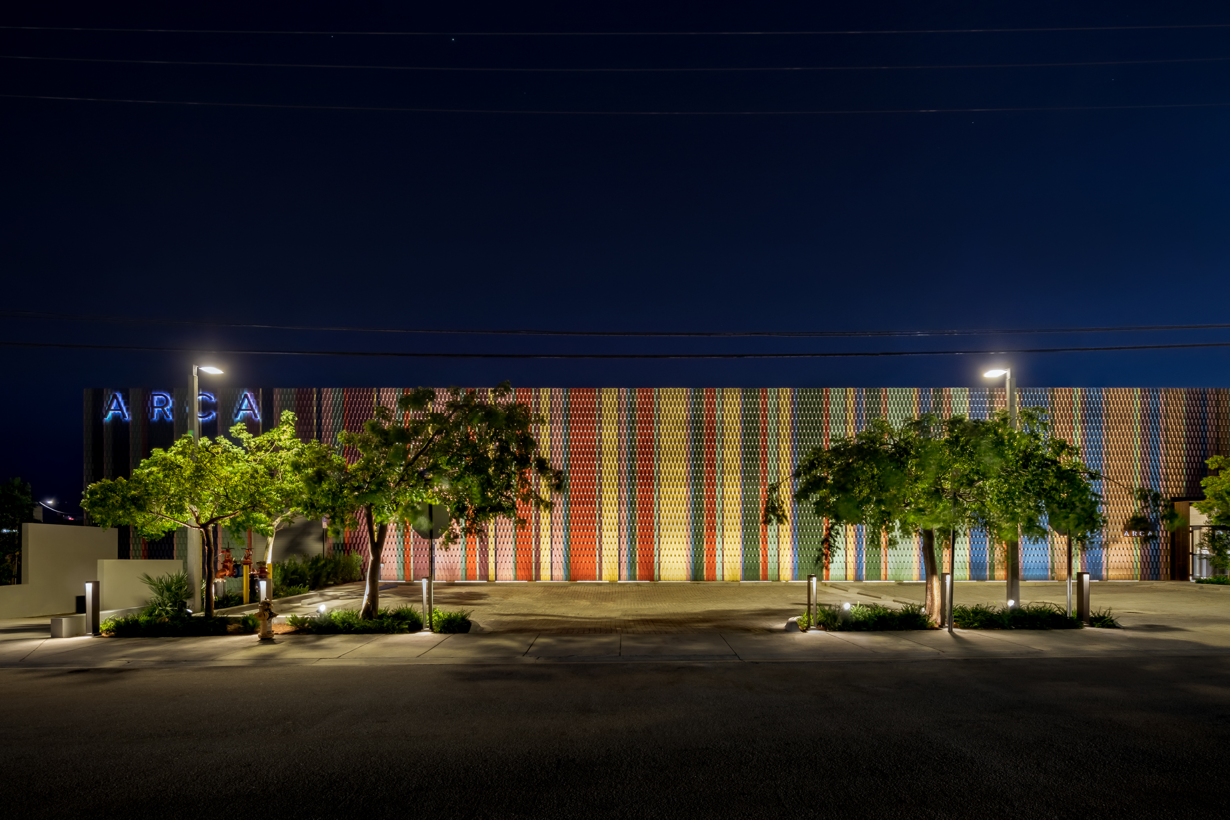
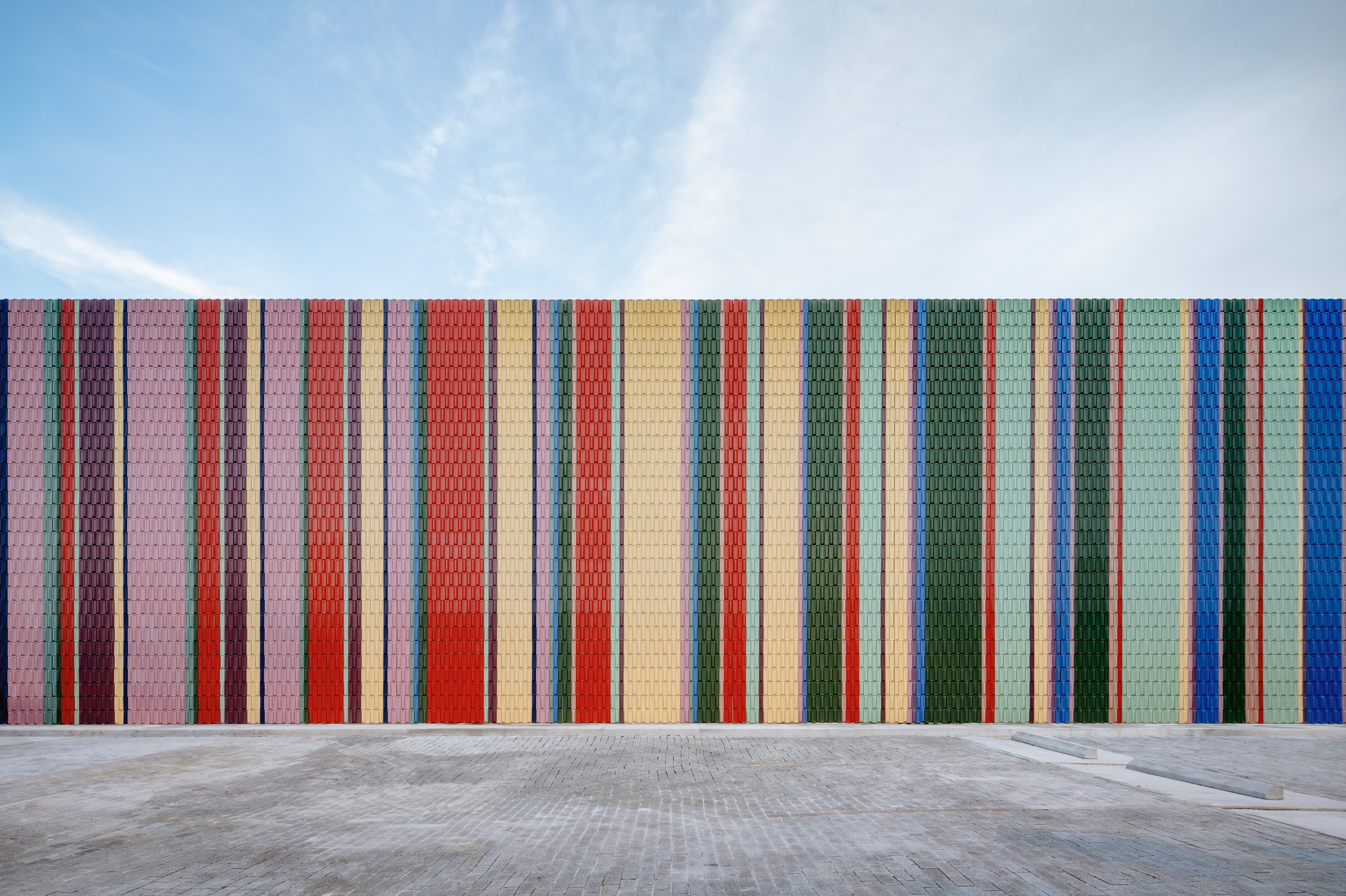
ARCA Wynwood Design Center by Esrawe Studio, Miami, Florida
Danish artist group SUPERFLEX conceptualized the façade as a work of art, titled Like a Force of Nature, using tiles that are inspired from the colors of banknotes, arranged to fit the Fibonacci sequence that is repeatedly found in nature. This arrangement is in stark contrast to its interiors that are made up of black walls and wooden finishes.
Images by Nacasa & Partners Inc.
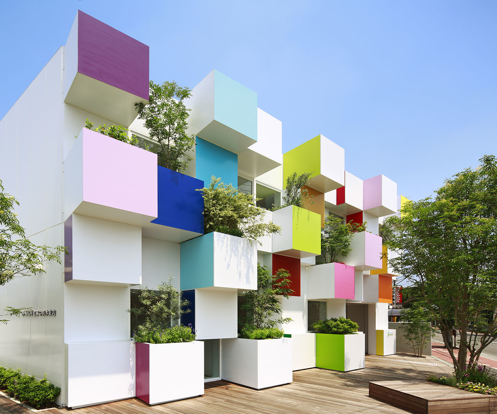
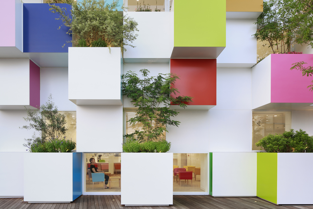
Sugamo Shinkin Bank / Nakaaoki Branch by emmanuelle moureaux architecture + design, Kawaguchi, Japan
Based on the theme of “Rainbow Melody”, the structure’s exterior is made up of several cubes that have various colored faces. The rhythmic composition looks different from every angle. 12 gardens have been incorporated within these cubes to plant season flowers, adding to the chromatic display. These colors are repeated in the interior in the form of seating to create a positive and inviting space.
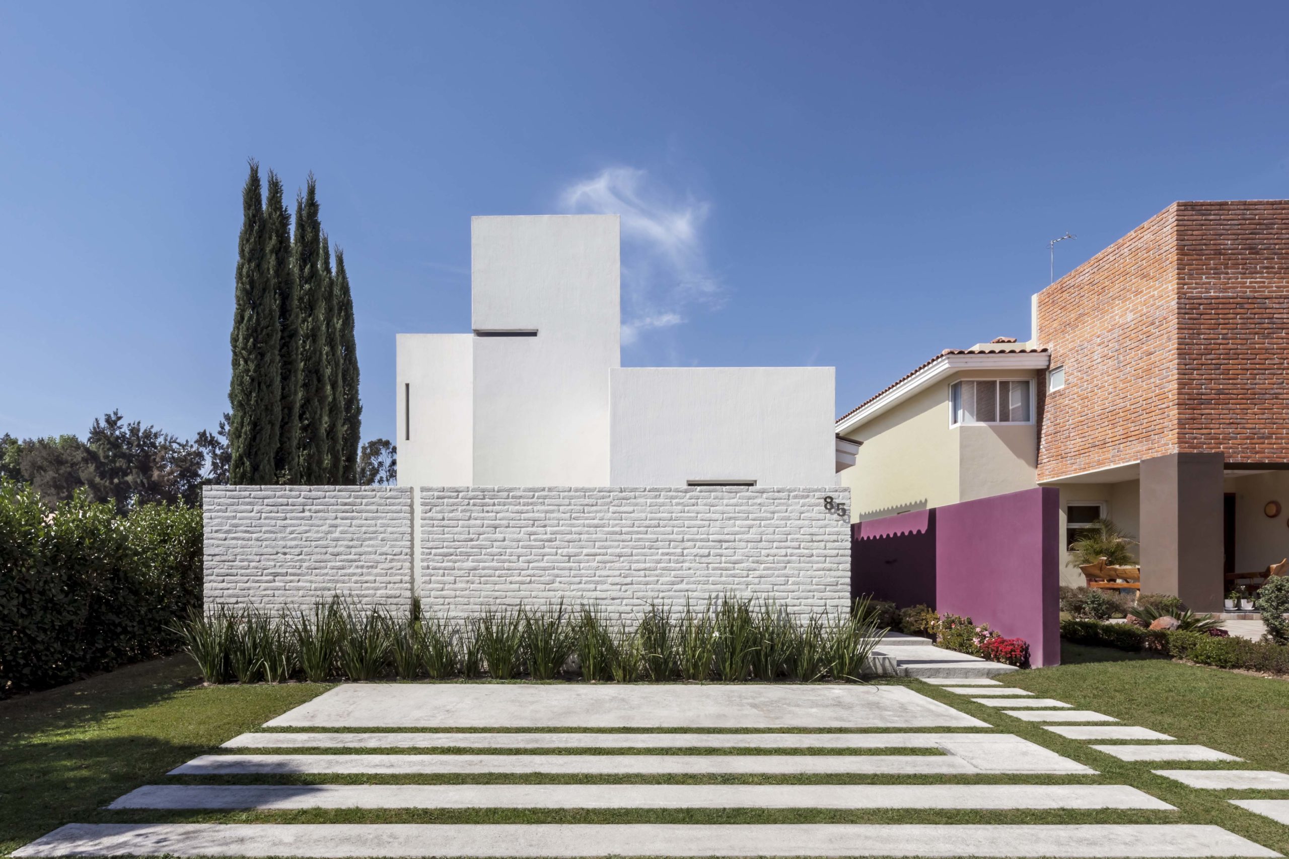
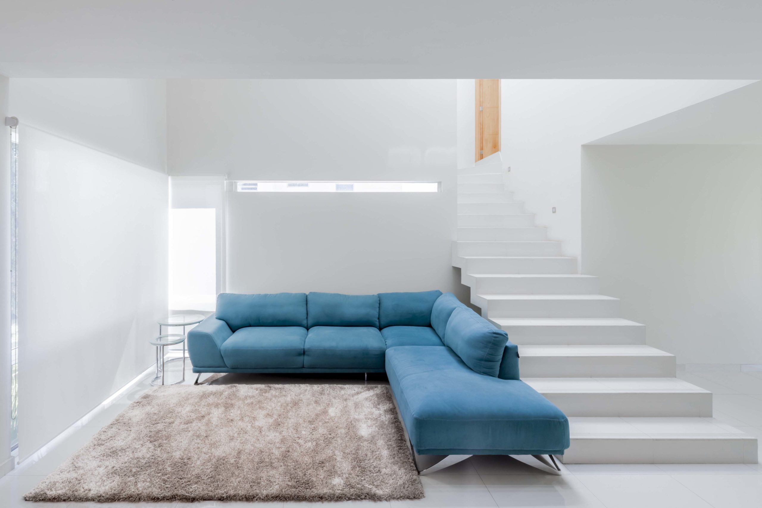 Olguín House by COTAPAREDES Arquitectos, Tlajomulco de Zúñiga, Mexico
Unlike the other projects in this list, white is the dominant color in this house. Solid external surfaces of the higher levels are juxtaposed with a textured brick wall, also painted in white. The purity of form and color helps it stand out in the neighborhood. Bright pops of purple and blue are added inside to give more character to the space.
Architects: Want to have your project featured? Showcase your work by uploading projects to Architizer and sign up for our inspirational newsletters.
 ARCA Wynwood Design Center
  Casitas de Colores
  Mama Smile
  Nagoya housing
  Nursery School in Berriozar
  Olguín House
  Pablo Neruda Nursery School
  Social housing in Athis-Mons (Immobilière 3F)
  Sugamo Shinkin Bank / Nakaaoki Branch