Japanese youths’ infatuation for cosplay and vibrant make-up is on full display in the convivial streets of Harajuku, but just blocks away in the Omotesando district of Tokyo, another cosmetic trend characteristic of the Japanese has osmosed its way onto the façades of Tokyo’s high-end retailers.
The exteriors of these seven retailers operate in tandem with the minimal smoothness distinctive of many enviable Japanese cosmetic ads. Beyond blemish-free, the faces of these buildings exhibit a subtle but rigorous attention to detail, and a transparency which invites a particular intimacy between person and product. Amidst the mélange that is Tokyo’s architectural landscape, these faces are exemplary of a lustrous Japanese aesthetic that is evident in both architectural expression and facial ideals.

© Takumi Ota Photography

© Takumi Ota Photography

© Takumi Ota Photography
Beauty Libraryby Nendo, Tokyo, Japan
The Beauty Library, designed by Nendo and built in 2015, has a crisply angled and clear window on its façade. The concept behind this hybrid beauty supplies–coffee shop is the coexistence of inner and outer beauty and health. While supplying patrons with wholesome food and skincare products, this store uses its façade to similarly reflect a balance between the interior and the Tokyo streetscape.
© Tsubasa Iwahashi Architects
© Tsubasa Iwahashi Architects
© Tsubasa Iwahashi Architects
Folm Arts Beauty Salonby Tsubasa Iwahashi Architects, Sakai, Japan
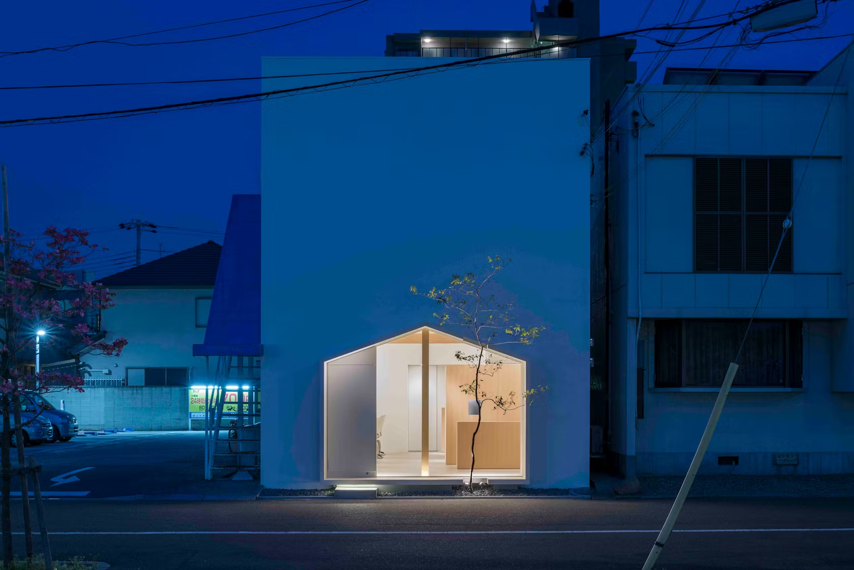
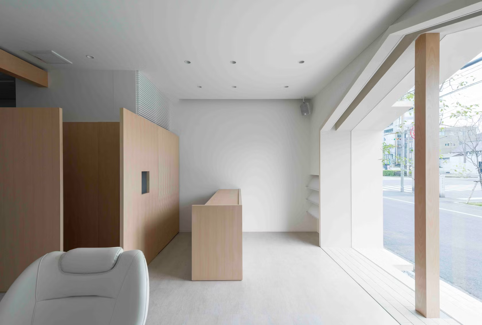
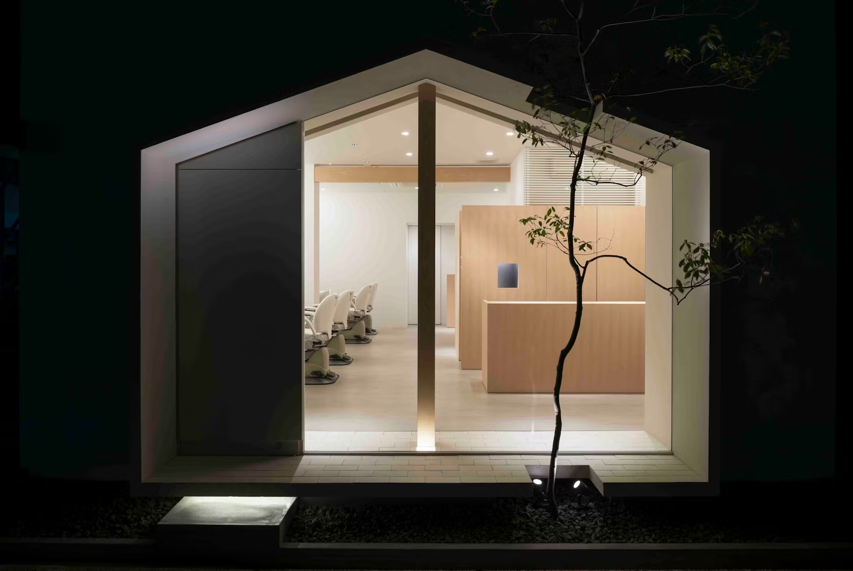
Tsubasa Iwahasi’s 2013 Folm Arts Beauty Salon employs its façade as a frame for an intimate setting. The salon uses the archetypical pitched-roof-house silhouette as a cut-out and window into the interior, enabling the frontage to engage richly with the community. In the business of good looks, the salon owner expresses a desire for a face-to-face connection with the town.

© Torafu Architects

© Torafu Architects

© Torafu Architects
Papabubbleby Torafu Architects, Tokyo, Japan
In 2013, Spanish candy artisans Papabubble hired Torafu Architects to design a 100-square-foot candy-art store in Tokyo’s famous Shinjuku Station. Rather than obscure the site’s lack of depth, Torafu Architects chose to celebrate the slender situation with the design of a signboard façade that itself consisted of the “store.” In the most quintessentially Japanese retail market — the crowded train platform — the Papabubble shop is a dexterous façade capable of advertising, storing, displaying and interacting within a single partition.

© Daisuke Shima / Nacasa & Partners

© Daisuke Shima / Nacasa & Partners

© Daisuke Shima / Nacasa & Partners
CORAZYsby emmanuelle moureaux architecture + design, Chiyoda, Japan
CORAZYs is a homewares retailer selling 150 items, each colored in orange, pink, green and blue versions. That’s it. This straightforward shopping experience is enriched by emmanuelle moureaux architecture + design’s concept of a color library. Carefully categorized and preciously displayed on the interior, the all glass façade allows this store to retain a sense of whimsy overall.
© Takumi Ota Photography
© Takumi Ota Photography

© Takumi Ota Photography

© Takumi Ota Photography
Tadafusa Factory ShowroombyYusuki Seke, Tsubame, Japan
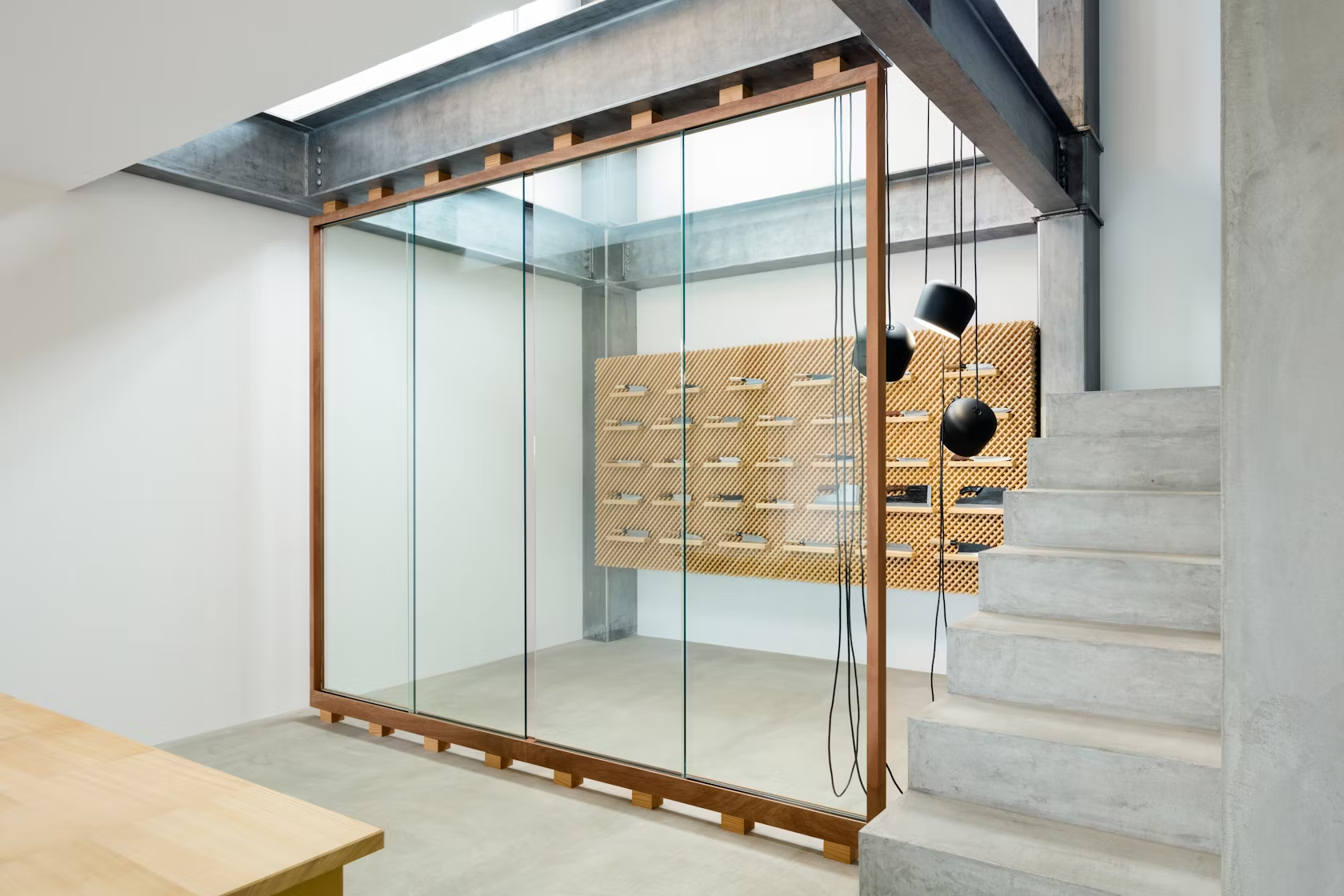
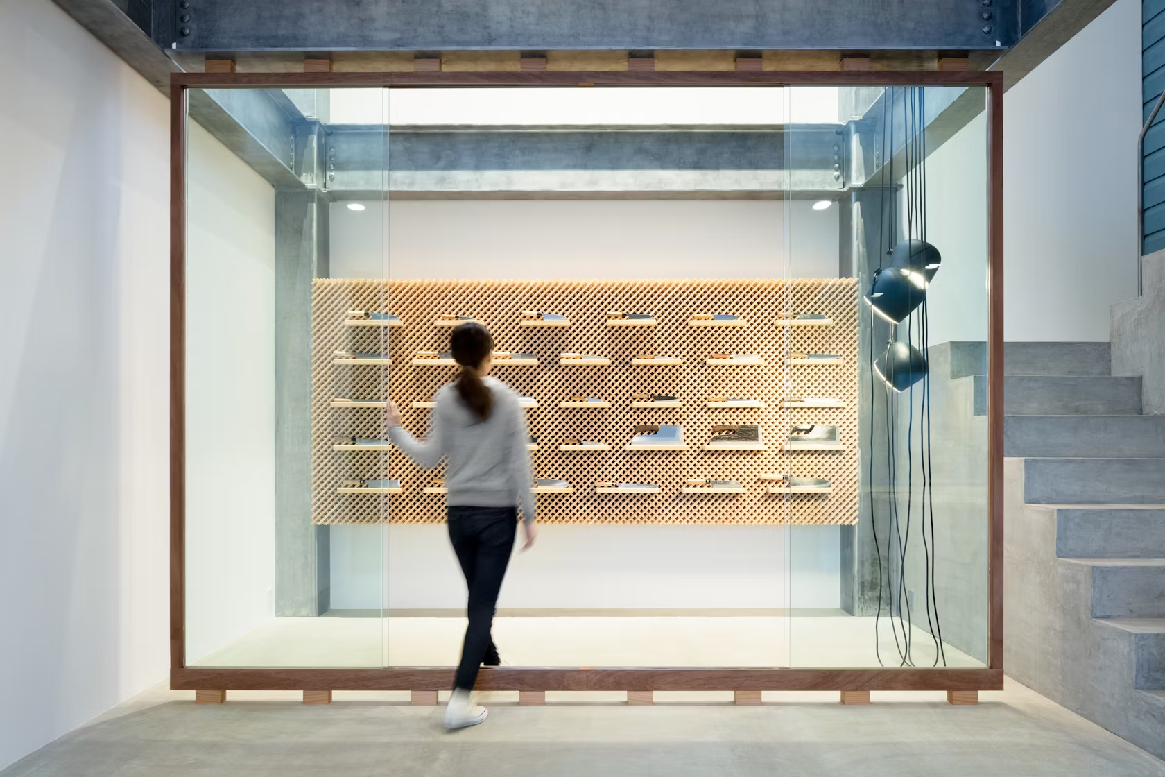
Blacksmiths at Tadafusa Factory are the makers of highly esteemed hand-forged knives, and the design of their showroom by Yusuki Seke follows the same standards of material sensitivity and aesthetic decorum. Though this program presents a logistical challenge — namely, the safety codes imposed on a dangerous weapons seller — Yusuki Seke’s design of the locked case which the knives must be displayed within is presented as a space of reverence rather than risk. The “display case” is not a barrier but a façade that spotlights extraordinary craftsmanship.
© Schemata Architects / Jo Nagasaka
© Schemata Architects / Jo Nagasaka
© Schemata Architects / Jo Nagasaka
Takeo Kikuchi Store by Schemata Architects / Jo Nagasaka, Shibuya, Japan
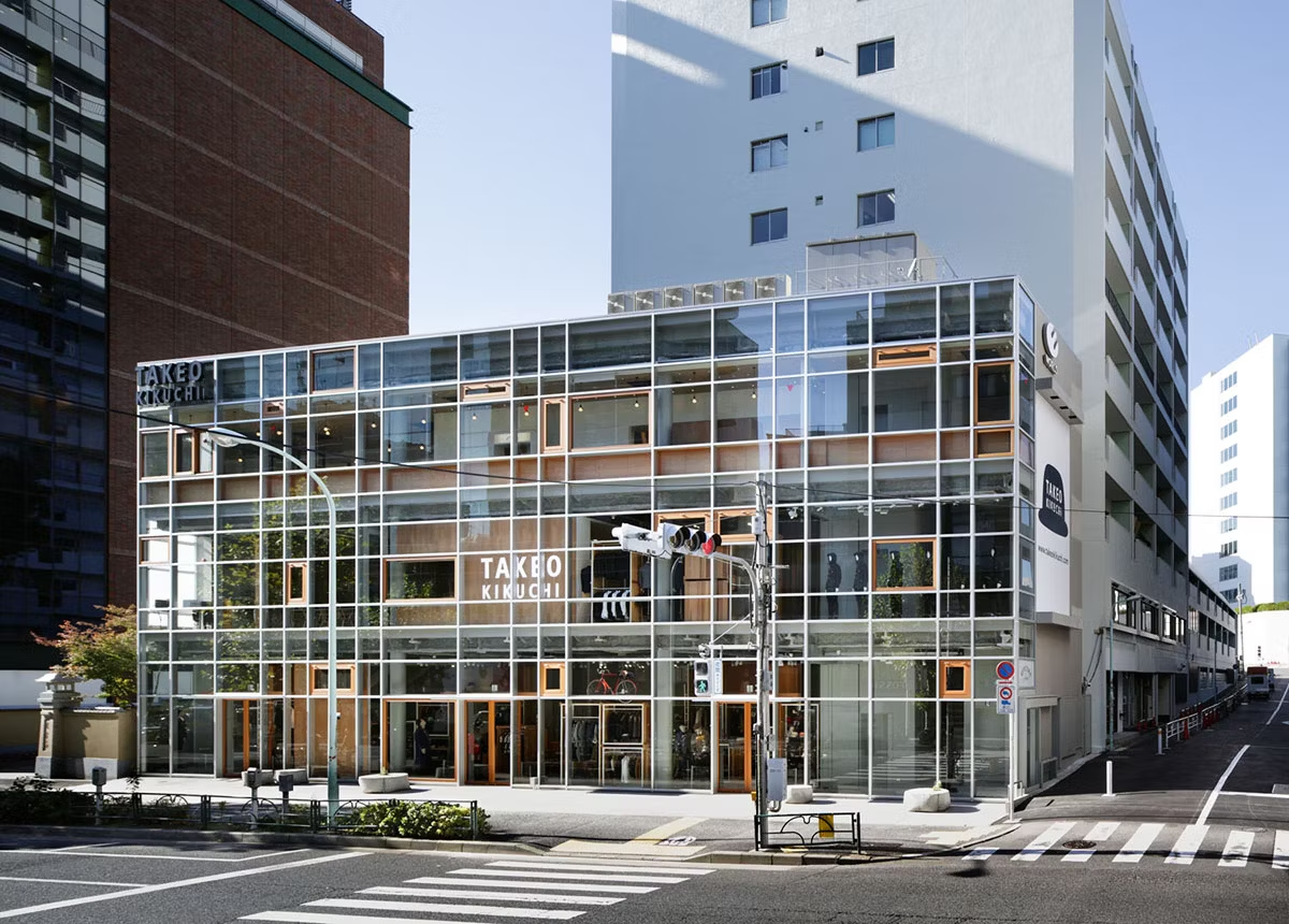
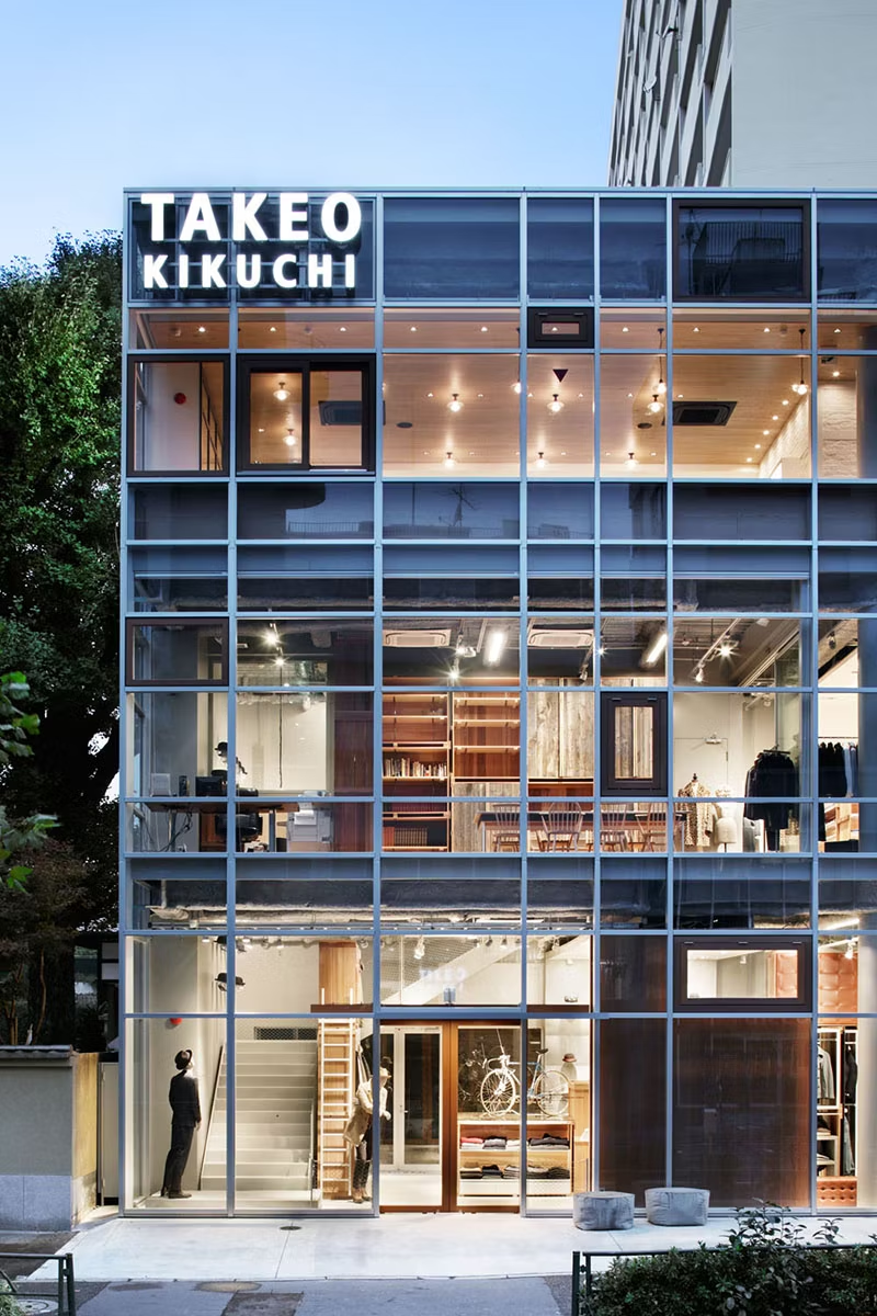
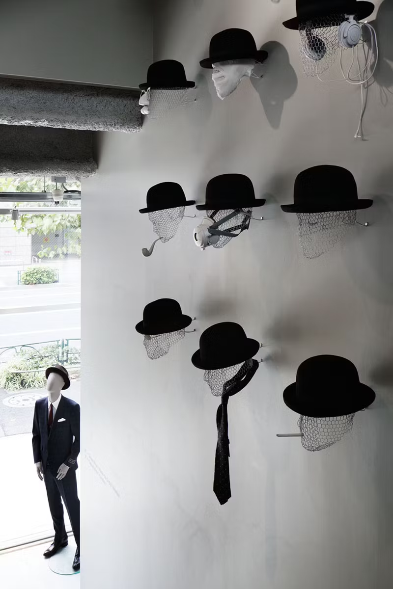
For the popular menswear retailer Takeo Kikuchi, Schemata Architects/Jo Nagasaki have designed a space wherein the urban nature of the exterior meanders its way in. The store is open and bright, and the furniture is arranged without intention, fostering a forest-like atmosphere of forking paths. Most crucial to this schema is the transparent and porous façade. With four doorways into the store, the façade is meant to allow for a continuous Tokyo street culture to seep seamlessly inside.
© Iwan Baan
© Iwan Baan

© Iwan Baan
Coach Flagshipby OMA, Tokyo, Japan
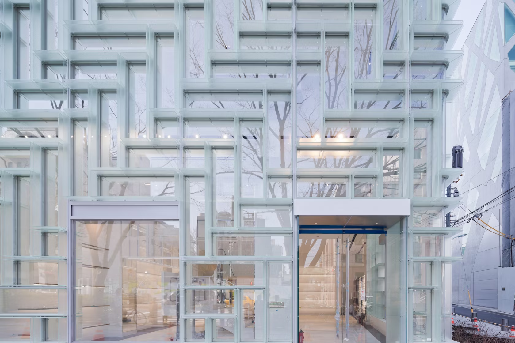
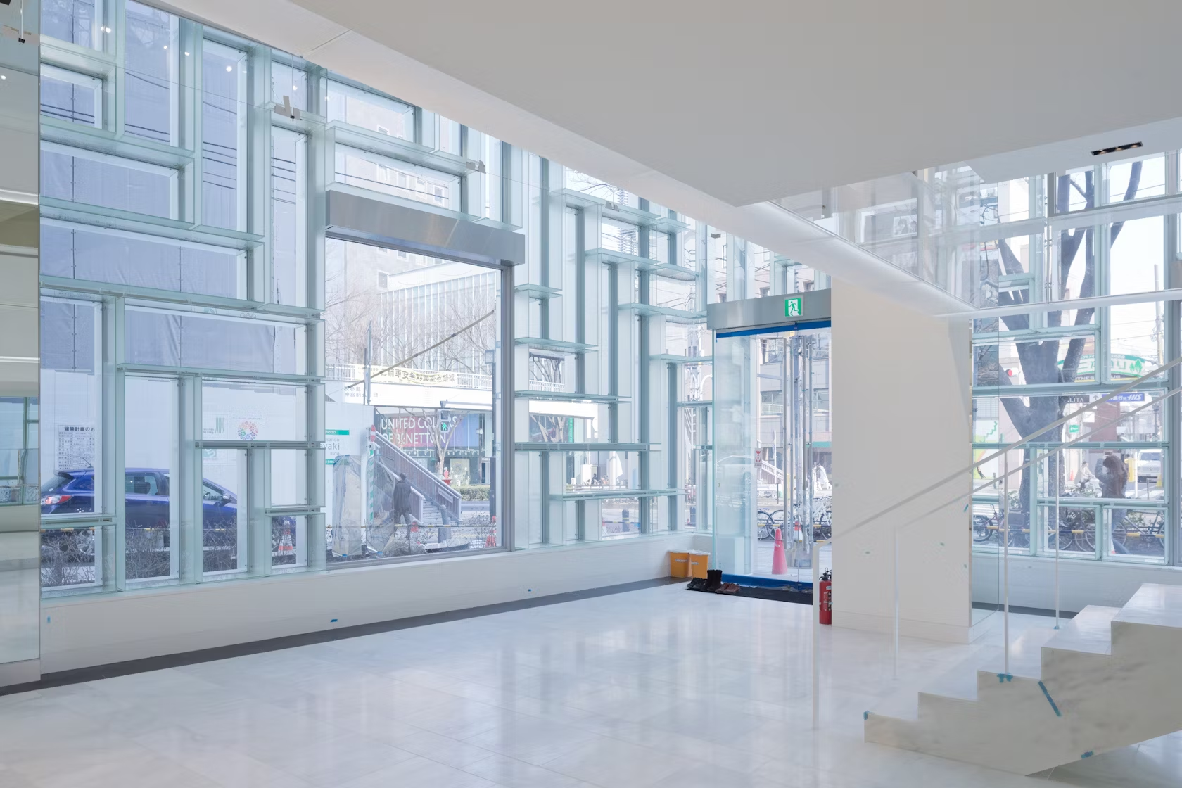
The Coach Flagship store in the upscale Omotesando shopping district in Tokyo was completed by OMA in 2013. After previously debuting a modular display system for Coach in New York, OMA used the design of this Tokyo building to showcase their invention in an expanded framework. Here the display strategy embodies the entire composition of the façade. The storefront acts as a large display case for the full line of Coach products, each with a singular herringbone showcase. The textured nature of the display framework appears translucent internally, making the façade an effective enclosure which retains the conceptually transparent view towards Coach merchandise.


