

In the 1920s El Lissitzky developed and proposed the idea of horizontal skyscapers — Wolkenbügels, or “cloud-irons” — eight structures intended for the Boulevard Ring in Moscow. His logic was that as long as humans could not fly, moving horizontally was natural, and moving vertically was not. In an area where there is not significant land for building, he preferred a plane created in the air at medium altitude instead of an American-style towers. Because of the gap between Lissitzsky’s idea and the existing architecture, it wasn’t until the 1940s that the Wolkenbügels were planned and built. Humans still cannot fly, and many “cloud-irons” now exist on the horizontal plane.

Wolkenbügels. Image via Diesel Punks
With that in mind, these are six projects where architects opted for, or at least emphasized, the horizontal as opposed to the vertical:
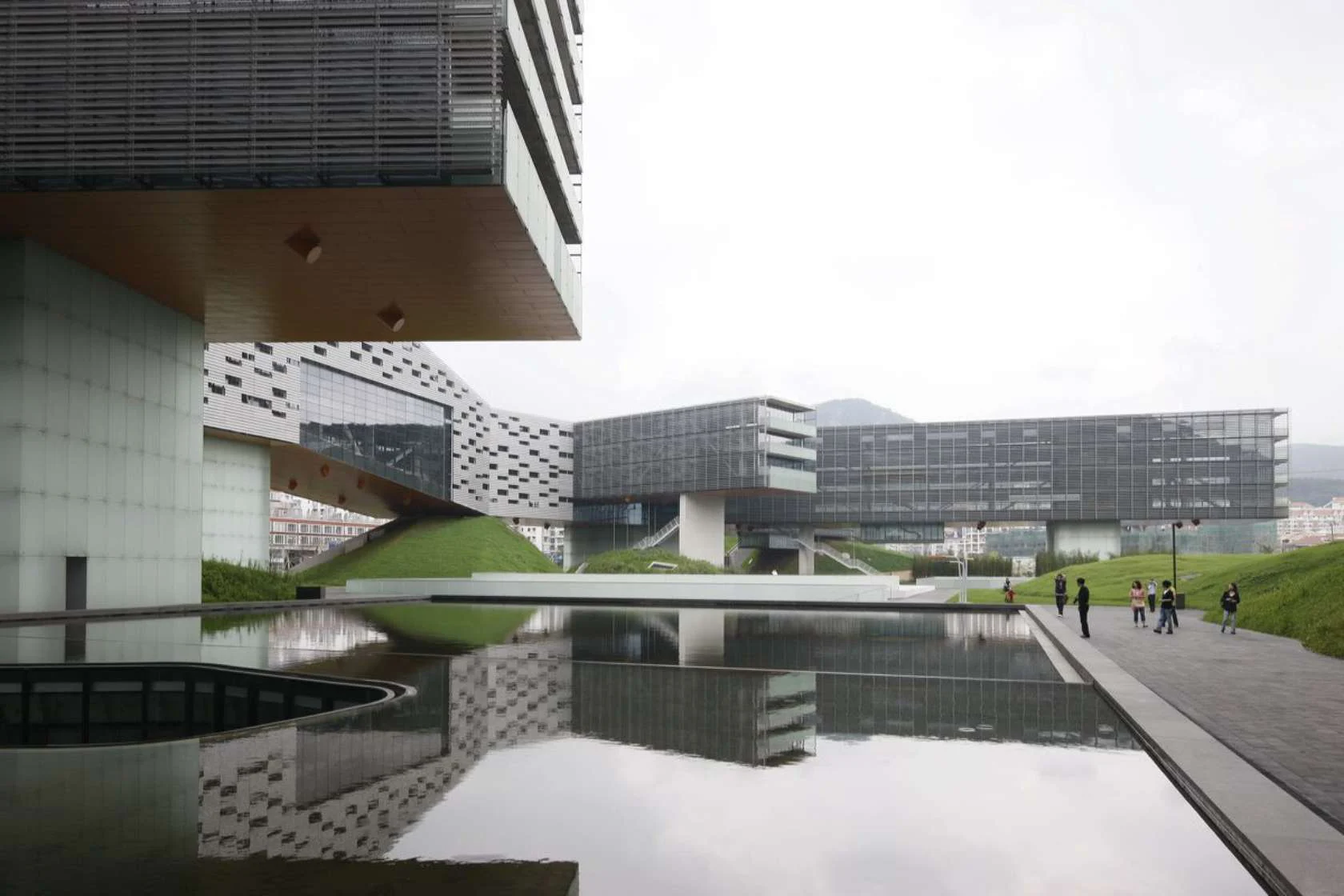
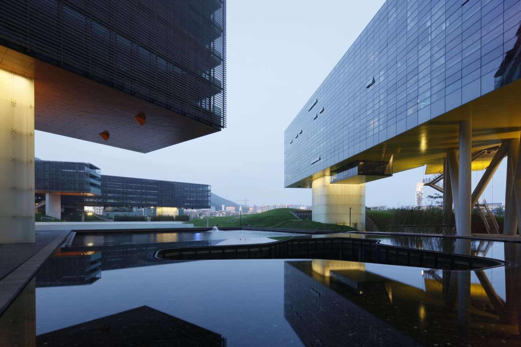

Vanke Center by Steven Holl Architects
This building is equal in length to the height of the Empire State Building. It is described as a hybrid building, including apartments, a hotel, office space, a spa, a conference center, parking, restaurants, and a 500-seat auditorium. The building was decided conceived as one large structure instead of several smaller structures each catering to a specific program. Under the 35-meter height limit, Vanke Center affords the largest possible green space open to the public on the ground level.

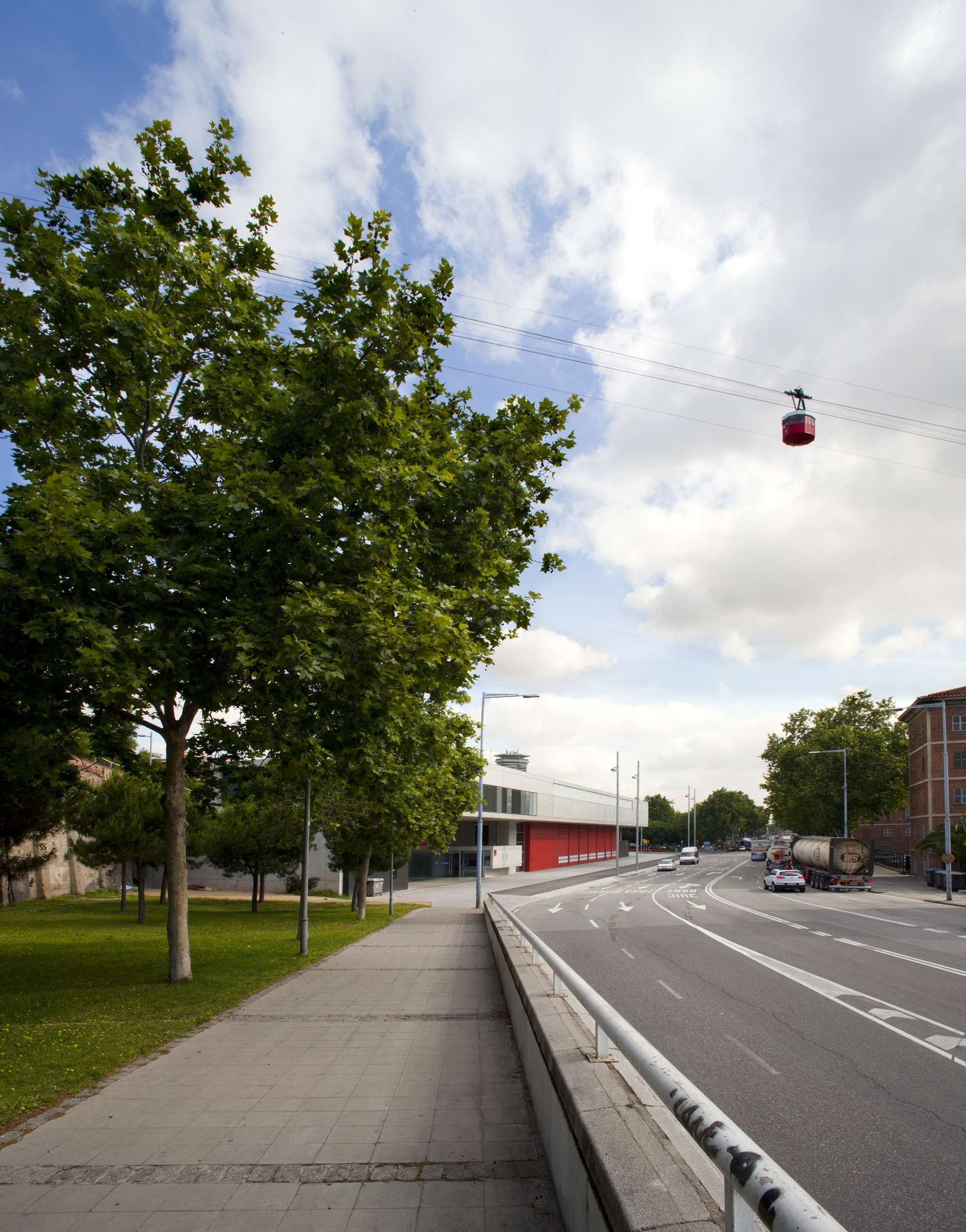

Montjuic Fire Station by Manuel Ruisánchez Arquitecto
Montjuic Fire Station is situated between a main avenue, a side street, and the mountainside. The building was intentionally designed to parallel to the avenue, as it is both the entry and exit to the city. While the structure is primarily horizontal, in reference to Montjuic mountain, the tower stands as the only vertical counterpoint.


Ravenna Harbour Apartment Building by Cino Zucchi Architetti
Ravenna Harbour Apartment building is a residential structure that is part of an urban renewal project on both sides of an artificial canal, next to Ravenna Station. Amongst the shops, semi-public spaces, and living spaces, the “bridge” serves as a connecting element giving a sense of intimacy and spatial enclosure. The final plan envisions a new park parallel to the water.
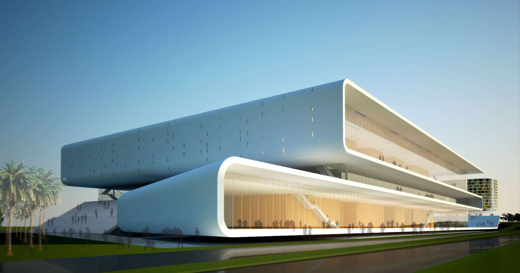

Bangalore International Convention Centre by Yazdani Studio of Cannon Design
The Bangalore International Convention Centre was inspired the the Bangalore tradition of silk weaving. Yazdani Studio weaves both built and landscaped elements into the tapestry of horizontal spaces. Based on ideas of layering and weaving, the interplay of closed and open spaces at different levels maximizes the use of daylight and creates a new dynamic use for busy programmed areas.
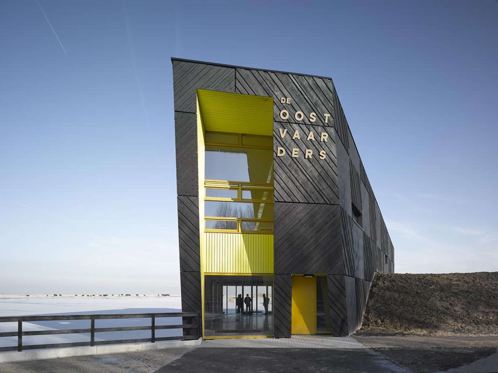


De Oostvaarders by Droost + van Veen architecten
De Oostvaarders is a nature education center located in a nature reserve in the Netherlands, the Oostvaardersplassen in Almere. The building presents itself in two different shapes. The view from the parking lot was intended to be an inviting “vertical beacon rising from the plain.” However, if you were to look at the structure from the lakeside, the shape of the building would appear horizontal, connecting with the water. Droost + van Veen architecten reduced the construction time by prefabicating the panels of the timber façade so as to minimize disruption of the surrounding natural environment.


Hospital South of Paris by Atelier d’architecture Michel Rémon
The Villeneuve-Saint-Georges hospital was constructed with two different perspectives. From a distance, the extension serves as a solid base for the hospital complex. From up-close, the foreground pronounces the verticality of the tower. “No posts, no vertical lines.” The Women and Children’s Wing extension is made up of various horizontal lines that bring the building closer to the ground, the ground of the town, for people arriving by foot, bus, taxi or car.


