Whimsical furniture design isn’t always the most aesthetically pleasing. In fact, it can be downright tacky and may be suitable only for kids. But there are some product designers who hit the sweet spot, who understand just how to blend a bit of tongue-in-cheek quirkiness or young-at-heart humor with minimalist forms and honest materials that grown-ups can appreciate. We take a look at six concepts — a few of which are in production — that demonstrate this.

Bookniture
Bookniture
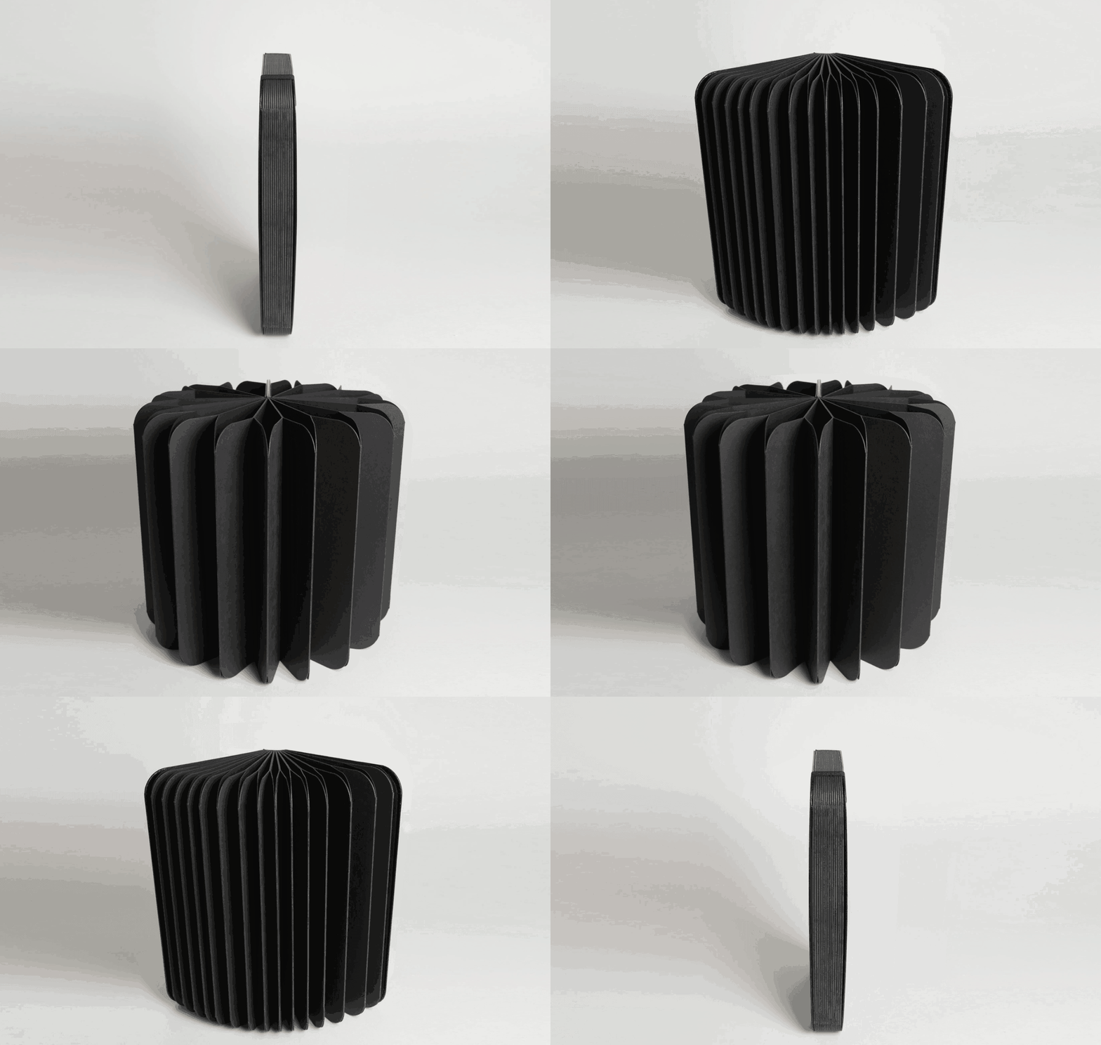
This may look like a designer journal akin to a Moleskine, but it opens into a lightweight, portable stool or side table. The light bulb went off when Mike Mak discovered the strength of a honeycomb board sample at a furniture fair and returned home to store the sample in a bookcase. An accordion-like honeycomb structure folded into the “book” fans out into a round base that can be topped with a variety of materials for sitting or resting objects. Multiple units can be grouped with longer pieces of wood to form benches or stacked to support tabletops. Currently Bookniture is offered in six finishes: Concrete Grey, Mid Grey/Dark Grey Felt, Field Brown, Light Grey/Red Felt, Leather Black and Dark Grey/Black Felt.

Bookniture


De-Dimension
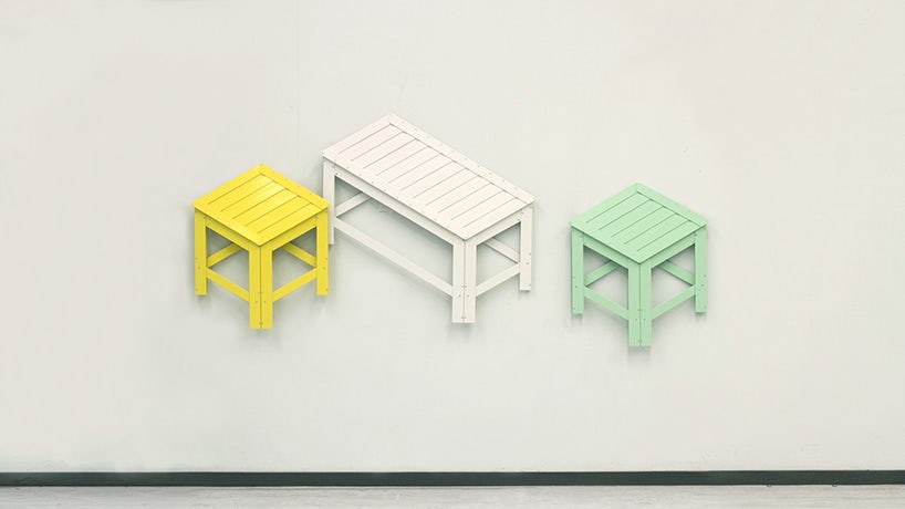
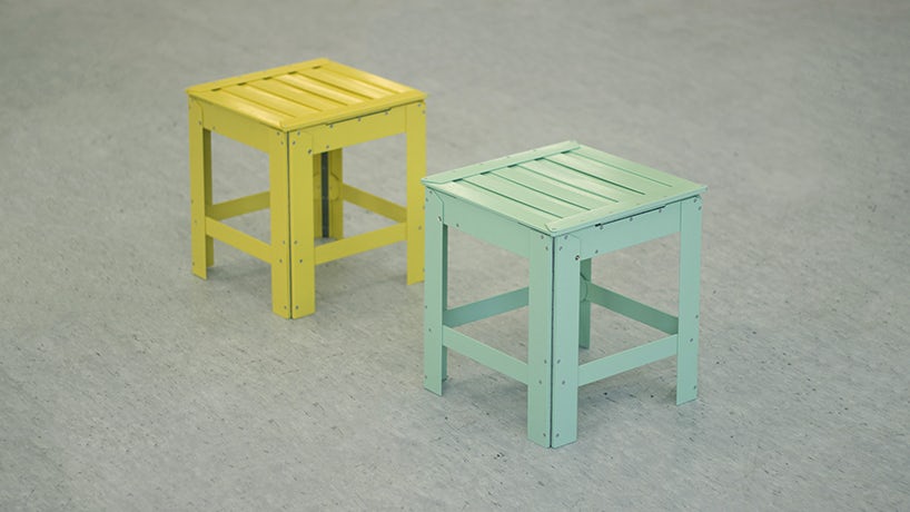
Look again because these flat two-dimensional objects with forced perspectives really are the three-dimensional objects that they trick the eye into seeing; they transform into usable stools and benches. Eindhoven-based designer Jongha Choi came up with the clever concept when pondering, “Why don’t we try to get more stereoscopic and attempt for direct experience with the image?”

De-Dimension


Pet Furniture
Furnishings take on the form of animal silhouettes — from wildlife to livestock and domesticated animals — in this collection designed by Benoît Convers that can delight both children and adults alike. The pieces include occasional tables, short and tall bookcases, wall shelves, desks and even floor lamps and are constructed of compact-laminate panels in a variety of colors. Pet Furniture is sold through French brand ibride.

Pet Furniture


Rocking Pacman
Back in the spring at the International Contemporary Furniture Fair (ICFF), we spotted this rocking loveseat that, with a skewed log shape and Pac-Man profile, works much like a seesaw: The sitters are somewhat tête-à-tête, and when one sitter’s feet are on the floor, the other sitter is raised and tilted back. It looked tricky to maneuver safely, but some curious show attendees did indeed get the hang of it. Louis Lim / Makingworks designed the piece in white oak that was reclaimed from old vermouth barrels. It measures 108 inches long by 33 inches in diameter.

Rocking Pacman


Sylph Chair
Shanghai architecture studio Atelier Deshaus has designed some striking buildings ranging from the Long Museum West Bund to the Jiading New Town Kindergarten. Now it’s come up with a quirky chair concept — its first product design — called Sylph. The chair’s gently contoured wooden seat and front legs combine with white powder-coated tubular steel rear legs that curve up to form arms and a line drawing or doodle–like back in four styles.

Sylph Chair


Trace Collection
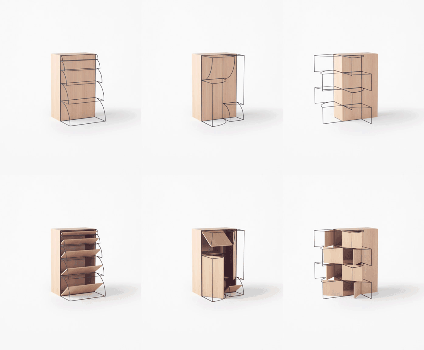
No stranger to injecting whimsy into its designs, Nendo continued to wow us this year with intriguing products, from reflective Manga chairs for Friedman Benda to the minimalist, clear H-horse rocking horse for Kartell. One of our 2016 favorites is this collection of case goods in which the swing motion of hinged furniture doors are “traced.” The pieces are not only fully functional, but works of contemporary art.

Trace Collection


