Architecture can quickly become self-indulgent. Pursuing idealistic forms and lofty concepts, architects may readily trade purpose for pomp. Overlooking contextual, spatial, or environmental qualities, designers erect shining monuments that reflect themselves. These tendencies are amplified when working with a material like gold, the canonical element embodying affluence and decadence. Designing with gold, whether by color or material composition, has been an endeavor largely outside vernacular or traditional architecture. Historically used for decoration or gilded reliefs within the realm of interior design, architects are now beginning to create golden façades with subtlety and systemic logic.
The second article in a three-part series on metallic architecture, the following collection features contemporary golden structures and designs. Carefully straddling the line between being self-referential and sensitive, these modern golden façades are crafted with innovative assemblies and new tectonic approaches. Folded, perforated, and screened, they explore the dynamics of weathering, alloys, and added depth to building envelopes. The projects all take a rigorous and restrained look at how to incorporate gold alongside programmatic and technical demands. Shaping spaces and experiences through liminal conditions, the projects show how architects can begin specifying golden elements within the design process.
© Hufton+Crow Photography
© Feilden Clegg Bradley Studios
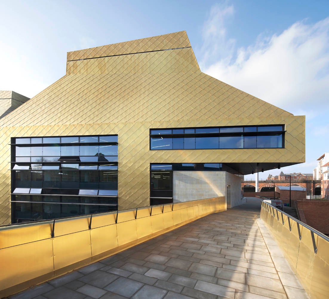
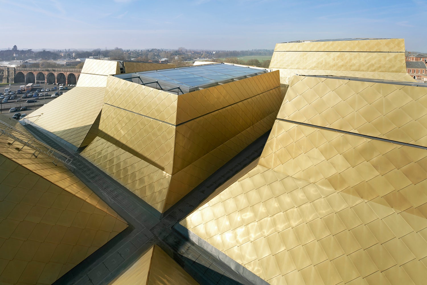
The Hive by Feilden Clegg Bradley Studios, Worcester, United Kingdom
Designed as the UK’s first purpose-built, joint-use library, the Hive includes a diverse programmatic range. Housing diverse spaces like a county archive and local history center, the building was formally designed as a beacon for learning within Worcester. Gold color cladding was specified throughout the entire envelope, including roof spaces, establishing the building in stark contrast to its surroundings.

© AGi architects
© AGi architects
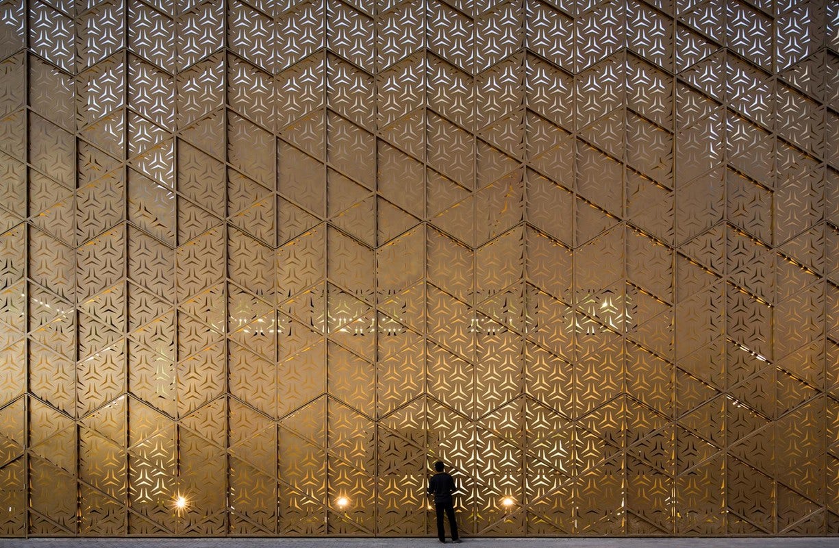
Ali Mohammed T. Al-Ghanim Clinic by AGi architects, Kuwait
Utilizing a strategy that places courtyards along the building façade, the Ali Mohammed T. Al-Ghanim Clinic was designed as a unique typology and project. While other buildings explore light and views through the façade, this clinic reverses that relationship and uses the courtyards and golden metal mesh screens to create veiled thresholds.

© litotes
© Sergio Grazia
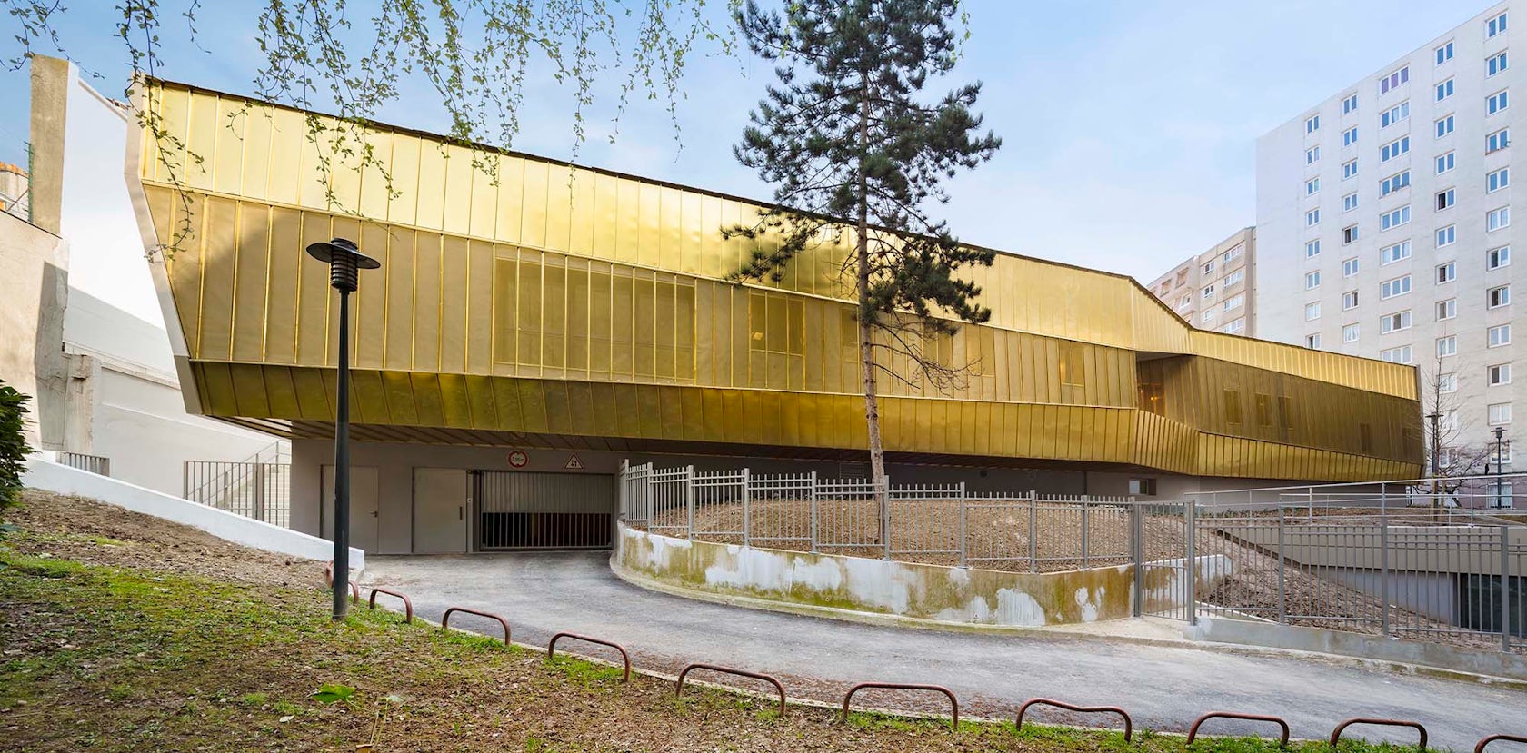
La crèche en papier by WRA Architectes, Rue Piat, Paris, France
Half garden and half space-ship, this nursery building utilizes a golden folded brass membrane to envelope interior programs. Designed to evolve over time as the metal becomes covered with a new patina, the project utilizes a compact shape, vegetal roof, and efficient coverings.

© Architekt Christian Kronaus, KNOWSPACE architecture + cities

© Architekt Christian Kronaus, KNOWSPACE architecture + cities
Erweiterung Gerichtsgebäude Sankt Pölten by KNOWSPACE architecture + cities and Architekt Christian Kronaus, Sankt Pölten, Austria
Standing with a perforated golden façade, the renovation and expansion of the St. Polen courthouse was created to house office spaces. Wrapped in TECU-Gold, the façade helps to control the scale of the building’s structure and resolve differences in building stories between the two buildings.


Burwood Highway Frontage Building, Deakin University by Woods Bagot, Melbourne, Australia
Woods Bagot’s proposal for new research spaces at Deakin University was developed into a tower, base, and gateway building for the campus. Creating social gathering spaces for both the university and the public, the design was formed with two interlocking shapes. The building’s “tower” volume was clad in gold louvres.

© Alexander Gempeler

© Alexander Gempeler
Extension of Orientation School in Kerzers by Morscher Architekten BSA SIA AG, Kerzers, Switzerland
Sited on an elevated location within Kerzers village center, this education project creates added space for increased student enrollment. Responding to new forms of learning and teaching, the building’s classrooms were suspended from the roof while group rooms were stacked atop each other. Touches of golden metal panels are found on multiple faces of the building’s façade.

© Modulorbeat Ambitious Urbanists & Planners

© Modulorbeat Ambitious Urbanists & Planners
switch / skulptur projekte münster by Modulorbeat Ambitious Urbanists & Planers, Münster, Germany
Switch was created as a pavilion project and information center. The parallelepiped volume is clad with golden copper alloy panels, and the design integrates round perforations with varied diameters. The design earned its name from its ability to open the façade using slide rollers.

© David Helman

© marjan hessamfar & joe verons architectes associes
School, Educative & Cultural Center by marjan hessamfar & joe verons architectes associes, Pau, France
This French learning center aimed to initiate urban renewal. The design combines seven spatial programs around an entrance courtyard and alley. A gold-colored, copper alloy skin was perforated and folded into a number of cladding strips applied along the façade and concrete folds.

© GPAA Gaëlle Péneau Architecte & Associés

© GPAA Gaëlle Péneau Architecte & Associés
Theatre Cergy by GPAA Gaëlle Péneau Architecte & Associés, Pontoise, France
The Theatre Cergy design reshapes and reuses the existing Théâtre 95 in Pontoise while also exploring urban design and public space. Promoting interactions between the theater and the town, the design was placed directly in the heart of Pontoise. The building’s 400-seat auditorium was clad in golden-colored scales made from a copper aluminum alloy to reflect light and brighten the surroundings.
© Hufton+Crow Photography

© Hugh Broughton Architects
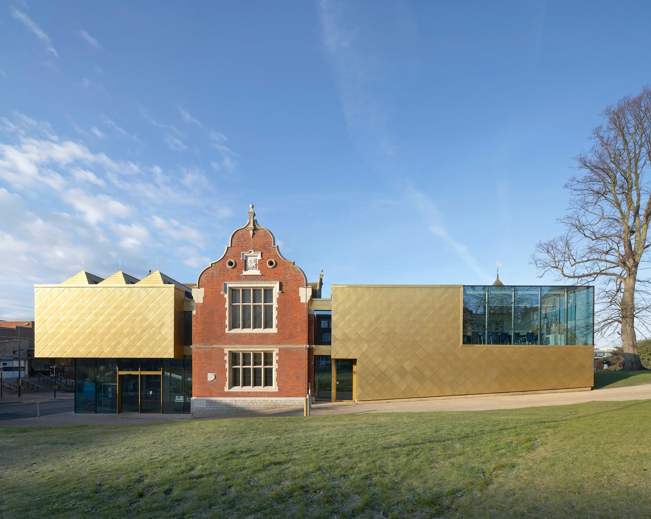
Maidstone Museum East Wing by Hugh Broughton Architects, Maidstone, United Kingdom
Expanding the existing Maidstone Museum, the new east wing was designed to accommodate over 600,000 artifacts. Gold-colored shingles were used to hint at the valuables and ‘treasures’ on display inside. The project was guided by three principles and goals: increase visitor numbers, advocate long-term preservation of the museum’s collection, and engage greater public involvement.


