Do you have an outstanding image that tells a compelling architectural story? The 2026 Vision Awards has a range of categories, from hyperrealistic or artistic renderings to expressive drawings or hybrid digital mediums. Start your entry >
Truly great architectural drawings challenge us to take another look. They ask us to question how and why we read, and what we imagine between the lines. Through sections, plans, sketches and projections, we discover the ideas driving architecture’s evolution. This is what this summer’s competition, the One Drawing Challenge, is all about — the stories a drawing can tell through visual, visceral means.
Below, eight drawings are chosen that, whether guiding or representing, are tied to practices of making. The realized constructions echo techniques used in drawing as a reflection of emerging trends. In an age of building information and post-digital culture, these drawings show that analog methods still provide a powerful way of seeing the world:

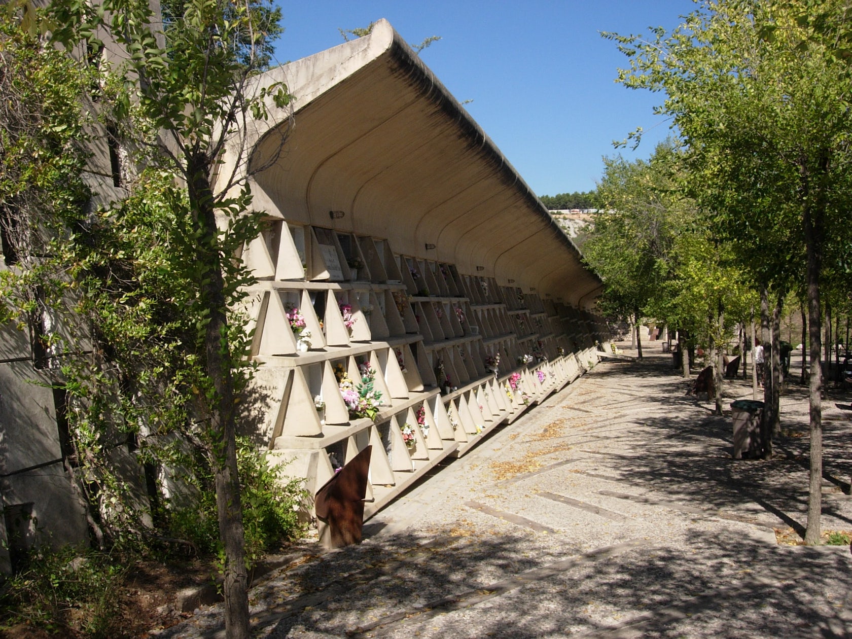
Igualada Cemetery by Enric Miralles, Barcelona, Spain
Completed after 10 years of construction, the Igualada Cemetery was envisioned as a new type of cemetery designed around reflection and memory. Built as a way to understand the cycles of life and their connection to the past, present and future, the project creates space for those that were laid to rest and the families that remain. Embedded in the Catalonian landscape, space becomes a natural extension of earthwork.
The cemetery’s plan reads as landscape, art and insertion. With minimal difference in line weight, the drawing conveys movement, boundaries, edges and flow as a depiction of procession. The drawing draws the viewer in and fluidly moves them between moments, connecting ideas both translated and real.
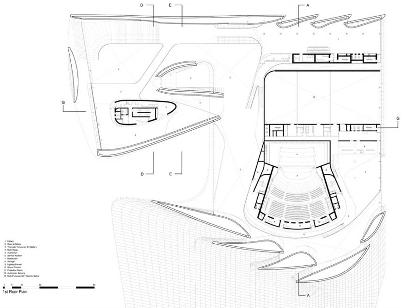
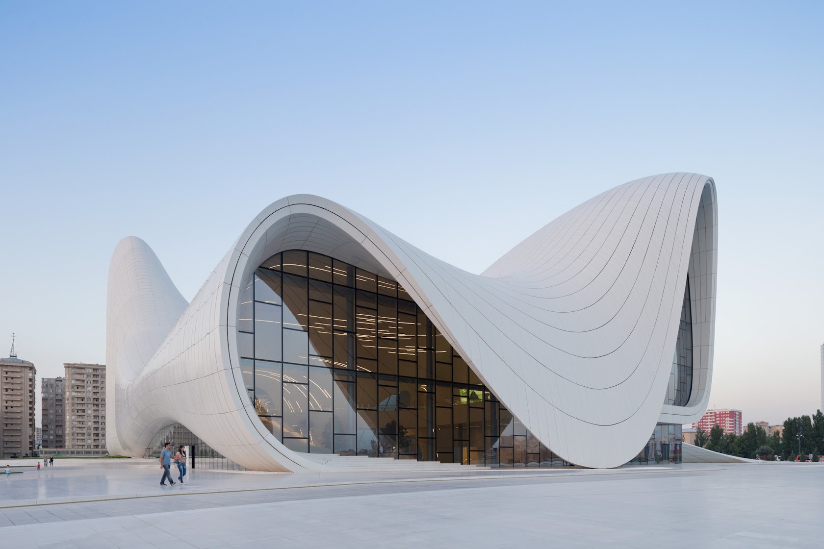
Heydar Aliyev Center by Zaha Hadid Architects, Baku, Azerbaijan
Zaha Hadid’s Heydar Aliyev Center may be her most sinuous and iconic project. Combing diverse cultural programs, the design breaks from the traditional monumental architecture of the former Soviet Union to express modern Azeri culture. As a continuous and fluid form, the building connects a public plaza and extended ground surface to the building’s interior.
Here, surface defines sequence, giving life to undulations and inflections as the building forms itself around interior functions. The building’s plan expresses the continuity of interior and exterior space as well as the graceful curves and flowing lines that become directional spatial experiences.


Serpentine Gallery Pavilion by Herzog & de Meuron and Ai Weiwei, London, England
Herzog & de Meuron partnered with Ai Weiwei to create the 2012 Serpentine Pavilion as an exploration of the previous installations that came before it. Hidden history is revealed through columns, a floating platform and a new cork-cladded landscape below.
Made to echo the excavated earth, the project’s diagram echoes a desire to look beneath the surface of the park and back in time. The drawing becomes a representational ghost of earlier structures while opening up to contemporary culture.
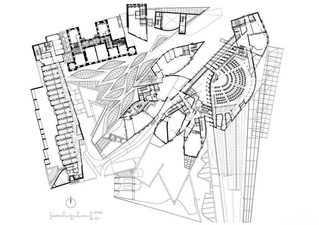
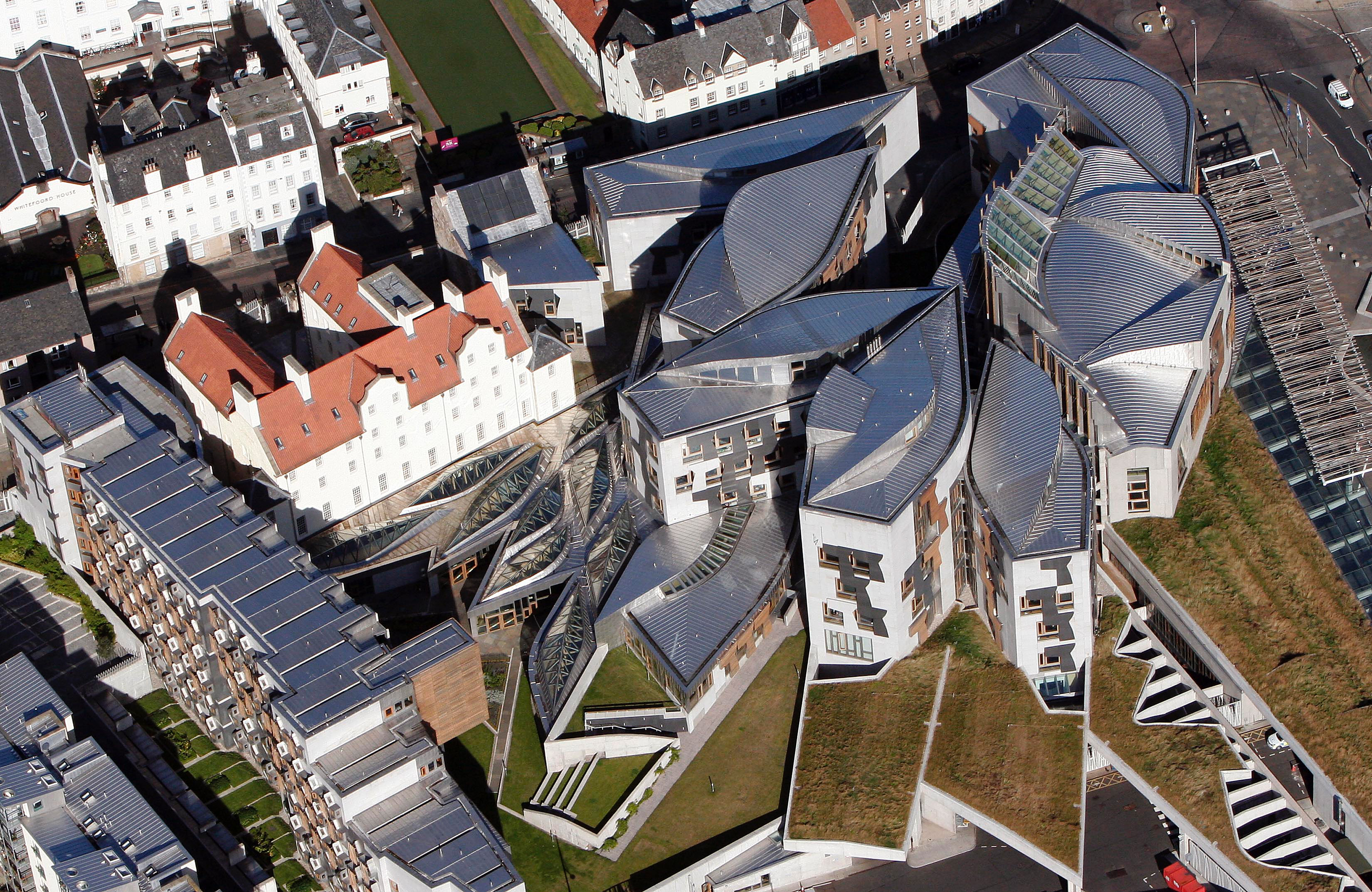
The Scottish Parliament by Miralles Tagliabue, Edinburgh, Scotland
Designed by Enric Miralles and Benedetta Tagliabue, the Scottish Parliament has arguably become one of the most famous buildings in Scotland. The structure was designed to reflect Scotland itself and qualities of the landscape.
Elements like peat, turf and water helped create a formal expression for the building. The plan shows a flowing form that readily recalls the designer’s inspiration in floating boats. Varied lines trace the outline of existing and new construction while leaving abundant room for interpretation.
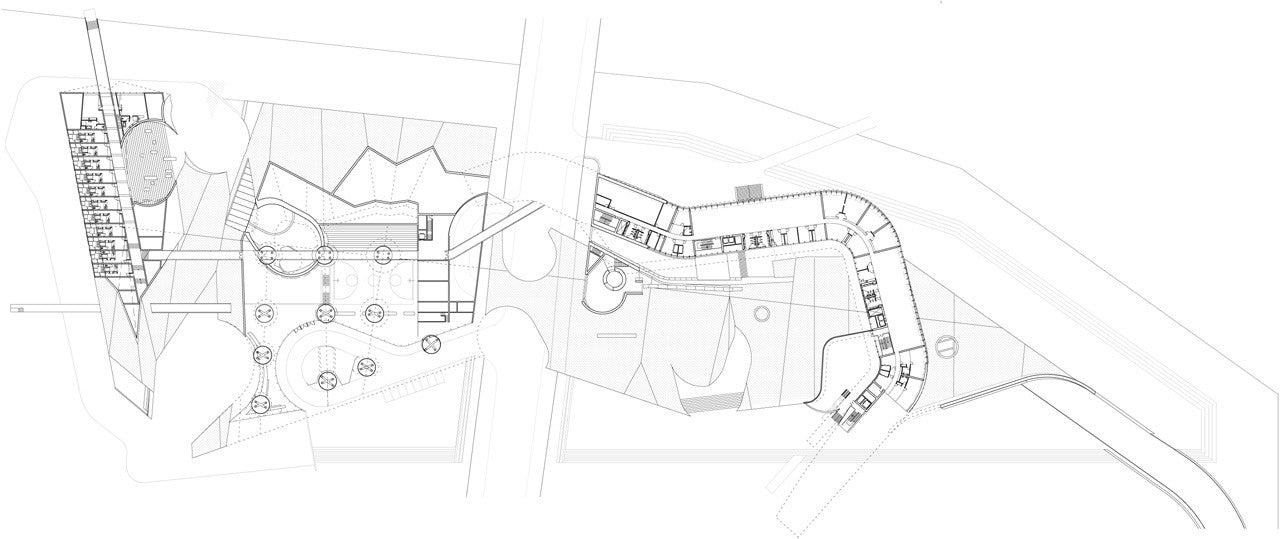
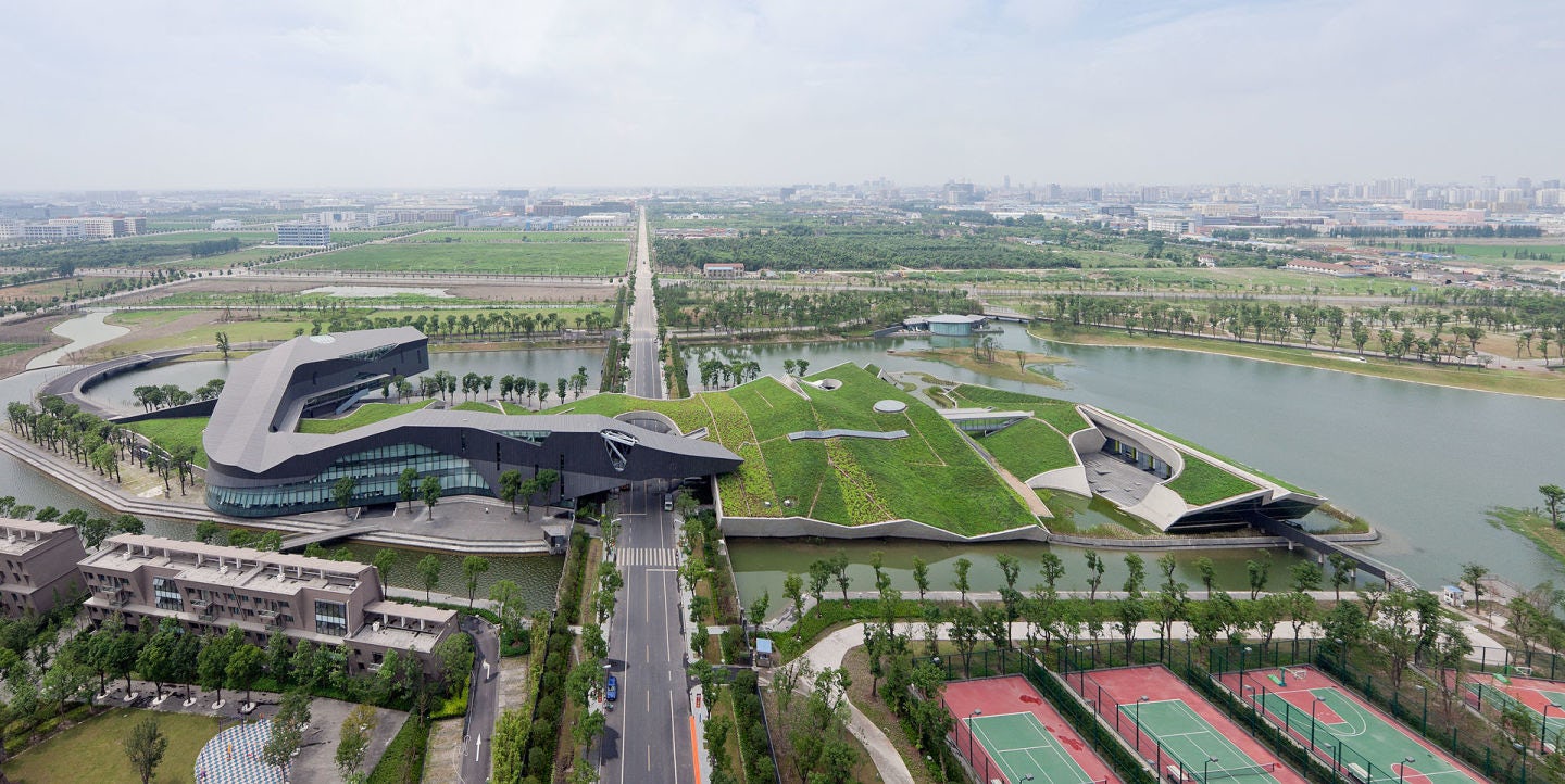
Giant Interactive Group Headquarters by Morphosis, Shanghai, China
As an investigation into ground, surface and building, the Giant Headquarters was made to emerge from complexity. As a compact village, the campus combines multiple programmatic functions that weave in and out of a sculpted landscape.
As Morphosis states, the “undulating office building and augmented ground plane marry architecture to landscape and environment to site.” This ambiguity in ground, level and boundary is revealed through the plan drawings. Here, the lines between space and form begin to dissolve as you read the plan and uncover moments of subtraction, object and direction.
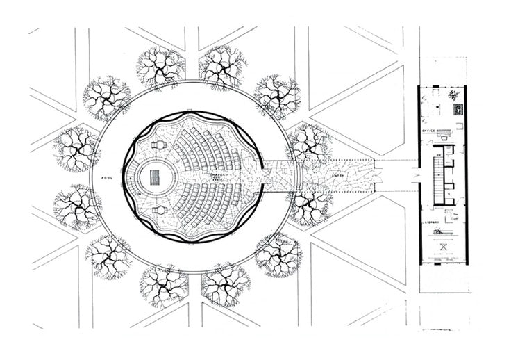

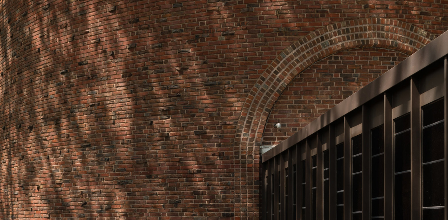
CAC MIT Chapel by Eero Saarinen, Cambridge, Mass., United States, photographed by Jim Stephenson
While Saarinen’s chapel was dedicated in 1955, the project continues to remain a powerful example of architecture’s imaginative potential. The nondenominational chapel was formed as a simple, windowless brick cylinder set inside a shallow moat.
The windowless interior features undulating brickwork, while a full-height metal sculpture by Harry Bertoia becomes the centerpiece seemingly falling from a circular skylight above. Here, the plan only barely hints at the experiences inside and the haptic connections made in section.
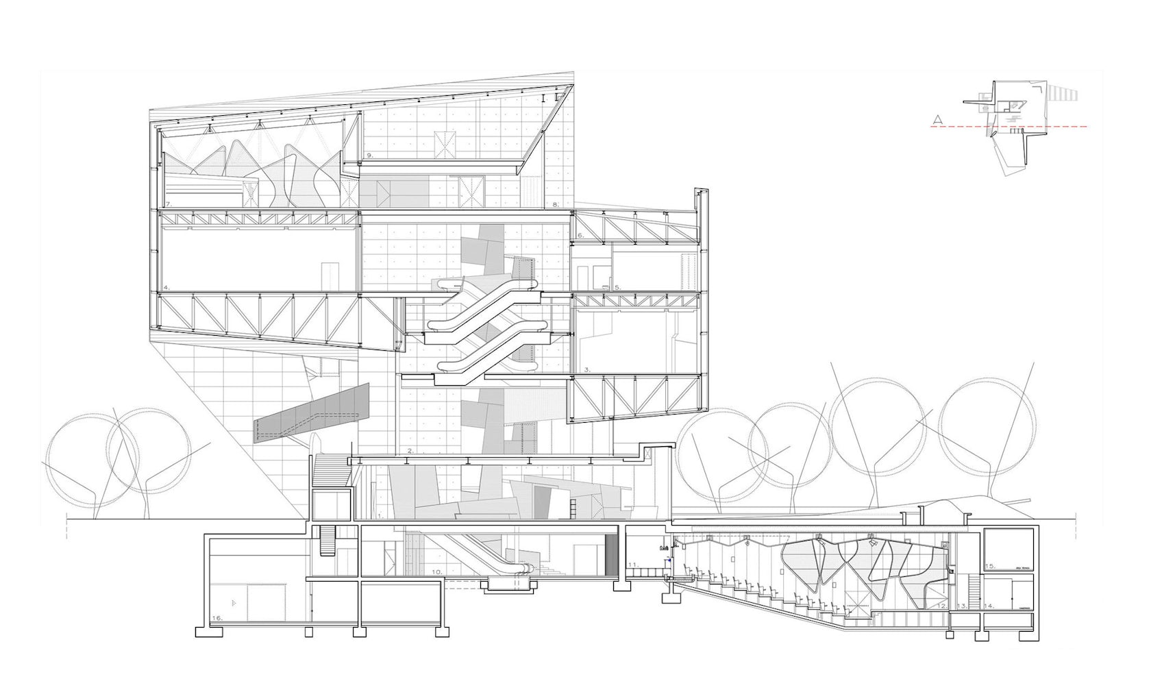

CaixaForum Zaragoza by Estudio Carme Pinós, Zaragoza, Spain
Designed as a building that would feel like a city, the CaixaForum was formed by raising multiple halls atop one another to free the ground floor. Two suspended halls face each other at different levels, and visitors can experience areas of decompression and relaxation between the primary spaces.
These larger concepts are most readily understood in section, where we begin to read the order of space and how it is experienced. The section drawing reveals an incredible play between interior and exterior condition as well as ideas about light, envelope and the city.
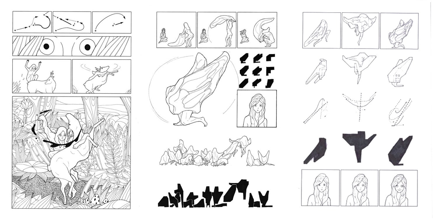
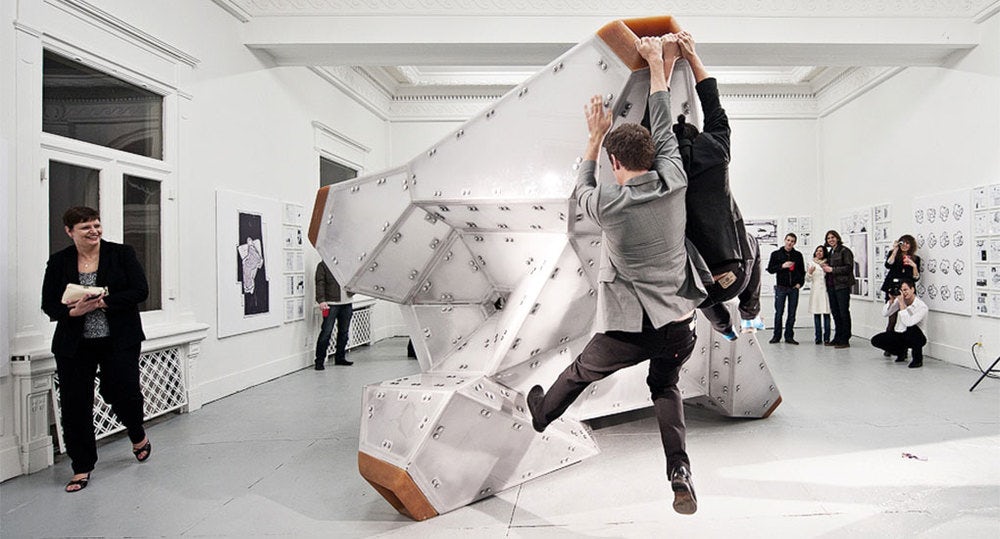
White Elephant (Privately Soft) by Bureau Spectacular, Louisville, Ky., United States
White Elephant was designed around three premises: building inside a building, blurring plan and section through a tumbled object and an object that’s hard on the outside but soft on the inside. Clad with translucent polycarbonate, the interior of the project was made with stuffed cowhide.
Flipped into eight different stances, the project challenges reading and translation. While these same ideas are apparent in the elevation studies of the design, Jimenez and the Bureau include a wonderful series of cartoon sets that further animate the object to give it an entirely different narrative.
Do you have an outstanding image that tells a compelling architectural story? The 2026 Vision Awards has a range of categories, from hyperrealistic or artistic renderings to expressive drawings or hybrid digital mediums. Start your entry >
Top image: CAC MIT Chapel by Eero Saarinen, photo by Jim Stephenson
 Caixaforum Museum
  Heydar Aliyev Center
  Morphosis
  Serpentine Pavilion
  The Scottish Parliament
  White Elephant (Privately Soft)