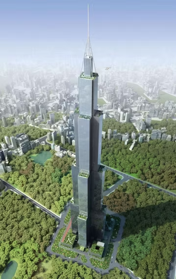
Formal gimmicks in architecture are a fact of life. Many are incidental; no one set out to build a sky-high pickle, a can of ham, a drunkard’s gaping mouth, or a pair of boxer shorts. But recent trends seem to favor imbuing buildings with regionalist clichés as a form of deeper meaning. These projects aim for site-specificity through a close examination of what makes a region unique, then sculpting these qualities into tangible structures: a centuries-old French gardening tradition can be reworked into a deconstructed greenhouse. Windswept desert sand and Islamic geometric patterns can be re-adapted into what seems to be any building proposed to the Middle East (we called an end to this kind of pandering years ago).
There’s a specific type of architectural regionalist cliché, however, that deserves a category of its own. We’re talking about Disaster Regionalism, an approach that looks at a site’s history of very bad things as sources of formal inspiration, and the results can either impress with their artistic ingenuity, or enrage for their insensitivity. But either way. Plagued by tornadoes? Destroyed by war? Left homeless by a hurricane? You name it, Disaster Regionalism will build it.


Tulsa Tornado Tower, 2015, by Kinslow, Keither & Todd, Inc. Images above and at top © Kinslow, Keither & Todd, Inc.
Currently taking the Internet by figurative storm is the latest example of Disaster Regionalism. Kinslow, Keith & Todd, Inc., based in the fine state of fatal- and destructive-tornado-ridden Oklahoma, would like to harness the awe-inspiring power of extreme weather and turn it into something more manageable: a 20-to-30-story extreme weather museum, complete with outdoor observation decks and revolving restaurant. Surprisingly, the Tornado Tower concept has no client yet, architect Andrew Kinslow recently told Fox News, but the online popularity of its newly published renderings has attracted a few potential investors.

Bend House (2008), by MVRDV
© MVRDV
Following the aftermath of Hurricane Katrina, Brad Pitt’s Make It Right Foundation enlisted the help of a few star architects to rebuild the destroyed lower Ninth Ward. Among them: MVRDV, who earnestly proposed an adaptation of the region’s shotgun home architecture that would look like it had literally been broken in half. New Orleans was not amused. “People said, ‘Is this a joke?’ And we said, ‘No, it’s serious’,” principal Winy Maas unapologetically told Metropolis Magazine. “Provocation is good because it pushes people. We need architectural Michael Moores.” Ultimately, it was never built.

Seoul Municipal Building (2013) by iArc Architects. Photo via Wikimedia Commons
To many, the bluish glass and slightly over-arching curve on the façade of iArc Architects’ 2013 Seoul municipal building looks like a wave, which some actually read as a subtle jab (a “truly inconsiderate” one) at survivors of the Japanese tsunami. Although the architects had wanted to invent a “future shape architecture” inspired by the Korean landscape, the Internet’s myriad commentators were quick to point out how the wave appears to be crashing down on the original 1926 city hall situated in front of it, which was built by the Japanese during their former Korean occupation.

Dresden Military History Museum Extension (2011) by Daniel Libeskind. © Bitter Bredt Courtesy of Studio Daniel Libeskind
“The destruction of Europe and European cities by the Nazis is part of the story of the destruction of Dresden,” says Libeskind. “One cannot separate the Shoah and the museums that deal with memories from the history of Germany and Dresden.” And so, for his 2011 extension of the Dresden Military History Museum, he wedged a five-story shard of glass into the existing 19th-century architecture as a visual act of violence and metaphor for war. For the most part, critics lauded its overtly confrontational symbolism, but the architecture itself was a different matter. “It gets embarrassed by necessary verticals and horizontals… Its energy also dissipates rather too rapidly when you are returned to the world of the right angle,” according to Rowan Moore’s review. “The design’s weakness is its belief that sheer shape can speak on its own.”

The Cloud (2011) by MVRDV. © MVRDV
MVRDV made this list, not one, but twice, with the help of what may be one the most outrageous architectural proposals of recent memory. The cluster of cellular amenities bridging the 27th floors of these two adjacent skyscrapers in Seoul was meant to evoke a cloud. Instead, when the firm released renderings of the building in 2011, the public saw the explosion of the original World Trade Center Twin Towers. Although the likeness was unintentional and unrelated to the site in the South Korean Yongsan Business District, outrage ensued. “A real media storm has started and we receive threatening emails and calls of angry people calling us Al Qaeda lovers or worse,” the firm stated in an apology on its Facebook page. “MVRDV regrets deeply any connotations The Cloud projects evokes regarding 9/11, it was not our intention.” Construction was reportedly going to continue, but as of now, there’s no trace of the Cloud in sight. (Unless you put “Outrage” and “architecture” into a Google search. Then, this is the first image that appears.)


