Twice every year, fashion houses and ateliers reinvent themselves for the runway. With traditional shows largely appropriated by the mainstream — see Zoolander — contemporary designers are expected to curate a novel experience that not only debuts the latest styles of that season but also offers spectacle and context through set design.
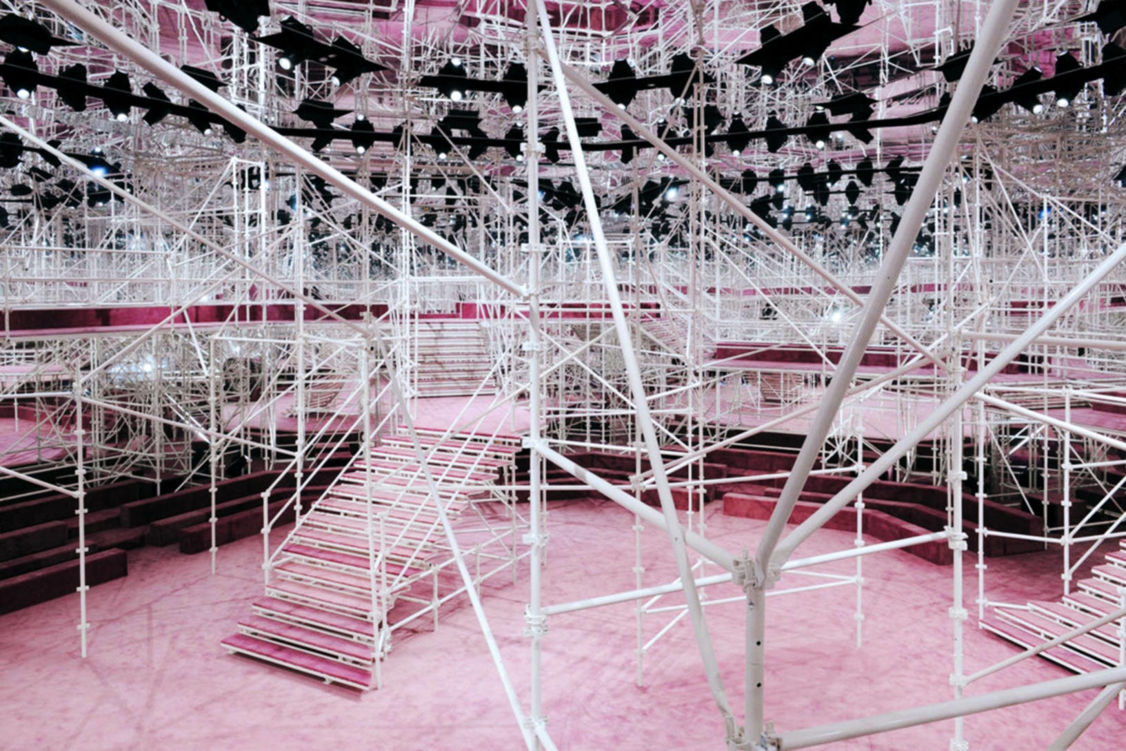
Paris Fashion Week presented a plethora of outstanding set designs to showcase with the spring 2015 haute couture collections. Among the best were Chanel’s Karl Lagerfeld with his exotic paper terrarium and Giorgio Armani’s oriental-inspired, bamboo-lined catwalk, not to mention the OMA-designed Prada show. But perhaps the most architecturally interesting set design seen last week was Raf Simon’s runway maze of white scaffolding for French fashion house Christian Dior.

Photo via The New York Times


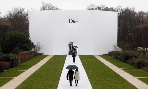
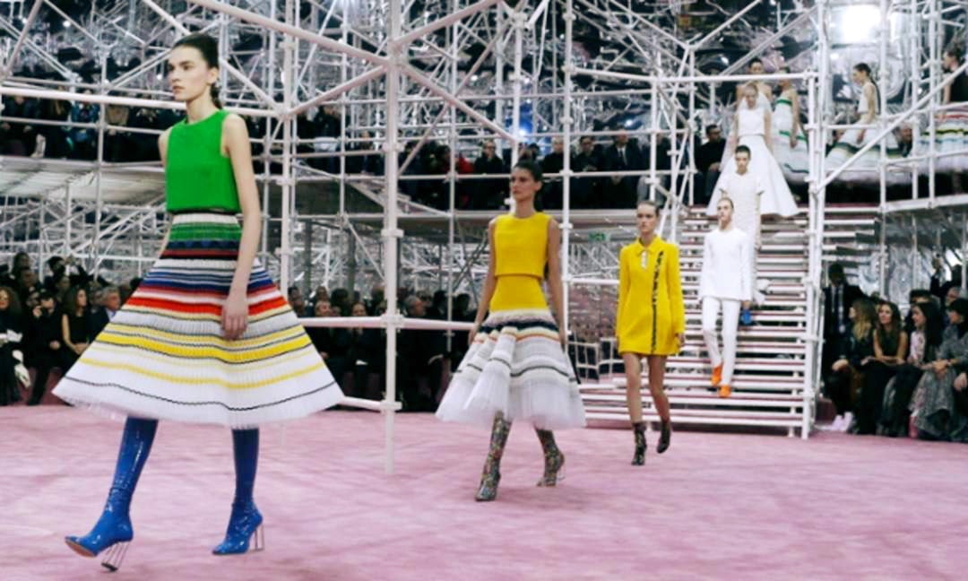
Photos via The Guardian
His spring collection, shown Jan. 26 at the Musée Rodin, comprised a series of 1950s-70s couture made futuristic with ribbon-ringed pleated skirts, sequined minidresses, clear plastic coats, and boldly patterned bodysuits. Descending from the mezzanine on a floating staircase, models sporting the stunning designs took to the pink-carpeted stage against a geometric backdrop of skeletal lines, the bold mod mash-ups contrasting — but not clashing — with the exposed scaffolding that criss-crossed the set.
Before fashion, Simons studied furniture and industrial design. He was named creative director of Dior in 2012 after holding the same position at German fashion house Jil Sander for seven years. Since joining Dior, Simons has partnered with Paris-based creative agency Bureau Betak to bring his structurally-intricate set designs to life.
Here’s a look into the construction and installation of Simons’ 2014 set designs at the Musée Rodin.
Last fall, Simons premiered his collection inside a white pavilion with its interior walls covered in white orchids. Spectators sat in black chairs curved against the walls as the models strutted in pale dresses and light-colored jumpsuits with accents and accessories mimicking the room’s floral theme.
Simons worked with ceramicist Valentine Schlegel to create the Gaudí-like interior for the spring/summer show, where models presented flowing black and white dresses. The mirrored orange façade was created in partnership with Bureau Betak.


