Architects: Want to have your project featured? Showcase your work by uploading projects to Architizer and sign up for our inspirational newsletters.
This collection introduces 7 compact cafe and restaurant designs. Sited within tight urban contexts, these gorgeous hospitality spaces take up no more than 1, 000 square feet (93 meters square). Each design has a unique material and color selection tailored for its concept.
Some of these spaces are so well-disguised within the urban fabric that pedestrians out for a stroll might walk right past them. Meanwhile, others stand out from their surroundings, like a brisk breath of fresh air in otherwise tedious, everyday scenes. They are not spacious and luxurious banquet halls that offer superior dining experiences. Instead, they are secret gardens hidden in the neighborhood that offer a quick escape from busy works or noisy cities.
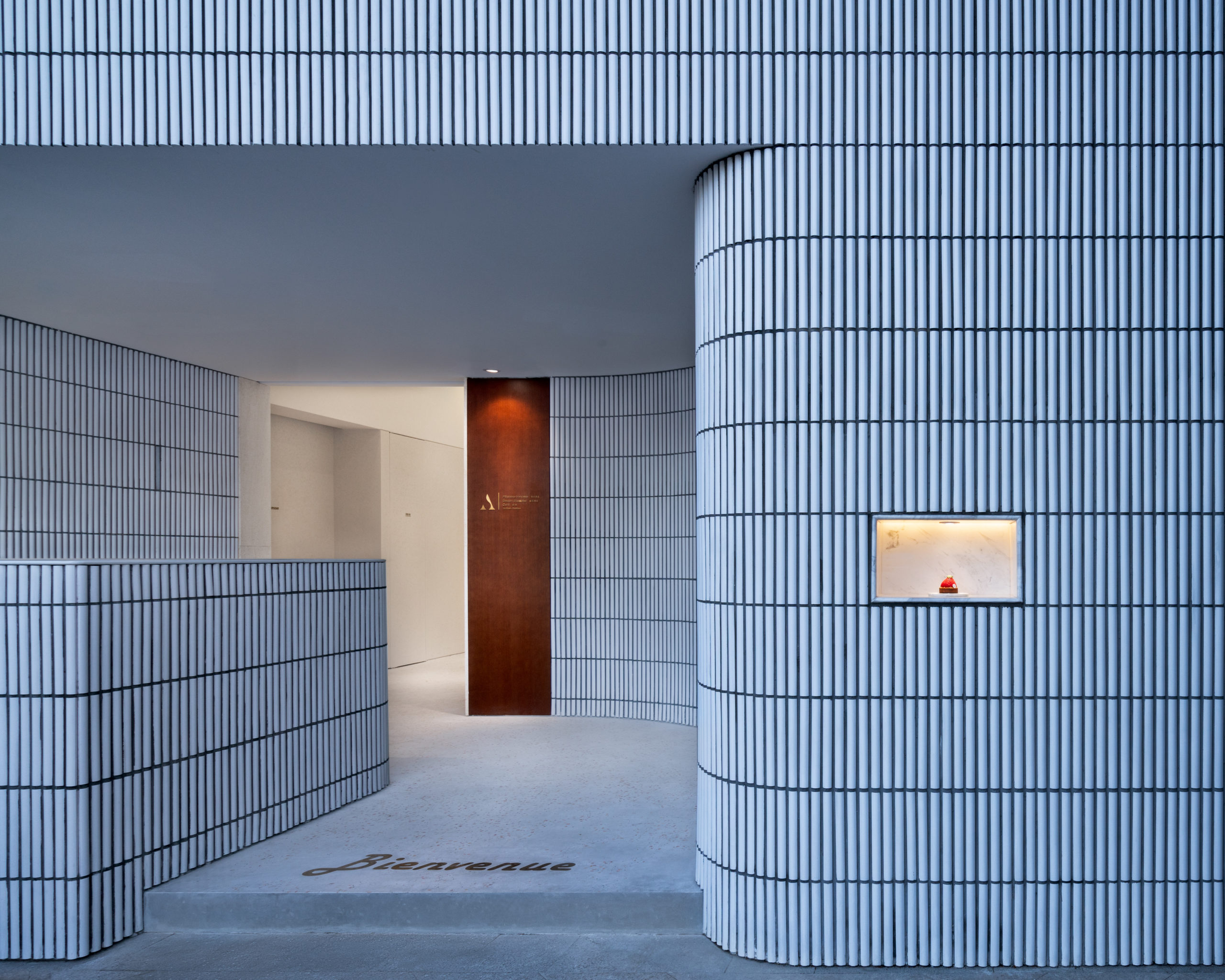
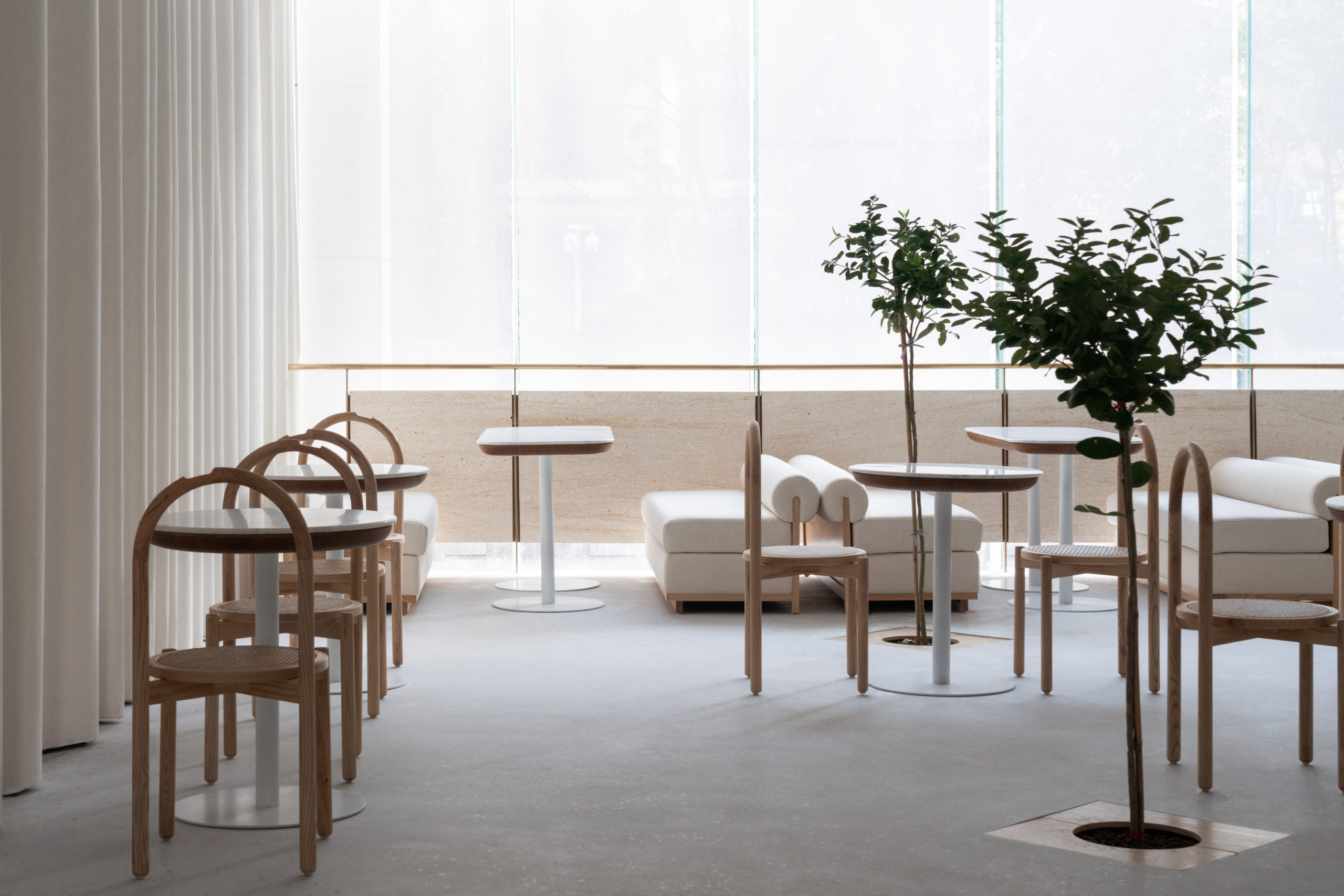 Angelot Patisserie by SayArchitects, Hangzhou, Zhejiang, China
Angelot Patisserie is a French style patisserie hiding under a tall stone façade. Custom narrow tiles create a smoothly indented façade that forms a rounded entry to gently welcome customers into the store.
Upon entering, the journey is prolonged by the curvy circulation, and the whole space is gradually revealed in the order of the entrance, counter and dining area. The distance between the floor and the ceiling gradually increases from the entrance to the dining area, enriching the spatial experience on a tight site.
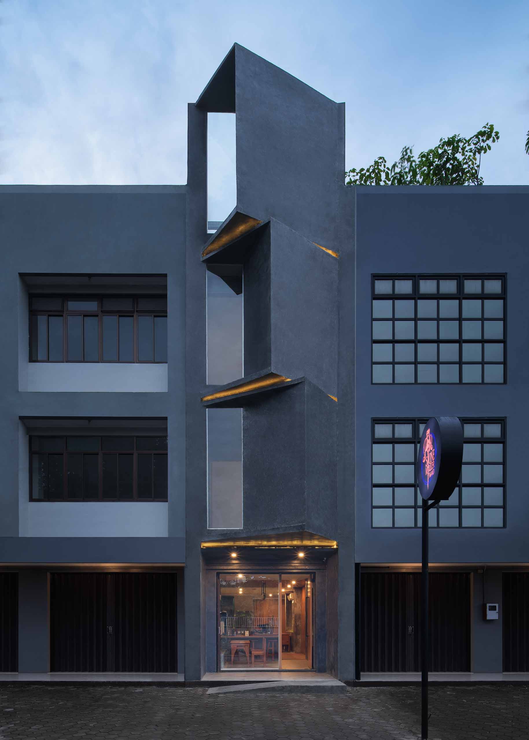
 Stone Milker by oxo arc, Yogyakarta, Indonesia
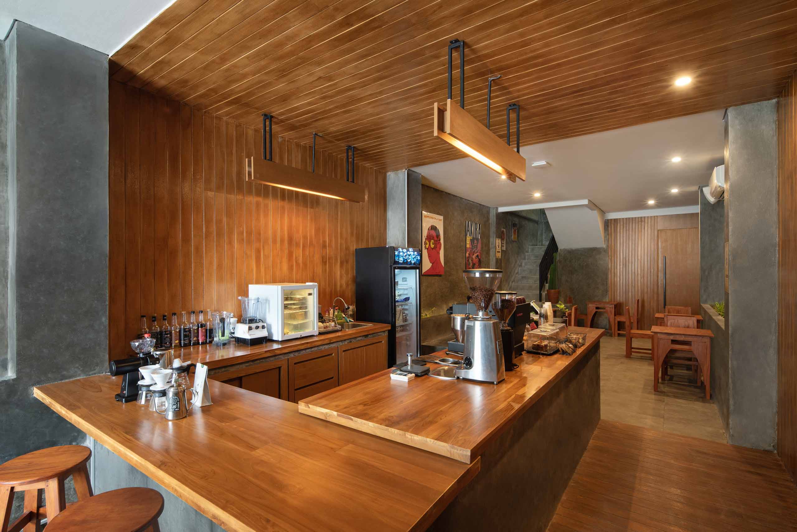
The narrow site occupied by the independent coffee shop Stone Milker used to be a small commercial building in Yogyakarta. Inspired by the song “stonemilker” by Björk, the new building is a celebration of clarity and simplicity that can balance differences in our life.
Accordingly, the façade is twisted in a simple yet effective way to break the continuous rhythm of the street. Meanwhile, the color of the exterior remains the same as its neighbors to preserve the visual harmony on the street. The stone-grey continues to the interior, where the cool color is then neutralized by the warm-colored wood, to balance between cold and warm, tough and gentle.
 Roly-Poly Cotto by studioVASE, Seoul, South Korea
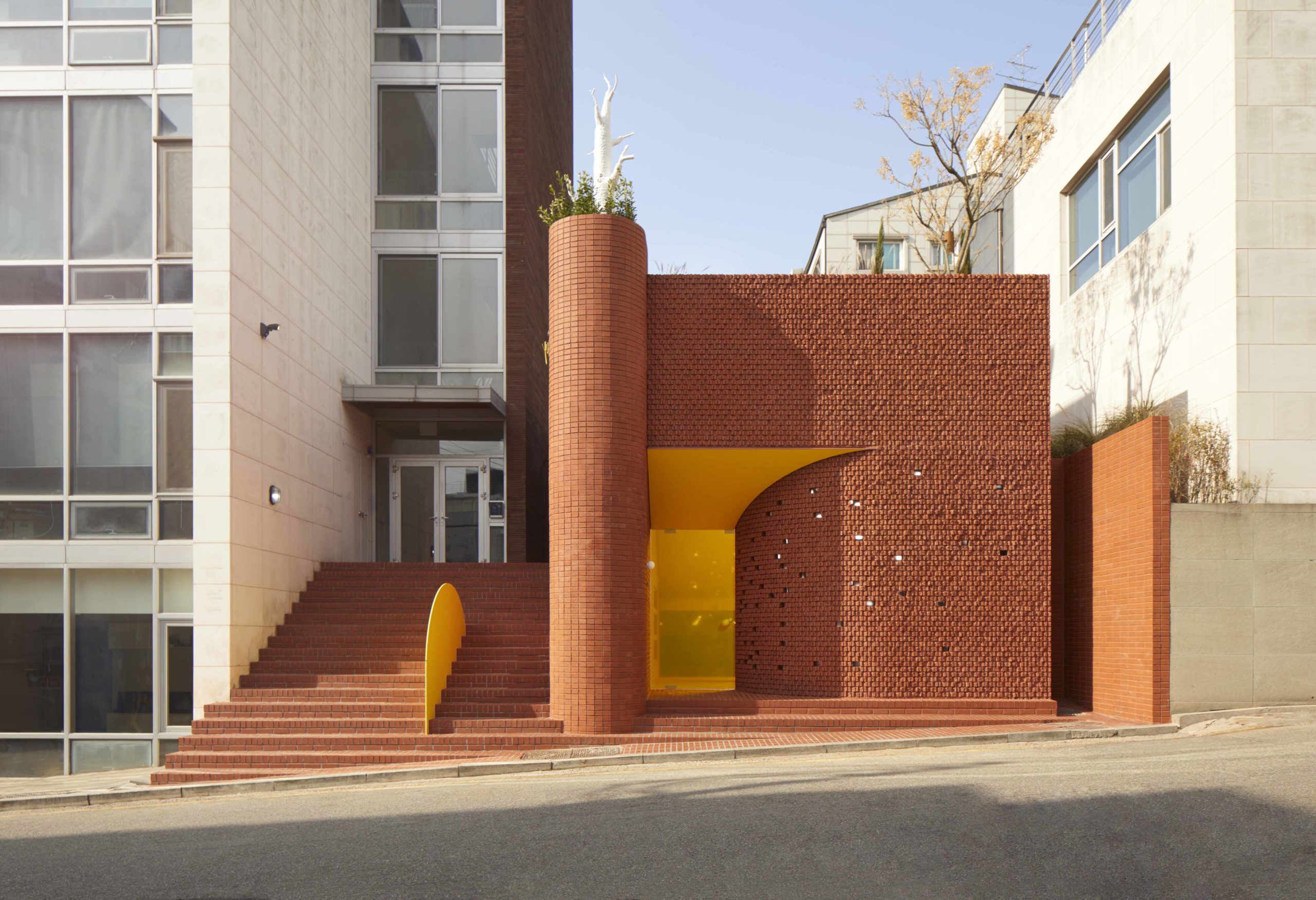
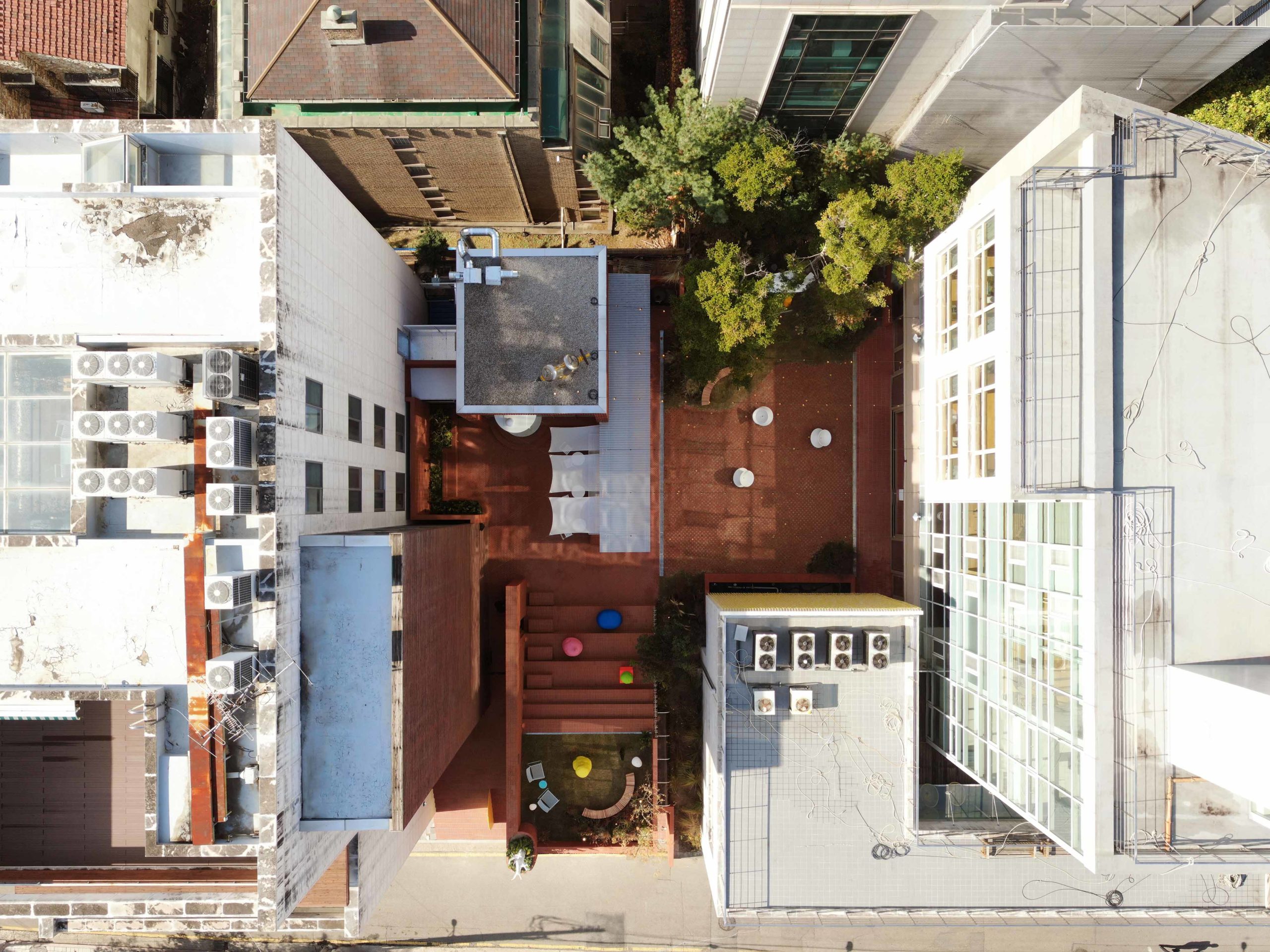
Roly-Poly Cotto is a ramen and curry shop, but it is also a piece of playful urban landscape hidden between two existing buildings. The design team utilized small red bricks to create the appearance of a pixelated graphic façade that contrasts to the surrounding buildings in both color and form.
Six spaces themed accordingly as cave, cube, slope, shade, hall and sala, are connected by the garden, forming a series of landscapes with varied levels and lighting conditions. The brand’s iconic bright yellow is widely incorporated into the design; by highlighting the spaces with yellow, white and other highly saturated colors, the design is made attractive to young generations.
 POKE POKE by STUDIO DOHO, Shanghai, China
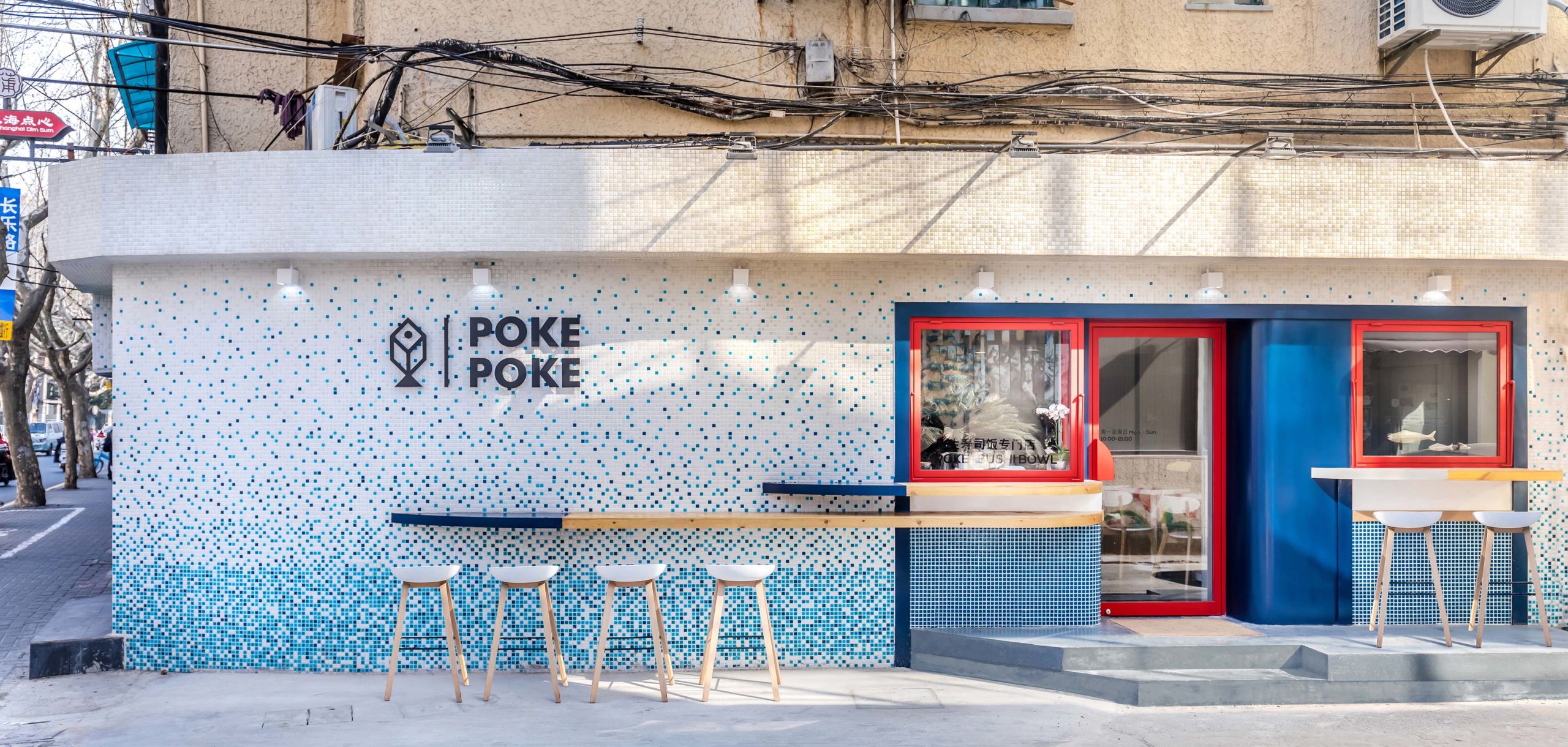
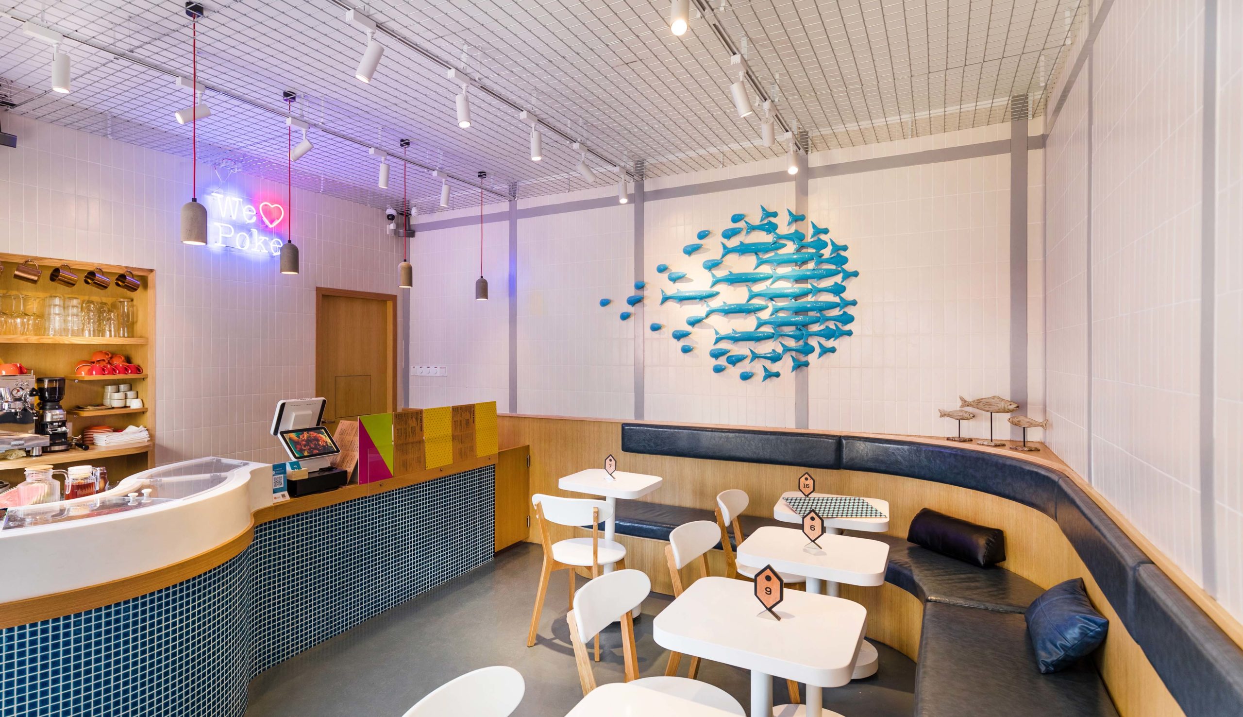
The 32-square-meter poke shop POKE POKE is located on the ground floor of an old Shanghainese lane house in the historic Jing’an District. STUDIO DOHO built a modern eatery that reflects the Hawaiian origins of the dish poke on this crowded while context-rich site.
Referring to the oceanic state of Hawaii, an eye-catching mosaic façade pictures the abstracted scenery of the sea meets the sky. Stretching from the façade, outdoor countertops inspired by the shape of surfboards accommodate more customers and extend the interior closer to the street and community. The architect used blue as the theme color and neutralized its coolness by the bright red frames. Less saturated colors are joined by timber to form a rather cozy interior atmosphere.
 Ryoutei Matsuko by Tsutsumi And Associates, Hangzhou, Zhejiang, China
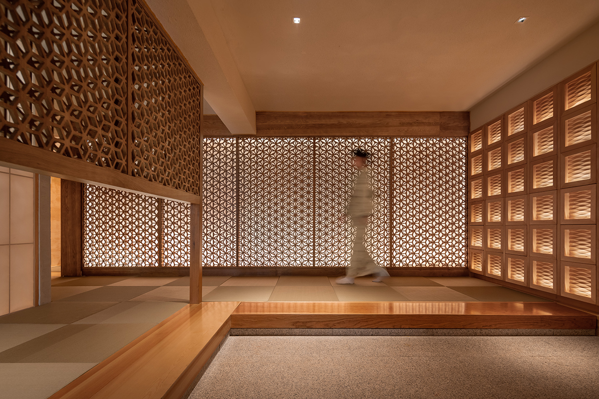
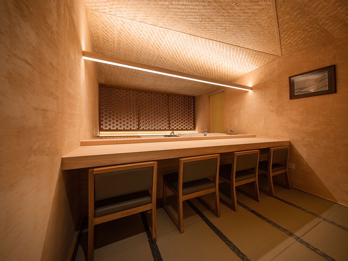
The Japanese restaurant Ryoutei Matsuko is a quiet respite from the modern city of Hangzhou. The restaurant occupies the top two floors of a three-story lakeside house next to the West Lake in Hangzhou. Wood is repeatedly used in this interior design to create a calming yet rich spatial experience.
The entrance wall is covered by two layers of screens, each layer is carved into a different variation of the traditional ASANOHA pattern, shifting gradually from one to another as the viewing angle changes. Views to the outside are blocked by washi partitions and timber screens to provide an immersive experience while allowing natural lights in.
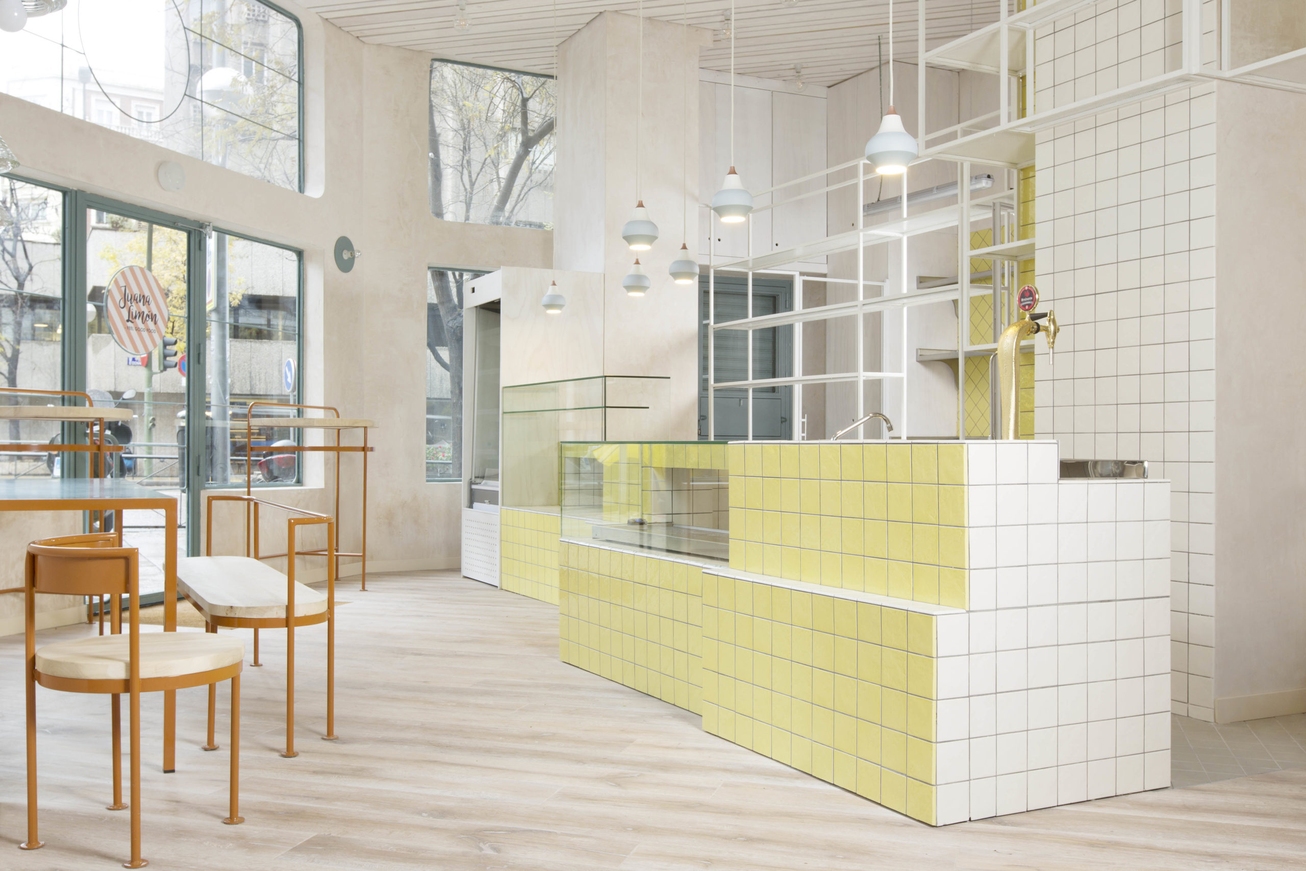 Juana Limón by Lucas y Hernández-Gil Arquitectos, Madrid, Spain
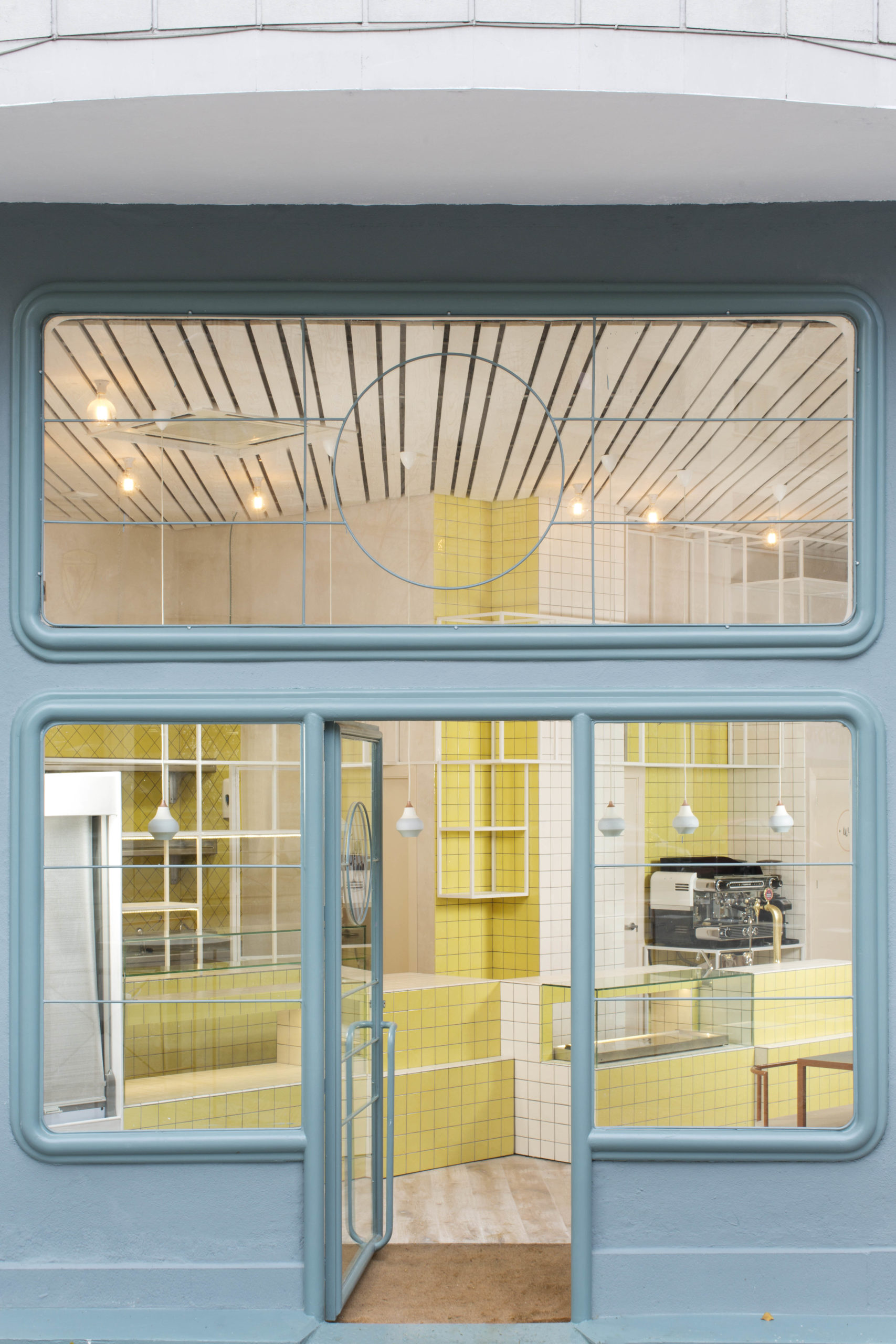
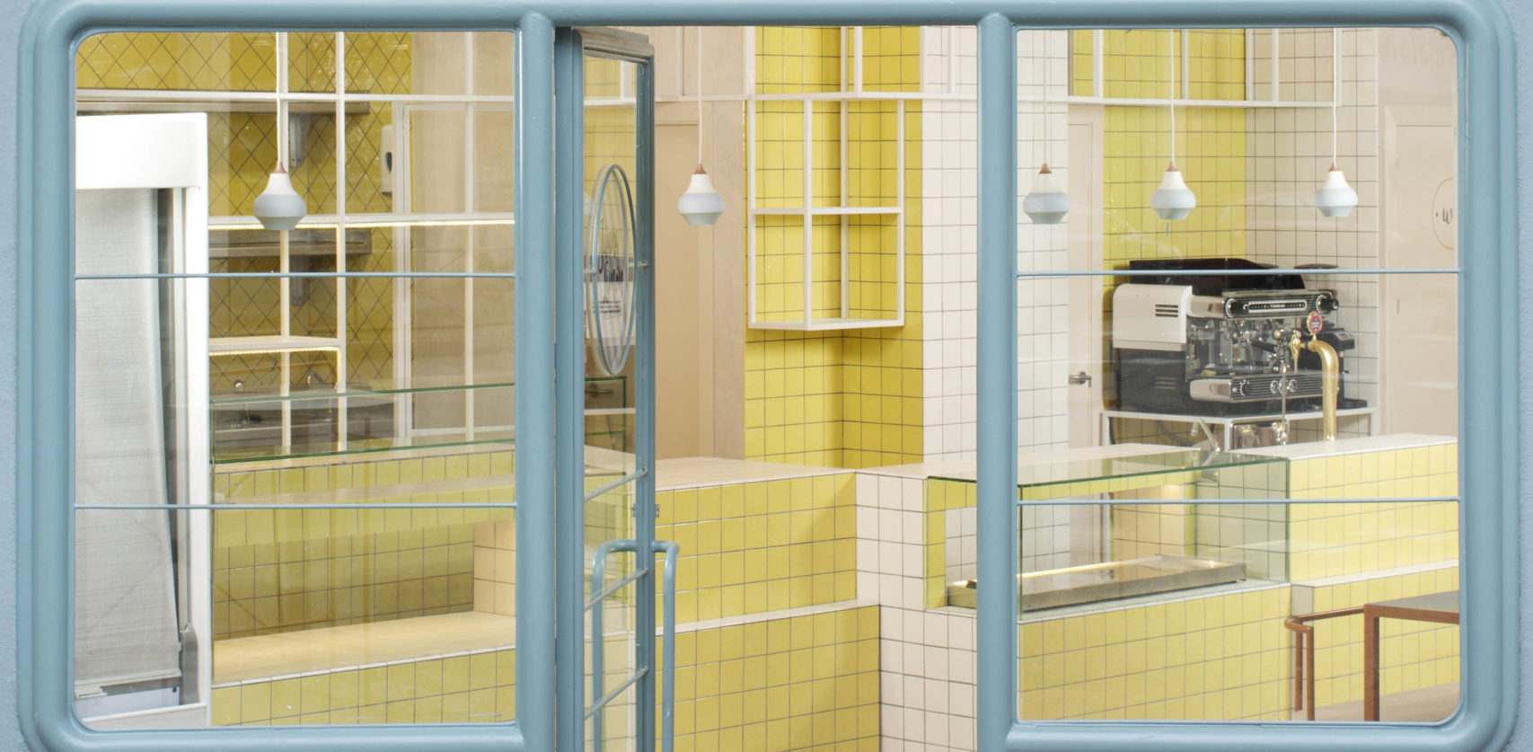
Juana Limón is a park-side coffee shop and bakery in Madrid. Food preparation, selling and consumption areas are tightly fit onto the 50-square-meter site. A wide range of colors are neatly balanced and harmonically delightful.
The yellow tiles are hand-painted to echo the artisan nature of the bakery and coffee shop. The flooring, walls and ceiling are all constructed using different materials of the same color, blurring the boundaries between them. The space feels more open with the overall light color swatch and blurred interior boundaries.
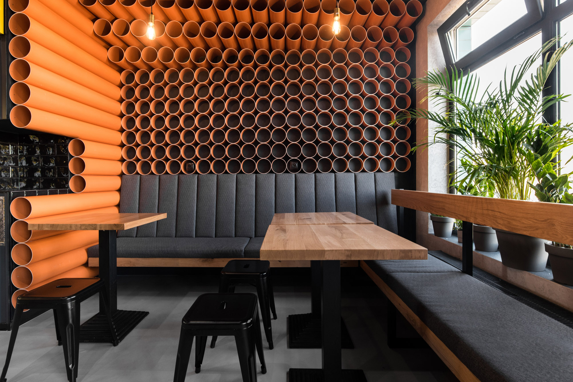
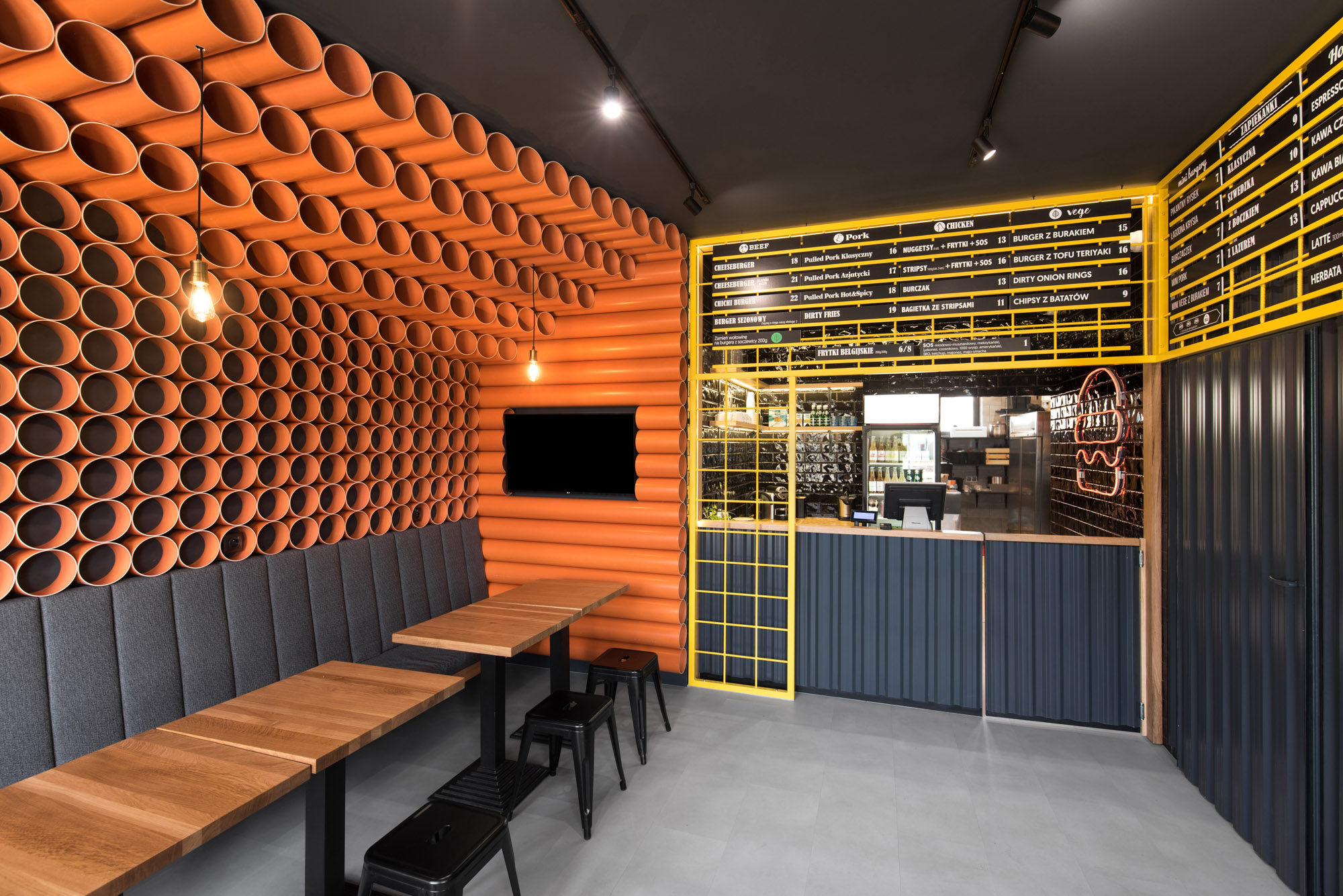 ChiChi 4U – Batorego, by mode:lina™, Poznań, Poland
Continued from previous collaborations with the brand, the design team mode:lina™ designed a new interior for the burger restaurant ChiChi 4U in a unique yet consistent style. Three hundred bright orange PVC pipes from a warehouse were cut and mount onto the walls, forming a dynamic 3D finishing. The yellow mesh that framed the menu, together with the pipes, strongly contrasts the dark grey background. Black corrugated metal sheets and the steel-and-timber furnishing creates a contemporary yet industrial aesthetic.
Architects: Want to have your project featured? Showcase your work by uploading projects to Architizer and sign up for our inspirational newsletters.
 Angelot Patisserie
  ChiChi 4U - Batorego
  Juana Limón
  POKE POKE
  Ryoutei Matsuko