Architects: Want to have your project featured? Showcase your work by uploading projects to Architizer and sign up for our inspirational newsletters.
The circular-patterned façades in this collection operate in sharp contrast to the constructed form of the buildings and the spaces within them. Here, the circular pattern is often used as an aesthetic adornment for the archetypal form of the building it is covering, setting it apart from its neighbors. While most serve little structural use, it is interesting to compare the functions that have been created for or incorporated into the façades of these buildings.
The circular-patterned façades of Incineration Line, O House, Urban Hive and Dot Envelope encase a structure and change it from something familiar to something unique. The unbroken, repetitive patterns of the façades cause us to look at the exteriors in a new way and see the form as a whole, instead of the stratified layers of the traditional building. These façades are open to the elements, allowing air and light to penetrate, while they maintain a buffer zone between the glass and wall of the building underneath that controls the interior climate.
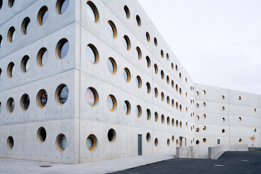
On the other hand, the Research Library in Hradec Králové and MON Factory/House use their circular-patterned façades as the only barrier between the interior and exterior climate. The circular windows are a refreshing change from the floor-to-ceiling windows or rectangular windows in most modern buildings. Each of these unconventional projects is explored in greater detail below.

© Tim Van de Velde Photography

© Tim Van de Velde Photography

© Tim Van de Velde Photography
Incineration Line by (designed by) Erick van Egeraat, 70, Håndværkervej, Roskilde, Denmark
Surrounded by other industrial buildings, the incineration line stands out in the low-lying landscape in Denmark. The building begins with a more traditional industrial roof line before it climbs to the towering peak of the smokestack, becoming more angular and porous in the upper reaches.


Dot Envelope by OFIS architects, Poljanska cesta, Ljubljana, Slovenia
The Dot Envelope was a creative solution to add more architectural interest to a chain store location in a designated historical industrial area. The architects had to restore the tower above the store and maintain the brand’s identity in a way that would fit with the surrounding architecture.

© Subarquitectura

© Subarquitectura

© Subarquitectura
Tram Stop in Alicante by Subarquitectura, Glorieta Deportista Sergio Cardell, Alacant, Spain
The Tram Stop in Alicante creates a tranquil waiting area off the street surrounded by trees for the commuter. The circular-patterned shelters provide some protection from the elements and create a soft light source for the surrounding community.

© Archium

© Archium

© Archium
Urban Hive by Archium, Seoul, South Korea
The urban hive uses its circular-patterned façade to create an interesting and structurally important exterior that sets it apart from the surrounding office buildings.


MON Factory/House by EASTERN Design Office, gojo, Kyoto, Japan
Circular windows sets MON Factory/House apart from other modern concrete homes that we see so often today. The circular windows work together with larger rectangular doors and windows to bring interesting light to the interior, changing the mood of the home.

© Philippe Stuebi Architekten

© Philippe Stuebi Architekten

© Philippe Stuebi Architekten
O House by Philippe Stuebi Architekten, Switzerland
The expressive front elevation of O House, with its large circular openings, creates a dramatic approach to the home and echoes the architect’s use of small circular windows on the back side of the home.

© Projektil architekti s.r.o.

© Projektil architekti s.r.o.

© Projektil architekti s.r.o.
The Research Library in Hradec Králové by Projektil architekti s.r.o., 2, Hradecká, Hradec Králové, Czech Republic
The architect’s use of circular windows for the research library contrasts the sharp form of the library’s ‘X’-shaped plan and brings in ample light to the interior. The library also features circular skylights and an atrium allowing light to penetrate to all levels of the research facility.
Architects: Want to have your project featured? Showcase your work by uploading projects to Architizer and sign up for our inspirational newsletters.


