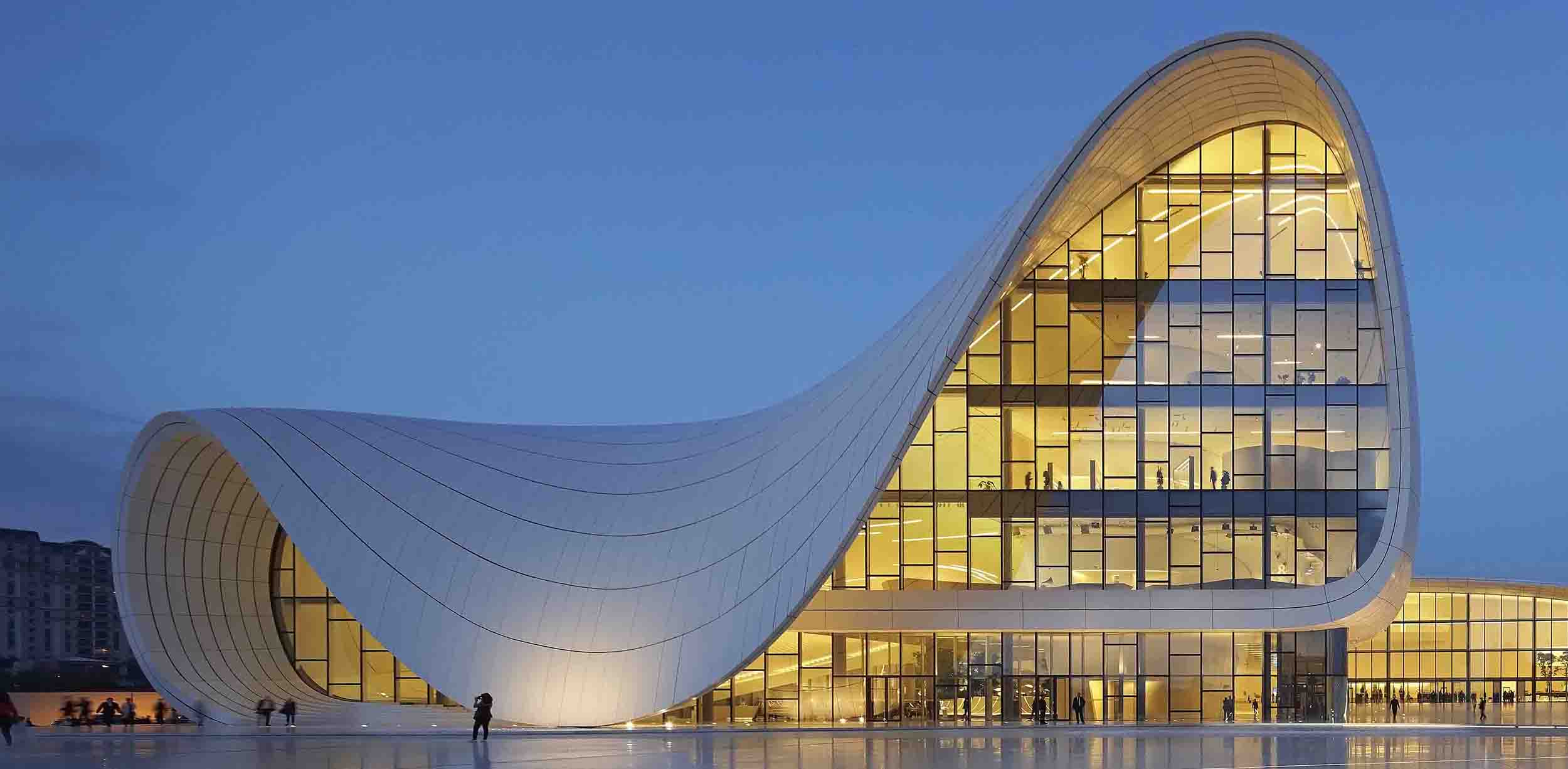
What’s in a name? That depends who’s giving it. In the case of high-profile architecture, a large number of buildings have official names, but the more distinctive forms among those structures tend to attract popular sobriquets bestowed on them by the public. These nicknames can run the gamut from humorous to disparaging and are often quite memorable, but their real value lies in the disconnect they illustrate between an architect’s original design intent and the way it is perceived by the general public.

London’s skyline is packed with nicknamed towers. Image via the Daily Mail
This phenomenon can be seen as mainstream society’s attempt to take possession over a conspicuous element that may feel forced on them, because an eye-catching, prominently placed building is something that’s passed by, entered and used every day by many people who had no hand in the decision-making process that led to that building.
As such, a public nickname can be seen as valuable feedback for the effect that certain design decisions have on a wide range of people and, as a gap in translation between architects and the society they serve, can offer fantastic insight into a culture’s common perceptions. Below are some of the most notable examples of this occurrence, as featured on the Architizer database.

© LAD LABORATORIO ARCHITETTURA E DESIGN
“The Stealth”
Olgiata Shopping Plaza by LAD, Rome, Italy
A sloped, pyramidal form defines this suburban shopping center in an attempt to mediate natural and human constructions. As an allusion to a mastaba, the form was intended to reference ancient shelters made entirely from earthen materials, but with a contemporary skin of sleek, orthogonal titanium, its users instead perceive an aesthetic of military aircraft. Referred to as “The Stealth” for the aerodynamic feel of its dark exterior panels and shape, the name is indicative of the pervasive power of modern imagery over the visceral understandings of elemental forms that are often believed to be deeply rooted in the human psyche.

“The Berlin Brain”
Free University of Berlin by Foster + Partners,Berlin, Germany
Set within the historic modernist campus of the Free University of Berlin, a library for the philology department was conceived to be an aesthetic embodiment of spatial and environmental efficiency, with a panelized façade paying homage to the modular orientation of the surrounding campus.
Chosen because it combines maximum volume with minimum surface area, the resulting teardrop-shaped enclosure employs its faceted surface to allow natural ventilation and daylighting. The distinctive shape also serves as the basis for the building’s cranial moniker, a reminder that regardless of design intent, popular understanding of architecture lies somewhere between what it houses and what it looks like.

© DLR Group
“The Rainbow School”
South Region Elementary School No. 2 by DLR Group, Los Angeles, Calif., United States
A variety of bright, vibrant colors were applied to the perimeter wall of this school in order to lighten the mood of what is essentially a security feature. Sheltering an interior schoolyard, this wall provides a haven for students at recess and a place for teachers to conduct outdoor classes, without appearing to be a fortification from either the schoolyard or the sidewalk.
It seems this goal has been accomplished, to an extent, because the school’s nickname could hardly be construed as negative. Whether or not the application of this nickname indicates success in the school’s goal to also become a symbol for neighborhood revitalization is less clear and will likely rely on future circumstances beyond the control of its designers. In any case, this name suggests the school is at least seen as a symbol for the community regardless of the fate of the neighborhood.

“The Praying Hand in the Vineyard”
Haus Wurth by Hermann & Valentiny and Partners, Wormeldange, Luxembourg
A desire to provide natural light in a way that would appear architecturally elemental from the outside led the designer of this private residence to apply a solid/void rhythm to the façade, alternating between vertical bands of glass and COR-TEN steel.
The resulting “fingers,” when seen from afar, were interpreted by the local townspeople as two hands coming together in prayer. While the nickname may sound better when spoken in the language it was coined in, it’s nonetheless suggestive of a culture that tends to graft its values onto the objects it encounters. In this case, it can also remind architects to consider their designs from all possible vantage points — near or far.

© Moon Hoon
“Lollipop House”
by Moon Hoon, Yongin-si, South Korea
A client’s wish to live in a unique-looking house was the impetus behind the distinctive qualities of this residence flanked by typical homes in a tightly packed residential area. Contrary to appearances, an expressive façade wasn’t the starting point for the resulting house, but rather a side effect that came about from an interior layout based on spiraling circulation.
As a reflection of this concept, the paneled façade certainly does its job, though like many symbolic works of art, it needs to be explained to passersby who weren’t in the room for the original creative discussion. In that sense, the child-like, candy-themed nickname reflects a public attitude of appropriation of artistic objects placed in their everyday sphere, outside of museums and galleries.


