Architects: Want to have your project featured? Showcase your work by uploading projects to Architizer and sign up for our inspirational newsletters.
When someone describes blue as a “cool” color, the term can have a wide range of meanings. In regards to literal color temperature, the inverse is actually true, as blue ranks highest on this scale relative to other colors. Most probably the association is rooted in a likeness to the color of the ocean (typically cool, temperature-wise), which may serve as a basis for how the color blue is understood in this collection: for its subconscious undertones of calmness and tranquility.
Cross-cultural understandings of blue as the color of a subdued, passive feeling ensures it will have a strong effect when used in architecture. The projects below all feature blue extensively and, for better or worse, this choice sets the predominant mood for each. These examples are powerful illustrations of how color choice can affect a broad user base in a consistent manner — a move that, no matter how it is wielded, will almost always strengthen a particular understanding of that project in the collective unconscious.

© Hofrichter-Ritter Architekten

© Hofrichter-Ritter Architekten
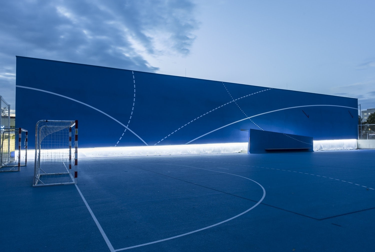
Blue Box by Hofrichter-Ritter Architekten, Graz, Austria
Blue was an interesting choice for this sports hall and complex, as its unconsciously calming effects run counter to the invigorating, stereotypically athletic mood inspired by a red or orange. In any case, the vibrancy of this particular blue gives a strong identity to this urban ensemble, as it ties together three separate buildings and identifies disparate entrances as being associated with the same complex.

© Moussafir Architectes

© Moussafir Architectes
La Luciole by Moussafir Architectes, Alençon, France
A range of blue-toned metal panels wrap around the two circular façades of this concert hall, comprising a canvas that abstracts the partially cloudy blue skies common in the area. The circular forms of the concert hall are slanted askew to each other, seeming to grow out of their starkly contrasting lush, green surroundings.


Stade Océane by SCAU architects, Le Havre, France
A smooth blue cover was chosen to envelope the upper portion of this stadium for a contrasting quality with the stadium’s concrete base and its industrial surroundings. The colored motif is repeated throughout the stadium but is especially noticeable underneath the massive translucent cover, which casts a deep blue glow onto areas below the grandstands, and can be dramatically lit from within at night.

© Dylan Perrenoud

© BUREAU A
BIG by BUREAU A, Geneva, Switzerland
A formal homage to Stonehenge was created here with a series of bright blue shipping containers. Housing an arts festival and seasonal party, the coloring of the shipping containers has the capability of casting a tranquil mood over the proceedings, but also provides a bold contrast to its earth-toned setting in a parade ground, clearly visible in the middle of Geneva.

© Dominique Coulon & Associés

© Dominique Coulon & Associés
Swimming Pool in Bagneux by Dominique Coulon & Associés, Bagneux, France
Color treatment was of utmost importance in the renovation of this existing aquatic center. As an accent color with obvious relations to water, blue is used carefully throughout, casting a pall over spectator seating areas next to a lap pool, and used to imply a tranquil mood in a relaxation area. The lighting effect in the relaxation area is provided by an underwater window looking into the bottom of one of the center’s other pools.

© Primitivo Gonzalez Arquitecto

© Primitivo Gonzalez Arquitecto
Burgos Art School by Primitivo Gonzalez Arquitecto, Burgos, Spain
Articulation of color was used on the exterior of this art school to denote not only a shift in form but also program, as a brick base housing workshops, becomes a mass of deep blue on the upper floor, where it contains theory classrooms. Visible to passersby, the blue portion of the form differentiates the school from its surroundings, which it otherwise blends into geometrically.

© Arthur Péquin Photographe

© Arthur Péquin Photographe
HDE 17 by POGGI Architecture + MORE Architecture, La Rochelle, France
Blue is employed here to announce ingress, for both people and vehicles, at this industrial production facility. Wanting to pay homage to the aesthetically stereotypical factory buildings surrounding this facility while clearly individualizing the new structure, these swaths of colored metal panels helped the designers make an abstraction of quotidian forms. The resulting facility imparts the colloquial feel of a factory with the impression of a progressive leaning in its notable use of color.

© ARM Architecture, Cameron Chisholm Nicol

© ARM Architecture, Cameron Chisholm Nicol
Perth Arena by ARM Architecture and Cameron Chisholm Nicol, Perth, Australia
The striking qualities of blue are notable here for their elevated presence within an urban gray sea of roads and parking lots. Picked as the color to define this high-profile arena project, the choice is carried through to the building’s interior, where it’s joined by high-quality wood finishes with bright orange and red hues, acting to contrast the blue and give a homely, intimate feel to this necessarily over-scaled building type.
Enjoy this article? Check out the others in our series on “The Psychology of Color”:


