Architects: Want to have your project featured? Showcase your work by uploading projects to Architizer and sign up for our inspirational newsletters.
No matter how many trends come and go, the pairing of black and white will always be chic. There is something classic yet contemporary about the combination, with its endless versatility. A greyscale palette can enhance the grandeur of an ornate setting, or reinforce the sleekness of minimal interiors. Whether used as a monochrome palette or accented in choice places with colors like mango yellow, candy red or muted pink, there is a way to make a black and white design work for every space and scale.
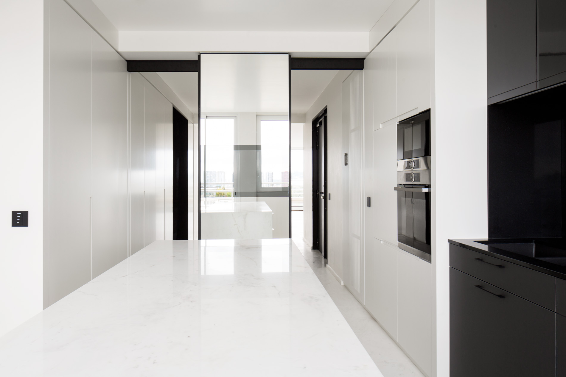
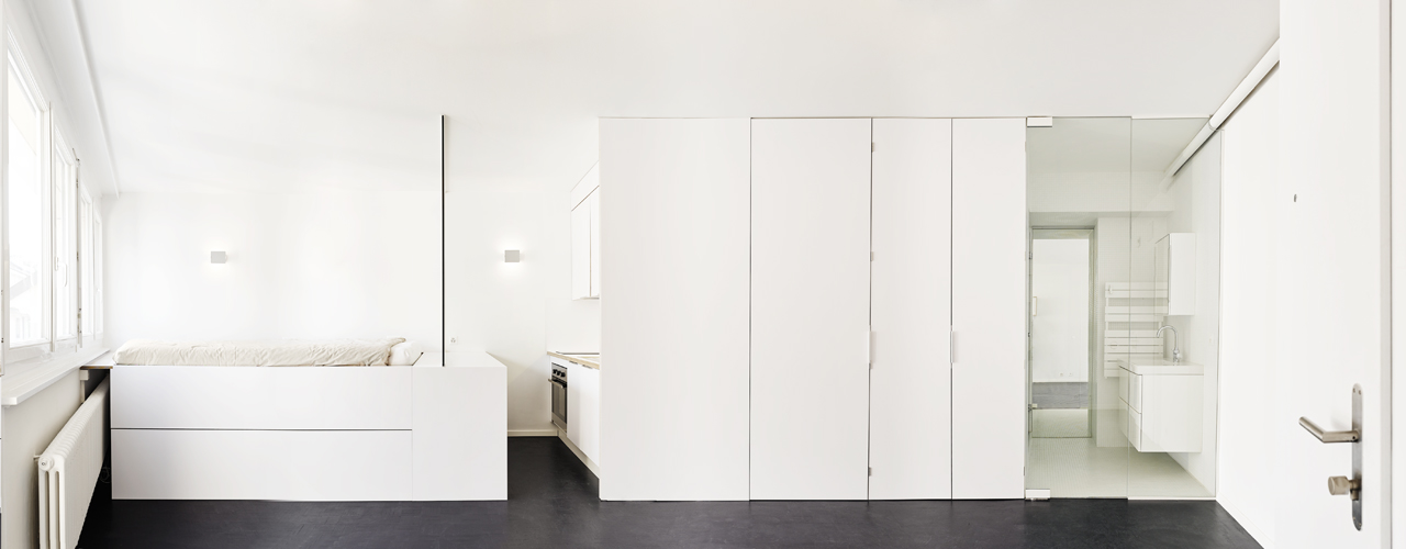
Apartment Montmorency by Cube architectes, Paris, France
Play With Dimension
Highlighting level differences or painting recesses black in an all-white setup can break the monotony and create an almost 2D visual. This is evident in the design of Apartment Montmorency by Cube architectes where the space looks brighter and more open without appearing clinical or bland.
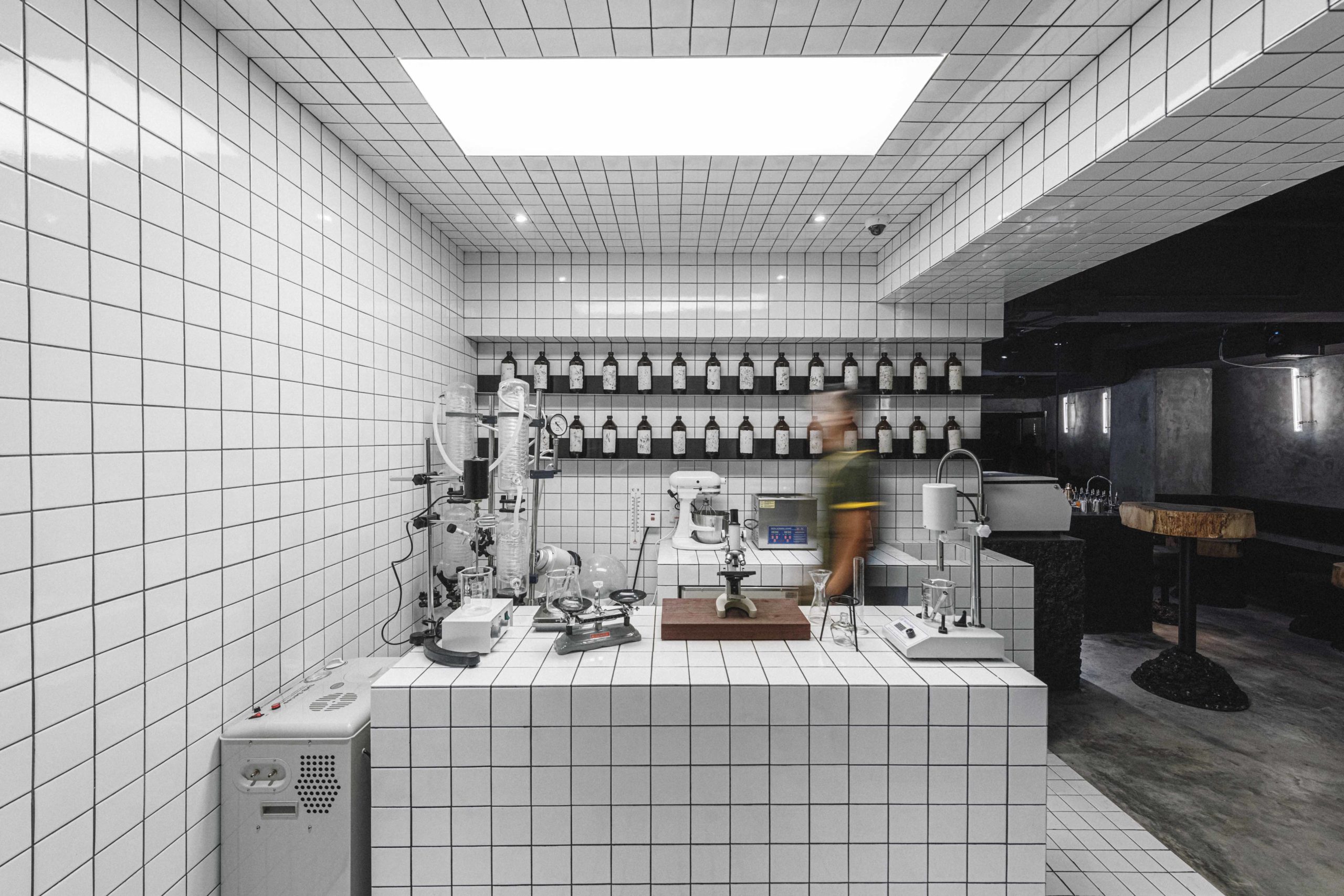
PENICILLIN by COLLECTIVE, Hong Kong
Texture and Tiles
White tiles with dark grout are an easy way to achieve a retro aesthetic that is fun and easy to maintain. Design studio COLLECTIVE used this format to create PENICILLIN — the first closed-loop sustainable bar in Hong Kong. The continuation of the grid on the floor, walls, ceiling and counter makes the entire space look cohesive and separates it from the other spaces in the bar.
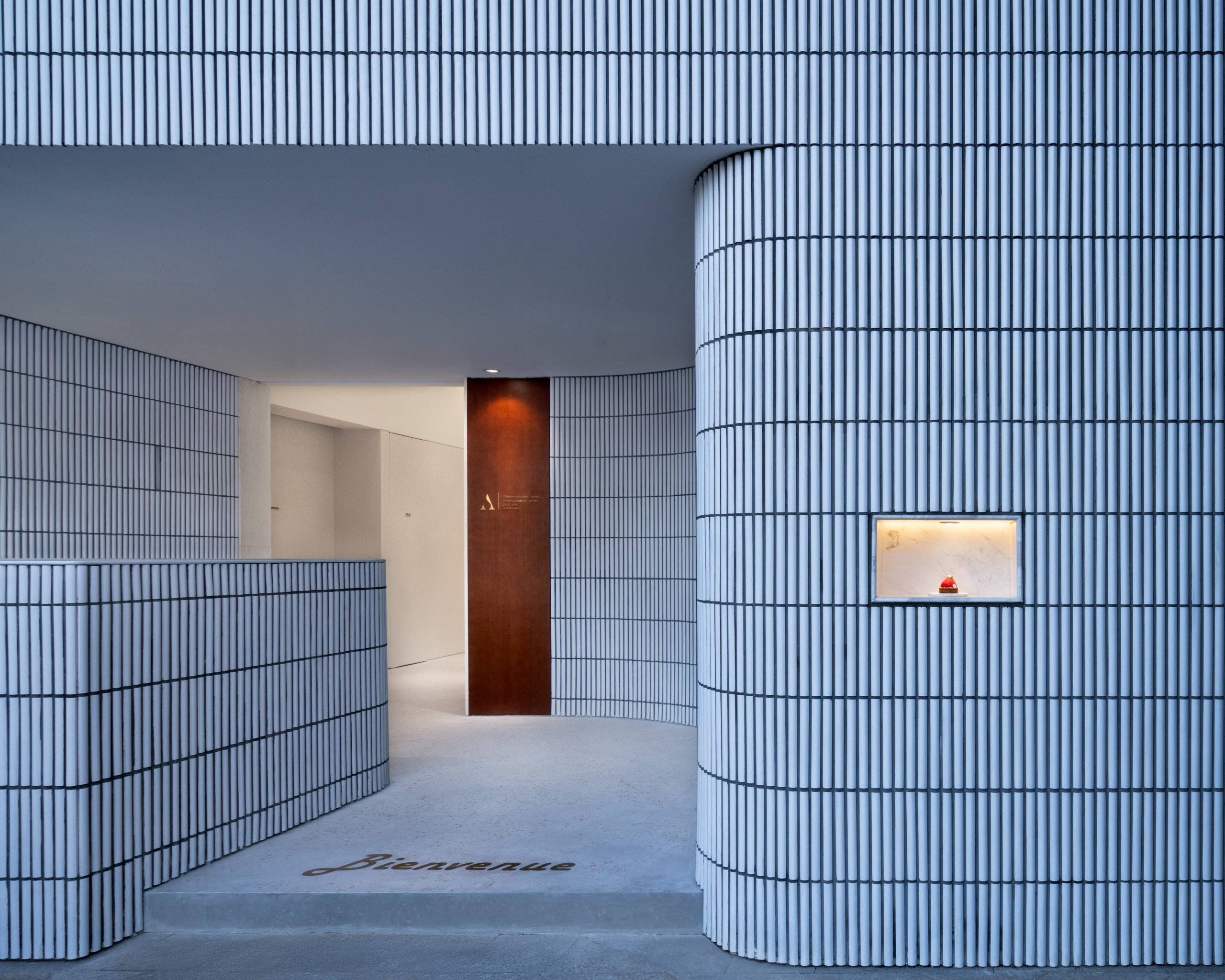
Angelot Patisserie by SAY architects, Xiasha Hangzhou, China
Curved Lines
Rounded alcoves and partitions that are topped with curved tiles are another way to inject some motion in a large or empty space. The corrugated walls of Angelot Patisserie by SAY architects open up the space while still making it feel cozy.
 Focus on Furniture
What better way to create an impact than a sculptural piece of seating. Orca, designed by Ateljé Sotamaa, is a versatile piece of black and white furniture that can easily be a centerpiece in a white living room or a black and grey den. Quirky additions to rooms can infuse momentum and fluidity in spaces that have plain walls or simple furnishings.
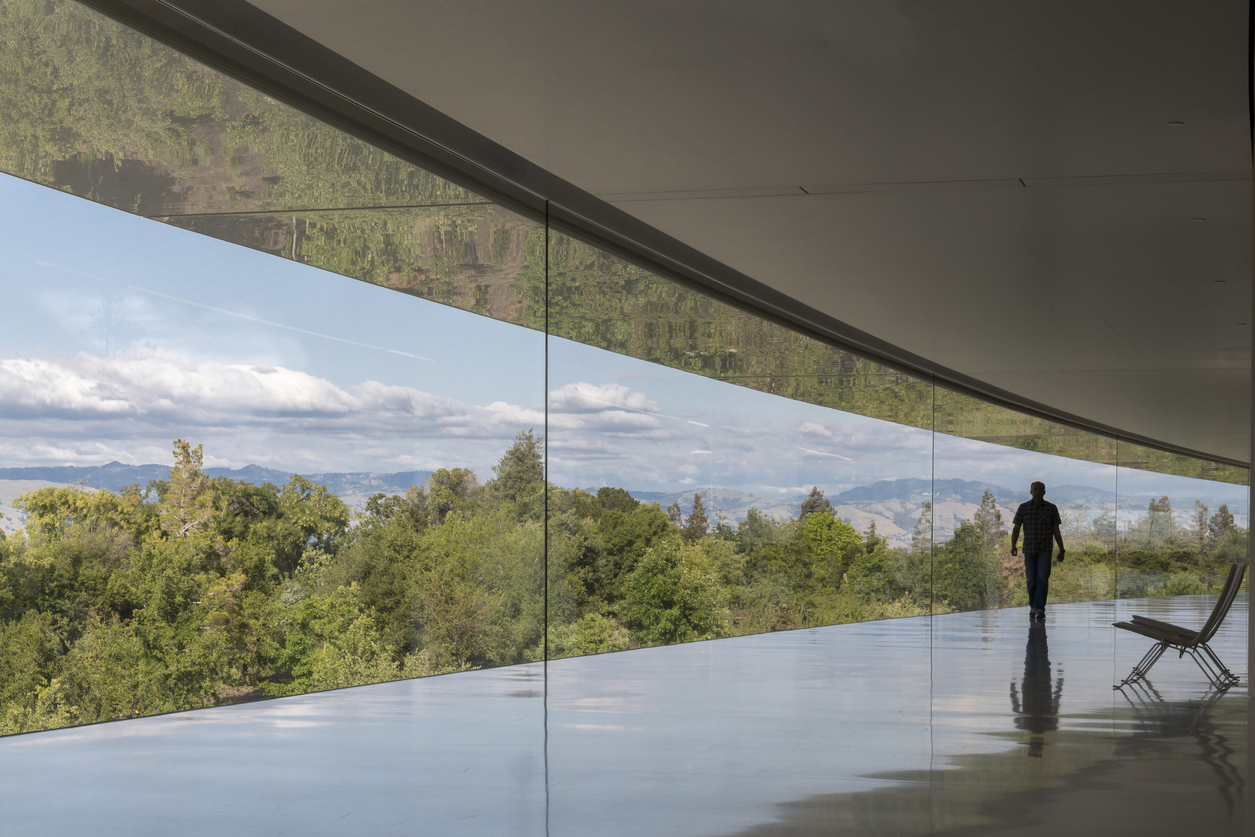
Nakahouse by XTEN Architecture, Hollywood Hills, CA, United States. Image by Steve King
Separating Spaces
XTEN Architecture used simple black borders in Nakahouse to distinguish the kitchen area from the external plinth without breaking the line of vision. Even a simple line or two can be very effective in breaking up large spaces or creating nooks without using walls.
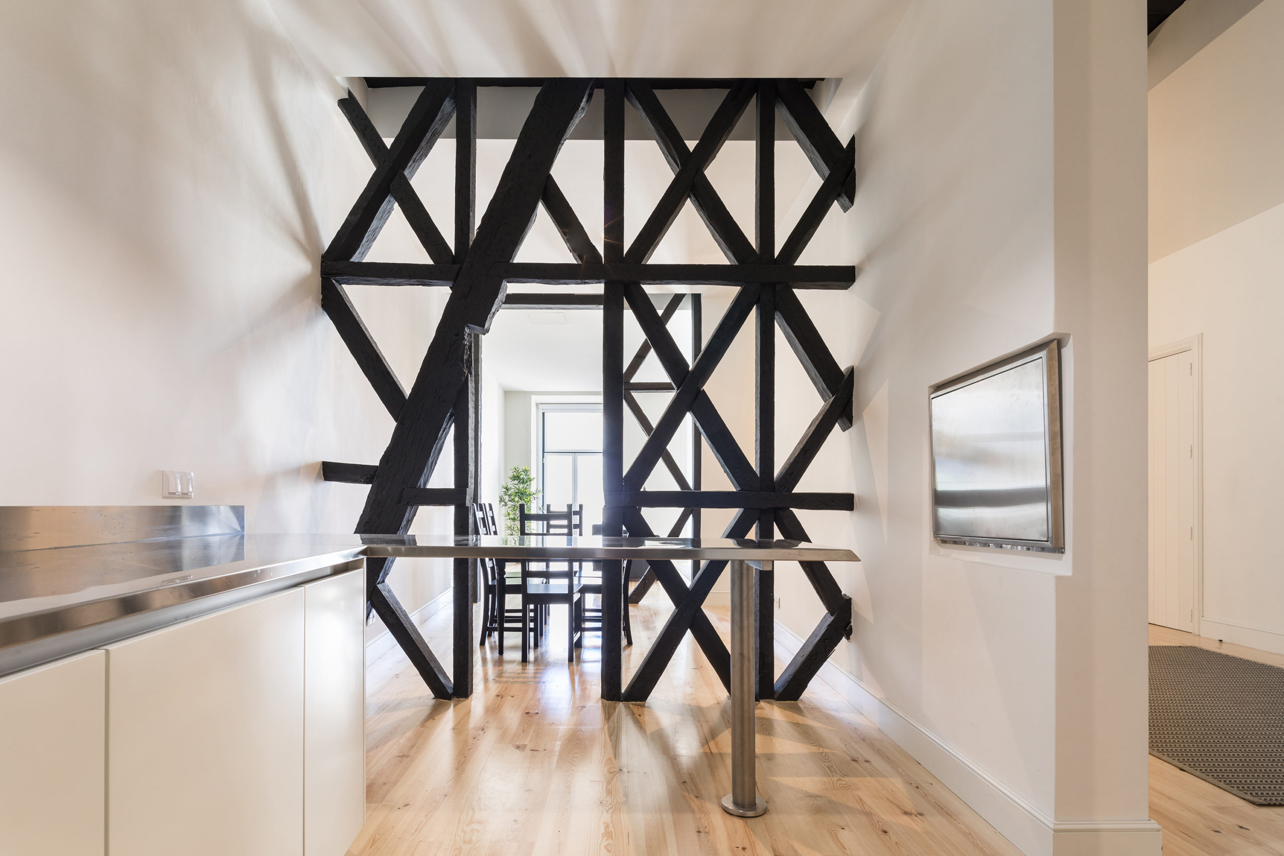
Apartment in Cais do Sodré by António Costa Lima Arquitectos, Lisbon, Portugal. Image by Francisco Nogueira
Open Partitions
Using geometric patterns or simple black outlines to make screens can divide rooms while allowing light to pass through. In Apartment in Cais do Sodré, António Costa Lima Arquitectos uses a black lattice to create privacy in a small and narrow space without compromising on ventilation and natural light.
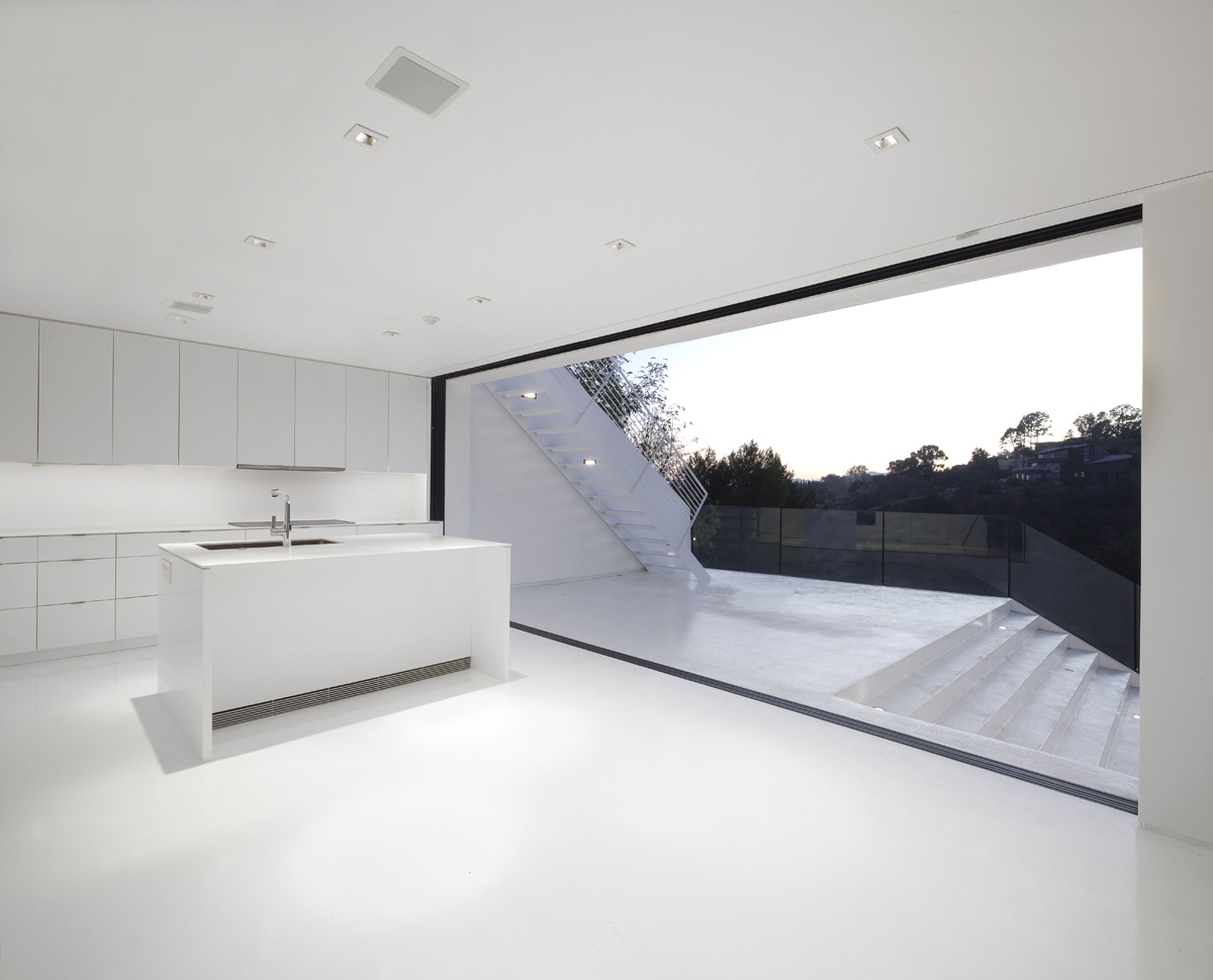
White Is the New Black (Geneva Flat) by FREAKS freearchitects, Geneva, Switzerland. Image by David Foessel
Bare Minimum
When all else fails, going back to the basics is an easy bet. A darker floor is a great way to add contrast in an all-white apartment, as showcased in White Is the New Black (Geneva Flat) by FREAKS freearchitects. The white helps widen cramped spaces while the inky floors anchor all the elements of the house.
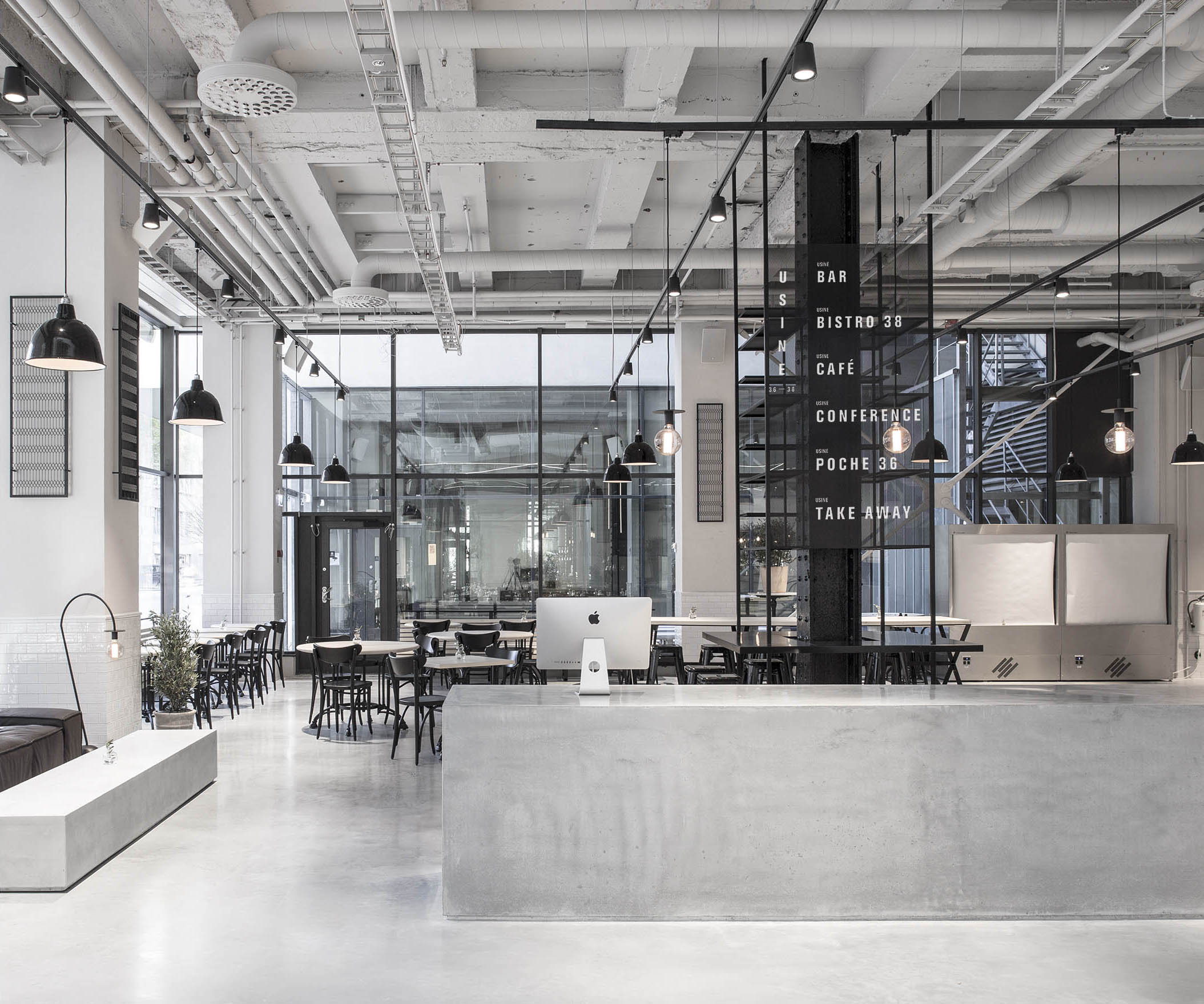
USINE by Studio Richard Lindvall, Stockholm, Sweden
Industrial Appeal
To turn a sausage factory into a recreational space, Studio Richard Lindvall used a wash of white on the existing ceiling pipes and fixtures and introduced black lighting fixtures and furniture in the same design language. Despite the use of heavy materials, USINE still looks airy due to the slender profiles of the furniture used.
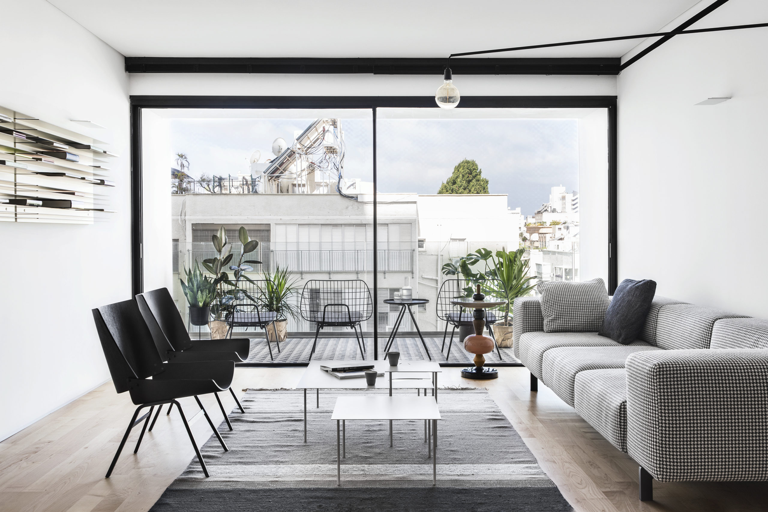
RED by YAEL PERRY | INTERIOR DESIGNER, Tel Aviv-Yafo. Images by Itay Benit
The Right Balance
While conceptualizing RED, YAEL PERRY | INTERIOR DESIGNER did not shy away from painting entire rooms with a deep charcoal hue. The designer has created a balanced symphony throughout the home by using darker tones for more intimate corners and lighter walls for the common areas. Black fixtures are used in the lighter spaces to tie the design together.
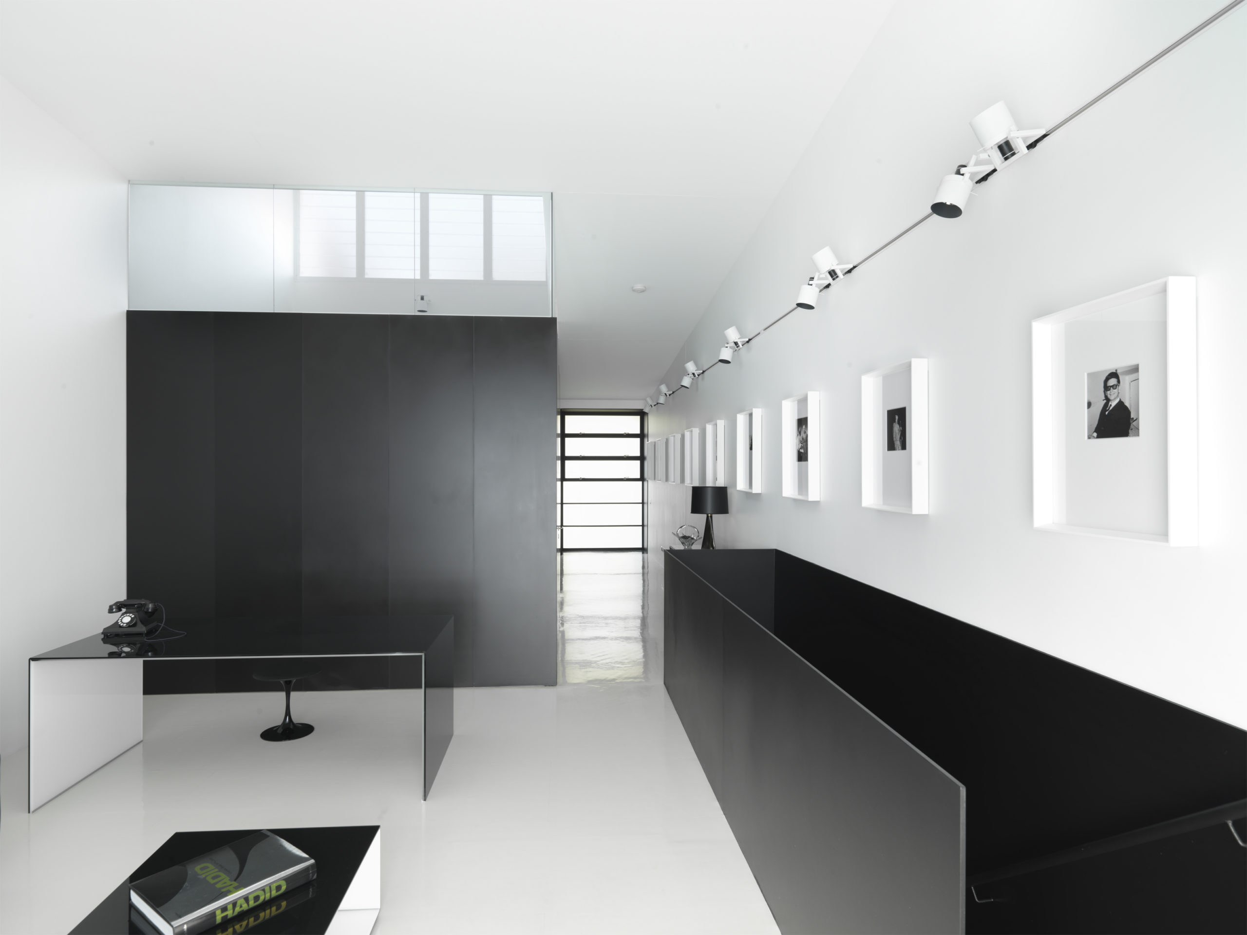
Strelein Warehouse by Ian Moore Architects, Surry Hills, Australia
A Touch of Art
Plain alabaster walls can sometimes look slightly boring. Adding art in a monochrome palette can help liven these surfaces without crowding the room. In Strelein Warehouse, the firm Ian Moore Architects lined up small black and white photos in oversized white frames to add character and texture.
Architects: Want to have your project featured? Showcase your work by uploading projects to Architizer and sign up for our inspirational newsletters.
 Angelot Patisserie
  Apartment in Cais do Sodré
  Apartment Montmorency
  Nakahouse
  Orca
Orca  Strelein Warehouse
  USINE
USINE  White Is the New Black (Geneva Flat)