Architects: Want to have your project featured? Showcase your work by uploading projects to Architizer and sign up for our inspirational newsletters.
Black is a color with a very special presence in architecture. Besides defining the stereotypical manner of dress for architects (to the extent that someone has gone so far as to write a book in an attempt to figure out why), it can have a powerful effect when used in actual architecture.
The strength this effect has on building occupants cannot be understated. Relatively rare in large expanses as part of a building’s design, black is notable for its associations with power, prestige and authority. With attendant notions of formality and respect, the subtle insinuations of black are impossible to miss when it defines a project. The examples below typify exactly this, each of them featuring black to an overpowering degree.
Whether the employment of its subliminal properties are intentional or not, extensive use of black in architecture can incite an instinctual sort of reverence from almost anyone who encounters it, and as such should be employed conscientiously. Take note.

© ValdesHagemann Architects

© ValdesHagemann Architects
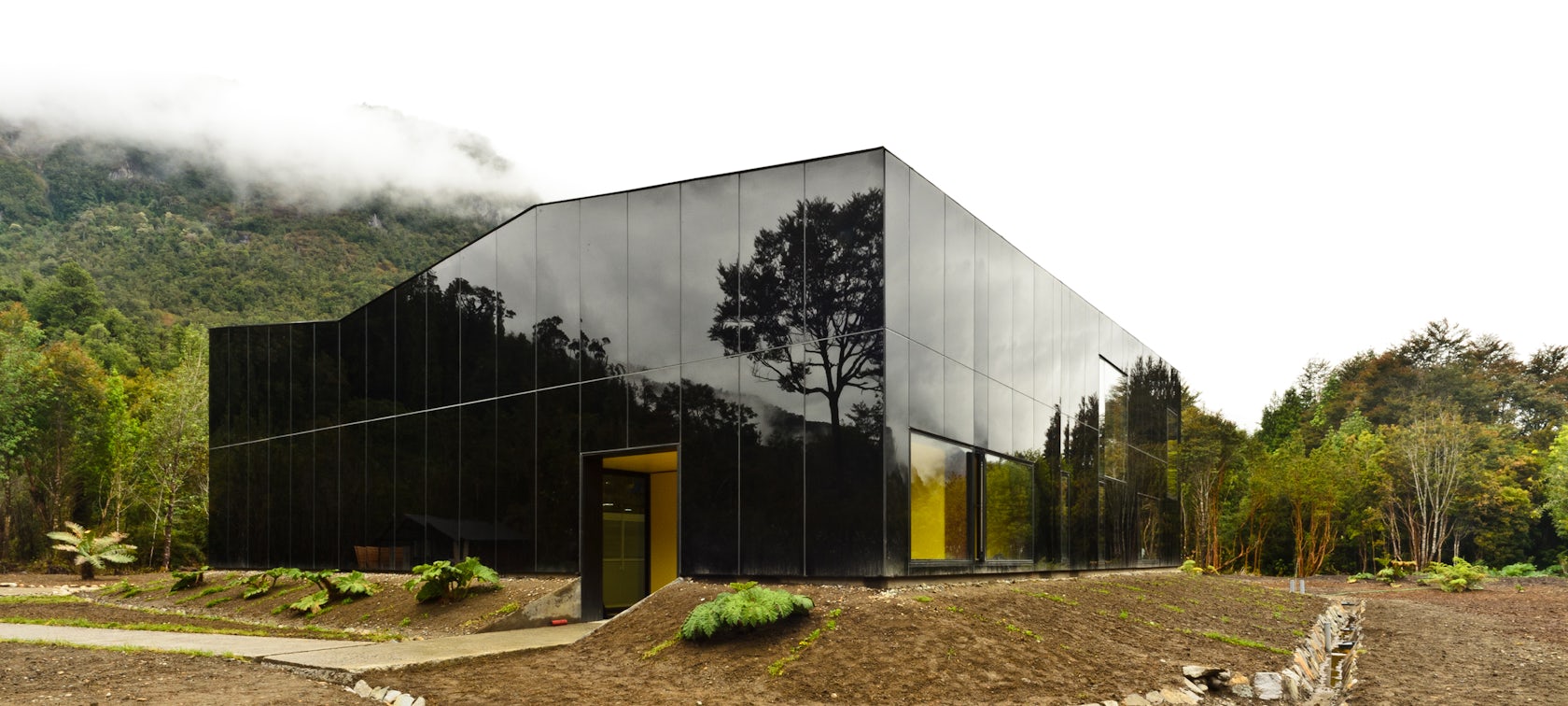
Water Bottling Plant by Panorama Arquitectos, Coihaique, Chile
A black glass coating was picked to reflect this facility’s heavily wooded surroundings while also giving the building an ornamental presence in the wilderness. Its function as ornament is best supported by the sleek color choice, as it speaks to the prestige of this company in being allowed to bottle the water from a picturesque, glacier-formed cascade adjacent to the plant.

© DILEKCI Architects (DDA)

© DILEKCI Architects (DDA)
Prestige Mall by DILEKCI Architects (DDA), Istanbul, Turkey
The subconscious connotations of black were not lost on the designers of this shopping center. Conveying an aura of chic cool, the complex offers an appropriately elegant setting for shops wishing to appear high-end. Such an accomplishment with an otherwise simple construction of glass wall and monolithic concrete speaks to the power of a single color to cast a theme over almost any design.

© SALTO

© SALTO
No99 Straw Theater by SALTO, Tallinn, Estonia
The entirety of this theater was constructed with spray-painted black hay bales and wooden trusses. As a temporary installation, the construction serves its purpose with ease of disassembly, but the color choice denotes an austere formality associated with theater productions. A winding black “tail” of an entrance procession further elicits a sense of reverence from patrons.

© METAFORM architects

© METAFORM architects
Luxembourg Apartment by Metaform atelier d’architecture, Luxembourg City, Luxembourg
Black shiny metal was employed as a façade material to give this home a monolithic appearance and to differentiate it from neighboring buildings. The home’s bold exterior color asserts a type of artistic dominance over its surroundings, serving as both a distinguishing element and as a blank surface for a commissioned artist’s work. The black surface, impossible to ignore, imbues the artist’s work with a sense of sophistication, commanding attention from anyone passing by.

© WISE Architecture

© WISE Architecture
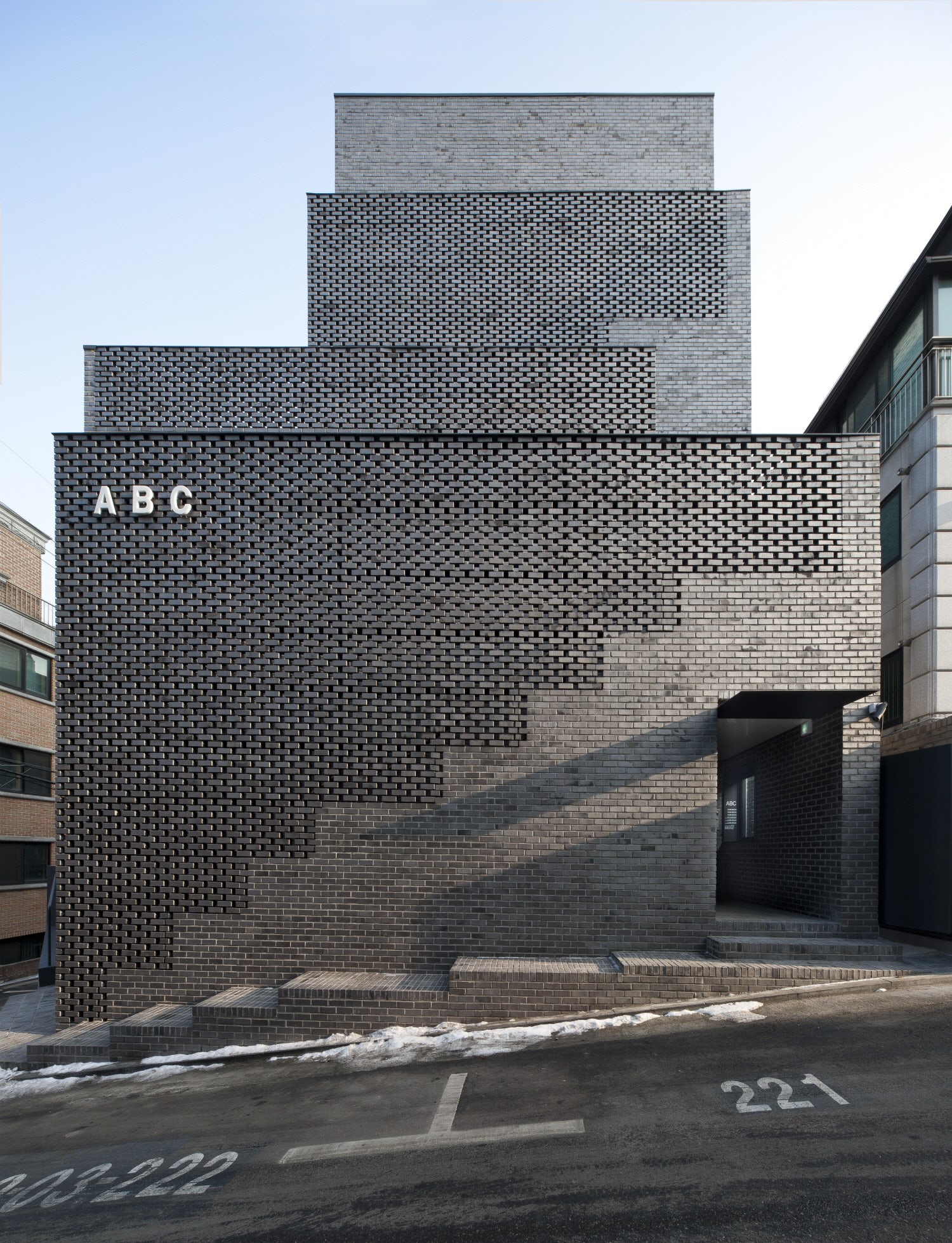
ABC Building by WISE Architecture, Seoul, South Korea
At its most formal, black is utilized for its authority to command respect for the dead. Such is the case in this small office building, which appears to stand guard near a royal tomb. In addition to its color, the building steps aside as it rises, allowing for a view of the park surrounding the tomb from a landscaped roof deck.

© Mario Mazzer Architects

© Gardin&Mazzoli
Private Clinic by Mario Mazzer Architects, Conegliano, Italy
The exclusive prestige of a private medical clinic is subtly communicated by this monolithic black cube. With a sculptural façade defined by elements such as an exterior stair and colored window openings, its dark color is an eye-catching backdrop for expressive architectural elements. Not to be overpowered by this choice of hue, the front of the building is opened by a transparent glass wall, appearing to be set in a jet black frame.

© Menkès Shooner Dagenais LeTourneux Architectes

© Menkès Shooner Dagenais LeTourneux Architectes
Centre de Collaboration MiQro Innovation by Menkès Shooner Dagenais Letourneux Architectes, Bromont, Canada
Black is established as the primary color throughout this technology park. Claimed to be designed “with people in mind,” the pervasive use of this color speaks to the regard with which employees of the park may hold the value of their work. Conversely, the choice of black could also underscore a sense of authority for the companies housed on campus.

© GSarchitects

© GSarchitects
MPO9 Headquarters by GSarchitects, Graz, Austria
Power and elegance were the driving factors behind the design of this company headquarters and hotel complex, which was positioned to appear like a panther getting ready to pounce. As the company housed here makes jewelry and eyewear, a sleek, high-end appearance was part of their mandate, brought to its fullest potential by a black-clad building. A cantilevered portion of the building adds a dynamic quality that the color choice supports.
Enjoy this article? Check out the others in our series on “The Psychology of Color”:
7 Uplifting Uses of Yellow in Architecture
8 Cool Blue Projects With Tranquil Undertones
8 Vigorous Applications of Orange
8 Clean and Clear Applications of White
Architects: Want to have your project featured? Showcase your work by uploading projects to Architizer and sign up for our inspirational newsletters.


