Architects: Want to have your project featured? Showcase your work by uploading projects to Architizer and sign up for our inspirational newsletters.
A window is a functional element, a place where architecture “stops” so that light can enter a building and people can see out of it. A window may also allow those outside of a building to gain a fuller understanding of the architecture within. The design of windows has changed drastically in the last hundred years, as new construction methods freed façades from the structural integrity of a building, and apertures could be placed anywhere or used to fill an entire wall. Yet even with the advent of curtain walls and glass skyscrapers, the roles of windows and apertures did not change. Windows were there to look through, not look at.
The projects on this list investigate new methods of designing negative space; instead of building apertures into a façade, the following architects designed façades around their apertures. These elements become essential to a project’s visual identity, and in some cases, to its program. Although all of the windows and openings have functional roles, they are also treated as design elements which can dictate a building’s relationship to history and can serve symbolic purposes. Although these projects represent diverse strategies for designing negative space, they all share common characteristics: they use apertures to negotiate unconventional relationships between indoor and outdoor space, eschewing order and symmetry in favor of rhythm and expression, and obscure any distinctions between aesthetic and functional design.

© SUPPOSE DESIGN OFFICE

© SUPPOSE DESIGN OFFICE

© SUPPOSE DESIGN OFFICE
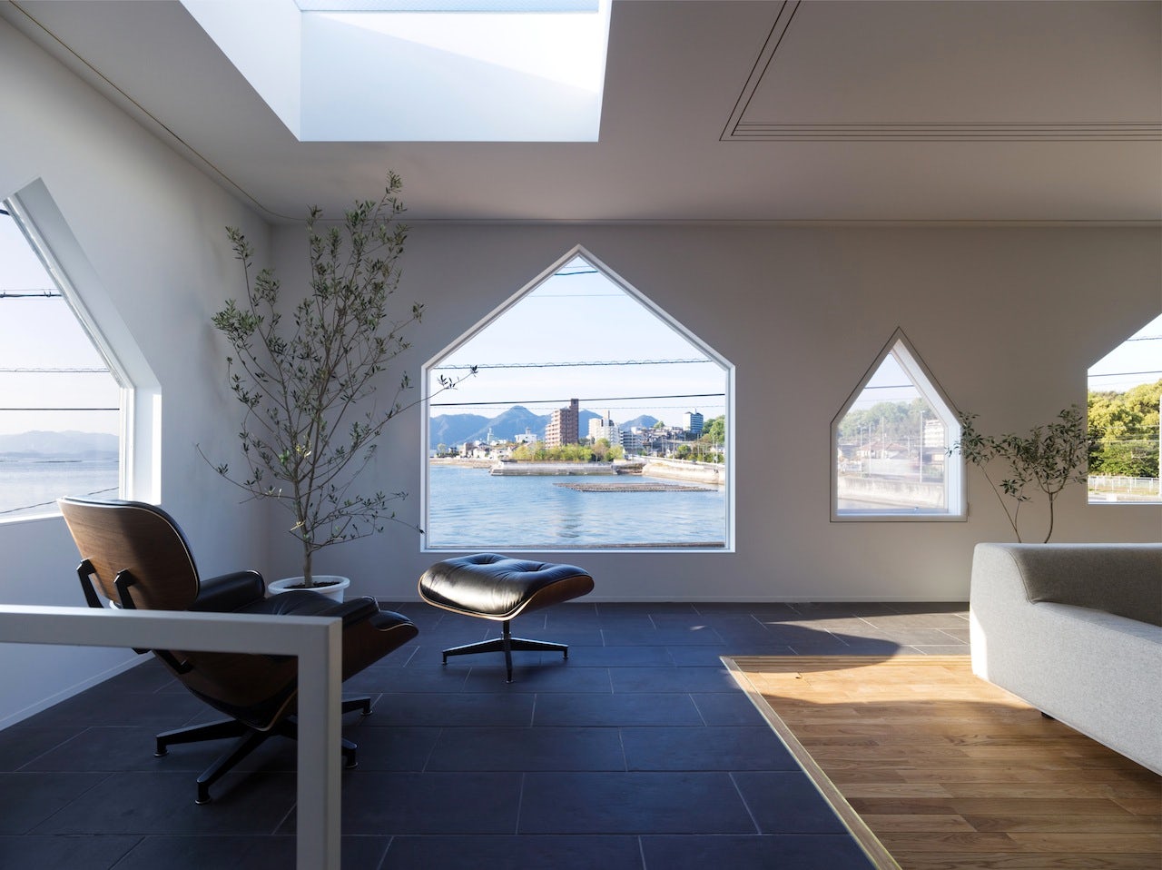
House in Jigozen by SUPPOSE DESIGN OFFICE, Hatsukaichi, Japan
While the House in Jigozen is shaped as a neat, rectangular prism — a quintessentially modern feature — the façade is pierced by many windows resembling the pentagonal outline of a traditional home. The juxtaposition is a playful inversion of the ubiquitous gabled house with rectangular windows, setting the tone for further subversive design. The house also blurs the boundary between inside and outside space, with a terrace that is hidden behind the façade yet simultaneously exposed by the oversized windows.

© LOCALARCHITECTURE

© LOCALARCHITECTURE

© LOCALARCHITECTURE
Cow Barn in Lignières by Localarchitecture, Neuchâtel, Switzerland
Barns typically have large doors for moving cattle and equipment in and out, but this barn in Lignières features four large openings on its front face, making the structure almost unrecognizable. Yet the project is an adaption of local agricultural architecture, updated with modern approaches to design and sustainable modes of production. The structure is intended to preserve and honor its Swiss heritage, while still keeping a mind on the future.

© Quang Tran

© Quang Tran

© Quang Tran
2H House by Truong An architecture, Ho Chi Minh City, Vietnam
During daytime, the small glass tiles on 2H House are tucked away in a recessed portion of the façade, and are overall less noticeable than the house’s unique geometry. Yet at night, lights from inside the house stream through these multi-colored tiles to create a spectral display which saturates the otherwise white exterior. The use of stained glass allows for many windows without sacrificing privacy.


Centre Village by 5468796 Architecture, Winnipeg, Canada
Centre Village is a complex of low-income housing organized around public courtyards and pedestrian streets. The buildings feature distinctive sets of windows, in many sizes and all highlighted by bright orange frames. The windows give the village a strong visual identity, while opening up each housing unit to the common spaces in order to increase community interactions and strengthen the villagers’ collective safety.


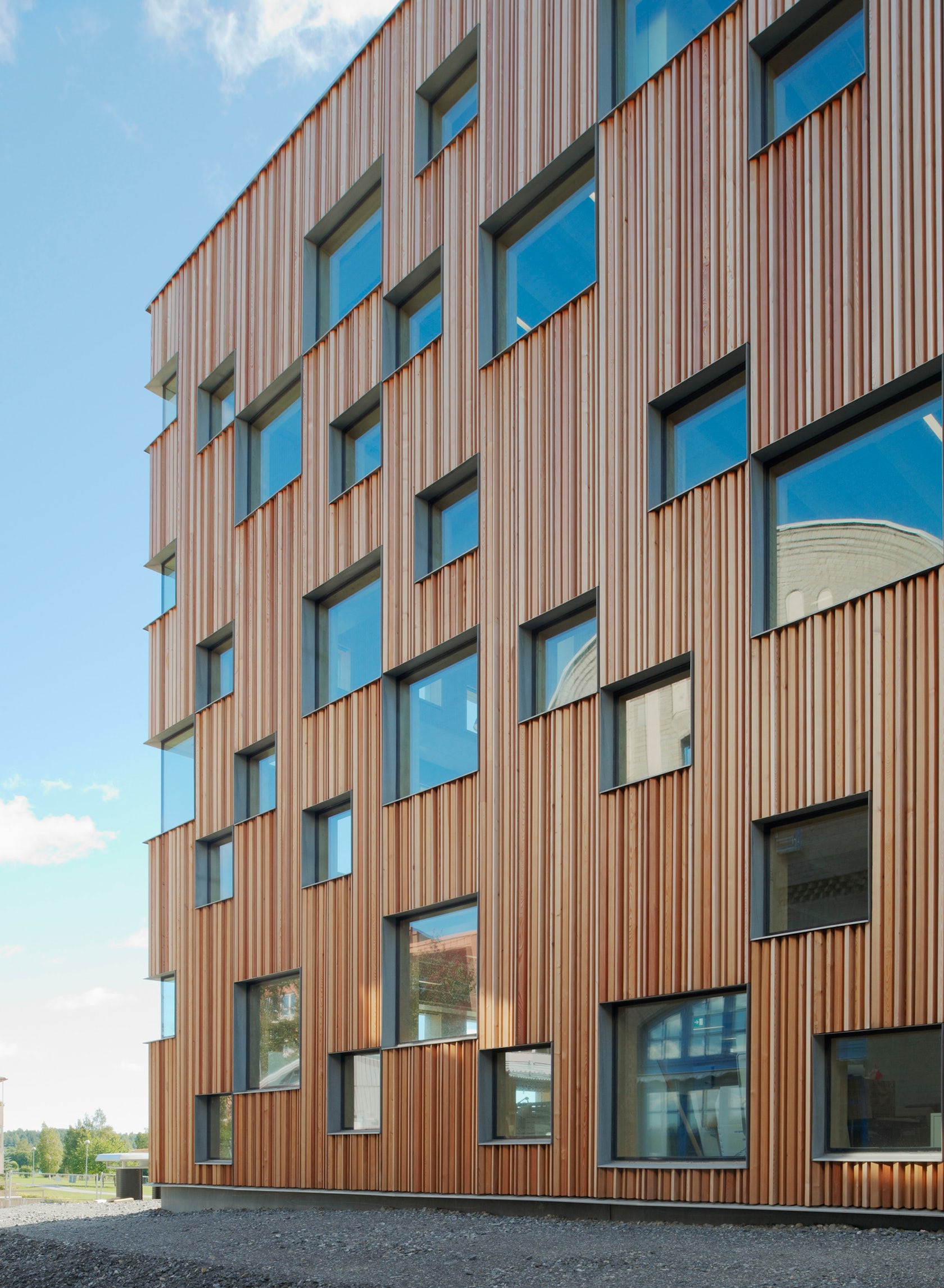
Umeå School of Architecture by Henning Larsen Architects, Umeå, Sweden
The checkered exterior of the Umeå School of Architecture offers as much visual interest from the outside as it does from within. A pattern of windows wraps around the building to create a dynamic façade that admits abundant natural light into the structure’s classrooms and drafting rooms. The design is also a compromise for sustainability: by embedding the windows into larch siding, rather than constructing the entire façade out of glass, the project can rely on natural insulation as well as natural light, vastly reducing the building’s energy consumption.

© Estudio A2arquitectos

© Estudio A2arquitectos

© Estudio A2arquitectos
Pool and spa area for an Hotel in Majorca by Estudio A2arquitectos, Balearic Islands, PM, Spain
The pool and spa halls were installed to update and recontextualize an established resort in Majorca. The design called for a narrow palette and simple forms, but uses fenestration to great effect. Windows pierce through every surface, covering walls and cutting through roofs. The design is most dramatic in the pool hall, where windows not only flood the room with light, but reflect and refract bright squares across the water’s surface.
Architects: Want to have your project featured? Showcase your work by uploading projects to Architizer and sign up for our inspirational newsletters.


