Architizer's 14th A+Awards judging is live! Subscribe to our Awards Newsletter for updates on Public Voting and the big winner reveal later this spring.
Branding is the multifaceted art of building a recognizable and distinct public identity. It’s an intricate web of threads that entwine to form a powerful perception of a company in the consumer’s mind. These threads range from fundamentals such as name, logo and mission statement, to more nuanced elements like tone of voice and visual design. The built environment can be an integral part of this strategy.
Creating a compelling spatial experience that reinforces the values and vision of a business is an incredibly effective marketing tool. In the right hands, form, scale, texture, light and acoustics are extraordinary storytelling devices — architecture offers a uniquely immersive way to bring a brand to life. From a bustling stock exchange, a dynamic head office and a flagship store to an electric car charging station and a scientific symposium, discover how these seven outstanding projects, celebrated at the 11th A+Awards, are fusing branding and the built environment.
Genesis Electric Vehicle Charging Stations
By Morphosis Architects, Seoul, South Korea
Jury Winner, 11th Annual A+Awards, Architecture +Branding
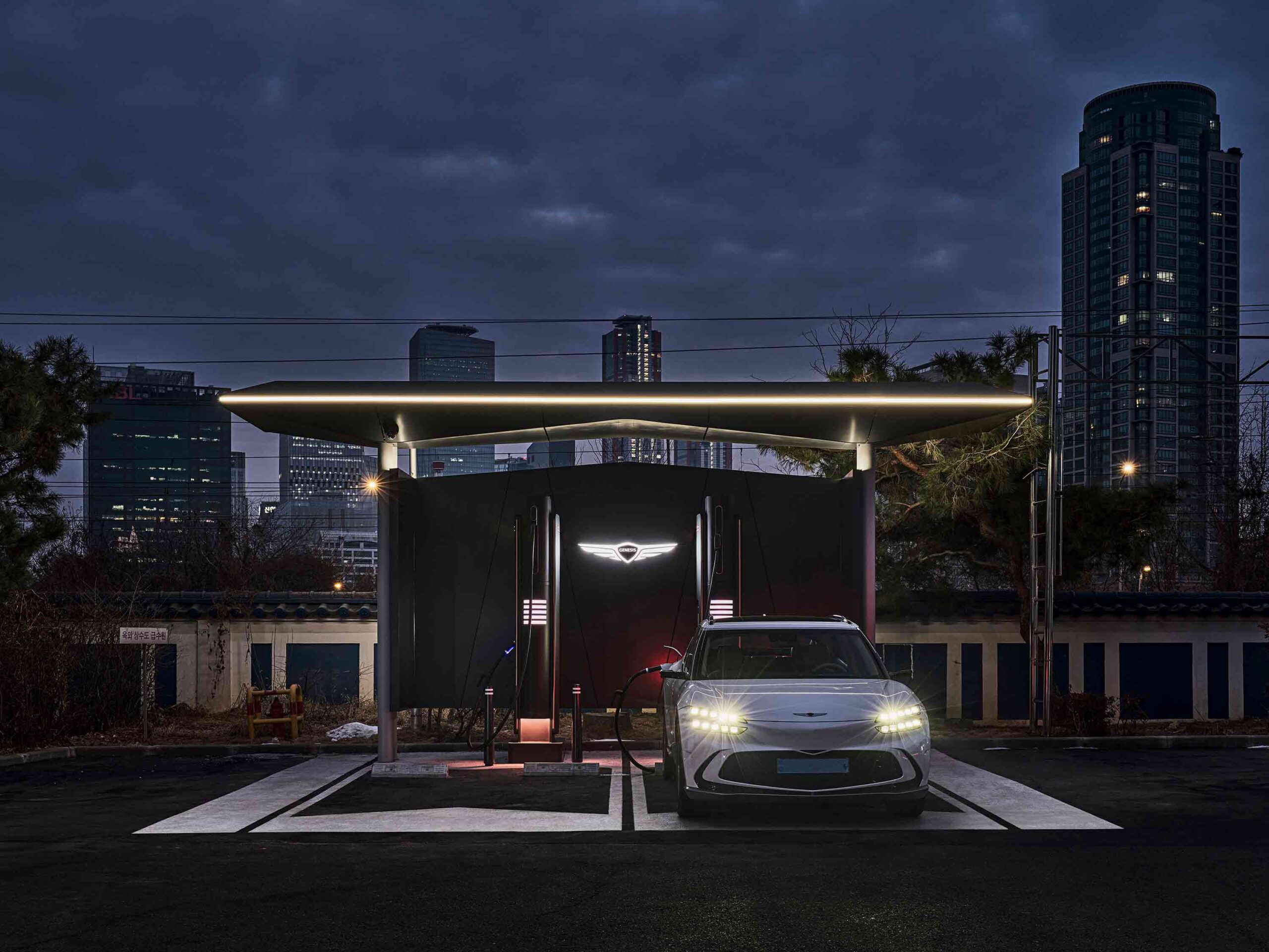
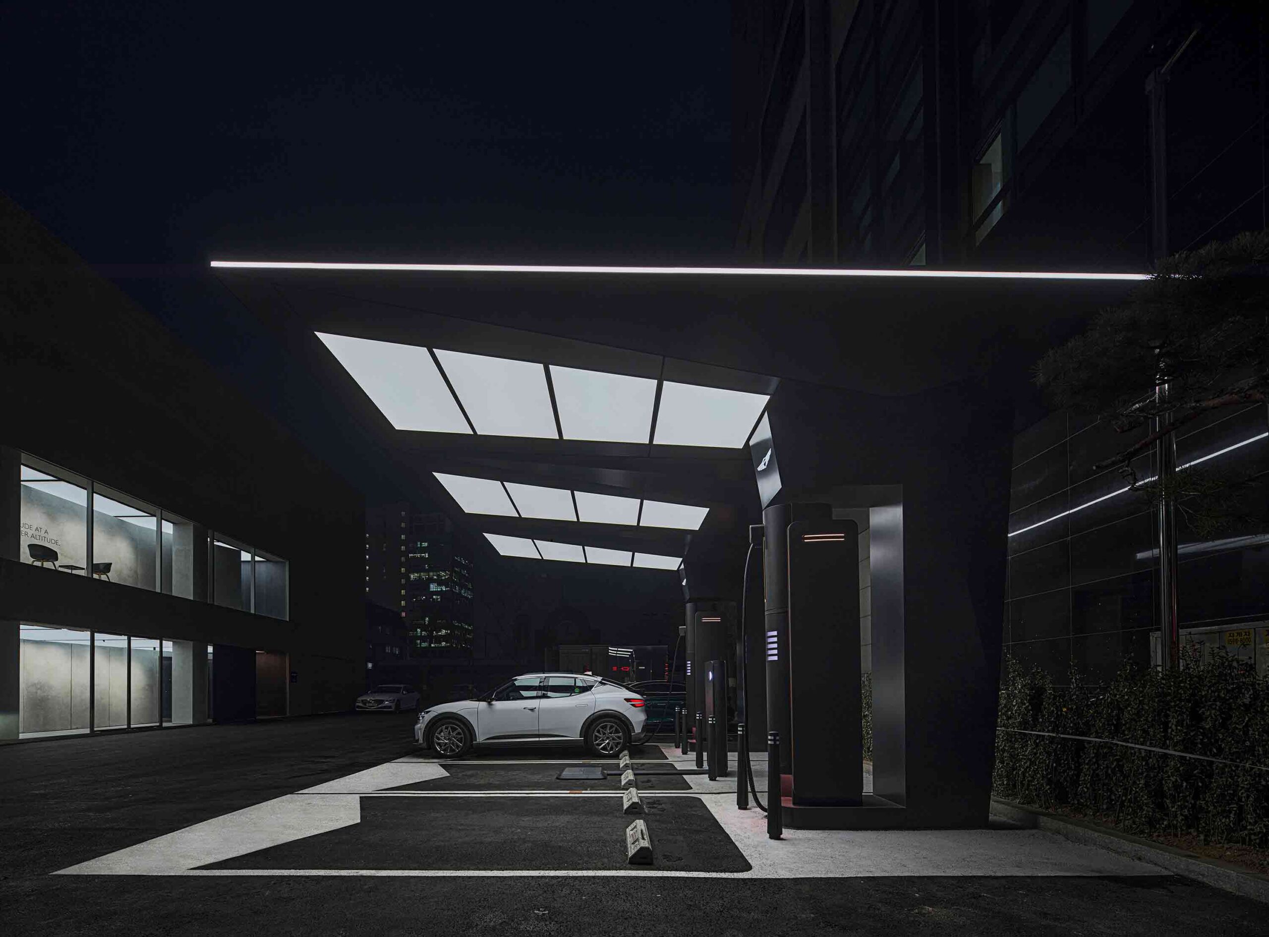 Embodying the values of luxury automotive brand Genesis, a series of sleek electric car charging stations have been designed for an array of global urban locations. Bold and streamlined, distinctive canopies shelter the bays, encircled by a continuous LED edge that functions as a beacon after nightfall. The structure’s unique, sculptural profile channels the familiar form of the company’s winged logo.
The innovative modular design can grow or shrink depending on the site restrictions, while each station’s functionality can be customized to its environment. Inserts on the underside of the canopy can be swapped out to offer lighting, heating elements, sun louvers and display screens. Yet uniform features create a defining identity across the iterations. Epoxy-coated floor motifs segment the bays and minimalistic black wall displays conceal the charging infrastructure and provide maximum visibility for branding.
Spotify At Mateo Campus Los Angeles
By RIOS, Los Angeles, California
Popular Winner, 11th Annual A+Awards, Architecture +Workspace
Finalist, 11th Annual A+Awards, Architecture +Branding
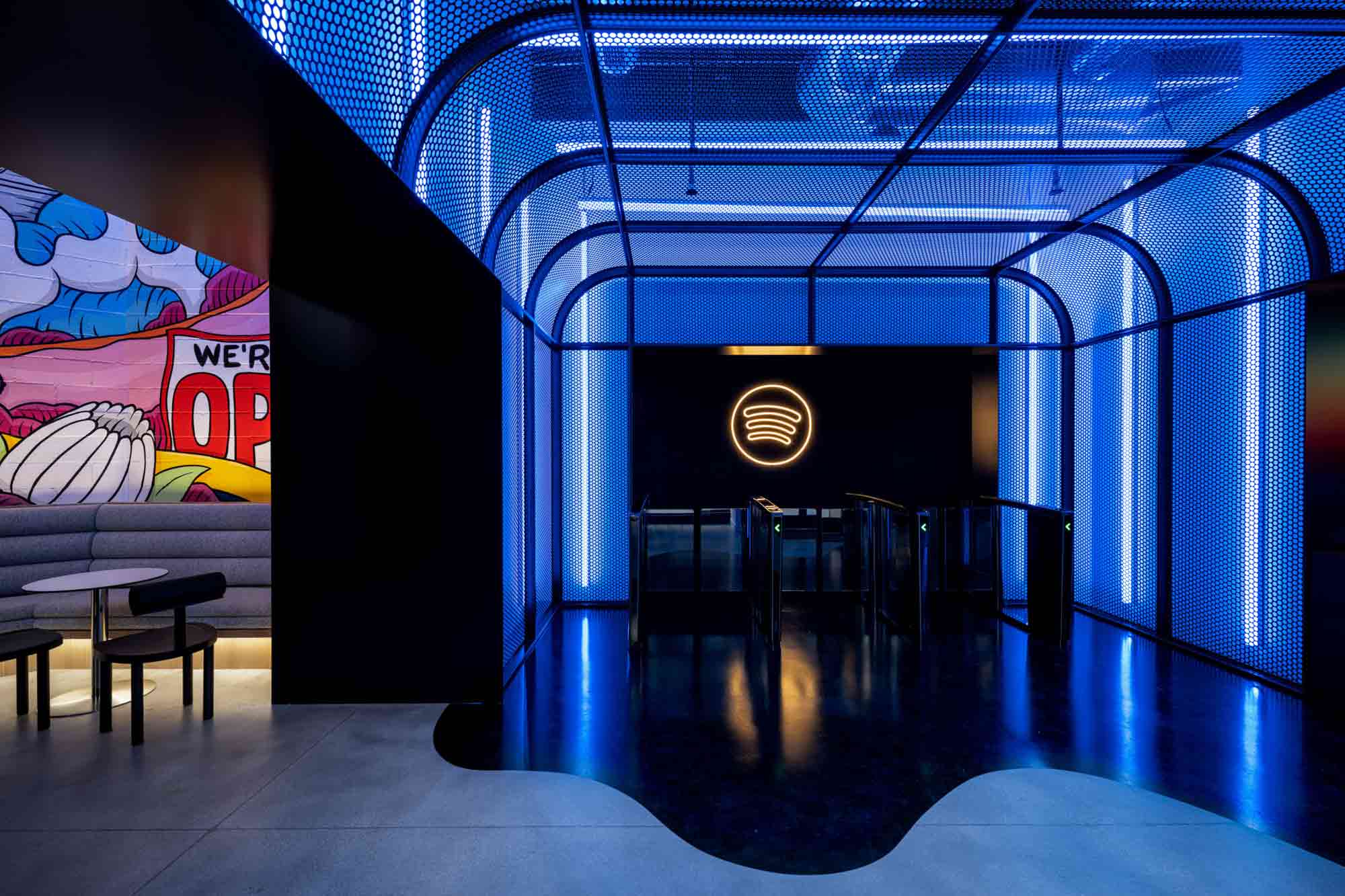
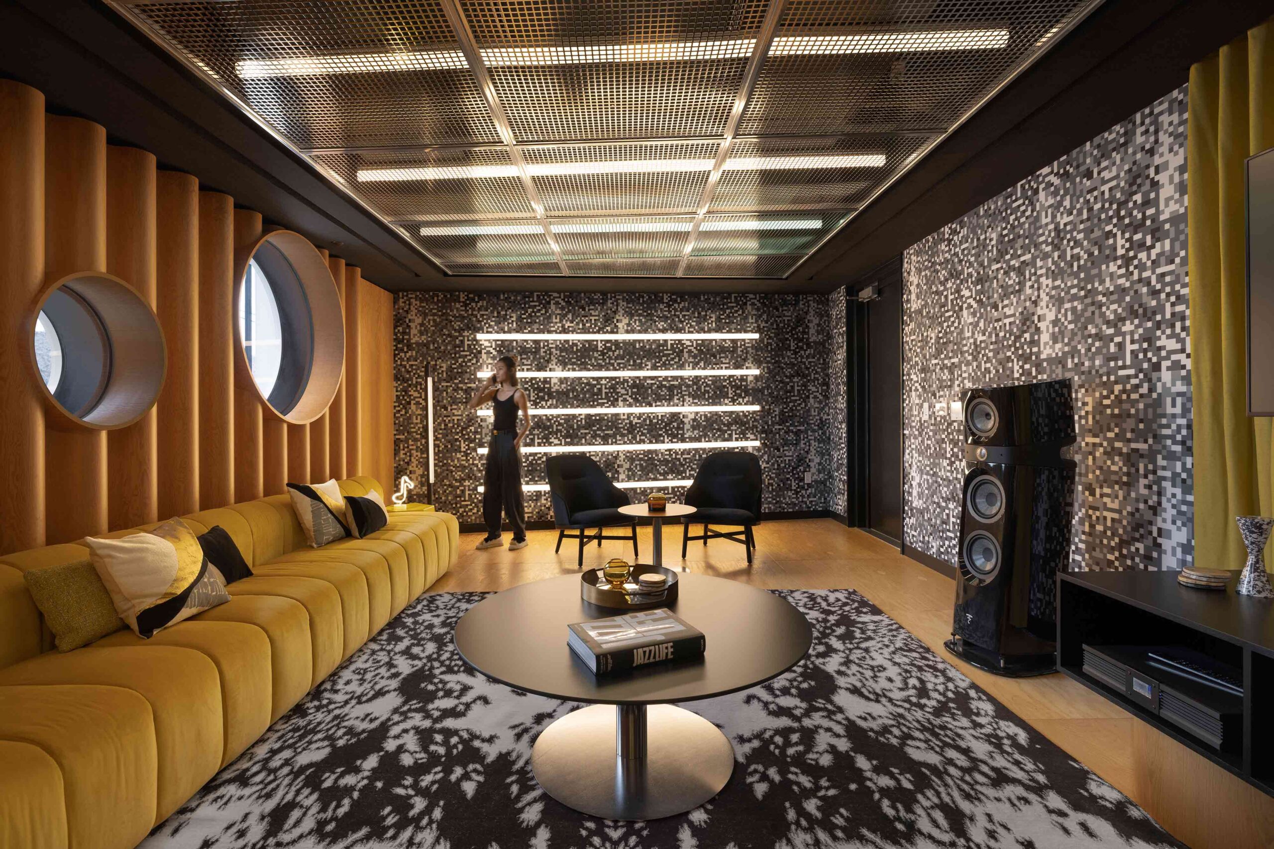 Envisaged as an extension of LA’s Arts District, the Spotify At Mateo Campus functions as both an office for the company’s employees and a meeting venue for visiting music labels and business partners. It was vital then that the complex’s architectural spirit typified Spotify’s iconic brand identity. Encapsulating recording studios, editing suites, informal work rooms and staff amenities across three buildings, the result is a vibrant, playful scheme imbued with a recognizable personality.
The entrance to the complex is dark and dramatic — sheets of punctured metal frame a tunnel-like vestibule, illuminated by neon strip lighting. The perforated surface is reminiscent of the mesh of a speaker grille, as though spatial users were delving inside the inner workings of music itself. Elsewhere, intimate listening and writing rooms offer creative nooks away from the hubbub. In one space, pixelated wall coverings visualize white noise, while undulating timber wall treatments refine the room’s acoustics.
Hong Kong Stock Exchange
By LAAB Architects, Hong Kong
Popular Winner, 11th Annual A+Awards, Architecture +Branding
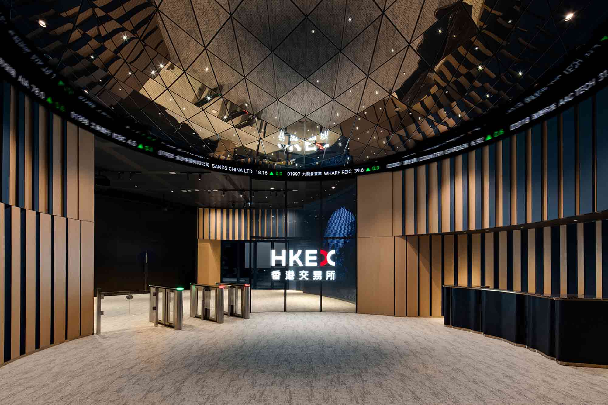
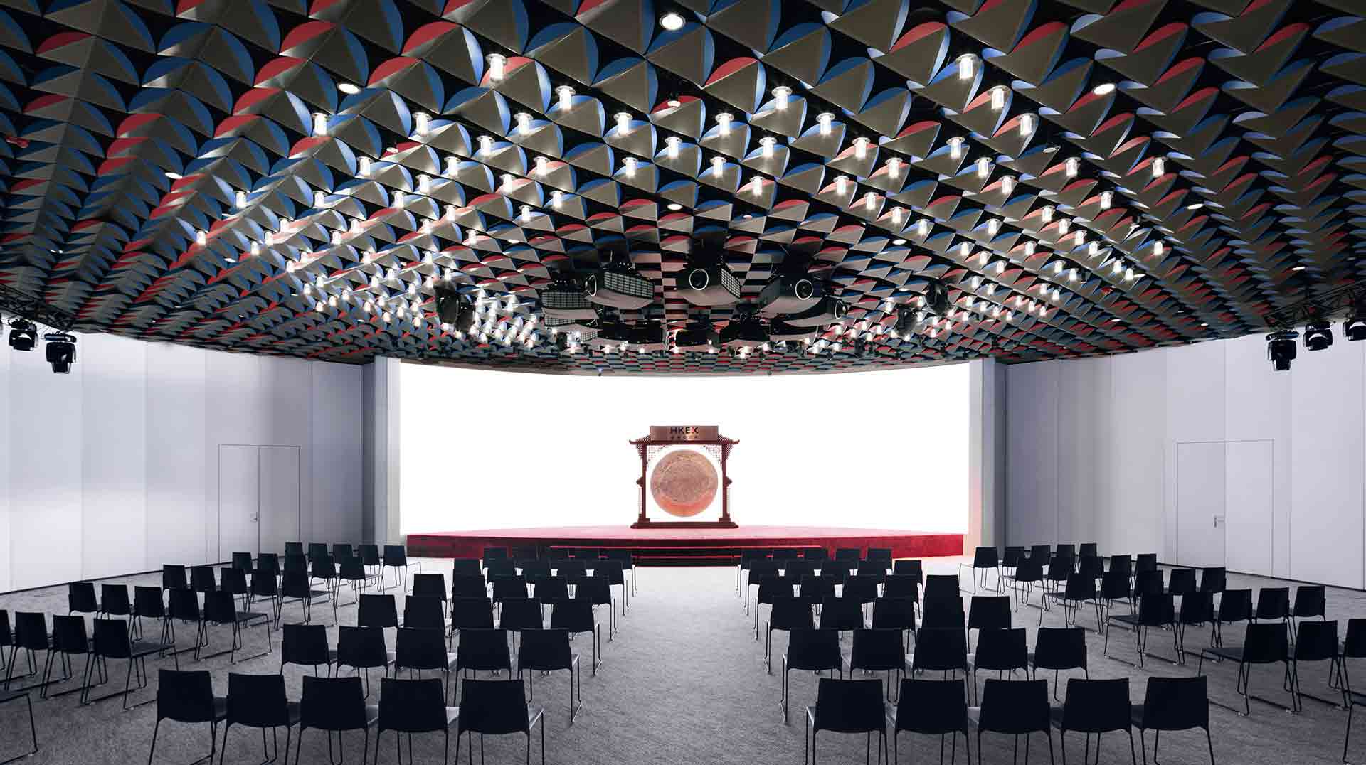 To mark the rebranding of the Hong Kong Stock Exchange, an extensive overhaul of the company’s Connect Hall was commissioned. However, as the space is a crucial backdrop for financial broadcasting, it had to remain operational during the renovation. Consequently, the considerate design emphasizes textural materials and modular solutions, rather than major structural interventions.
The entrance feels almost celestial, with its convex mirrored ceiling and constellation of spotlights. Graphic fabric wall treatments in the company’s signature navy hue evoke a sense of movement, reflecting the frenetic activity of the stock market. With trading transitioning to the digital realm, the hall has been repurposed as a media space. Segmented by curved walls, the redesign carves out a succession of event zones. Meanwhile, the auditorium dazzles with a flexible, origami-inspired ceiling system. Lighting fixtures illuminate burgundy and navy accents, in a tactile celebration of the brand’s reinvigorated identity.
CAMS 2022
By Baliza Norte, A Coruña, Spain
Finalist, 11th Annual A+Awards, Architecture +Branding
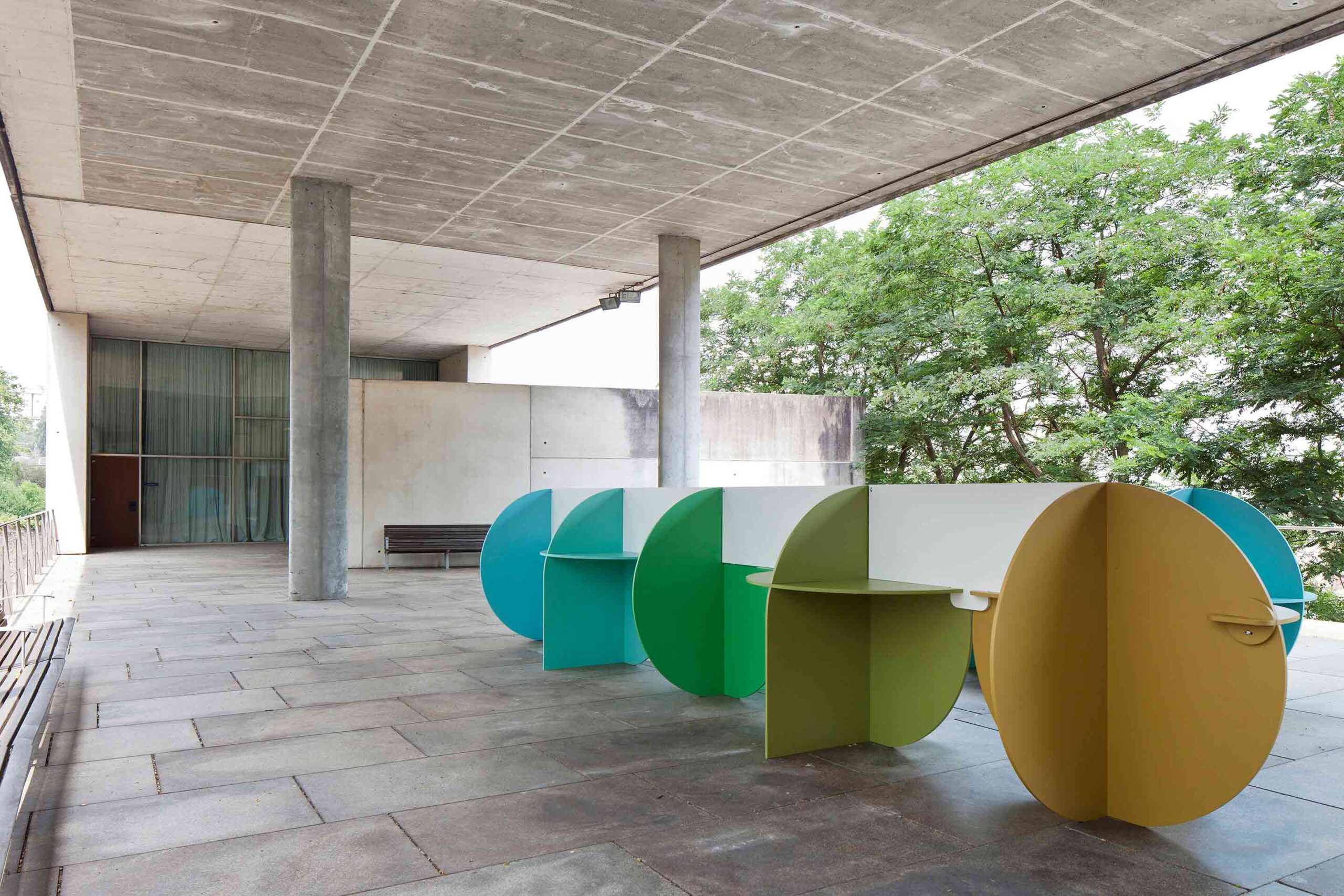
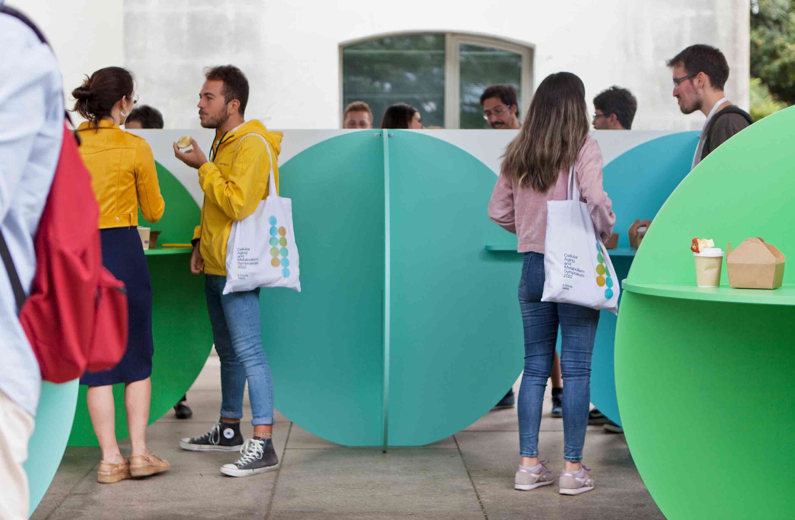 Graphic design and spatial design achieve perfect synergy in this multidimensional project. Tasked with overseeing the branding and physical furnishings of the CAMS 2022 symposium on cellar aging and metabolism, studio Baliza Norte devised a smart and cohesive response. The event’s logo, a vibrant arrangement of circles, takes its cue from a method of cell aging analysis — chemical agents are added to cell culture dishes and color changes are monitored.
The conference furniture is an ingenious 3D articulation of the visual branding. Cut with a CNC machine, a series of colored MDF boards slot together to form dynamic structures with a myriad of uses. The surfaces act as display units for exhibition posters, makeshift bars and catering tables, plus the vertical dividers organize attendees into smaller discussion groups. This creative framework is at once part social hub, part signpost.
HOLILAND TRAVEL: Future Narrativism in the Multiverse
By SLT Design, Shanghai, China
Finalist, 11th Annual A+Awards, Architecture +Branding
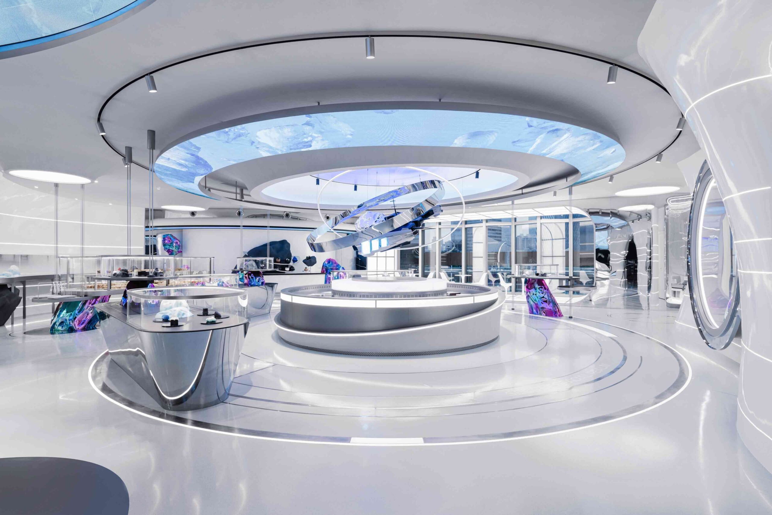
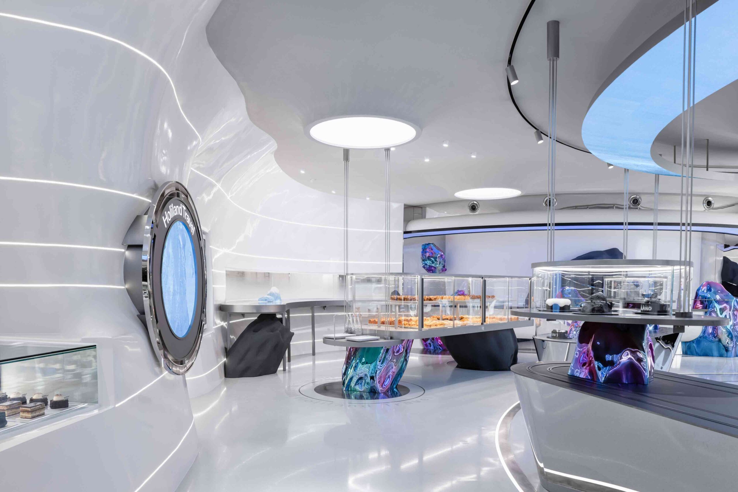 This fantastical retail concept elevates the typology of the humble bakery to intergalactic heights. Holiland Travel epitomizes a new era of baking, one that revels in new frontiers and transports customers beyond the mundanity of the everyday. Its flagship store in Shanghai is a masterful exercise in immersive, transformative branding.
An ambitious architectural task, the facets of the universe are shrunk down to human scale in this curvilinear scheme. The concept is anchored by a central crater, around which meteorites bearing sweet treats orbit, alongside a ‘hyperspace’ conveyor belt of confections. A porthole window offers glimmers of distant solar systems, while ribbons of linear light envelop the space, as though the very fabric of space-time were disintegrating. A glass wall overlays the futuristic landscape with the present, as the city plays out in real-time outside. Here is a store that confounds the senses and transcends the expected.
VICUTU Concept Flagship Store
By AntiStatics Architecture, Beijing, China
Special Mention, 11th Annual A+Awards, Architecture +Branding
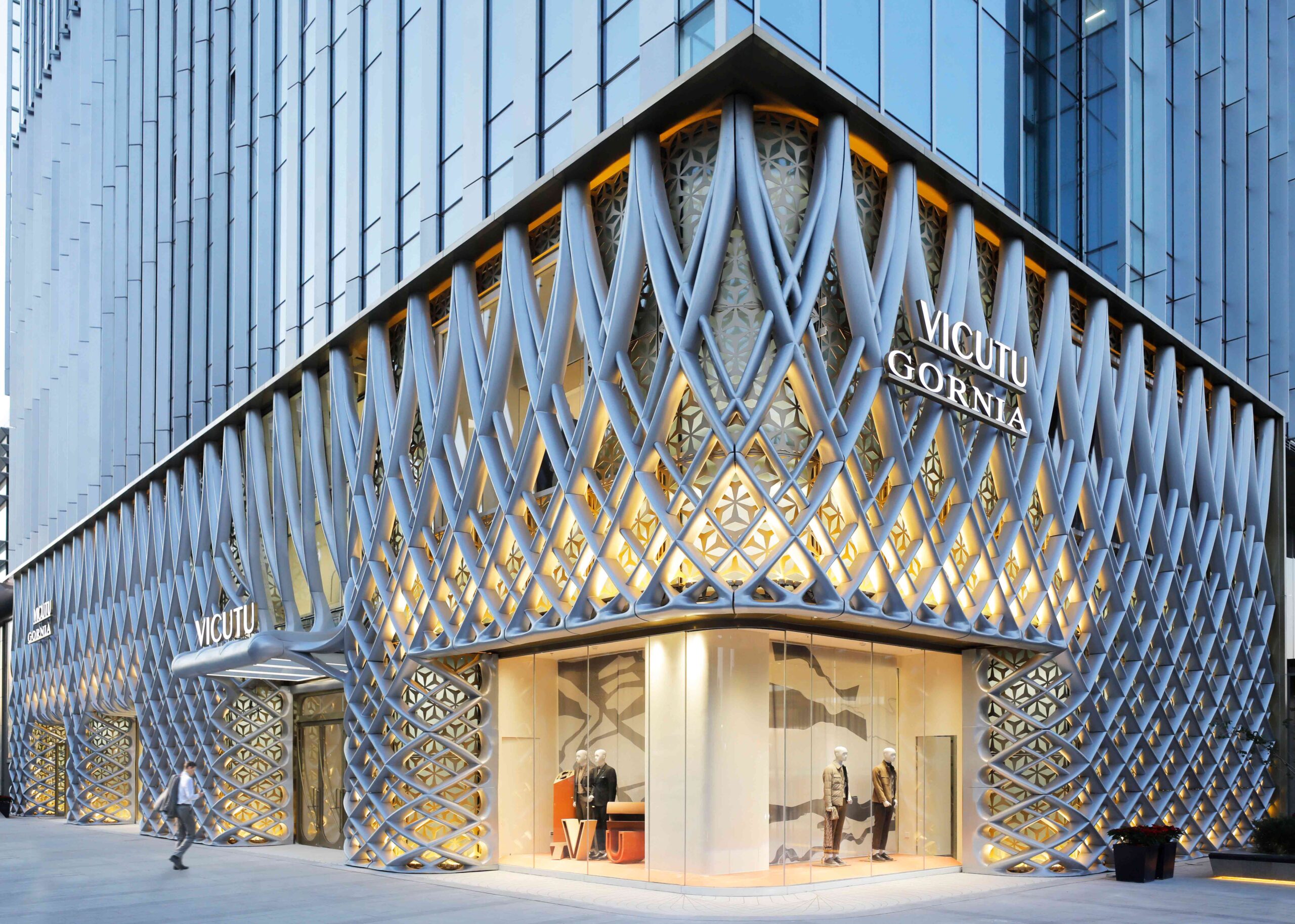
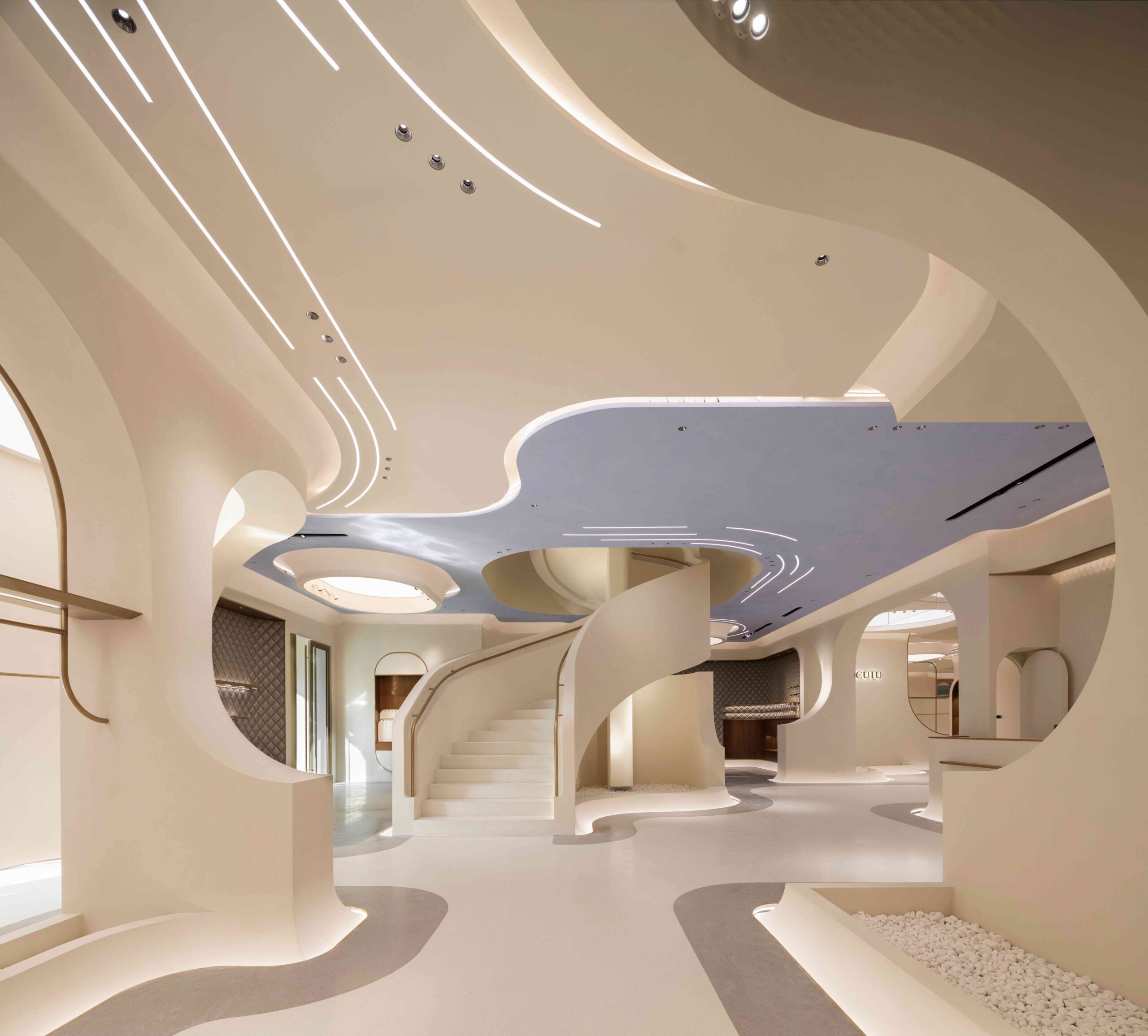 This remarkable concept store in Beijing for clothing brand VICUTU exemplifies a juncture between fashion and architecture. The brand’s principles of reinvention and exploration are made palpable in this astonishing design. A woven aluminum skin, like the magnified threads of a piece of fabric, cloaks the building’s façade.
This exterior diagrid is a motif that’s interwoven throughout the interior. It reappears as a subtle relief across pedestals, in graphic detailing across the flooring and in the quilted geometry of wall paneling. The store’s inner world is strikingly fluid, defined by soft, flowing lines — as though its architectural features were draped across the space like a mannequin. Inset above, iterative lighting fixtures outline the contours of the ceiling, in the same way dressmaker’s chalk marks out garment patterns. Here, the building embodies the garment.
BMCAR . Avenida dos Aliados . Porto. Portugal
By ATELIER CENTRAL Arquitectos, Porto, Portugal
Special Mention, 11th Annual A+Awards, Architecture +Branding
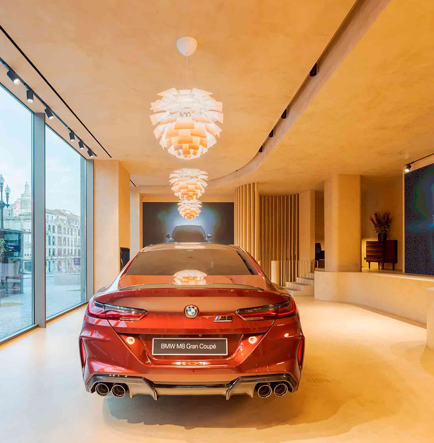
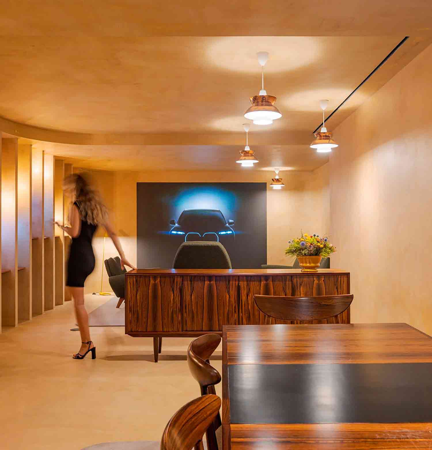 A far cry from the anonymous car dealership with row upon row of vehicles, the newly imagined BMW showroom in Porto signifies a shift in branding for the company. Subverting traditional typology, the furniture of the sales office is traded for the familiar fixtures of the home. Rather than focusing on exhibition, moments of social connection are placed on a pedestal.
The striking showroom is shaped by domestic tableaus. Copper pendant lights cast a warming glow across the display car. An intimate seating area anchored by a rug sits adjacent, while a living room complete with a kitchenette, dining set and snug armchairs offers a welcoming space for buyers to relax. The BMW universe is made personal, condensed into the affable garb of an old friend’s house.
Architizer's 14th A+Awards judging is live! Subscribe to our Awards Newsletter for updates on Public Voting and the big winner reveal later this spring.
