Architizer is delighted to reveal the Winners and Commended Entries for the 2022 One Rendering Challenge, architecture’s biggest rendering competition! After a meticulous review by our incredible panel of visualization experts, 2 Top Winners came out on top, each winning themselves $2,500 and professional rendering software packages from Chaos Group.
The Top Non-Student Prize went to Swiss designer and illustrator Arnaud Imobersteg, for his visualization “Shanty Stack“. Imobersteg’s atmospheric image — coupled with an evocative written story — proved highly compelling to jurors. “I highly admire the creative spirit and imagination that ‘Shanty Shack’ brings,” said Mengyi Fan, Director of Visualization at SHoP Architects.
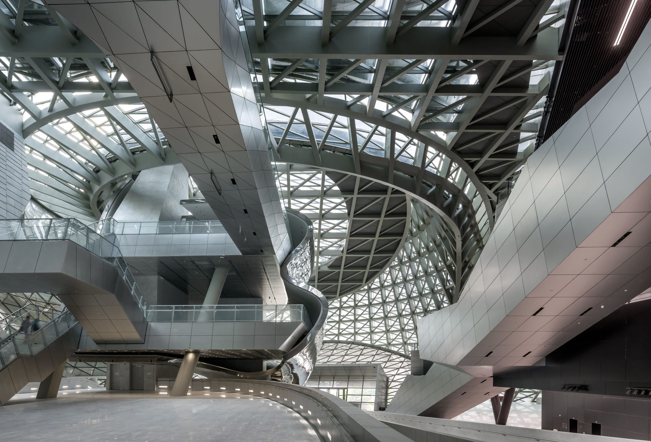
Meanwhile, the Top Student Prize went to Christian Coackley, student at the University College of London (UCL), for “22 Gordon Street” — a mysterious and detailed reimagining of UCL’s famous Bartlett School of Architecture building. “’22 Gordon Street’ illustrates how architectural rendering can be used to tell an epic tale about the malleable and perpetually evolving nature of our built environment”, commented Architizer’s Editor in Chief, Paul Keskeys.
Now in its third year, the One Rendering Challenge entrants continue to raise the bar for story telling through architectural visualization. “I want to commend not only the continuing improvements in image quality, but also the quality of the architectural design in some of the more imaginative works,” commented Fan. “In general, the work has been as diverse and as high-quality as ever.”
Without further ado, explore the Winners and Commended Entries for this year’s competition below, and let us know your favorites on social media using the hashtag #OneRenderingChallenge!
Non-Student Winner: “Shanty Stack” by Arnaud Imobersteg
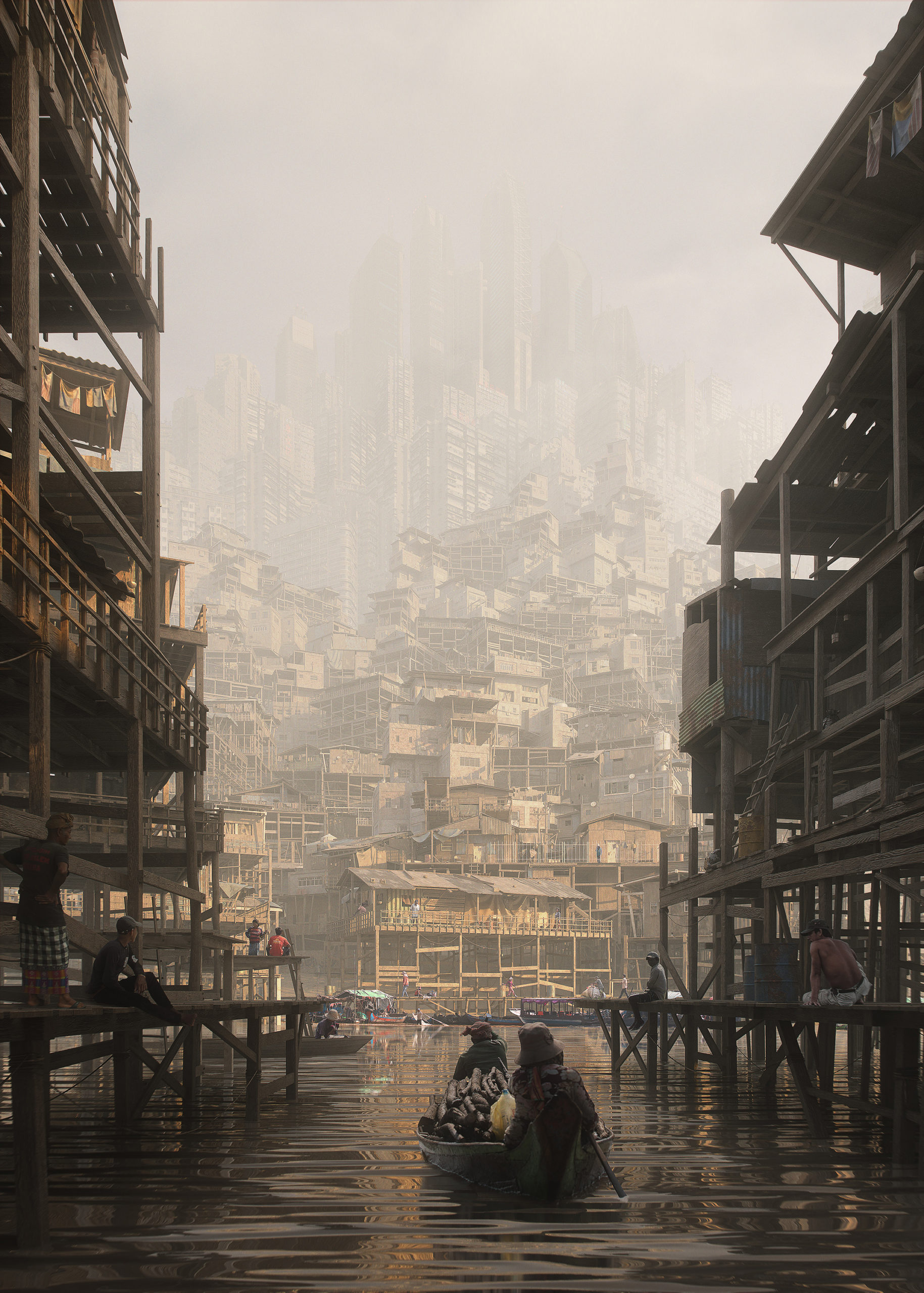 “The sun is warming the air as the market is closing now. My shirt is already sticking to my skin. They advised to avoid going out, but I feel good, I’m only coughing.”
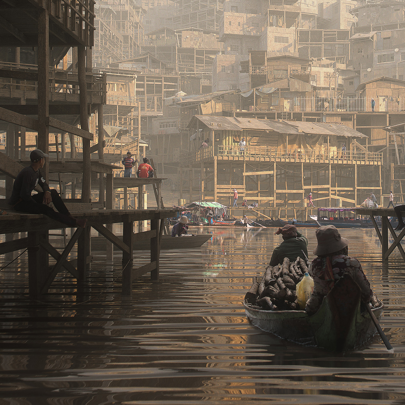
Shanty Stack Detail
“Uncle Alisha is saying he got sick because it’s not air anymore, he says that before we used to see the sky and it was blue.
But I don’t know — maybe he’s just getting old; he’s already 37.
The Stack is constantly growing as new people are moving in. Are they coming from Above?”
Software used: Blender and Photoshop
Student Winner: “22 Gordon Street” by Christian Coackley, The Bartlett School of Architecture, University College London (UCL)
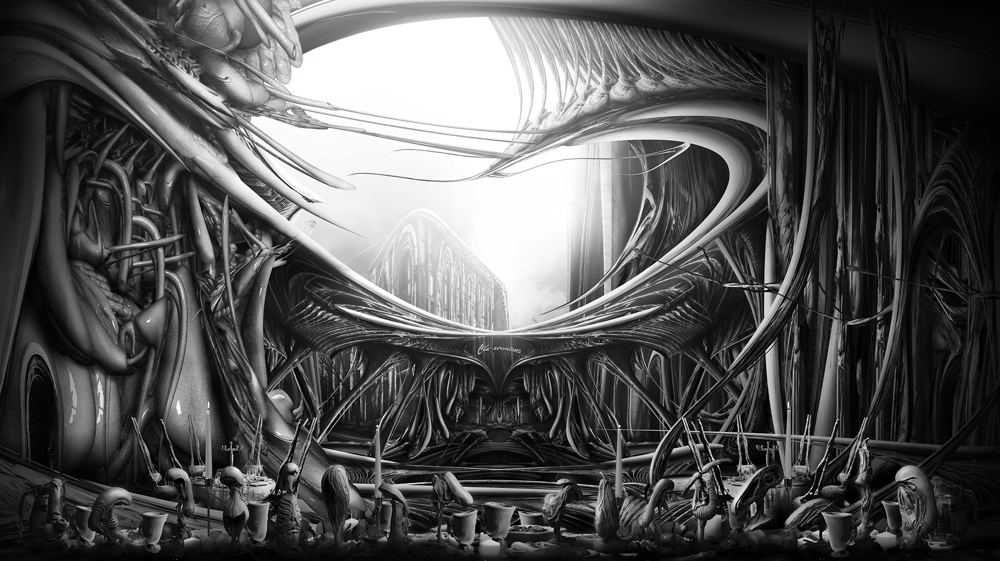 “In light of enduring issues we are facing globally, such as a climate and ecological emergency, schools of architecture must nurture a culture of collaboration in architectural education to meaningfully address them. Therefore the drawing speculates on the third iteration of The Bartlett School of Architecture. In contrast to the building’s previous 2 iterations, Wates House (1975) and The Bartlett (2016), this next installment of the school will be constructed over the course of a 1000 years by the students and tutors themselves.”
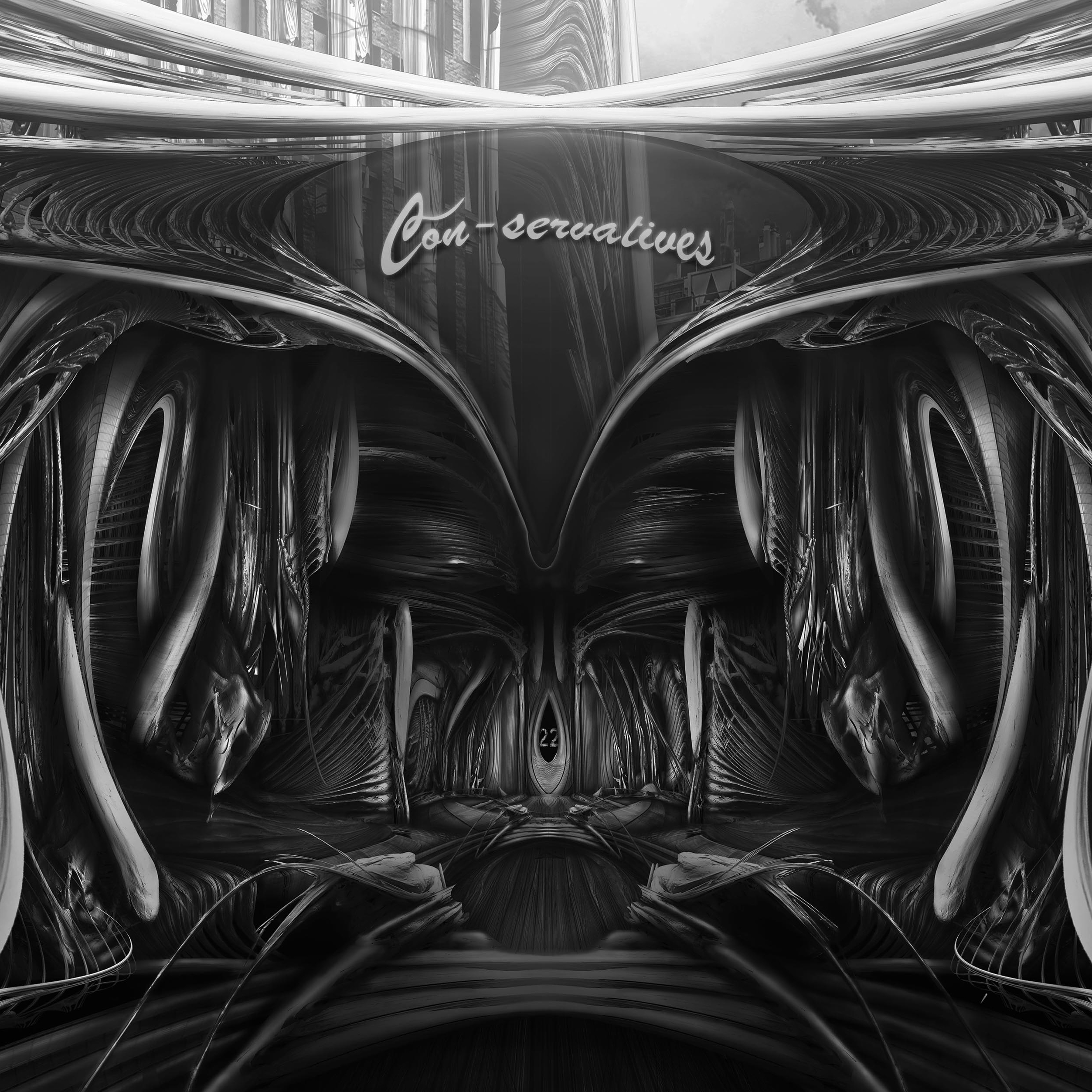 “The future generations of the building’s inhabitants will recover a lost material culture of hand-crafted ceramics. This interchangeable orchestra of students and tutors will weave themselves together through the poetic symphony of a shared material culture, ushering in a new era in architectural education: The Age of Belonging.”
Software used: Photoshop, ZBrush
Commended Entry: “Poles and umbrellas” by HISM Studio
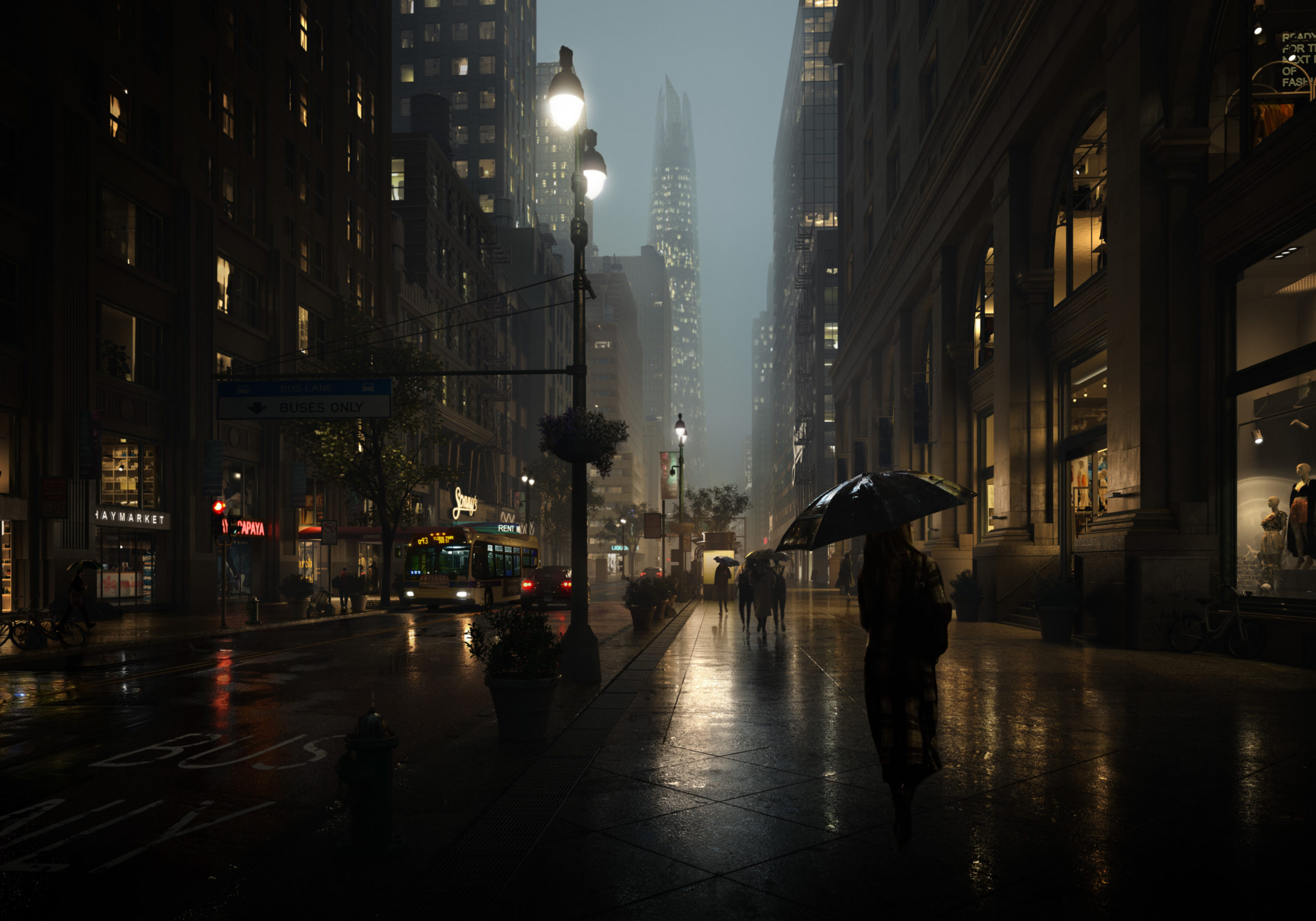 “Rainy evening in downtown New York. Wet asphalt, night city lights, and the never-sleeping life in the Big Apple.”
Software used: 3ds Max, Corona Renderer, Photoshop
Juror Carlotta Cominetti comment: “Living Characters and architecture are melted together, through darkness and expressive lights. What makes the composition powerful and charming is the play of reflections and glares; it’s a great work of sculpting, where everything is highlighted as if we were attending a real theatre performance.”
Commended Entry: “The Lantern” by Evan Mott
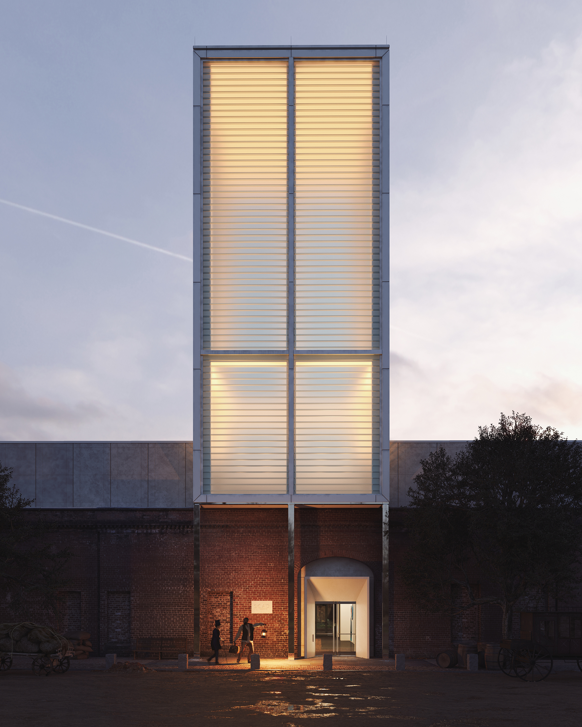 “On December 21, 1848, a white plantation owner, traveling with his enslaved servant, passed through the Central of Georgia Railroad terminal in Savannah, seeking medical care in Boston.
Or so it seemed.
In actuality, the pair were Ellen and William Craft. Enslaved since birth, the married couple devised an artful plan of escape in which fair-skinned Ellen disguised herself as William’s white owner. Four terrifying days and 1,000 miles later, they successfully carried their lantern to freedom. They would devote their lives to exposing the dark brutalities of slavery, lighting the way to liberty for others.
Today the same railroad terminal, reimagined as the SCAD Museum of Art, carries its own lantern. The glow of the 85-foot glass tower reminds us that Craft-like creativity and courage are essential in building and protecting the delicacy of equity and freedom.
Thank you, SCAD, for telling this story.”
Software used: V-Ray, 3ds Max, Photoshop, Other
Juror Alex Hogrefe’s comment: “This image has a beautiful composition and proportion to it, as well as a great story, and is also really well crafted.”
Commended Entry: “WAVE” by Roman Huzar
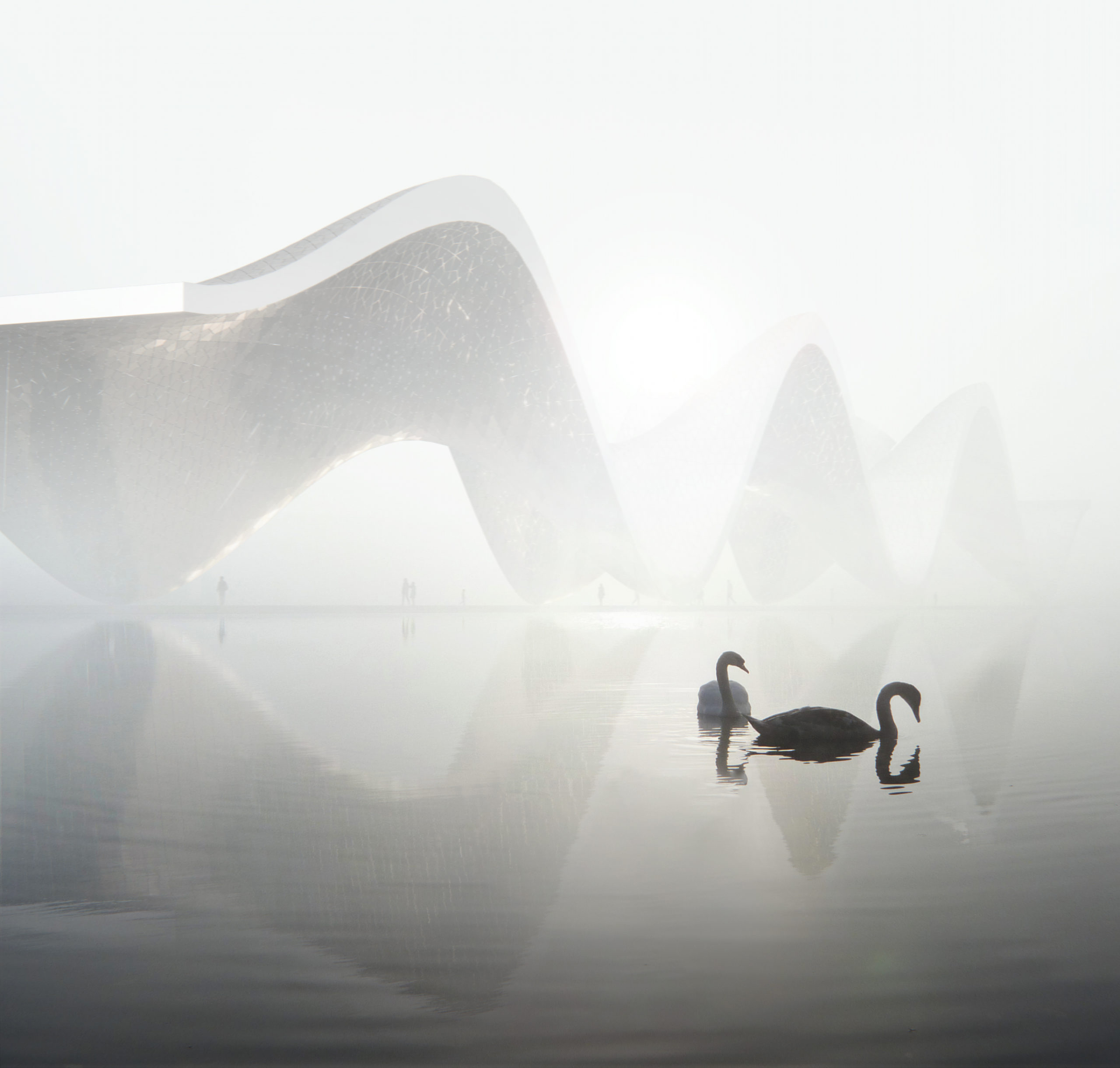 “The unity of nature and architectural form. The architecture seems to echo the shapes of the swans that live there, turning into waves and distorting the shape. It’s like a big stroke trying to unite the architecture with its surroundings by repeating it.”
Software used: 3ds Max, Corona Renderer, Photoshop
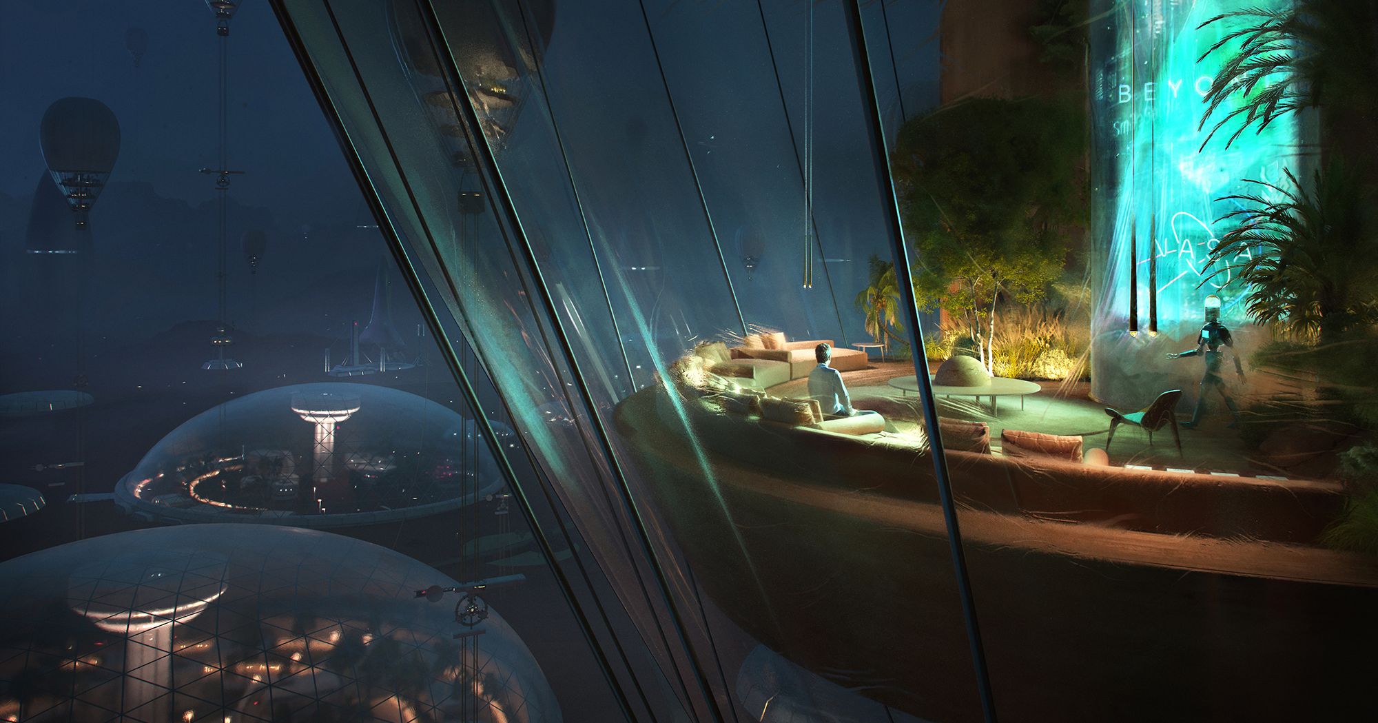
Commended Entry: “Up In The Air” by Vittorio Bonapace
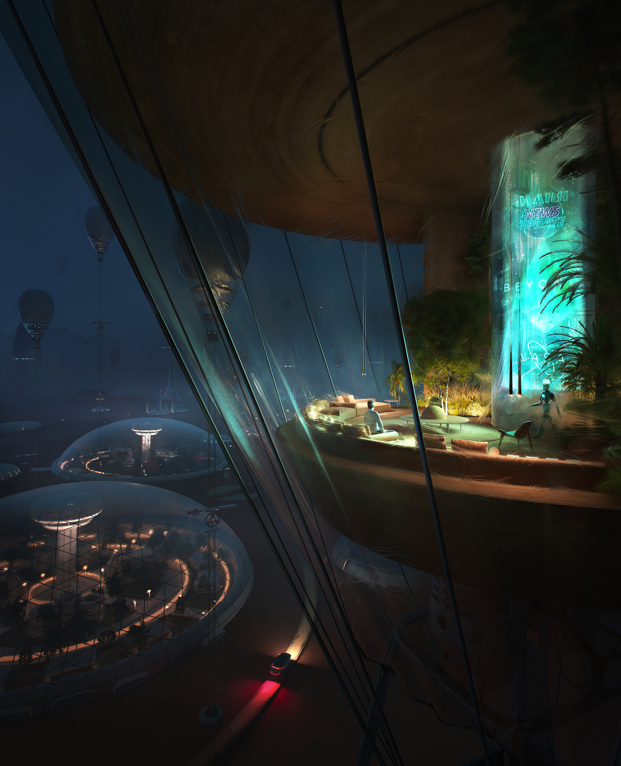 “The First Settlement on Mars.
The author imagined the first Colony – not so far in the future – inhabiting the sky into high-altitude balloons, leaving Mars’s surface for laboratories, roads, research and science experiments.
“Up In The Air ” – Visual part of a set of three illustrations – it’s not about the first epic human’s landing on the planet but the whole concept is about the confidence of living there, enjoying home.”
Software used: 3ds Max, Corona Renderer, Photoshop, Other
Commended Entry: “Copenhagen Opera House” by Antonio D’avolio
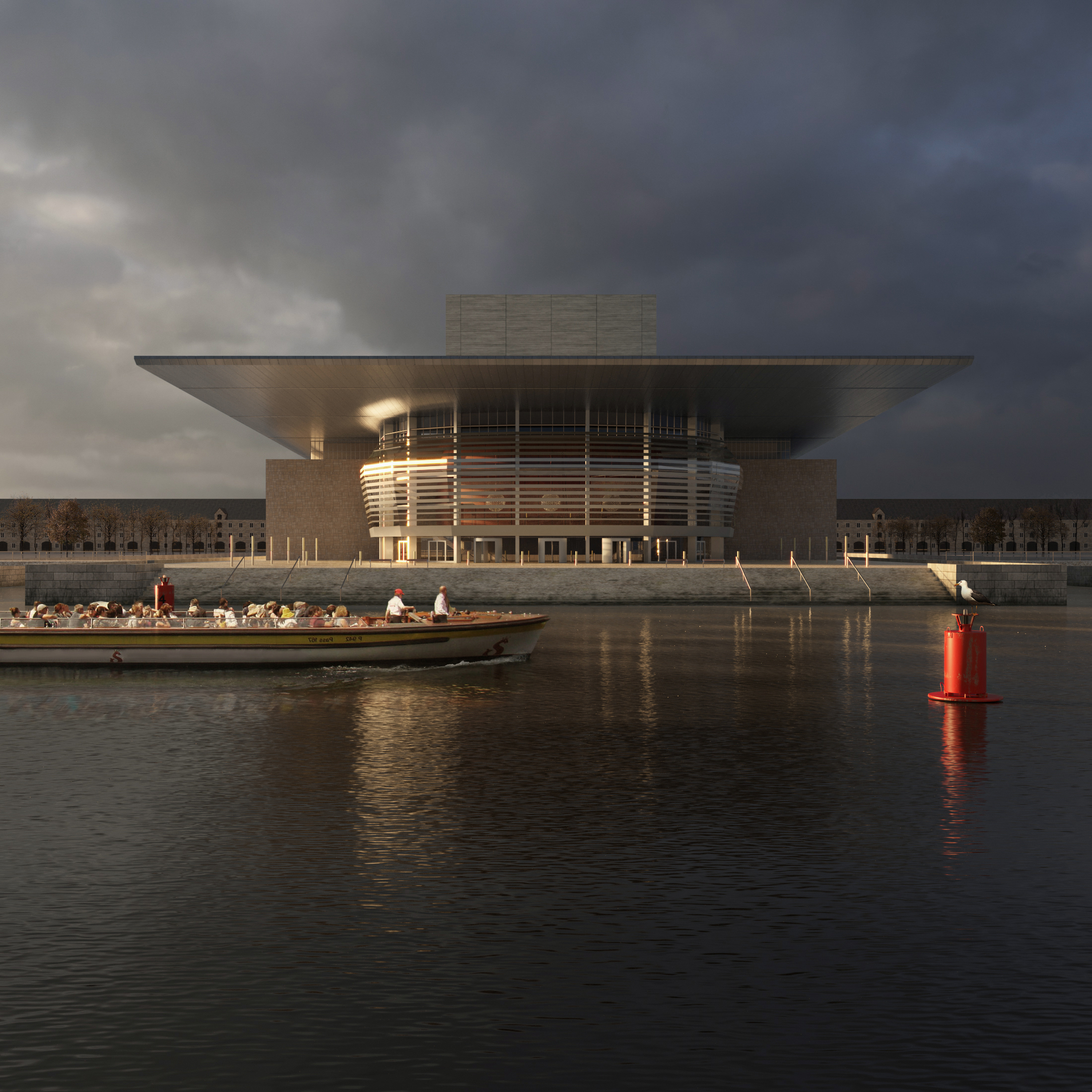 “The image depicts one of the icons of the city of Copenhagen, the Opera house, designed by the Danish architect Henning Larsen between 2001 and 2004. During my trip to the Danish capital I took some photos of it and used them as a reference to reproduce this personal work of mine. I focused my attention on reproducing a lighting that could emphasize not only the building but the whole context. I hope you like it!”
Software used: 3ds Max, Rhino, Corona Renderer, Photoshop
Commended Entry: “Sunset Love” by Mark Eszlari
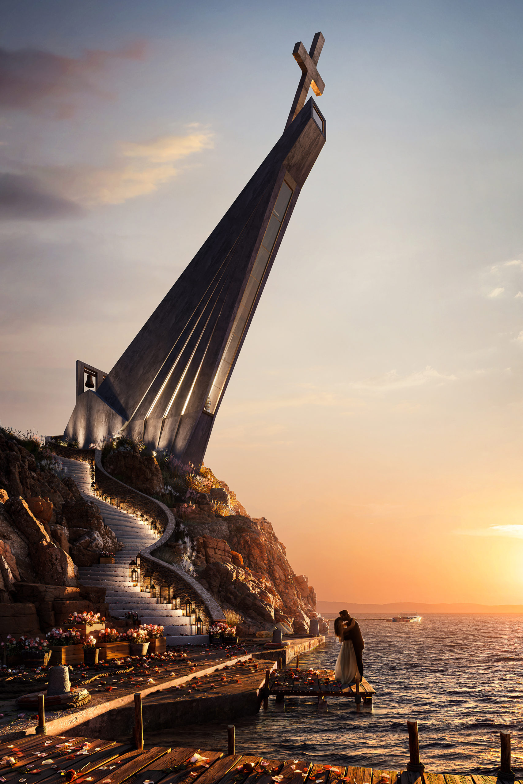 “Churches are sacred spaces where people unite spiritually with a higher power. We enter churches when faced by pure and meaningful emotions like true love. Churches are therefore unique types of architecture where humans can express their deepest feelings through prayers influencing their psychology, philosophy and lifestyle. Love at first sight usually culminates in a church during the wedding ceremony.
The illustrated couple expresses their love for one another, sharing a kiss at sunset, before climbing the stairs to enter this sacred space while the priest looks after them with his prayers, binding the souls together to be one. The design of the church is inspired by praying hands pointing towards heaven, the location by Greek islands. The elements such as the red roses, symbol of love, the sunset and staircase to the church contribute to the romantic emotions adding warmth to the image, a metaphor for hearts in love.”
Software used: 3ds Max, Corona Renderer, Photoshop
Commended Entry: “House in the Karpathians” by Nazarii Derkach, HISM Studio
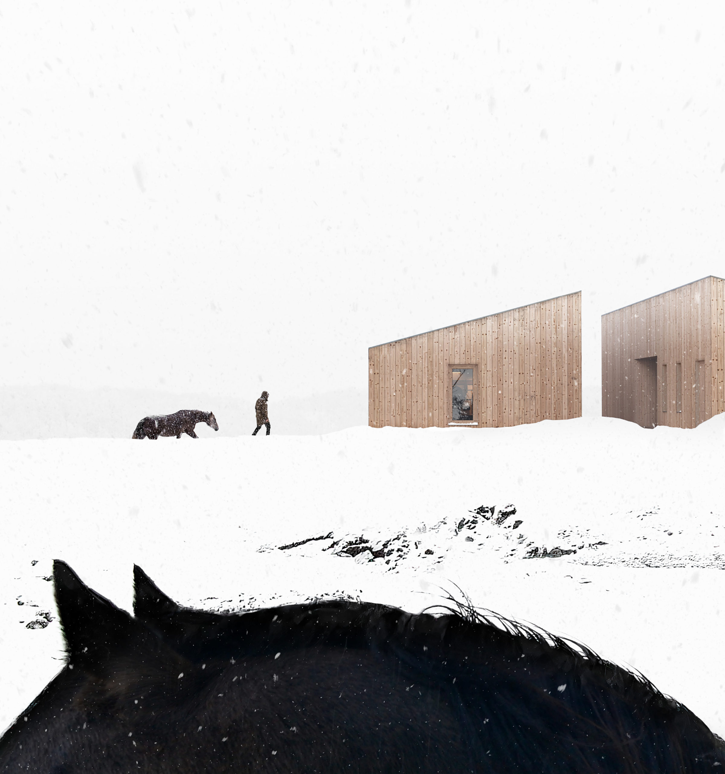 “An ode to minimalism and graphics. We play with shapes and elements of nature. Experimenting with the horse figures, wintery landscape, and minimalist structures gave us what we needed: a balance of sharpness and sinuosity.
Our team has made these images for a small house surrounded by Karpathian mountains.”
Software used: 3ds Max, Corona Renderer, Photoshop
Juror Duy Phan’s comment: “The humble muted color palette the artist used in this image helps strengthen a striking yet interesting contrast between the foreground element and the architecture context. Not only drawing the attention but such simplicity obsessively stucks in viewers mind. By breaking conventional rules, the image shows how confident the artist is; their masterful skills bring back the depth of the environment layers as well as a keen eye for mix mediums usage without losing the overall natural sense. This might be a good example for the thinking that, to make art better, try taking something out rather than adding in.”
Commended Entry: “About Storeys and Stories” by Guilherme Marcondes
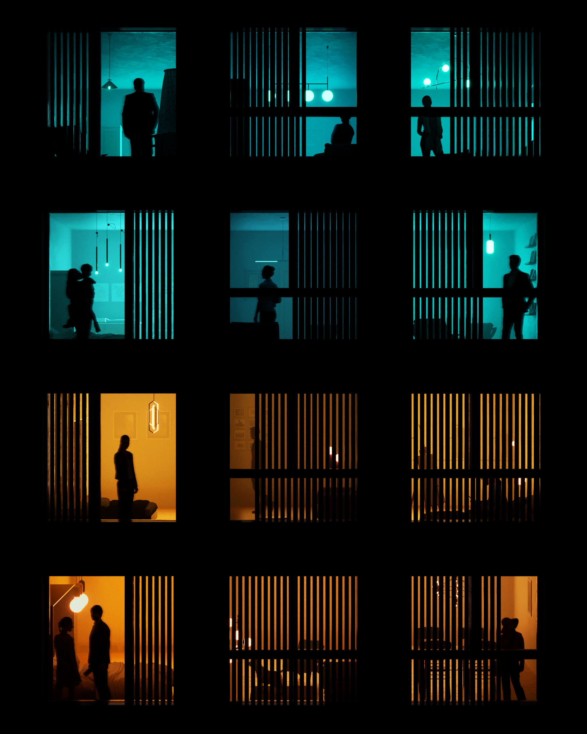 “People is what gives architecture life. With all their different lights and colors, they make the spaces alive. When designing a façade, a lot of effort is put into the relation with the exterior environment. With this rendering I wanted to focus on the role that the interior spaces play in a façade. Each of these windows have a story to tell, a feeling to show, a thought going on.
Home can have a lot of meanings: it’s where we come after work, rest, see our loved ones. It’s where we process the thing that happened outside, where we plan the things we want to do outside. Most importantly, it’s where we can show our true colors: sometimes bright, strong and warm. Sometimes soft, cold and blue. Through the day and the night the façade is where we see not just the city, but also the people’s light.”
Software used: 3ds Max, Corona Renderer, Photoshop
“REMEMBRANCE” by Zoe Russian Moreno
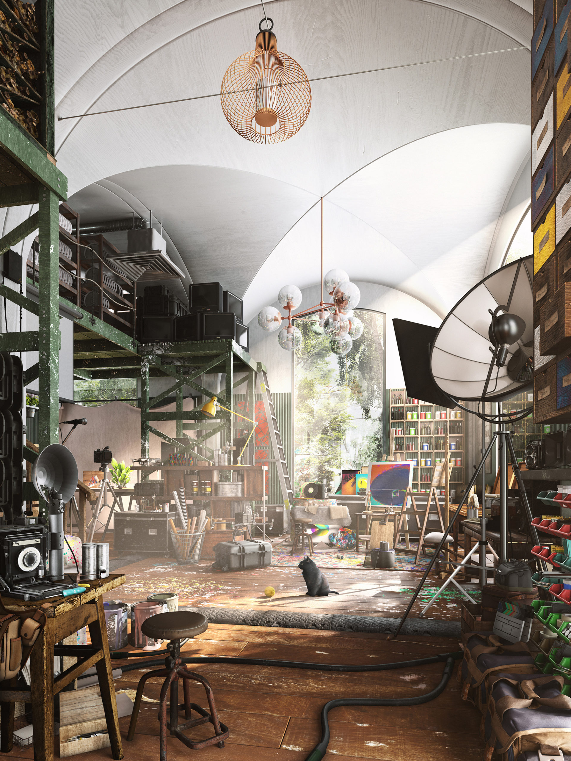 “Memories and dreams sometimes go hand in hand. The combination of reality and fantasy is an intrinsic force that supplies the creative portfolio of an artistic mind with endless possibilities. Nevertheless, even with all the infinite pieces put together sometimes one can’t help but look into triggers of certain spaces that take you back into specific moments of life.
This particular studio is a combination of said moments in time; clutter in respective areas, materiality, scale, objects and the conglomeration of mechanical pieces grounds the imagery, which brings a sense of character that many people resonate with. It’s a sense of remembering a space that does not exist. A remembrance.”
Software used: V-Ray, 3ds Max, Photoshop
“The Built Environment” by Wilson Costa
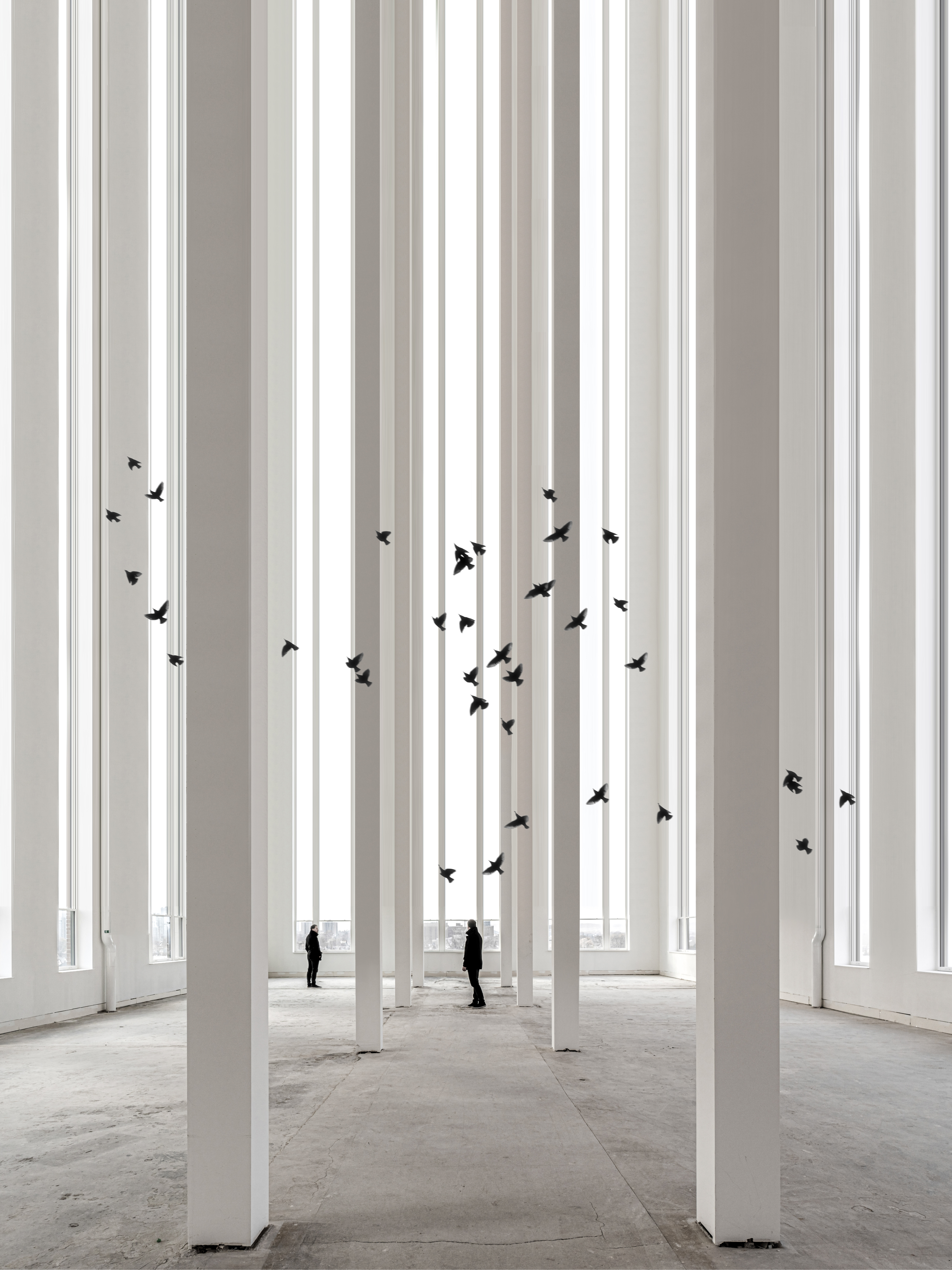 “This piece is more of a political statement to depict how the built environment can affect nature. The columns represent tall leafless trees in the forest. The concrete floors are dried out soil. The lack of color represents most architecture today which is very monochromatic and dull without paying homage to the nature around it. The architecture industry needs to embrace nature more by incorporating living walls, green roofs, natural light and color.”
Software used: SketchUp, Photoshop
Juror Bennet Oh offered a reflection on this year’s Finalists: “Visual storytelling has never been more important than in the era of metaverse and NFTs. These technologies have proven that visualization is no longer just a supplement to show what is to be, but the product itself. This year’s One Rendering Challenge has shown some of the brightest talents in the industry, demonstrating their ability to create substance out of thin air. I thoroughly enjoyed the works of entrants who challenged themselves to not only pursue realism but also create a real ‘value’. Congratulations to all entrants for their achievements!”
Revealed last month, the top 100 renderings were published in our special editorial feature, entitled “100 Renderings That Tell Powerful Stories about Architecture”. There will also be further features on the winners in the coming weeks.
Thank you to all participants for their hard work in creating these amazing renderings, each telling a fascinating story about architecture and our world today. Our next challenge, the 3rd Annual One Photo Challenge, is one of architecture’s biggest architectural photography competitions, and it launches on May 9th — sign up now to receive key updates and prepare your submission:
