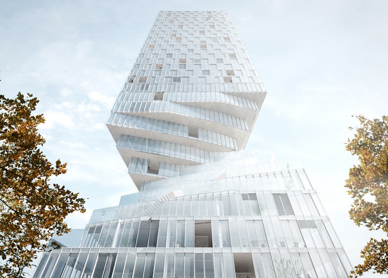
Dutch studio MVRDV have triumphed in a three-stage international competition to design a mixed-use skyscraper in the Austrian capital of Vienna with a new twist on the conventions of high-rise design yet again…
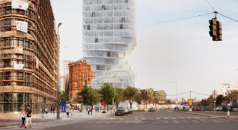
In order to satisfy the city’s strict planning regulations, the lower ten stories of the tower are pivoted around the building’s core to ensure daylighting for adjacent structures. This tenacious twist maintains glimpses of Vienna’s historic gasometers situated nearby, and also serves to redirect wind away from the plaza and metro station entrance at the foot of the building.
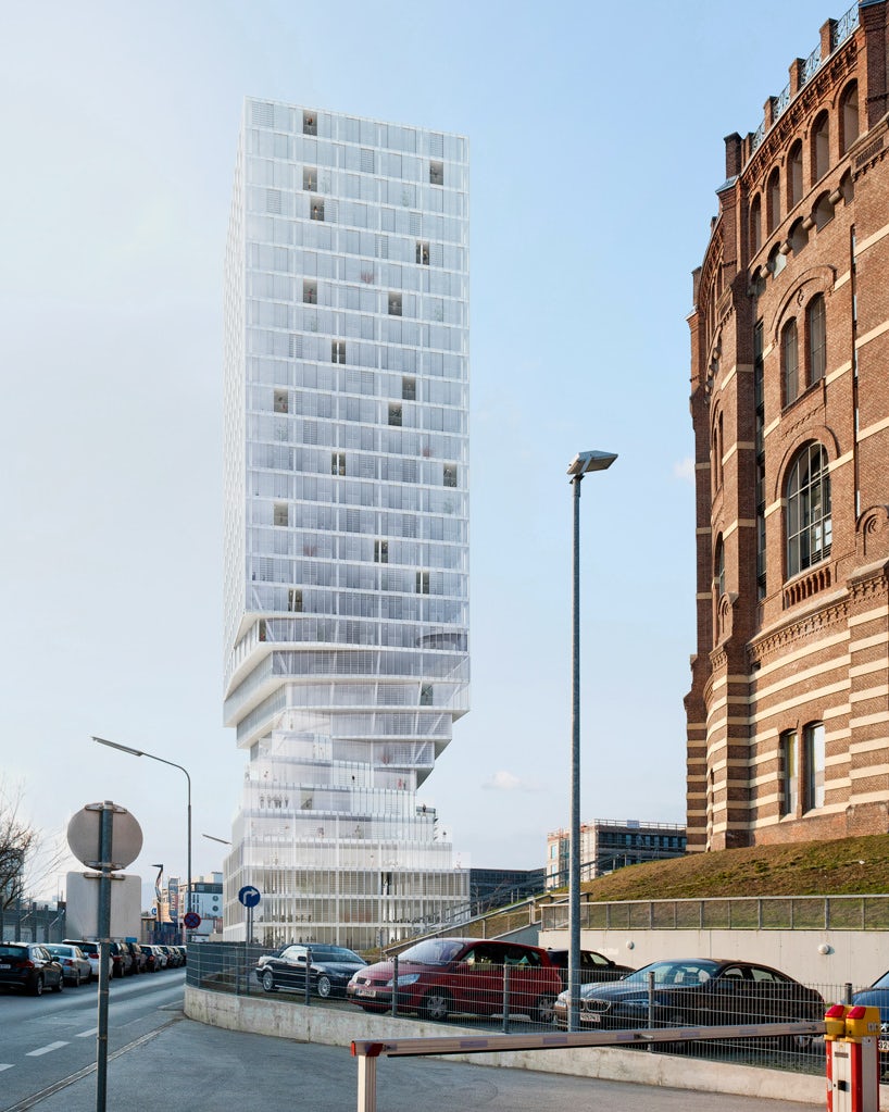
MVRDV’s design is nothing if not jaunty. Its distinctive silhouette gives the structure a precarious appearance, reminiscent of a tree trunk that has been gnawed to within breaking point by a Godzilla-sized beaver. Its perilously slender waist culminates in a building full of counterbalanced tension, similar to the Dutch Firm’s pixelated Sky Village, a mixed-use tower proposed for Copenhagen in 2008.
The playfulness of this formal pirouette stands in contrast with the building’s overriding aesthetic: A highly conservative palette of steel and glass in keeping with the universal appearance of the International Style. The juxtaposition of typical modernist high-rise conventions and an extreme manipulation of the lower levels gives the tower a curious appearance, like one of Victor Enrich’s Photoshopped office blocks made real.
The rotation of the skyscraper’s lower reaches takes the limelight as the design’s standout feature, but what of the rest of the proposal? MVRDV have specified unusually high floor-to-ceiling dimensions, from 3–3.5 meters, which should give the internal spaces a refreshingly open feel and provides for program flexibility. These ceiling heights permit a mixture of uses, allowing offices and retail to be included along with residential apartments.
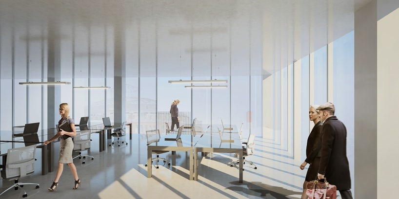
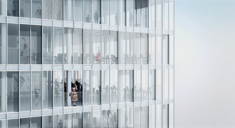
The façades are comprised entirely of glazing, with operable windows for natural ventilation. Full-height sliding doors allow whole elevations to be opened up, transforming internal spaces into deep, covered balconies. The chosen structural system allows for relatively column-free floor plates, which also lends itself to flexible layouts for open plan offices and retail at ground level.
Beyond this, the tower’s appearance is simple to the point of faceless banality — but in a curious fashion, this no-frills aesthetic appears appropriate when combined with the twist, an extravagant formal gesture which abides as the building’s defining characteristic.

The upper portion of the building — 20 standardized floors — looks somewhat uncomfortable perched upon its helical pedestal, giving the overall form a top-heavy, unbalanced appearance. However, this is undoubtedly a consequence of the client’s brief, specifying a minimum square footage of leasable space: MVRDV have endeavored to satisfy these demands, whilst simultaneously ticking the boxes of Vienna’s planning regulations.
Whether the resulting building will sit well within the wider urban environment is open to question, but one thing is certain — the quirky spirit of MVRDV remains undiminished. Their latest take on the high-rise typology is due to begin construction in 2016, with completion of the torqued tower set for 2018.
Yours twistingly,
The Angry Architect
All images via Design Boom
