Designing a facility for international border control can be a tricky proposition amounting to an architectural tightrope walk. The imperative for almost every border crossing is to communicate contradictory messages of welcoming and surveillance, at once making desired border-crossers feel at ease while trying to make potentially threatening border-crossers feel watched and intimidated.
In meeting this imperative, a duality has developed around the design of these types of facilities that often employs a single element in service of both mandates. Simultaneously ingenious and shrewd, such tactics represent a successful cognitive dissonance in architecture that can be very hard to achieve in any other building type. The projects below exemplify various aspects of these contradictory designs, broken down into four elemental categories.

© J.MAYER.H
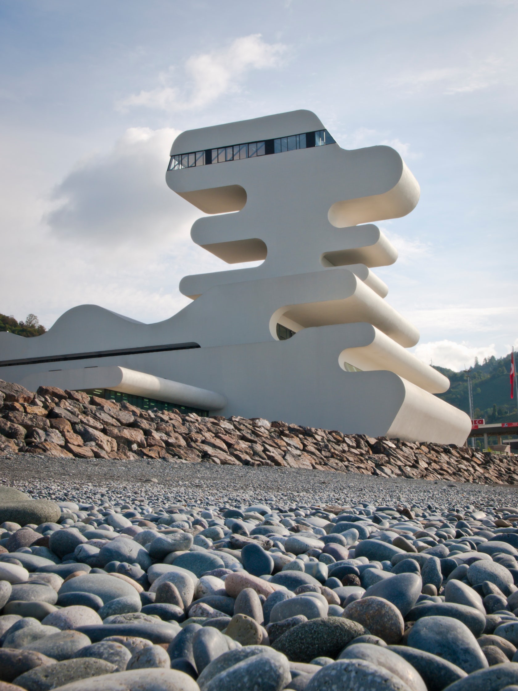
Sarpi Border Checkpoint by J. MAYER H., Sarpi, Georgia
Watchtower
Perhaps the most important mandate of border control is seeing (or giving the appearance of seeing) who and what is passing through the border. But simply monitoring this flow acknowledges the limited capabilities of a relatively small number of border officials compared to the massive volumes of traffic they’re responsible for processing.
Thus, a visually striking watchtower can not only allow border officials to view traffic, but can also create an overbearing presence for their vantage point, exaggerating the capabilities of this design element in an effort to deter cross-border criminals. Doubling the inherently intimidating notion of a watchtower with a welcoming feel for innocent border-crossers can be seen in the Sarpi Border Control Checkpoint between Georgia and Turkey.
In this project, the watchtower is given a sculptural, almost cartoonish aesthetic that’s likely to make most people smile upon first seeing it — hardly a typical reaction for a person to have when they know they’re being watched. The distinctive, bizarre form of this crossing’s monumental tower will likely become a landmark in the minds of the people who cross this border and can be seen as making a positive impression for both visitors and nationals alike.

© NORR
Canadian Plaza at the Peace Bridge by NORR, Fort Erie, Canada
Gate
At its core, a border crossing is nothing more than an official door into a country, so it’s no surprise that the actual point of crossing is frequently characterized as a ceremonial gate; the duality here being that even a beautiful gate can be off-putting when it is closed. At the Canadian Plaza at the Peace Bridge, this gate is marked by a wooden roof structure that mimics the appearance of a canoe turned upside down.
As an allusion to local history, it is a handsome icon, and its warm materials and traditional appearance may be enough to offer a pleasant feeling to anyone who would otherwise become anxious underneath it, as it also serves to cover a vehicle inspection area.

Border Checkpoint Kazbegi by Giorgi Meladze, Tbilisi, Georgia
At the Border Checkpoint Kazbegi in Tbilisi, a sharp, angular roof form — taking cues from the surrounding mountains — jumps between checkpoint support buildings and passes over the crossing gate. This move brings attention to the gate itself, enhancing its presence and underscoring its function as it mimics the natural mountain passes around it.

© Paul Crosby Photography
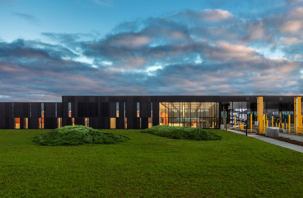
US Land Port of Entry by Snow Kreilich Architects, Van Buren, Maine, United States
Camouflage
Toward the goals of security and surveillance, border patrol staff may often desire invisibility in tandem with omnipresence. At two US border checkpoints, in Maine and California, designs that pay respect to local surroundings also serve to conceal the activities of the facility’s agents. In Maine, a façade paying homage to local ecology appears, from a certain distance, pixelated in the same way as military camouflage uniforms. Intended to blend in with heavy forest, its paneled façade can be seen to vanish into the landscape surrounding it.

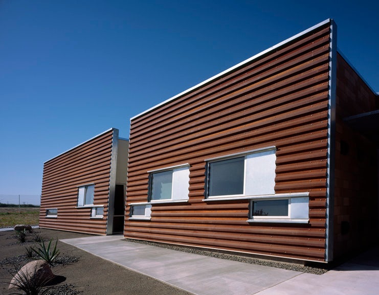
Border Patrol Station by Garrison Architects, Murrieta, Calif., United States
In California, a façade of CorTen steel, matching the construction of the nearby border fence, also blends into the landscape. Earth integration of the building itself makes ostensible claim to support the facility’s eco-friendly ethos while further concealing the activity of its agents.

© Robert Siegel Architects
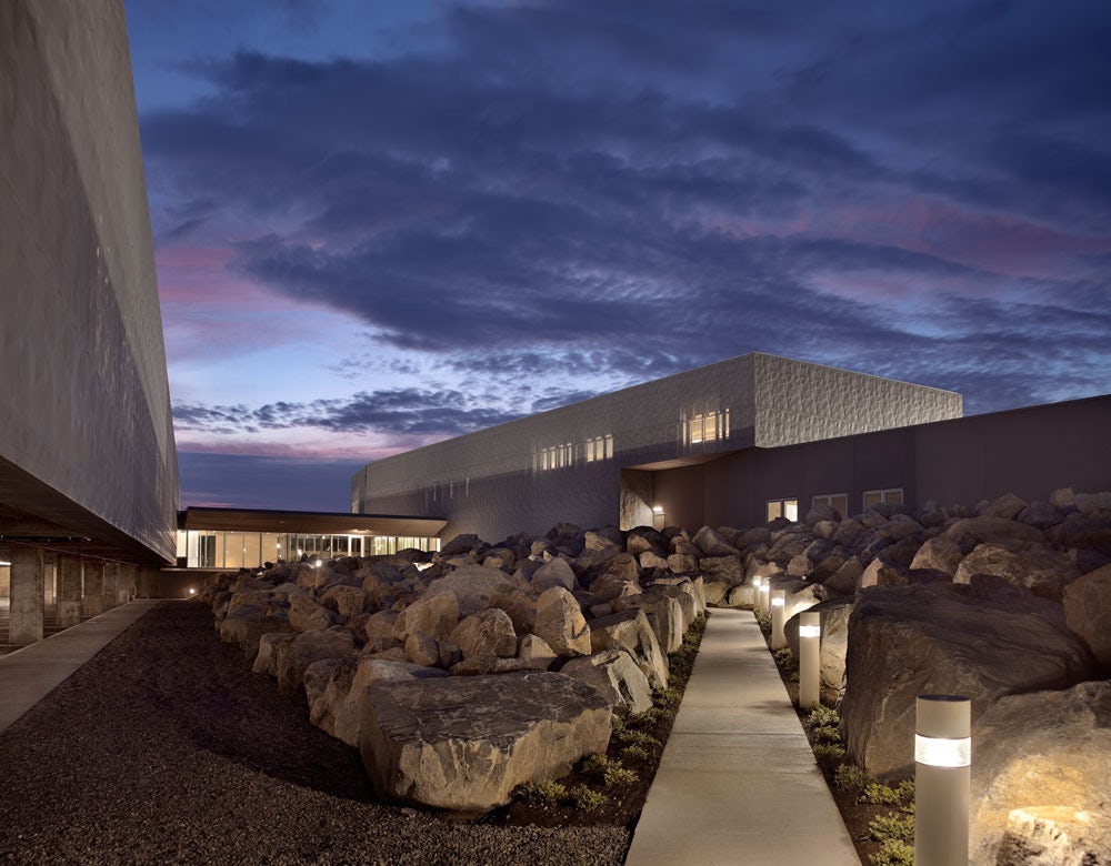
US Land Port of Entry by Robert Siegel Architects, Calais, Maine, United States
Barrier
Reinforced bollards in the form of planters or steel posts are a common sight around sensitive buildings — but the level of integration for such elements can be taken to a higher degree than obvious perimeter obstacles.
In Calais, Maine, a border checkpoint employs a field of massive rocks that can not only complicate a direct path to building entrances from the outside, but also alludes to a natural beauty that fits with the project’s environmental goals, such as passively purifying all runoff water from the site. A series of broad, expansive level changes creates further physical barriers while still communicating an “open door” aesthetic desired by the architect.


