Architects: Want to have your project featured? Showcase your work through Architizer and sign up for our inspirational newsletter.
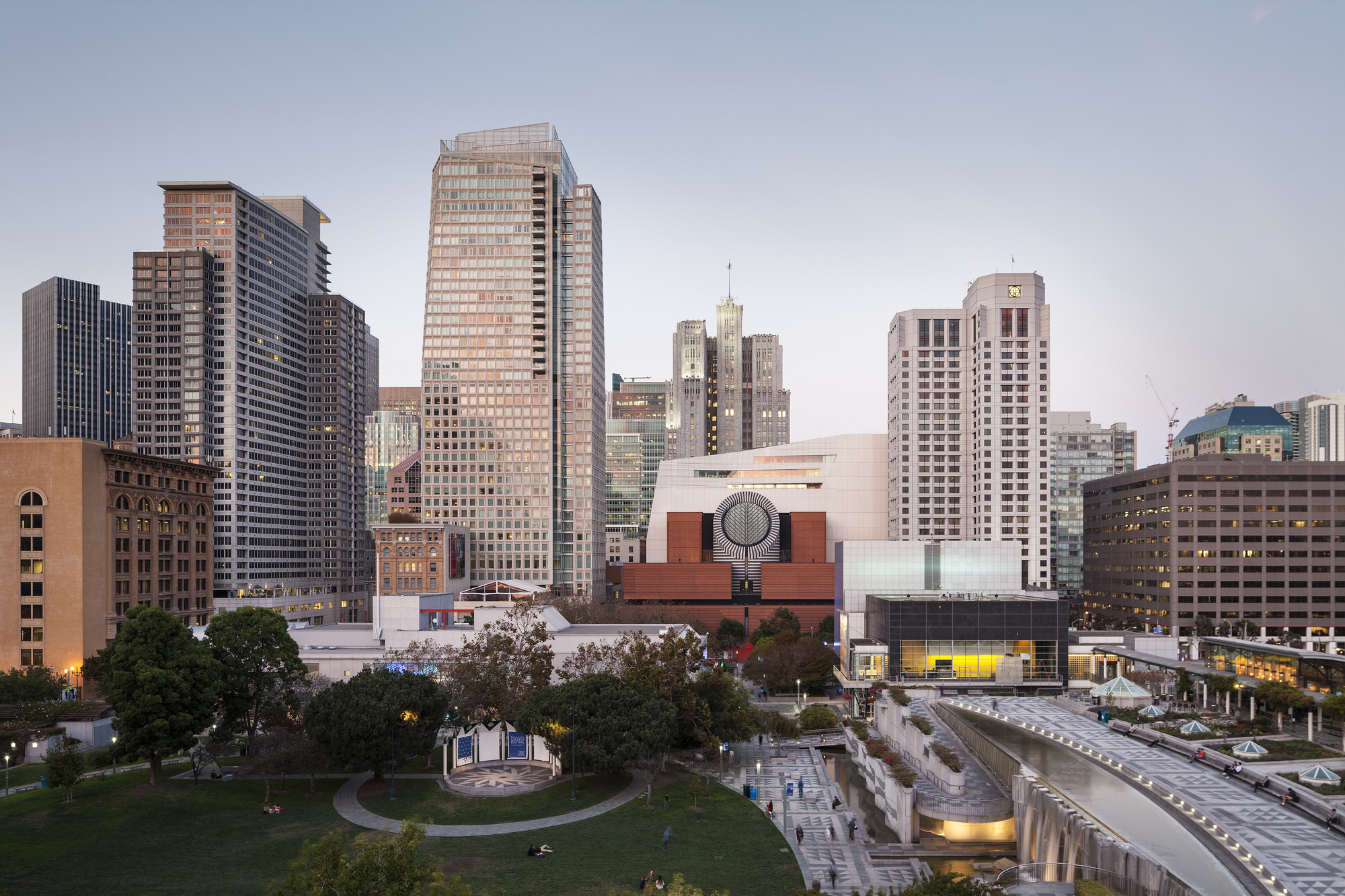
New additions require no small amount of finesse. By their nature, building upon an existing structure encompasses technical, structural and programmatic concerns. These are multiplied when dealing with an iconic work like the Mario Botta–designed San Francisco Museum of Modern Art. The purpose-built structure became the home for SFMOMA in 1995, suffering from a design with poor circulation. Fast forward two decades and enter Snøhetta, the internationally-recognized design practice tasked with remodeling the Botta building and expanding both gallery and exhibition space.
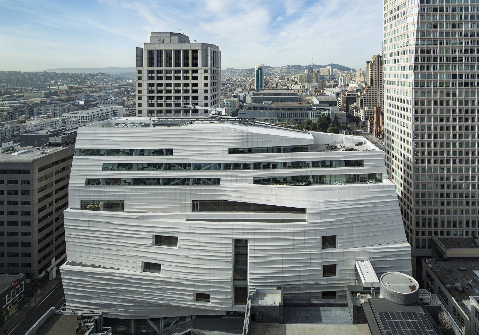
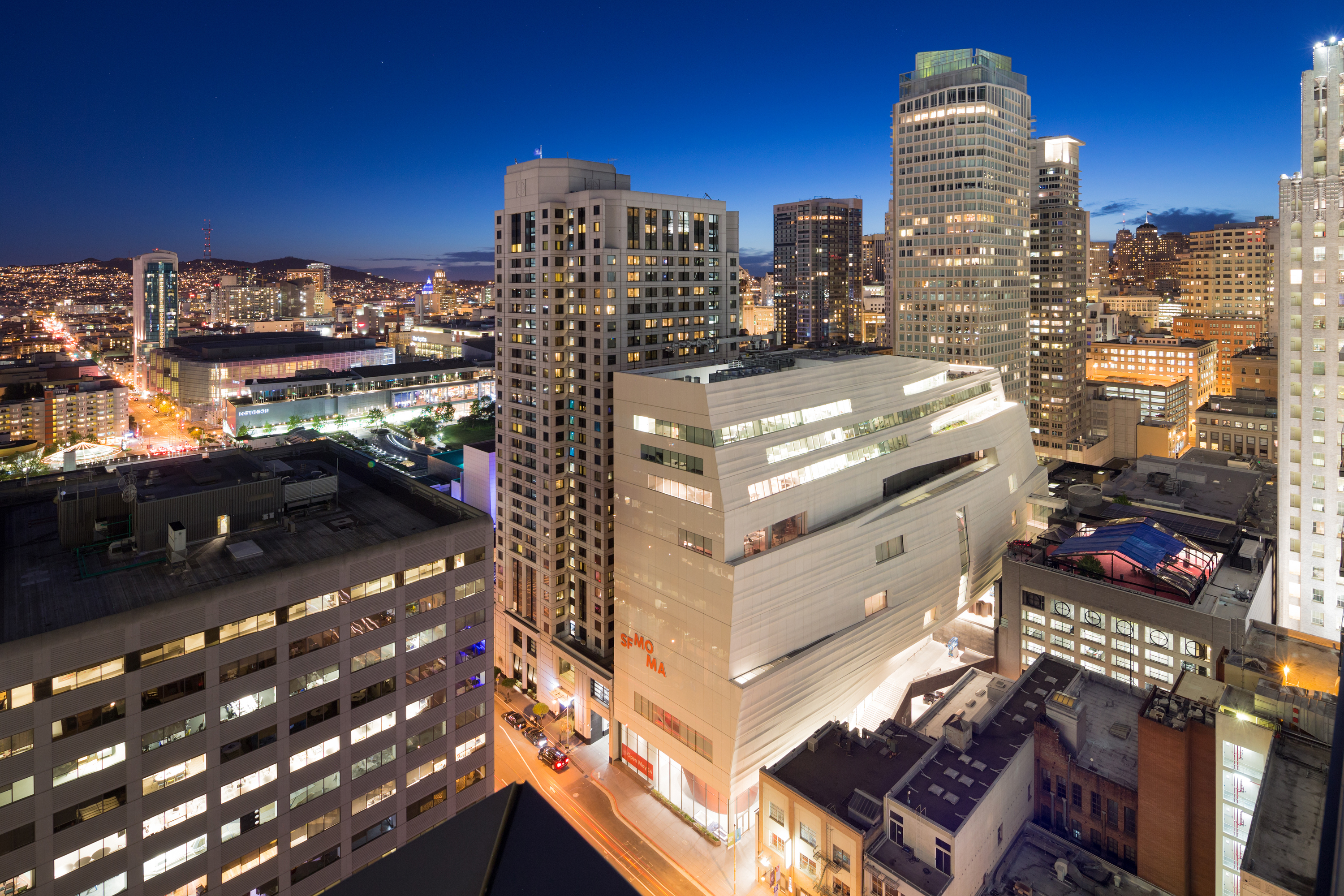
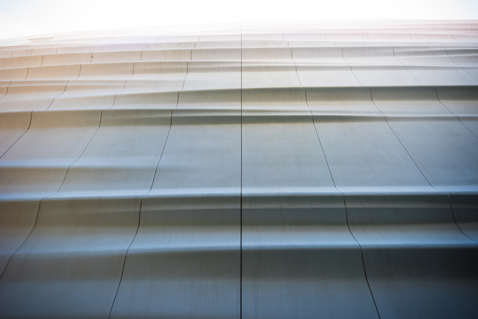
 The new SFMOMA expansion responds to Botta’s red brick structure with an elegant cascade of over 700 sculptural panels made from glass-fiber reinforced polymer. Inspired by the San Francisco Bay, the 200 foot tall signature work has a façade made with silicate crystals from Monterey Bay. The project features a bow shape form made to embrace light lower in the project. As Snøhetta founding partner Craig Dykers said, “We recognized that, if we pulled the building back from the property line, it would allow more light to hit the surface of the building and more light to illuminate the ground plane.” The undulating, pristine façade and towering form has become a new landmark in SoMa. Here, we uncover the manufacturers and materials that helped realize San Francisco’s latest monument.
 FRP Rainscreen Panels
Manufactured by Kreysler & Associates
As the most defining element of the new SFMOMA expansion, the FRP rainscreen panels by Kreysler & Associates were inspired by San Francisco’s fog and bay landscape. The façade panels are the largest architectural application of composites technology in the United States. According to K&A, the lightweight FRP cladding saved an enormous amount of weight and installation cost in the construction of the façade compared to the alternative of using glass fiber reinforced concrete. The production panels were oriented vertically so they aligned with the unitized panel system behind them, while every panel is a unique shape individual molds formed by CNC fabrication.
 Glazing
Manufactured by Silicon Valley Glass
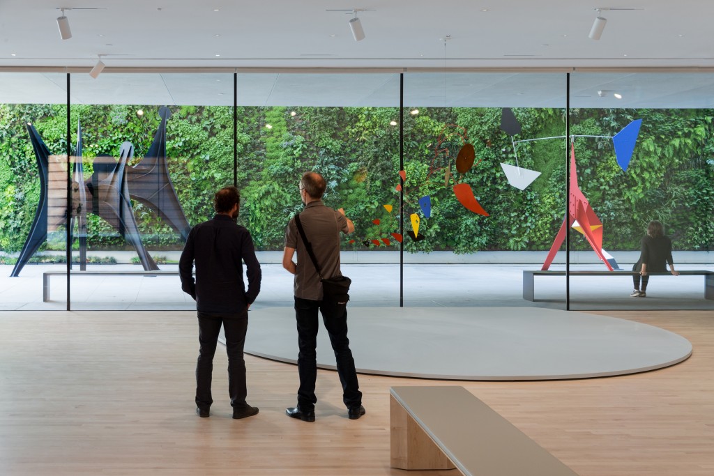
Bringing light into SFMOMA’s interior spaces, glazing was considered to create connections to SoMa and the city. Integrating with landscaping and outdoor spaces, the glazing connects with pedestrian paths and the streetscape. The building’s iconic FRP panels are affixed to the curtain-wall system to create the rippling horizontal bands that shift with the changing light. To protect the art collection from direct sunlight, a series of wide, glazed corridors were formed adjacent to the galleries. These offer views out to San Francisco and the neighborhood.
 Suspension Grid
Manufactured by Armstrong
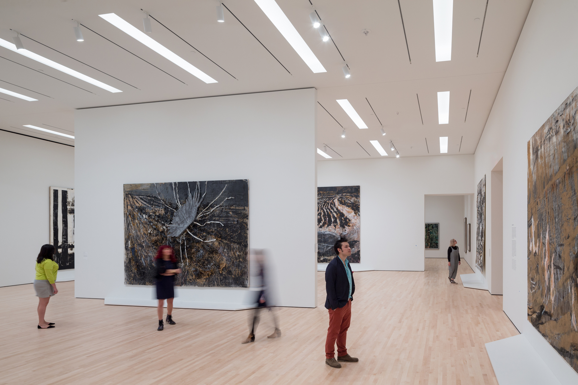
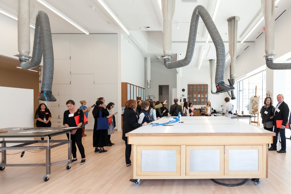
Supporting the museum’s building systems while providing a simple framework, the suspension grid by Armstrong adapts to both gallery and exhibitions spaces. The galleries are formed in a 57-foot-wide bay, determined by the maximum throw of the ventilation system. This is concealed to avoid ceiling diffusers interrupting the ceiling surface. Intimate in scale, the galleries were made for a range of work at different scales. The suspension grid integrates with the flexible, column-free scheme to accommodate temporary wall layouts. The ceiling strategy also works in tandem with lighting to support different viewing experiences.
 Living Wall
Designed by Habitat Horticulture
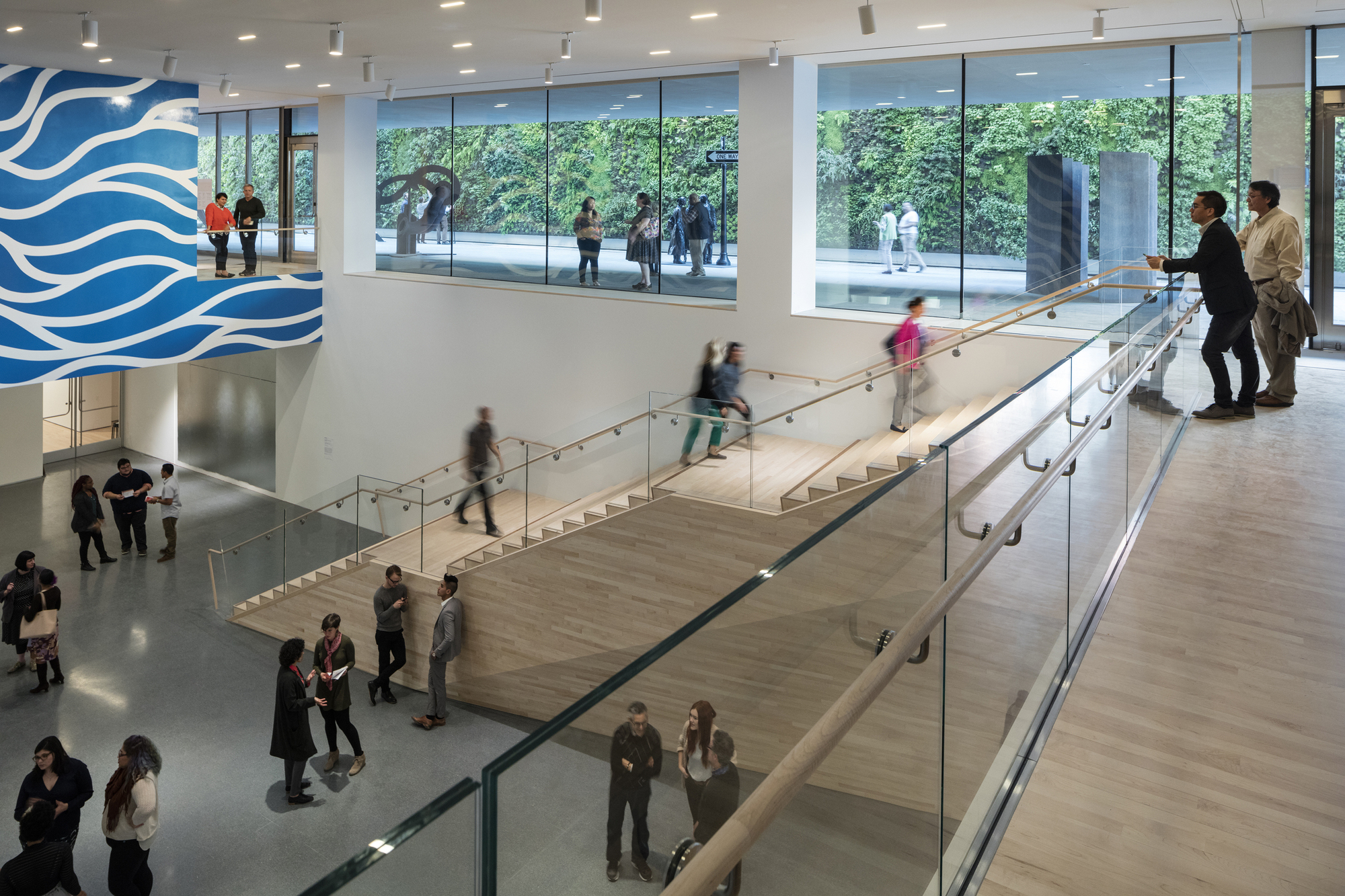
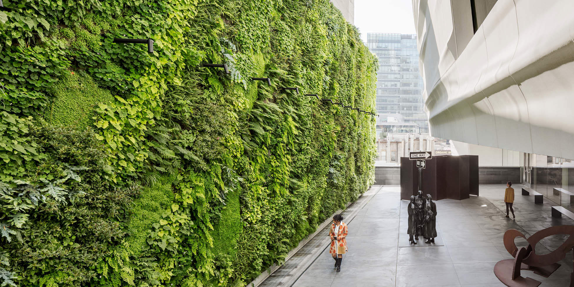
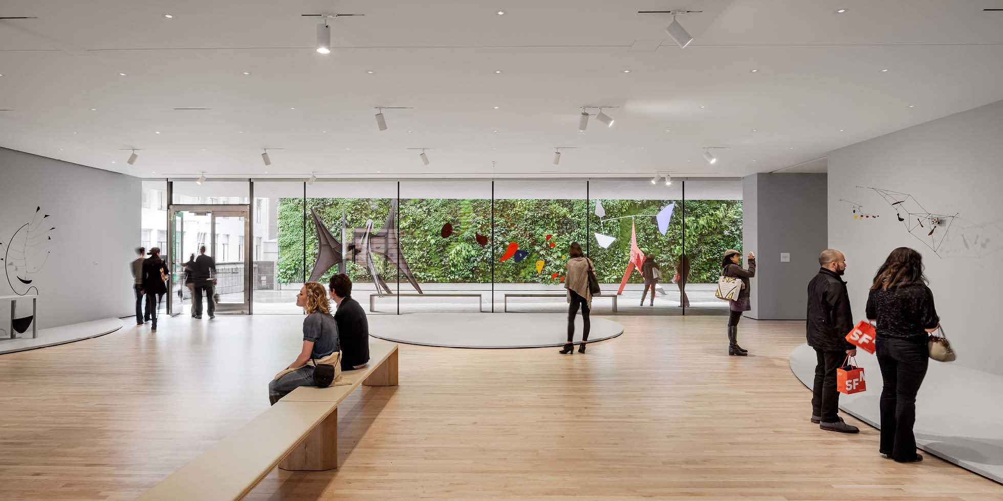
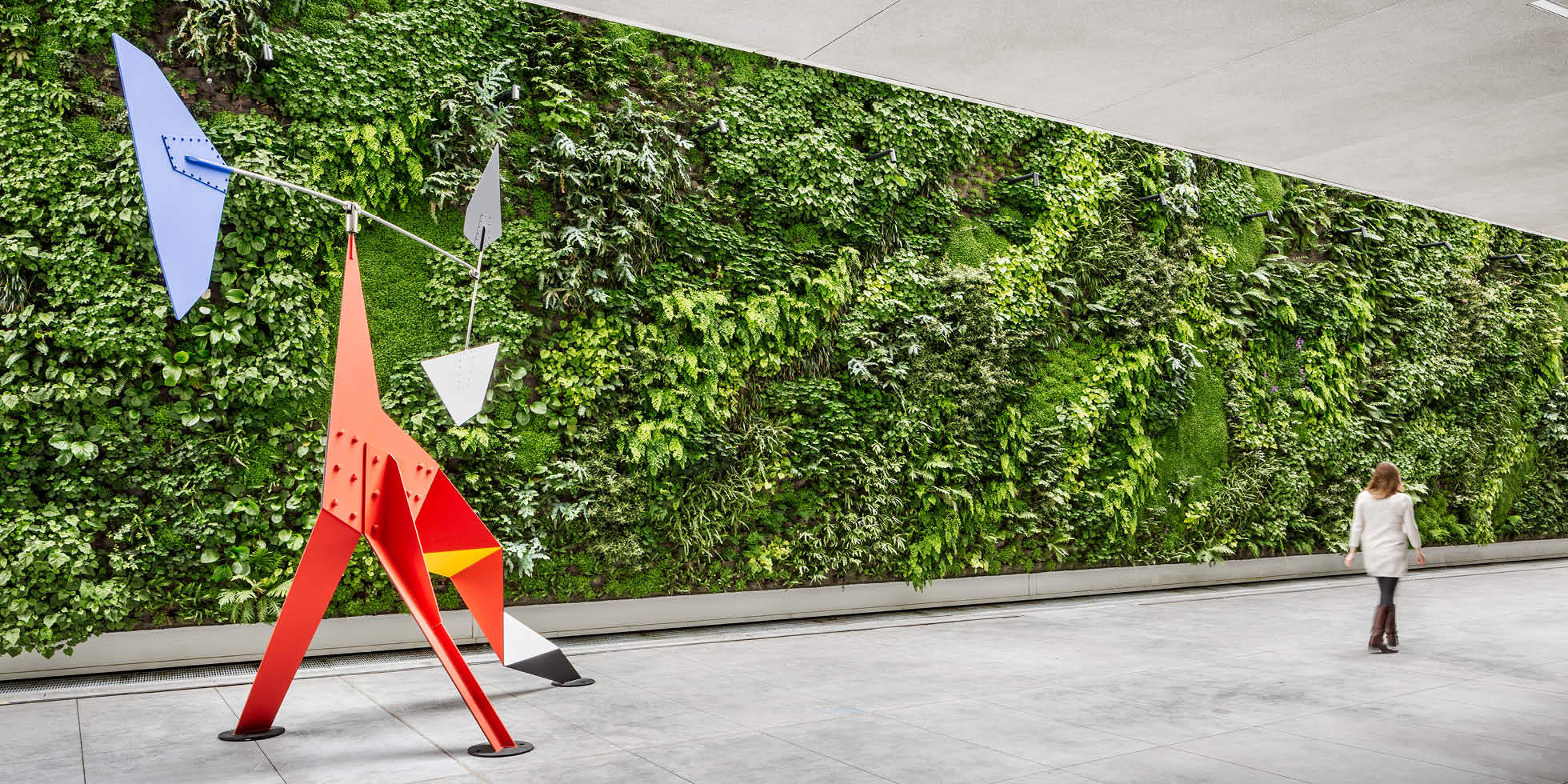
Formed as the third-floor Pat and Bill Wilson Sculpture Terrace, this section of SFMOMA features the largest public living wall in the United States. Designed by Habitat Horticulture with more than 19,000 plants and 21 native species, the living wall was conceptually imagined as an “extension of the natural world” rooted in the local landscape. As a counterpoint to the museum’s context, the wall was made by artist David Brenner to capture the essence of an understory plant community in a California woodland. Different textures combine with amorphous and seasonal plantings to shape a sensory experience.
 Entrances
Manufactured by Ellison and Dorma
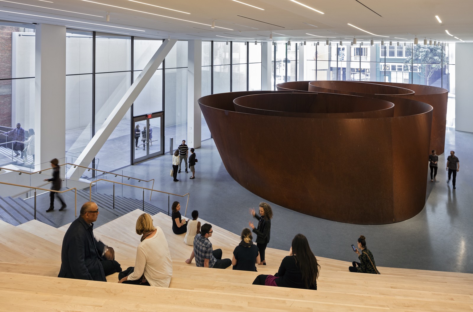
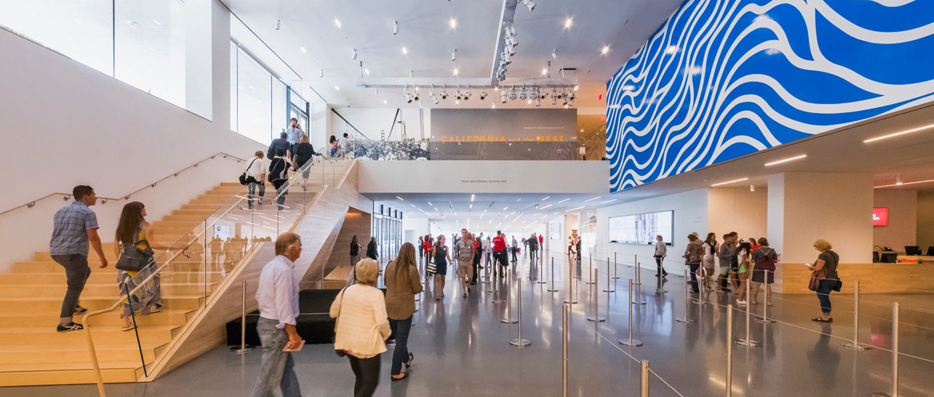
When designing the new addition to the original Mario Botta structure, Snøhetta created two main entrances to the new museum. A Third Street entrance opens to a the new Evelyn and Walter Haas, Jr. Atrium, where Botta’s oculus allows in natural light. Here, a new sculptural stair leads visitors to the Helen and Charles Schwab Hall, the new hub of the museum. The hall is connected to Howard Street through a new entrance adjacent to the glass-walled Roberts Family Gallery. The entrances for SFMOMA were manufactured by Ellison and Dorma to provide a seamless flow between the city and the new building interiors.
Architects: Want to have your project featured? Showcase your work through Architizer and sign up for our inspirational newsletter.
 SFMOMA Expansion
  SFMOMA Rooftop Sculpture Garden