Architizer is thrilled to announce that the 2026 A+Product Awards is open for submissions! The clock is ticking — get your products in front of the AEC industry’s most renowned designers by submitting today.
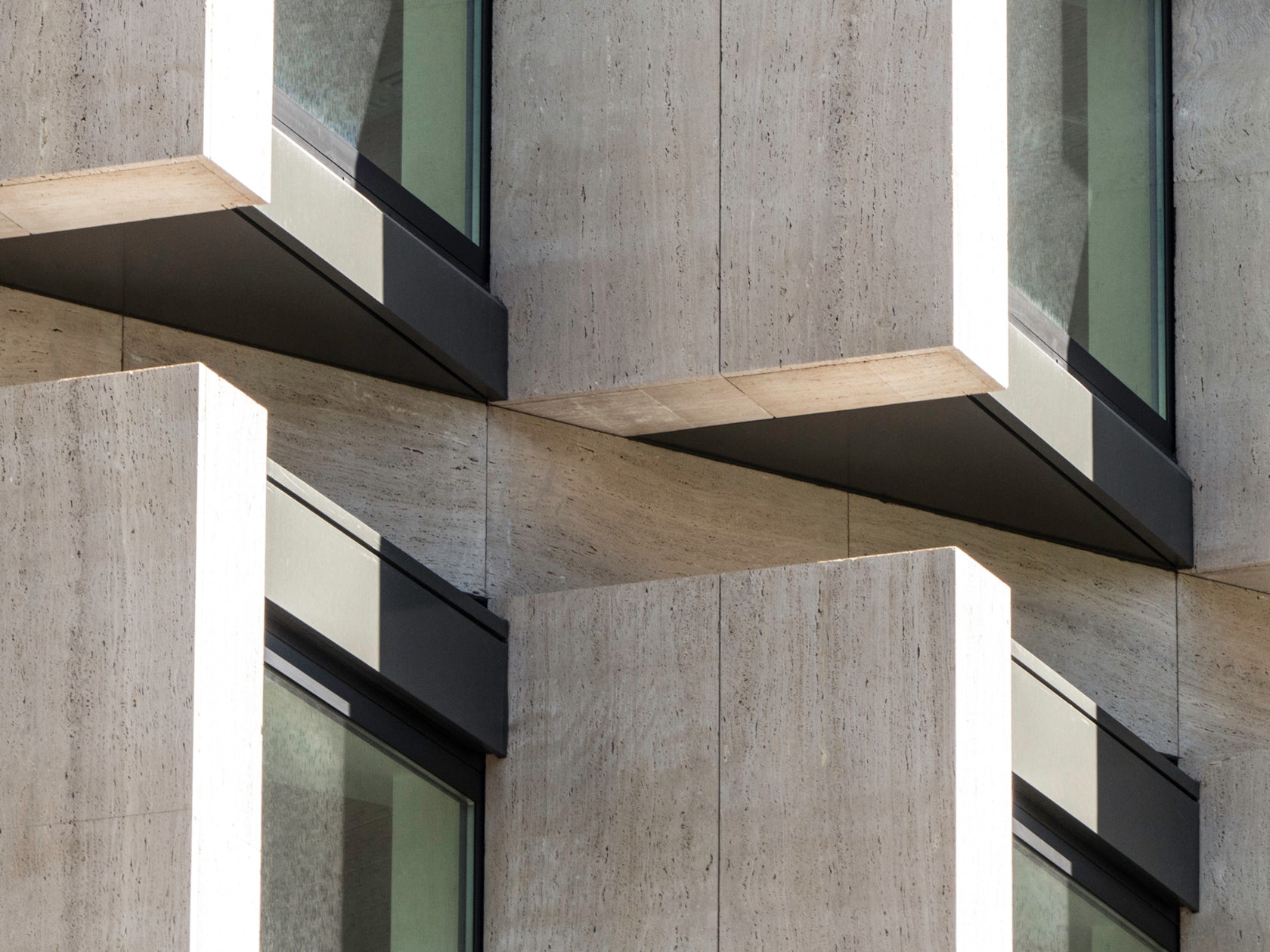
Why do we make windows flush with the wall? Is it habitual? The following six projects are reminiscent of a sawtooth roof, only flipped on its side:

© Zhu Siyu

© Xia Zhi

© Xia Zhi
Beijing Cidi Memo iTown by Atelier Liu Yuyang Architects, Beijing, China
Located on a previously isolated and forgotten site, Atelier Liu Yuyang Architects transformed a series of broken warehouses into “a secret garden in the urban desert.” Resembling a carriage or passing train, the offset window detailing gives the rough industrial mass a refined and textural touch. The design employs volcanic rock, grey and red brick, polycarbonate and glass, which offer varying levels of transparency.

© doublespace photography inc

© doublespace photography inc

© Batay-Csorba Architects
CORE Modern Homesby Batay-Csorba Architects, Toronto, Canada
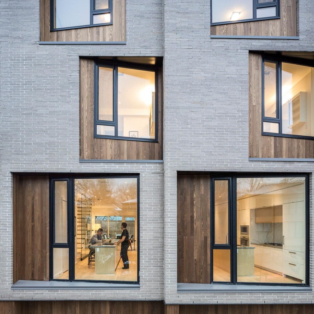
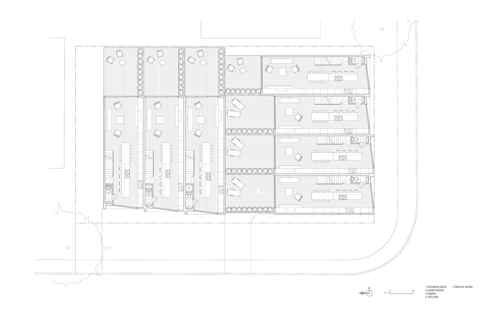
CORE Modern Homes is a 7-unit townhouse, which explores the potential of “spatially oriented apertures” that maximize light while creating a new element of visual interest. The street facing windows reference an inverted model of traditional bay windows, which are found in much of Toronto’s Victorian housing stock. By shifting their orientations, the architects created a highly animated and unique façade.

© RUIZ BARBARIN Architects

© RUIZ BARBARIN Architects

© RUIZ BARBARIN Architects
G17 _ HNA BUILDINGby RUIZ BARBARIN Architects, Madrid, Spain
Set beside an embellished historic building in Madrid,
The building lacked entrance, it was entered through the passage of vehicles of the garage; the commercial premises could not be touched, and so we decided to make a large threshold that would unify the store, the entrance and the garage. If we met visually “a great entrance”, the double height of the same and its retranqueo of the street would have the desired effect.
The entrance, although narrow between the premises and the garage, is spatially wide, with double height, acoustic ceilings of light wood, and walls and floor in white stone of Almeria, which together with the white backlit uglass wall, take care of build a “grand entrance”: space and light that leads us subtly to the heart of the building: to its core of elevators (a new one), and stairs (extended from the first floor to the basement and parking).
The heart of the building, the central core, qualifies with a large staircase, almost sculptural drawn in space with a continuous line of color – the only one – and complemented in the body of elevators: metallic.
On both sides of courtyards (in which the symmetry of one of them recovered) they pour both the staircase and the other the nucleus of toilets. It is an exchangeable core according to the needs of the tenant, depending on whether you want to receive it or not, if the whole or average plant is rented. These patios formerly filled with installation ducts are recovered as “light pits” for the interior parts of the offices.
These plants are distributed through a previous lobby that can be adapted to the needs of each tenant, and where the registers and controls of all its facilities are located. The natural light, the wink of its windows to the East, protecting itself from the West.

© C.F. Møller Architects

© C.F. Møller Architects

© C.F. Møller Architects
Villa Rypen by C.F. Møller Architects, Aarhus, Denmark
Villa Rypen is a single-story detached home situated on the edge of a forest in Aarhus. The rear of the house features a large window section arranged in a serrated formation. The dynamic shape creates an exquisite frame for the forest’s tall trees, while ensuring an inflow of light from several directions.

© LYCS Architecture

© LYCS Architecture

© LYCS Architecture
dave&bela’s Headquartersby LYCS Architecture, Hangzhou, China
LYCS Architecture converted a warehouse into a multi-purpose office building in order to accommodate the expanding business of dave&bella. While the conventional factory layout left the interior under-lit and poorly ventilated, LYCS aimed to capitalize on the linearity of the layout. Along the perimeter, full-height windows provide natural lighting and angled protruding window lighten the monolithic building mass.

© TenBerke

© TenBerke
21c Museum Hotel by Deborah Berke Partners, Bentonville, Ariz., United States
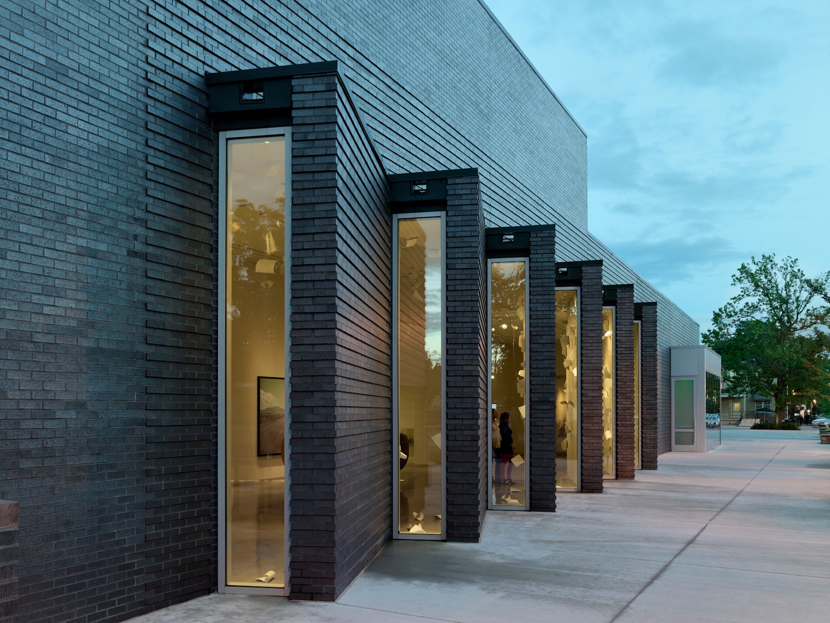
At 21c Museum Hotel, boutique hotel, art museum, a restaurant and ballroom ae all housed within this 12,000 square foot space. The formal composition and use of natural light varies between spaces, creating a unique setting for each function. For example, the lobby is illuminated by a clerestory, while the main gallery receives light through its sawtooth façade.
Architizer is thrilled to announce that the 2026 A+Product Awards is open for submissions! The clock is ticking — get your products in front of the AEC industry’s most renowned designers by submitting today.


