Architects: Showcase your projects and find the perfect materials for your next project through Architizer. Manufacturers: To connect with the world’s largest architecture firms, sign up now.
“Design is for everyone.”
Architect Evan Bronstein’s universal statement embodies the thinking behind developer TopHatch’s popular Concepts: Smarter Sketching app for iPhone, iPad and iPad Pro. The interface of this drawing software has been pared down to its basic elements, maximizing accessibility for beginners while retaining concealed layers of complexity for those that demand it. The app scooped a Tabby Award back in 2013, but makes our App of the Week column with its latest update this month.
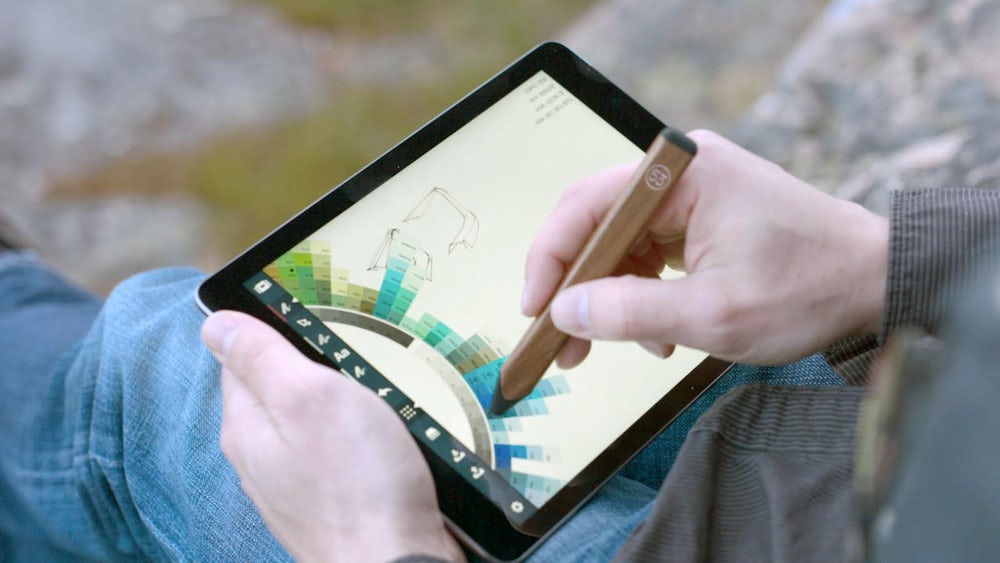
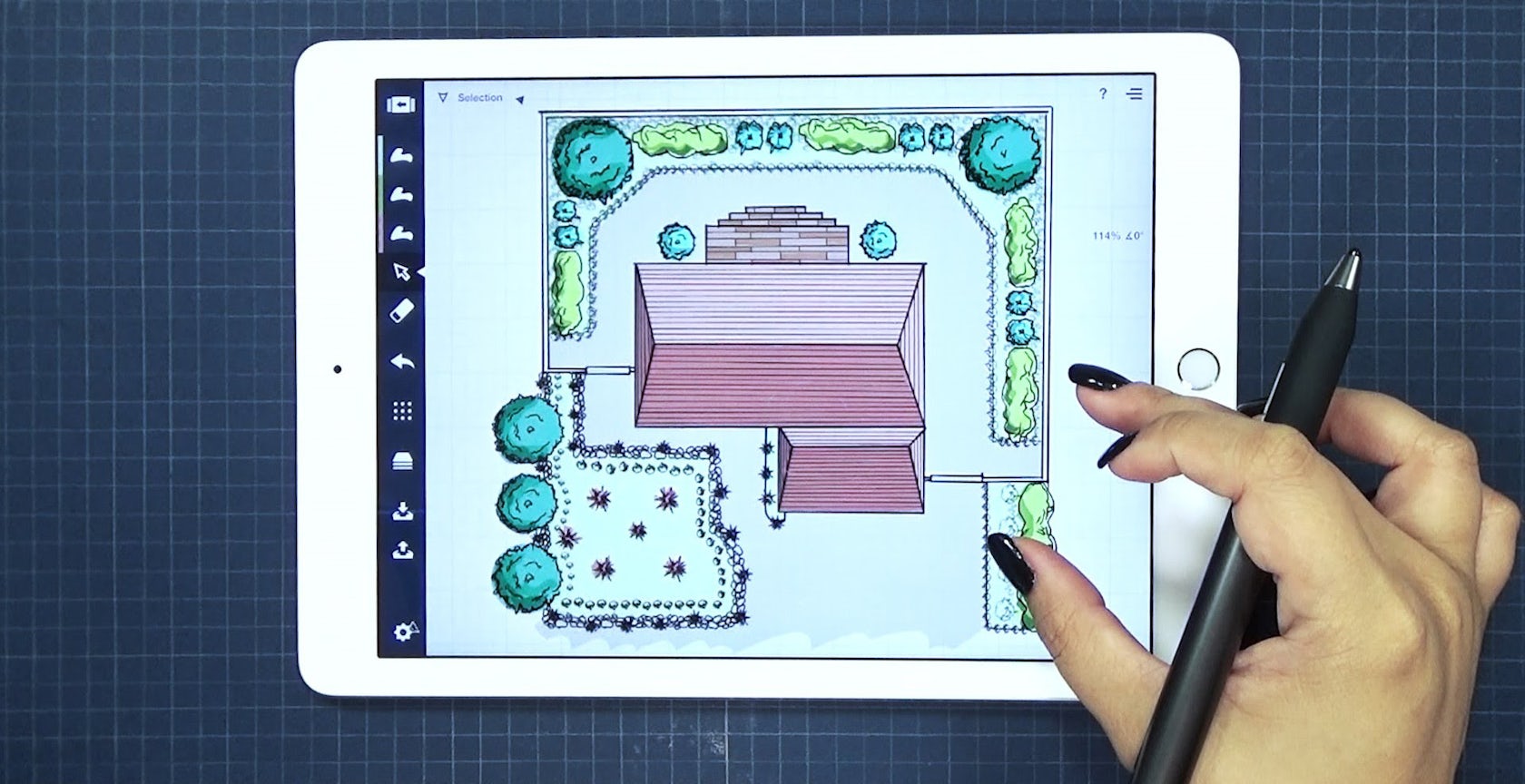
The application is described as a “visual thinking” tool that “combines the freedom and feel of artistic sketching with the precision, clarity and usefulness of CAD.” This is largely thanks to Concepts’ vector-based output, which allows for accurate creation and manipulation of marks upon the screen with a choice between soft, analog aesthetics and hard-edged drafting lines.
The virtual tools have been designed with the Apple Pencil in mind, but can also be used with other styluses, as the video above demonstrates. Above all, they are designed to be used instinctively: Pick a line weight, choose a brush tip or pen nib, select a color from the ingenious color-wheel revealed with a quick swipe from left to right and away you go.
Bronstein uses the app for design development work on the go, but has also found great value in the tool as an educational device for early architecture lessons at the Center of Creative Arts in St. Louis. “Concepts allows me to teach children in a new way,” explains Bronstein. “Sometimes we spend the entire session talking about how to use the tools of an architect, and we haven’t even touched on the fun stuff, which is — just let me draw …

Via FiftyThree
“Here, you can — with Concepts you can just design. It does all these other things for you in the background that you’re not even aware of it, but the beauty of it being in a virtual space means that we can always go back to it, long-press on it and adjust it. It’s that level of intuition that they have with the application; it just works with how they think.”
The simplicity of Concept’s interface and intuitive controls certainly makes it ideal for young designers, but the app has hidden depths that make it a viable tool for professionals, as well. “As one matures, so does the application evolve,” says Bronstein. “As a design professional, I have a variety of resources available to me in the design process. Concepts is a tool that helps bridge the gap between the initial inception of an idea and the production phase of a project … Concepts has fundamentally changed how I deliver my ideas.”

Via 1080
Strong words indeed — the type of endorsement that appears to back up the developer’s claim that the Concepts app is “the smartest sketchbook ever.” What do you think? Does the future of drawing lie here?
Find all your architectural inspiration through Architizer: Click here to sign up now. Are you a manufacturer looking to connect with architects? Click here.
Top image via 1080


