Brady Ernst is a licensed architect from Bozeman, Mont., and author of the popular blog Soapbox Architect, blending helpful guidance for budding architects with witty anecdotes about life in the profession.
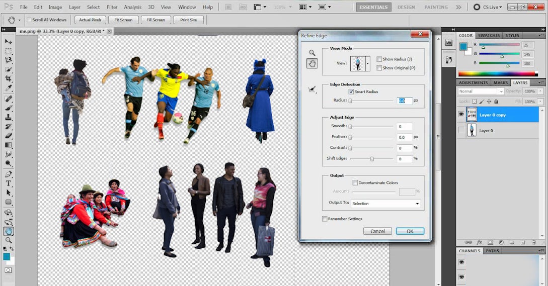
Google still says I’m in the millennial generation, but I sound like an old fuddy-duddy* when I reference my days in school. Nevertheless, back when I was in school, we had to tediously Photoshop our own scale figures.
Humans in architectural renderings are essential to show the scale, activity and usability of spaces. Depending on the graphic intent of renderings, different scale figures could be used. Again, back when I was in school, many people would use “ghosted” figures of people. However, with advanced photo-realistic renderings, mystical entities wandering around your images often made your museum project appear to be an enchanted mausoleum.
Therefore, I would tediously begin each semester photographing people on the street, sitting, hurriedly walking to class, leisurely leaving class while talking on their cell phone … or hurriedly leaving class while pretending to talk on their cell phone just so they don’t have to interact with other students on campus.
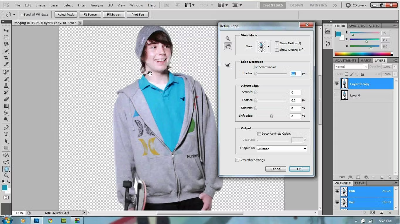
Via YouTube
I would also scour the internet for non-wedding photographers who published high-quality images I could download and Photoshop to be used as scale figures. However, Photoshopping backgrounds out of images took a lot of time. You have to use a masking region and delicately separate the person’s hair from the background, maybe even redrawing in hair follicles, while delicately feathering the edges to ensure the person would seamlessly integrate into your new renderings.
Every semester usually began with these high ambitions, but I usually would only get one human scale figure Photoshopped, typically a cheesy high-school graduation picture of a kid posing in front of white background with an argyle sweater-vest because the background was easiest to crop out. But then my museum project’s rendering would have an 18-year-old lying on his side, with his arm propping up his smiling head, in the middle of the concrete floor for no apparent reason.
One would assume that, with the advancement of photo-realistic renderings in architectural illustrations, the need for scale figures would have been fulfilled by some company on the internet. For years, there were millions of animated GIFs and dozens of photo stock image websites but still no reliable resource that had the background removed from images. Then, one day, there was a shared folder with dozens of scale figure images. Soon, everyone within the confines of Cheever Hall began using these scale figures.
The only problem was that these humans appeared to have been photographed in the 1980s. I don’t know if someone had scanned in old slides of people with leg warmers and large hoop earrings, or if they used the first digital camera with their Macintosh II to create the images, but all of the people looked like this:

Most of these scale figures were suitable if I were designing an outdated Postmodern building. However, I live in Montana, where all of the school site visits were in the cold-ass winter, with snow. The girl with shorts and her Starter jacket wrapped around her waist was even more out of context than the smiling high school graduation kid lying in the snow; at least he was wearing an argyle sweater-vest. All of the people in the shared folder were photographed during the summer. Therefore, every student’s renderings all included the only guy wearing a jacket. Yes, this guy:

Fortunately, since my days in school, several invaluable resources have been created to obtain free scale figures for architectural renderings without the use of file sharing.
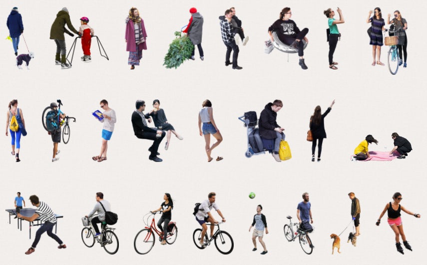
Skalgubbar
Skalgubbar was created by Teodor Javanaud Emdén from Sweden. Google translates Skalgubbar to mean Shell Figures in English. However, instead of a website filled with crustaceans and Jonathan (the world’s oldest tortoise), Skalgubbar was the first and best website with quality cutout images. After experiencing the same frustrations I had with finding images of people for architectural renderings, Teodor began his own website with images of himself and his friends.
It’s actually incredible how many large architectural offices use Skalgubbar images within their renderings. Teodor is currently working for BIG, and they use a surprisingly large number of Teodor’s images. I imagine Bjarke Ingels was like, “Let’s not get another lawsuit for illegally using unlicensed copies of software and just hire Teodor so we can use all of his images without any chance of repercussion.”
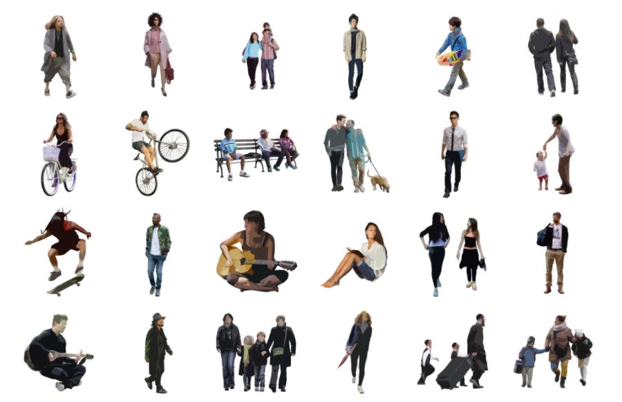
Nonscandinavia
Nonscandinavia is a completely not-for-profit project out of the Columbia University GSAPP student group A-Frame. Nonscandinavia is a free, open-source, online database of PNG images dedicated to increasing diversity in architectural representation and is widely used within GSAPP. The project was framed as a counterpart to Skalgubbar, after A-Frame grew tired of seeing student work sited in the South Bronx populated by wealthy young people entirely unreflective of the area’s true demographics.
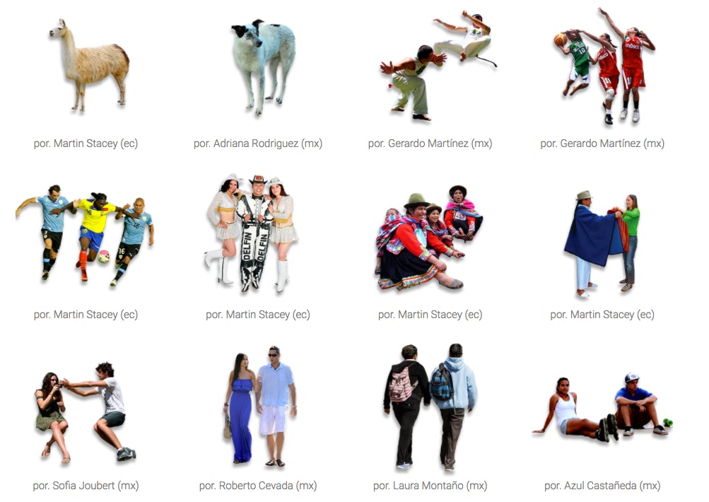
Escalatina
If your project is based in South or Central America, check out the great images at escalatina. Equally, if you want images of a Latin American parade of people in lucha libre costumes for your South American Fusion Restaurant, then this will be an invaluable resource.
This website is the Latin American counterpoint to Teodor’s fun Swedish imagery. Their cutout Photoshop skills are consistently quite good, and who doesn’t want an alpaca in their renderings?
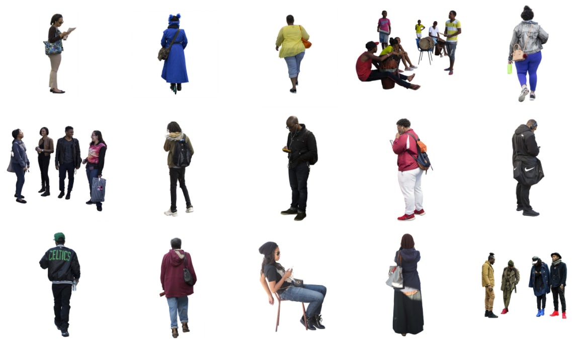
Just Nøt the Same
Another great resource that represents more diversity by acknowledging the minority population.†
Urban environments — indeed, all environments — need to accurately represent the demographic that the architecture inhabits. Therefore, no Teodor, no ping-pong tables, no people holding wine glasses with their pinky fingers extended and no people playing ping-pong while drinking wine.

Kaleidoscope
Kaleidoscope claims to “challenge the dominance of gender normativity, ableism and race blindness in architectural drawings by diversifying the population of represented peoples in renderings.”
I don’t know what that means, but I’m assuming they could have just said, “Images without Teodor.”
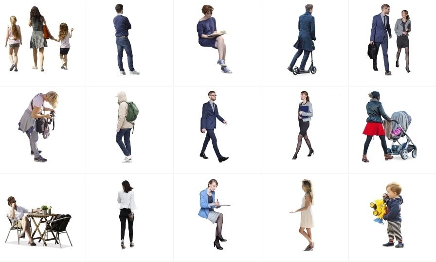
MrCutout.com
A couple Polish dudes‡ created MrCutout.com. You have to register on the site but can freely download (with a daily limit) most images. All of the other cutout sites listed are completely free, as they probably don’t want to infringe upon copyright laws by not obtaining permission to use street people in renderings. I’m sure this website is completely legal, but then again LimeWire and BitTorrents might still exist in the country of Poland.
And if you want one more cutout person — you can download this crappy-resolution image of me squinting. Free for both both student and commercial usage without restrictions.

This post first appeared on Soapbox Architect. For more free resources for your architectural visualizations, check out these posts:
More Than 4,000 High-Resolution Material Textures
12 Common Construction Details Fully Modeled in SketchUp
* Yes, I realize that is a term used by people who suck on Werther’s® Original Butterscotch Candies and leave their cup of teeth around the house.
† Or the population Donald Trump refers to as “living in the inner city”
‡Or if you speak Polish, a couple ‘kolesie’
