Do you have an outstanding image that tells a compelling architectural story? The 2026 Vision Awards has a range of categories, from hyperrealistic or artistic renderings to expressive drawings or hybrid digital mediums. Start your entry >
Libraries are defined by a personal and collective exchange. As cornerstones of civic life, these buildings promote understanding and celebrate curiosity. Today, libraries are rapidly evolving to meet modern technological and collective demands as they anticipate future trends. Combining media and community space, these projects help build knowledge while advocating new ideas. Balancing circulation and gathering areas with storage and administration rooms, library design embraces interaction while also providing private space for reflection.
With nearly 53 million items, New York’s public library system is the fourth largest in the world. Showcasing a diverse range of architecture across New York City, the NYPL system is independently managed as a public lending library through branches in The Bronx, Manhattan and Staten Island. The following collection explores New York’s library designs, both public and private, throughout its boroughs. Each project explores New York’s cultural life through library design.
Stavros Niarchos Foundation Library
By Mecanoo, Manhattan, New York
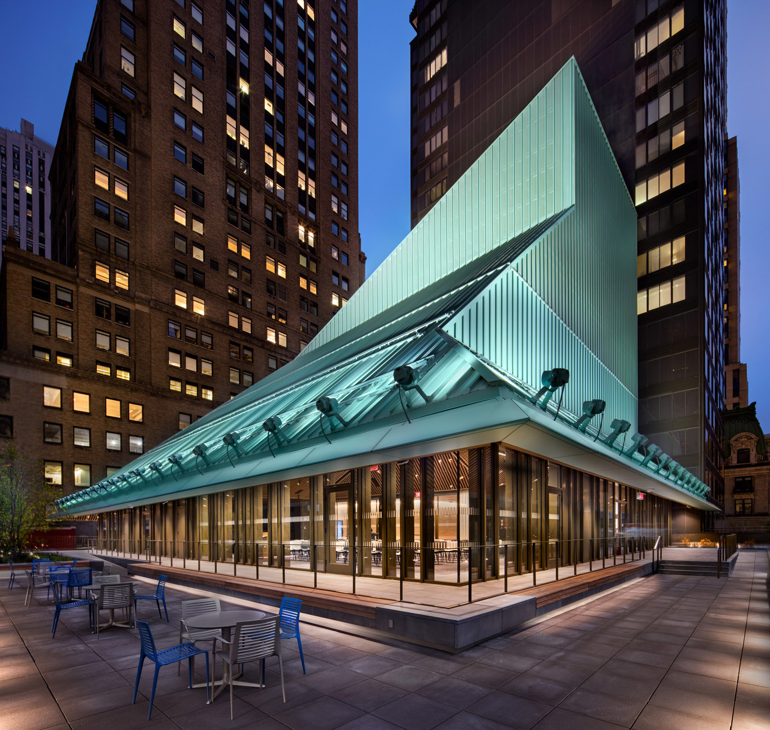
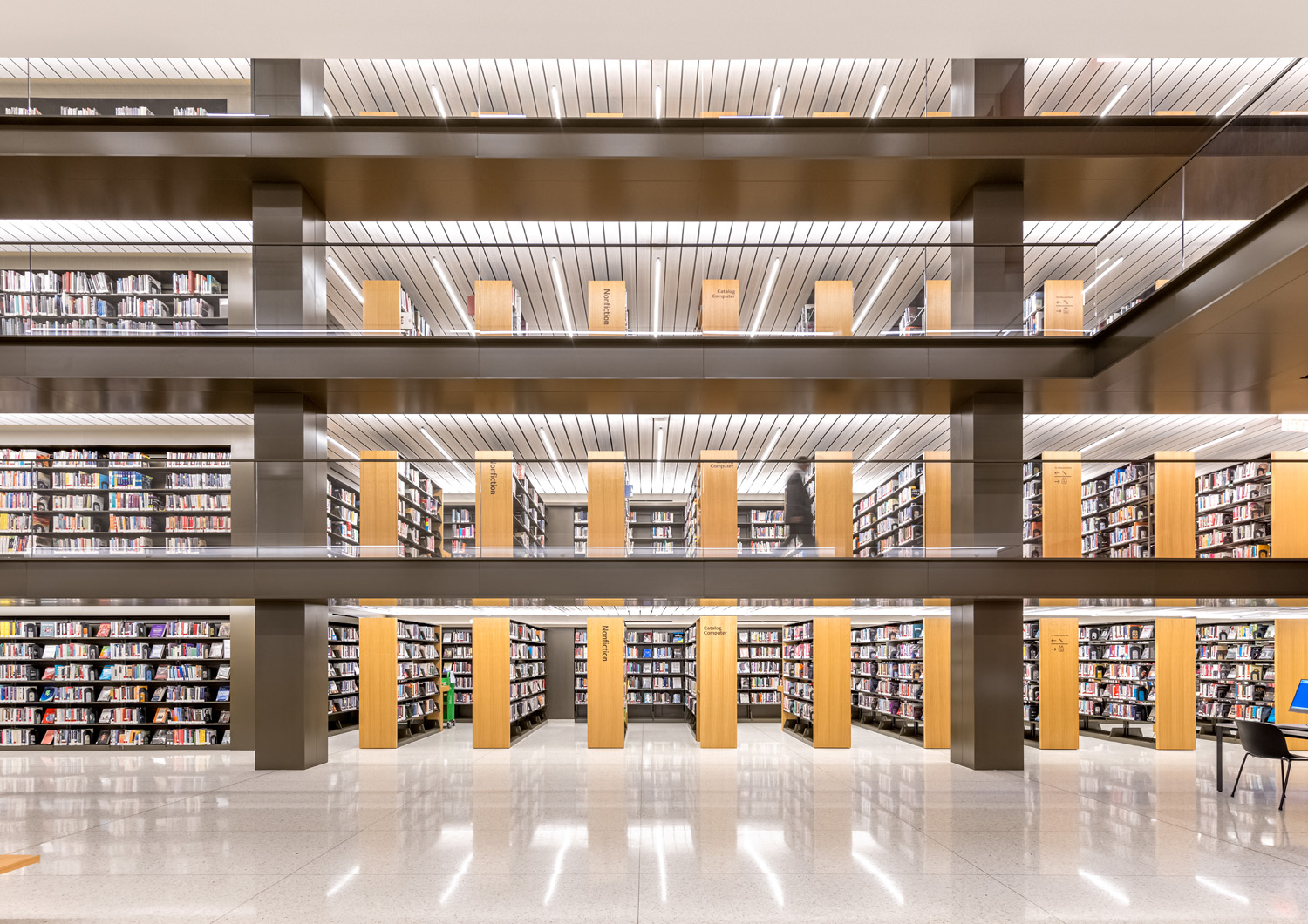 Designed to be a new-generation library for all New Yorkers, SNFL was made with special facilities for young users, adult learning and business. It was created as a contemporary complement to NYPL’s Stephen A. Schwarzman Building (SASB), located across Fifth Avenue. SNFL has an annual circulation of two million items, and this volume generates challenges in access, organization and storage. The design solution offers more space, more books, more seats, and lower shelves.
The heart of the library is the Long Room, a new space that truly brings the idea of a library into the old structure, which was originally designed as a department store. This dramatic linear atrium separates three floors of flexible, day-lit reading areas on one side and five levels of book stacks on the other, a creative and efficient solution to balancing the need for a browsable collection and the desire for more public reading room space.
Brooklyn Public Library Central Branch Renovation
By Toshiko Mori Architect, Brooklyn, New York
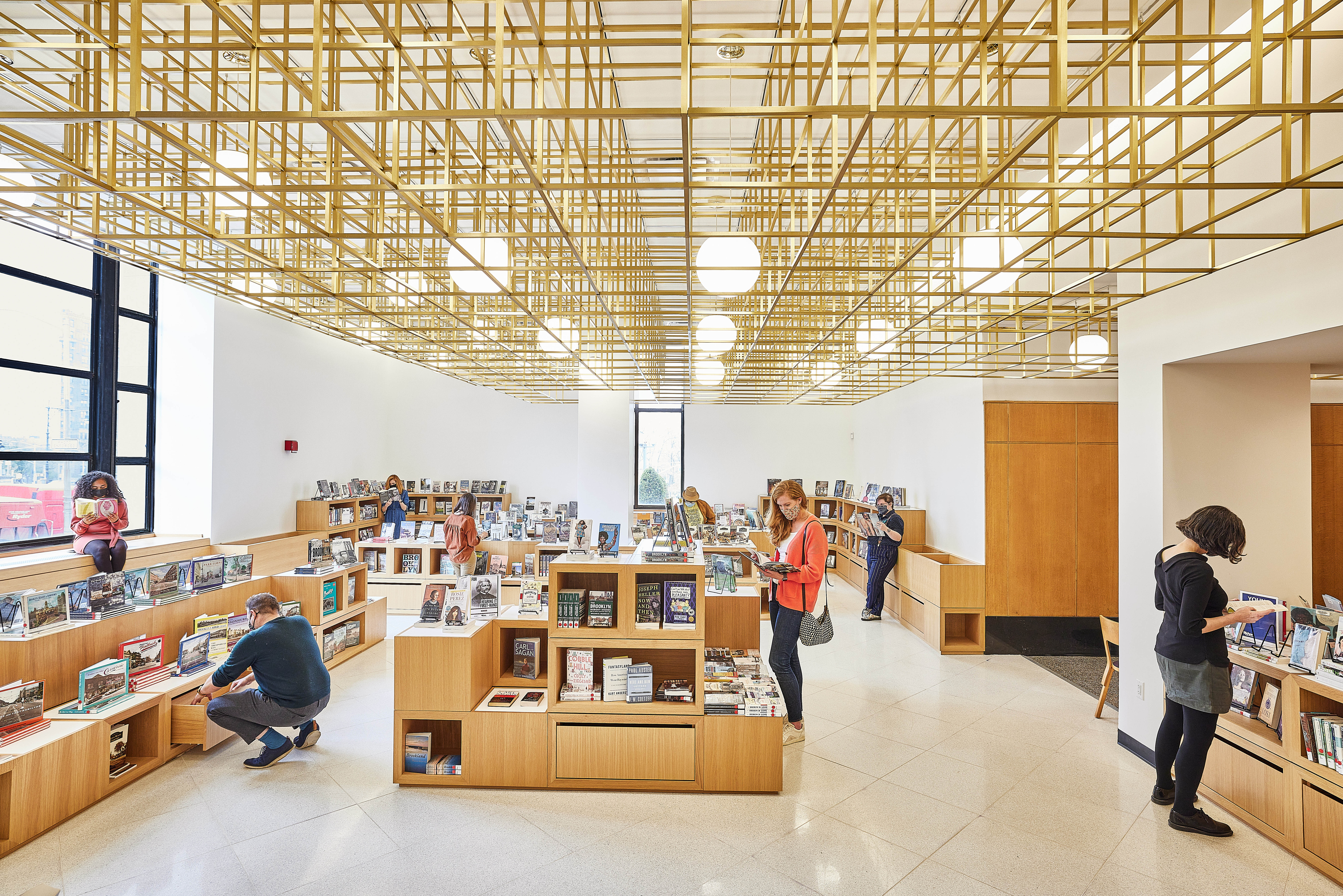
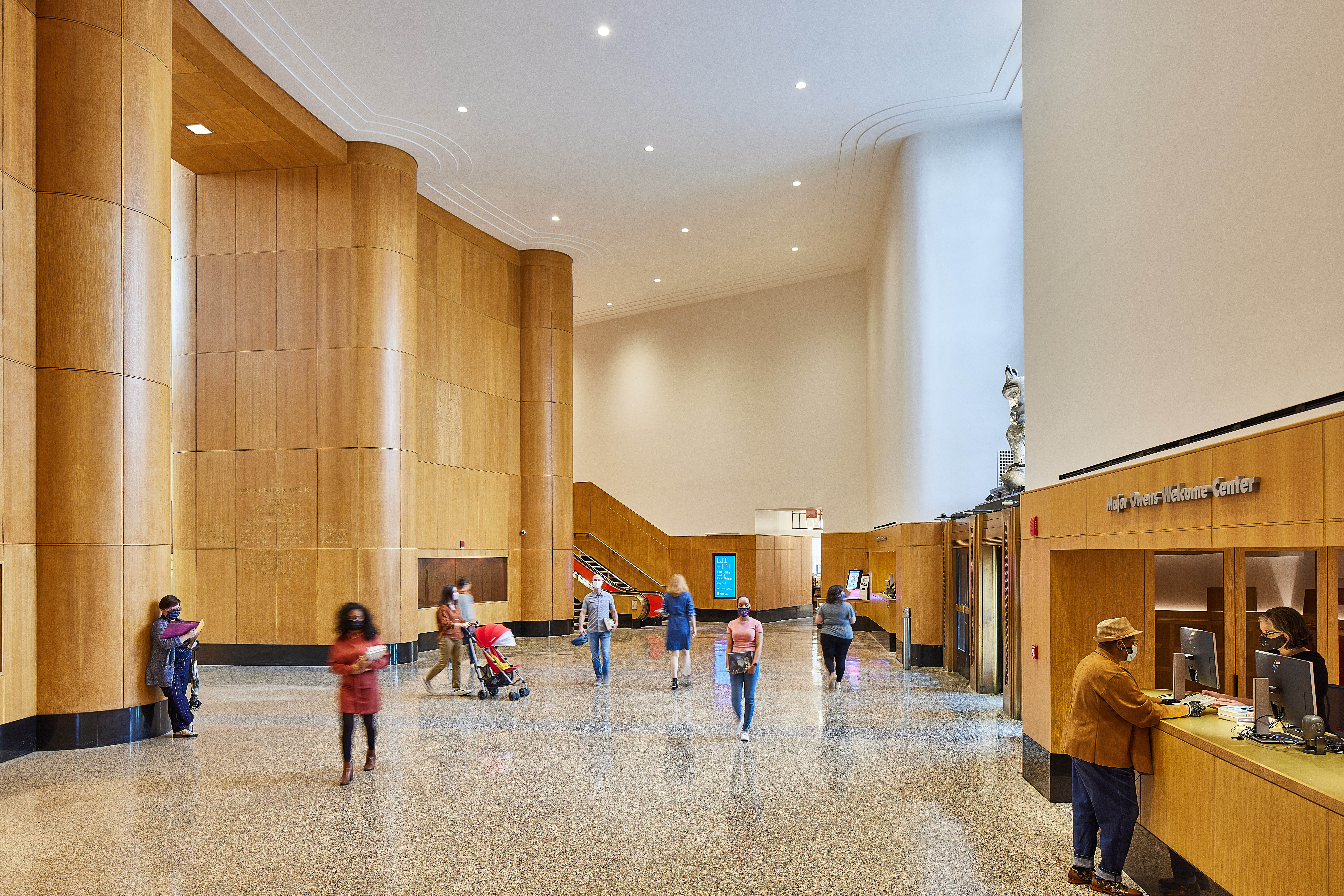 To study the complexity of the Central Branch of the Brooklyn Public Library, Toshiko Mori Architect developed a unique methodology that integrated library administrators, staff and users into the master planning process. Initial workshops, site visits and interviews were distilled into system-level visualizations.
The landmarked 1941 building is located at Grand Army Plaza in Brooklyn, and since 2009 Toshiko Mori has served as planner and architect for the Central Branch, coordinating a series of key capital projects. These include a strategic re-design of the materials handling system, a contemporary co-working and technology center called the Info Commons, and a new youth services center designed around the growing needs of the borough’s teenage community.
NYU Bobst Library Pixel Veil
By Joel Sanders Architect, Manhattan, New York
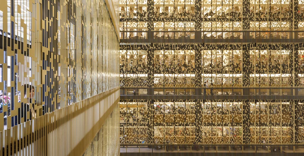
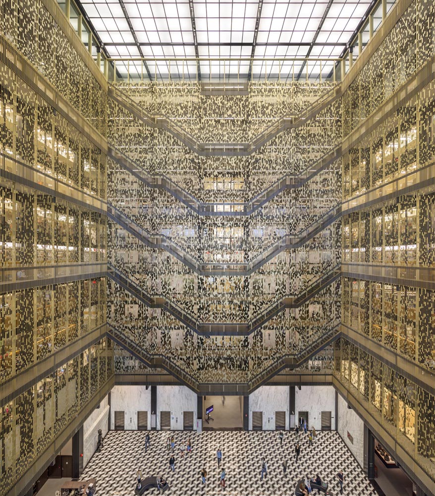 Working on the NYU Bobst Library, a key consideration was solving practical safety issues in the atrium. It represented an opportunity to enhance the quality, character and identity of this important NYU institution. The team’s design is guided by the dual objective of creating an attractive security membrane that is secure yet visually porous while at the same time aesthetically compatible with the existing atrium designed by Philip Johnson in 1968.
The Pixel Veil is composed of two layered components —aluminum panels are mechanically attached to vertical aluminum structural supports. The components are painted bronze to match the existing bronze handrail. Each laser-cut panel is inscribed with a perforated pattern–the Pixel Matrix—composed using an underlying 4” grid whose spacing aligns with the vertical stanchions of the original bronze railings while also complying with ADA building codes.
Queens Central Library, Children’s Library Discovery Center
By 1100 Architect, Queens, New York
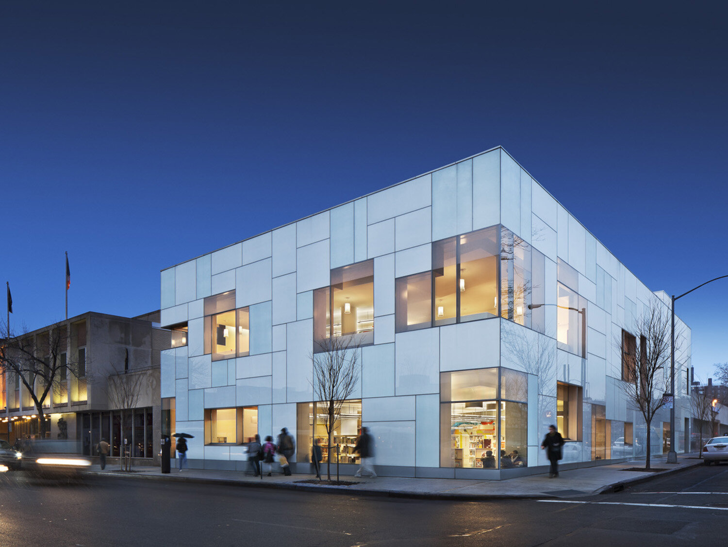
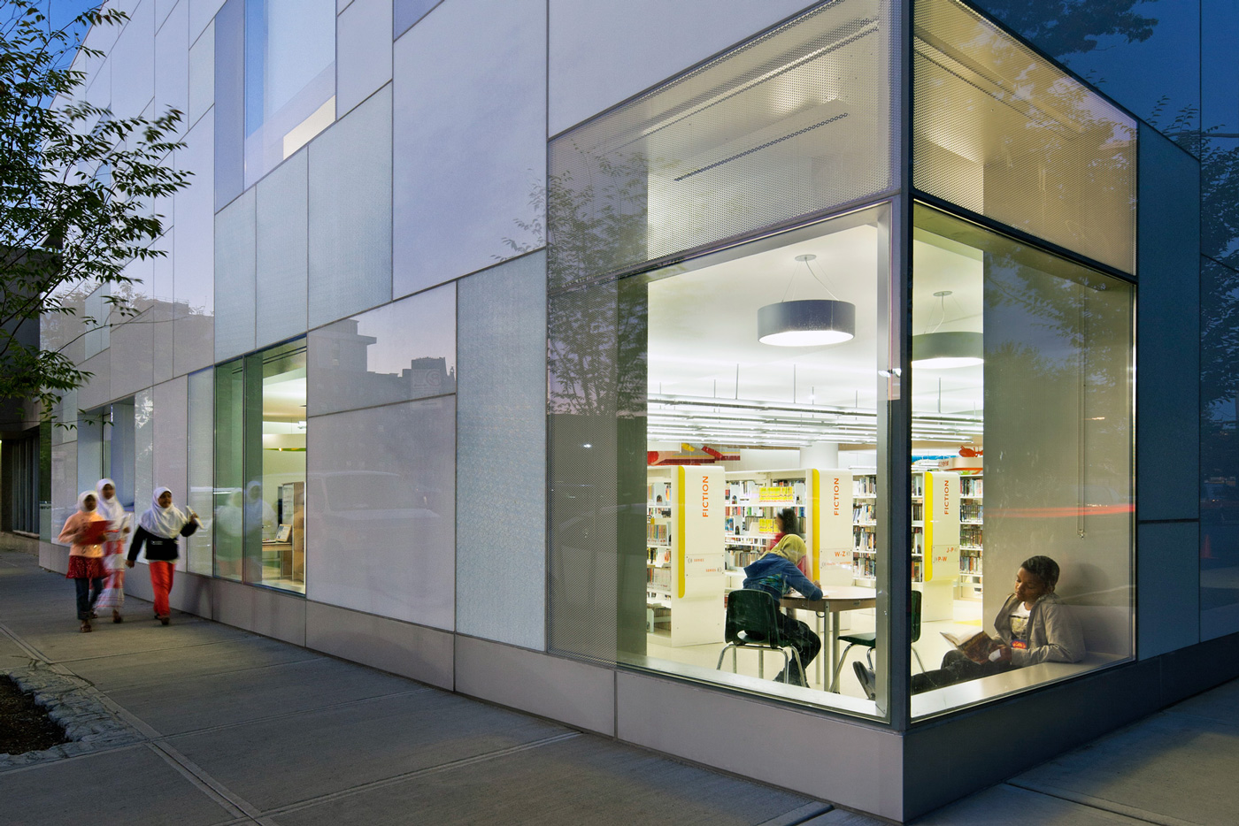 The design and construction of the Children’s Library Discovery Center (CLDC) is the implementation of one of the first phases of 1100 Architect’s master plan for the renovation and modernization of the sprawling Queens Central Library. The CLDC is a hulking two-story addition adjacent to the existing Central Library building. The glowing glass façade will be a beacon in the surrounding community and is elemental in increasing the library’s visibility and reintroducing it as a central cultural and social destination.
Situated on a corner, the new addition takes advantage of its exposure to the street, creating a dialogue between the interior and exterior through the use of large transparent windows that allow an abundance of natural light to enter. The perimeter wall has been thickened to incorporate quiet reading nooks and intimate social spaces.
UNI (Urban Neighborhood Institution)
By Höweler + Yoon Architecture LLP, New York, New York
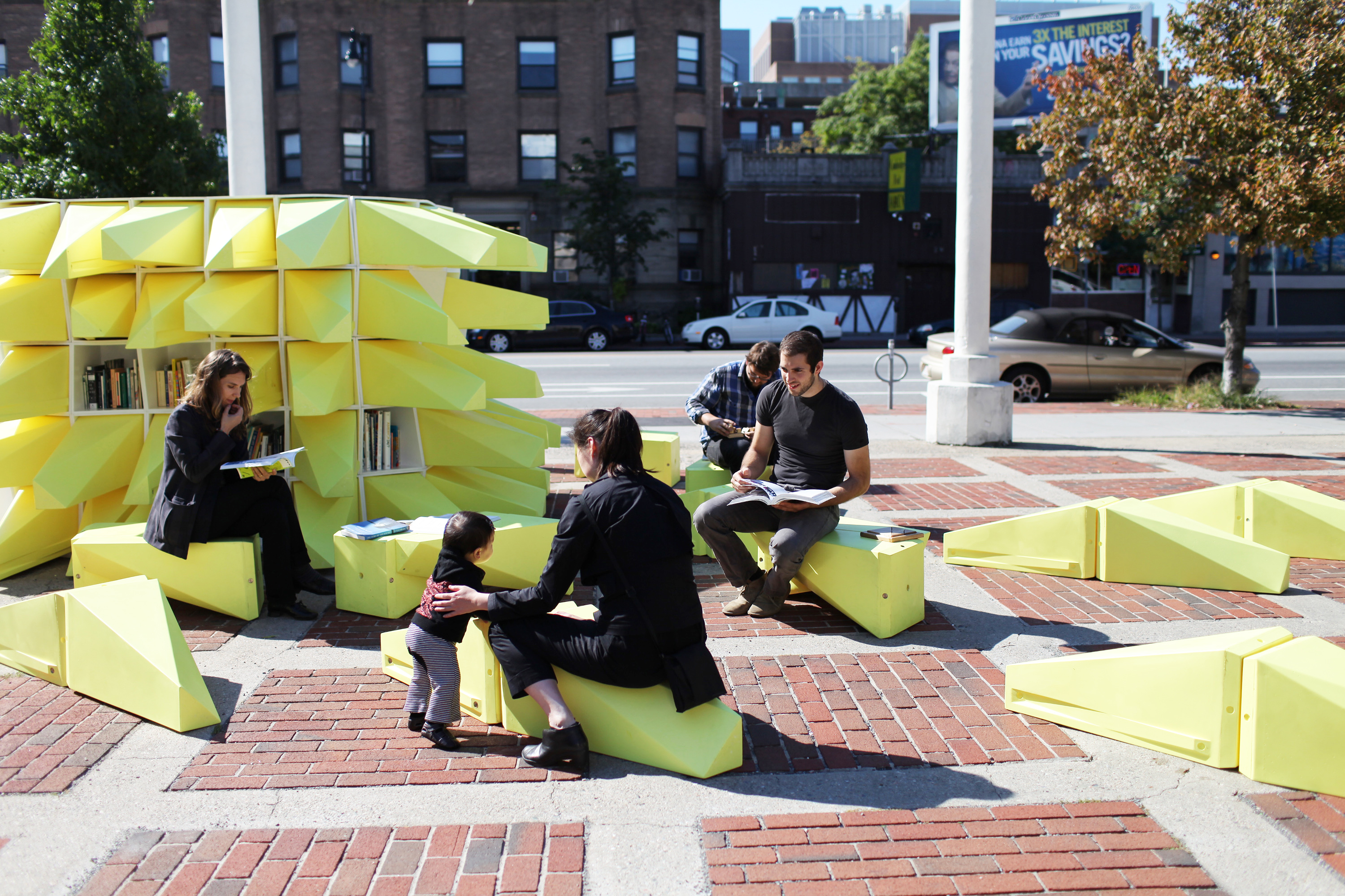
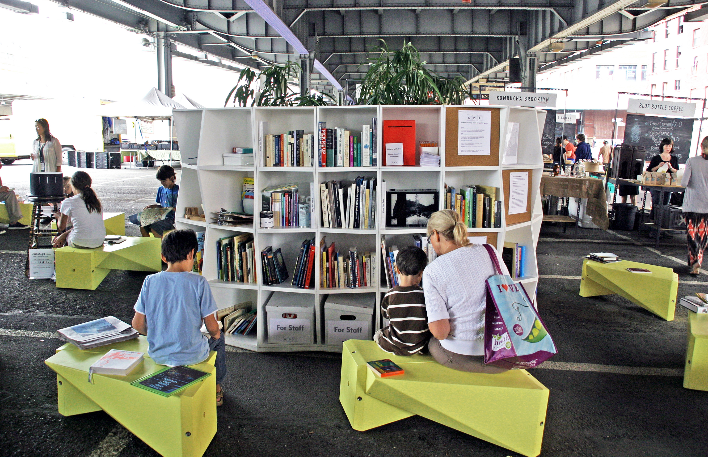 Höweler + Yoon made UNI (urban neighborhood institution) as an open-air reading room developed for The Uni Project, a nonprofit with the ambition to create a mobile, reconfigurable, public institution in the city. Designed to take up temporary residency in neighborhoods and communities, the UNI can accommodate vastly different populations, support a variety of social and urban agendas, as well as provide a variety of spaces for public lectures, workshops and screenings.
Being portable and flexible in both form and situation, the UNI temporarily transforms almost any available urban space, in particular ones that don’t have access to amenities of traditional institutions like libraries and community centers. The structure consists of 144 repetitive, open-faced cubes that aggregate to form various heights and configurations. Identical in dimension, each cube can house approximately ten to fifteen books.
Renovation and Expansion of the Morgan Library
By Renzo Piano Building Workshop, Manhattan, New York
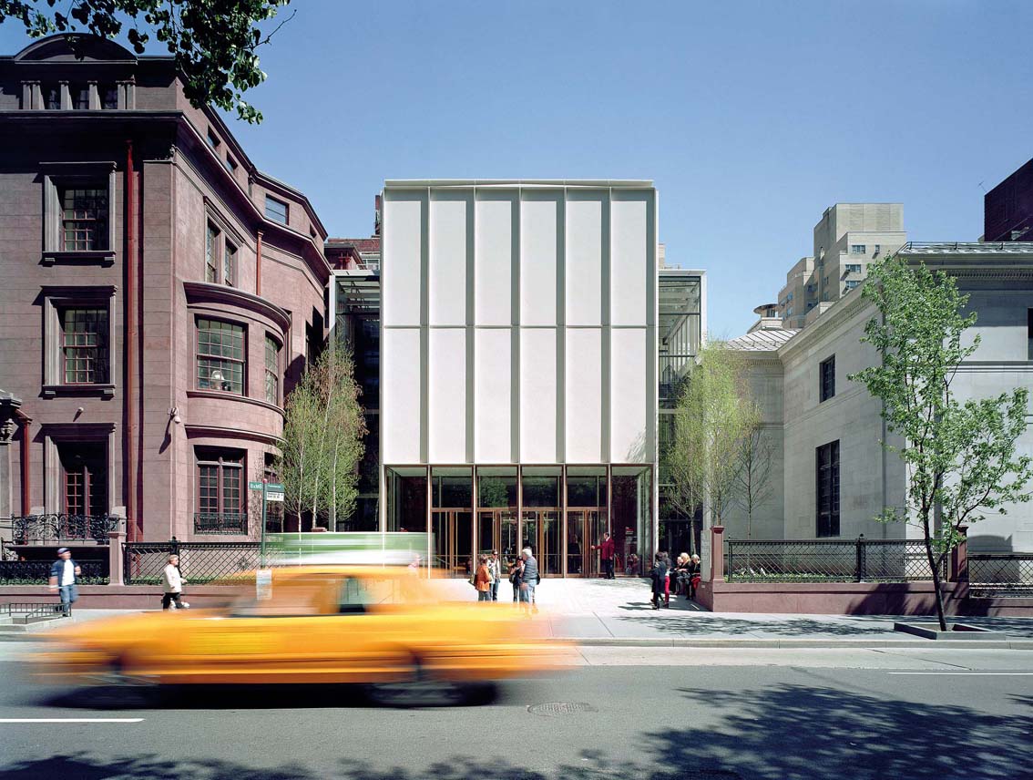
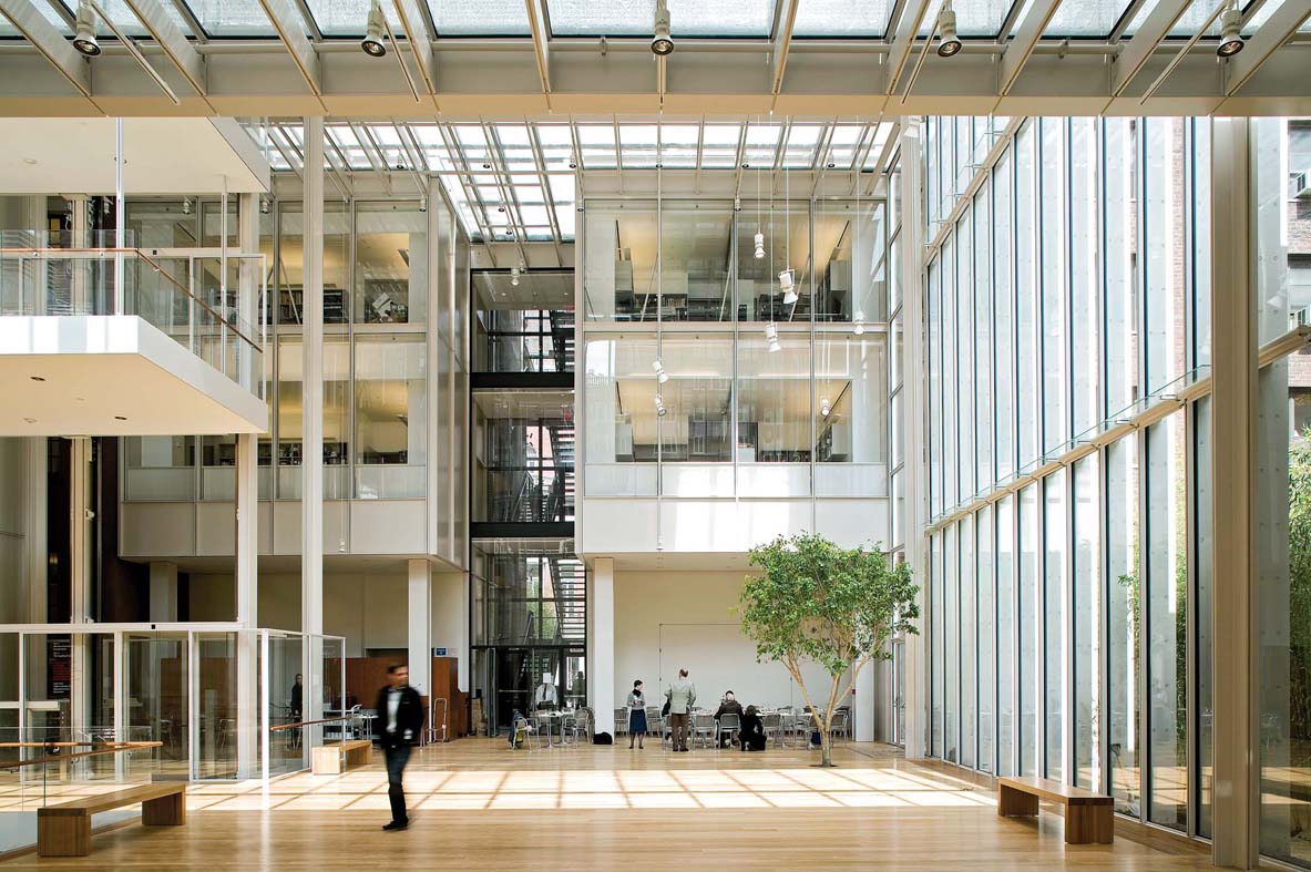 RPBW designed three new pavilions connected to the historic buildings, leaving a large open “plaza” at the center of the Morgan complex that could be used for public functions and as a metaphorical breathing space for visitors. The three historic buildings, the plaza and the new pavilions meet under a steel and glass transparent roof. Located in Manhattan, the challenge of the seemly solid physical barrier of the dense urban fabric had to be overcome.
By reversing the idea of building upwards, RPBW decided to dig downwards into the hard rock to build an underground vault in which to house the library’s rare book collection. With precision, they inserted new steel and glass units in and amongst the existing buildings. The Morgan Library required new public spaces, safe and organized storage areas for the collection itself, an auditorium for chamber music and a new reading room — all whilst preserving the Library’s original buildings.
New York Public Library – 53rd St Branch
By Andrea Steele Architecture and TEN Arquitectos, Manhattan, New York
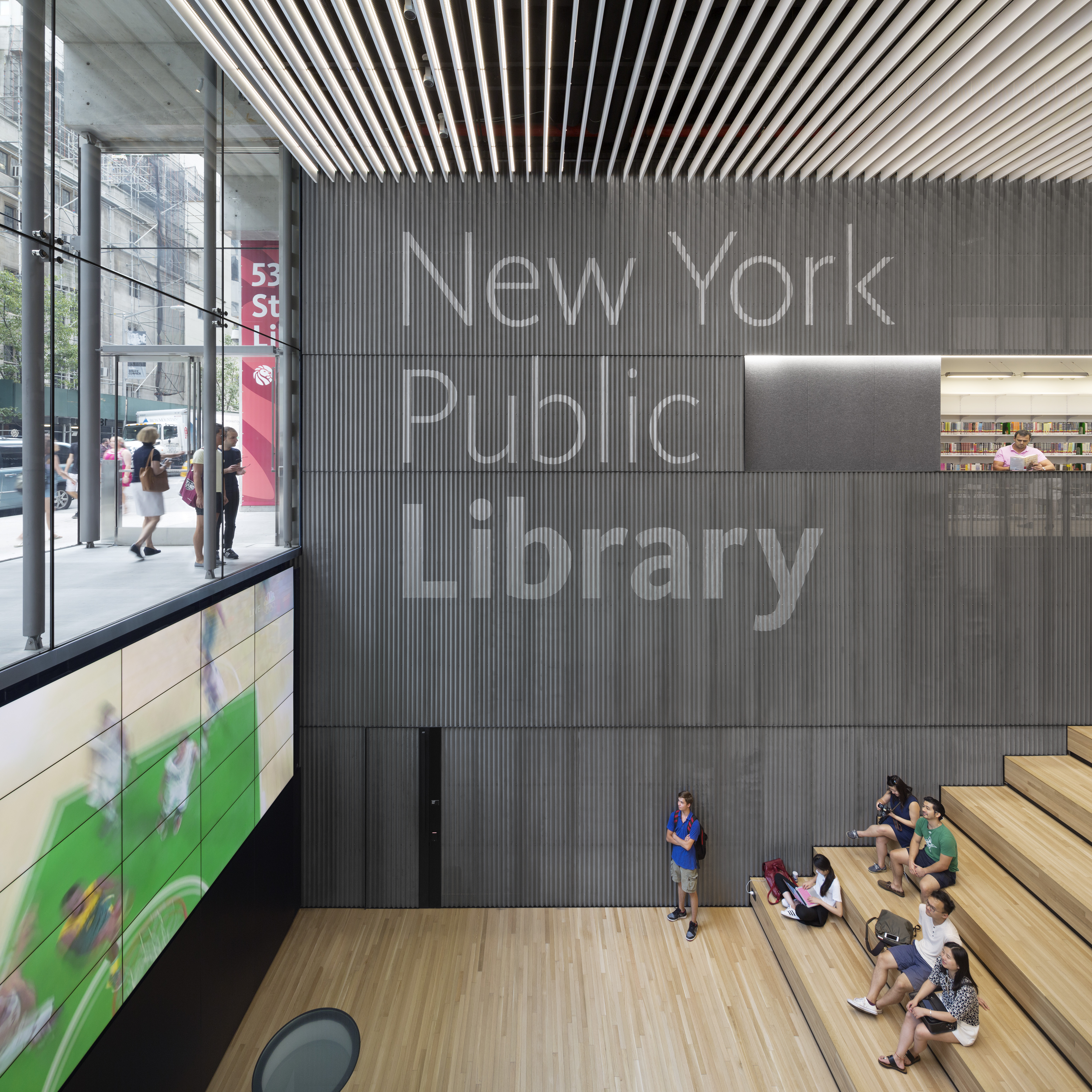
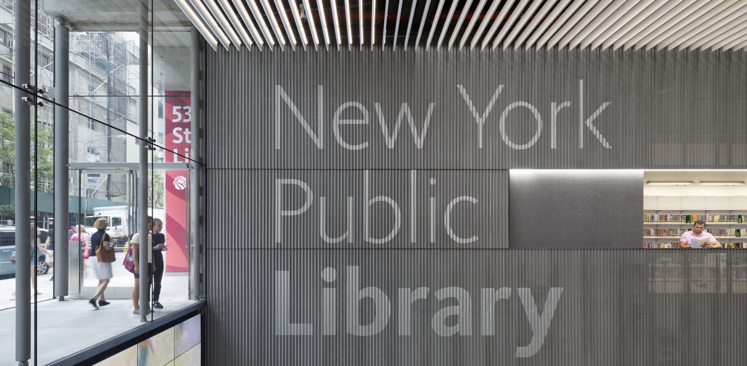
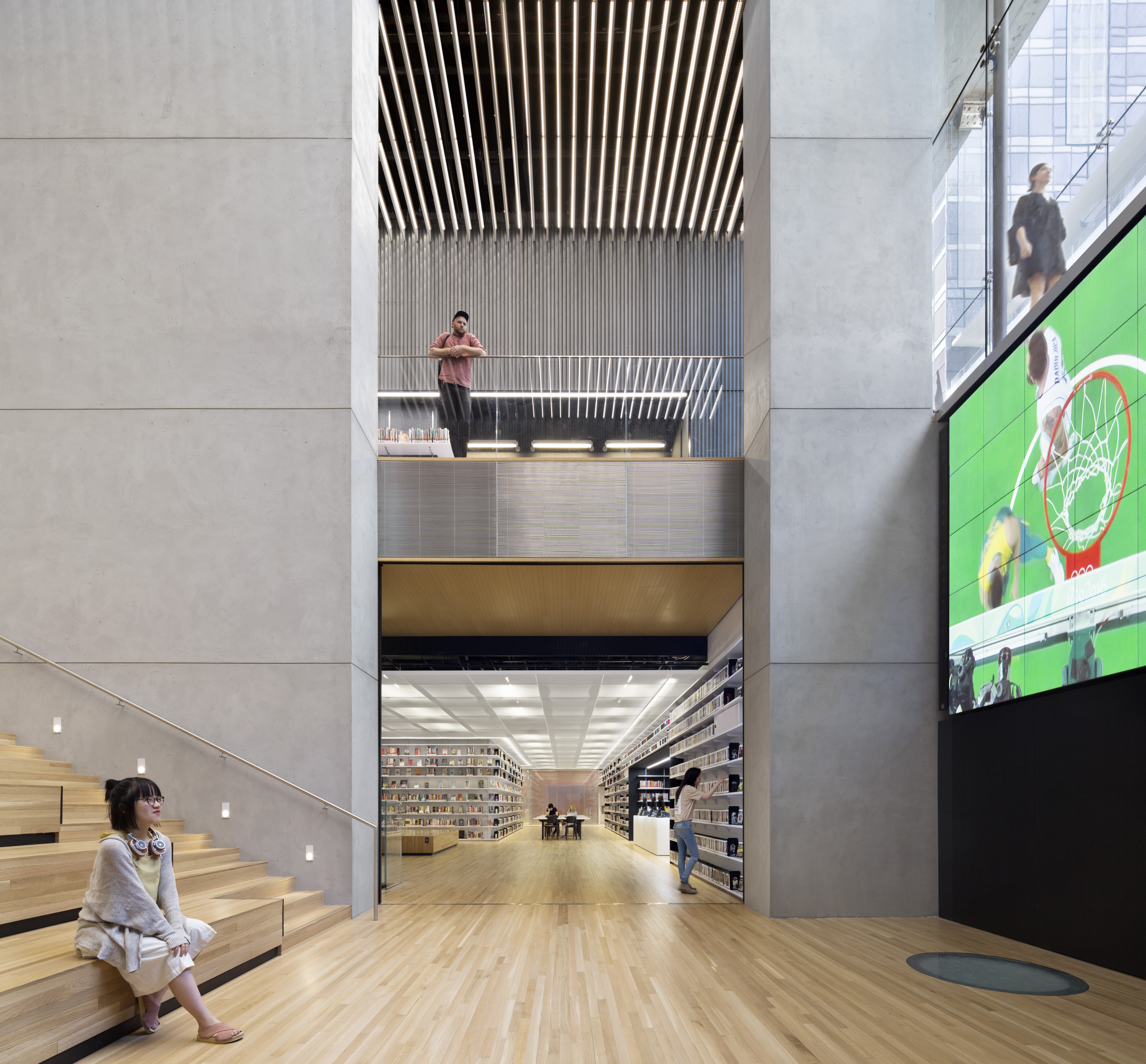 From the street entrance, passersby see the myriad programs taking place within this library at different levels. Designed by TEN Arquitectos/Enrique Norten with Andrea Steele Architecture/Andrea Steele, in a neighborhood dense with high-end retail, luxury residences, and blue-chip institutions and offices, this 28,000-square-foot branch of the New York Public Library (NYPL) fulfills a much-needed role as an accessible space and a touchstone for the local community and visiting tourists.
To activate the mostly below-grade space and transform it into an inviting, open, and light-filled civic landscape, the design called for a glass facade that virtually disappears to reveal a dynamic internal topography. Inside, the innovative use of modest materials creates a rich palette of texture and expression for the three floors, which are openly connected to bring light and views to the deepest corners of the plan.
Do you have an outstanding image that tells a compelling architectural story? The 2026 Vision Awards has a range of categories, from hyperrealistic or artistic renderings to expressive drawings or hybrid digital mediums. Start your entry >
 New York Public Library - 53rd St Branch
  NYU Bobst Library Pixel Veil
  Queens Central Library, Children's Library Discovery Center
  Renovation and Expansion of the Morgan Library
  The New York Public Library, Battery Park City