
Ronen Bekerman is an industry leader in Architectural Visualization who hosts in-depth tutorials on his specialist blog. Architizer is pleased to present a selection of these guides written by some of the world’s best rendering artists.
Atelier Crilo is an interdisciplinary studio focused on architecture, co-founded and directed by Cristian Farinella and Lorena Greco. They develop unique solutions to design issues and provide a large range of services for design development and 3D visualization. Following on from our features on creating renderings using photographic principles and the challenge of achieving real-time photorealism, Atelier Crilo’s guide looks at a more stylized, illustrative approach to architectural visualization, where traditional art meets the digital age.
The firm posted some architectural watercolor visuals back in 2014 that immediately captured my eye. I like this approach in general, and their use of AutoCAD layers in this case was especially interesting. This is a traditional technique revisited with digital tools to produce architectural illustrations that have a watercolor feel as well as the precision of CAD drawing. Read on for Atelier Crilo’s account of their creative process. Enjoy this one!
Intro
We have been following Ronen’s blog for a long time now, and we admire the predominant quality achieved via 3D in the many posts published, even the ones by beginners. Just a few years ago it was a completely different story. There were very few that showcased really high levels of competence, but today — without underestimating the considerable effort required — you can get really good results following tutorials and making-of guides on the web. This would not be possible without a place like this blog, and we are very proud to offer our own contribution to it.
Why Watercolors?
We began focusing on watercolors because of the desire to experiment with new representation techniques that come from other areas such as art, graphic design and comics, trying to cross and combine other disciplines with architectural visualization. This is the case all the time — working as architects and designers but also as graphic designers and illustrators. It’s really helpful finding inspirations elsewhere.
In this way, we rediscovered the watercolor where you least expect it — in the world of Italian comics that, today, seems to be going through a rebirth.
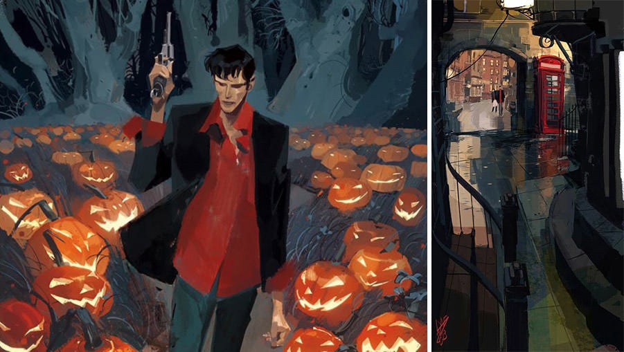
Dylan Dog with the forest as background (left) and the view of a narrow street in London (right) made with a few bold strokes, based on strong use of color, without any outline to the contours. The choice of the camera as well as the forced perspective given lends a strong dynamic sense to the two scenes.
If we look at both graphic-novel and popular comics, it is possible to find great writers and artists like Gipi (Gian Alfonso Pacinotti), but most significantly, we are witnessing the rebirth of Dylan Dog with the new editorial line by Roberto Recchioni and with talented comic artists such as Gigi Cavenago. Architecture and comics are disciplines closely related, and the two positions — comic artist and architect — may be complementary even though they technically make drawings with very different goals.
Looking at the depth of the cartoon drawing as well as at the expressive use of line and color can be a source of deep inspiration, complementing the technical knowledge required by any 3D visualizer that is called to represent buildings, illustrate perspective views and to tell the stories of unbuilt visions through his or her images.
Modus Operandi
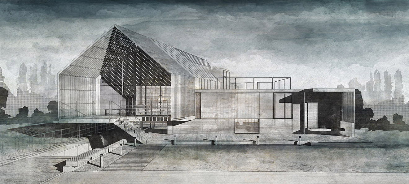
Broadly speaking, it’s important to understand the following general structure. Drawings were intended to be a single board, whose reading should be seen as a whole. The layout is made by strips in a horizontal format, using a strong painted background of black — such as in the use of traditional ink in hand drawings — and using watercolors with a wide range of tone. These vary from dark colors with cold green and blue to the pure white that — as with the classic technique — is not obtained by using white paint, but by using the white of the paper.

Study model
The design choices are immediately and clearly visible on the materials, joining together the step of texturing to the process of modeling as an element of control for the project.
Starting From the Model
In our case, both the architectural project and the 3D visualization are managed by us. The positions of designer and 3D visualizer are the same, so we have developed a very detailed 3D model to better manage 2D drawings and sections. Generally, we design directly in 3D using textures and materials from the outset and considering camera angles for the interiors design.
In this way, we try to keep a total control of the project from the very beginning. This can be hard especially in the early stages of design, but it has a great advantage in the rest of the workflow, as you can imagine. For modeling we use SketchUp, where it is possible to obtain a high level of detail and complexity even though it is a simple and immediate tool. At the same time, from the point of view of an architectural designer, it is unequaled when working with sections in real time. Other applications do not provide this option so well.
To explain myself better, it’s not about viewing the section planes, but to work on them, editing profiles and polygons in the rest of the model. The house is heavily based on the section, and this tool was a very useful one to manage the project with. The section tool allows you not only to display the section plane, but also to model inside.

The section
Exporting
Once the model is built with a sufficient level of detail, there are two export options:
- Export to AutoCAD (DWG);
- Export as raster (PNG, JPG, TIFF), useful for shadows and hidden lines.
Both are valid methods for a drawing basis to work on afterward, with some differences in the workflow. Let’s take for example the DWG export to AutoCAD, which is what we usually use. You have to pay attention to the scale of the drawing by setting it to 1:1 in the case of technical drawings such as plans and elevations because our output will be a vector drawing. Then, we select lines rather than poly lines.

After exporting and opening in CAD, you will have something like the image below: a good basis in wireframe with hidden front geometries. This form of export generates a good wireframe for use as a basic drawing.

Exporting to DWG
Forcing the Hand
On the basic drawing in AutoCAD, we can give depth to the contour lines and shadows and in general carry our feeling from the hand drawing to the cold, vectorial shapes of CAD software. Taking advantage of the common tools in CAD, we use hatches as dots and crosses to highlight windows, interior surfaces and shadows, working to emphasize some areas of the design. The purpose here is to give an interpretation; it is a completely personal aspect of this workflow.

AutoCAD drawing
We use thicker border lines to highlight the profile of the house or to highlight the skylight as in this case. We work to create imperfections and dirty effects typical of hand drawings, which actually simulate the materials in reality. A series of hatches highlight materials and dirtiness on the floor.

AutoCAD drawing
Black
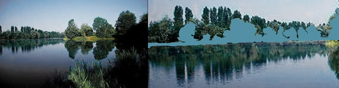
Black is a color you must be able to use with courage. Draftsmen that use black ink not only as the crosshatch of a section know that very well. To find the right amount of black to use, we created a background landscape from a reference photo. We essentially traced a picture using AutoCAD and then created a gradation of hatches that become denser until they appear as solid black.

Hatches
We traced some landscape photos directly on AutoCAD with poly lines and then filled areas with hatches line, dot and solid black.
To Sum Up …
We ended up with a good basis for watercolor on Photoshop made by an exported DWG, utilizing hatches and lines to accentuate some areas of the drawing, strong black hatches for the landscape and shadows on the ground obtained from a SketchUp export. The result is the raw image that you see below.

If you are not very familiar with AutoCAD or you want to speed up your workflow and still get a good base on which to make watercolors right away, you can export a combination of rasters from SketchUp and then use the overlay function on Photoshop. This way, you completely bypass the previous DWG steps. Let us summarize the steps to follow:
1. Export a hidden line drawing on transparent background.
2. Export a wireframe.
3. On Photoshop, create a white sheet that simulates the paper.
4. Overlap on the white sheet the two previous exportations.
On SketchUp, both the monochrome and shaded view can work, but in our case the best is hidden line mode. Enable this display mode from the menu — View>Face Style>Hidden Line — and go to File>Export>2D Graphic. Save the file as a PNG and open the Options dialog box to set the size of the file. 4000 to 5000 pixels are more than enough. Check the box for transparent background. Once this is done, you will have a file to open in Photoshop that looks something like this:
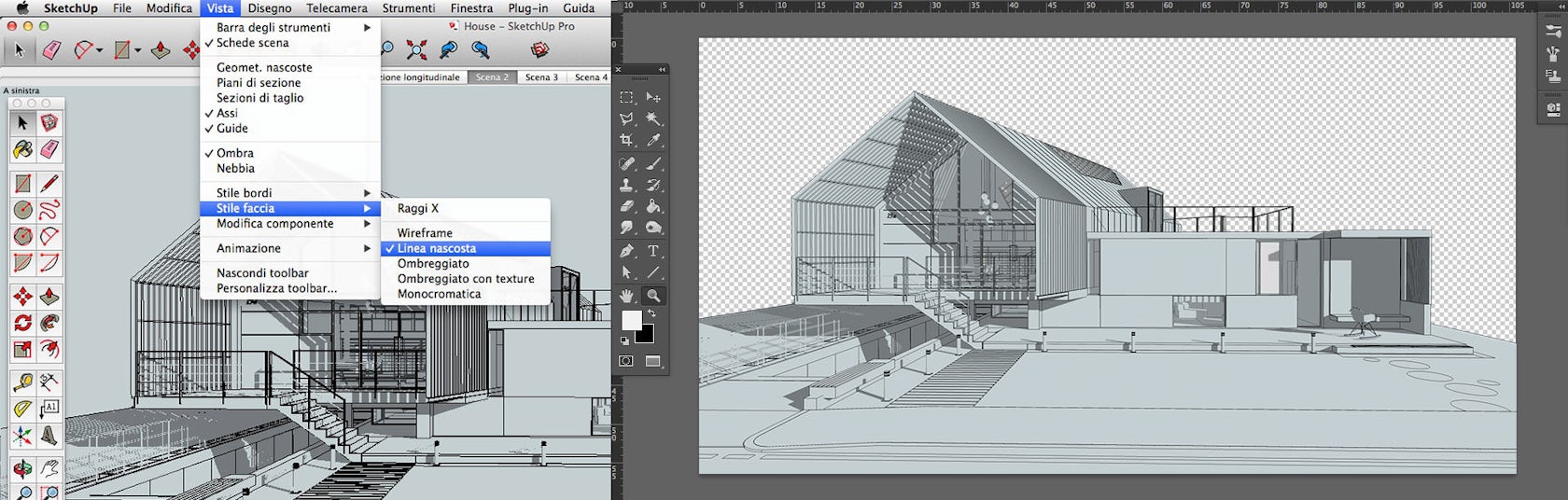
Hidden line
The exported file lets us see the background color of SketchUp (light blue, in our case). Just make the picture monochrome later on Photoshop to delete it. Back in SketchUp, enable the wireframe visualization mode from the same menu — View>Face Style>Wireframe — and then go to File>Export>2D Graphic. Once again, save the file as a PNG and open the Options dialog box. Use the same size as before and always make the background transparent.

Wireframe
You can overlap the exported wireframe with the hidden line drawing with the multiply effect and set the opacity to 20 to 30 percent. On Photoshop, create a new sheet, not necessarily white. Then, select from the menu Filter>Noise>Add Noise or use a texture that simulates a sheet of paper, perhaps crinkled or aged.
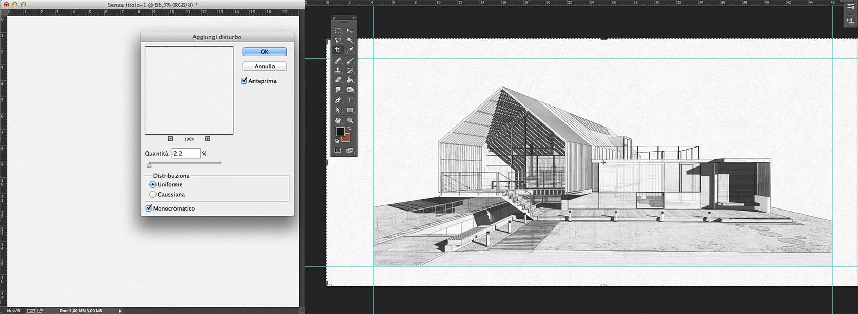
Drawing with shadows and wireframe
By overlapping the two exports, you create a complete drawing with shadow and a light wireframe that gives depth to the geometry. In this case, the white sheet was made with a noise effect starting as a simple solid gray color.
Working With Brushes
On the drawing with the shadows, you can finally paint with watercolor brushes. You can find all kinds of brushes on the web, such as here on BrushKing, this link or in this collection, or you can even create your own from scratch.
However, the secret lies not so much in a specific brush, but in collecting several different types. It is therefore better to find a palette with many brushes that have already been made, paying attention to modulate the transparency to avoid a stained effect. This is the less-technical part, and definitely the more artistic aspect of the workflow, so I’ll leave the following short video to show how we use brushes.
Viewing on mobile? Click here.
Step by step, we completed the watercolor drawing. We combined all the elements here, such as trees obtained with fill patterns, black shadows, the wireframe with a little transparency and the watercolor brush strokes.
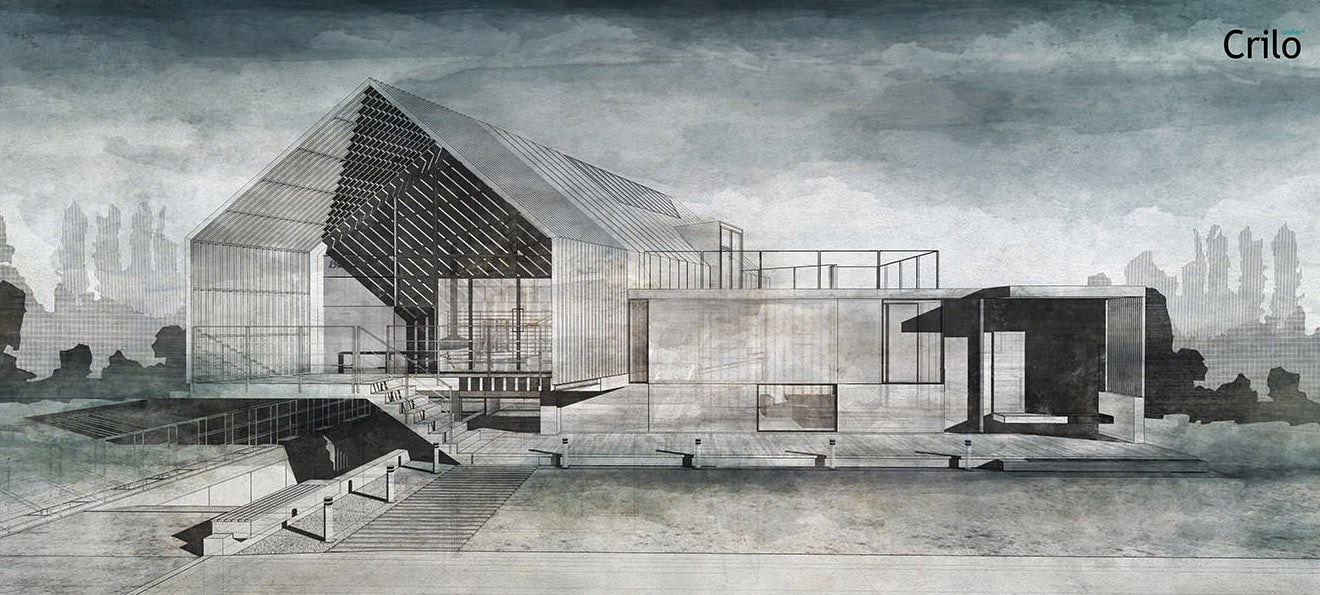
Complete drawing
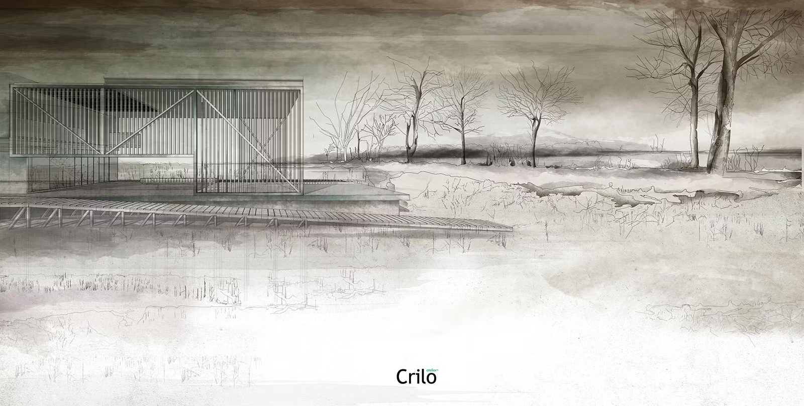
Here are some watercolor works recently made using the techniques shown in the article:


This article first appeared on Ronen Bekerman Architectural Visualization Blog
Architizer is building tech tools to help power your practice: Click here to sign up now. Are you a manufacturer looking to connect with architects? Click here.


