Architizer's 14th A+Awards judging is live! Subscribe to our Awards Newsletter for updates on Public Voting and the big winner reveal later this spring.
When one thinks about the works of Italian-born British architect Richard Rogers, the Pompidou Centre and Millennium Dome are some of the first structures that come to mind. Along with British architect Norman Foster, Rogers was well-known for the popularization of high-tech architecture – also known as structural expressionism. This style is best exemplified in Lloyd’s building, where the edifice’s structural and mechanical components were placed on the external surfaces instead of being hidden in the core.
Additionally, Rogers’ early ideas about sustainability and proposals for urban planning, where public spaces were a dominant feature, made him a popular name in the United Kingdom. For his revolutionary ideas and remarkable design, Rogers received several accolades like the RIBA gold medal, Praemium Imperiale, Pritzker Prize and the Minerva Medal before he retired from the firm Rogers Stirk Harbour + Partners (formerly called Richard Rogers Partnership) in 2020. Below are a selection of his firm’s less canonical works that showcase the late architect’s emblematic concepts and design details.
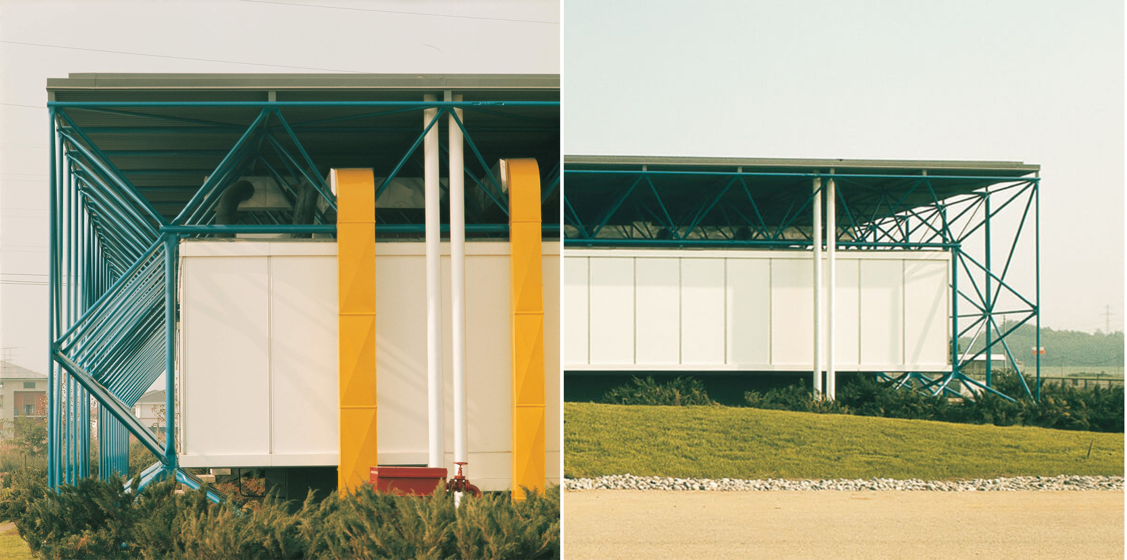 B&B Italia, Como, Italy
In the early 1970s, the young firm was asked to create a design with open-ended systems to assure flexibility. The solution was a streamlined structural framework comprising lightweight portal frames that were used to suspend a glazed office container. This system helps the interior remain column-free and partition-free with the services being placed in the peripheral areas.
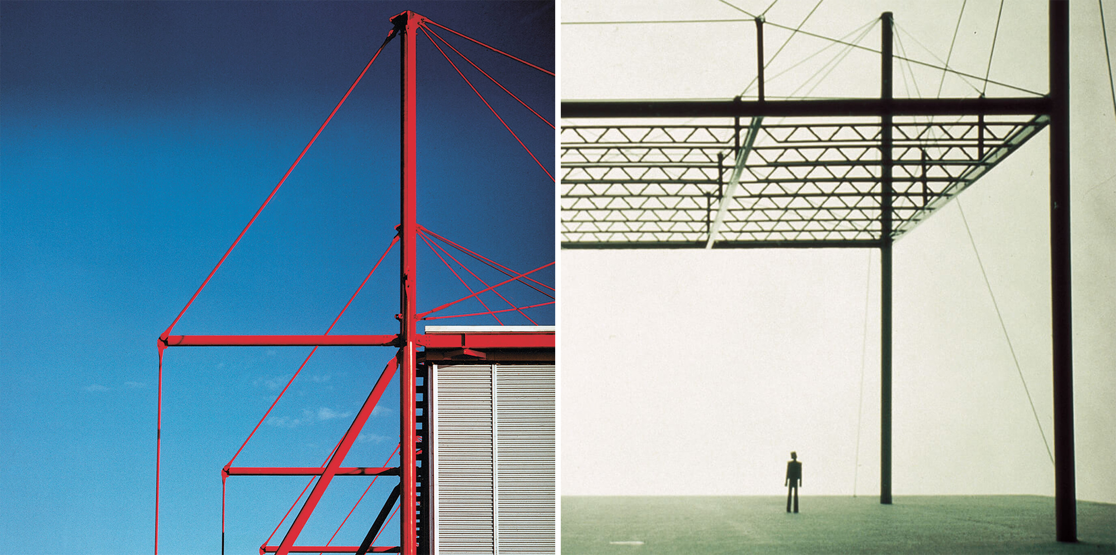
 Fleetguard, Quimper, France
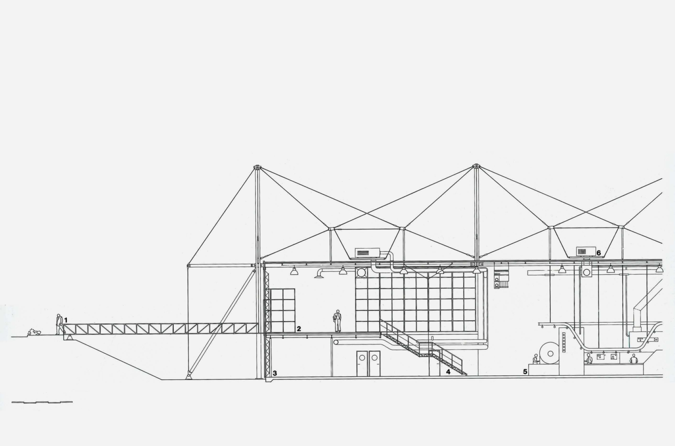
This 1981 project is a manufacturing plant for air, fuel and oil filters. Along with these production facilities, it also includes storage facilities and administrative offices. The design was created keeping in mind the potential growth in the future. One of the main focal points was a minimal intrusion on the surrounding landscape, which was achieved by using excavated soil to create a landscaping scheme that segregated industrial and regular traffic.
The main structure is formed using a suspension system of prefabricated elements to reduce roof span and structural depth. This allows the easy addition of functions without disrupting the ongoing work in the building. The emerging firm’s design won a couple of awards including the Premier Award for Exceptional Steel Structure, France and the Constructa-Preis for Overall Excellence in the Field of Architecture.
 Centre Commercial St Herblain, Nantes, France
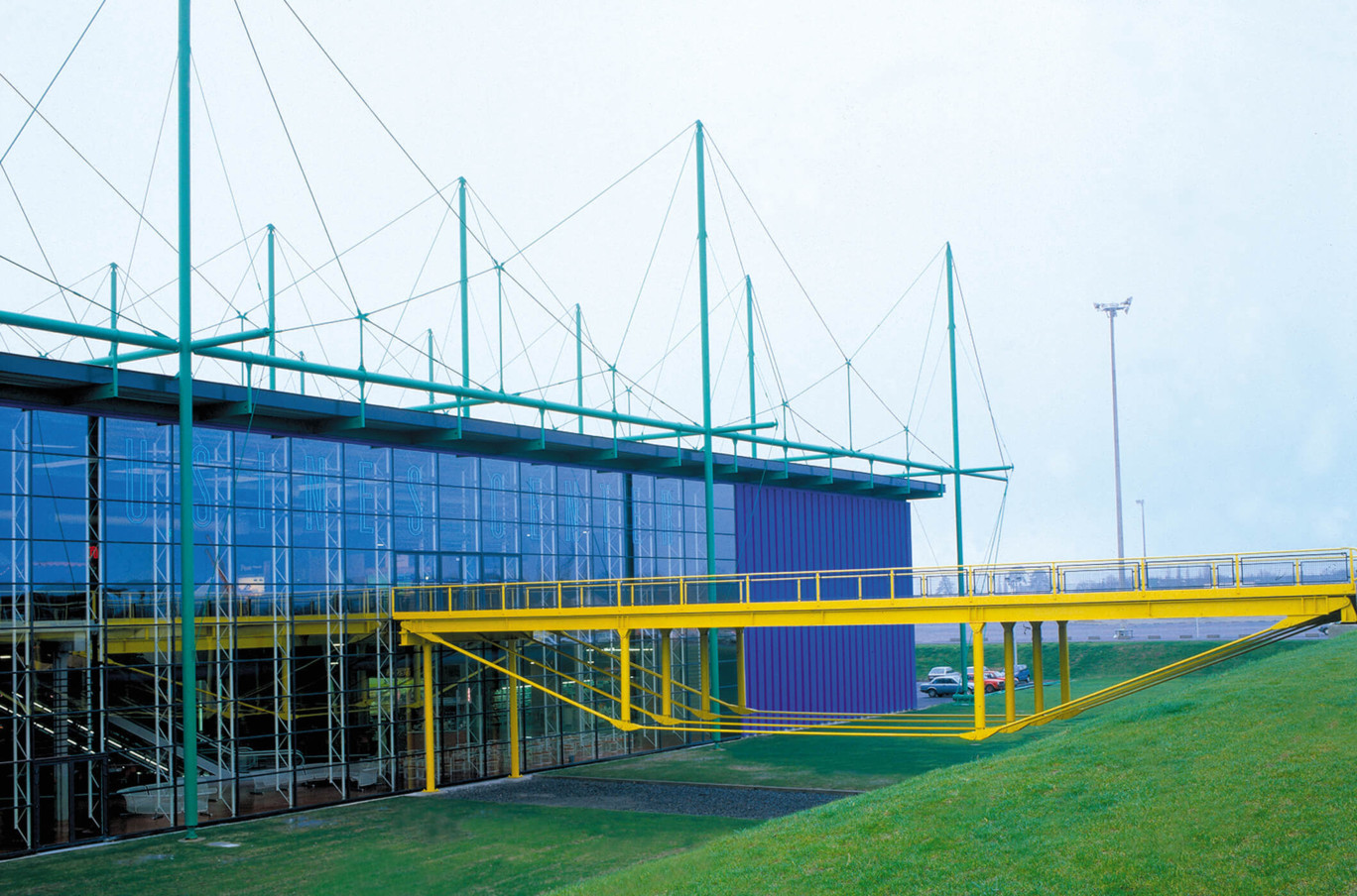
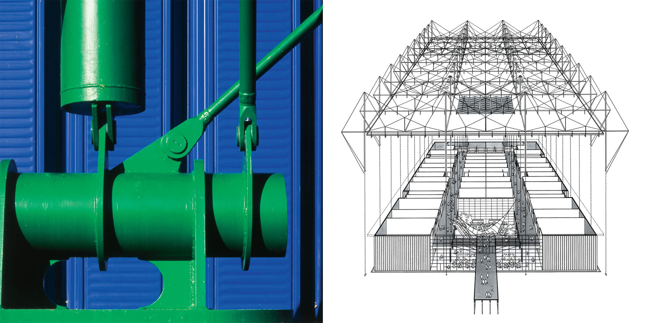
Less than a decade after completing the Fleetguard factory, Rogers’ firm undertook the design of a low-cost shopping center featuring a suspended system with bright turquoise masts in 1987. A metal bridge, painted in a vibrant yellow, guides users to a double-height reception area. All the structural elements outside and services within have been kept exposed to give the building more character. The interior is organized similar to a regular mall, with stores placed on two sides and in a row in the center.
 Tomigaya, Tokyo, Japan
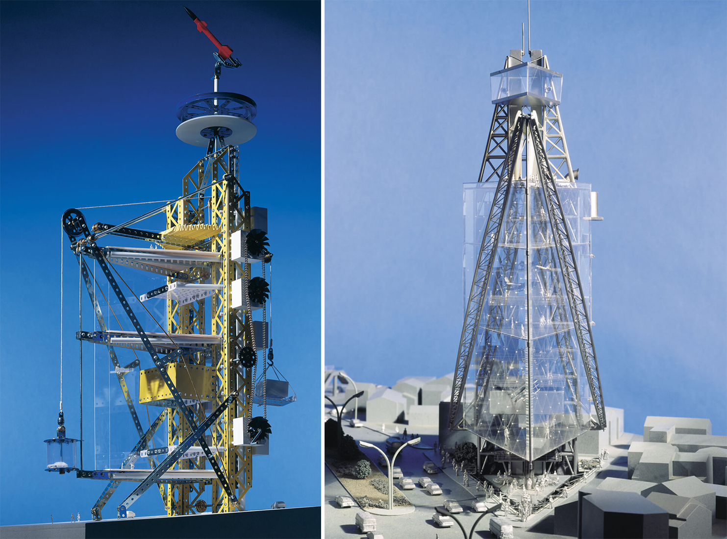
Built during the property boom in Tokyo in the 1980s, Tomigaya is a structure on a small triangular site surrounded by low-rise buildings, a highway and a park. Due to certain floor and height constraints, the proposal uses transparency to create vertical exhibition spaces that are visible from the highway. Additionally, two steel trusses on one side of the triangle hold up a large crane that can be used to change floor heights to accommodate different exhibits.
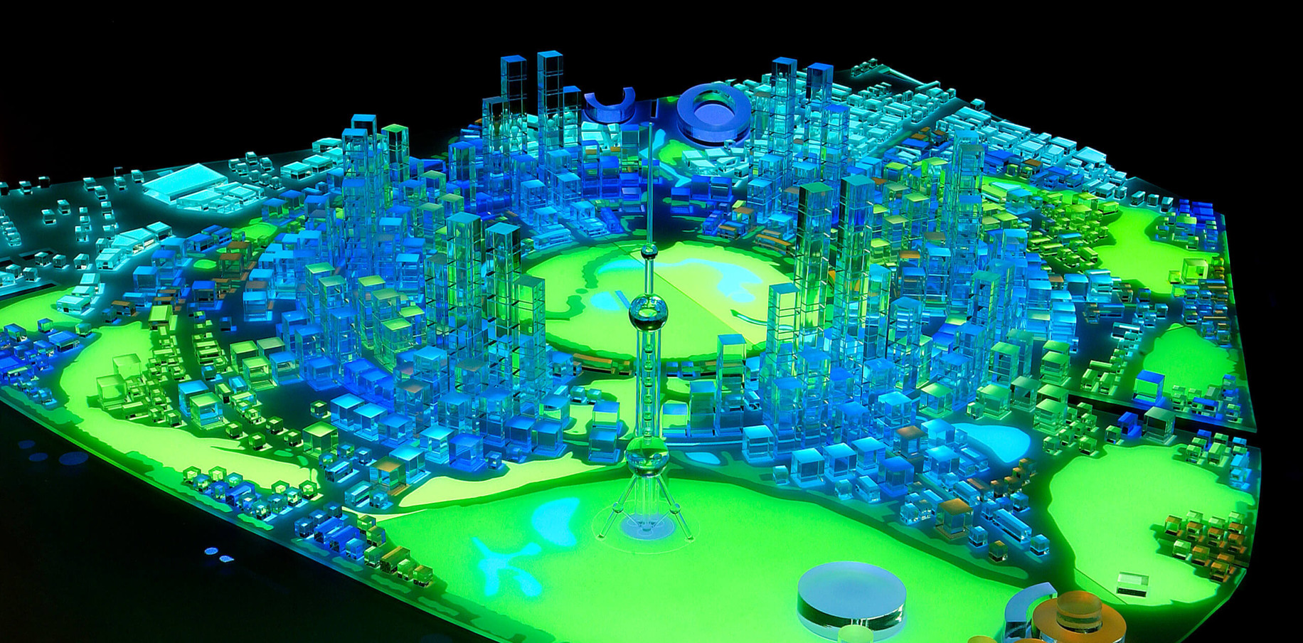
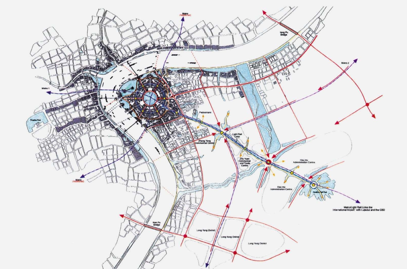 Shanghai Masterplan, Shanghai, China
Well known for his theories on urban design, Rogers also conceptualized several masterplans for cities across the world. When Pudong was identified as the new financial district in the early 1990s, shipyards and industries occupying the area were removed. This proposal for redevelopment is a residential and commercial area that is tied together with several parks and public spaces. The plan uses a circular core with a park at its center and boulevards forming concentric rings around it. These rings are separated and divided into segments by public transport routes and nodes. This results in easy access and better connectivity.
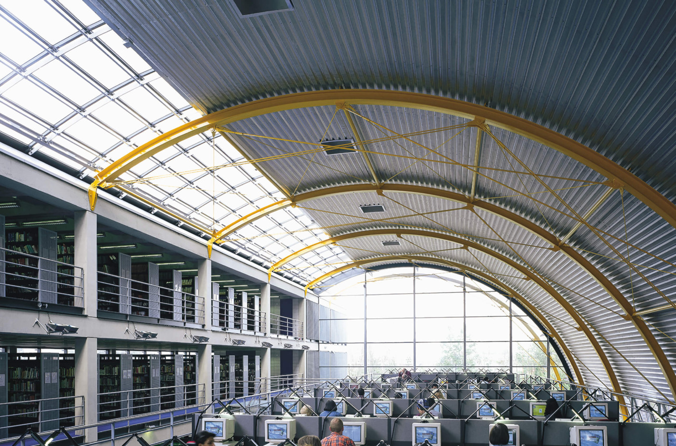
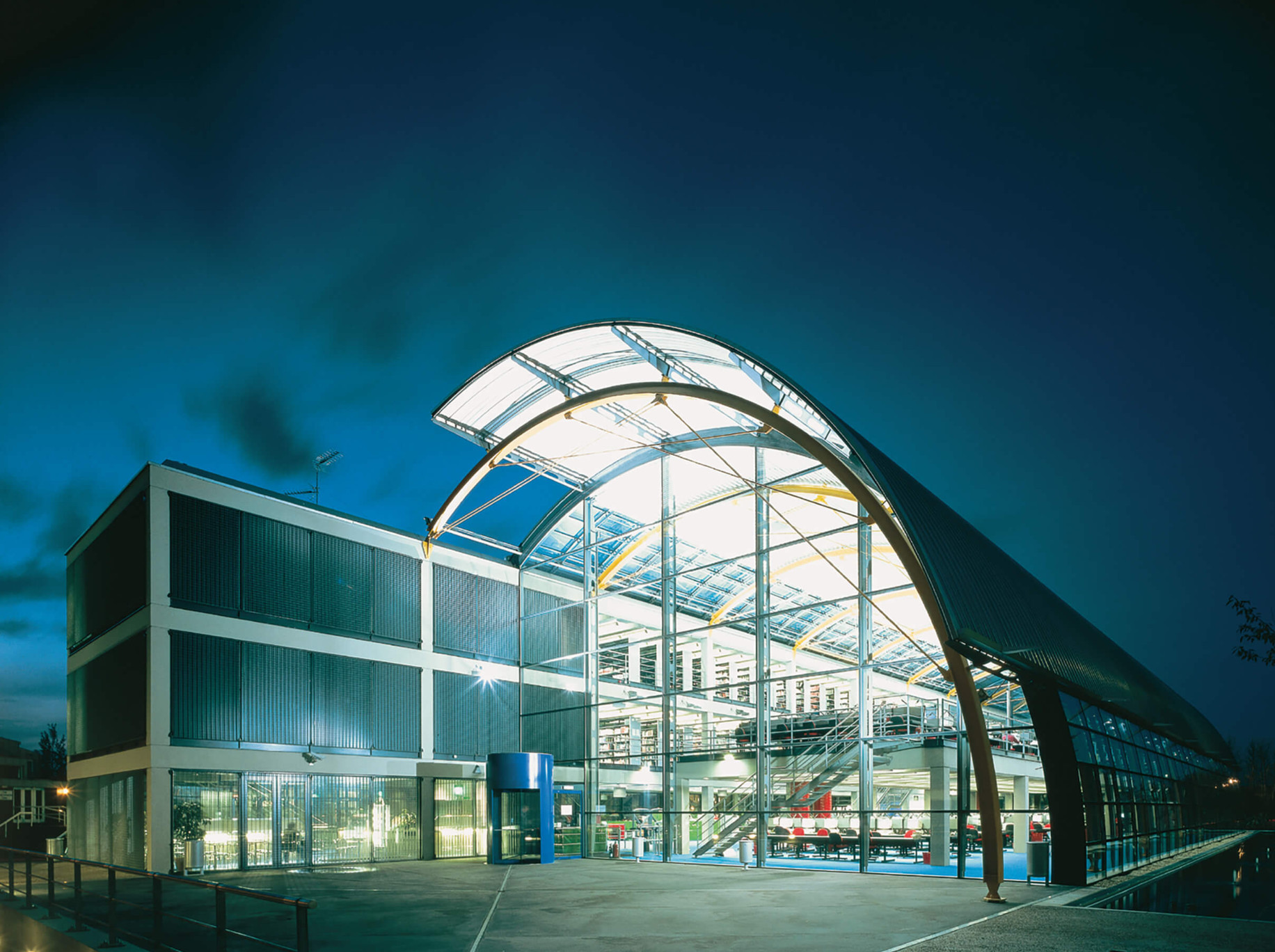 Thames Valley University, Slough, UK
What makes this iconic 1996 structure very recognizable is the large covered dome that is connected to a rectangular block. It is equipped with internal motorized fabric blinds for solar control and is also designed to collect rainwater. The facility contains spaces for books, CDs, laptops, open working areas and seminar rooms. To ensure connectivity with the landscape outside, this curved surface also has a large opening at the base.
 Hesperia Hotel, Barcelona, Spain
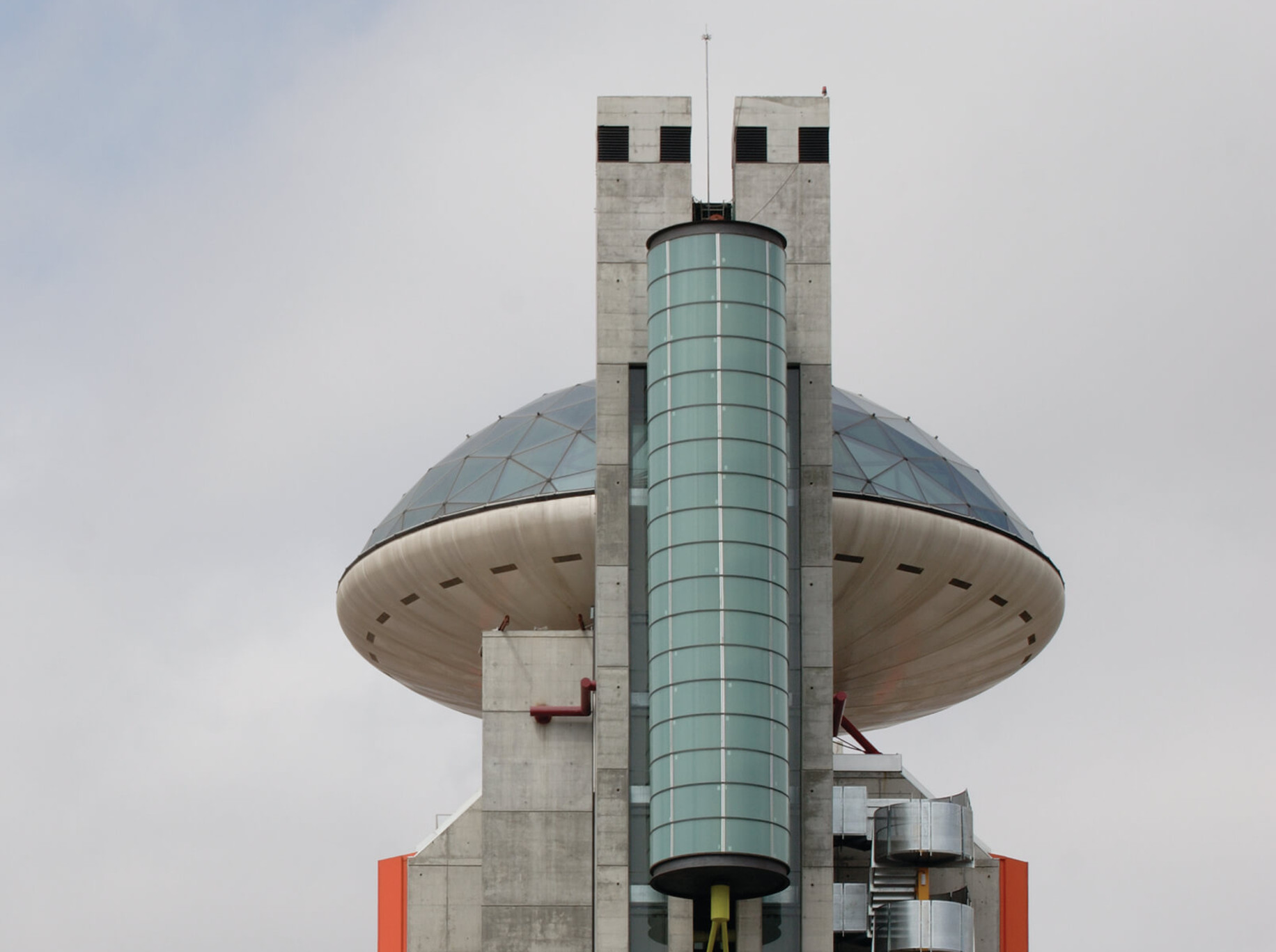
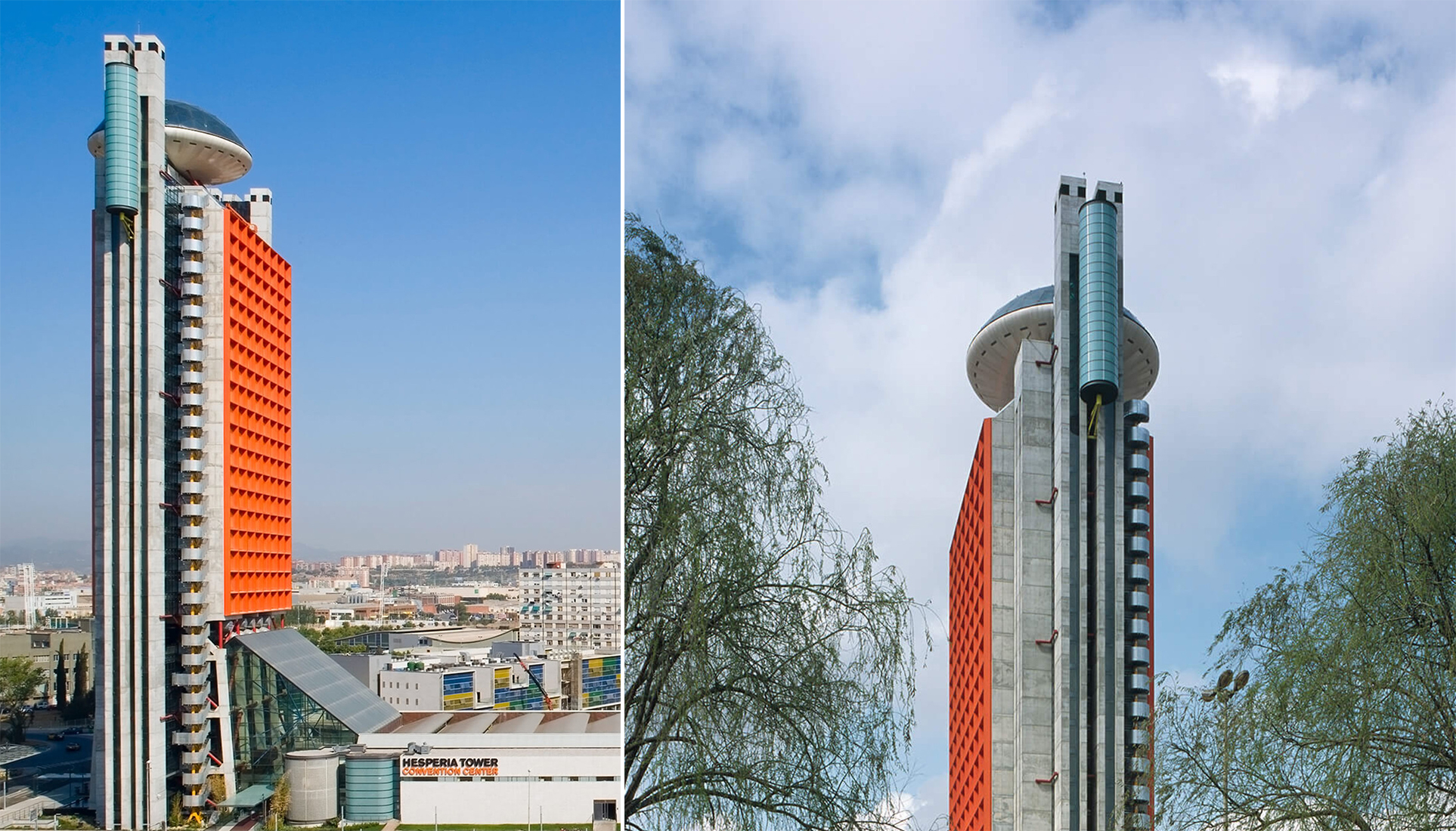
This large tower features a bubble-shaped restaurant on the top. Completed in 2006, the tower is broken up into two parts: the vertical arm houses all the hotel rooms whereas the horizontal block at its base contains the offices and other supporting facilities. A large atrium at the base is topped with an angled roof to create a spacious entrance space. The most striking feature is the gridded orange façade of the tower which can be spotted even from a distance. And like Lloyd’s building, the circulation block is added to the eternal surface, running along the entire height of the tower.

 The Richard Rogers’ Drawing Gallery, Provence, France
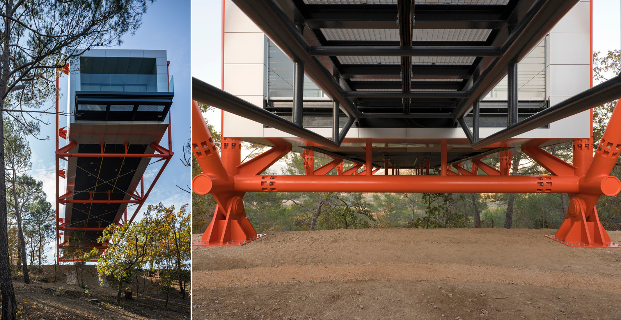
For the final built project in his long and distinguished career, Rogers picked a remote, elevated site with dense vegetation. A cantilevered concept was chosen to ensure minimal disturbance to the ground below. The mostly opaque block is held up in the air using a contrasting orange structural cage which is anchored to the ground. The building was completed in 2021. Visitors can access this viewing space through a small bridge and then walk onto the other end of the building for spectacular views.
All images used are via Rogers Stirk Harbour + Partners.
Architizer's 14th A+Awards judging is live! Subscribe to our Awards Newsletter for updates on Public Voting and the big winner reveal later this spring.
