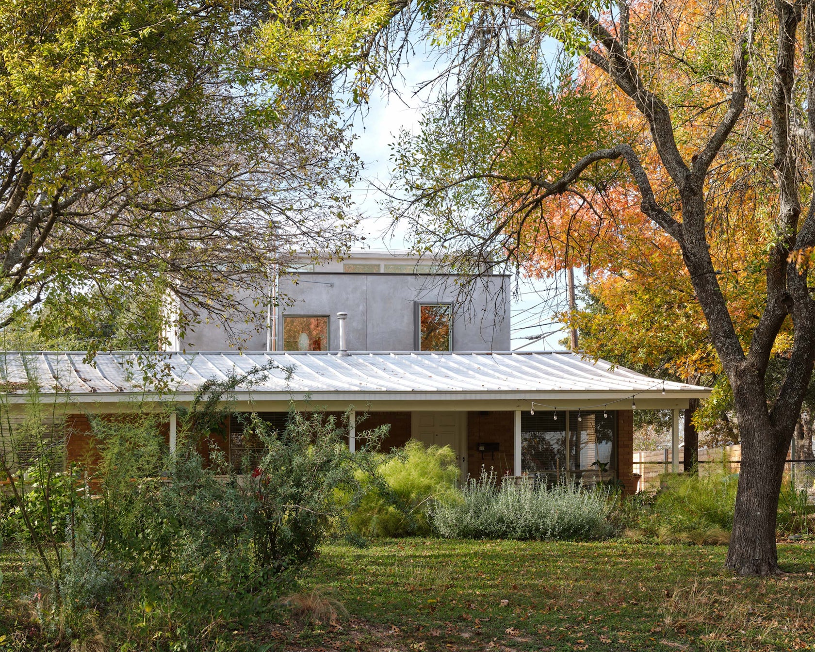
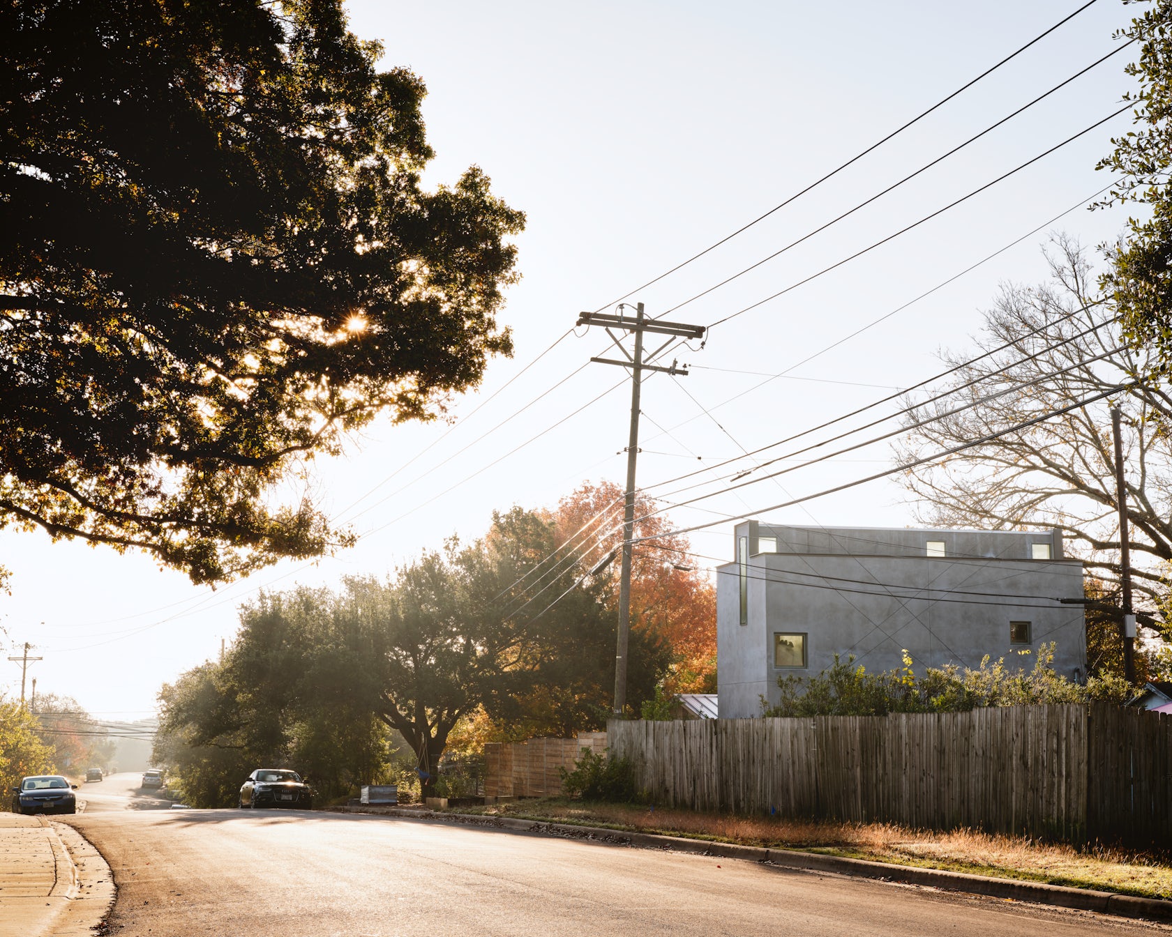
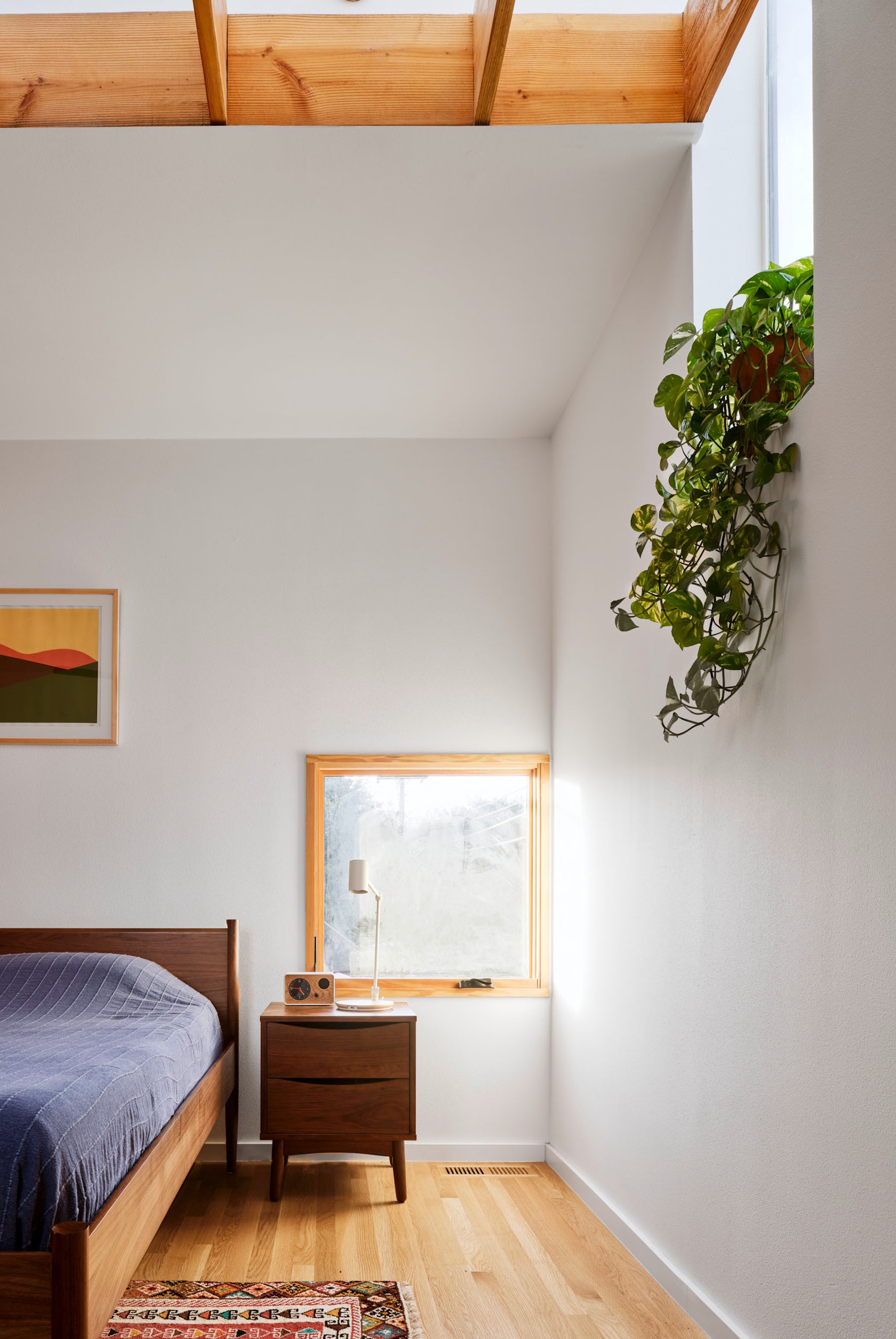
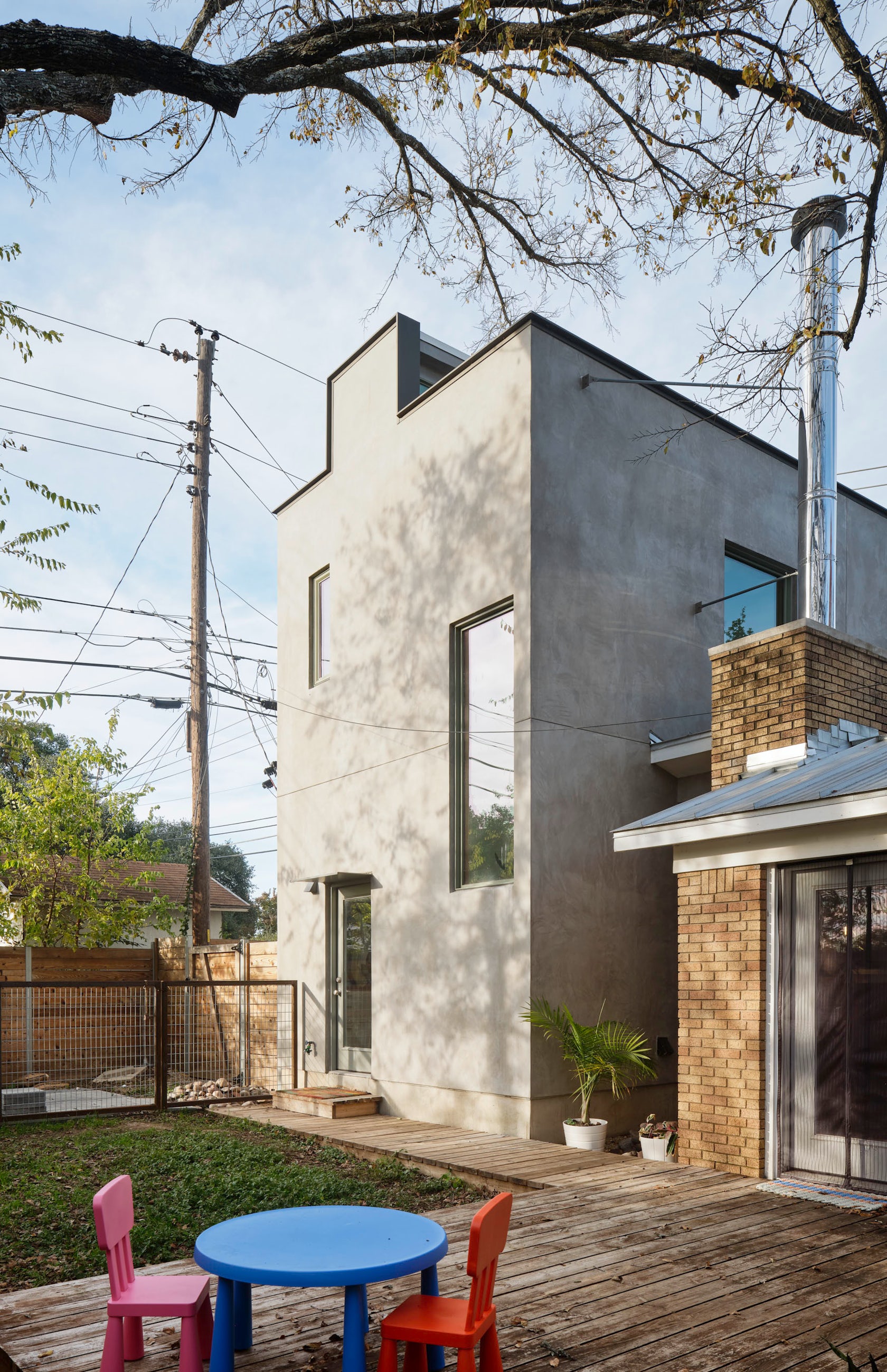
South 2nd – This 2-story addition stands among a single-story sea of 1960’s suburban South Austin homes. With its roof top light monitor striking a figurative silhouette the addition peers out over the privacy fence and across the neighbourhood. The old house and new addition are unlikely companions, their connection a glancing kiss at the fireplace. Inside the continuous light monitor brings diffused natural light into the 2nd floor bedroom and bathroom changing throughout the day.
Architizer chatted with Murray Legge, FAIA Principal at Murray Legge Architecture, to learn more about this project.
Architizer: What inspired the initial concept for your design?
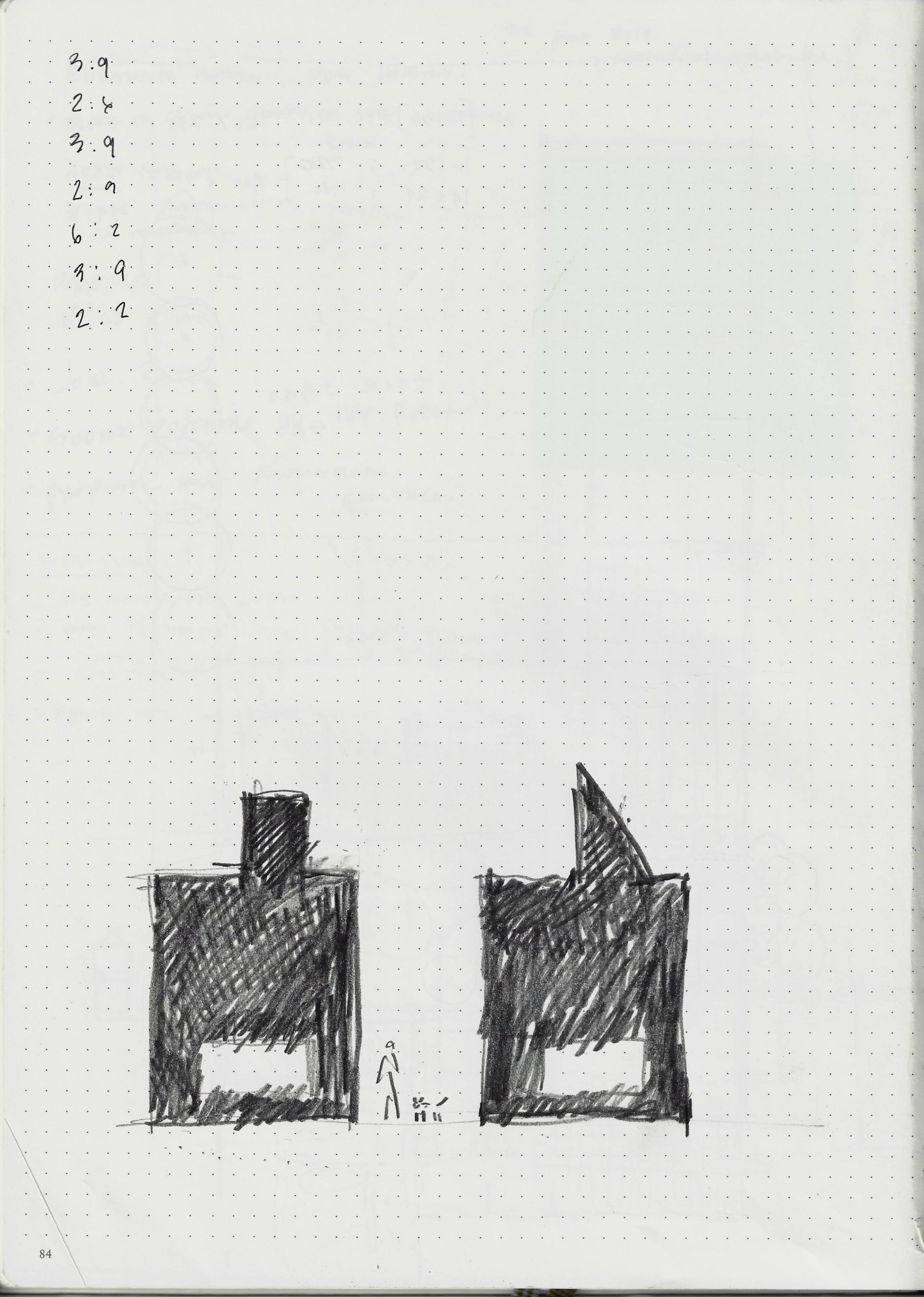
Murray Legge: We worked in a very collaborative way with our clients, a veterinarian and librarian with a growing family. The concept grew out of that conversation. The owners asked for a new home office and utility room on the ground floor and new principal bedroom suite on the 2nd floor. To conserve space on the site we kept the footprint really compact and proposed a tall 2-story addition that contrasts in massing to the single-story existing house. We offered a couple of different approaches including a steep gable roof scheme with an inhabited 2nd floor roof and the final design concept which is the flat roof scheme with a rooftop light monitor. In the end the owners preferred the figurative flat roof version with the light monitor.

© Murray Legge Architecture
This project won in the 10th Annual A+Awards! What do you believe are the standout components that made your project win?
We’re interested in creating work that is both familiar but also unexpected or surprising in some way. The project combines these two approaches. The idea of the rooftop light monitor is practical. It was designed to shape and provide light on the inside. Initially we’d pushed the monitor off the roof edge so that it was not visible from the outside but the shortened monitor was not as effective a light source. Pushing it to the façade changes the silhouette profile of the building creating a surprising and ambiguous figure that appears to be looking out across the neighbourhood. The building also, strangely, looks like an old western storefront facade. To me it’s the combination of fable in the façade coming from the deeply practical consideration of daylighting that is its success. We’re also excited to be able to achieve this in a very modest and low budget project.
© Murray Legge Architecture
What was the greatest design challenge you faced during the project, and how did you navigate it?
For this project we had very limited space on the site and a very modest budget. The challenge was to make something special within these constraints. Regardless of the size or budget of a project we work really hard to bring a very high level of thoughtfulness and resolution to our work. It’s very satisfying if we can achieve our goals with small projects on tight budgets. We’re very interested in this idea of creating something special with very modest means and in unexpected places. It’s the challenge of finding wonder in everyday things; It’s both the challenge but also the inspiration.
© Murray Legge Architecture
How did the context of your project — environmental, social or cultural — influence your design?
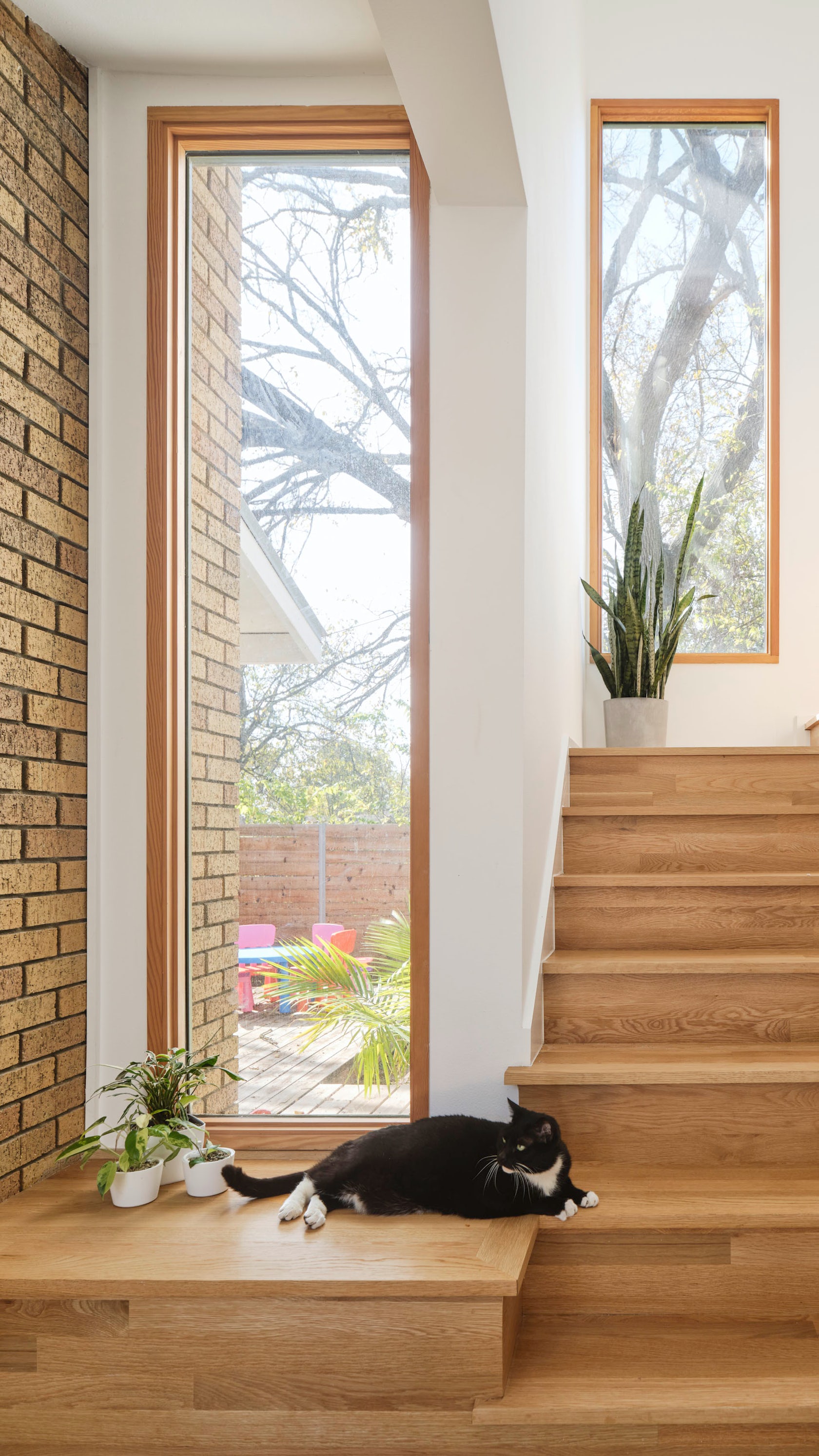
The context for the project is extremely important. With every new project we’re always concerned with the context. Are we trying to fit in and disappear or stand out? How are we relating to the landscape or neighbouring buildings? The site is a corner lot in a very low density, typical American suburban environment defined by privacy fences and single story homes setback far from the street. Austin is growing rapidly and these outer neighbourhoods, once suburban, are slowly increasing in density and becoming more urbanized. Or addition responds to this low density neighbourhood through contrast. It is tall and visible and appears to be looking out over the privacy fences to the houses beyond. In that sense it’s an urban figure standing in a suburban field.
© Murray Legge Architecture
What drove the selection of materials used in the project?
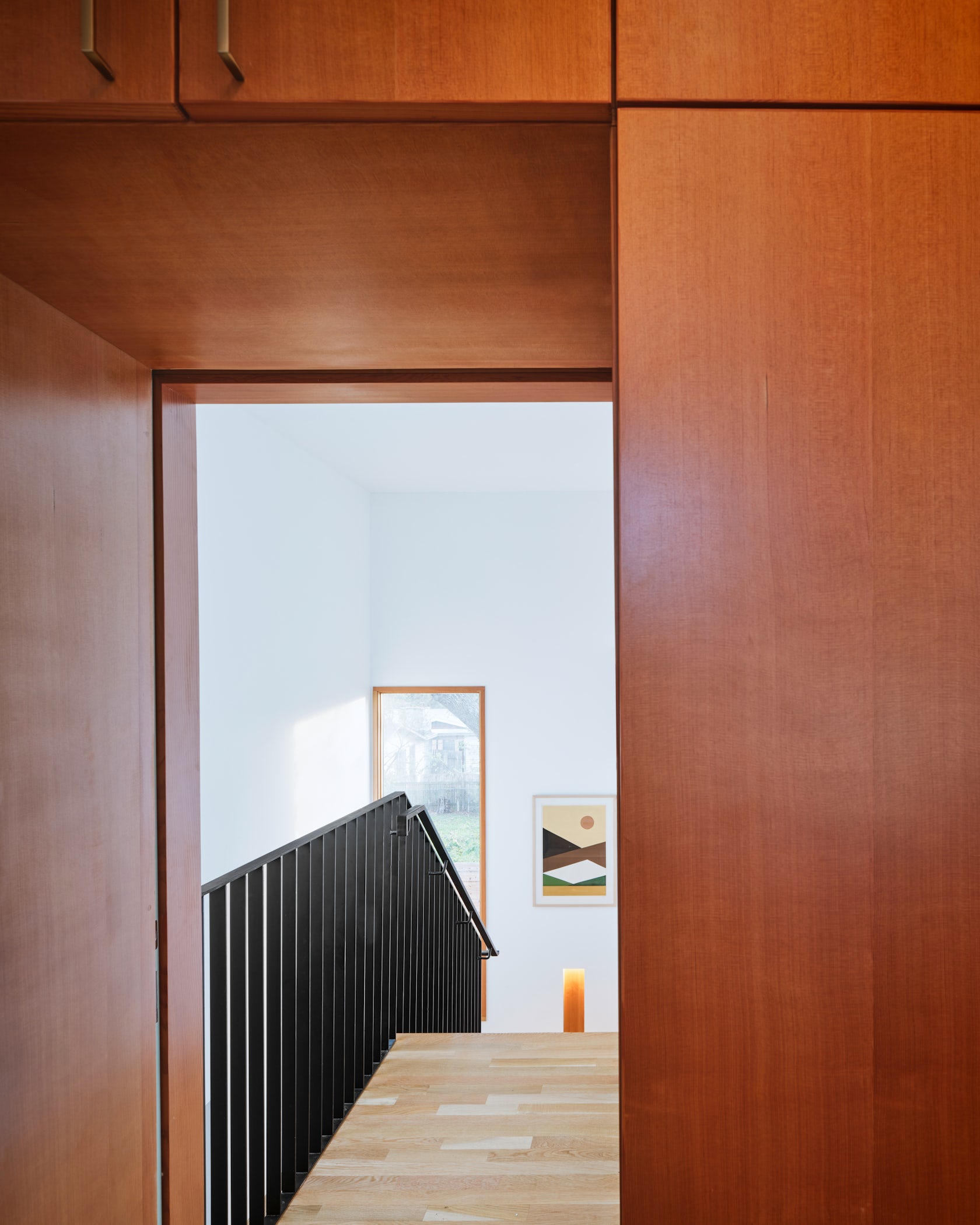
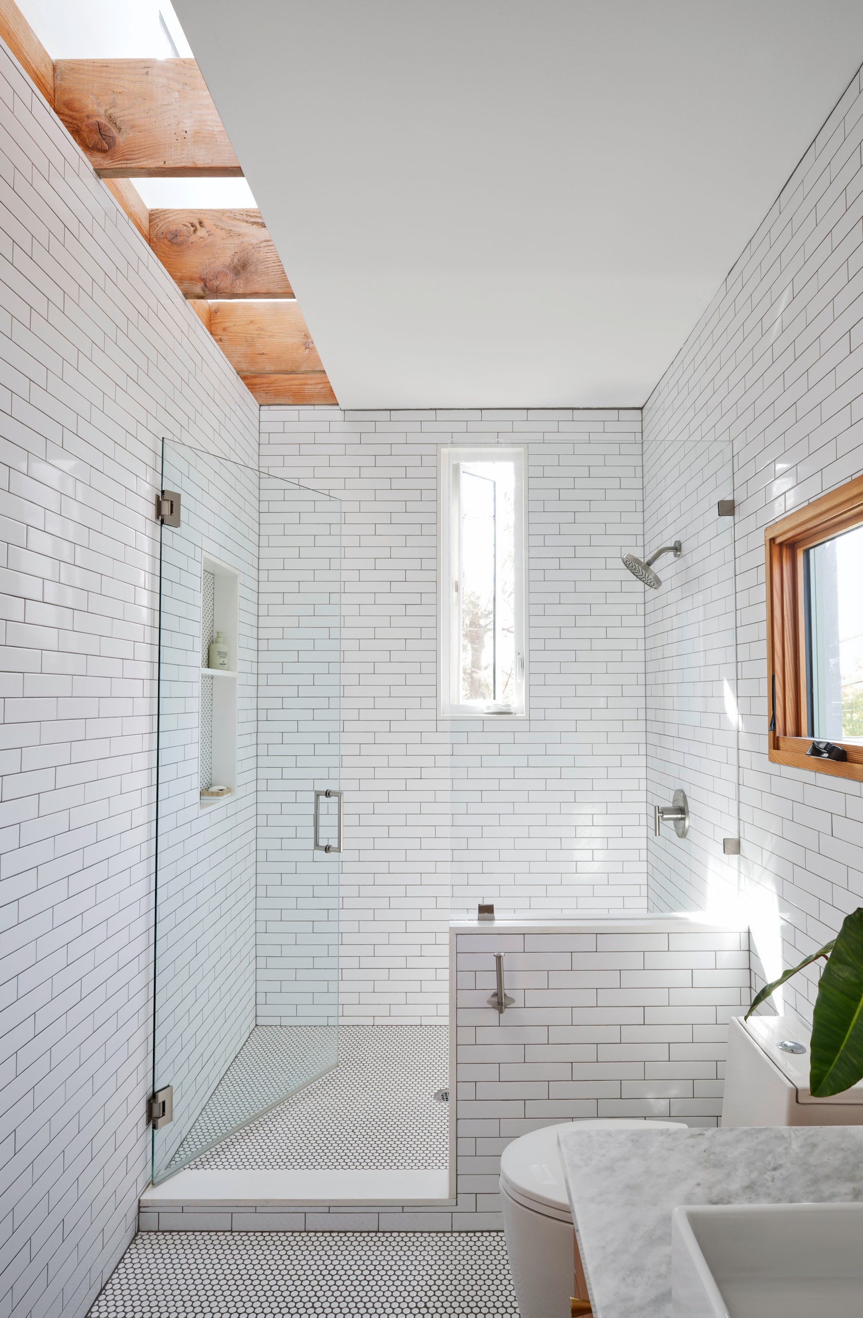
For the exterior material we used a warm grey LaHabra stucco that looks like concrete. It gives the addition a natural uniform quality, like a building block. The windows are aluminum clad Douglas fir by Weather Shield. The Owner chose a green window color for the exterior aluminum that works beautifully with the stucco color. On the exterior the addition has a timeless material quality to it. Inside, the exposed wood framing in the light monitor, the wood casework and panelling and the windows are all Fir. We really love Fir because it is common, a more sustainable wood product and brings a warm tone to the interior. In the bathroom the owner chose a white tile to catch the changing daylight.
© Murray Legge Architecture
What is your favorite detail in the project and why?
One of our favorite details is the rooftop monitor and the changing quality of light it brings to the interior.
© Murray Legge Architecture
How important was sustainability as a design criteria as you worked on this project?
Sustainability is extremely important in our work. There are a couple of important considerations in this project. First would be the compact footprint and building envelop. Reducing a buildings footprint reduces its foundation and roof area. It’s both more efficient in terms of material usage but also makes for a more energy efficient building envelop. Second the rooftop light monitor sources sunlight from the vertical clerestory sides of the monitor which brings in natural light while minimizing the potential heat gain that might occur with a conventional skylight.
© Murray Legge Architecture
© Murray Legge Architecture
Team Member
Builder: Justin Gray
Consultant
Structural Engineering: TK Consulting Engineers
Products and Materials
LaHabra Stucco, Weather Shield Windows and Doors
For more on South 2nd, please visit the in-depth project page on Architizer.


 South 2nd
