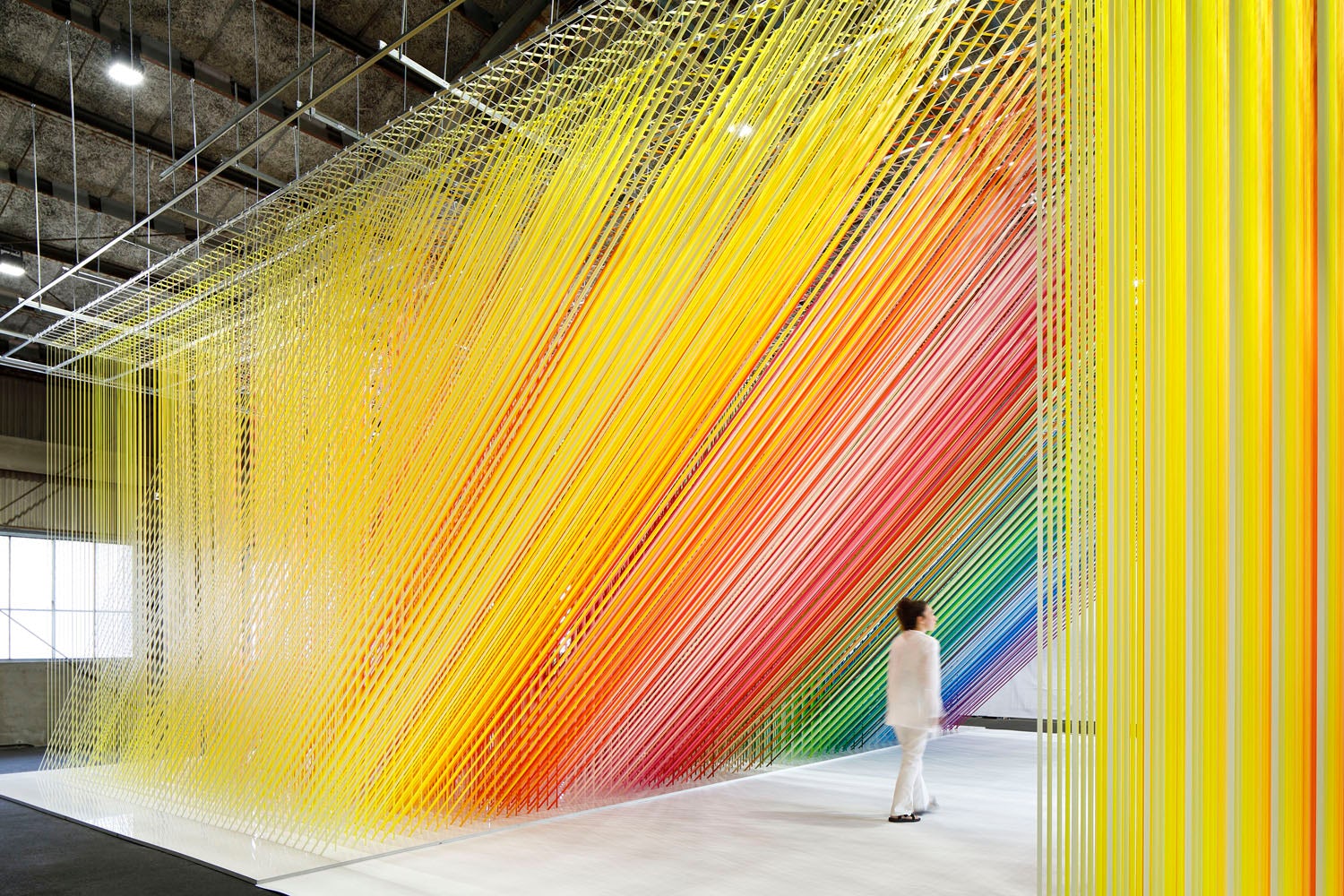
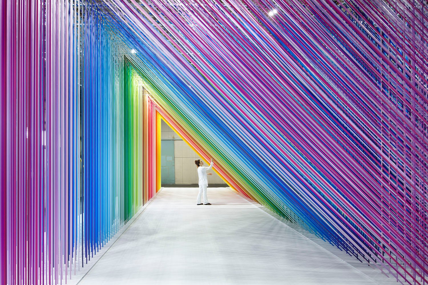
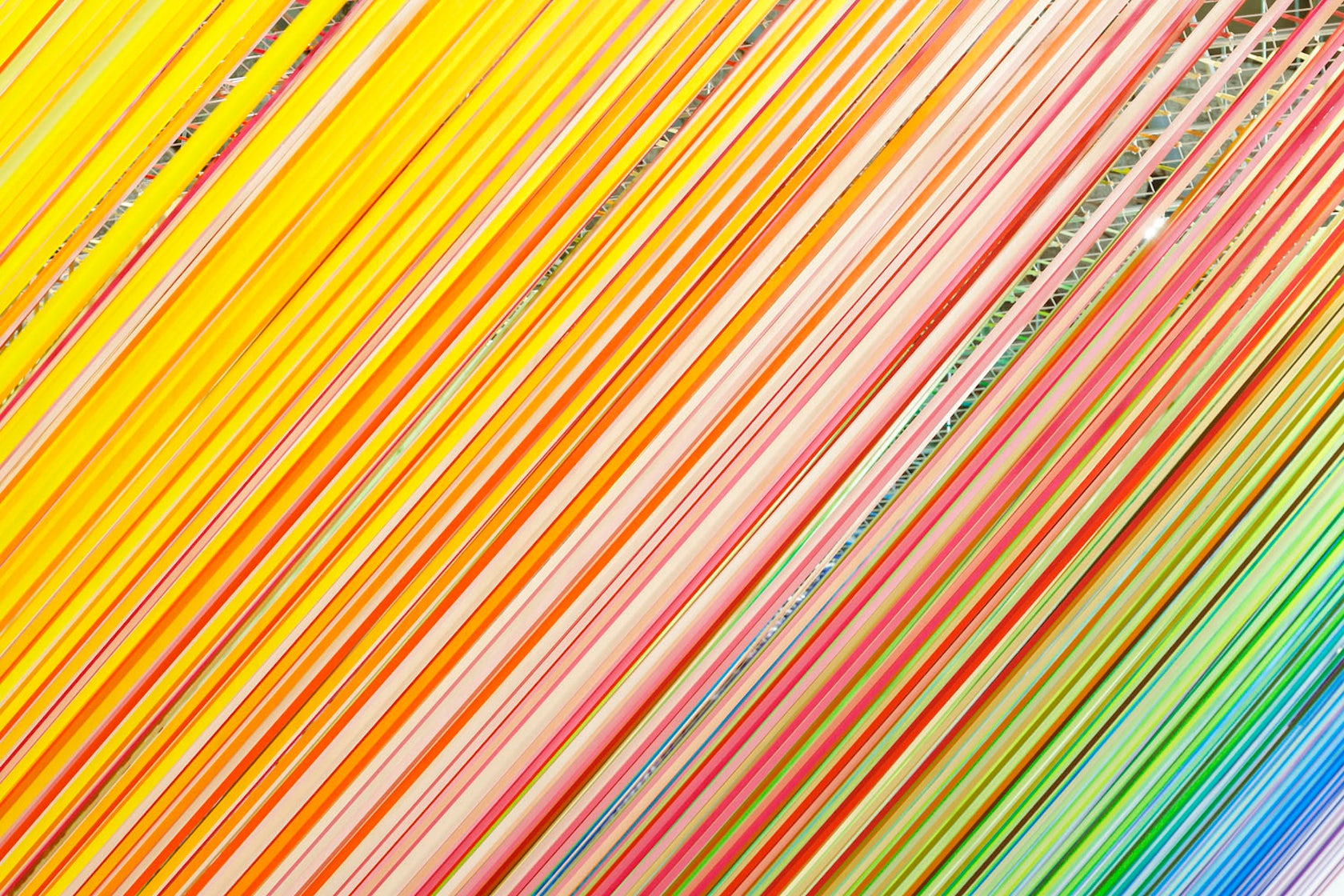
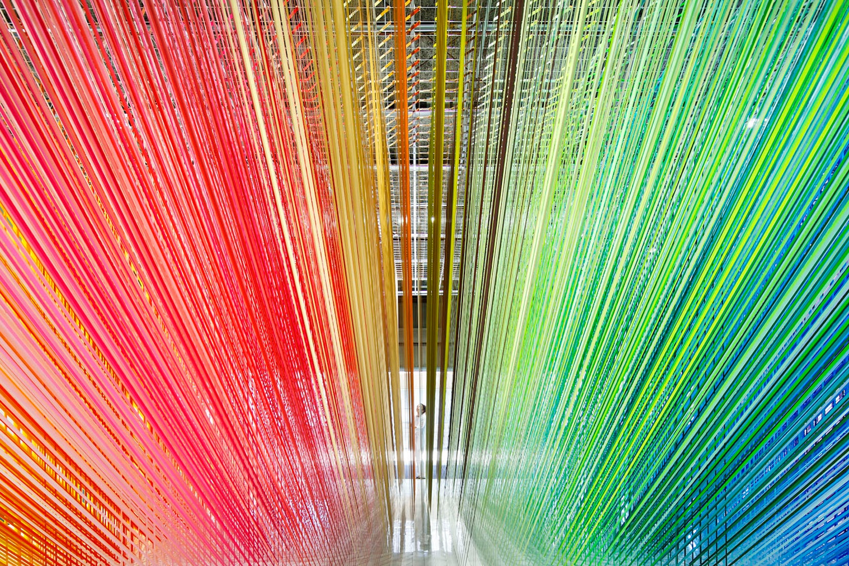
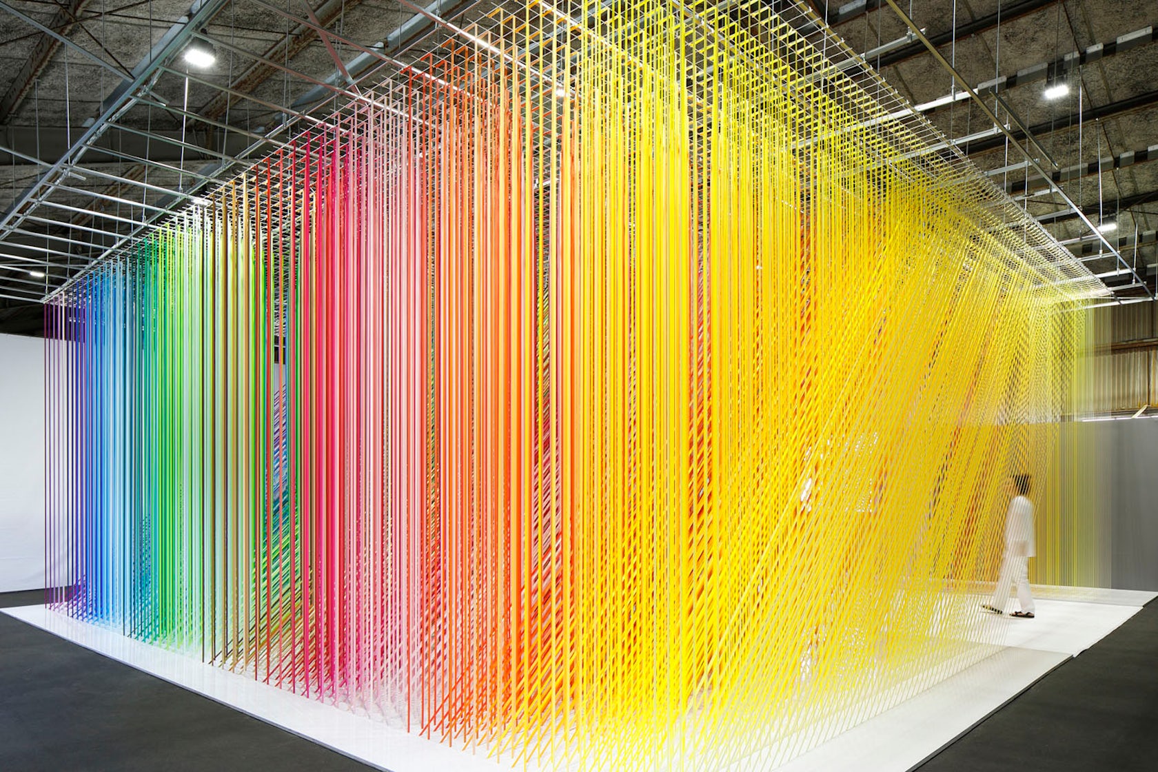
100 colors no.35 – I created this installation for the world-famous Japanese masking tape brand “mt”. Part of my “100 colors” series, the tape made of Japanese paper (washi) was especially created for the installation in my unique 100 different shades of colors. My challenge was to create a huge moiré you can walk and experience from the inside. In order to emphasize the linear shape characteristic of the masking tape, I used a total of 28 km length of thin tapes, regularly layered vertically and diagonally, creating a rhythmical immersive colorful space. People can walk through this immersive one hundred colors path, feeling with their entire body the various expressions of colors overlapping, creating a beautiful rainbow moiré.
Architizer chatted with Tokyo-based French architect and artist Emmanuelle Moureaux to learn more about this project.
Architizer: What inspired the initial concept for your design?
Emmanuelle Moureaux: First, my concept of “shikiri”, meaning dividing (creating) space with colors, which is the fundamental of all my works: I use colors as three-dimensional elements, like layers, in order to create spaces, not as a finishing touch applied to surfaces. I want people to feel color with their entire body.
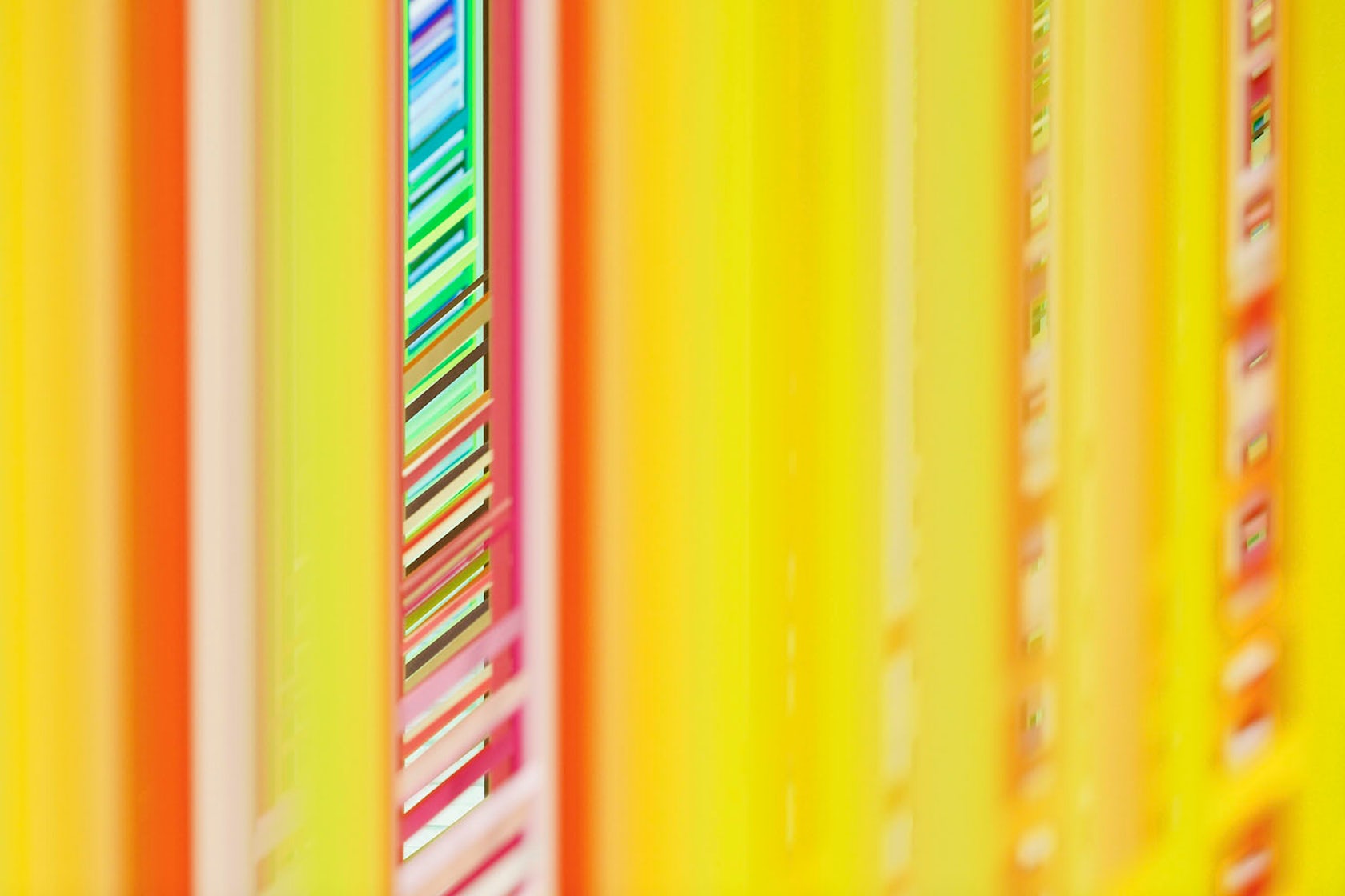
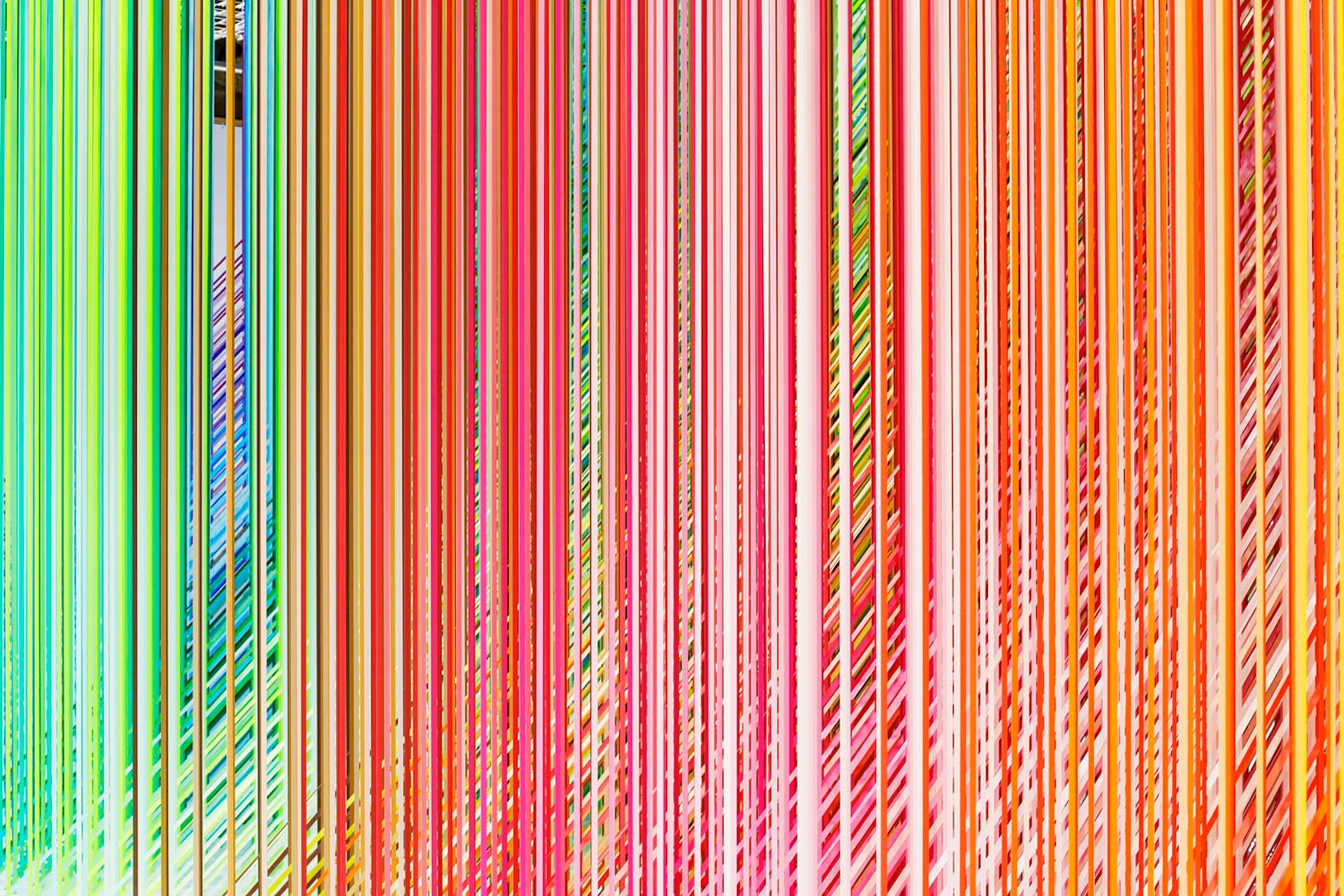
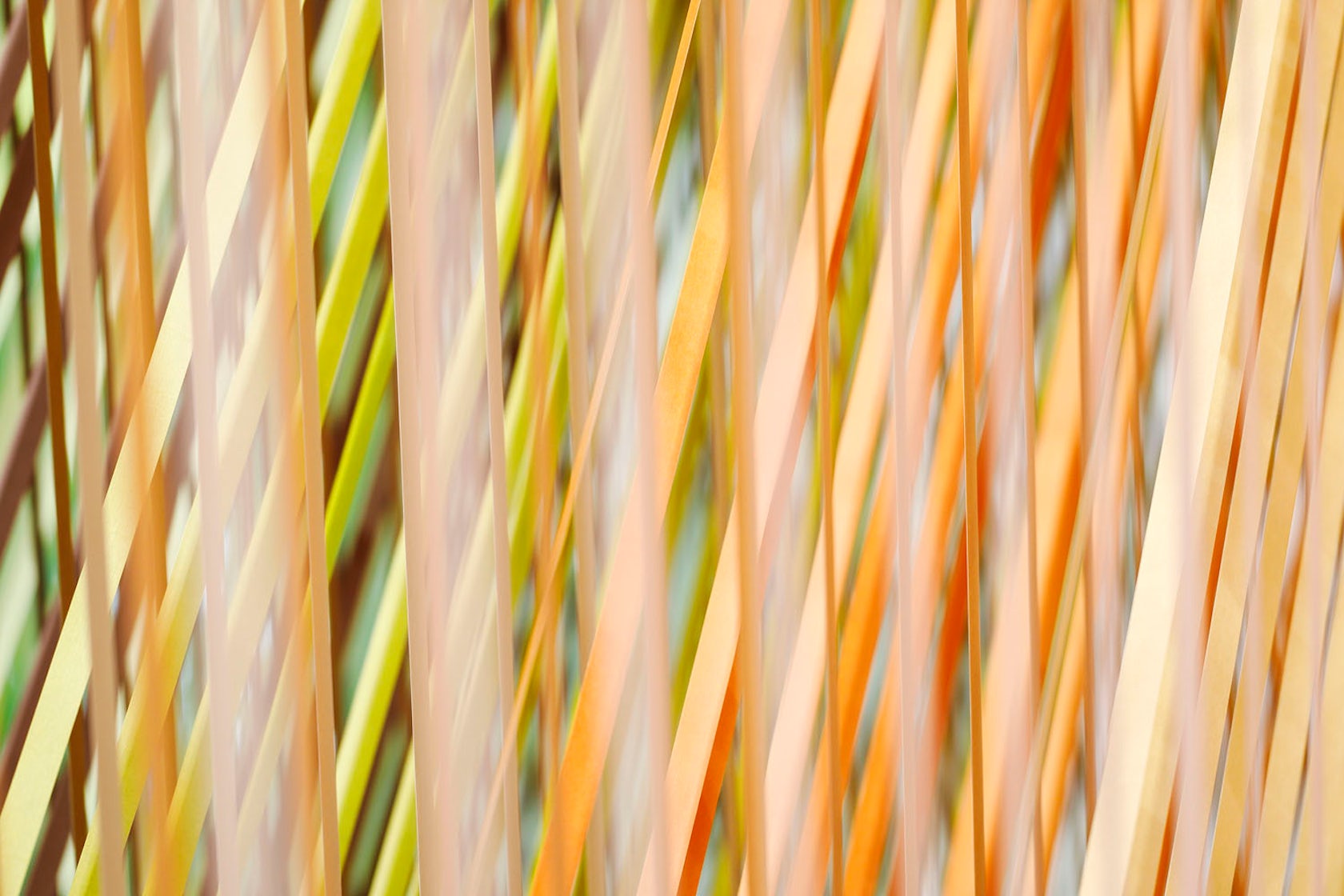
I explore colors in various forms depending on the environment, to maximize the beauty of colors. For 100 colors no.35, as form of color, I focused on the “line”, characteristic of the masking tape. By overlapping a lot of thin lines, I decided to create a huge moiré you can walk and experience from the inside.
© emmanuelle moureaux INC.
What do you believe is the most unique or ‘standout’ component of the project?
The effect of moiré in a spatial scale, the use of color as three-dimensional elements composing space. And also the concept of “100 colors”, an installation series began in 2013, which forms space using 100 shades of colors.

© emmanuelle moureaux INC.
What was the greatest design challenge you faced during the project, and how did you navigate it?
The production and installation on site was the biggest challenge. It was very difficult to find a way to make all the lines perfectly straight, and aligned in a three-dimensional grid. My installation team made a great job. It was perfect.

© emmanuelle moureaux INC.
What drove the selection of materials used in the project?
100 colors no.35 is an installation made for the brand “mt” so I naturally used masking tape. But in general materials are not important for me. Only colors matter. The absolute condition in the choice of material is to be able to obtain the beauty of colors I want, by painting, dyeing and so on.

© emmanuelle moureaux INC.
What is your favorite detail in the project and why?
The tunnel, cut out in the installation, where you can feel the 100 colors moiré with your entire body.
© emmanuelle moureaux INC.
In what ways did you collaborate with others, and how did that add value to the project?
All my installations require a lot of time from the concept development to production. Everything is made by hand and is prepared prior to the set up. It means a huge time and the participation of a lot of people, in different steps. I cannot do it alone. It is a long process involving different teams.

© emmanuelle moureaux INC.
Is there anything else important you’d like to share about this project?
People can see millions of colors, our world is composed of an infinite numbers of beautiful colors, we “see” colors everyday but do not “look” at colors. For me, Color is a medium to create space and emotion. With colors, I try to give emotions to people. Color can make people smile, give energy, joy, and most importantly they make people happy. Color is emotion. Color is universal and eternal, borderless and infinite.
Credits
Photography and Videography by Daisuke Shima
For more on 100 colors no.35, please visit the in-depth project page on Architizer.


 100 colors no.35