This article was written by Jim Keen, an architect-turned-architectural illustrator whose motto is “stand out from the crowd.” Here, he discusses the pitfalls of computer visualizations, and what he is doing to break with the status quo.
The Problem With Computer Renderings
I graduated as an architect 20 years ago. Back then, computer renderings were new and fresh and had a huge impact upon presentations. Their affect was magical — clients were willing to trust the image as if it were a photograph. The perceived step up in “reality” was a jump over the illustration styles of the time.
Over the last two decades, however, I have seen what was once a fantastic tool become a liability. Computer renderings now make your presentations look dated and, worse, actively prevent you being able to explain your ideas.
To understand why this has happened we need to ask ourselves the key question: Why do we present? The answer is simple — to communicate our ideas. Therefore anything that gets in the way of this communication is working against the presenter, and this is what has happened with modern computer imaging. Why has this come to be?
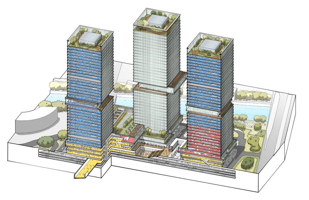
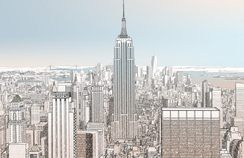
Keen’s perspectives are all hand-drawn.
There are four stand-out reasons:
Overuse
Renderings have become normalized and clichéd — misty mountain fairy tales or super saturated fakery. Clients have become bored of it and hence bored of this presentation approach.
Obsession
Clients are so tired of renderings that they stop looking at the big picture, focusing instead on small details — door materials or carpet colors — while ignoring the actual design. I’ve seen dozens of presentations derailed over questions about door handles and furniture choices while the main ideas go unnoticed. Why? When all impact has been lost, what is left are the irrelevant details.
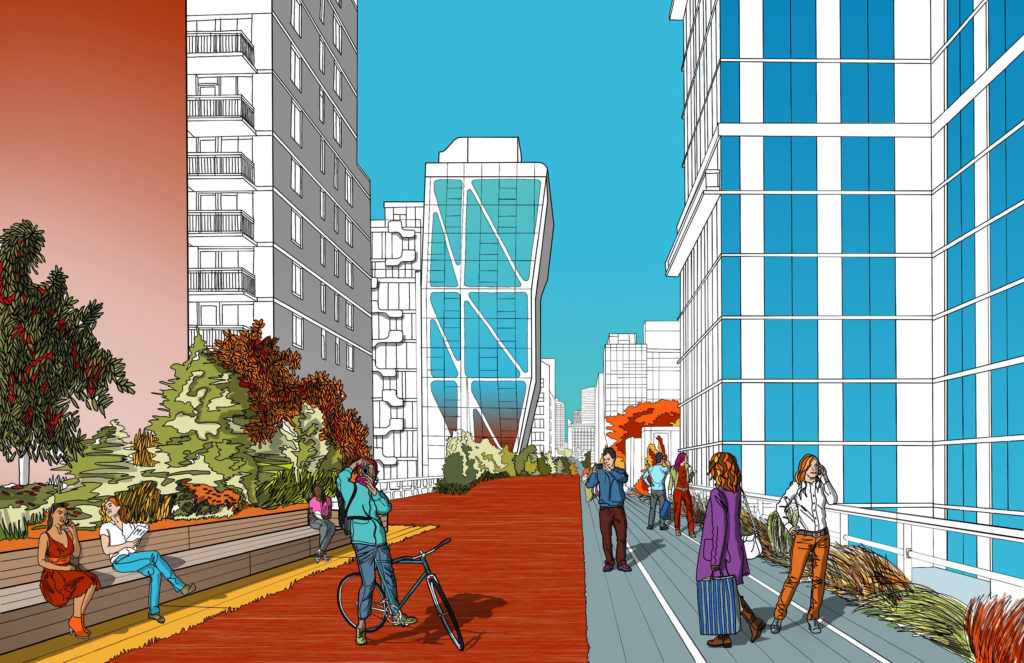
Keen’s illustrations were chosen by Apple to promote their new iPad Pro.
Perfection
Perfection prevents connection. A lot of presentations are made for people unused to reading drawings and diagrams, for example to a local community. In these situations, renderings are taken literally — this is what will come to pass. Often these images are concept level, done the day before, yet the architect gets held to that vision. An angry crowd dismisses the image, saying “this is not what I want” or, “I don’t like that”, while a happy crowd gets disappointed when reality bites and the design changes over time.
Monotony
Presentations all look the same these days. A typical modern presentation is a mix of Illustrator diagrams and renderings and the client has seen it all before. The same old presentations produce the same old results. How can a client pick a scheme or a competition winner amongst all the repetition? For your work to stand out, you must do something different.
I saw these problems occur time and again, and it was this repetition that made me search for a new approach to illustration. Over the years I have developed a ‘clear line’ style that helps relay design in a direct and simple way.
How do we do this? First we have to decide what the image has to communicate: Space? Materials? People? Once that has been clarified I redraw and redraw the scheme until it is illustrated in as minimal way as possible. This sounds easy, but like minimal architecture, showing less can be very difficult! As Hergé (Tin Tin’s creator) put it, “I would have drawn less but I didn’t have the time.”
Through hundreds of presentations I’ve used this approach to successfully communicate the simplicity of space, materials and light without the image distracting the audience. It has proven to be so effective because:
1. The illustration allows the client to use their imagination.
2. An emphasis on simplicity over detail communicates design intent free of distraction.
3. The drawings engage the viewer immediately and directly.
4. The approach is unique so the presentation feels fresh and different.
5. The illustrations make people smile.
Computers have gone from magical communication tools to a liability that prevents ideas from being communicated. Isn’t it time you let your work speak for itself?
All images courtesy Jim Keen; all opinions are Keen’s own and do not necessarily represent those of Architizer. Check out more of Keen’s work on his website.
 25 Best Architecture Firms in Germany
 15 Best Architecture Firms in Malaysia
 How an Award-Winning Architectural Visualization Studio Is Evolving in the Age of AI
 Southern Hospitality: 6 Charming Examples of Georgia’s New Class of Single-Family Homes
 Natural Wonder: 10 Examples of Arkansas’ Elaborate Institutional Architecture