Dekton, the high-end composite material by Cosentino, is always a superb choice for surfaces like countertops, wall paneling and façades. For years, Dekton has been a clear leader in the field, not only because of its resilience (Dekton retains its magnificent, glossy finish after years of heavy use) but also because of its visual splendor. With intricate texturing and incomparable sheen, Dekton always makes a strong impression.
Each year, Cosentino releases a new suite of colors and patterns for Dekton, expanding the possibilities for its use. Unlike a natural stone, architects can do anything with an ultra-compact material like Dekton, and Cosentino takes full advantage of the product’s versatility.
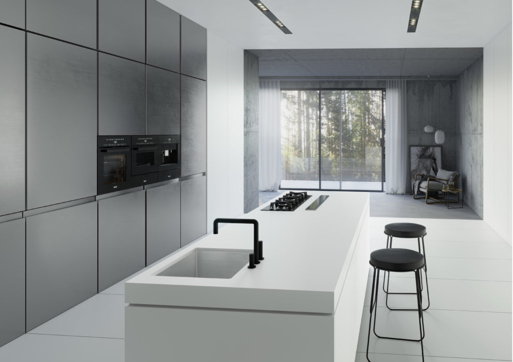
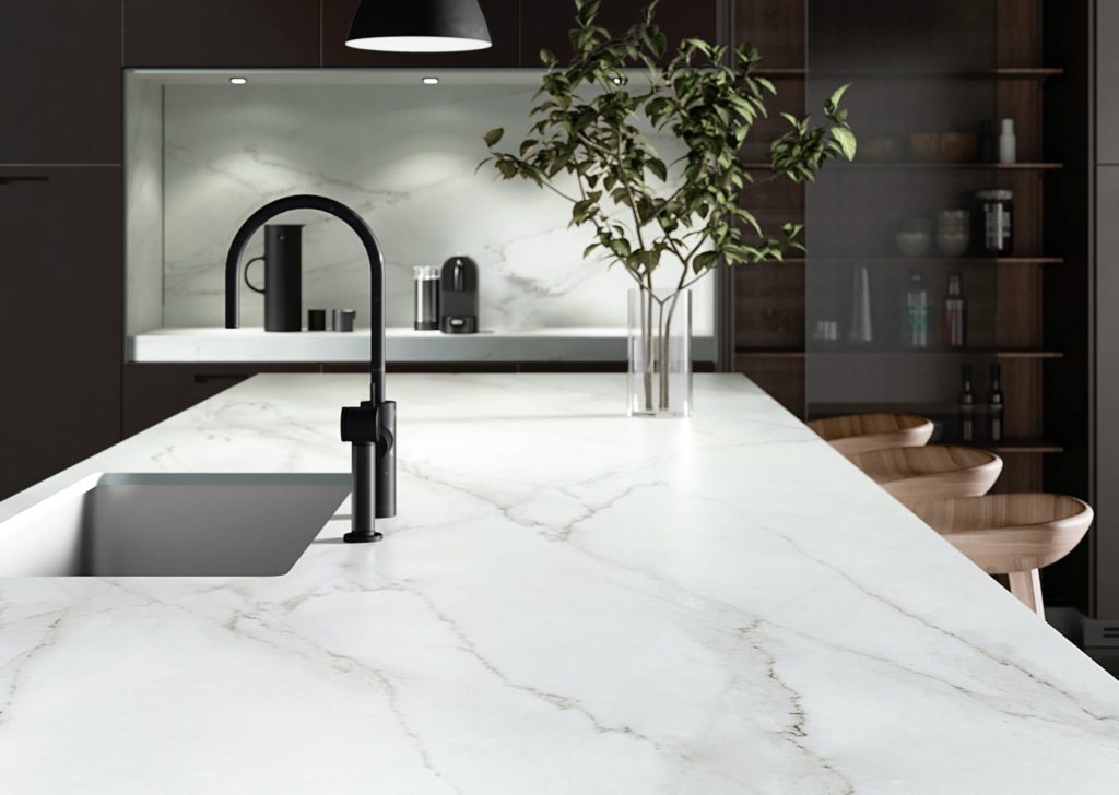
Clean, resilient surfaces are characteristic of Dekton. This clean, white color is called Uyuni.
In 2020, Cosentino has divided their new designs into four series that represent different style and themes. They have titled this initiative “The Collection” and explained that going forward, it will “be the main basis from which Cosentino will unveil its new products to the world, both in terms of series and colors.” This will be true not just for Dekton, but for Cosentino’s other main brands: Silestone and Sensa.
The Collection provides a new way for designers to think about Cosentino’s projects, finding surfaces that truly match their vision.
The first series released under The Collection is called Liquid, created by the London-based design studio PATTERNITY. The colors included in this series celebrate the elegant properties of natural materials, yet the designs themselves are unlike anything in nature. “It’s nature—everything comes and flows from it,” describes Cosentino. “This is our inspiration: freshness, elegance … a subtle visual movement that brings uniqueness to any project.”
Kitchen featuring Dekton surface in Liquid Embers
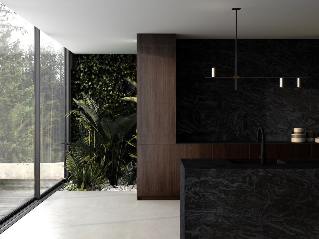
Liquid Embers, the first color featured in this series, “is a dark design in blue tones, which can be distinguished from one another due to their matte and gloss effects.” This is a truly subtle design, with a texture that resembles ripples on the water, barely glimpsed on a dark and moonless night.
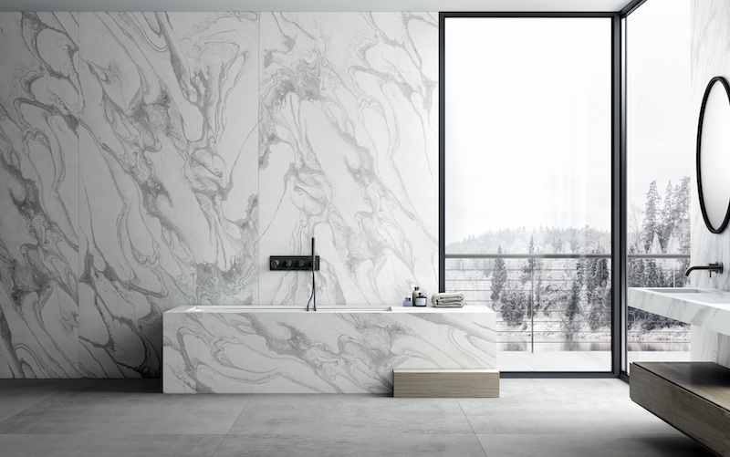
Bathroom featuring Dekton surfaces in Liquid Sky
Liquid Shell and Liquid Sky are the other two colors included in the Liquid series.,, These colors are just as subtle as Liquid Embers, but brighter. The swirling gray-on-white pattern of Liquid Sky has an arctic quality that would look amazing in certain bathrooms.
In contrast, the Chromica series of finishes is notable for its absence of patterns. Designed and created in collaboration with Daniel Germani Designs, the Chromica series features solid colors, lending them a smooth yet rich quality.
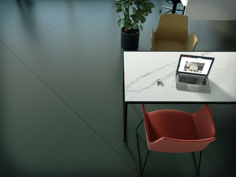
Office with Dekton flooring in Feroe green
“Understated design is on trend: the stunning Feroe green and balanced Baltic blue equal serenity and consistency,” explains Cosentino. These are unique colors for surfaces, the type of hue you can use to design a whole room around.

Airport with Dekton flooring in Baltic blue
For designers looking for a little more of an edge, the Avant-Garde Series might be the best option. “To be daring is to be a trendsetter; to innovate is to have an impact, to break away from the norm,” reads the description of this bold series.
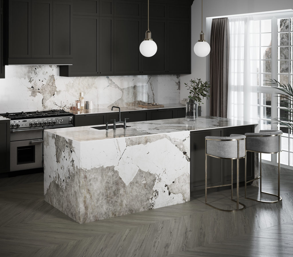
Kitchen with Dekton surfaces in Khalo
Each of the colors featured in the Avant-Garde series are inspired by natural stone. The striking Dekton Khalo finish is designed to evoke Patagonia Granite, blending patches of cream and brown with black and gold flecks.
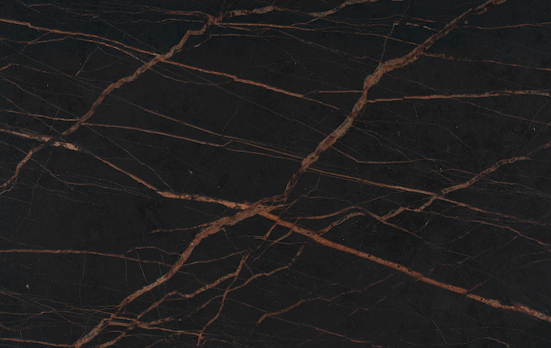
Detail of Dekton in Port Laurent
Meanwhile, Dekton Laurent is inspired by Port Laurent Stone, with gold veining that resembles branch lightning against a dark sky. This would be a great choice for a designer looking to make a bold, contemporary statement.
Countertop in Dekton Rem
Finally, there is Portfolio, a series featuring designs that would work well in a wide variety of situations. The lightest color in this series, Rem, is inspired by Calacatta Lincoln quartz and would bring a touch of sophistication to any kitchen. On the other hand, the darker Milar is both subtle and rich, taking inspiration from oxidized and faded-looking materials.
“Less is more: a scale of colors to suit any project perfectly,” describes Cosentino. “The versatility of the monochromatic style, with sophisticated touches from Portfolio‘20, will conquer you.”
Whatever the goals of the architect or interior designer is, The Collection has something amazing to offer. Cosentino’s expanded range means that finding exactly the right surface is now easier than ever.
 25 Best Architecture Firms in Germany
 How an Award-Winning Architectural Visualization Studio Is Evolving in the Age of AI
 Southern Hospitality: 6 Charming Examples of Georgia’s New Class of Single-Family Homes
 Natural Wonder: 10 Examples of Arkansas’ Elaborate Institutional Architecture
 The Future is Modular: Factory-Built Architecture is the Way Out of the Housing Crisis