
Architects: Showcase your next project through Architizer and sign up for our inspirational newsletter.
Wassily Kandinsky’s art explored the relationship between color and its viewers. He eschewed the grays, browns and blacks of Cubism, embracing color as the primary vehicle for expression. In doing so he completely separated painting from a need to depict a subject. The goal of Kandinsky’s art was to capture music in a plastic medium, to evoke the same feelings a piece of music could evoke through shades and hues.

Color Study: Squares with Concentric Circles by Wassily Kandinsky. Image via Wikipaintings
The theories he developed about color and meaning would prove influential in all creative fields, with the De Stijl movement expanding his philosophies and incorporating color into industrial design and architecture. Employing the color wheel, Kandinsky went through each hue, explaining the feelings it evoked, emotions it captured, and the sound it “made.”
Cycling through the colors of the rainbow, here is a sample of Kandinsky’s thoughts on color from his book “Concerning the Spiritual in Art,” paired with buildings from the Architizer database. If you are considering a vibrant cladding product for your next building, be inspired by the master of the whole spectrum:

© GBANG
YOUNG DISABLED MODULES by ///g.bang/// josé javier gallardo, Zaragoza, Spain
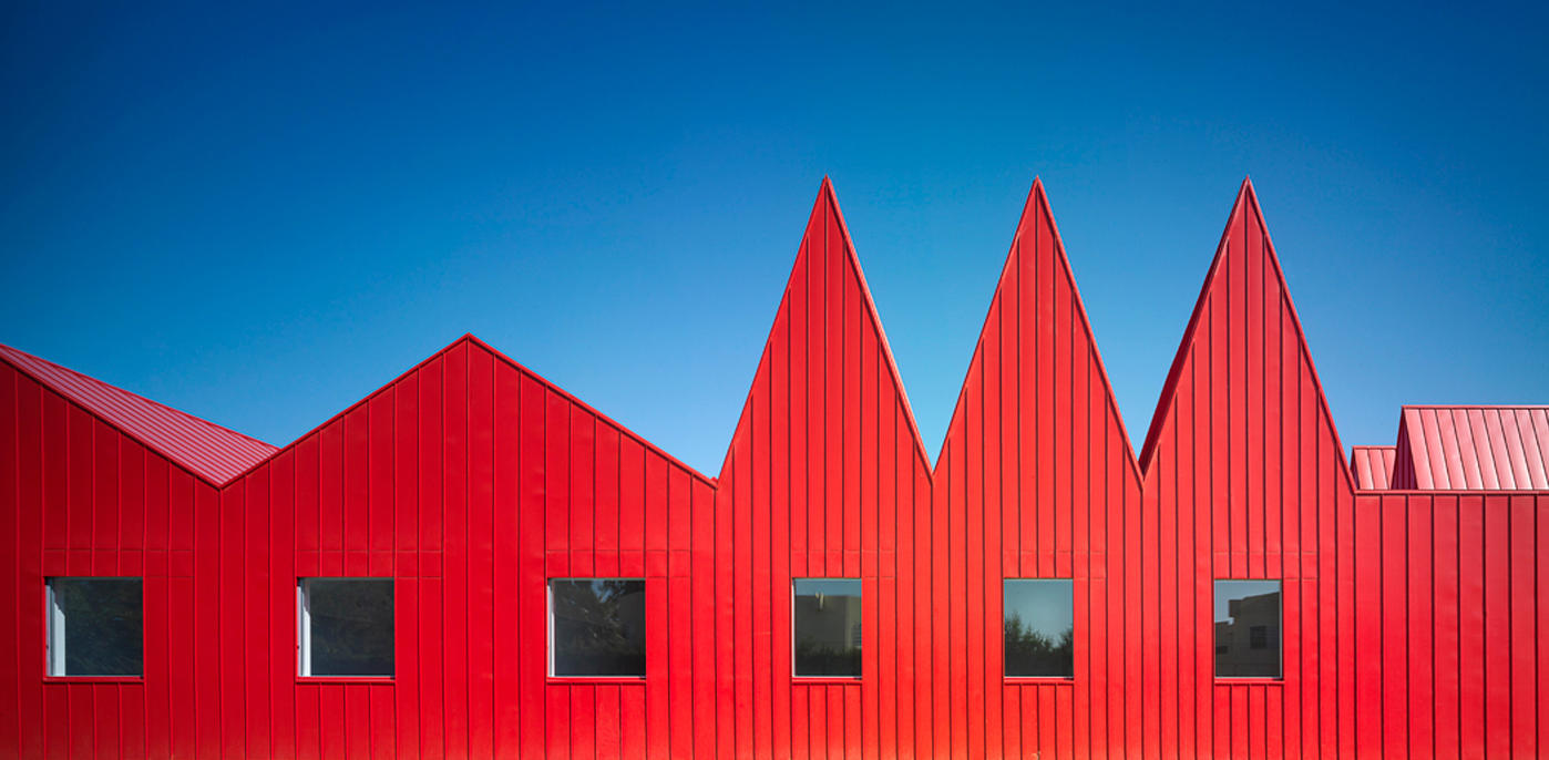
Red: alive, restless, confidently striving towards a goal, glowing, “manly maturity.” Translated into sound: “sound of a trumpet, strong and harsh,” Fanfare, Tuba, deep notes on the cello, clear violin.
Refurbishment and Extension of ArcelorMittal R&D Headquarters [insideOUT] by [baragaño], Avilés, Spain
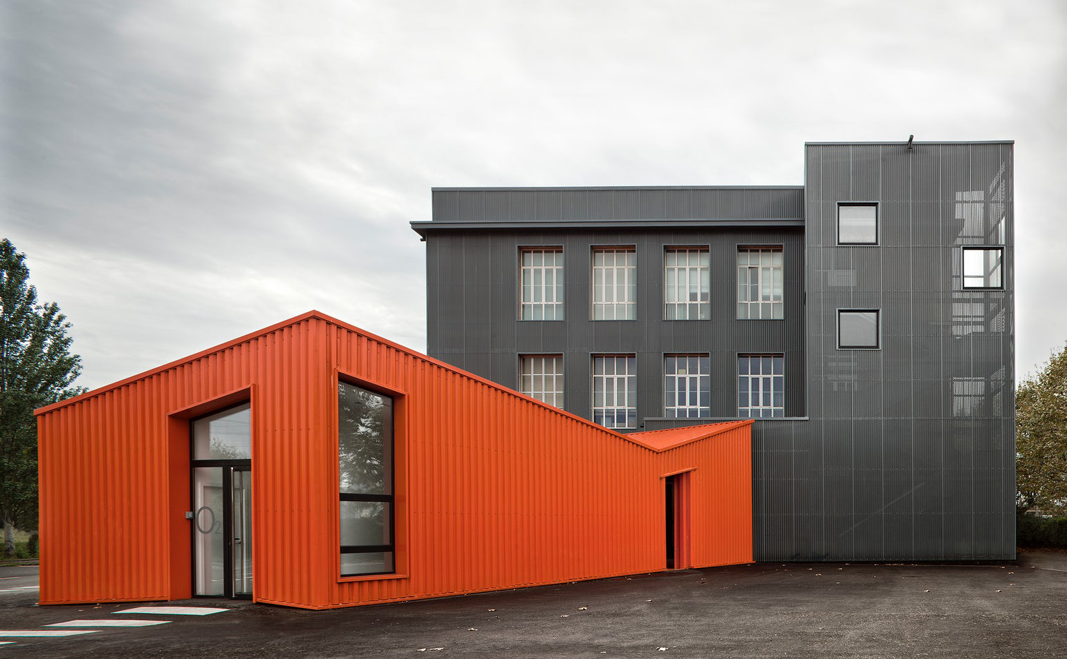
Orange: a mixture of red and yellow, radiant, healthy, serious. Translated into sound: middle range church bell, an alto voice.

© Rojkind Arquitectos
Falcon Headquarters by Rojkind Arquitectos, San Angel, Mexico
Cladding by Panelite
Yellow: “warm, cheeky, and exciting, disturbing for people, typical earthly color… representing madness in color, an attack of rage, blind madness, maniacal rage.” Translated into sound: loud sharp trumpets and high fanfares.
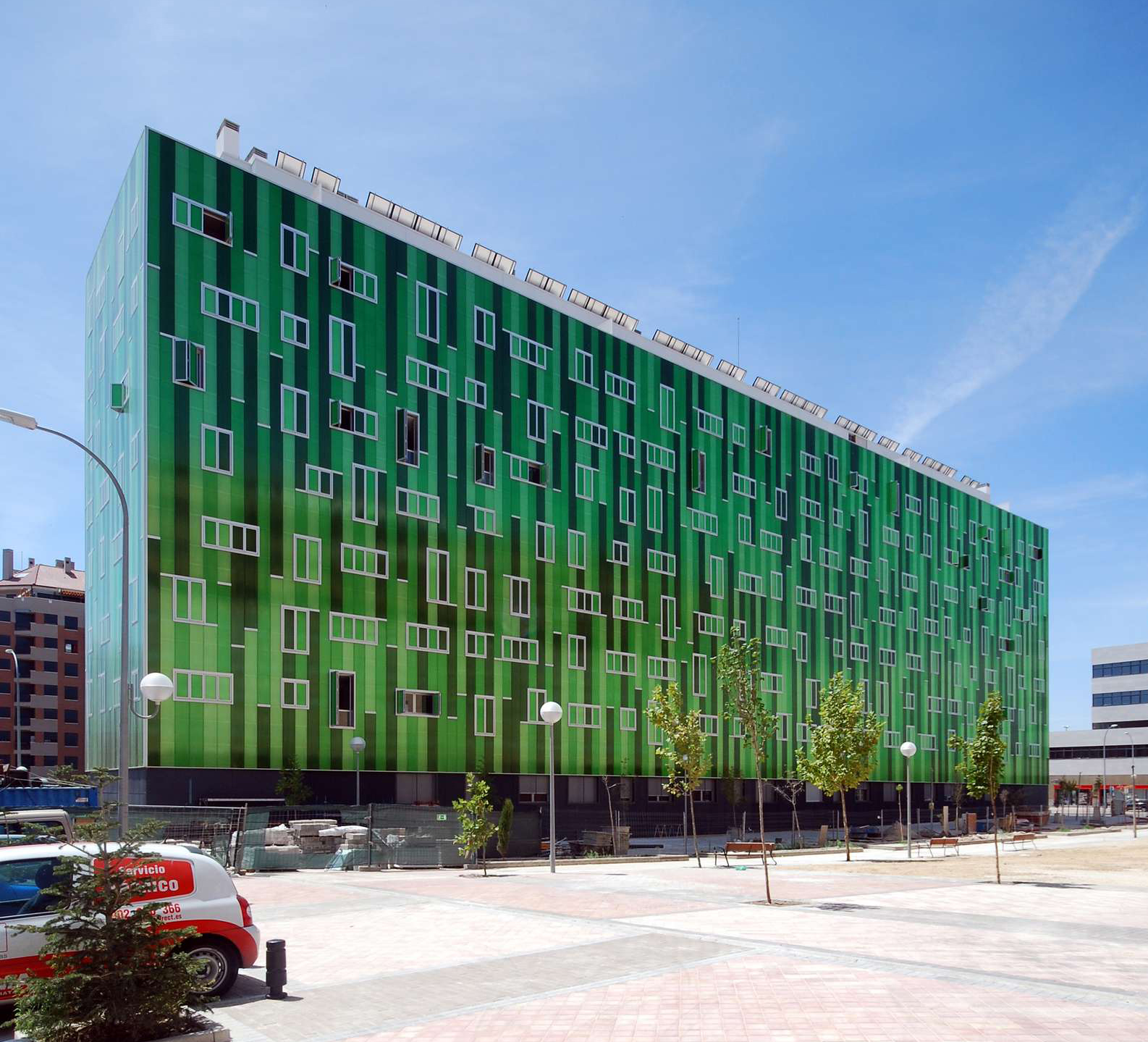
123 social green housing in Madrid by SOMOS.arquitectos, Madrid
Green: stillness and peace, but with a hidden, passive strength. “Green is like a fat, very healthy cow lying still and unmoving, only capable of chewing the cud, regarding the world with stupid dull eyes.” Translated into sound: quiet drawn out middle position violin.

© MVRDV
Didden Village by MVRDV, Rotterdam, Netherlands
Exterior finish: Kunststof Coatings Nederland
Blue: deep, inner, supernatural, peaceful. “Sinking towards black, it has the overtone of a mourning that is not human … typical heavenly color.” Translated into sound: the flute, cello, and organ.
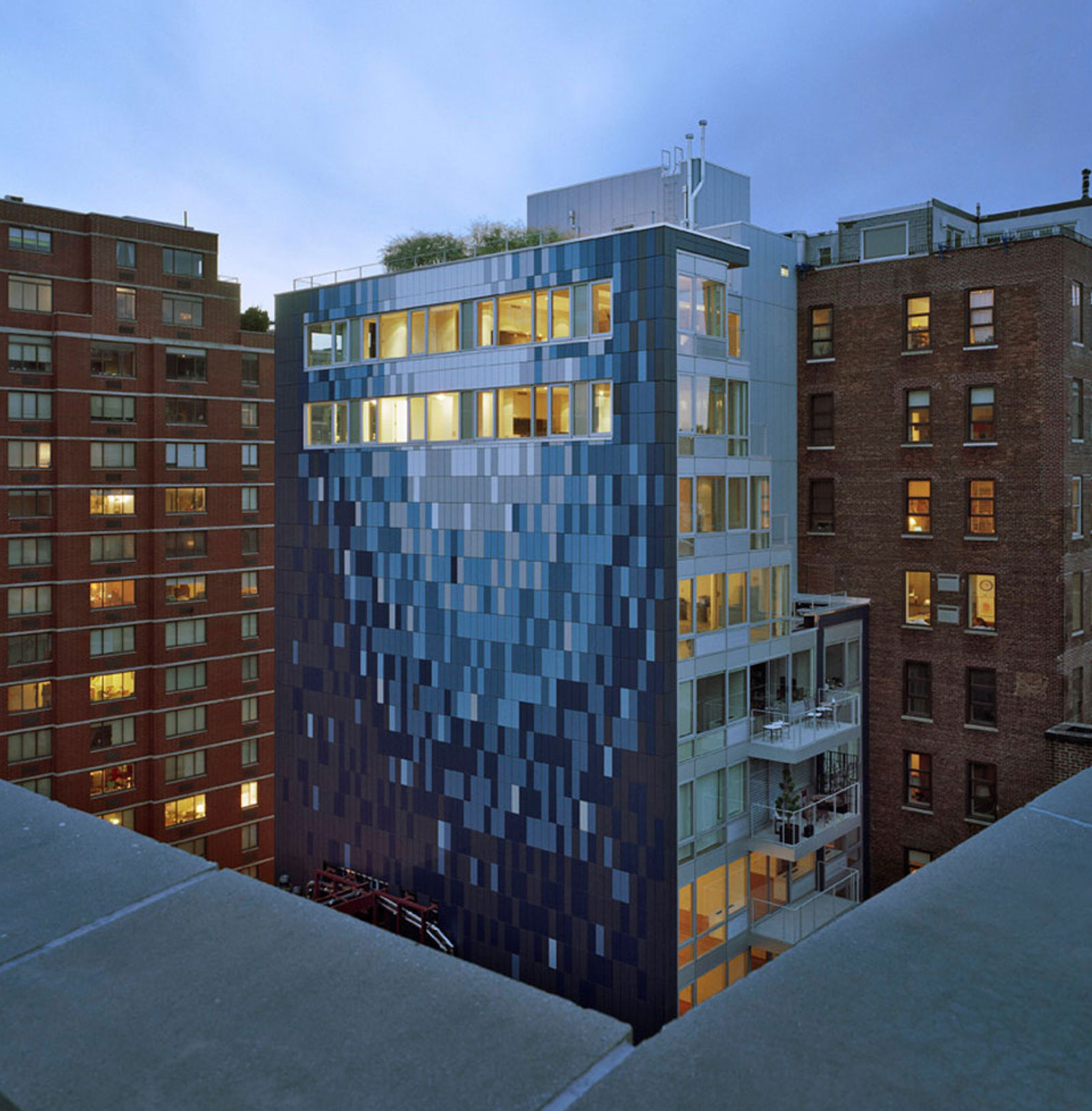
Avant Chelsea by 1100 Architect, New York City
Unfortunately Kandinsky didn’t distinguish between blue and indigo. Apparently they were the same to him.

© IROJE KHM Architects
Purple Hill House by IROJE KHM Architects, Gyeounggi-do, Korea
Violet: a mixture of red and blue, “morbid, extinguished … sad.” Translated into sound: the english horn and bassoon.
Architects: Showcase your next project through Architizer and sign up for our inspirational newsletter.
 25 Best Architecture Firms in Germany
 30 Best Architecture Firms in Ireland
 How an Award-Winning Architectural Visualization Studio Is Evolving in the Age of AI
 Southern Hospitality: 6 Charming Examples of Georgia’s New Class of Single-Family Homes
 Natural Wonder: 10 Examples of Arkansas’ Elaborate Institutional Architecture
 123 social green housing in Madrid
 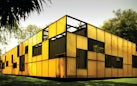 Falcon Headquarters
  Purple Hill House
 ![© [baragaño]](https://architizer-prod.imgix.net/mediadata/projects/502012/5e97a825.jpg?fit=max&w=175&q=60&auto=format&auto=compress&cs=strip&h=86) Refurbishment and Extension of ArcelorMittal R&D Headquarters [insideOUT]
Refurbishment and Extension of ArcelorMittal R&D Headquarters [insideOUT]  YOUNG DISABLED MODULS