Architizer's 14th A+Awards judging is live! Subscribe to our Awards Newsletter for updates on Public Voting and the big winner reveal later this spring.
While cohesion is often the safe route, we architects have always had a soft spot for material contrasts that, on paper, shouldn’t quite work, and yet somehow do. But when the line is clear, the result can feel sharper and more intentional than any carefully matched palette.
And at a time when add-ons and adaptive reuse are quite common and a renewed interest in honoring what already exists, these material splits have become even more visible. Extensions declare themselves. Insertions refuse to imitate. But the strategy isn’t limited to just renovations. Even new builds are embracing deliberate divides to clarify structure, signal function or simply establish identity.
This collection spotlights eight projects that draw that line with confidence. Projects where contrast isn’t an unplanned side effect, but the organizing idea.
Virunga Mountain Spirits Distillery
By BE_Design, Musanze, Rwanda
Jury Winner, Architecture +Low Cost Design, 13th Annual A+Awards
Popular Choice Winner, Architecture +Low Cost Design, 13th Annual A+Awards
Special Mention, Factories & Warehouses, 13th Annual A+Awards
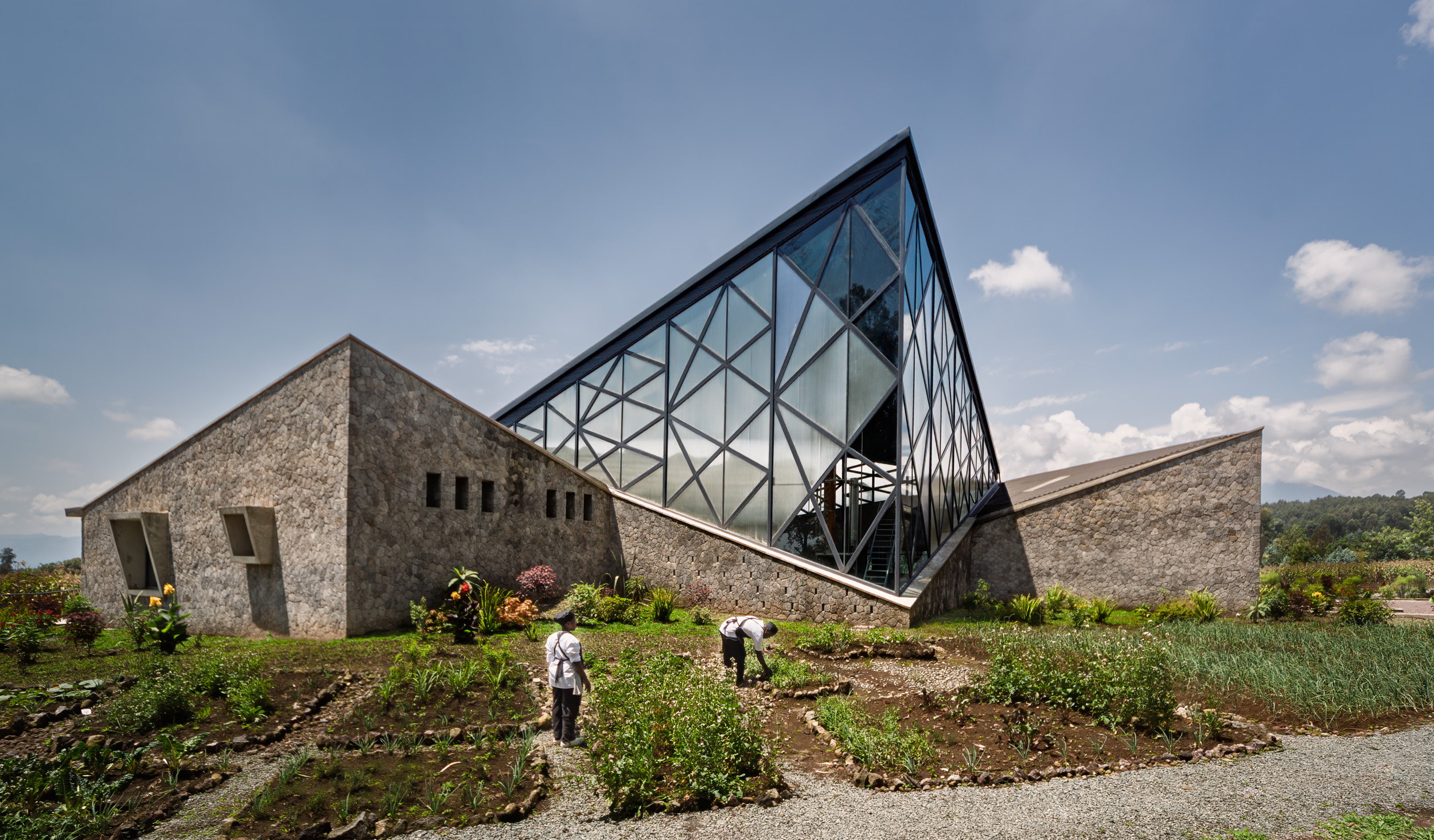
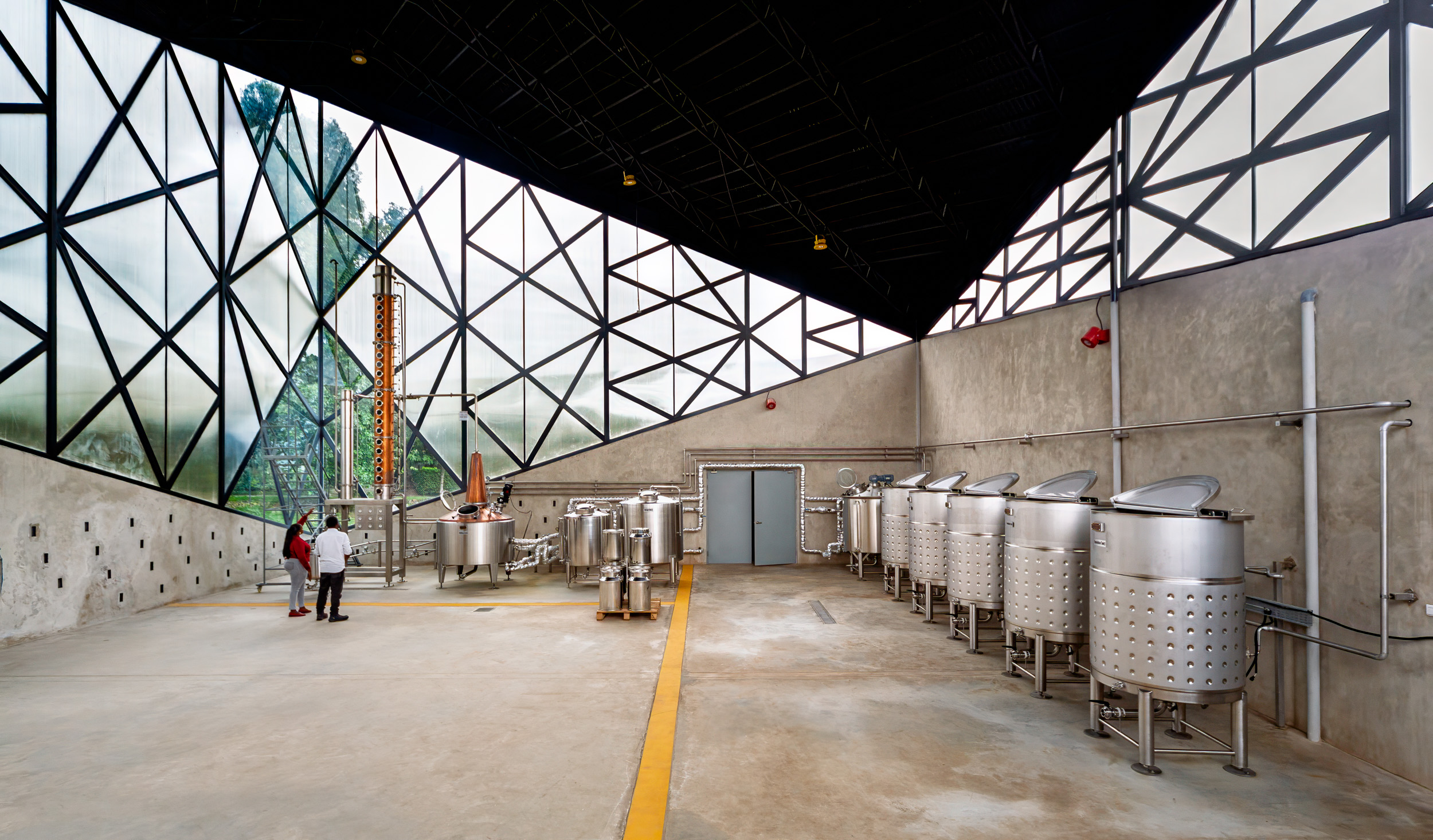
The distillery room occupies a transparent and semi-transparent volume that exposes the full height of a 10-meter copper and stainless steel still. Daylight enters freely, turning the technical process into something visible and shared. Surrounding this luminous core, hand-shaped volcanic rock walls form a dense outer ring that contains offices, tasting areas and storage.

The Refinery at Domino
By Practice for Architecture & Urbanism | PAU, Brooklyn, New York
Jury Winner, Commercial Adaptive Reuse Projects, 12th Annual A+Awards
Popular Choice Winner, Commercial Adaptive Reuse Projects, 12th Annual A+Awards
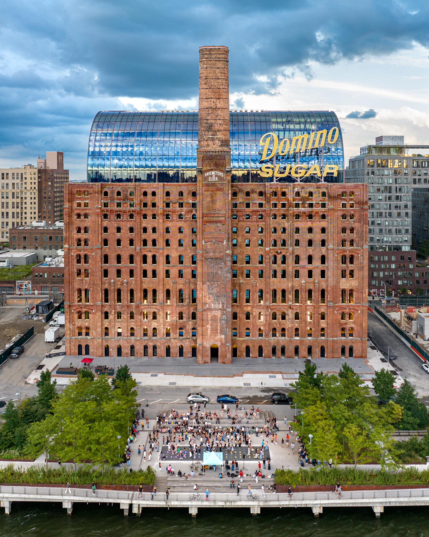
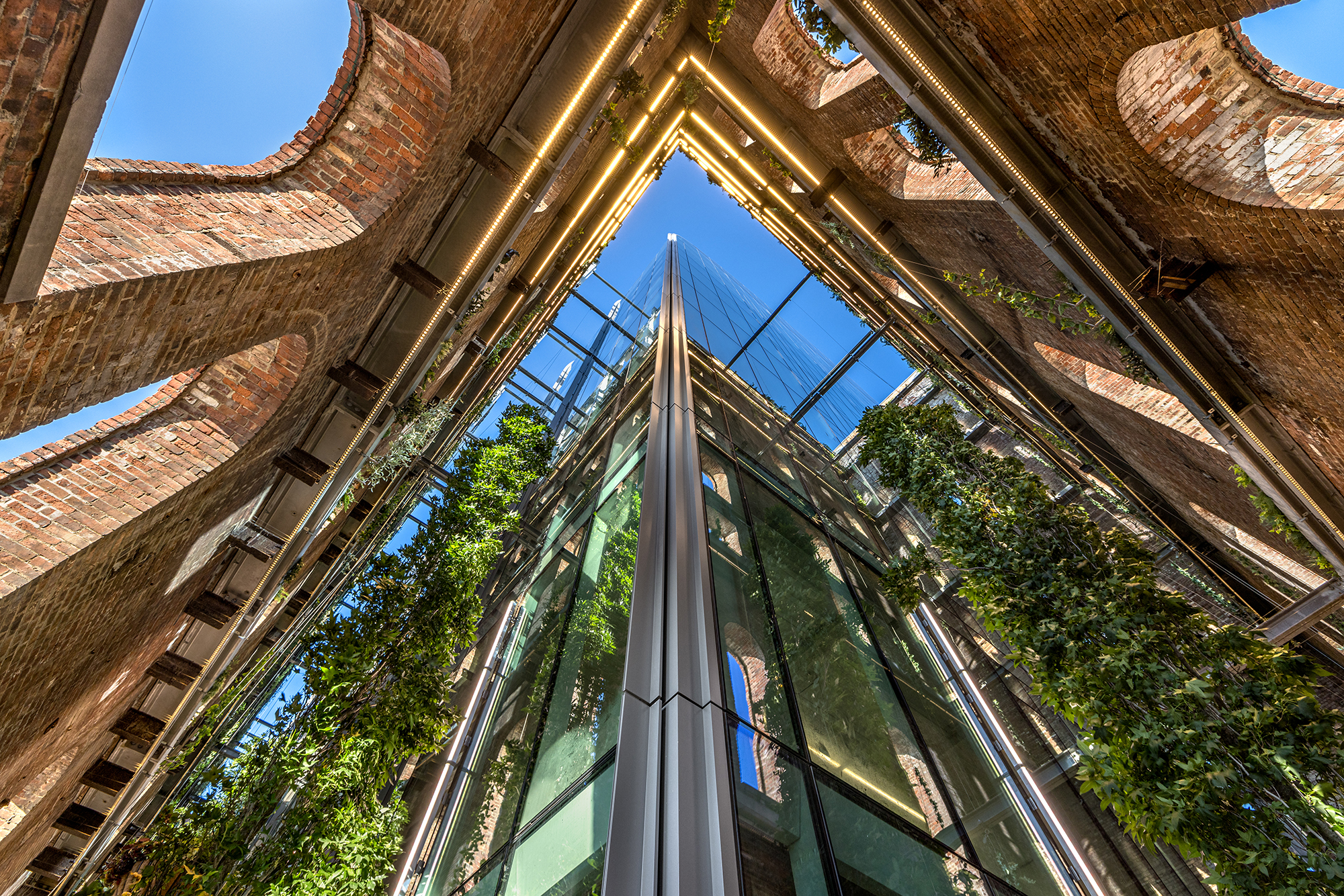


The original brick remains heavy and scarred, its small windows recalling a time of controlled light and intense labor. Set back from this envelope, a freestanding glass and steel vault introduces tall, accessible floor plates and daylight-filled atria. The contrast is intentional and sharp. Weathered masonry holds memory and mass, while the new interior form reads as light, precise and openly modern, establishing a firm line between preservation and present use.
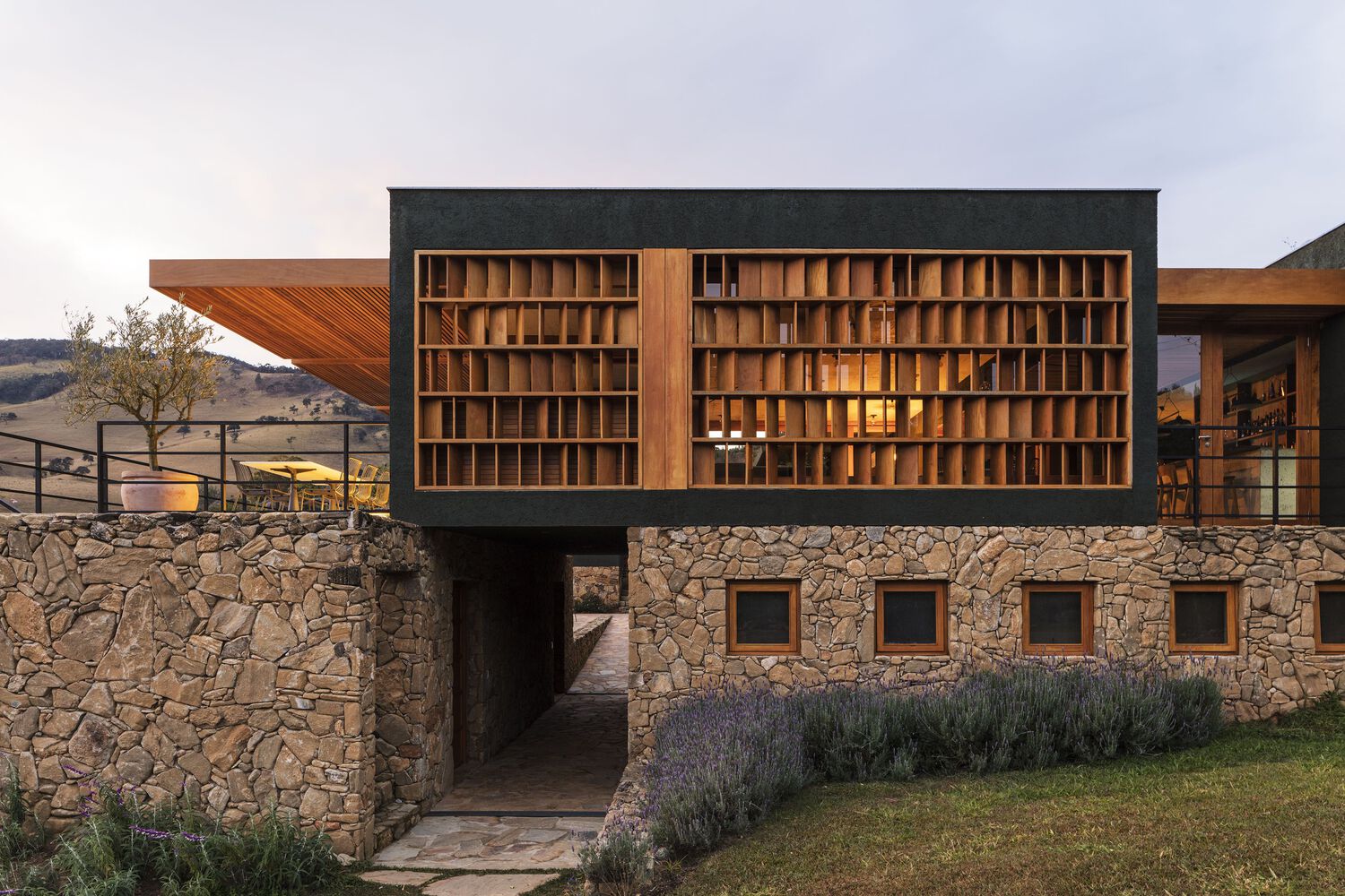
A TOUCH OF NEW
By ARISTIDES DALLAS ARCHITECTS, Tinos Regional Unit, Greece
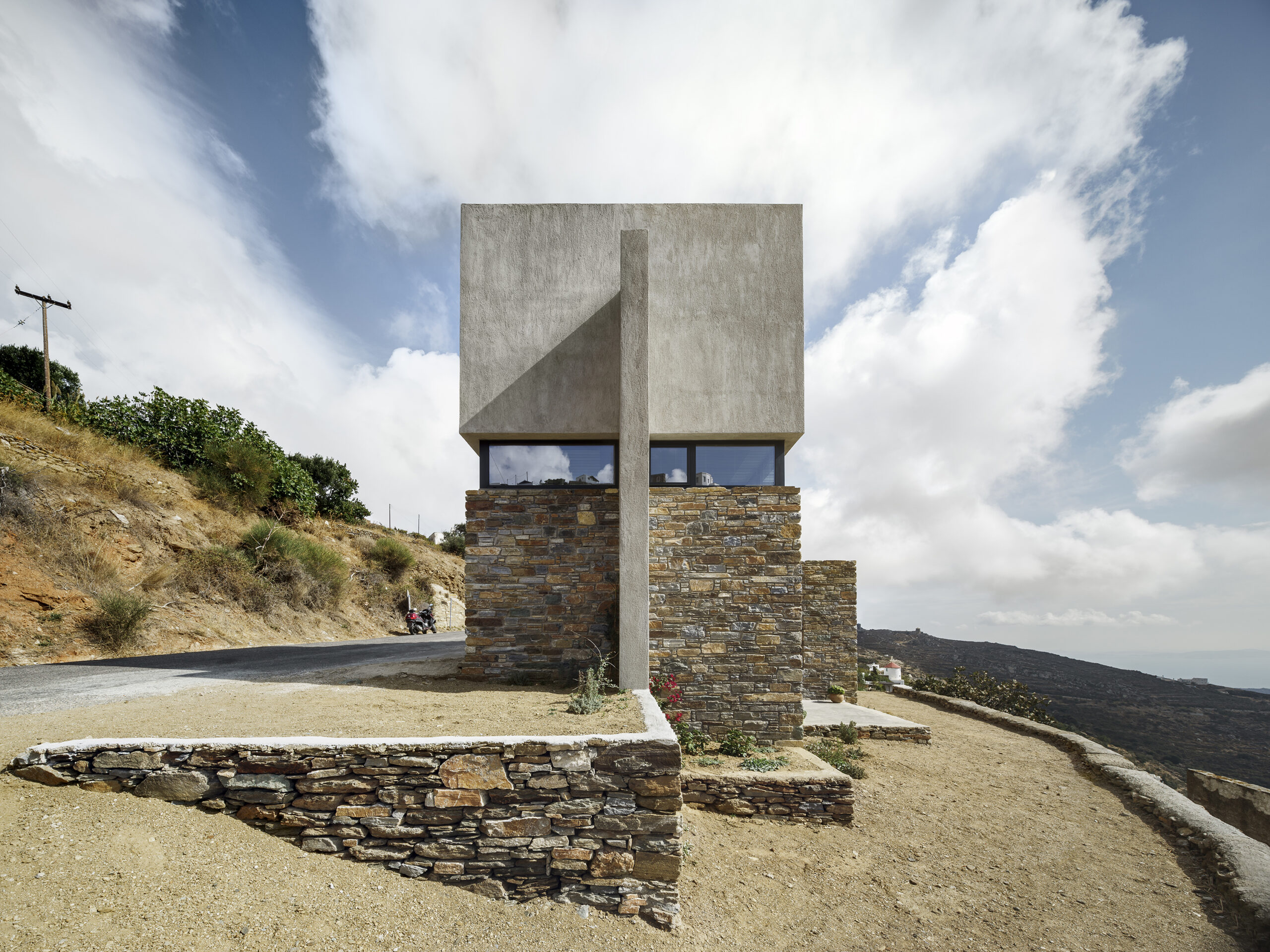
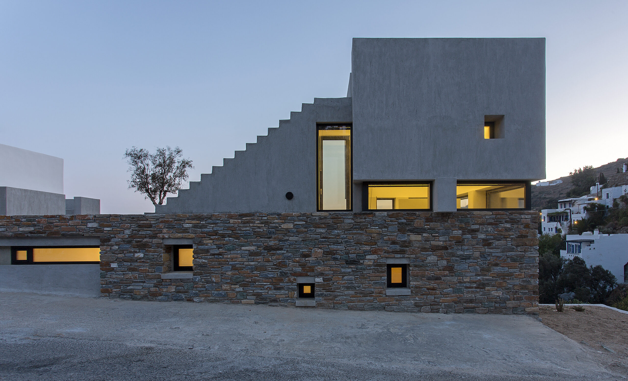


This gap, filled with glazing, brings light into the depth of the plan and frames distant views, while making the construction sequence legible. The rough, load-bearing stone speaks of local building traditions and accumulated labor, while the smooth concrete sitting above reads as intentional and contemporary. The house tells its story through this measured separation, allowing old and new to coexist without imitation.
Arghavan (Cercis) Commercial Project
By 13 Degrees Architecture Studio, Yazd, Iran
Popular Choice Winner, Architecture +Innovation, 13th Annual A+Awards
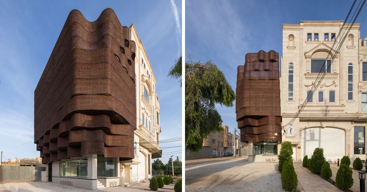
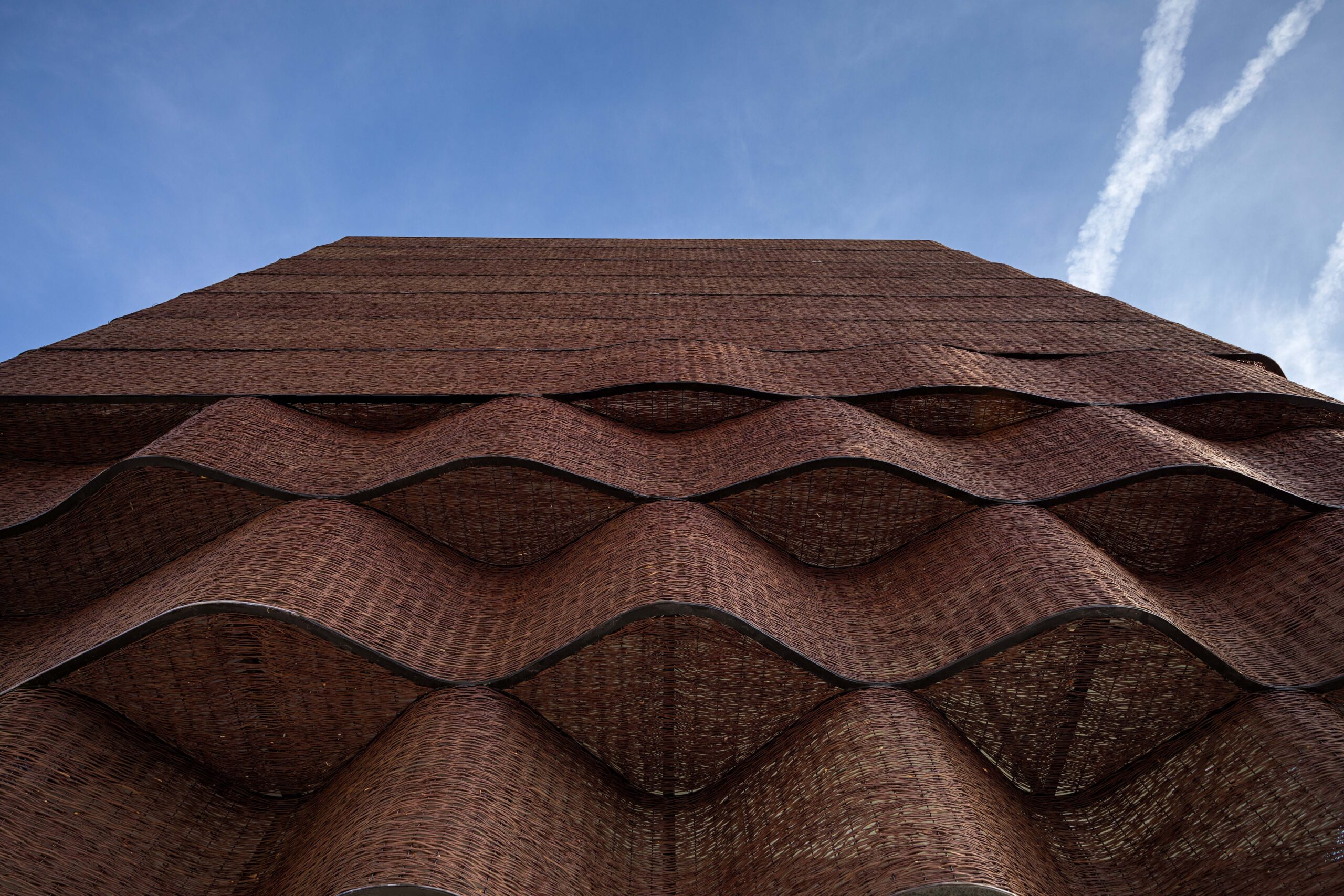


The woven screen stands before a conventional structural frame, creating a clear separation between load-bearing construction and climatic envelope. Its porous surface filters Yazd’s intense sun and moderates heat, acting as a breathable membrane rather than a sealed wall. The contrast lies in the meeting of scales and values: fragile branches assembled by hand set against urban mass and standard building methods, transforming low-cost organic material into a permanent civic façade.
VJC Iporaga House
By Marina Salles Arquitetura e Interiores, Guarujá, Brazil
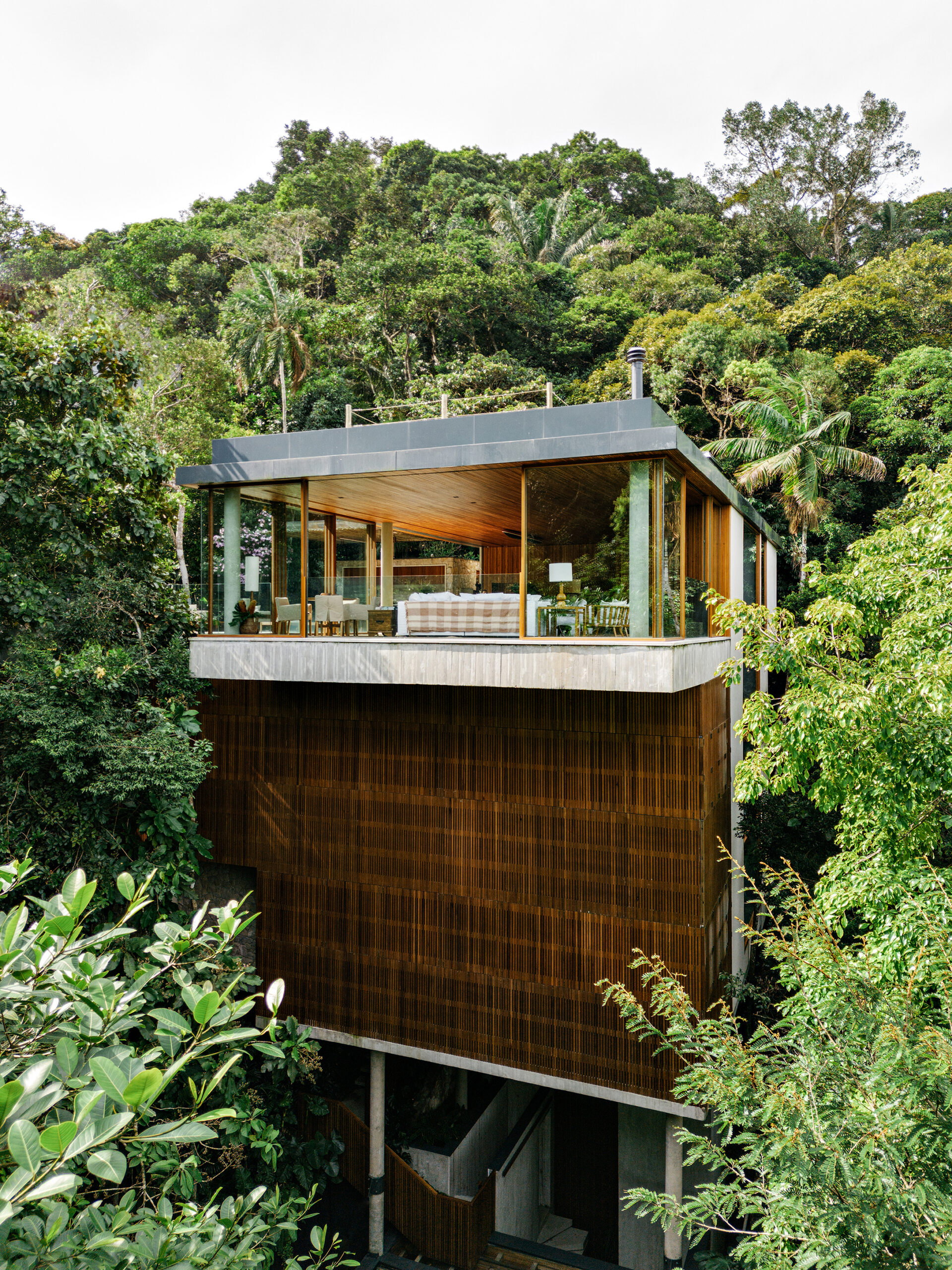
A concrete structure establishes the main slabs and roof plane, giving the house a clear geometric outline. Within this frame, wide glass panels and slatted timber screens define the living spaces. The wood wraps the middle levels as a permeable layer, filtering light and air, while granite floors extend from interior rooms to the pool deck, anchoring the house to the ground.

Thirty75 Tech
By Verse Design LA, Santa Clara, California
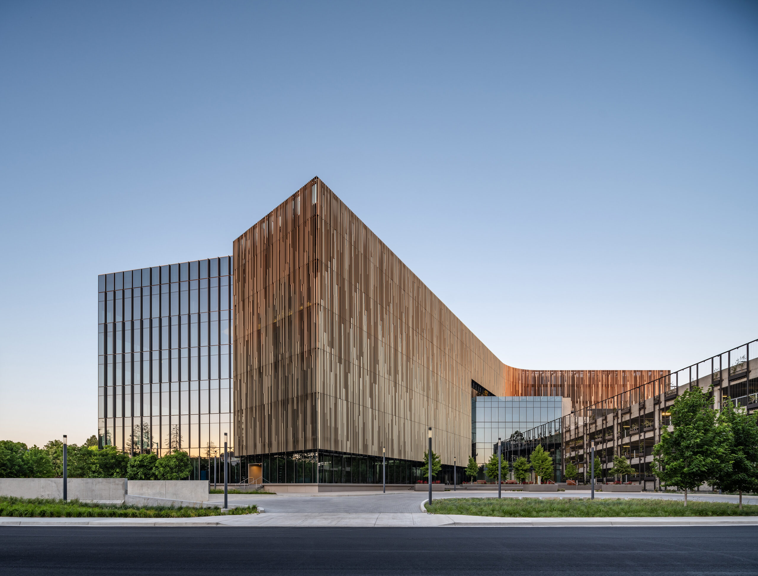
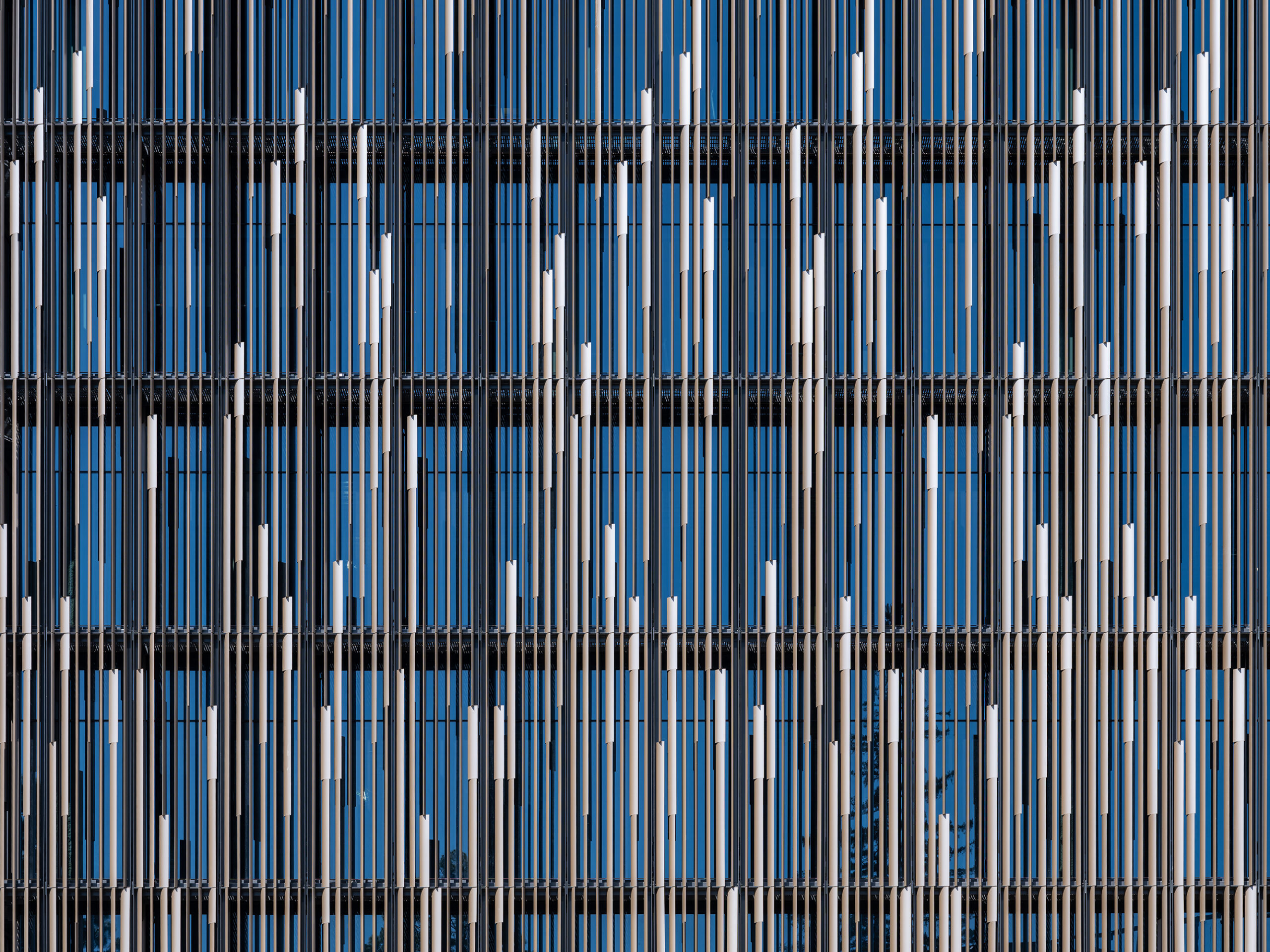

As you approach, that reading shifts. The seemingly solid volume is, in fact, wrapped in a continuous layer of vertical aluminum louvers set in front of a curtain wall. What first feels opaque begins to reveal depth and spacing. The fins are precisely angled to meet solar shading targets, turning the façade into a performative screen that contrasts with the unfiltered transparency of the glass corner.
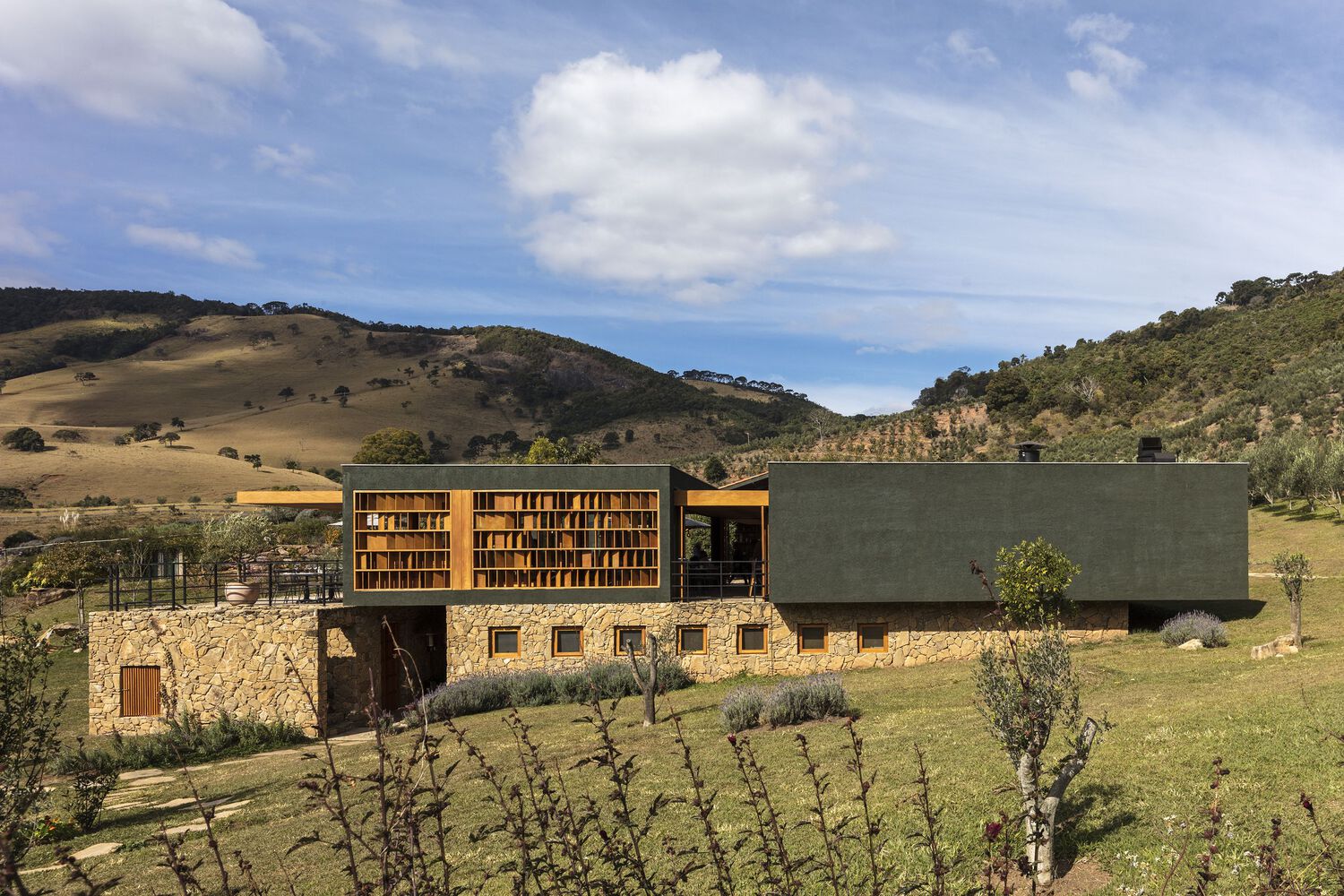
Lagar Oliq Complex
By Play Arquitetura, São Bento do Sapucaí, Brazil

Fire Station in Straubenhardt
By wulf architekten, Straubenhardt, Germany
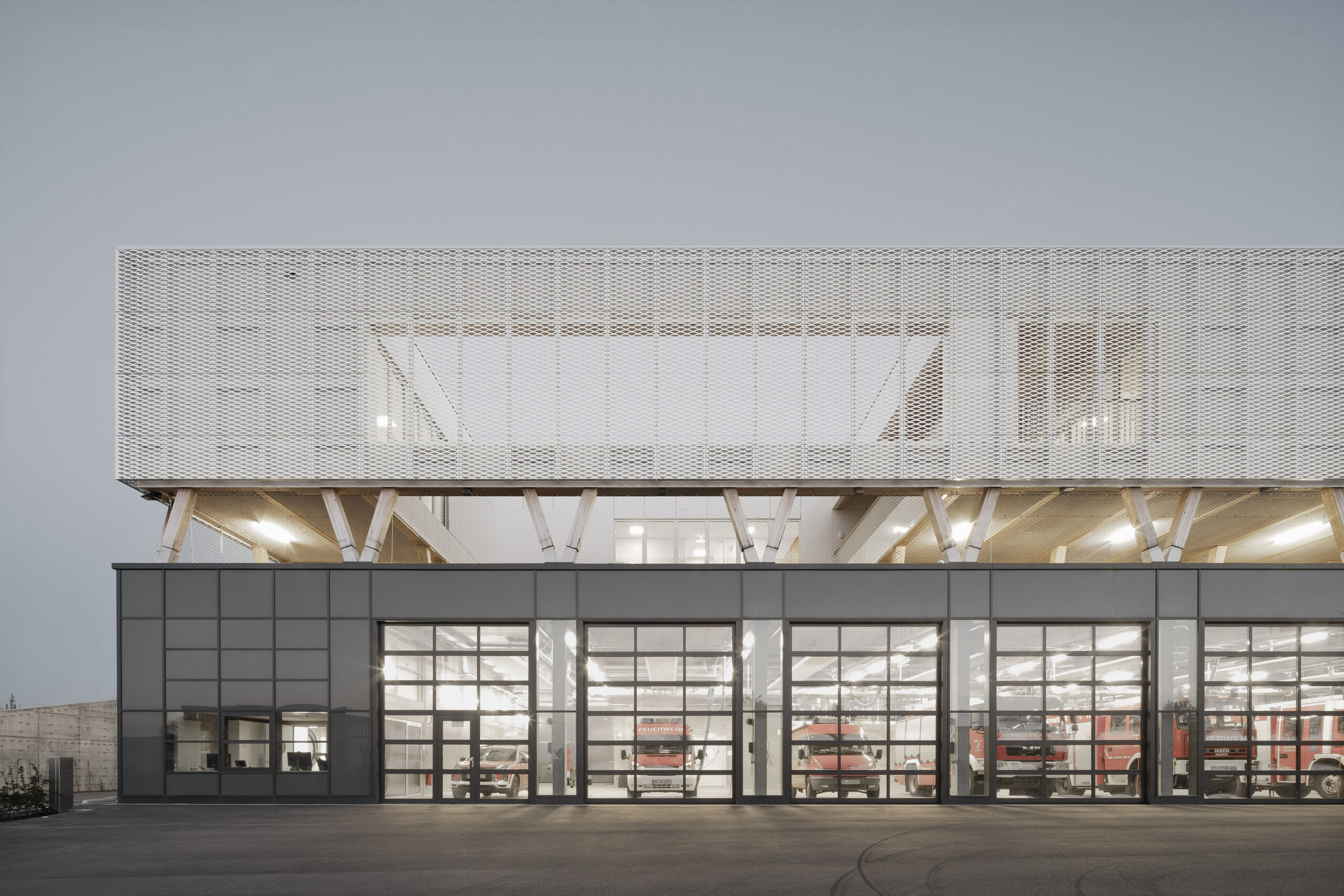
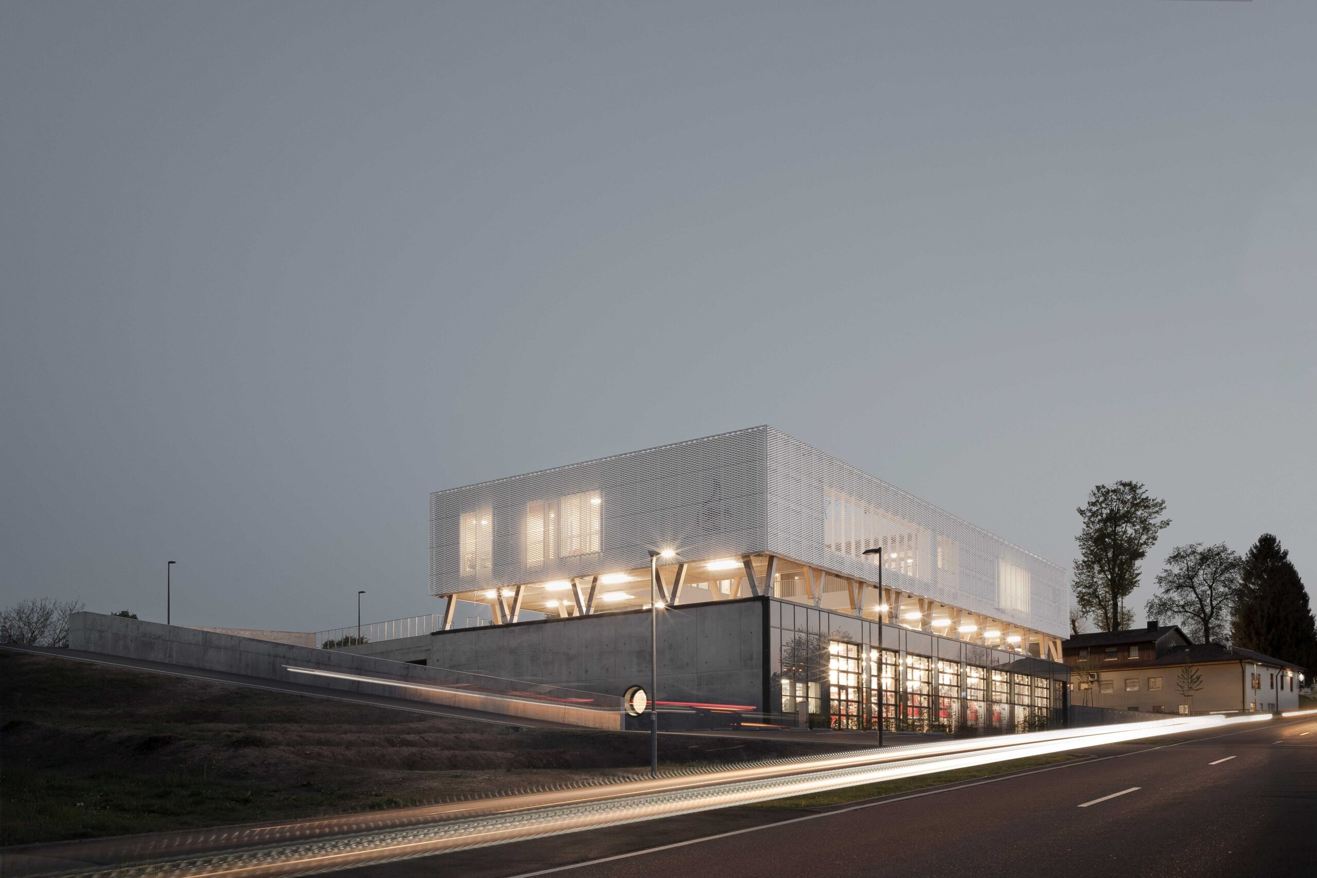

The project organizes its operational, public and administrative spaces through a clear vertical stacking that is legible from the outside.
A concrete base is cut into the slope, containing the vehicle garage, storage and all essential operational facilities, with the north façade opening directly to the street for rapid deployment. Above it, an open-air deck functions as parking and event space. The top level is built in timber and wrapped in a continuous white expanded metal façade, housing classrooms and offices.
Architizer's 14th A+Awards judging is live! Subscribe to our Awards Newsletter for updates on Public Voting and the big winner reveal later this spring.